#CB6015 Color
Your all-in-one color resource. Download hex background images, Adobe swatches (ASE), PDF color sheets, and SVG files. Explore palettes, harmonies, accessibility, conversions, and professional exports — designed for designers, developers, and color perfectionists.
The emotional impact of #CB6015 is one of warmth and grounded energy. It evokes feelings of comfort, security, and a touch of nostalgia, like the final moments of a sunset or the comforting glow of a fireplace. It reminds one of autumn leaves, rich earth, and aged leather. This color creates a cozy and inviting atmosphere, suggestive of a space built for connection and relaxation. In design, it can be used to add depth and character to a room, providing a sense of heritage and handcrafted charm. Its cultural associations can be tied to rustic living, the harvest season, and the feeling of home. The color subtly suggests strength and resilience. Visually matched named color: Sunset Rust.
PANTONE 159 C
Choose Color
Selected Color
Recent Colors
Color Details
Similar Ink Alternatives for #CB6015 color Alternative print inks for reproducing #CB6015 background image with a similar visual appearance.
Disclaimer: The visually matched ink reference is an independent approximation intended as a guide only. Please be advised that this pantone colors is only intended as a guide, Actual colours will depend on screen calibration variances. The print ink suggestions provided are independent visual approximations and are not affiliated with or endorsed by Pantone LLC. For official color specifications, conversion factors, and comprehensive color system information, please visit Pantone Connect. Official Pantone products can be purchased at pantone.com.
Color Previews for #000000 See how this color looks as a background or as text.
Complete Guide to Your Color Laboratory
Everything you need to know about this professional color toolkit.
Use the Color Picker at the top to select any color. All modules below update instantly.
Workflow: Pick a color → Explore palettes & data → Download what you need (PDF, Image, or Adobe ASE).
Color Details — Your color in all formats: HEX, RGB, RGBA, HSL, HSLA, HSV, CMYK, CIELab, Hunter-Lab, XYZ, Yxy, YUV. One-click copy.
Color Psychology — Emotional impact, cultural meanings, physiological effects, branding applications, and historical significance.
Named Colors — Find official color names (HTML/CSS, Pantone) that match your selection with similarity percentages.
Light & Dark Shades
80-step gradient from black to white. Perfect for button states and component systems.
Tints
Color mixed with white → lighter, pastel variations for backgrounds and disabled states.
Monochromatic — 11 curated tints/shades from one color. Production-ready for design systems.
- Complementary — Opposite on wheel (180°). High contrast.
- Analogous — Neighbors (±30°). Harmonious flow.
- Triadic — Three colors (120° apart). Vibrant, balanced.
- Split-Complementary — Base + two near-complements. Softer contrast.
- Tetradic/Square — Four colors. Complex, maximum variety.
- Neutral — Desaturated versions. Subtle, sophisticated.
15 Professional Variations — Monochromatic, Analogous, Complementary, Warm/Cool/Earth Tones, Pastel, Vibrant, High Contrast, and more.
Color Infusion — 10 palettes showing your color morphing into each major hue. Find bridge colors.
Similar Colors — 60+ colors generated via CIELAB Delta E matching. Unexpected harmonious combinations.
18 Ready-to-Use Gradients — Complementary, Analogous, Triadic, Tint/Shade progressions, and more.
Downloads: PNG (2560×1440), CSS (production-ready code), SVG (scalable vector).
WCAG Contrast Checker — Tests your color against white, black, and custom colors for AA (4.5:1) and AAA (7:1) compliance. Large text thresholds included.
Harmony & Accessibility Guide — Tests against 10 canonical hues. Shows which pairs are both beautiful AND WCAG-compliant for text.
PNG/JPG — High-res images for presentations and mood boards.
PDF — Print-ready reports for clients and teams.
Adobe ASE — Direct import to Photoshop, Illustrator, InDesign, XD.
CSS/SVG — Gradients only. Production-ready code and vectors.
Color Science: Industry-standard conversions (HSL, CIELAB, CMYK, XYZ). WCAG 2.1 luminance formula. Delta E (ΔE76) for perceptual matching.
Direct Links: Share colors via icolorpalette.com/color/ff5733 or icolorpalette.com/color/red
Issues? Refresh the page, wait for rendering, try another browser, or check console (F12) for errors.
Printing Guide for #cb6015 Background Image
Use PANTONE 159 C as a visually matched ink reference when printing this background image.
To print the #cb6015 background image from our site, consider using PANTONE 159 C as a visually matched ink reference.
Download the background image, then provide this reference code to your print vendor to help achieve accurate color reproduction.
The visually matched ink reference for the #cb6015 background image is PANTONE 159 C.
This color is commonly described as Sunset Rust.
The emotional impact of #CB6015 is one of warmth and grounded energy. It evokes feelings of comfort, security, and a touch of nostalgia, like the final moments of a sunset or the comforting glow of a fireplace. It reminds one of autumn leaves, rich earth, and aged leather. This color creates a cozy and inviting atmosphere, suggestive of a space built for connection and relaxation. In design, it can be used to add depth and character to a room, providing a sense of heritage and handcrafted charm. Its cultural associations can be tied to rustic living, the harvest season, and the feeling of home. The color subtly suggests strength and resilience.
We provide PANTONE 159 C as a visually matched ink reference to help you reproduce the #cb6015 background image accurately in professional printing.
This reference code helps print vendors achieve consistent color output across different printing equipment and materials.
After downloading the #cb6015 background image from our site:
- Include the visually matched ink reference PANTONE 159 C in your print order notes
- Inform your print vendor that this is your target color reference
- Request a proof print to verify the Sunset Rust color appearance before full production
The #cb6015 background image with PANTONE 159 C as visually matched ink reference can be used for:
- Posters, banners, and backdrops
- Business cards, brochures, and flyers
- Packaging, labels, and stickers
- Signage and promotional materials
This is an independent visual approximation.
While PANTONE 159 C closely matches the #cb6015 background image color, variations may exist between screen display and printed output.
We recommend requesting a proof print to verify the final appearance.
The emotional impact of #CB6015 is one of warmth and grounded energy. It evokes feelings of comfort, security, and a touch of nostalgia, like the final moments of a sunset or the comforting glow of a fireplace. It reminds one of autumn leaves, rich earth, and aged leather. This color creates a cozy and inviting atmosphere, suggestive of a space built for connection and relaxation. In design, it can be used to add depth and character to a room, providing a sense of heritage and handcrafted charm. Its cultural associations can be tied to rustic living, the harvest season, and the feeling of home. The color subtly suggests strength and resilience.
Understanding these associations helps ensure the #cb6015 background image aligns with your intended message and brand impact.
Important Information
The visually matched ink reference is an independent approximation intended as a guide only.
Actual printed colors may vary depending on screen calibration, substrate material, ink type, and printing equipment used.
For official color specifications and certified color standards, visit Pantone Connect.
Official color guides and swatch books can be purchased from pantone.com.
Pantone 159 C Color: Warm Autumn | #CB6015
Introduction:
Warm Autumn (Pantone 159 C) is a vibrant and bold color that exudes energy and warmth. It is a deep orange shade with a hint of brown undertones, reminiscent of autumn foliage and cozy fireside hues.
Historical Significance:
First Use in Fashion: Warm Autumn first gained popularity in the fashion industry during the 1970s and 1980s when earthy tones became a prominent trend. It was seen in various clothing and accessory designs, reflecting the warm and nostalgic aesthetic of the time.
Use in Interior Design: Warm Autumn has been consistently used in interior design to create a cozy and inviting atmosphere. It is often found in living spaces, kitchens, and bedrooms, adding warmth and depth to the overall aesthetic.
Role in Pop Culture: Warm Autumn has made appearances in movies and TV shows, setting the tone for scenes depicting warmth, nostalgia, and a sense of comfort. Its timeless appeal continues to be relevant in contemporary media.
Symbolism and Meaning:
Symbolism in Nature: Warm Autumn symbolizes the changing of seasons, particularly the transition from summer to autumn. It represents the warmth of the sun, the harvest season, and the vibrant colors of falling leaves.
Meaning in Culture: In many cultures, Warm Autumn signifies abundance, harvest, and a celebration of nature's bounty. It is often associated with festivities, gratitude, and a sense of coziness.
Warm Autumn in Fashion:
Fashion Trends: Warm Autumn is commonly used in fall and winter fashion collections. It complements the season's rich color palette and adds a touch of warmth to outfits. It is often seen in sweaters, coats, and accessories.
Impact on Styles: Warm Autumn can be used to create both bold and subtle fashion statements. It can be paired with neutral tones for a sophisticated look or combined with other warm colors for a more vibrant and bohemian style.
Warm Autumn in Graphic Design:
Color Aesthetics: Warm Autumn is often used in graphic design to evoke feelings of warmth, energy, and nostalgia. It adds depth and visual interest to logos, branding materials, and digital designs.
Branding: Companies and brands in industries such as food, hospitality, and outdoor recreation often incorporate Warm Autumn in their logos and branding materials to convey a sense of warmth, comfort, and natural appeal.
Color Combinations:
Possible Combinations: Warm Autumn can be paired with various colors to create striking combinations. Some popular choices include:
- Warm Autumn and deep burgundy: a rich and elegant pairing
- Warm Autumn and mustard yellow: a vibrant and energetic combination
- Warm Autumn and earthy browns: a natural and cozy palette
Nature’s Palette:
Flora: Warm Autumn can be found in the colors of fall leaves, including maple trees, oak trees, and various flowering plants. It represents the changing of seasons and the beauty of nature.
Landscape: Warm Autumn is often seen in picturesque autumn landscapes, where it blends with the warm tones of the earth, creating breathtaking scenes of colorful foliage and cozy ambiance.
Artistic Representations:
Paintings: Warm Autumn has been widely used by artists to capture the beauty and warmth of the autumn season. It can be seen in landscape paintings, still life compositions, and abstract artworks.
Photography: Photographers often utilize Warm Autumn in their compositions to convey the mood and atmosphere of the season. It adds depth and richness to images, creating visually compelling photographs.
Movies and Cinematic Landscapes:
Warm Autumn in Movies: Warm Autumn is frequently used in movies to evoke specific moods and atmospheres. It is commonly found in scenes depicting cozy interiors, nostalgic flashbacks, and warm-toned landscapes.
Mood Setting: Warm Autumn is particularly effective in setting a nostalgic or romantic tone in movies. It creates an emotional connection with the audience and adds depth to the visual storytelling.
Products and Commercial Appeal:
Home Decor and Furnishings: Warm Autumn is often used in home decor and furnishings to create a cozy and inviting atmosphere. It can be found in furniture, textiles, and decorative accents, adding warmth and character to living spaces.
Clothing and Accessories: Warm Autumn is a popular color choice for clothing and accessories, especially in the fall and winter seasons. It can be seen in sweaters, scarves, handbags, and footwear, adding a touch of warmth and style to outfits.
National Symbols and Significance:
Cultural Celebrations: In some cultures, Warm Autumn is associated with harvest festivals and celebrations of abundance. It represents the bountiful harvest and the transition from summer to autumn.
National Flags: Warm Autumn is not commonly found as a dominant color in national flags, but it can be seen as a secondary color in flags that represent autumnal landscapes or agricultural-based economies.
The Psychological and Emotional Impact:
Energetic and Warm: Warm Autumn has a psychologically stimulating effect, evoking feelings of energy, excitement, and warmth. It can uplift moods and create a sense of positivity and optimism.
Comfort and Security: Warm Autumn also creates a sense of comfort and security. Its earthy tones remind us of cozy evenings by the fire and the warmth of home, promoting feelings of relaxation and contentment.
Conclusion:
Warm Autumn (Pantone 159 C) is a vibrant and warm color that holds historical significance in the fashion industry. Its symbolism and cultural meaning represent abundance, harvest, and changing seasons. It has a strong presence in various aspects of design, including fashion, graphic design, and interior design. Warm Autumn's impact on emotions and perceptions makes it a powerful and versatile color in creating visual experiences. Its timeless appeal and association with the autumn season make it a popular choice in many creative fields.
Pantone 159 C Color | Hex color Code #cb6015 Image & Artwork
Download high-quality assets for your projects.

#cb6015 Color Schemes
Download Color Schemes
#cb6015 Color Shades
Download Color Shades
Pantone 159 C Color | Hex color Code #cb6015 Solid Color Background
Download Solid Color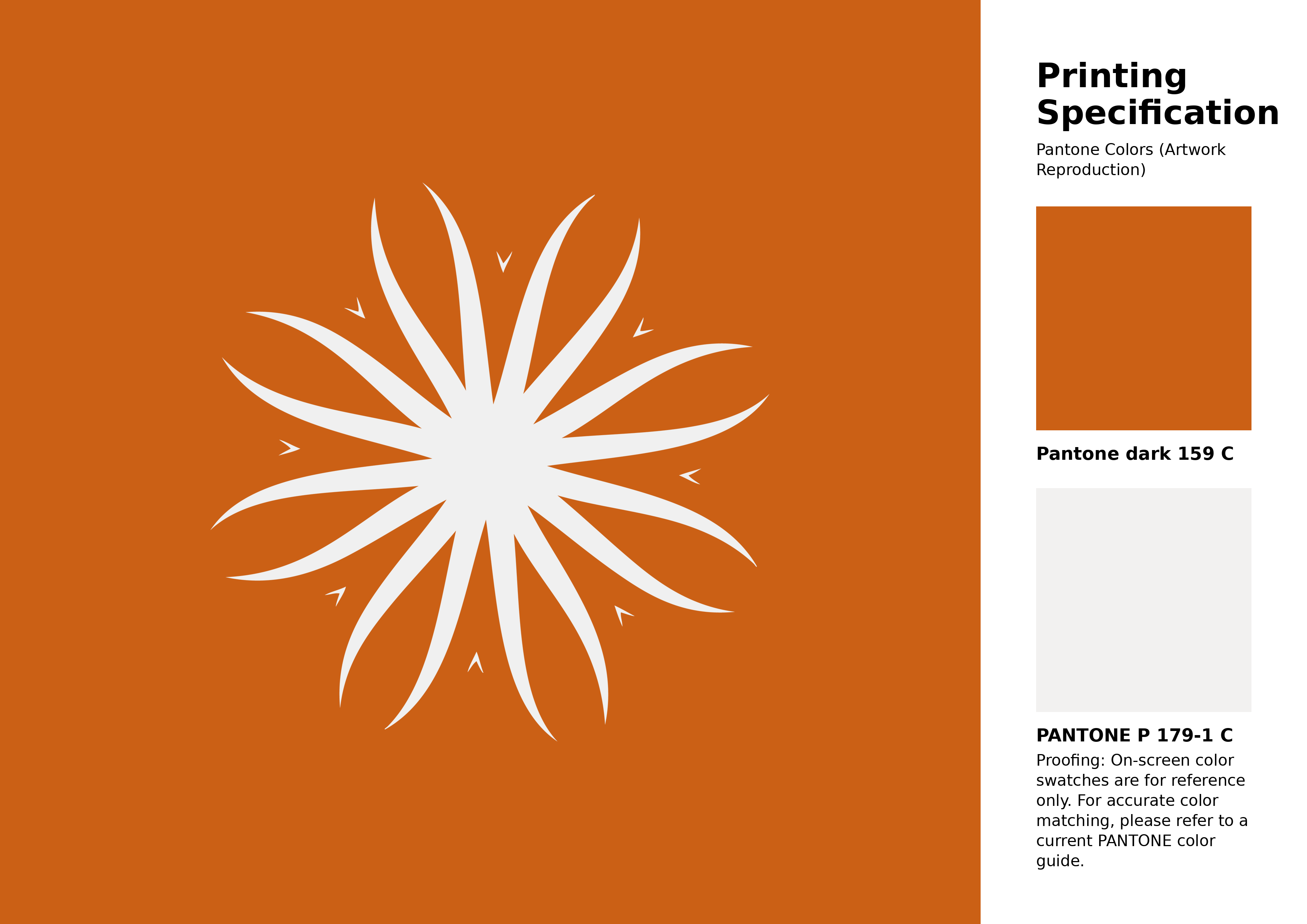
#cb6015 Pantone 159 C Color | Hex color Code #cb6015 Artwork Image (PNG)
Download Artwork (PNG)#cb6015 Pantone 159 C Color | Hex color Code #cb6015 Artwork Vector (PDF)
Download Artwork (PDF)#cb6015 Pantone 159 C Color | Hex color Code #cb6015 Artwork Vector (SVG)
Download Artwork (SVG)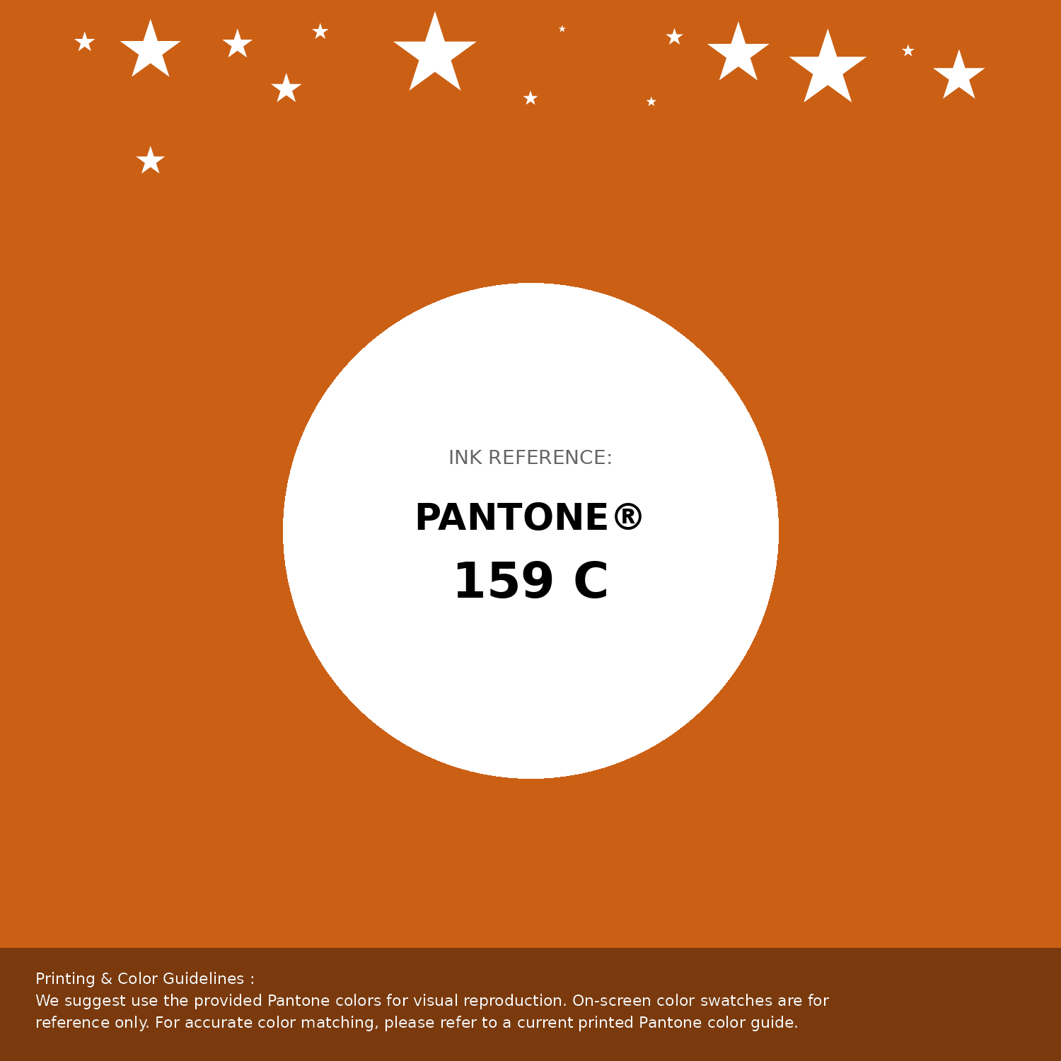
#cb6015 Pantone 159 C Color | Hex color Code #cb6015 Pantone Swatch Artwork
Download Artwork Swatch
#cb6015 Pantone 159 C Color | Hex color Code #cb6015 Gradient Artwork (PNG)
Download Gradient (PNG)#cb6015 Pantone 159 C Color | Hex color Code #cb6015 Gradient Artwork (SVG)
Download Gradient (SVG)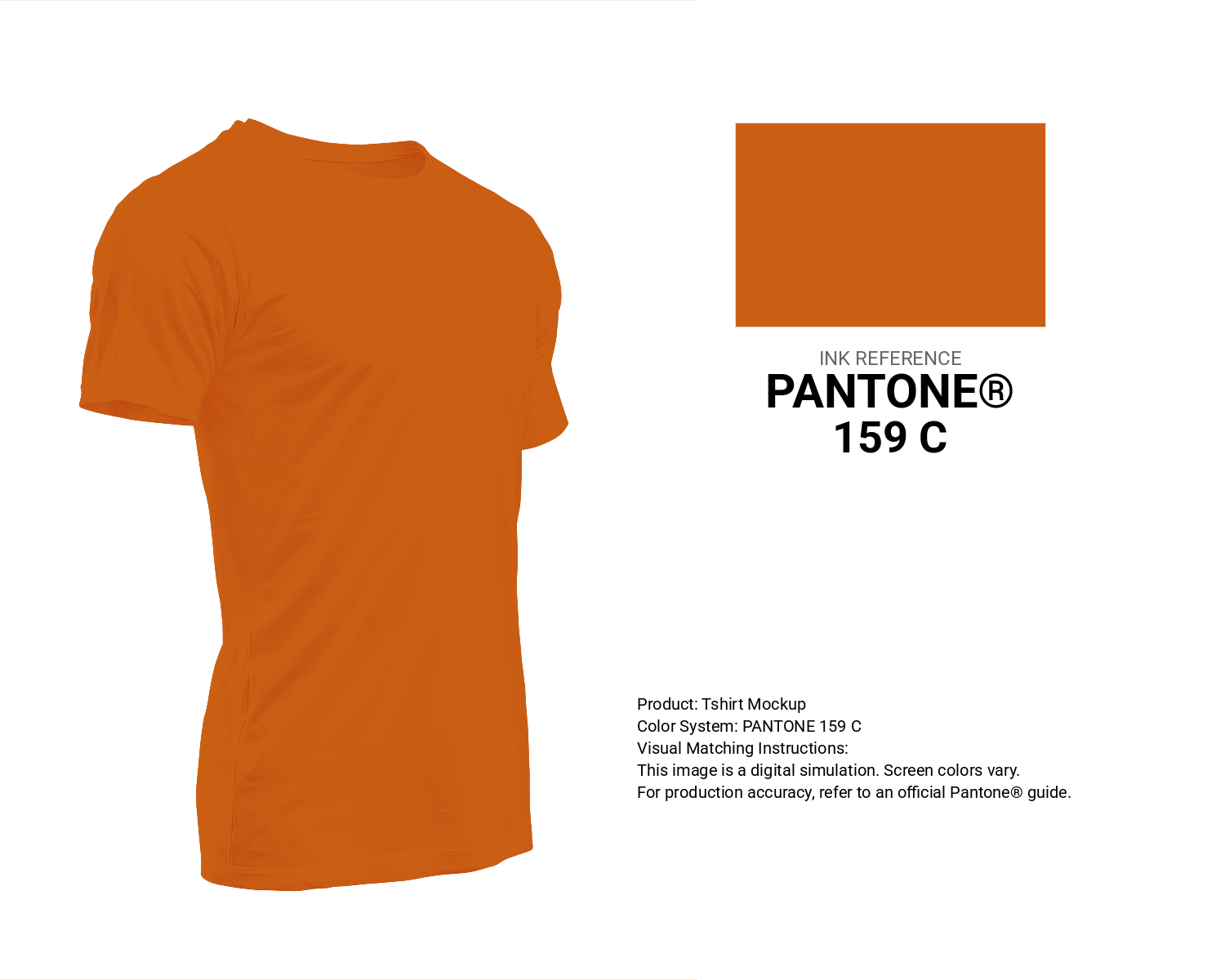
#cb6015 Pantone 159 C Color | Hex color Code #cb6015 T-Shirt Mockup
Download T-Shirt Mockup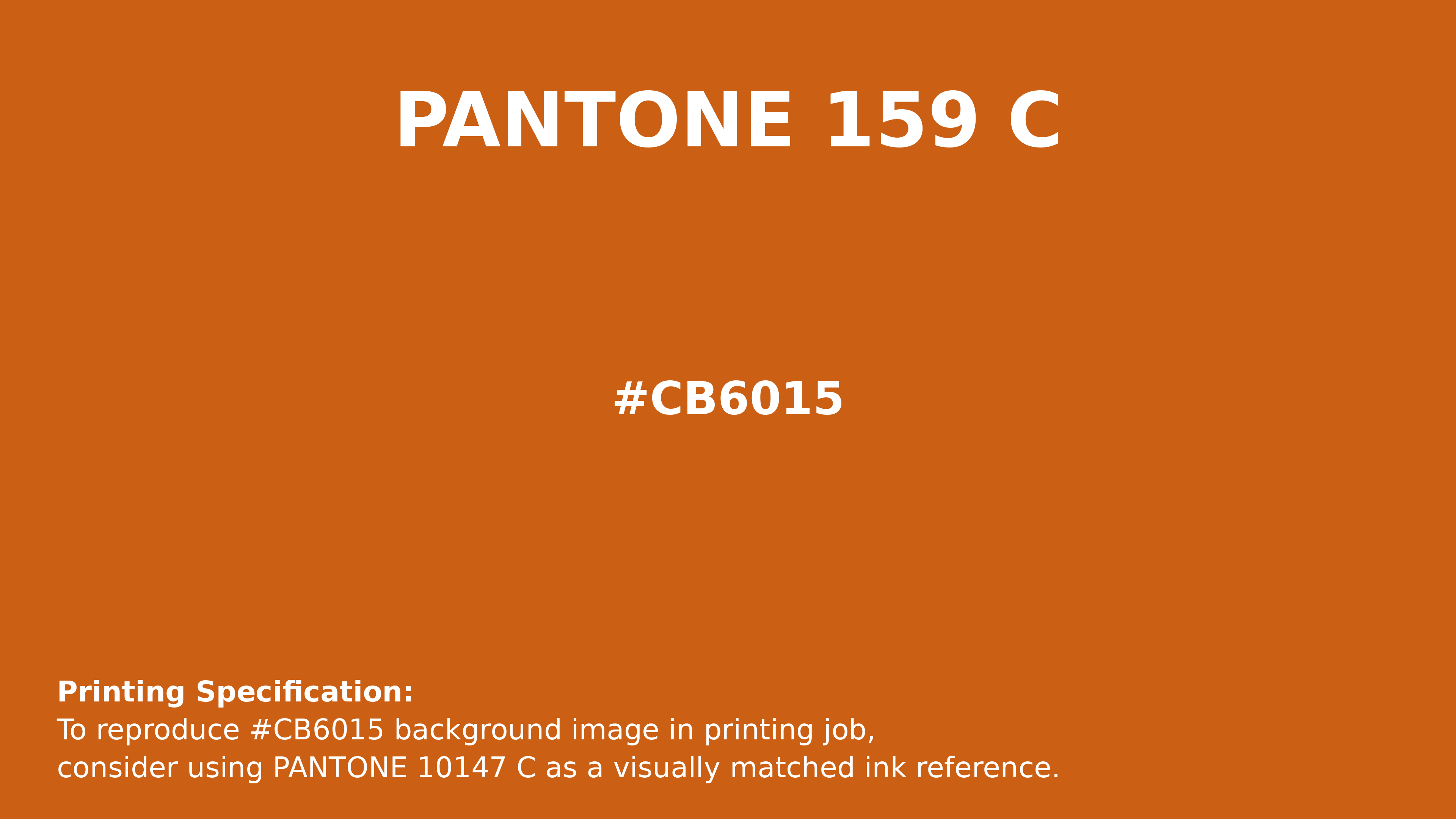
#cb6015 Pantone 159 C Color | Hex color Code #cb6015 Printing Artwork Pantone Reference
Download Pantone Printing ReferenceRelated Color Palettes
- Light Coral and Rosy Brown •
- Crater Brown •
- Grain Brown •
- Rosy Brown and Cadet Blue •
- Brown and Indian Red •
- Lavender and Rosy Brown •
- Pale Turquoise and Rosy Brown •
- Dark Slate Gray and Rosy Brown •
- Brown Pod •
- Crimson and Sandy brown •
- Rosy Brown and Light Pink •
- Powder Blue and Rosy Brown •
- Saddle Brown and Fire Brick •
- Rosy Brown and Dark Salmon •
- Light Gray and Brown
Color Palette Collection
Summer Beach Vibes
1 color palettes with 5 colors.
23 Light Blue Color Schemes
23 color palettes with 115 colors.

50 Beige Color Palettes
50 color palettes with 250 colors.
34 Yellow Color Schemes
34 color palettes with 170 colors.