#CB2C30 Color
Your all-in-one color resource. Download hex background images, Adobe swatches (ASE), PDF color sheets, and SVG files. Explore palettes, harmonies, accessibility, conversions, and professional exports — designed for designers, developers, and color perfectionists.
This deep, saturated red evokes strong emotions of passion, energy, and intensity. It's reminiscent of the vibrant color of ripe cherries, the warmth of a crackling fire, and the flush of excitement. The color suggests boldness, confidence, and a sense of urgency. It can create a stimulating and dramatic atmosphere, drawing attention and igniting the senses. In design, this color is often used to create focal points, convey a sense of luxury, or evoke feelings of love and romance. Symbolically, it can represent courage, power, and vitality. Visually matched named color: Crimson Heartbeat.
PANTONE 711 C
Choose Color
Selected Color
Recent Colors
Color Details
Similar Ink Alternatives for #CB2C30 color Alternative print inks for reproducing #CB2C30 background image with a similar visual appearance.
Disclaimer: The visually matched ink reference is an independent approximation intended as a guide only. Please be advised that this pantone colors is only intended as a guide, Actual colours will depend on screen calibration variances. The print ink suggestions provided are independent visual approximations and are not affiliated with or endorsed by Pantone LLC. For official color specifications, conversion factors, and comprehensive color system information, please visit Pantone Connect. Official Pantone products can be purchased at pantone.com.
Color Previews for #000000 See how this color looks as a background or as text.
Complete Guide to Your Color Laboratory
Everything you need to know about this professional color toolkit.
Use the Color Picker at the top to select any color. All modules below update instantly.
Workflow: Pick a color → Explore palettes & data → Download what you need (PDF, Image, or Adobe ASE).
Color Details — Your color in all formats: HEX, RGB, RGBA, HSL, HSLA, HSV, CMYK, CIELab, Hunter-Lab, XYZ, Yxy, YUV. One-click copy.
Color Psychology — Emotional impact, cultural meanings, physiological effects, branding applications, and historical significance.
Named Colors — Find official color names (HTML/CSS, Pantone) that match your selection with similarity percentages.
Light & Dark Shades
80-step gradient from black to white. Perfect for button states and component systems.
Tints
Color mixed with white → lighter, pastel variations for backgrounds and disabled states.
Monochromatic — 11 curated tints/shades from one color. Production-ready for design systems.
- Complementary — Opposite on wheel (180°). High contrast.
- Analogous — Neighbors (±30°). Harmonious flow.
- Triadic — Three colors (120° apart). Vibrant, balanced.
- Split-Complementary — Base + two near-complements. Softer contrast.
- Tetradic/Square — Four colors. Complex, maximum variety.
- Neutral — Desaturated versions. Subtle, sophisticated.
15 Professional Variations — Monochromatic, Analogous, Complementary, Warm/Cool/Earth Tones, Pastel, Vibrant, High Contrast, and more.
Color Infusion — 10 palettes showing your color morphing into each major hue. Find bridge colors.
Similar Colors — 60+ colors generated via CIELAB Delta E matching. Unexpected harmonious combinations.
18 Ready-to-Use Gradients — Complementary, Analogous, Triadic, Tint/Shade progressions, and more.
Downloads: PNG (2560×1440), CSS (production-ready code), SVG (scalable vector).
WCAG Contrast Checker — Tests your color against white, black, and custom colors for AA (4.5:1) and AAA (7:1) compliance. Large text thresholds included.
Harmony & Accessibility Guide — Tests against 10 canonical hues. Shows which pairs are both beautiful AND WCAG-compliant for text.
PNG/JPG — High-res images for presentations and mood boards.
PDF — Print-ready reports for clients and teams.
Adobe ASE — Direct import to Photoshop, Illustrator, InDesign, XD.
CSS/SVG — Gradients only. Production-ready code and vectors.
Color Science: Industry-standard conversions (HSL, CIELAB, CMYK, XYZ). WCAG 2.1 luminance formula. Delta E (ΔE76) for perceptual matching.
Direct Links: Share colors via icolorpalette.com/color/ff5733 or icolorpalette.com/color/red
Issues? Refresh the page, wait for rendering, try another browser, or check console (F12) for errors.
Printing Guide for #cb2c30 Background Image
Use PANTONE 711 C as a visually matched ink reference when printing this background image.
To print the #cb2c30 background image from our site, consider using PANTONE 711 C as a visually matched ink reference.
Download the background image, then provide this reference code to your print vendor to help achieve accurate color reproduction.
The visually matched ink reference for the #cb2c30 background image is PANTONE 711 C.
This color is commonly described as Crimson Heartbeat.
This deep, saturated red evokes strong emotions of passion, energy, and intensity. It's reminiscent of the vibrant color of ripe cherries, the warmth of a crackling fire, and the flush of excitement. The color suggests boldness, confidence, and a sense of urgency. It can create a stimulating and dramatic atmosphere, drawing attention and igniting the senses. In design, this color is often used to create focal points, convey a sense of luxury, or evoke feelings of love and romance. Symbolically, it can represent courage, power, and vitality.
We provide PANTONE 711 C as a visually matched ink reference to help you reproduce the #cb2c30 background image accurately in professional printing.
This reference code helps print vendors achieve consistent color output across different printing equipment and materials.
After downloading the #cb2c30 background image from our site:
- Include the visually matched ink reference PANTONE 711 C in your print order notes
- Inform your print vendor that this is your target color reference
- Request a proof print to verify the Crimson Heartbeat color appearance before full production
The #cb2c30 background image with PANTONE 711 C as visually matched ink reference can be used for:
- Posters, banners, and backdrops
- Business cards, brochures, and flyers
- Packaging, labels, and stickers
- Signage and promotional materials
This is an independent visual approximation.
While PANTONE 711 C closely matches the #cb2c30 background image color, variations may exist between screen display and printed output.
We recommend requesting a proof print to verify the final appearance.
This deep, saturated red evokes strong emotions of passion, energy, and intensity. It's reminiscent of the vibrant color of ripe cherries, the warmth of a crackling fire, and the flush of excitement. The color suggests boldness, confidence, and a sense of urgency. It can create a stimulating and dramatic atmosphere, drawing attention and igniting the senses. In design, this color is often used to create focal points, convey a sense of luxury, or evoke feelings of love and romance. Symbolically, it can represent courage, power, and vitality.
Understanding these associations helps ensure the #cb2c30 background image aligns with your intended message and brand impact.
Important Information
The visually matched ink reference is an independent approximation intended as a guide only.
Actual printed colors may vary depending on screen calibration, substrate material, ink type, and printing equipment used.
For official color specifications and certified color standards, visit Pantone Connect.
Official color guides and swatch books can be purchased from pantone.com.
Pantone 711 C Color: Fiery Red | #CB2C30
Introduction:
Fiery Red is a vibrant shade that exudes energy and intensity. Its boldness captures attention and creates a powerful visual impact.
Historical Significance:
Key moments in history where Fiery Red was prominently used or played a significant role: Fiery Red gained attention in the fashion industry during the 1920s as a symbol of rebellion and liberation. In the 1960s, it became associated with the counterculture movement and was frequently showcased in protest marches and psychedelic art.
Another subtopic heading: Relevant content for historical significance of Fiery Red.
Symbolism and Meaning:
Symbolism and Meaning of Fiery Red: In various cultures, Fiery Red typically symbolizes passion, love, power, and courage. It is often associated with strong emotions and can convey both danger and excitement.
Fiery Red in Fashion:
How Fiery Red impacts styles and trends in the fashion world: Fiery Red is a popular choice for making bold fashion statements. It is often used to create eye-catching garments and accessories that demand attention on runways and red carpets.
Fiery Red in Graphic Design:
Significance of Fiery Red in design aesthetics, branding, and visual impact: Fiery Red is often used in graphic design to create a sense of urgency or excitement. It can be employed to draw attention to important elements or to evoke strong emotions in viewers.
Color Combinations:
Potential color combinations with Fiery Red: Fiery Red pairs well with neutral tones like black and white for a striking contrast. It also complements shades of orange and pink to create a harmonious and energetic palette.
Nature’s Palette:
Natural occurrences of Fiery Red: Fiery Red can be found in various flowers such as roses and poppies. It can also be seen in sunsets, fiery autumn leaves, and vibrant bird plumage.
Artistic Representations:
How Fiery Red has been used in various forms of art over time: Artists often incorporate Fiery Red into their works to convey energy, passion, and intense emotions. It has been used in paintings, sculptures, and digital art to create visually striking compositions.
Movies and Cinematic Landscapes:
Movies or scenes where Fiery Red sets the tone or mood: Fiery Red is often employed in movies to portray passion, danger, or intense emotions. It can be seen in iconic scenes such as the red dress dance sequence in "The Matrix" or the fiery explosions in action films.
Products and Commercial Appeal:
Popular products or brands associated with Fiery Red or using it in their branding: Many sports teams, energy drink companies, and fast-food chains incorporate Fiery Red into their logos and branding to convey a sense of energy, power, and excitement.
National Symbols and Significance:
Any national or cultural significance tied to Fiery Red: In some cultures, Fiery Red is associated with important national symbols, such as national flags or traditional attire. Its use can represent patriotism, bravery, or cultural significance.
The Psychological and Emotional Impact:
How Fiery Red influences emotions or perceptions psychologically: Fiery Red can evoke feelings of passion, excitement, and intensity. It has the potential to increase heart rate and capture attention, making it an effective color for grabbing viewers' emotions.
Conclusion:
Fiery Red, with its historical significance, symbolism, and attention-grabbing nature, continues to captivate and inspire. Its timeless appeal in various fields, from fashion to art, makes it a powerful color that leaves a lasting impact.
Pantone 711 C Color | Hex color Code #cb2c30 Image & Artwork
Download high-quality assets for your projects.

#cb2c30 Color Schemes
Download Color Schemes
#cb2c30 Color Shades
Download Color Shades
Pantone 711 C Color | Hex color Code #cb2c30 Solid Color Background
Download Solid Color
#cb2c30 Pantone 711 C Color | Hex color Code #cb2c30 Artwork Image (PNG)
Download Artwork (PNG)#cb2c30 Pantone 711 C Color | Hex color Code #cb2c30 Artwork Vector (PDF)
Download Artwork (PDF)#cb2c30 Pantone 711 C Color | Hex color Code #cb2c30 Artwork Vector (SVG)
Download Artwork (SVG)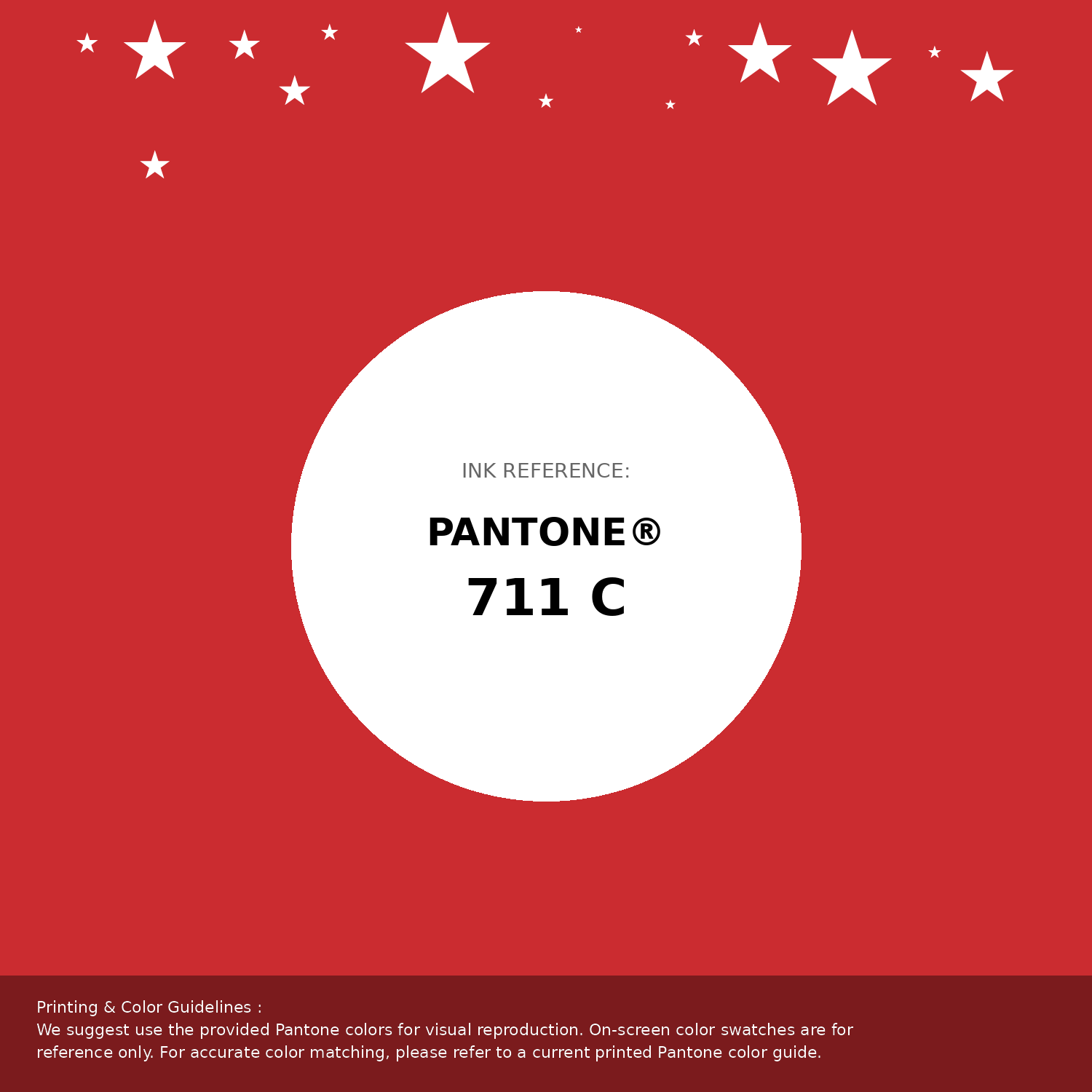
#cb2c30 Pantone 711 C Color | Hex color Code #cb2c30 Pantone Swatch Artwork
Download Artwork Swatch
#cb2c30 Pantone 711 C Color | Hex color Code #cb2c30 Gradient Artwork (PNG)
Download Gradient (PNG)#cb2c30 Pantone 711 C Color | Hex color Code #cb2c30 Gradient Artwork (SVG)
Download Gradient (SVG)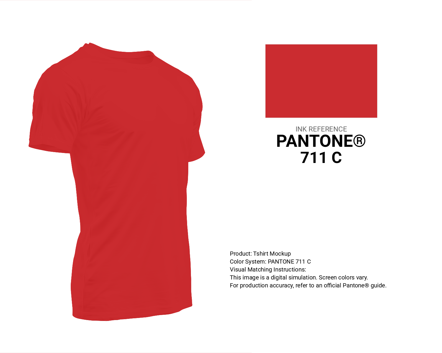
#cb2c30 Pantone 711 C Color | Hex color Code #cb2c30 T-Shirt Mockup
Download T-Shirt Mockup
#cb2c30 Pantone 711 C Color | Hex color Code #cb2c30 Printing Artwork Pantone Reference
Download Pantone Printing ReferenceRelated Color Palettes
- Red Color Palettes • Green Color Palettes • Purple Color Palettes • Pink Color Palettes • Orange Color Palettes • Blue Color Palettes • Yellow Color Palettes • Brown Color Palettes • Gray Color Palettes • Beige Color Palettes • Turquoise Color Palettes
Color Palette Collection

50 Green Color Palettes
50 color palettes with 250 colors.
Forest Theme colors
15 color palettes with 75 colors.
46 Flower Inspired Color Schemes
46 color palettes with 230 colors.

89 Blue Color Palettes
89 color palettes with 445 colors.