#BE3A34 Color
Your all-in-one color resource. Download hex background images, Adobe swatches (ASE), PDF color sheets, and SVG files. Explore palettes, harmonies, accessibility, conversions, and professional exports — designed for designers, developers, and color perfectionists.
This deep, reddish-brown evokes a sense of warmth tinged with intensity. It brings to mind the fiery glow of a dying ember, or the rich hues of autumn leaves. The color suggests a passionate, sometimes melancholic mood, perhaps reflecting the end of something significant. It can create a dramatic or sophisticated atmosphere. In design, it could be used in smaller doses to add a touch of elegance or warmth to a room, or in a bold statement piece, such as a statement wall. The color might evoke feelings of nostalgia or contemplation. Visually matched named color: Crimson Ember.
PANTONE 180 C
Choose Color
Selected Color
Recent Colors
Color Details
Similar Ink Alternatives for #BE3A34 color Alternative print inks for reproducing #BE3A34 background image with a similar visual appearance.
Disclaimer: The visually matched ink reference is an independent approximation intended as a guide only. Please be advised that this pantone colors is only intended as a guide, Actual colours will depend on screen calibration variances. The print ink suggestions provided are independent visual approximations and are not affiliated with or endorsed by Pantone LLC. For official color specifications, conversion factors, and comprehensive color system information, please visit Pantone Connect. Official Pantone products can be purchased at pantone.com.
Color Previews for #000000 See how this color looks as a background or as text.
Complete Guide to Your Color Laboratory
Everything you need to know about this professional color toolkit.
Use the Color Picker at the top to select any color. All modules below update instantly.
Workflow: Pick a color → Explore palettes & data → Download what you need (PDF, Image, or Adobe ASE).
Color Details — Your color in all formats: HEX, RGB, RGBA, HSL, HSLA, HSV, CMYK, CIELab, Hunter-Lab, XYZ, Yxy, YUV. One-click copy.
Color Psychology — Emotional impact, cultural meanings, physiological effects, branding applications, and historical significance.
Named Colors — Find official color names (HTML/CSS, Pantone) that match your selection with similarity percentages.
Light & Dark Shades
80-step gradient from black to white. Perfect for button states and component systems.
Tints
Color mixed with white → lighter, pastel variations for backgrounds and disabled states.
Monochromatic — 11 curated tints/shades from one color. Production-ready for design systems.
- Complementary — Opposite on wheel (180°). High contrast.
- Analogous — Neighbors (±30°). Harmonious flow.
- Triadic — Three colors (120° apart). Vibrant, balanced.
- Split-Complementary — Base + two near-complements. Softer contrast.
- Tetradic/Square — Four colors. Complex, maximum variety.
- Neutral — Desaturated versions. Subtle, sophisticated.
15 Professional Variations — Monochromatic, Analogous, Complementary, Warm/Cool/Earth Tones, Pastel, Vibrant, High Contrast, and more.
Color Infusion — 10 palettes showing your color morphing into each major hue. Find bridge colors.
Similar Colors — 60+ colors generated via CIELAB Delta E matching. Unexpected harmonious combinations.
18 Ready-to-Use Gradients — Complementary, Analogous, Triadic, Tint/Shade progressions, and more.
Downloads: PNG (2560×1440), CSS (production-ready code), SVG (scalable vector).
WCAG Contrast Checker — Tests your color against white, black, and custom colors for AA (4.5:1) and AAA (7:1) compliance. Large text thresholds included.
Harmony & Accessibility Guide — Tests against 10 canonical hues. Shows which pairs are both beautiful AND WCAG-compliant for text.
PNG/JPG — High-res images for presentations and mood boards.
PDF — Print-ready reports for clients and teams.
Adobe ASE — Direct import to Photoshop, Illustrator, InDesign, XD.
CSS/SVG — Gradients only. Production-ready code and vectors.
Color Science: Industry-standard conversions (HSL, CIELAB, CMYK, XYZ). WCAG 2.1 luminance formula. Delta E (ΔE76) for perceptual matching.
Direct Links: Share colors via icolorpalette.com/color/ff5733 or icolorpalette.com/color/red
Issues? Refresh the page, wait for rendering, try another browser, or check console (F12) for errors.
Printing Guide for #be3a34 Background Image
Use PANTONE 180 C as a visually matched ink reference when printing this background image.
To print the #be3a34 background image from our site, consider using PANTONE 180 C as a visually matched ink reference.
Download the background image, then provide this reference code to your print vendor to help achieve accurate color reproduction.
The visually matched ink reference for the #be3a34 background image is PANTONE 180 C.
This color is commonly described as Crimson Ember.
This deep, reddish-brown evokes a sense of warmth tinged with intensity. It brings to mind the fiery glow of a dying ember, or the rich hues of autumn leaves. The color suggests a passionate, sometimes melancholic mood, perhaps reflecting the end of something significant. It can create a dramatic or sophisticated atmosphere. In design, it could be used in smaller doses to add a touch of elegance or warmth to a room, or in a bold statement piece, such as a statement wall. The color might evoke feelings of nostalgia or contemplation.
We provide PANTONE 180 C as a visually matched ink reference to help you reproduce the #be3a34 background image accurately in professional printing.
This reference code helps print vendors achieve consistent color output across different printing equipment and materials.
After downloading the #be3a34 background image from our site:
- Include the visually matched ink reference PANTONE 180 C in your print order notes
- Inform your print vendor that this is your target color reference
- Request a proof print to verify the Crimson Ember color appearance before full production
The #be3a34 background image with PANTONE 180 C as visually matched ink reference can be used for:
- Posters, banners, and backdrops
- Business cards, brochures, and flyers
- Packaging, labels, and stickers
- Signage and promotional materials
This is an independent visual approximation.
While PANTONE 180 C closely matches the #be3a34 background image color, variations may exist between screen display and printed output.
We recommend requesting a proof print to verify the final appearance.
This deep, reddish-brown evokes a sense of warmth tinged with intensity. It brings to mind the fiery glow of a dying ember, or the rich hues of autumn leaves. The color suggests a passionate, sometimes melancholic mood, perhaps reflecting the end of something significant. It can create a dramatic or sophisticated atmosphere. In design, it could be used in smaller doses to add a touch of elegance or warmth to a room, or in a bold statement piece, such as a statement wall. The color might evoke feelings of nostalgia or contemplation.
Understanding these associations helps ensure the #be3a34 background image aligns with your intended message and brand impact.
Important Information
The visually matched ink reference is an independent approximation intended as a guide only.
Actual printed colors may vary depending on screen calibration, substrate material, ink type, and printing equipment used.
For official color specifications and certified color standards, visit Pantone Connect.
Official color guides and swatch books can be purchased from pantone.com.
Pantone 180 C Color: Vivid Red | #BE3A34
Introduction:
Vivid Red, also known as Pantone 180 C, is a bold and intense color that exudes energy and power. Its vibrant hue catches the eye and commands attention, making it an impactful choice for creative projects.
Historical Significance:
Key moments in history: Vivid Red has been prominently used in historical events and cultural movements. For example, it was often associated with revolutionary movements due to its symbolism of passion and power. It was also used by artists during the Renaissance period to create dramatic and captivating compositions. The color has a rich history of being present in significant moments of human expression and social change.
Symbolism and Meaning:
Symbolism and Meaning: Vivid Red is commonly associated with love, passion, and strength. It evokes emotions of intensity and desire. In various cultures, red is considered a symbol of good luck, prosperity, and celebration. It is often used to represent power and importance in branding and visual communication.
Vivid Red in Fashion:
Vivid Red in Fashion: The color has long been a staple in the fashion industry, making appearances on runways and in designer collections. It is often used to create bold and striking garments, capturing attention and making a statement. Vivid Red can be both glamorous and edgy, depending on how it is styled and incorporated into an outfit.
Vivid Red in Graphic Design:
Vivid Red in Graphic Design: In graphic design, Vivid Red is known for its ability to grab attention and create a strong visual impact. It is often used in branding and advertising to evoke emotions of excitement and urgency. The color's boldness and intensity make it an effective choice for logos, packaging, and promotional materials.
Color Combinations:
Color Combinations: Vivid Red can be combined with various other colors to create different visual effects. Some popular color combinations include:
- Vivid Red and white: This combination creates a classic and clean look.
- Vivid Red and black: This combination adds a touch of sophistication and drama.
- Vivid Red and gold: This combination exudes luxury and elegance.
Nature's Palette:
Nature's Palette: Vivid Red can be found in various natural occurrences. It is often seen in vibrant flowers such as roses, poppies, and tulips. It also appears in stunning sunsets, fiery autumn leaves, and the plumage of certain bird species. The color's presence in nature adds to its visual appeal and connection with life and energy.
Artistic Representations:
Artistic Representations: Vivid Red has been used by artists throughout history to create powerful and impactful compositions. It is often used to convey strong emotions and draw the viewer's attention. Artists such as Vincent van Gogh, Henri Matisse, and Mark Rothko have utilized Vivid Red in their paintings to create striking contrasts and evoke deep emotional responses.
Movies and Cinematic Landscapes:
Movies and Cinematic Landscapes: Vivid Red has been used in movies and cinematic landscapes to set the tone and create a specific mood. It is often employed in scenes depicting passion, love, or intense emotions. The color's visual impact helps create a visually memorable experience for the audience.
Products and Commercial Appeal:
Products and Commercial Appeal: Vivid Red is often associated with popular brands and products that aim to convey energy, excitement, and passion. It is frequently used in sports equipment, energy drinks, and cosmetics. The color's ability to create a sense of urgency and catch the viewer's attention makes it a valuable asset in advertising and marketing.
National Symbols and Significance:
National Symbols and Significance: Vivid Red holds symbolic significance in various cultures and countries. For example, it is the color of the Chinese flag and represents revolution, communism, and national pride. In some Western countries, red is associated with bravery and courage, often seen in the flags and emblems of national heroes. Its presence in national symbols highlights its importance and cultural relevance.
The Psychological and Emotional Impact:
The Psychological and Emotional Impact: Vivid Red has a profound psychological and emotional impact on individuals. It is known to stimulate energy, increase heart rate, and evoke intense emotions such as passion and excitement. The color can also be associated with anger and aggression in certain contexts. Its psychological impact makes it an effective tool for creating specific atmospheres and influencing emotions.
Conclusion:
Vivid Red, also known as Pantone 180 C, is a color that has a rich historical significance and carries symbolism of passion, power, and intensity. Whether used in fashion, graphic design, or artistic representations, this vibrant hue commands attention and creates a strong visual impact. Its presence in nature, movies, and national symbols further accentuates its timeless appeal. Overall, Vivid Red is a color that captures the essence of energy and evokes profound emotions.
Pantone 180 C Color | Hex color Code #be3a34 Image & Artwork
Download high-quality assets for your projects.

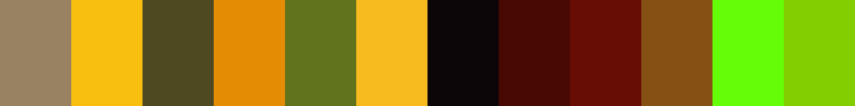
#be3a34 Color Schemes
Download Color Schemes
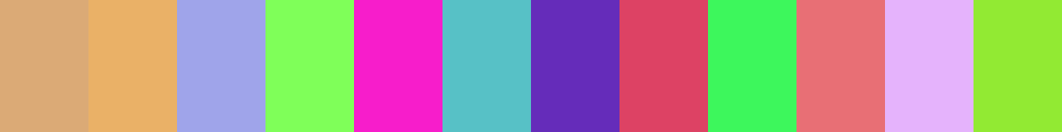
#be3a34 Color Shades
Download Color Shades
Pantone 180 C Color | Hex color Code #be3a34 Solid Color Background
Download Solid Color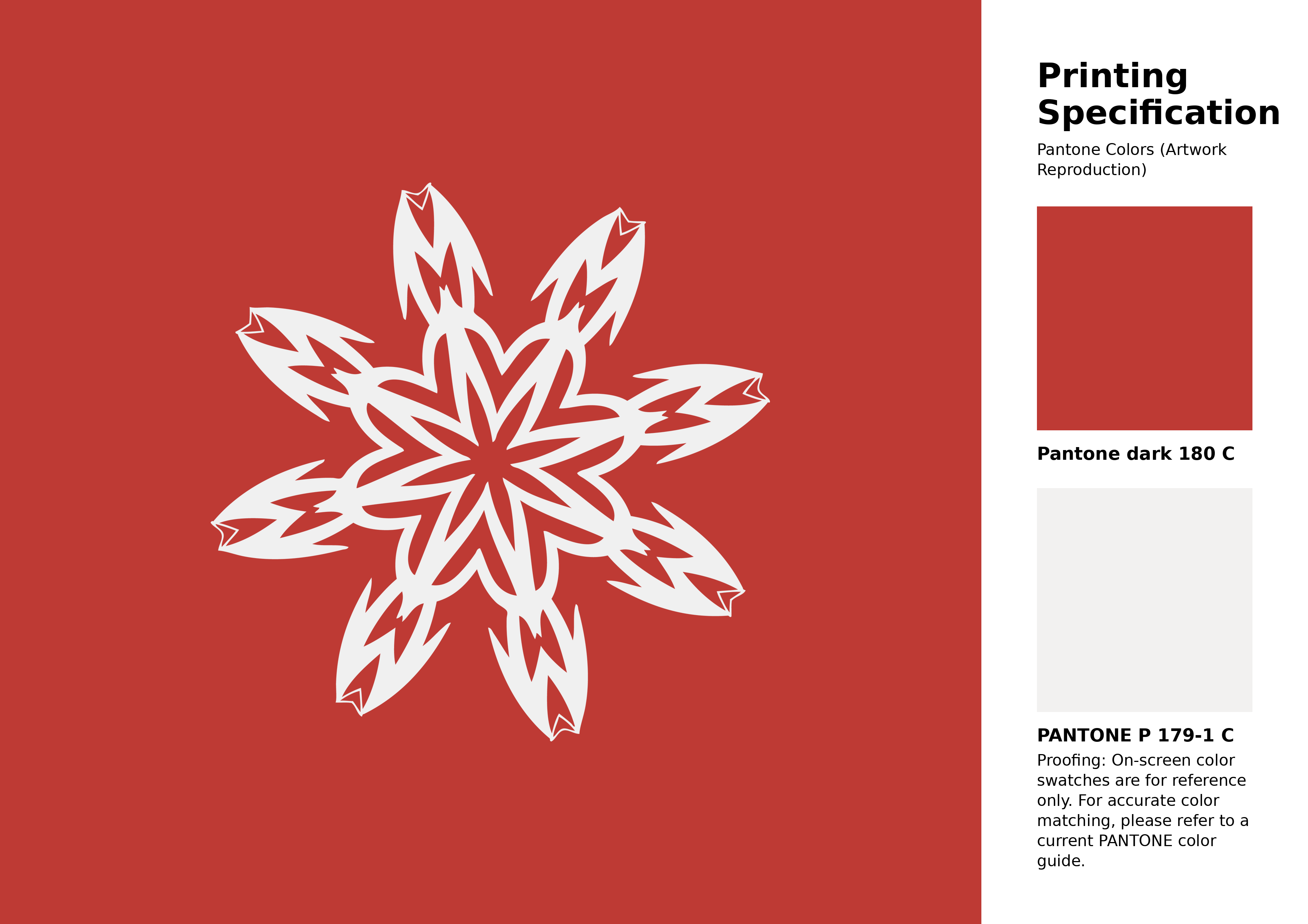
#be3a34 Pantone 180 C Color | Hex color Code #be3a34 Artwork Image (PNG)
Download Artwork (PNG)#be3a34 Pantone 180 C Color | Hex color Code #be3a34 Artwork Vector (PDF)
Download Artwork (PDF)#be3a34 Pantone 180 C Color | Hex color Code #be3a34 Artwork Vector (SVG)
Download Artwork (SVG)
#be3a34 Pantone 180 C Color | Hex color Code #be3a34 Pantone Swatch Artwork
Download Artwork Swatch
#be3a34 Pantone 180 C Color | Hex color Code #be3a34 Gradient Artwork (PNG)
Download Gradient (PNG)#be3a34 Pantone 180 C Color | Hex color Code #be3a34 Gradient Artwork (SVG)
Download Gradient (SVG)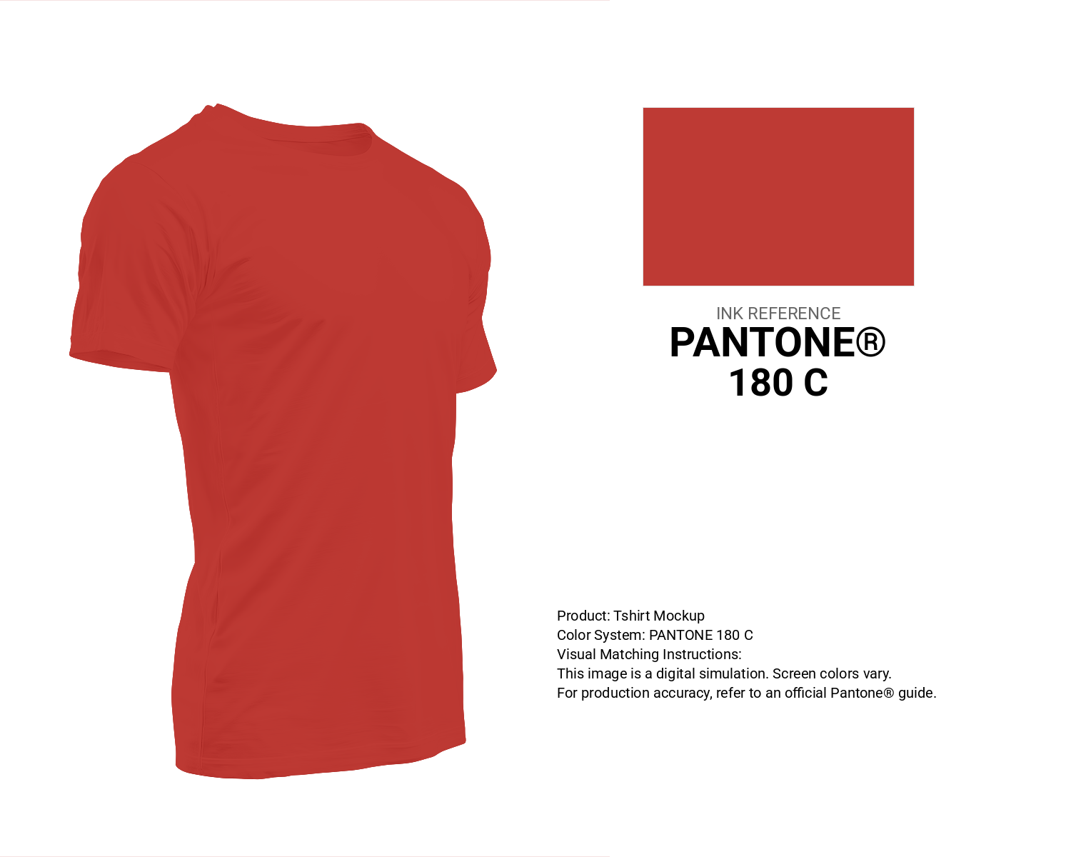
#be3a34 Pantone 180 C Color | Hex color Code #be3a34 T-Shirt Mockup
Download T-Shirt Mockup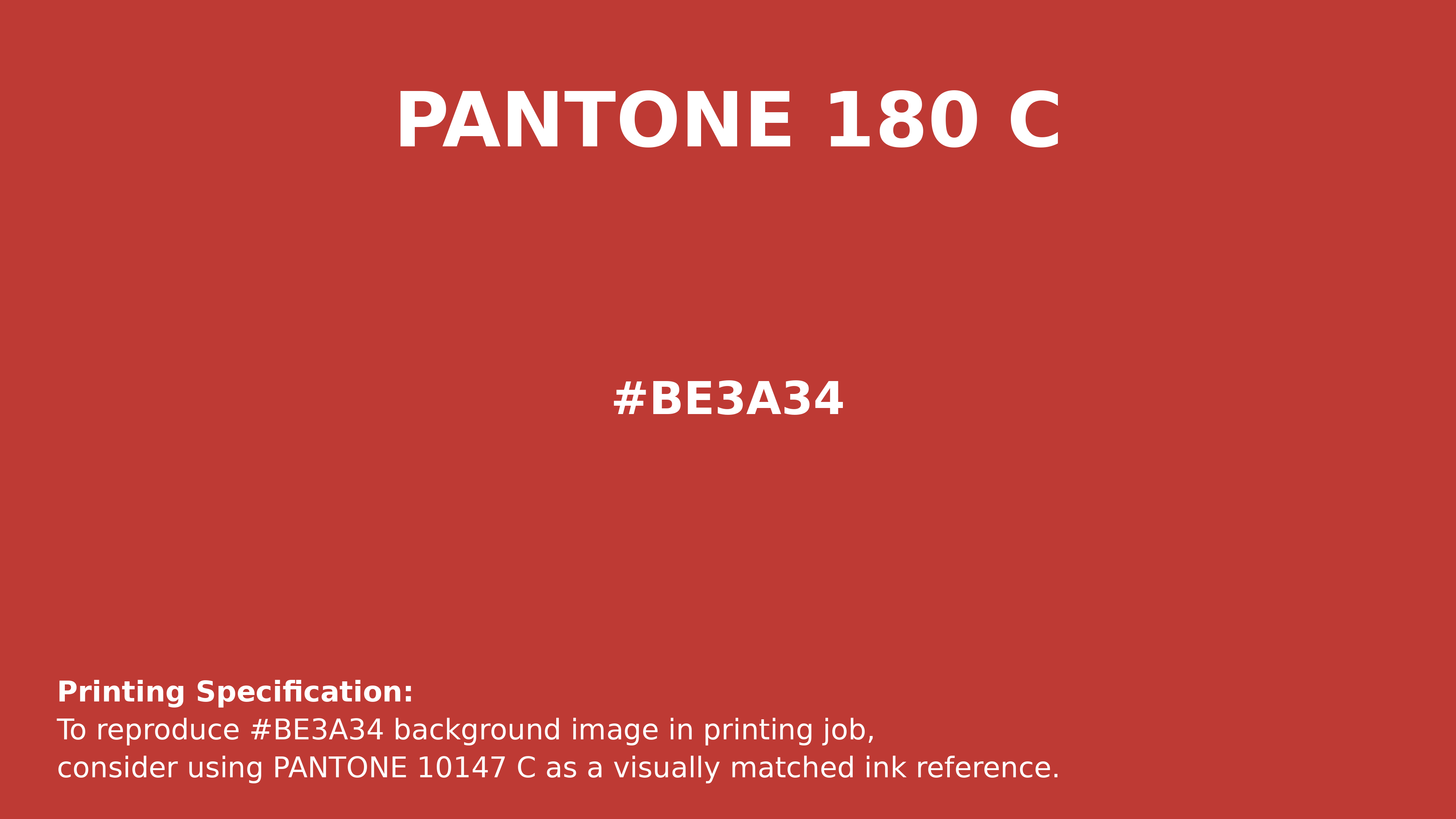
#be3a34 Pantone 180 C Color | Hex color Code #be3a34 Printing Artwork Pantone Reference
Download Pantone Printing ReferenceRelated Color Palettes
- Red Color Palettes • Green Color Palettes • Purple Color Palettes • Pink Color Palettes • Orange Color Palettes • Blue Color Palettes • Yellow Color Palettes • Brown Color Palettes • Gray Color Palettes • Beige Color Palettes • Turquoise Color Palettes
Color Palette Collection

45 Gold Color Palettes
45 color palettes with 225 colors.
34 Yellow Color Schemes
34 color palettes with 170 colors.
Home vibes
1 color palettes with 5 colors.
Chardon
1 color palettes with 5 colors.