#BD9B60 Color
Your all-in-one color resource. Download hex background images, Adobe swatches (ASE), PDF color sheets, and SVG files. Explore palettes, harmonies, accessibility, conversions, and professional exports — designed for designers, developers, and color perfectionists.
#BD9B60 evokes a warm, earthy feeling reminiscent of a desert sunset. The muted beige tones with hints of gold and brown create a sense of calm strength and quiet resilience. It brings to mind dry, sun-baked landscapes, ancient stones, and the enduring spirit of the desert. The mood is contemplative and peaceful, yet grounding and substantial. In design, this color works well in creating a sense of understated elegance and natural sophistication, perhaps in minimalist interiors, or as an accent color in spaces designed to promote relaxation and contemplation. It suggests a connection to nature and a sense of timeless beauty. The color lacks overt vibrancy, suggesting stability and quiet confidence. It might be associated culturally with ancient civilizations and the enduring power of nature. Visually matched named color: Desert Sunset.
PANTONE 7562 C
Choose Color
Selected Color
Recent Colors
Color Details
Similar Ink Alternatives for #BD9B60 color Alternative print inks for reproducing #BD9B60 background image with a similar visual appearance.
Disclaimer: The visually matched ink reference is an independent approximation intended as a guide only. Please be advised that this pantone colors is only intended as a guide, Actual colours will depend on screen calibration variances. The print ink suggestions provided are independent visual approximations and are not affiliated with or endorsed by Pantone LLC. For official color specifications, conversion factors, and comprehensive color system information, please visit Pantone Connect. Official Pantone products can be purchased at pantone.com.
Color Previews for #000000 See how this color looks as a background or as text.
Complete Guide to Your Color Laboratory
Everything you need to know about this professional color toolkit.
Use the Color Picker at the top to select any color. All modules below update instantly.
Workflow: Pick a color → Explore palettes & data → Download what you need (PDF, Image, or Adobe ASE).
Color Details — Your color in all formats: HEX, RGB, RGBA, HSL, HSLA, HSV, CMYK, CIELab, Hunter-Lab, XYZ, Yxy, YUV. One-click copy.
Color Psychology — Emotional impact, cultural meanings, physiological effects, branding applications, and historical significance.
Named Colors — Find official color names (HTML/CSS, Pantone) that match your selection with similarity percentages.
Light & Dark Shades
80-step gradient from black to white. Perfect for button states and component systems.
Tints
Color mixed with white → lighter, pastel variations for backgrounds and disabled states.
Monochromatic — 11 curated tints/shades from one color. Production-ready for design systems.
- Complementary — Opposite on wheel (180°). High contrast.
- Analogous — Neighbors (±30°). Harmonious flow.
- Triadic — Three colors (120° apart). Vibrant, balanced.
- Split-Complementary — Base + two near-complements. Softer contrast.
- Tetradic/Square — Four colors. Complex, maximum variety.
- Neutral — Desaturated versions. Subtle, sophisticated.
15 Professional Variations — Monochromatic, Analogous, Complementary, Warm/Cool/Earth Tones, Pastel, Vibrant, High Contrast, and more.
Color Infusion — 10 palettes showing your color morphing into each major hue. Find bridge colors.
Similar Colors — 60+ colors generated via CIELAB Delta E matching. Unexpected harmonious combinations.
18 Ready-to-Use Gradients — Complementary, Analogous, Triadic, Tint/Shade progressions, and more.
Downloads: PNG (2560×1440), CSS (production-ready code), SVG (scalable vector).
WCAG Contrast Checker — Tests your color against white, black, and custom colors for AA (4.5:1) and AAA (7:1) compliance. Large text thresholds included.
Harmony & Accessibility Guide — Tests against 10 canonical hues. Shows which pairs are both beautiful AND WCAG-compliant for text.
PNG/JPG — High-res images for presentations and mood boards.
PDF — Print-ready reports for clients and teams.
Adobe ASE — Direct import to Photoshop, Illustrator, InDesign, XD.
CSS/SVG — Gradients only. Production-ready code and vectors.
Color Science: Industry-standard conversions (HSL, CIELAB, CMYK, XYZ). WCAG 2.1 luminance formula. Delta E (ΔE76) for perceptual matching.
Direct Links: Share colors via icolorpalette.com/color/ff5733 or icolorpalette.com/color/red
Issues? Refresh the page, wait for rendering, try another browser, or check console (F12) for errors.
Printing Guide for #bd9b60 Background Image
Use PANTONE 7562 C as a visually matched ink reference when printing this background image.
To print the #bd9b60 background image from our site, consider using PANTONE 7562 C as a visually matched ink reference.
Download the background image, then provide this reference code to your print vendor to help achieve accurate color reproduction.
The visually matched ink reference for the #bd9b60 background image is PANTONE 7562 C.
This color is commonly described as Desert Sunset.
#BD9B60 evokes a warm, earthy feeling reminiscent of a desert sunset. The muted beige tones with hints of gold and brown create a sense of calm strength and quiet resilience. It brings to mind dry, sun-baked landscapes, ancient stones, and the enduring spirit of the desert. The mood is contemplative and peaceful, yet grounding and substantial. In design, this color works well in creating a sense of understated elegance and natural sophistication, perhaps in minimalist interiors, or as an accent color in spaces designed to promote relaxation and contemplation. It suggests a connection to nature and a sense of timeless beauty. The color lacks overt vibrancy, suggesting stability and quiet confidence. It might be associated culturally with ancient civilizations and the enduring power of nature.
We provide PANTONE 7562 C as a visually matched ink reference to help you reproduce the #bd9b60 background image accurately in professional printing.
This reference code helps print vendors achieve consistent color output across different printing equipment and materials.
After downloading the #bd9b60 background image from our site:
- Include the visually matched ink reference PANTONE 7562 C in your print order notes
- Inform your print vendor that this is your target color reference
- Request a proof print to verify the Desert Sunset color appearance before full production
The #bd9b60 background image with PANTONE 7562 C as visually matched ink reference can be used for:
- Posters, banners, and backdrops
- Business cards, brochures, and flyers
- Packaging, labels, and stickers
- Signage and promotional materials
This is an independent visual approximation.
While PANTONE 7562 C closely matches the #bd9b60 background image color, variations may exist between screen display and printed output.
We recommend requesting a proof print to verify the final appearance.
#BD9B60 evokes a warm, earthy feeling reminiscent of a desert sunset. The muted beige tones with hints of gold and brown create a sense of calm strength and quiet resilience. It brings to mind dry, sun-baked landscapes, ancient stones, and the enduring spirit of the desert. The mood is contemplative and peaceful, yet grounding and substantial. In design, this color works well in creating a sense of understated elegance and natural sophistication, perhaps in minimalist interiors, or as an accent color in spaces designed to promote relaxation and contemplation. It suggests a connection to nature and a sense of timeless beauty. The color lacks overt vibrancy, suggesting stability and quiet confidence. It might be associated culturally with ancient civilizations and the enduring power of nature.
Understanding these associations helps ensure the #bd9b60 background image aligns with your intended message and brand impact.
Important Information
The visually matched ink reference is an independent approximation intended as a guide only.
Actual printed colors may vary depending on screen calibration, substrate material, ink type, and printing equipment used.
For official color specifications and certified color standards, visit Pantone Connect.
Official color guides and swatch books can be purchased from pantone.com.
Pantone 7562 C Color: Creative Harvest | #BD9B60
Introduction:
Pantone 7562 C Color, also known as Creative Harvest, is a warm and earthy color with a hex code of #BD9B60. It exudes a sense of creativity and harvest, reminiscent of autumnal landscapes and bountiful harvests.
Historical Significance:
Earthy Tones in Design: Earthy tones like Pantone 7562 C Color have been used throughout history in various design movements, such as the Arts and Crafts movement and the Mid-Century Modern era. These colors were associated with natural materials and craftsmanship.
Symbolism and Meaning:
Natural Beauty and Grounding: Pantone 7562 C Color symbolizes warmth, harmony, and grounding. It is often associated with the beauty of nature, tranquility, and stability.
Pantone 7562 C Color in Fashion:
Natural and Organic Fashion: Pantone 7562 C Color is often used in fashion to create a natural and organic look. It is commonly seen in bohemian and rustic-themed collections, adding a warm and earthy touch to outfits.
Pantone 7562 C Color in Graphic Design:
Branding and Nature: Pantone 7562 C Color is often utilized in graphic design to evoke feelings of nature, growth, and creativity. It is commonly used in branding, particularly for eco-friendly and natural product lines.
Color Combinations:
Complementary Colors: Pantone 7562 C Color can be paired with other earthy tones for a harmonious and natural color palette. Some complementary colors include shades of green, deep browns, and warm grays.
Nature’s Palette:
Natural Inspirations: Pantone 7562 C Color can be found in various natural elements, such as sun-kissed fields, autumn leaves, and the golden hour light. It represents the beauty and abundance of the natural world.
Artistic Representations:
Impressionist Landscapes: Pantone 7562 C Color has been used by artists throughout history to depict landscapes and nature. It is often found in impressionist paintings, conveying a sense of warmth and natural beauty.
Movies and Cinematic Landscapes:
Autumn Aesthetics: Pantone 7562 C Color is often used in movies and cinematography to create a warm and nostalgic atmosphere. It is commonly seen in scenes depicting autumn landscapes or cozy interiors.
Products and Commercial Appeal:
Natural and Organic Products: Pantone 7562 C Color is widely used in products and branding associated with natural and organic lifestyles. It can be found in cosmetics, home decor, and sustainable fashion brands.
National Symbols and Significance:
Autumn Festivals: Pantone 7562 C Color is often associated with harvest festivals and autumn celebrations in various cultures. It represents the abundance of the season and the gratitude for nature's bounty.
The Psychological and Emotional Impact:
Warmth and Comfort: Pantone 7562 C Color evokes feelings of warmth, comfort, and relaxation. It can create a cozy and welcoming atmosphere, promoting a sense of security and contentment.
Conclusion:
Pantone 7562 C Color, also known as Creative Harvest, has a rich historical significance and is commonly used in fashion, graphic design, and various artistic representations. With its warm and earthy tones, it symbolizes nature, abundance, and creativity. Embracing this color can bring a sense of comfort and grounding, making it a timeless and versatile choice.
Pantone 7562 C Color | Hex color Code #bd9b60 Image & Artwork
Download high-quality assets for your projects.

#bd9b60 Color Schemes
Download Color Schemes
#bd9b60 Color Shades
Download Color Shades
Pantone 7562 C Color | Hex color Code #bd9b60 Solid Color Background
Download Solid Color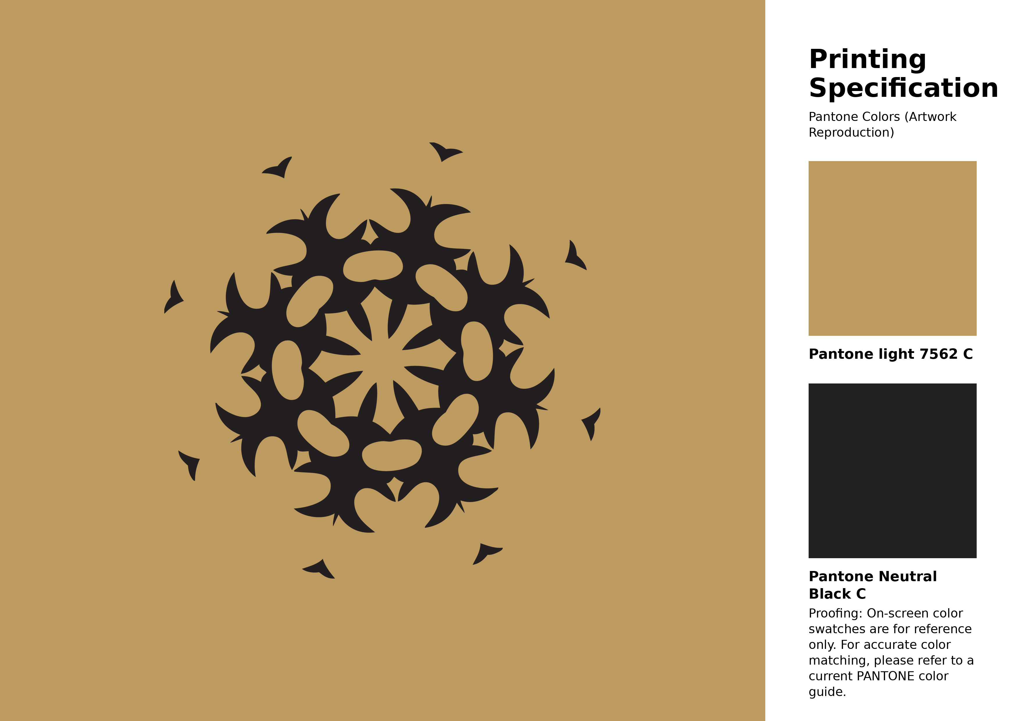
#bd9b60 Pantone 7562 C Color | Hex color Code #bd9b60 Artwork Image (PNG)
Download Artwork (PNG)#bd9b60 Pantone 7562 C Color | Hex color Code #bd9b60 Artwork Vector (PDF)
Download Artwork (PDF)#bd9b60 Pantone 7562 C Color | Hex color Code #bd9b60 Artwork Vector (SVG)
Download Artwork (SVG)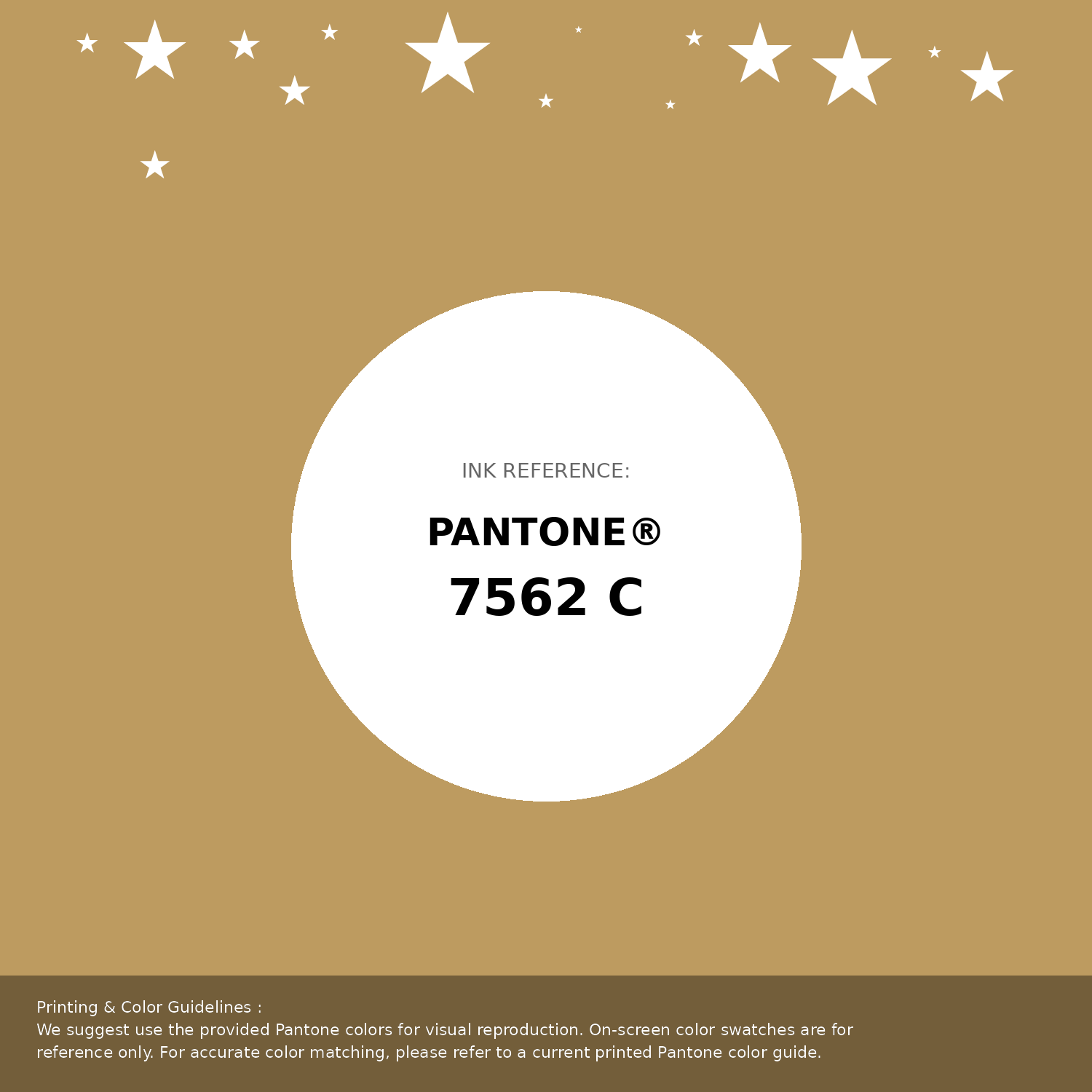
#bd9b60 Pantone 7562 C Color | Hex color Code #bd9b60 Pantone Swatch Artwork
Download Artwork Swatch
#bd9b60 Pantone 7562 C Color | Hex color Code #bd9b60 Gradient Artwork (PNG)
Download Gradient (PNG)#bd9b60 Pantone 7562 C Color | Hex color Code #bd9b60 Gradient Artwork (SVG)
Download Gradient (SVG)
#bd9b60 Pantone 7562 C Color | Hex color Code #bd9b60 T-Shirt Mockup
Download T-Shirt Mockup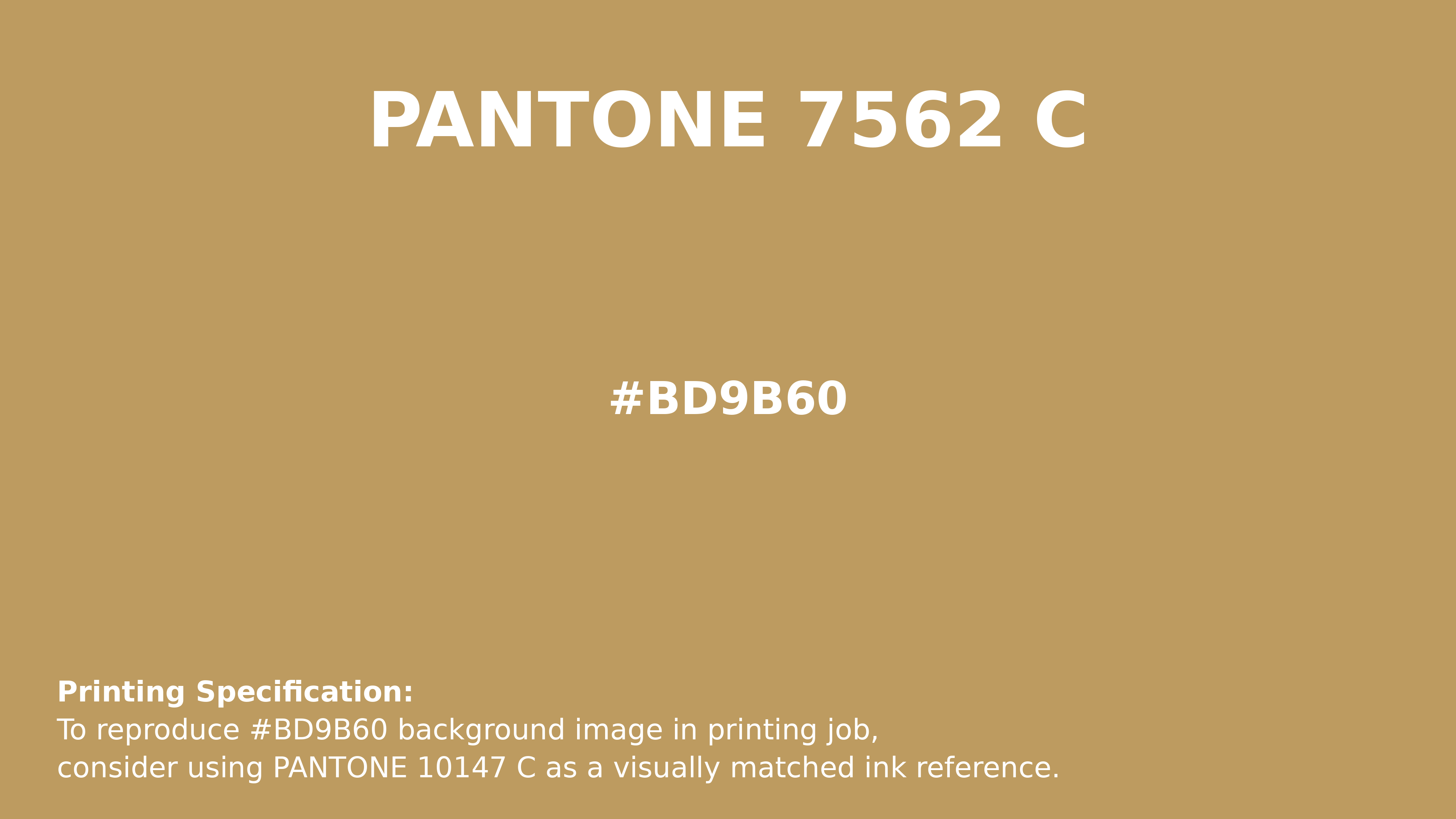
#bd9b60 Pantone 7562 C Color | Hex color Code #bd9b60 Printing Artwork Pantone Reference
Download Pantone Printing ReferenceRelated Color Palettes
- Gray and Light Sky Blue •
- Dim Gray and Pale Turquoise •
- Indian Red and Dark Gray •
- Dark Sea Green and Dim Gray •
- Sienna and Slate Gray •
- Dark Slate Gray and Linen •
- Dark Slate Blue and Slate Gray •
- Midnight Blue and Light Slate Gray •
- Battleship Gray •
- Dim Gray and Antique White •
- Dark Slate Gray and Dark Sea Green •
- Gray Suit •
- Slate Gray and Powder Blue •
- Gray and Tomato •
- Light Steel Blue and Dark Slate Gray
Color Palette Collection
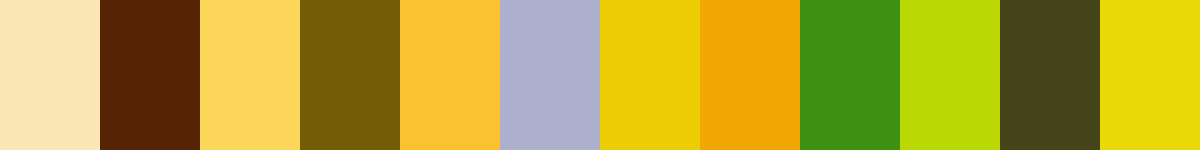
117 Yellow Color Palettes
117 color palettes with 585 colors.

366 Bright Color Palettes
366 color palettes with 1830 colors.
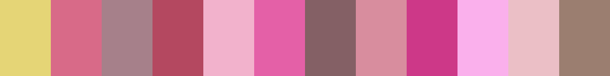
28 Pink Color Combinations
28 color palettes with 140 colors.
My color palette 1
863 color palettes with 4315 colors.