#BAB8D3 Color
Your all-in-one color resource. Download hex background images, Adobe swatches (ASE), PDF color sheets, and SVG files. Explore palettes, harmonies, accessibility, conversions, and professional exports — designed for designers, developers, and color perfectionists.
#BAB8D3 evokes a soft, muted feeling, reminiscent of a hazy lavender field at dawn. The pale purple with a hint of gray suggests a quiet serenity, a gentle melancholy, or perhaps a pensive introspection. It reminds one of soft fabrics, delicate flowers, and the calm before a storm. The color creates a mood of peaceful contemplation and understated elegance, avoiding overt vibrancy. In design, it would work well in spaces requiring a soothing and sophisticated atmosphere bedrooms, libraries, or art galleries. It suggests refinement and a touch of romanticism, but without being overly sentimental. The muted tone prevents it from being overpowering, making it a versatile choice for backgrounds or accent pieces. There's a subtle air of nostalgia associated with the color, hinting at memories or dreams. Visually matched named color: Misty Lavender.
PANTONE 14-3911 TCX
Choose Color
Selected Color
Recent Colors
Color Details
Similar Ink Alternatives for #BAB8D3 color Alternative print inks for reproducing #BAB8D3 background image with a similar visual appearance.
Disclaimer: The visually matched ink reference is an independent approximation intended as a guide only. Please be advised that this pantone colors is only intended as a guide, Actual colours will depend on screen calibration variances. The print ink suggestions provided are independent visual approximations and are not affiliated with or endorsed by Pantone LLC. For official color specifications, conversion factors, and comprehensive color system information, please visit Pantone Connect. Official Pantone products can be purchased at pantone.com.
Color Previews for #000000 See how this color looks as a background or as text.
Complete Guide to Your Color Laboratory
Everything you need to know about this professional color toolkit.
Use the Color Picker at the top to select any color. All modules below update instantly.
Workflow: Pick a color → Explore palettes & data → Download what you need (PDF, Image, or Adobe ASE).
Color Details — Your color in all formats: HEX, RGB, RGBA, HSL, HSLA, HSV, CMYK, CIELab, Hunter-Lab, XYZ, Yxy, YUV. One-click copy.
Color Psychology — Emotional impact, cultural meanings, physiological effects, branding applications, and historical significance.
Named Colors — Find official color names (HTML/CSS, Pantone) that match your selection with similarity percentages.
Light & Dark Shades
80-step gradient from black to white. Perfect for button states and component systems.
Tints
Color mixed with white → lighter, pastel variations for backgrounds and disabled states.
Monochromatic — 11 curated tints/shades from one color. Production-ready for design systems.
- Complementary — Opposite on wheel (180°). High contrast.
- Analogous — Neighbors (±30°). Harmonious flow.
- Triadic — Three colors (120° apart). Vibrant, balanced.
- Split-Complementary — Base + two near-complements. Softer contrast.
- Tetradic/Square — Four colors. Complex, maximum variety.
- Neutral — Desaturated versions. Subtle, sophisticated.
15 Professional Variations — Monochromatic, Analogous, Complementary, Warm/Cool/Earth Tones, Pastel, Vibrant, High Contrast, and more.
Color Infusion — 10 palettes showing your color morphing into each major hue. Find bridge colors.
Similar Colors — 60+ colors generated via CIELAB Delta E matching. Unexpected harmonious combinations.
18 Ready-to-Use Gradients — Complementary, Analogous, Triadic, Tint/Shade progressions, and more.
Downloads: PNG (2560×1440), CSS (production-ready code), SVG (scalable vector).
WCAG Contrast Checker — Tests your color against white, black, and custom colors for AA (4.5:1) and AAA (7:1) compliance. Large text thresholds included.
Harmony & Accessibility Guide — Tests against 10 canonical hues. Shows which pairs are both beautiful AND WCAG-compliant for text.
PNG/JPG — High-res images for presentations and mood boards.
PDF — Print-ready reports for clients and teams.
Adobe ASE — Direct import to Photoshop, Illustrator, InDesign, XD.
CSS/SVG — Gradients only. Production-ready code and vectors.
Color Science: Industry-standard conversions (HSL, CIELAB, CMYK, XYZ). WCAG 2.1 luminance formula. Delta E (ΔE76) for perceptual matching.
Direct Links: Share colors via icolorpalette.com/color/ff5733 or icolorpalette.com/color/red
Issues? Refresh the page, wait for rendering, try another browser, or check console (F12) for errors.
Printing Guide for #bab8d3 Background Image
Use PANTONE 14-3911 TCX as a visually matched ink reference when printing this background image.
To print the #bab8d3 background image from our site, consider using PANTONE 14-3911 TCX as a visually matched ink reference.
Download the background image, then provide this reference code to your print vendor to help achieve accurate color reproduction.
The visually matched ink reference for the #bab8d3 background image is PANTONE 14-3911 TCX.
This color is commonly described as Misty Lavender.
#BAB8D3 evokes a soft, muted feeling, reminiscent of a hazy lavender field at dawn. The pale purple with a hint of gray suggests a quiet serenity, a gentle melancholy, or perhaps a pensive introspection. It reminds one of soft fabrics, delicate flowers, and the calm before a storm. The color creates a mood of peaceful contemplation and understated elegance, avoiding overt vibrancy. In design, it would work well in spaces requiring a soothing and sophisticated atmosphere bedrooms, libraries, or art galleries. It suggests refinement and a touch of romanticism, but without being overly sentimental. The muted tone prevents it from being overpowering, making it a versatile choice for backgrounds or accent pieces. There's a subtle air of nostalgia associated with the color, hinting at memories or dreams.
We provide PANTONE 14-3911 TCX as a visually matched ink reference to help you reproduce the #bab8d3 background image accurately in professional printing.
This reference code helps print vendors achieve consistent color output across different printing equipment and materials.
After downloading the #bab8d3 background image from our site:
- Include the visually matched ink reference PANTONE 14-3911 TCX in your print order notes
- Inform your print vendor that this is your target color reference
- Request a proof print to verify the Misty Lavender color appearance before full production
The #bab8d3 background image with PANTONE 14-3911 TCX as visually matched ink reference can be used for:
- Posters, banners, and backdrops
- Business cards, brochures, and flyers
- Packaging, labels, and stickers
- Signage and promotional materials
This is an independent visual approximation.
While PANTONE 14-3911 TCX closely matches the #bab8d3 background image color, variations may exist between screen display and printed output.
We recommend requesting a proof print to verify the final appearance.
#BAB8D3 evokes a soft, muted feeling, reminiscent of a hazy lavender field at dawn. The pale purple with a hint of gray suggests a quiet serenity, a gentle melancholy, or perhaps a pensive introspection. It reminds one of soft fabrics, delicate flowers, and the calm before a storm. The color creates a mood of peaceful contemplation and understated elegance, avoiding overt vibrancy. In design, it would work well in spaces requiring a soothing and sophisticated atmosphere bedrooms, libraries, or art galleries. It suggests refinement and a touch of romanticism, but without being overly sentimental. The muted tone prevents it from being overpowering, making it a versatile choice for backgrounds or accent pieces. There's a subtle air of nostalgia associated with the color, hinting at memories or dreams.
Understanding these associations helps ensure the #bab8d3 background image aligns with your intended message and brand impact.
Important Information
The visually matched ink reference is an independent approximation intended as a guide only.
Actual printed colors may vary depending on screen calibration, substrate material, ink type, and printing equipment used.
For official color specifications and certified color standards, visit Pantone Connect.
Official color guides and swatch books can be purchased from pantone.com.
Pantone 14-3911 Tcx Purple Heather Color | Hex color Code #bab8d3 Image & Artwork
Download high-quality assets for your projects.

#bab8d3 Color Schemes
Download Color Schemes
#bab8d3 Color Shades
Download Color Shades
Pantone 14-3911 Tcx Purple Heather Color | Hex color Code #bab8d3 Solid Color Background
Download Solid Color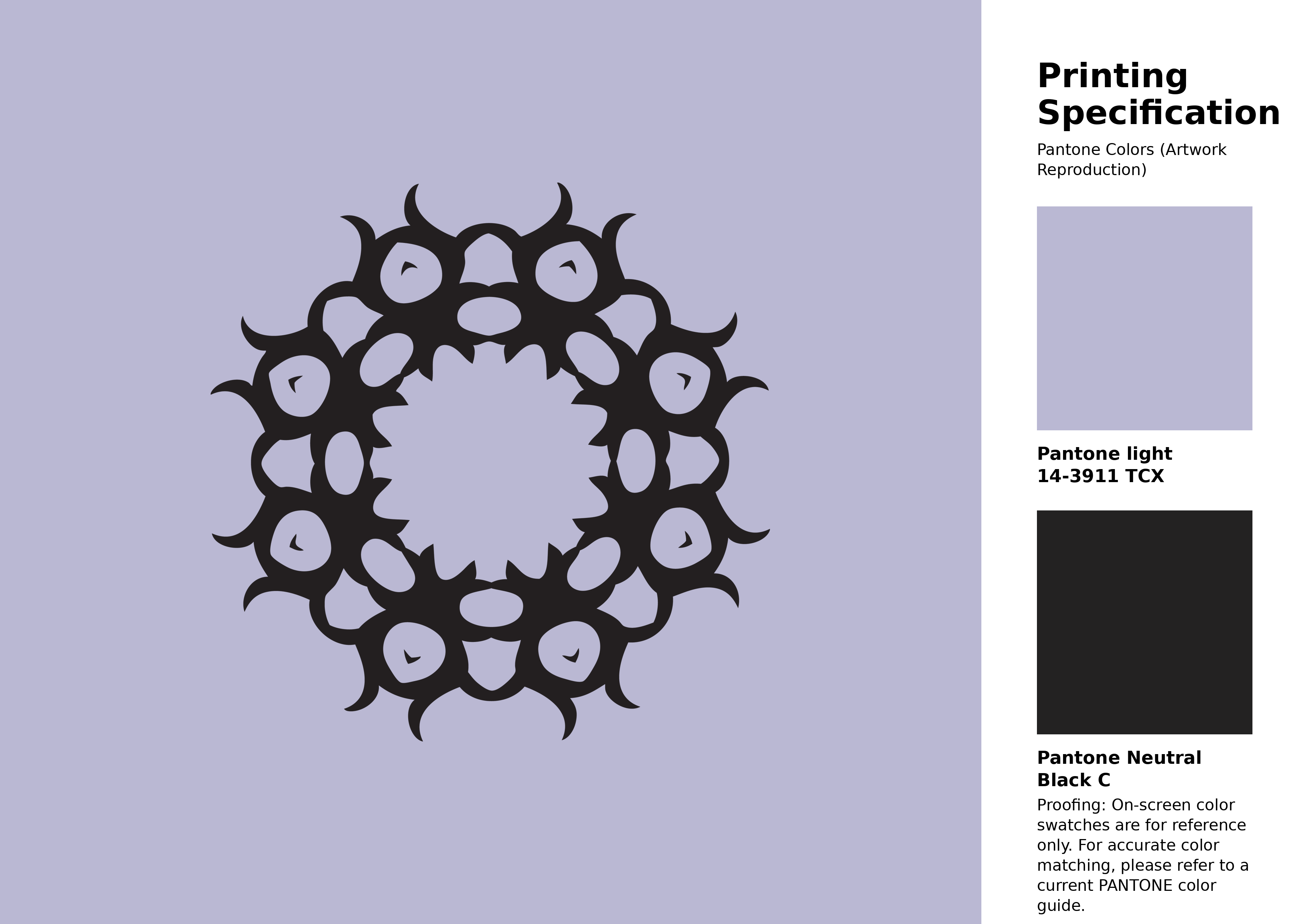
#bab8d3 Pantone 14-3911 Tcx Purple Heather Color | Hex color Code #bab8d3 Artwork Image (PNG)
Download Artwork (PNG)#bab8d3 Pantone 14-3911 Tcx Purple Heather Color | Hex color Code #bab8d3 Artwork Vector (PDF)
Download Artwork (PDF)#bab8d3 Pantone 14-3911 Tcx Purple Heather Color | Hex color Code #bab8d3 Artwork Vector (SVG)
Download Artwork (SVG)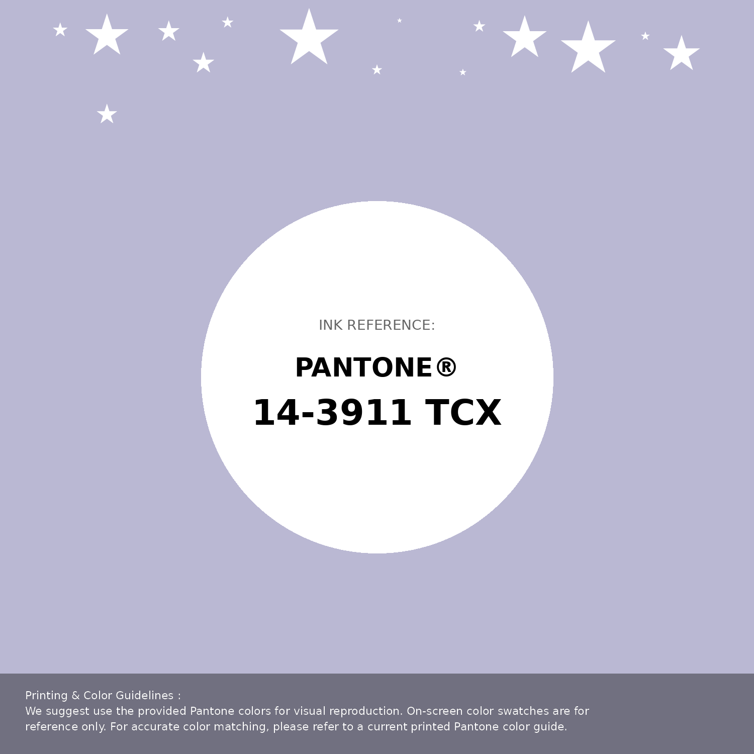
#bab8d3 Pantone 14-3911 Tcx Purple Heather Color | Hex color Code #bab8d3 Pantone Swatch Artwork
Download Artwork Swatch
#bab8d3 Pantone 14-3911 Tcx Purple Heather Color | Hex color Code #bab8d3 Gradient Artwork (PNG)
Download Gradient (PNG)#bab8d3 Pantone 14-3911 Tcx Purple Heather Color | Hex color Code #bab8d3 Gradient Artwork (SVG)
Download Gradient (SVG)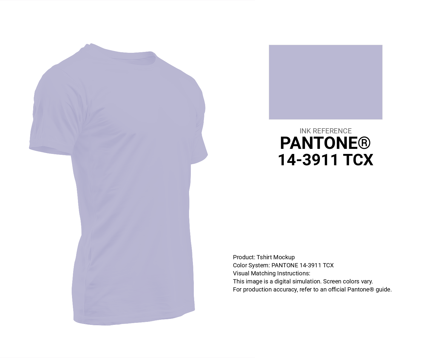
#bab8d3 Pantone 14-3911 Tcx Purple Heather Color | Hex color Code #bab8d3 T-Shirt Mockup
Download T-Shirt Mockup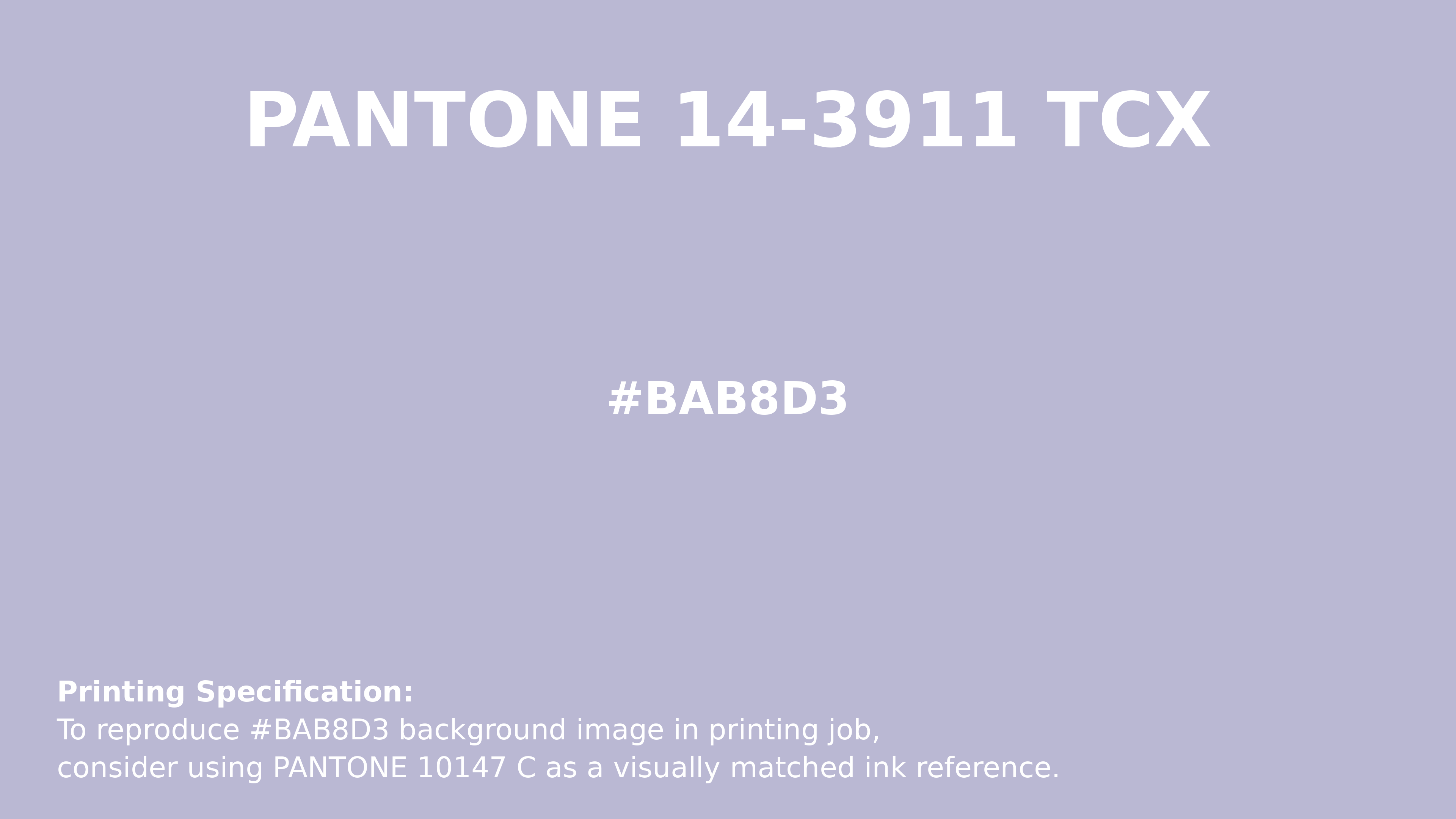
#bab8d3 Pantone 14-3911 Tcx Purple Heather Color | Hex color Code #bab8d3 Printing Artwork Pantone Reference
Download Pantone Printing Reference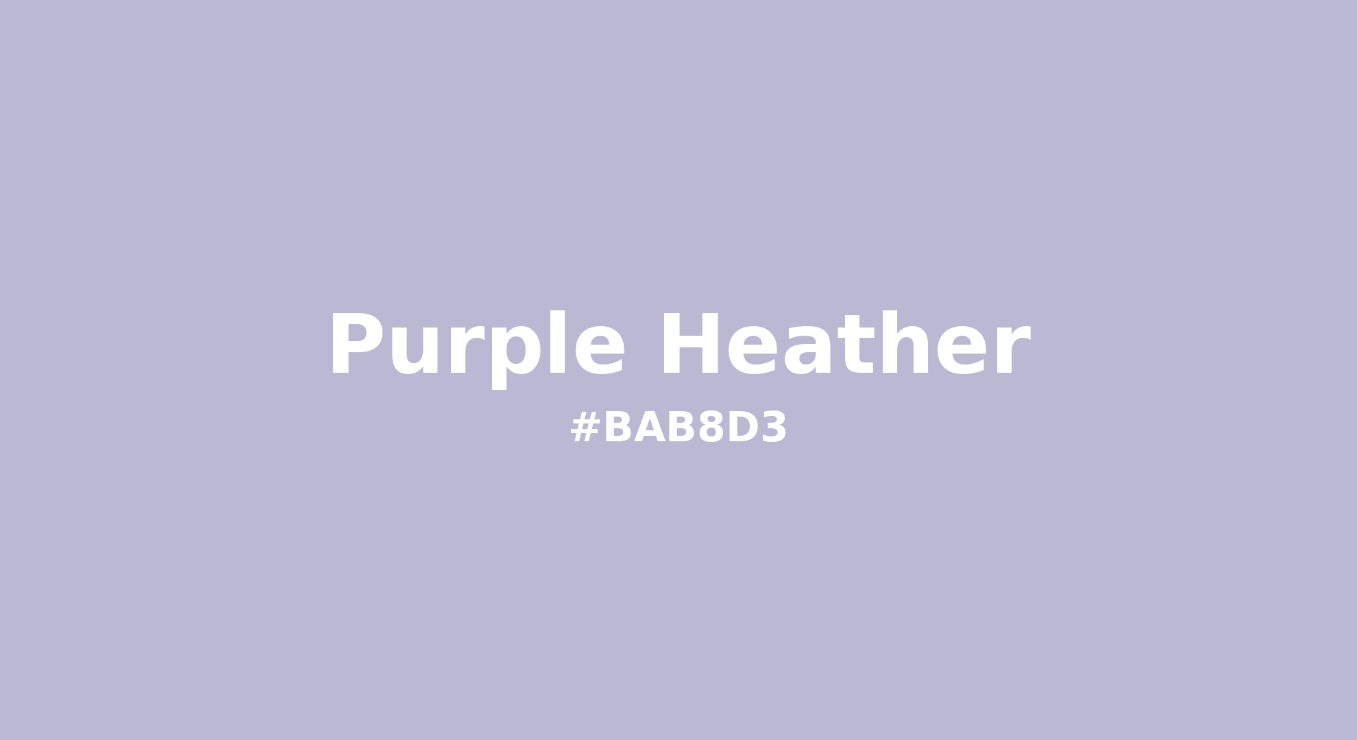
Purple Heather - #bab8d3 Color Name
Download Color NameRelated Color Palettes
- New York Pink •
- Dark Sea Green and Light Pink •
- Deep Pink and Sandy Brown •
- Dark Orange and Deep Pink •
- Dark Sea Green and Hot Pink •
- Dark Slate Gray and Hot Pink •
- Persian Pink •
- Deep Pink and Black •
- Light Pink and Dark Sea Green •
- Dark Sea Green and Deep Pink •
- Deep Pink and Tomato •
- Light Pink and Beige •
- Pink •
- Oriental Pink •
- Salmon and Light Pink
Color Palette Collection
ADC Website Accents
1 color palettes with 5 colors.

20 Beige Color Combinations
20 color palettes with 100 colors.

The Color of Calm: 18 Blue Palettes to Enhance Your Design
18 color palettes with 90 colors.

24 Summer Color Palettes
24 color palettes with 120 colors.