#B7312C Color
Your all-in-one color resource. Download hex background images, Adobe swatches (ASE), PDF color sheets, and SVG files. Explore palettes, harmonies, accessibility, conversions, and professional exports — designed for designers, developers, and color perfectionists.
This deep, rich red, #B7312C, pulsates with a visceral energy. It evokes the warmth of a crackling fire, the raw power of a beating heart, and the passionate intensity of a dramatic sunset. This color is associated with strong emotions: love, anger, excitement, and danger. It reminds me of ripe cherries, blood, and the flush of embarrassment. It creates a bold and assertive mood, demanding attention. In design, it can be used to signify importance, urgency, or luxury. It can be used sparingly to add pops of drama or in larger doses for a statement of power and confidence. Culturally, red often symbolizes love, courage, and vitality, but it can also represent warning and aggression. Visually matched named color: Crimson Heartbeat.
PANTONE 7620 C
Choose Color
Selected Color
Recent Colors
Color Details
Similar Ink Alternatives for #B7312C color Alternative print inks for reproducing #B7312C background image with a similar visual appearance.
Disclaimer: The visually matched ink reference is an independent approximation intended as a guide only. Please be advised that this pantone colors is only intended as a guide, Actual colours will depend on screen calibration variances. The print ink suggestions provided are independent visual approximations and are not affiliated with or endorsed by Pantone LLC. For official color specifications, conversion factors, and comprehensive color system information, please visit Pantone Connect. Official Pantone products can be purchased at pantone.com.
Color Previews for #000000 See how this color looks as a background or as text.
Complete Guide to Your Color Laboratory
Everything you need to know about this professional color toolkit.
Use the Color Picker at the top to select any color. All modules below update instantly.
Workflow: Pick a color → Explore palettes & data → Download what you need (PDF, Image, or Adobe ASE).
Color Details — Your color in all formats: HEX, RGB, RGBA, HSL, HSLA, HSV, CMYK, CIELab, Hunter-Lab, XYZ, Yxy, YUV. One-click copy.
Color Psychology — Emotional impact, cultural meanings, physiological effects, branding applications, and historical significance.
Named Colors — Find official color names (HTML/CSS, Pantone) that match your selection with similarity percentages.
Light & Dark Shades
80-step gradient from black to white. Perfect for button states and component systems.
Tints
Color mixed with white → lighter, pastel variations for backgrounds and disabled states.
Monochromatic — 11 curated tints/shades from one color. Production-ready for design systems.
- Complementary — Opposite on wheel (180°). High contrast.
- Analogous — Neighbors (±30°). Harmonious flow.
- Triadic — Three colors (120° apart). Vibrant, balanced.
- Split-Complementary — Base + two near-complements. Softer contrast.
- Tetradic/Square — Four colors. Complex, maximum variety.
- Neutral — Desaturated versions. Subtle, sophisticated.
15 Professional Variations — Monochromatic, Analogous, Complementary, Warm/Cool/Earth Tones, Pastel, Vibrant, High Contrast, and more.
Color Infusion — 10 palettes showing your color morphing into each major hue. Find bridge colors.
Similar Colors — 60+ colors generated via CIELAB Delta E matching. Unexpected harmonious combinations.
18 Ready-to-Use Gradients — Complementary, Analogous, Triadic, Tint/Shade progressions, and more.
Downloads: PNG (2560×1440), CSS (production-ready code), SVG (scalable vector).
WCAG Contrast Checker — Tests your color against white, black, and custom colors for AA (4.5:1) and AAA (7:1) compliance. Large text thresholds included.
Harmony & Accessibility Guide — Tests against 10 canonical hues. Shows which pairs are both beautiful AND WCAG-compliant for text.
PNG/JPG — High-res images for presentations and mood boards.
PDF — Print-ready reports for clients and teams.
Adobe ASE — Direct import to Photoshop, Illustrator, InDesign, XD.
CSS/SVG — Gradients only. Production-ready code and vectors.
Color Science: Industry-standard conversions (HSL, CIELAB, CMYK, XYZ). WCAG 2.1 luminance formula. Delta E (ΔE76) for perceptual matching.
Direct Links: Share colors via icolorpalette.com/color/ff5733 or icolorpalette.com/color/red
Issues? Refresh the page, wait for rendering, try another browser, or check console (F12) for errors.
Printing Guide for #b7312c Background Image
Use PANTONE 7620 C as a visually matched ink reference when printing this background image.
To print the #b7312c background image from our site, consider using PANTONE 7620 C as a visually matched ink reference.
Download the background image, then provide this reference code to your print vendor to help achieve accurate color reproduction.
The visually matched ink reference for the #b7312c background image is PANTONE 7620 C.
This color is commonly described as Crimson Heartbeat.
This deep, rich red, #B7312C, pulsates with a visceral energy. It evokes the warmth of a crackling fire, the raw power of a beating heart, and the passionate intensity of a dramatic sunset. This color is associated with strong emotions: love, anger, excitement, and danger. It reminds me of ripe cherries, blood, and the flush of embarrassment. It creates a bold and assertive mood, demanding attention. In design, it can be used to signify importance, urgency, or luxury. It can be used sparingly to add pops of drama or in larger doses for a statement of power and confidence. Culturally, red often symbolizes love, courage, and vitality, but it can also represent warning and aggression.
We provide PANTONE 7620 C as a visually matched ink reference to help you reproduce the #b7312c background image accurately in professional printing.
This reference code helps print vendors achieve consistent color output across different printing equipment and materials.
After downloading the #b7312c background image from our site:
- Include the visually matched ink reference PANTONE 7620 C in your print order notes
- Inform your print vendor that this is your target color reference
- Request a proof print to verify the Crimson Heartbeat color appearance before full production
The #b7312c background image with PANTONE 7620 C as visually matched ink reference can be used for:
- Posters, banners, and backdrops
- Business cards, brochures, and flyers
- Packaging, labels, and stickers
- Signage and promotional materials
This is an independent visual approximation.
While PANTONE 7620 C closely matches the #b7312c background image color, variations may exist between screen display and printed output.
We recommend requesting a proof print to verify the final appearance.
This deep, rich red, #B7312C, pulsates with a visceral energy. It evokes the warmth of a crackling fire, the raw power of a beating heart, and the passionate intensity of a dramatic sunset. This color is associated with strong emotions: love, anger, excitement, and danger. It reminds me of ripe cherries, blood, and the flush of embarrassment. It creates a bold and assertive mood, demanding attention. In design, it can be used to signify importance, urgency, or luxury. It can be used sparingly to add pops of drama or in larger doses for a statement of power and confidence. Culturally, red often symbolizes love, courage, and vitality, but it can also represent warning and aggression.
Understanding these associations helps ensure the #b7312c background image aligns with your intended message and brand impact.
Important Information
The visually matched ink reference is an independent approximation intended as a guide only.
Actual printed colors may vary depending on screen calibration, substrate material, ink type, and printing equipment used.
For official color specifications and certified color standards, visit Pantone Connect.
Official color guides and swatch books can be purchased from pantone.com.
Pantone 7620 C Color: Vibrant Red | #B7312C
Introduction:
Vibrant Red, represented by Pantone 7620 C Color, is a striking shade of red. It exudes energy and intensity, catching the eye with its boldness and commanding presence.
Historical Significance:
Usage in American Revolutionary History: Vibrant Red played a significant role during the American Revolution, symbolizing passion, courage, and the fight for freedom.
Representation in Soviet Union Propaganda: The color was extensively utilized in Soviet Union propaganda, representing the revolutionary spirit and socialist ideals.
Symbolism and Meaning:
Symbol of Love and Passion: Vibrant Red is universally recognized as a symbol of love, passion, and romance. It evokes strong emotions and has a seductive allure.
Cultural Significance in Chinese Culture: In Chinese culture, red symbolizes good luck, fortune, and celebration. It is often used in traditional weddings and Lunar New Year celebrations.
Vibrant Red in Fashion:
Statement-Making Fashion Choice: Vibrant Red is a popular color choice in the fashion industry, adding a powerful statement to any outfit. It is often associated with confidence and boldness.
Making an Impact on Runways: Fashion designers frequently incorporate Vibrant Red into their collections, using it to create eye-catching ensembles that demand attention.
Vibrant Red in Graphic Design:
Creating Visual Impact: Vibrant Red is a powerful color in graphic design, often used to draw attention and create a focal point. Its boldness adds energy and excitement to designs.
Branding and Logos: Many brands incorporate Vibrant Red into their logos and branding to evoke feelings of passion, strength, and excitement. It helps them stand out and make a memorable impression.
Color Combinations:
Vibrant Red and White: The combination of Vibrant Red and white creates a classic and timeless look.
Vibrant Red and Gold: Vibrant Red paired with gold is often associated with luxury and opulence.
Nature’s Palette:
Red Flowers: Vibrant Red can be found in various beautiful flowers, such as roses, poppies, and tulips, adding a stunning burst of color to gardens and landscapes.
Vibrant Autumn Foliage: During the fall season, leaves turn vibrant shades of red, creating breathtaking landscapes.
Artistic Representations:
Expression of Passion: Vibrant Red has been used by artists throughout history to express strong emotions and convey intense passion in their artwork.
Contrast and Boldness: The use of Vibrant Red in art adds contrast and intensity, drawing the viewer's attention and creating a dynamic visual experience.
Movies and Cinematic Landscapes:
Suspense and Danger: Vibrant Red is often used in movies to create a sense of suspense, danger, or intense situations. It can represent blood, passion, or fire.
Power and Authority: In some movies, Vibrant Red is associated with power, authority, and dominance. It can be used to portray strong and influential characters.
Products and Commercial Appeal:
High-Energy Beverages: Many energy drinks use Vibrant Red in their branding to convey a sense of energy and vitality.
Passionate Personal Care Products: Hair dyes, lipsticks, and nail polishes often feature Vibrant Red to evoke notions of confidence, allure, and self-expression.
National Symbols and Significance:
American Flag: Vibrant Red is one of the colors in the American Flag, representing valor and hardiness.
Chinese National Flag: The color red holds immense significance in the Chinese National Flag, symbolizing revolution, prosperity, and the Communist Party.
The Psychological and Emotional Impact:
Emotional Intensity: Vibrant Red elicits intense emotions such as love, anger, passion, and excitement. It can increase heart rate and create a sense of urgency.
Energizing and Motivating: This color is known for its ability to energize people, increase motivation, and stimulate action.
Conclusion:
Vibrant Red, represented by Pantone 7620 C Color, has a rich historical significance and a strong cultural presence. It is associated with love, passion, power, and vitality. In various fields like fashion, graphic design, and cinematography, it creates a striking visual impact. Vibrant Red's use in nature, art, and products further showcases its timeless appeal. Overall, it is a color that captures attention, expresses intensity, and leaves a lasting impression.
Pantone 7620 C Color | Hex color Code #b7312c Image & Artwork
Download high-quality assets for your projects.

#b7312c Color Schemes
Download Color Schemes
#b7312c Color Shades
Download Color Shades
Pantone 7620 C Color | Hex color Code #b7312c Solid Color Background
Download Solid Color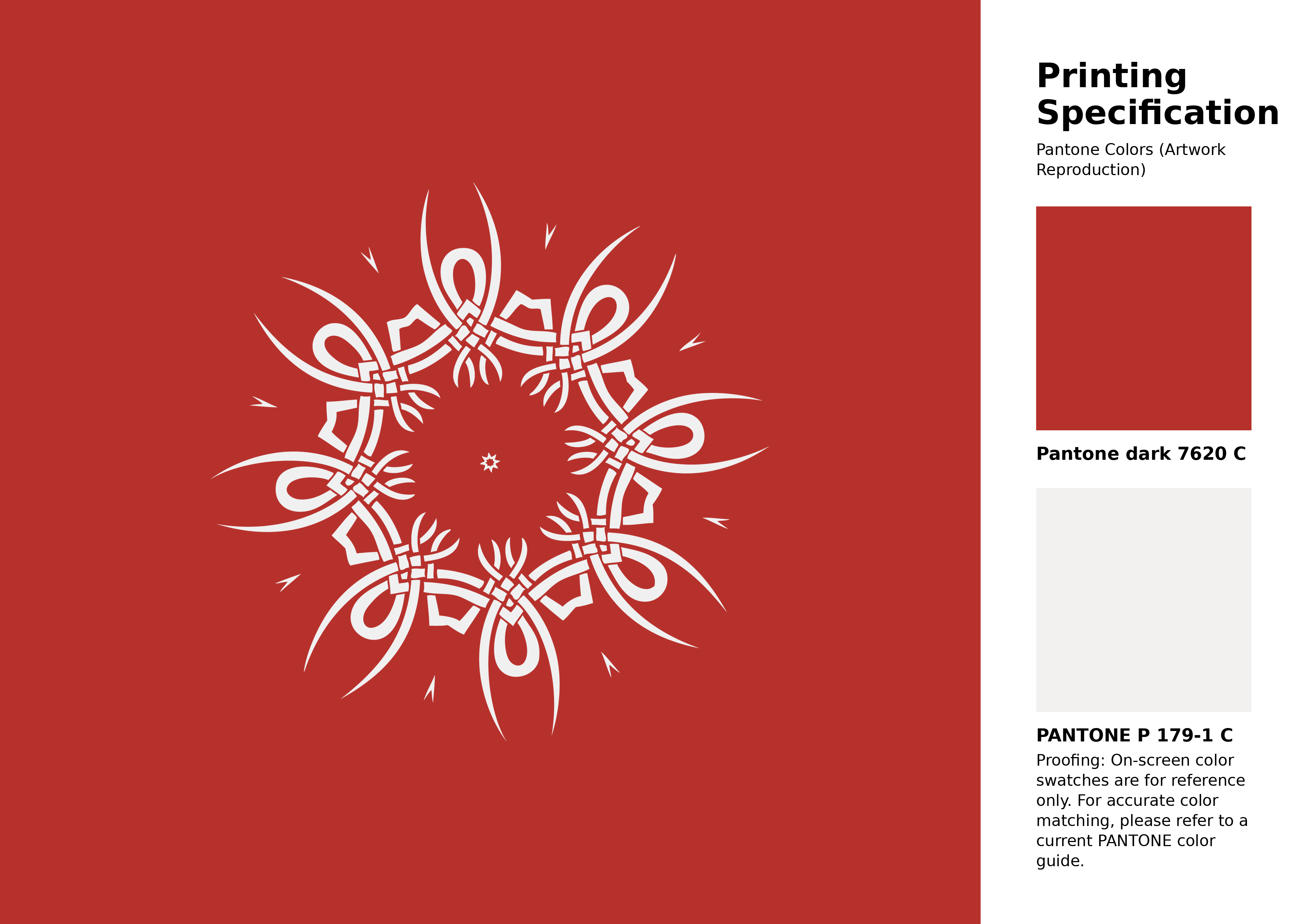
#b7312c Pantone 7620 C Color | Hex color Code #b7312c Artwork Image (PNG)
Download Artwork (PNG)#b7312c Pantone 7620 C Color | Hex color Code #b7312c Artwork Vector (PDF)
Download Artwork (PDF)#b7312c Pantone 7620 C Color | Hex color Code #b7312c Artwork Vector (SVG)
Download Artwork (SVG)
#b7312c Pantone 7620 C Color | Hex color Code #b7312c Pantone Swatch Artwork
Download Artwork Swatch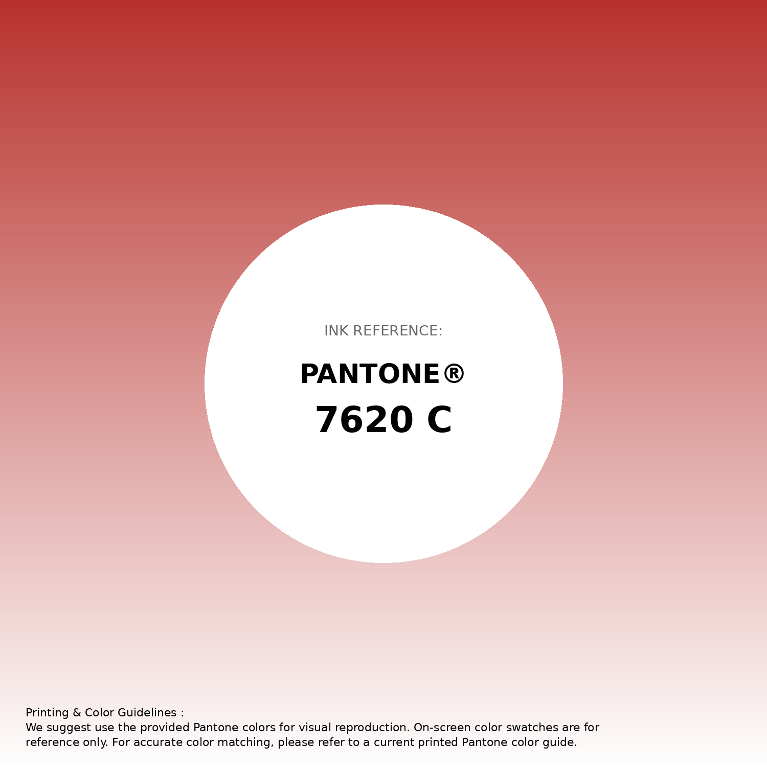
#b7312c Pantone 7620 C Color | Hex color Code #b7312c Gradient Artwork (PNG)
Download Gradient (PNG)#b7312c Pantone 7620 C Color | Hex color Code #b7312c Gradient Artwork (SVG)
Download Gradient (SVG)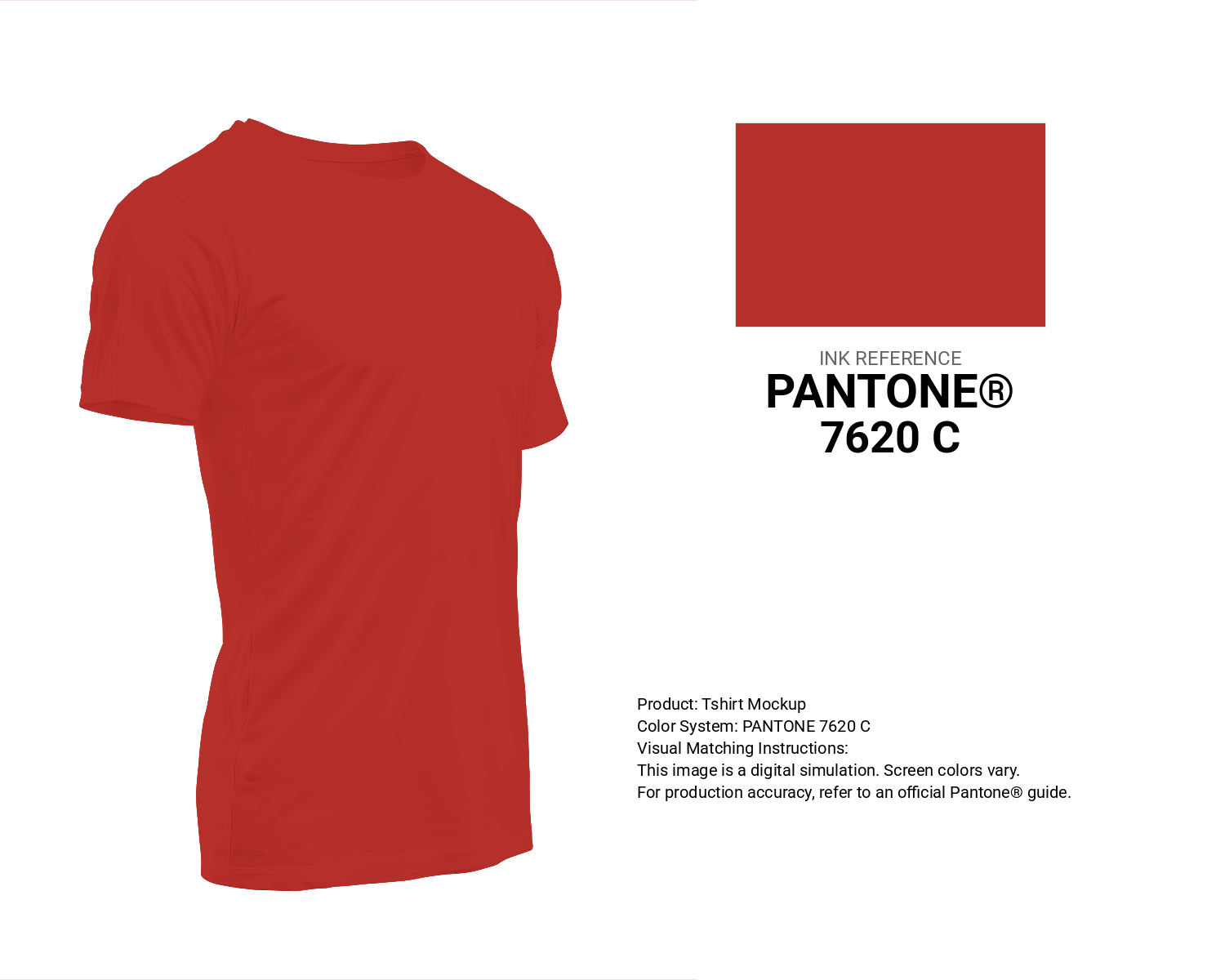
#b7312c Pantone 7620 C Color | Hex color Code #b7312c T-Shirt Mockup
Download T-Shirt Mockup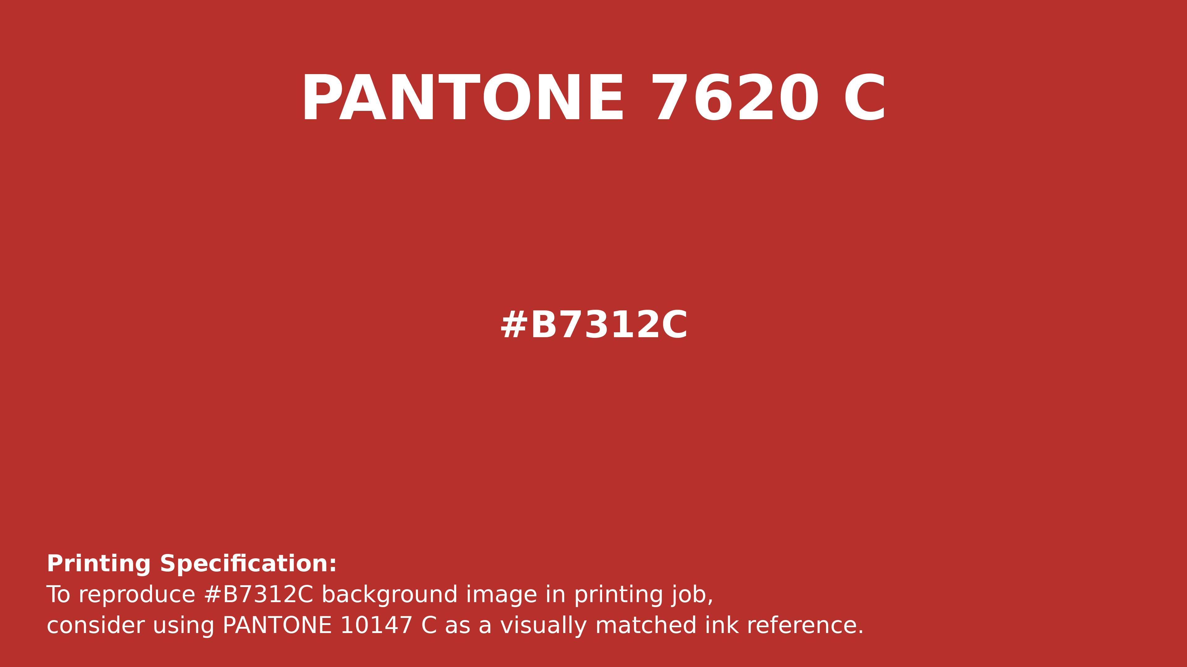
#b7312c Pantone 7620 C Color | Hex color Code #b7312c Printing Artwork Pantone Reference
Download Pantone Printing ReferenceRelated Color Palettes
- Red Color Palettes • Green Color Palettes • Purple Color Palettes • Pink Color Palettes • Orange Color Palettes • Blue Color Palettes • Yellow Color Palettes • Brown Color Palettes • Gray Color Palettes • Beige Color Palettes • Turquoise Color Palettes
Color Palette Collection

744 Color Palettes
744 color palettes with 3720 colors.

81 Pink color palettes
81 color palettes with 405 colors.

89 Blue Color Palettes
89 color palettes with 445 colors.
Yadunna
1 color palettes with 5 colors.