#B59E5F Color
Your all-in-one color resource. Download hex background images, Adobe swatches (ASE), PDF color sheets, and SVG files. Explore palettes, harmonies, accessibility, conversions, and professional exports — designed for designers, developers, and color perfectionists.
This color whispers of sun-drenched fields at dusk, the gentle warmth of fading light. It evokes feelings of comfort, nostalgia, and a quiet contentment, similar to the feeling of being wrapped in a soft blanket on a chilly evening. Reminiscent of autumn leaves, aged wood, and the gentle glow of a fireplace, it carries a sense of history and groundedness. The mood is one of warmth, inviting intimacy, and a gentle slowing down. In design, it can be used to create a sense of sophistication and understated elegance, suitable for warm, inviting spaces such as libraries, living rooms, and bedrooms. It suggests a connection to nature, a sense of being sheltered and secure, and perhaps a touch of rustic charm. Visually matched named color: Golden Twilight.
PANTONE 16-0730 TCX
Choose Color
Selected Color
Recent Colors
Color Details
Similar Ink Alternatives for #B59E5F color Alternative print inks for reproducing #B59E5F background image with a similar visual appearance.
Disclaimer: The visually matched ink reference is an independent approximation intended as a guide only. Please be advised that this pantone colors is only intended as a guide, Actual colours will depend on screen calibration variances. The print ink suggestions provided are independent visual approximations and are not affiliated with or endorsed by Pantone LLC. For official color specifications, conversion factors, and comprehensive color system information, please visit Pantone Connect. Official Pantone products can be purchased at pantone.com.
Color Previews for #000000 See how this color looks as a background or as text.
Complete Guide to Your Color Laboratory
Everything you need to know about this professional color toolkit.
Use the Color Picker at the top to select any color. All modules below update instantly.
Workflow: Pick a color → Explore palettes & data → Download what you need (PDF, Image, or Adobe ASE).
Color Details — Your color in all formats: HEX, RGB, RGBA, HSL, HSLA, HSV, CMYK, CIELab, Hunter-Lab, XYZ, Yxy, YUV. One-click copy.
Color Psychology — Emotional impact, cultural meanings, physiological effects, branding applications, and historical significance.
Named Colors — Find official color names (HTML/CSS, Pantone) that match your selection with similarity percentages.
Light & Dark Shades
80-step gradient from black to white. Perfect for button states and component systems.
Tints
Color mixed with white → lighter, pastel variations for backgrounds and disabled states.
Monochromatic — 11 curated tints/shades from one color. Production-ready for design systems.
- Complementary — Opposite on wheel (180°). High contrast.
- Analogous — Neighbors (±30°). Harmonious flow.
- Triadic — Three colors (120° apart). Vibrant, balanced.
- Split-Complementary — Base + two near-complements. Softer contrast.
- Tetradic/Square — Four colors. Complex, maximum variety.
- Neutral — Desaturated versions. Subtle, sophisticated.
15 Professional Variations — Monochromatic, Analogous, Complementary, Warm/Cool/Earth Tones, Pastel, Vibrant, High Contrast, and more.
Color Infusion — 10 palettes showing your color morphing into each major hue. Find bridge colors.
Similar Colors — 60+ colors generated via CIELAB Delta E matching. Unexpected harmonious combinations.
18 Ready-to-Use Gradients — Complementary, Analogous, Triadic, Tint/Shade progressions, and more.
Downloads: PNG (2560×1440), CSS (production-ready code), SVG (scalable vector).
WCAG Contrast Checker — Tests your color against white, black, and custom colors for AA (4.5:1) and AAA (7:1) compliance. Large text thresholds included.
Harmony & Accessibility Guide — Tests against 10 canonical hues. Shows which pairs are both beautiful AND WCAG-compliant for text.
PNG/JPG — High-res images for presentations and mood boards.
PDF — Print-ready reports for clients and teams.
Adobe ASE — Direct import to Photoshop, Illustrator, InDesign, XD.
CSS/SVG — Gradients only. Production-ready code and vectors.
Color Science: Industry-standard conversions (HSL, CIELAB, CMYK, XYZ). WCAG 2.1 luminance formula. Delta E (ΔE76) for perceptual matching.
Direct Links: Share colors via icolorpalette.com/color/ff5733 or icolorpalette.com/color/red
Issues? Refresh the page, wait for rendering, try another browser, or check console (F12) for errors.
Printing Guide for #b59e5f Background Image
Use PANTONE 16-0730 TCX as a visually matched ink reference when printing this background image.
To print the #b59e5f background image from our site, consider using PANTONE 16-0730 TCX as a visually matched ink reference.
Download the background image, then provide this reference code to your print vendor to help achieve accurate color reproduction.
The visually matched ink reference for the #b59e5f background image is PANTONE 16-0730 TCX.
This color is commonly described as Golden Twilight.
This color whispers of sun-drenched fields at dusk, the gentle warmth of fading light. It evokes feelings of comfort, nostalgia, and a quiet contentment, similar to the feeling of being wrapped in a soft blanket on a chilly evening. Reminiscent of autumn leaves, aged wood, and the gentle glow of a fireplace, it carries a sense of history and groundedness. The mood is one of warmth, inviting intimacy, and a gentle slowing down. In design, it can be used to create a sense of sophistication and understated elegance, suitable for warm, inviting spaces such as libraries, living rooms, and bedrooms. It suggests a connection to nature, a sense of being sheltered and secure, and perhaps a touch of rustic charm.
We provide PANTONE 16-0730 TCX as a visually matched ink reference to help you reproduce the #b59e5f background image accurately in professional printing.
This reference code helps print vendors achieve consistent color output across different printing equipment and materials.
After downloading the #b59e5f background image from our site:
- Include the visually matched ink reference PANTONE 16-0730 TCX in your print order notes
- Inform your print vendor that this is your target color reference
- Request a proof print to verify the Golden Twilight color appearance before full production
The #b59e5f background image with PANTONE 16-0730 TCX as visually matched ink reference can be used for:
- Posters, banners, and backdrops
- Business cards, brochures, and flyers
- Packaging, labels, and stickers
- Signage and promotional materials
This is an independent visual approximation.
While PANTONE 16-0730 TCX closely matches the #b59e5f background image color, variations may exist between screen display and printed output.
We recommend requesting a proof print to verify the final appearance.
This color whispers of sun-drenched fields at dusk, the gentle warmth of fading light. It evokes feelings of comfort, nostalgia, and a quiet contentment, similar to the feeling of being wrapped in a soft blanket on a chilly evening. Reminiscent of autumn leaves, aged wood, and the gentle glow of a fireplace, it carries a sense of history and groundedness. The mood is one of warmth, inviting intimacy, and a gentle slowing down. In design, it can be used to create a sense of sophistication and understated elegance, suitable for warm, inviting spaces such as libraries, living rooms, and bedrooms. It suggests a connection to nature, a sense of being sheltered and secure, and perhaps a touch of rustic charm.
Understanding these associations helps ensure the #b59e5f background image aligns with your intended message and brand impact.
Important Information
The visually matched ink reference is an independent approximation intended as a guide only.
Actual printed colors may vary depending on screen calibration, substrate material, ink type, and printing equipment used.
For official color specifications and certified color standards, visit Pantone Connect.
Official color guides and swatch books can be purchased from pantone.com.
Antique Gold Color: A Vintage Touch | #b59e5f
Introduction:
Antique Gold Color is a warm, earthy color with hints of gold and brown. It exudes a sense of antiquity and elegance, adding a vintage touch to any design.
Historical Significance:
Key moments in history: Antique Gold Color has been prominently used in various historical periods, such as the ancient Egyptian civilization, where it symbolized wealth and royalty. It also gained popularity during the Renaissance era, as it was associated with opulence and luxury.
Symbolism and Meaning:
Symbolism in different cultures: Antique Gold Color typically symbolizes prosperity, abundance, and success. In many cultures, it represents wealth and power. It is also associated with wisdom and enlightenment.
Antique Gold Color in Fashion:
Impact on fashion trends: Antique Gold Color has a timeless appeal in the fashion world. It is often used in evening wear and formal attire, adding a touch of sophistication and glamour. It is also a popular choice for accessories and jewelry.
Antique Gold Color in Graphic Design:
Significance in design aesthetics: Antique Gold Color is widely used in graphic design to evoke a sense of elegance and nostalgia. It adds a touch of luxury and sophistication to branding and visual materials.
Color Combinations:
Potential color combinations: Antique Gold Color pairs well with other warm shades like burgundy and deep brown. It also complements neutral tones such as cream and ivory. Combining Antique Gold Color with a deep blue can create a regal and elegant look.
Nature’s Palette:
Natural occurrences: Antique Gold Color can be found in the hues of autumn leaves, especially on maple trees. It also resembles the color of honey and adds warmth to natural landscapes and sunsets.
Artistic Representations:
Use in art: Antique Gold Color has been used by artists throughout history to create stunning paintings and sculptures. It adds depth, richness, and a sense of timelessness to their artwork.
Movies and Cinematic Landscapes:
Movies and scenes: Antique Gold Color is often used in movies to set a luxurious and vintage tone. It can be seen in period films and scenes depicting grandeur and opulence.
Products and Commercial Appeal:
Popular products and brands: Antique Gold Color is commonly used in the branding of high-end products and luxury brands. It adds a sense of exclusivity and elegance to their marketing materials.
National Symbols and Significance:
National and cultural significance: Antique Gold Color is often associated with the riches and heritage of ancient civilizations. It can be found in the national symbols of countries with a rich cultural history.
The Psychological and Emotional Impact:
Influence on emotions and perceptions: Antique Gold Color evokes feelings of warmth, comfort, and nostalgia. It can create a sense of sophistication and luxury, making people feel uplifted and self-assured.
Conclusion:
Antique Gold Color, with its rich history, symbolism, and timeless appeal, adds a touch of vintage elegance to any design. Whether it's in fashion, graphic design, or artistic representations, this color has a significant impact on the aesthetics and emotions it evokes.
Pantone 16-0730 Tcx Antique Gold Color | Hex color Code #b59e5f Image & Artwork
Download high-quality assets for your projects.

#b59e5f Color Schemes
Download Color Schemes
#b59e5f Color Shades
Download Color Shades
Pantone 16-0730 Tcx Antique Gold Color | Hex color Code #b59e5f Solid Color Background
Download Solid Color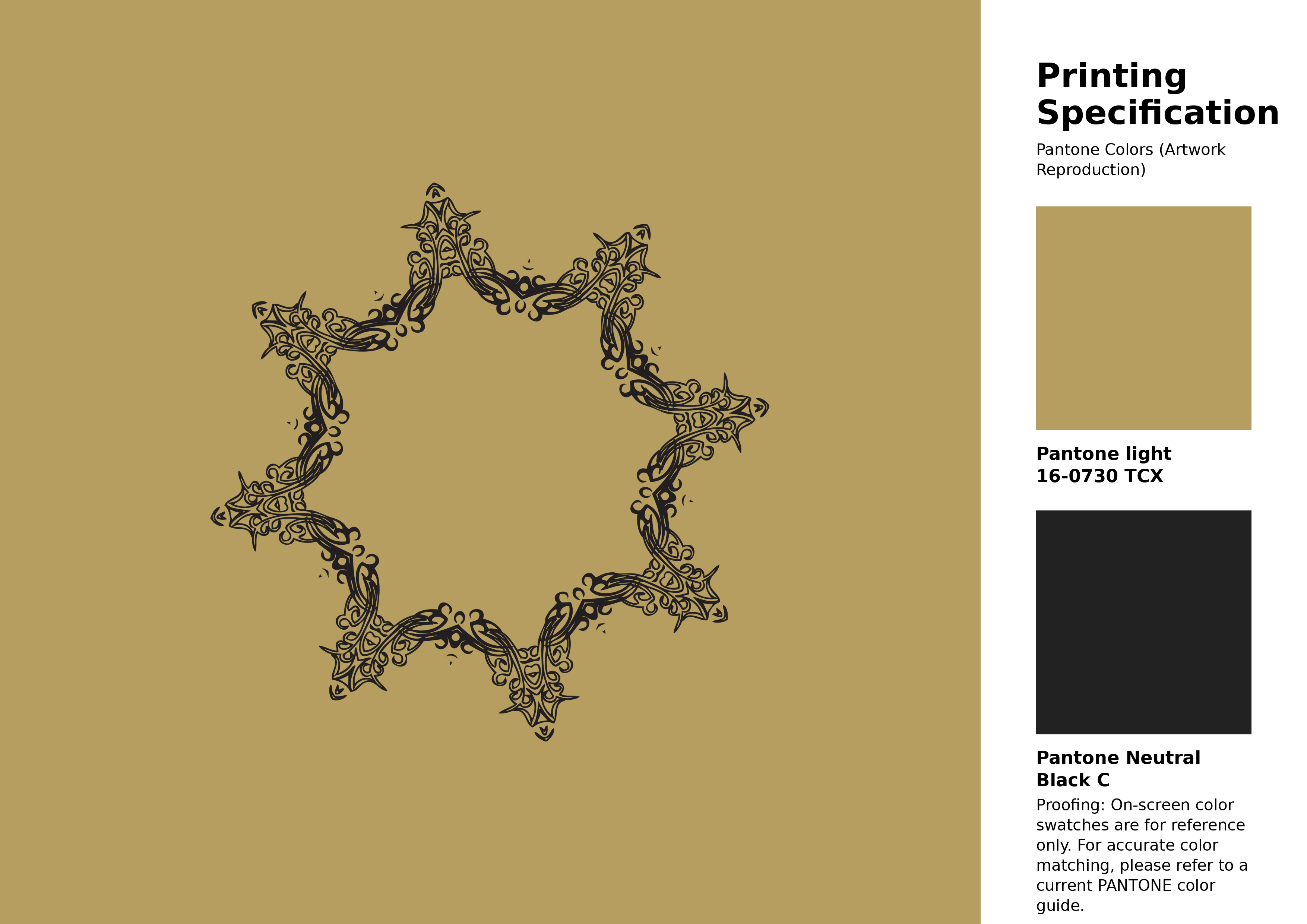
#b59e5f Pantone 16-0730 Tcx Antique Gold Color | Hex color Code #b59e5f Artwork Image (PNG)
Download Artwork (PNG)#b59e5f Pantone 16-0730 Tcx Antique Gold Color | Hex color Code #b59e5f Artwork Vector (PDF)
Download Artwork (PDF)#b59e5f Pantone 16-0730 Tcx Antique Gold Color | Hex color Code #b59e5f Artwork Vector (SVG)
Download Artwork (SVG)
#b59e5f Pantone 16-0730 Tcx Antique Gold Color | Hex color Code #b59e5f Pantone Swatch Artwork
Download Artwork Swatch
#b59e5f Pantone 16-0730 Tcx Antique Gold Color | Hex color Code #b59e5f Gradient Artwork (PNG)
Download Gradient (PNG)#b59e5f Pantone 16-0730 Tcx Antique Gold Color | Hex color Code #b59e5f Gradient Artwork (SVG)
Download Gradient (SVG)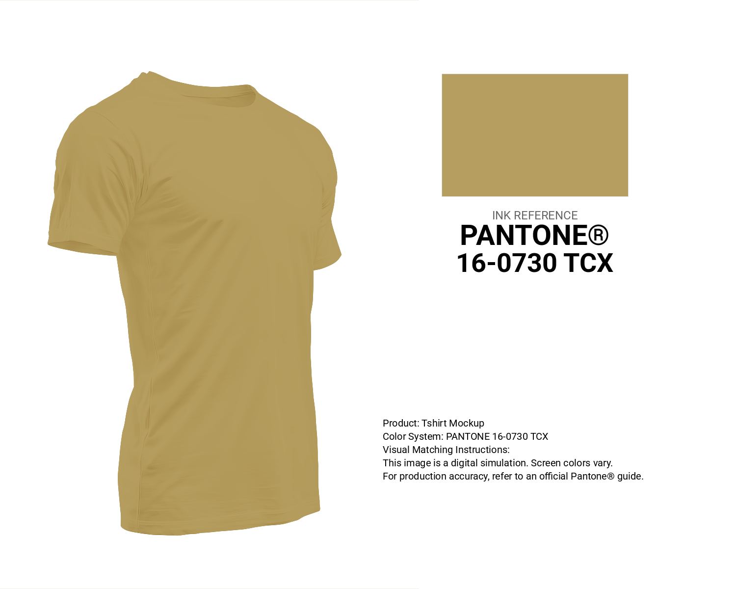
#b59e5f Pantone 16-0730 Tcx Antique Gold Color | Hex color Code #b59e5f T-Shirt Mockup
Download T-Shirt Mockup
#b59e5f Pantone 16-0730 Tcx Antique Gold Color | Hex color Code #b59e5f Printing Artwork Pantone Reference
Download Pantone Printing Reference
Antique Gold - #b59e5f Color Name
Download Color NameRelated Color Palettes
- Light Slate Gray and Dark Slate Gray •
- Goldenrod and Dark Gray •
- Slate Gray and Plum •
- Dim Gray and Wheat •
- Light Steel Blue and Dim Gray •
- Salmon and Dim Gray •
- Gray and Rosy Brown •
- Lemon Chiffon and Dark Slate Gray •
- Light Slate Gray and Black •
- White Smoke and Dark Gray •
- Olive Drab and Light Slate Gray •
- Slate Gray and Dark Olive Green •
- Dark Cyan and Dim Gray •
- Light Gray and Burly Wood •
- Light Gray and Light Gray
Color Palette Collection
117 Yellow Color Palettes
117 color palettes with 585 colors.

25 Blue Color Palettes
25 color palettes with 125 colors.

31 Purple Color Combinations
31 color palettes with 155 colors.

ERGO
1 color palettes with 5 colors.