#B2B4B2 Color
Your all-in-one color resource. Download hex background images, Adobe swatches (ASE), PDF color sheets, and SVG files. Explore palettes, harmonies, accessibility, conversions, and professional exports — designed for designers, developers, and color perfectionists.
This muted, grayish-beige evokes a sense of calm stability and quiet contemplation. It's reminiscent of a sun-drenched, lightly textured field of grass or the soft, diffused light of a cloudy day. The color is grounding and reassuring, creating a tranquil and unassuming atmosphere. It's suitable for spaces needing to foster a sense of peace and balance, such as a library or a quiet study. The subtle tone works well in minimalist settings, allowing other elements to take center stage, and avoids overwhelming the eye. It's a color of quiet confidence and understated elegance. Visually matched named color: Neutral Ground.
PANTONE 421 C
Choose Color
Selected Color
Recent Colors
Color Details
Similar Ink Alternatives for #B2B4B2 color Alternative print inks for reproducing #B2B4B2 background image with a similar visual appearance.
Disclaimer: The visually matched ink reference is an independent approximation intended as a guide only. Please be advised that this pantone colors is only intended as a guide, Actual colours will depend on screen calibration variances. The print ink suggestions provided are independent visual approximations and are not affiliated with or endorsed by Pantone LLC. For official color specifications, conversion factors, and comprehensive color system information, please visit Pantone Connect. Official Pantone products can be purchased at pantone.com.
Color Previews for #000000 See how this color looks as a background or as text.
Complete Guide to Your Color Laboratory
Everything you need to know about this professional color toolkit.
Use the Color Picker at the top to select any color. All modules below update instantly.
Workflow: Pick a color → Explore palettes & data → Download what you need (PDF, Image, or Adobe ASE).
Color Details — Your color in all formats: HEX, RGB, RGBA, HSL, HSLA, HSV, CMYK, CIELab, Hunter-Lab, XYZ, Yxy, YUV. One-click copy.
Color Psychology — Emotional impact, cultural meanings, physiological effects, branding applications, and historical significance.
Named Colors — Find official color names (HTML/CSS, Pantone) that match your selection with similarity percentages.
Light & Dark Shades
80-step gradient from black to white. Perfect for button states and component systems.
Tints
Color mixed with white → lighter, pastel variations for backgrounds and disabled states.
Monochromatic — 11 curated tints/shades from one color. Production-ready for design systems.
- Complementary — Opposite on wheel (180°). High contrast.
- Analogous — Neighbors (±30°). Harmonious flow.
- Triadic — Three colors (120° apart). Vibrant, balanced.
- Split-Complementary — Base + two near-complements. Softer contrast.
- Tetradic/Square — Four colors. Complex, maximum variety.
- Neutral — Desaturated versions. Subtle, sophisticated.
15 Professional Variations — Monochromatic, Analogous, Complementary, Warm/Cool/Earth Tones, Pastel, Vibrant, High Contrast, and more.
Color Infusion — 10 palettes showing your color morphing into each major hue. Find bridge colors.
Similar Colors — 60+ colors generated via CIELAB Delta E matching. Unexpected harmonious combinations.
18 Ready-to-Use Gradients — Complementary, Analogous, Triadic, Tint/Shade progressions, and more.
Downloads: PNG (2560×1440), CSS (production-ready code), SVG (scalable vector).
WCAG Contrast Checker — Tests your color against white, black, and custom colors for AA (4.5:1) and AAA (7:1) compliance. Large text thresholds included.
Harmony & Accessibility Guide — Tests against 10 canonical hues. Shows which pairs are both beautiful AND WCAG-compliant for text.
PNG/JPG — High-res images for presentations and mood boards.
PDF — Print-ready reports for clients and teams.
Adobe ASE — Direct import to Photoshop, Illustrator, InDesign, XD.
CSS/SVG — Gradients only. Production-ready code and vectors.
Color Science: Industry-standard conversions (HSL, CIELAB, CMYK, XYZ). WCAG 2.1 luminance formula. Delta E (ΔE76) for perceptual matching.
Direct Links: Share colors via icolorpalette.com/color/ff5733 or icolorpalette.com/color/red
Issues? Refresh the page, wait for rendering, try another browser, or check console (F12) for errors.
Printing Guide for #b2b4b2 Background Image
Use PANTONE 421 C as a visually matched ink reference when printing this background image.
To print the #b2b4b2 background image from our site, consider using PANTONE 421 C as a visually matched ink reference.
Download the background image, then provide this reference code to your print vendor to help achieve accurate color reproduction.
The visually matched ink reference for the #b2b4b2 background image is PANTONE 421 C.
This color is commonly described as Neutral Ground.
This muted, grayish-beige evokes a sense of calm stability and quiet contemplation. It's reminiscent of a sun-drenched, lightly textured field of grass or the soft, diffused light of a cloudy day. The color is grounding and reassuring, creating a tranquil and unassuming atmosphere. It's suitable for spaces needing to foster a sense of peace and balance, such as a library or a quiet study. The subtle tone works well in minimalist settings, allowing other elements to take center stage, and avoids overwhelming the eye. It's a color of quiet confidence and understated elegance.
We provide PANTONE 421 C as a visually matched ink reference to help you reproduce the #b2b4b2 background image accurately in professional printing.
This reference code helps print vendors achieve consistent color output across different printing equipment and materials.
After downloading the #b2b4b2 background image from our site:
- Include the visually matched ink reference PANTONE 421 C in your print order notes
- Inform your print vendor that this is your target color reference
- Request a proof print to verify the Neutral Ground color appearance before full production
The #b2b4b2 background image with PANTONE 421 C as visually matched ink reference can be used for:
- Posters, banners, and backdrops
- Business cards, brochures, and flyers
- Packaging, labels, and stickers
- Signage and promotional materials
This is an independent visual approximation.
While PANTONE 421 C closely matches the #b2b4b2 background image color, variations may exist between screen display and printed output.
We recommend requesting a proof print to verify the final appearance.
This muted, grayish-beige evokes a sense of calm stability and quiet contemplation. It's reminiscent of a sun-drenched, lightly textured field of grass or the soft, diffused light of a cloudy day. The color is grounding and reassuring, creating a tranquil and unassuming atmosphere. It's suitable for spaces needing to foster a sense of peace and balance, such as a library or a quiet study. The subtle tone works well in minimalist settings, allowing other elements to take center stage, and avoids overwhelming the eye. It's a color of quiet confidence and understated elegance.
Understanding these associations helps ensure the #b2b4b2 background image aligns with your intended message and brand impact.
Important Information
The visually matched ink reference is an independent approximation intended as a guide only.
Actual printed colors may vary depending on screen calibration, substrate material, ink type, and printing equipment used.
For official color specifications and certified color standards, visit Pantone Connect.
Official color guides and swatch books can be purchased from pantone.com.
Pantone 421 C Color: Subtle Thunder | #B2B4B2
Introduction:
Subtle Thunder is a color with a muted grayish tone. It embodies a sense of quiet calmness and sophistication.
Historical Significance:
Usage in Design: Subtle Thunder has been used in classic interior design styles, creating elegant and timeless spaces.
Symbolism and Meaning:
Ambiguity: Subtle Thunder symbolizes ambiguity and neutrality, often used in minimalist designs to convey a sense of balance.
Subtle Thunder in Fashion:
Muted Elegance: Subtle Thunder is often used in fashion to create subdued and sophisticated looks. It adds a touch of grace and refinement to outfits.
Subtle Thunder in Graphic Design:
Minimalistic Aesthetic: Subtle Thunder is commonly used in graphic design to create a clean and sleek visual impact. It is often employed in branding to convey a sense of professionalism and reliability.
Color Combinations:
Harmonious Combinations: Subtle Thunder pairs well with other muted neutrals such as beige, off-white, and light grays. It also provides a calming contrast when combined with deeper shades of blue and green.
Nature’s Palette:
Stone and Concrete: Subtle Thunder can be found in natural elements such as stones and concrete, adding a sense of stability and strength to various landscapes.
Artistic Representations:
Minimalist Art: Subtle Thunder has been utilized by artists to convey simplicity and elegance in their work. It is often seen in minimalist paintings and sculptures.
Movies and Cinematic Landscapes:
Subtle Atmosphere: Subtle Thunder is often used in movies and cinematic landscapes to create a calm and serene ambiance.
Products and Commercial Appeal:
Affordable Luxury: Subtle Thunder is frequently seen in products and brands that aim to convey an image of affordable luxury and sophistication.
National Symbols and Significance:
Neutral Ground: Subtle Thunder holds no specific national or cultural significance but is often associated with neutrality and balance.
The Psychological and Emotional Impact:
Tranquility: Subtle Thunder evokes a sense of tranquility and calmness. It can help reduce stress and create a peaceful environment.
Conclusion:
Subtle Thunder, Pantone 421 C color, is a versatile neutral tone. Its historical significance in design, symbolism of ambiguity, and calming effect make it a timeless choice in various industries, including fashion, graphic design, and interior design.
Pantone 421 C Color | Hex color Code #b2b4b2 Image & Artwork
Download high-quality assets for your projects.

#b2b4b2 Color Schemes
Download Color Schemes
#b2b4b2 Color Shades
Download Color Shades
Pantone 421 C Color | Hex color Code #b2b4b2 Solid Color Background
Download Solid Color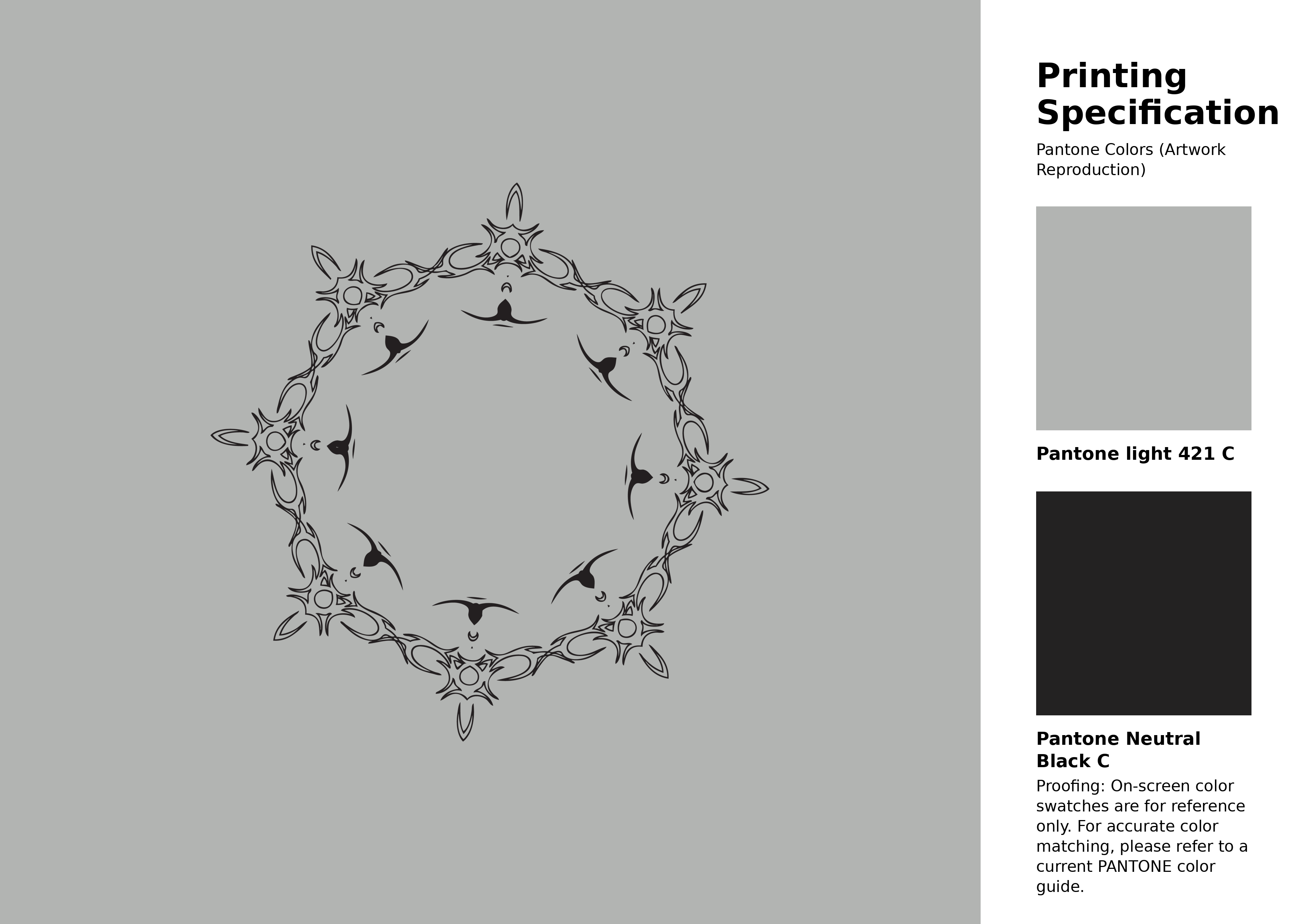
#b2b4b2 Pantone 421 C Color | Hex color Code #b2b4b2 Artwork Image (PNG)
Download Artwork (PNG)#b2b4b2 Pantone 421 C Color | Hex color Code #b2b4b2 Artwork Vector (PDF)
Download Artwork (PDF)#b2b4b2 Pantone 421 C Color | Hex color Code #b2b4b2 Artwork Vector (SVG)
Download Artwork (SVG)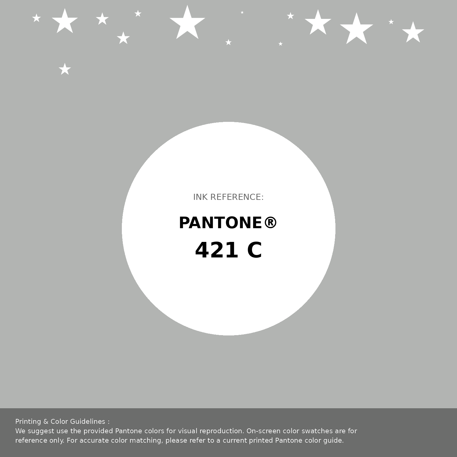
#b2b4b2 Pantone 421 C Color | Hex color Code #b2b4b2 Pantone Swatch Artwork
Download Artwork Swatch
#b2b4b2 Pantone 421 C Color | Hex color Code #b2b4b2 Gradient Artwork (PNG)
Download Gradient (PNG)#b2b4b2 Pantone 421 C Color | Hex color Code #b2b4b2 Gradient Artwork (SVG)
Download Gradient (SVG)
#b2b4b2 Pantone 421 C Color | Hex color Code #b2b4b2 T-Shirt Mockup
Download T-Shirt Mockup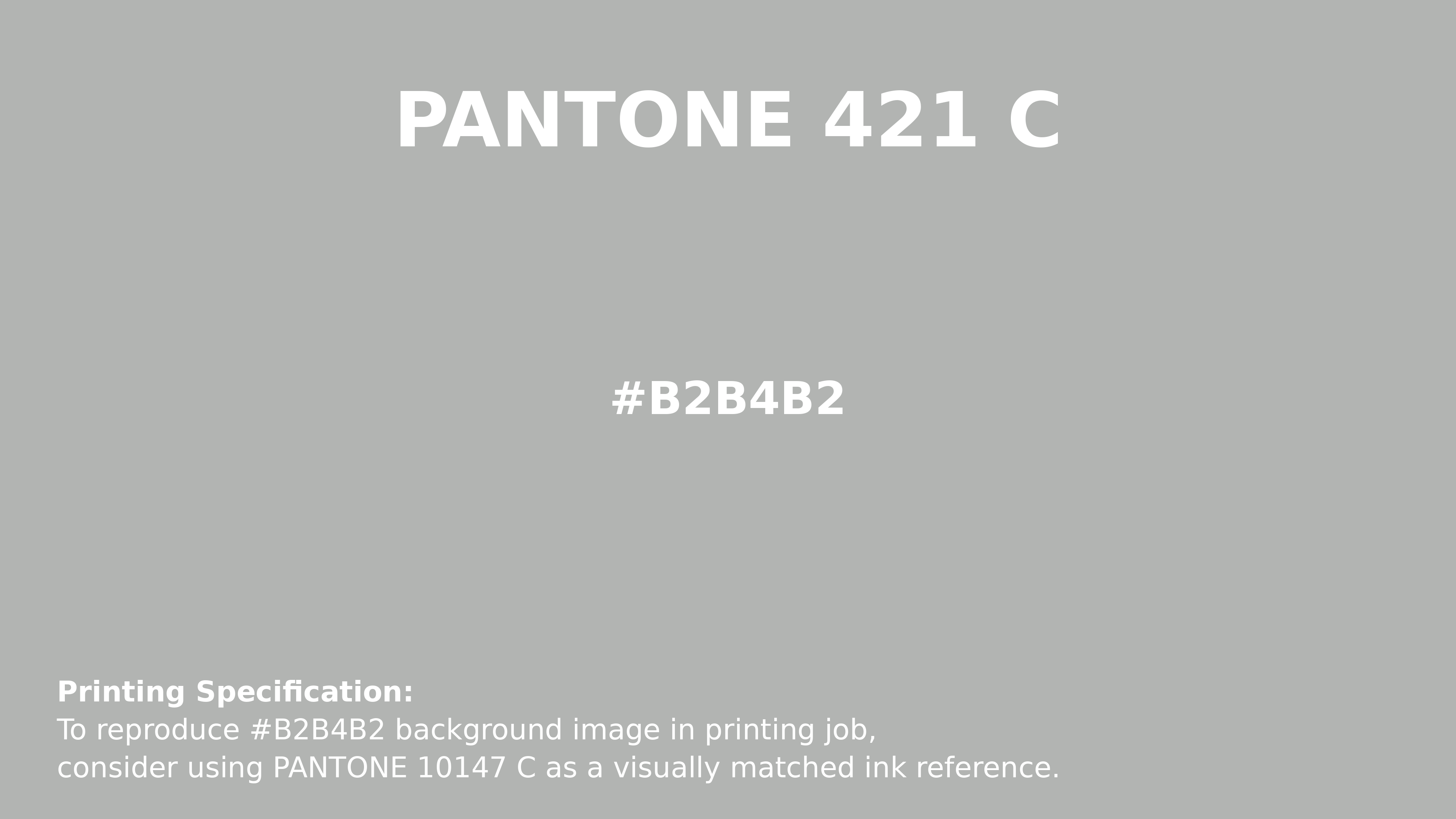
#b2b4b2 Pantone 421 C Color | Hex color Code #b2b4b2 Printing Artwork Pantone Reference
Download Pantone Printing ReferenceRelated Color Palettes
- Slate Blue and Medium Purple •
- Dark Olive Green and Medium Purple •
- Slate Gray and Medium Purple •
- Royal Purple •
- Medium Purple and Dark Khaki •
- Dark Khaki and Medium Purple •
- Medium Purple and Midnight Blue •
- Lavender Purple •
- Medium Purple •
- Purple Heart •
- Medium Purple and Dark Orchid •
- Purple Mountain's Majesty •
- Medium Violet Red and Purple •
- Medium Purple and Dark Slate Gray •
- Gray and Medium Purple
Color Palette Collection
ADC Website Accents
1 color palettes with 5 colors.
125 Yellow Color Palettes
125 color palettes with 625 colors.

49 Beautiful curated Color Schemes For Your Next Design Project
49 color palettes with 245 colors.

36 Orange shades Color Palette Collection
36 color palettes with 180 colors.