#ACDFDD Color
Your all-in-one color resource. Download hex background images, Adobe swatches (ASE), PDF color sheets, and SVG files. Explore palettes, harmonies, accessibility, conversions, and professional exports — designed for designers, developers, and color perfectionists.
This soft, light blue-gray hue evokes a sense of tranquil openness and vastness. It reminds one of a clear summer sky, the vastness of the ocean, and the gentle glow of dawn or dusk. The color creates a calm and airy atmosphere, promoting feelings of serenity and peace. It's a versatile color that can be used in various design applications, from bedrooms to living rooms, evoking a sense of serenity and quiet contemplation. The lightness and coolness of the color suggest a sense of spaciousness and freshness, making it ideal for promoting relaxation and a sense of calmness. Visually matched named color: Azure Sky.
PANTONE 13-4909 TCX
Choose Color
Selected Color
Recent Colors
Color Details
Similar Ink Alternatives for #ACDFDD color Alternative print inks for reproducing #ACDFDD background image with a similar visual appearance.
Disclaimer: The visually matched ink reference is an independent approximation intended as a guide only. Please be advised that this pantone colors is only intended as a guide, Actual colours will depend on screen calibration variances. The print ink suggestions provided are independent visual approximations and are not affiliated with or endorsed by Pantone LLC. For official color specifications, conversion factors, and comprehensive color system information, please visit Pantone Connect. Official Pantone products can be purchased at pantone.com.
Color Previews for #000000 See how this color looks as a background or as text.
Complete Guide to Your Color Laboratory
Everything you need to know about this professional color toolkit.
Use the Color Picker at the top to select any color. All modules below update instantly.
Workflow: Pick a color → Explore palettes & data → Download what you need (PDF, Image, or Adobe ASE).
Color Details — Your color in all formats: HEX, RGB, RGBA, HSL, HSLA, HSV, CMYK, CIELab, Hunter-Lab, XYZ, Yxy, YUV. One-click copy.
Color Psychology — Emotional impact, cultural meanings, physiological effects, branding applications, and historical significance.
Named Colors — Find official color names (HTML/CSS, Pantone) that match your selection with similarity percentages.
Light & Dark Shades
80-step gradient from black to white. Perfect for button states and component systems.
Tints
Color mixed with white → lighter, pastel variations for backgrounds and disabled states.
Monochromatic — 11 curated tints/shades from one color. Production-ready for design systems.
- Complementary — Opposite on wheel (180°). High contrast.
- Analogous — Neighbors (±30°). Harmonious flow.
- Triadic — Three colors (120° apart). Vibrant, balanced.
- Split-Complementary — Base + two near-complements. Softer contrast.
- Tetradic/Square — Four colors. Complex, maximum variety.
- Neutral — Desaturated versions. Subtle, sophisticated.
15 Professional Variations — Monochromatic, Analogous, Complementary, Warm/Cool/Earth Tones, Pastel, Vibrant, High Contrast, and more.
Color Infusion — 10 palettes showing your color morphing into each major hue. Find bridge colors.
Similar Colors — 60+ colors generated via CIELAB Delta E matching. Unexpected harmonious combinations.
18 Ready-to-Use Gradients — Complementary, Analogous, Triadic, Tint/Shade progressions, and more.
Downloads: PNG (2560×1440), CSS (production-ready code), SVG (scalable vector).
WCAG Contrast Checker — Tests your color against white, black, and custom colors for AA (4.5:1) and AAA (7:1) compliance. Large text thresholds included.
Harmony & Accessibility Guide — Tests against 10 canonical hues. Shows which pairs are both beautiful AND WCAG-compliant for text.
PNG/JPG — High-res images for presentations and mood boards.
PDF — Print-ready reports for clients and teams.
Adobe ASE — Direct import to Photoshop, Illustrator, InDesign, XD.
CSS/SVG — Gradients only. Production-ready code and vectors.
Color Science: Industry-standard conversions (HSL, CIELAB, CMYK, XYZ). WCAG 2.1 luminance formula. Delta E (ΔE76) for perceptual matching.
Direct Links: Share colors via icolorpalette.com/color/ff5733 or icolorpalette.com/color/red
Issues? Refresh the page, wait for rendering, try another browser, or check console (F12) for errors.
Printing Guide for #acdfdd Background Image
Use PANTONE 13-4909 TCX as a visually matched ink reference when printing this background image.
To print the #acdfdd background image from our site, consider using PANTONE 13-4909 TCX as a visually matched ink reference.
Download the background image, then provide this reference code to your print vendor to help achieve accurate color reproduction.
The visually matched ink reference for the #acdfdd background image is PANTONE 13-4909 TCX.
This color is commonly described as Azure Sky.
This soft, light blue-gray hue evokes a sense of tranquil openness and vastness. It reminds one of a clear summer sky, the vastness of the ocean, and the gentle glow of dawn or dusk. The color creates a calm and airy atmosphere, promoting feelings of serenity and peace. It's a versatile color that can be used in various design applications, from bedrooms to living rooms, evoking a sense of serenity and quiet contemplation. The lightness and coolness of the color suggest a sense of spaciousness and freshness, making it ideal for promoting relaxation and a sense of calmness.
We provide PANTONE 13-4909 TCX as a visually matched ink reference to help you reproduce the #acdfdd background image accurately in professional printing.
This reference code helps print vendors achieve consistent color output across different printing equipment and materials.
After downloading the #acdfdd background image from our site:
- Include the visually matched ink reference PANTONE 13-4909 TCX in your print order notes
- Inform your print vendor that this is your target color reference
- Request a proof print to verify the Azure Sky color appearance before full production
The #acdfdd background image with PANTONE 13-4909 TCX as visually matched ink reference can be used for:
- Posters, banners, and backdrops
- Business cards, brochures, and flyers
- Packaging, labels, and stickers
- Signage and promotional materials
This is an independent visual approximation.
While PANTONE 13-4909 TCX closely matches the #acdfdd background image color, variations may exist between screen display and printed output.
We recommend requesting a proof print to verify the final appearance.
This soft, light blue-gray hue evokes a sense of tranquil openness and vastness. It reminds one of a clear summer sky, the vastness of the ocean, and the gentle glow of dawn or dusk. The color creates a calm and airy atmosphere, promoting feelings of serenity and peace. It's a versatile color that can be used in various design applications, from bedrooms to living rooms, evoking a sense of serenity and quiet contemplation. The lightness and coolness of the color suggest a sense of spaciousness and freshness, making it ideal for promoting relaxation and a sense of calmness.
Understanding these associations helps ensure the #acdfdd background image aligns with your intended message and brand impact.
Important Information
The visually matched ink reference is an independent approximation intended as a guide only.
Actual printed colors may vary depending on screen calibration, substrate material, ink type, and printing equipment used.
For official color specifications and certified color standards, visit Pantone Connect.
Official color guides and swatch books can be purchased from pantone.com.
Blue Light Color: A Soothing Shade of Blue | #acdfdd
Introduction:
Blue Light Color is a light, pastel shade of blue that exudes a calm and soothing essence. Its visual appeal lies in its soft and gentle appearance, making it a popular choice for creating a serene atmosphere.
Historical Significance:
Early Usage: Blue Light Color has been used throughout history in various forms of art and design. In ancient civilizations, it symbolized tranquility and harmony.
Renaissance Period: During the Renaissance, the color gained popularity among artists who admired its delicate and ethereal qualities. It was often used to depict serene landscapes and peaceful scenes.
Modern Times: In the modern era, Blue Light Color has remained a popular choice in interior design and fashion for creating a sense of calmness and relaxation.
Symbolism and Meaning:
Cultural Symbolism: Blue Light Color is commonly associated with tranquility, peace, and serenity in various cultures. It represents a sense of tranquility and clarity, and is often used to evoke feelings of relaxation and calmness.
Spiritual Meanings: In spiritual practices, Blue Light Color symbolizes spiritual awakening and enlightenment. It is believed to bring a sense of peace and harmony to the mind, body, and soul.
Psychological Impact: Blue Light Color has a soothing effect on the mind and can help reduce stress and anxiety. It is often used in therapeutic settings to create a peaceful and calming environment.
Blue Light Color in Fashion:
Blue Light Color has made its mark in the fashion industry, particularly in spring and summer collections. It is often used in clothing and accessories to create a fresh and airy look. It pairs well with neutral tones and other shades of blue, creating stylish and elegant ensembles.
Blue Light Color in Graphic Design:
In graphic design, Blue Light Color is widely used for its calming and soothing properties. It is often used in branding to create a sense of trust and reliability. Its soft and gentle nature makes it an ideal choice for creating visually appealing designs with a calming effect.
Color Combinations:
Blue Light Color pairs well with a variety of colors, including shades of white, cream, and gray. It also works well with other pastel shades, such as blush pink and light lavender. Combining Blue Light Color with these colors creates a harmonious and serene color palette.
Nature’s Palette:
Blue Light Color can be found in nature in the form of delicate flowers, such as forget-me-nots and baby's breath. It also resembles the color of clear skies and calm waters, creating a sense of tranquility and serenity in natural landscapes.
Artistic Representations:
Throughout art history, Blue Light Color has been used by artists to depict serene scenes, peaceful atmospheres, and ethereal landscapes. It has been a popular choice in landscape paintings and impressionist art, capturing the calmness and tranquility of various natural settings.
Movies and Cinematic Landscapes:
Blue Light Color is often used in movies and cinematic landscapes to create a soothing and calming atmosphere. It is frequently seen in scenes that depict peaceful environments, dream sequences, or moments of reflection and introspection.
Products and Commercial Appeal:
Several products and brands utilize Blue Light Color in their branding to evoke a sense of trust, reliability, and relaxation. It is commonly used in skincare, wellness, and home decor industries to create a calming and serene image associated with their products.
National Symbols and Significance:
Blue Light Color holds significance in various national flags and emblems around the world. It often represents qualities such as peace, freedom, and harmony. Notable examples include the flag of Argentina and the emblem of the United Nations.
The Psychological and Emotional Impact:
Blue Light Color has a calming and soothing effect on our emotions and psychology. It can help reduce stress and anxiety, promote relaxation, and create a sense of tranquility. It is often used in therapeutic settings and meditation spaces to create a peaceful environment.
Conclusion:
In conclusion, Blue Light Color is a serene and calming shade of blue. Its historical significance, symbolism, and peaceful nature make it a timeless choice in various aspects of life, from fashion and design to art and emotional well-being.
Pantone 13-4909 Tcx Blue Light Color | Hex color Code #acdfdd Image & Artwork
Download high-quality assets for your projects.

#acdfdd Color Schemes
Download Color Schemes
#acdfdd Color Shades
Download Color Shades
Pantone 13-4909 Tcx Blue Light Color | Hex color Code #acdfdd Solid Color Background
Download Solid Color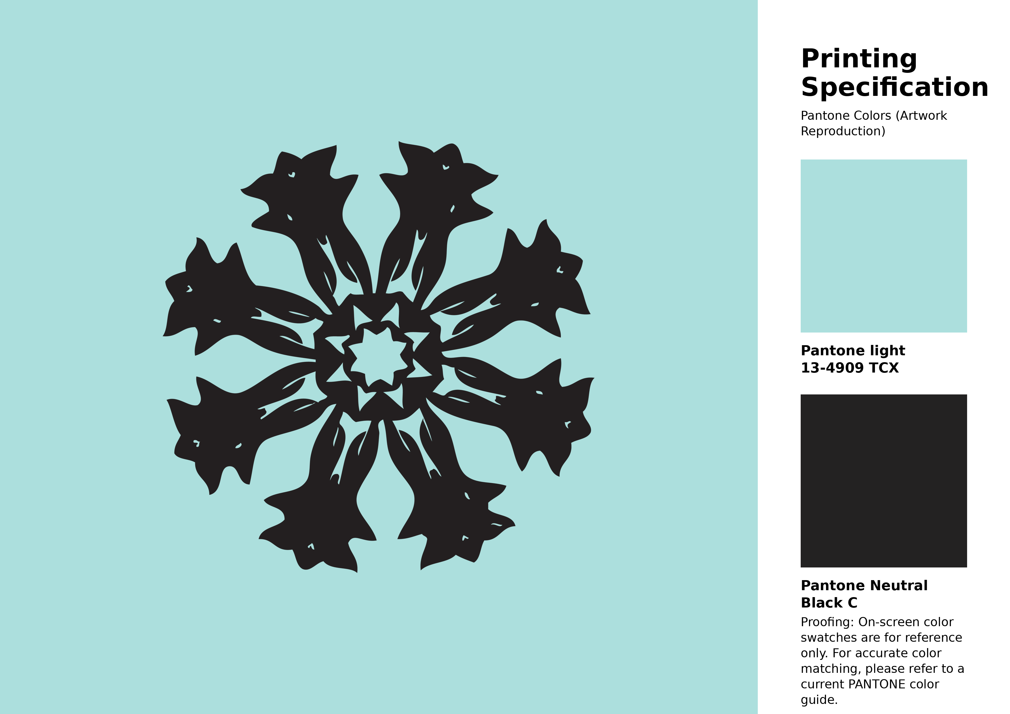
#acdfdd Pantone 13-4909 Tcx Blue Light Color | Hex color Code #acdfdd Artwork Image (PNG)
Download Artwork (PNG)#acdfdd Pantone 13-4909 Tcx Blue Light Color | Hex color Code #acdfdd Artwork Vector (PDF)
Download Artwork (PDF)#acdfdd Pantone 13-4909 Tcx Blue Light Color | Hex color Code #acdfdd Artwork Vector (SVG)
Download Artwork (SVG)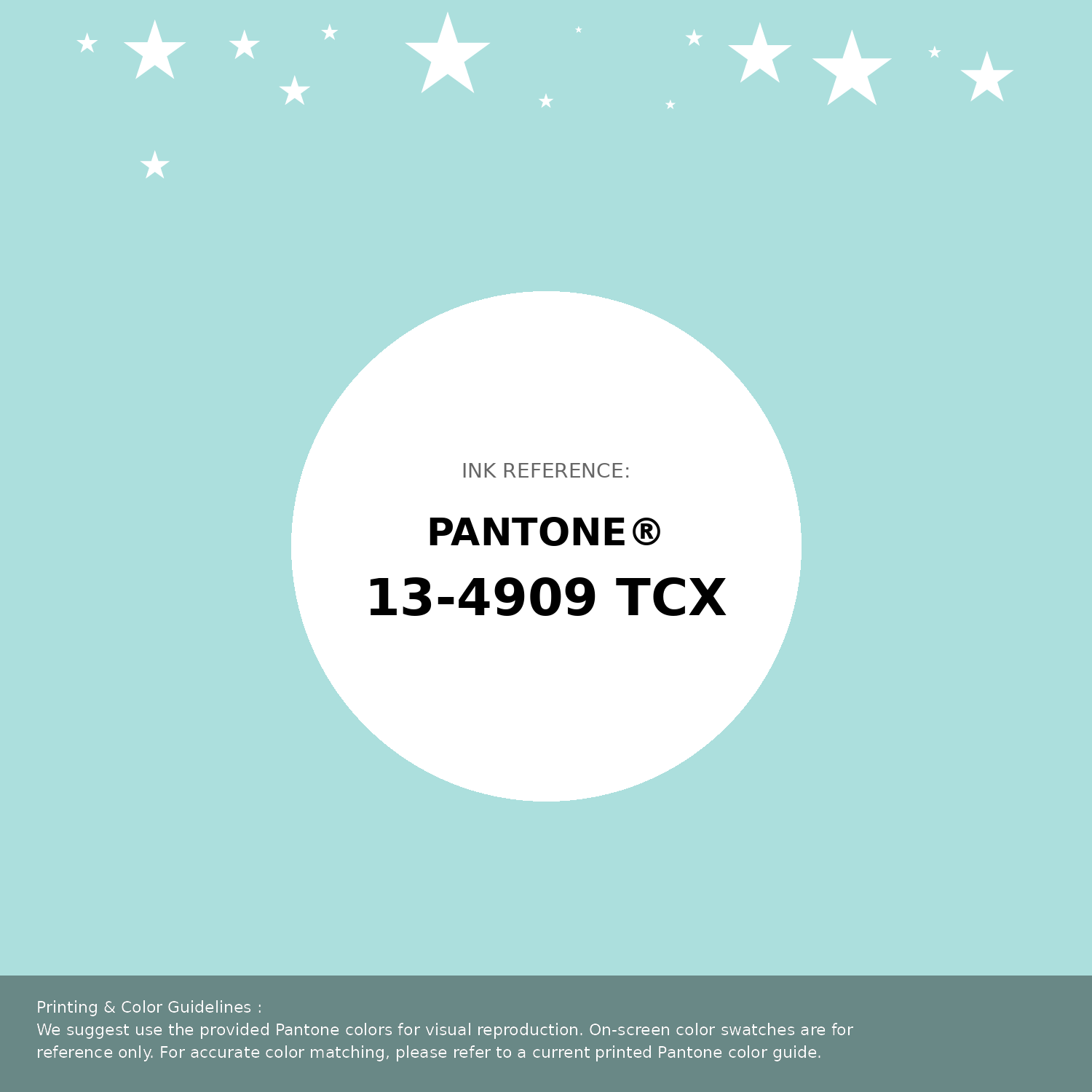
#acdfdd Pantone 13-4909 Tcx Blue Light Color | Hex color Code #acdfdd Pantone Swatch Artwork
Download Artwork Swatch
#acdfdd Pantone 13-4909 Tcx Blue Light Color | Hex color Code #acdfdd Gradient Artwork (PNG)
Download Gradient (PNG)#acdfdd Pantone 13-4909 Tcx Blue Light Color | Hex color Code #acdfdd Gradient Artwork (SVG)
Download Gradient (SVG)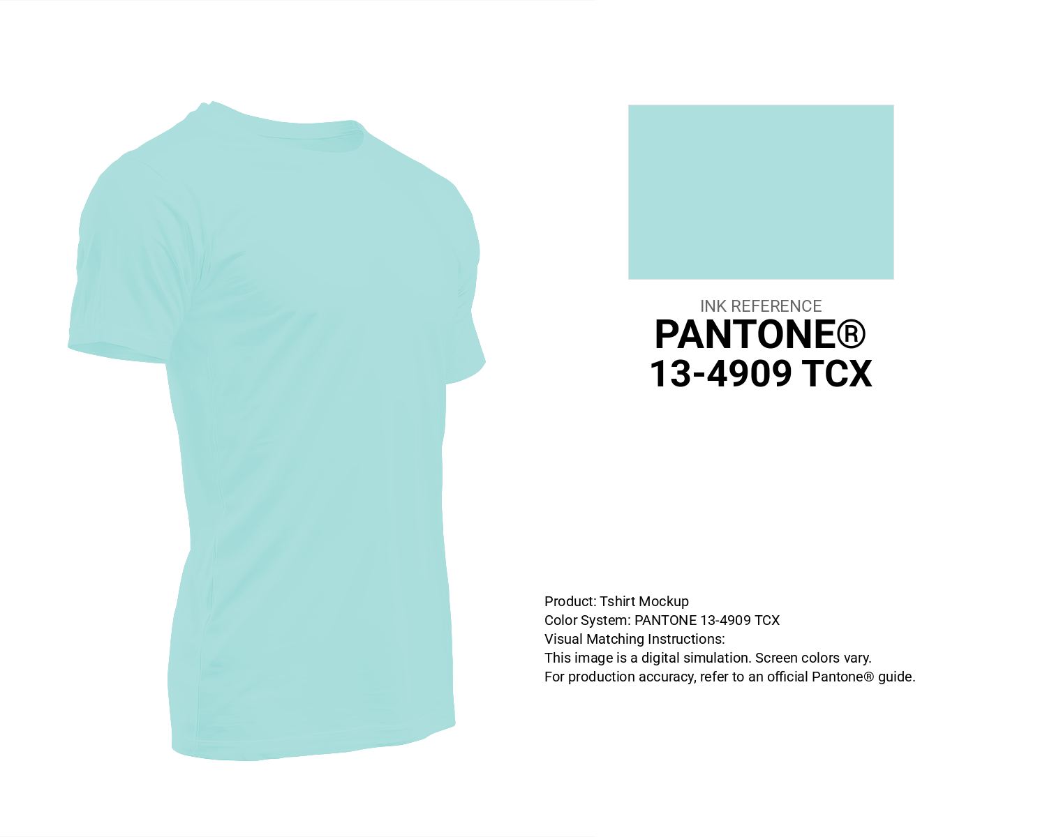
#acdfdd Pantone 13-4909 Tcx Blue Light Color | Hex color Code #acdfdd T-Shirt Mockup
Download T-Shirt Mockup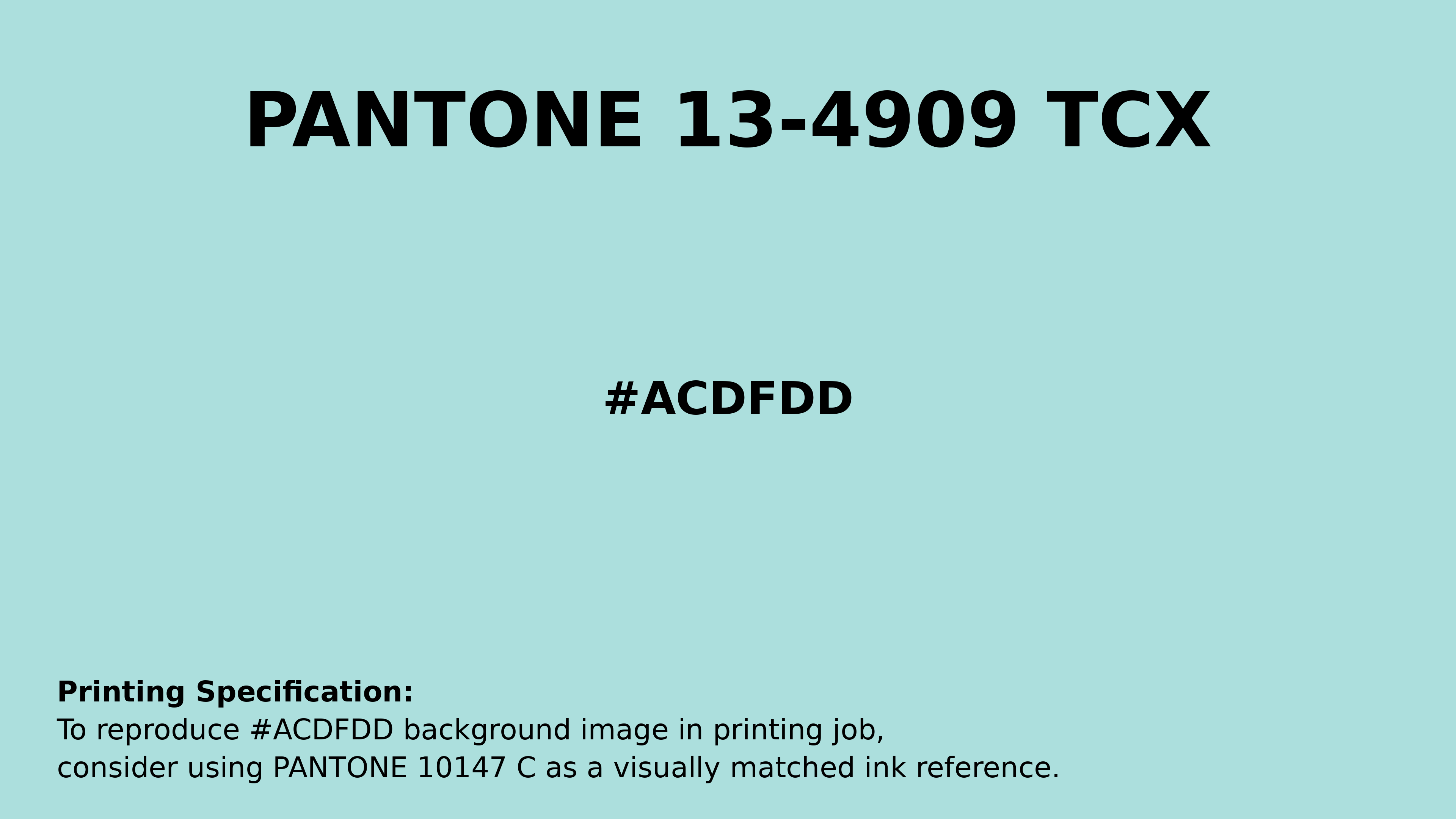
#acdfdd Pantone 13-4909 Tcx Blue Light Color | Hex color Code #acdfdd Printing Artwork Pantone Reference
Download Pantone Printing Reference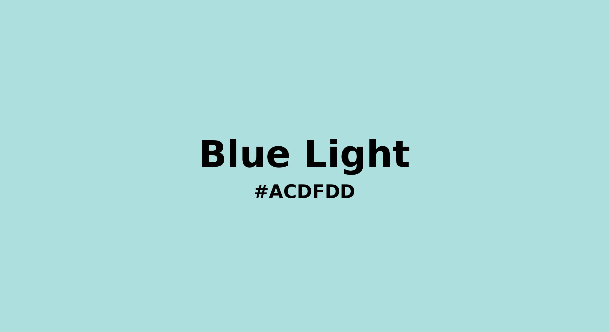
Blue Light - #acdfdd Color Name
Download Color NameRelated Color Palettes
- Beige and Gold •
- Beige and Sienna •
- Beige and Sea Green •
- Brown and Beige •
- Beige and Black •
- Peru and Beige •
- Powder Blue and Beige •
- Crimson and Beige •
- Beige and Steel Blue •
- Beige and Dark Green •
- Beige and Forest Green •
- Beige and Burly Wood •
- Beige and Dark Salmon •
- Khaki and Beige •
- Beige and Olive
Color Palette Collection
My Red Color Palettes
20 color palettes with 100 colors.
Home vibes
1 color palettes with 5 colors.
80 Pastel Light color Palettes
80 color palettes with 400 colors.

18 Light Color Palettes Collection
18 color palettes with 90 colors.