#A2AAAD Color
Your all-in-one color resource. Download hex background images, Adobe swatches (ASE), PDF color sheets, and SVG files. Explore palettes, harmonies, accessibility, conversions, and professional exports — designed for designers, developers, and color perfectionists.
This muted gray-blue evokes a sense of quiet contemplation and introspection. It's reminiscent of a cloudy winter sky or a dimly lit library, suggesting a peaceful and thoughtful atmosphere. The color feels grounded and reliable, promoting a sense of calm and focus. In design, it could be used to create a sophisticated and serene space, perfect for study rooms or meditation areas. Its subtle nature allows it to blend with other colors and create a neutral backdrop for more vibrant elements. Visually matched named color: Quiet Reflection.
PANTONE 429 C
Choose Color
Selected Color
Recent Colors
Color Details
Similar Ink Alternatives for #A2AAAD color Alternative print inks for reproducing #A2AAAD background image with a similar visual appearance.
Disclaimer: The visually matched ink reference is an independent approximation intended as a guide only. Please be advised that this pantone colors is only intended as a guide, Actual colours will depend on screen calibration variances. The print ink suggestions provided are independent visual approximations and are not affiliated with or endorsed by Pantone LLC. For official color specifications, conversion factors, and comprehensive color system information, please visit Pantone Connect. Official Pantone products can be purchased at pantone.com.
Color Previews for #000000 See how this color looks as a background or as text.
Complete Guide to Your Color Laboratory
Everything you need to know about this professional color toolkit.
Use the Color Picker at the top to select any color. All modules below update instantly.
Workflow: Pick a color → Explore palettes & data → Download what you need (PDF, Image, or Adobe ASE).
Color Details — Your color in all formats: HEX, RGB, RGBA, HSL, HSLA, HSV, CMYK, CIELab, Hunter-Lab, XYZ, Yxy, YUV. One-click copy.
Color Psychology — Emotional impact, cultural meanings, physiological effects, branding applications, and historical significance.
Named Colors — Find official color names (HTML/CSS, Pantone) that match your selection with similarity percentages.
Light & Dark Shades
80-step gradient from black to white. Perfect for button states and component systems.
Tints
Color mixed with white → lighter, pastel variations for backgrounds and disabled states.
Monochromatic — 11 curated tints/shades from one color. Production-ready for design systems.
- Complementary — Opposite on wheel (180°). High contrast.
- Analogous — Neighbors (±30°). Harmonious flow.
- Triadic — Three colors (120° apart). Vibrant, balanced.
- Split-Complementary — Base + two near-complements. Softer contrast.
- Tetradic/Square — Four colors. Complex, maximum variety.
- Neutral — Desaturated versions. Subtle, sophisticated.
15 Professional Variations — Monochromatic, Analogous, Complementary, Warm/Cool/Earth Tones, Pastel, Vibrant, High Contrast, and more.
Color Infusion — 10 palettes showing your color morphing into each major hue. Find bridge colors.
Similar Colors — 60+ colors generated via CIELAB Delta E matching. Unexpected harmonious combinations.
18 Ready-to-Use Gradients — Complementary, Analogous, Triadic, Tint/Shade progressions, and more.
Downloads: PNG (2560×1440), CSS (production-ready code), SVG (scalable vector).
WCAG Contrast Checker — Tests your color against white, black, and custom colors for AA (4.5:1) and AAA (7:1) compliance. Large text thresholds included.
Harmony & Accessibility Guide — Tests against 10 canonical hues. Shows which pairs are both beautiful AND WCAG-compliant for text.
PNG/JPG — High-res images for presentations and mood boards.
PDF — Print-ready reports for clients and teams.
Adobe ASE — Direct import to Photoshop, Illustrator, InDesign, XD.
CSS/SVG — Gradients only. Production-ready code and vectors.
Color Science: Industry-standard conversions (HSL, CIELAB, CMYK, XYZ). WCAG 2.1 luminance formula. Delta E (ΔE76) for perceptual matching.
Direct Links: Share colors via icolorpalette.com/color/ff5733 or icolorpalette.com/color/red
Issues? Refresh the page, wait for rendering, try another browser, or check console (F12) for errors.
Printing Guide for #a2aaad Background Image
Use PANTONE 429 C as a visually matched ink reference when printing this background image.
To print the #a2aaad background image from our site, consider using PANTONE 429 C as a visually matched ink reference.
Download the background image, then provide this reference code to your print vendor to help achieve accurate color reproduction.
The visually matched ink reference for the #a2aaad background image is PANTONE 429 C.
This color is commonly described as Quiet Reflection.
This muted gray-blue evokes a sense of quiet contemplation and introspection. It's reminiscent of a cloudy winter sky or a dimly lit library, suggesting a peaceful and thoughtful atmosphere. The color feels grounded and reliable, promoting a sense of calm and focus. In design, it could be used to create a sophisticated and serene space, perfect for study rooms or meditation areas. Its subtle nature allows it to blend with other colors and create a neutral backdrop for more vibrant elements.
We provide PANTONE 429 C as a visually matched ink reference to help you reproduce the #a2aaad background image accurately in professional printing.
This reference code helps print vendors achieve consistent color output across different printing equipment and materials.
After downloading the #a2aaad background image from our site:
- Include the visually matched ink reference PANTONE 429 C in your print order notes
- Inform your print vendor that this is your target color reference
- Request a proof print to verify the Quiet Reflection color appearance before full production
The #a2aaad background image with PANTONE 429 C as visually matched ink reference can be used for:
- Posters, banners, and backdrops
- Business cards, brochures, and flyers
- Packaging, labels, and stickers
- Signage and promotional materials
This is an independent visual approximation.
While PANTONE 429 C closely matches the #a2aaad background image color, variations may exist between screen display and printed output.
We recommend requesting a proof print to verify the final appearance.
This muted gray-blue evokes a sense of quiet contemplation and introspection. It's reminiscent of a cloudy winter sky or a dimly lit library, suggesting a peaceful and thoughtful atmosphere. The color feels grounded and reliable, promoting a sense of calm and focus. In design, it could be used to create a sophisticated and serene space, perfect for study rooms or meditation areas. Its subtle nature allows it to blend with other colors and create a neutral backdrop for more vibrant elements.
Understanding these associations helps ensure the #a2aaad background image aligns with your intended message and brand impact.
Important Information
The visually matched ink reference is an independent approximation intended as a guide only.
Actual printed colors may vary depending on screen calibration, substrate material, ink type, and printing equipment used.
For official color specifications and certified color standards, visit Pantone Connect.
Official color guides and swatch books can be purchased from pantone.com.
Pantone 429 C Color: Subtle Stone | #A2AAAD
Introduction:
Subtle Stone, represented by the color Pantone 429 C (#A2AAAD), is a serene and soothing hue that exudes a sense of calmness and stability. Its muted greyish-blue tone adds a touch of sophistication and elegance to any design.
Historical Significance:
Early Use: Subtle Stone has been used since ancient times as a pigment for cave paintings and frescoes.
Industrial Revolution: During the Industrial Revolution, Subtle Stone became popular in textile manufacturing and was commonly used for dyeing fabrics.
Modern Usage: In modern history, Subtle Stone has been widely used in architectural and interior design to create a calming and contemporary atmosphere.
Symbolism and Meaning:
Tranquility: Subtle Stone is often associated with tranquility and inner peace.
Simplicity: The understated elegance of Subtle Stone represents simplicity and minimalism.
Subtle Stone in Fashion:
Subtle Stone has been embraced by the fashion industry for its versatile and timeless appeal. It is often used as a neutral color in clothing and accessories.
Subtle Stone in Graphic Design:
In graphic design, Subtle Stone is valued for its ability to add depth and sophistication to visual compositions. It is often used to create a sense of balance and harmony.
Color Combinations:
Subtle Stone pairs well with other earthy tones such as warm browns and soft greens. It also complements shades of white and cream, creating a subtle and elegant color scheme.
Nature’s Palette:
Subtle Stone can be found in nature in the form of weathered stones, misty landscapes, and certain species of birds and sea creatures.
Artistic Representations:
Artists have used Subtle Stone in various mediums to convey a sense of calmness, tranquility, and harmony.
Movies and Cinematic Landscapes:
Subtle Stone often sets the tone for introspective and contemplative scenes in movies, adding an air of sophistication and depth to the cinematic landscapes.
Products and Commercial Appeal:
Many high-end brands use Subtle Stone in their branding to convey an image of luxury, elegance, and timelessness.
National Symbols and Significance:
No significant national or cultural significance is tied to Subtle Stone.
The Psychological and Emotional Impact:
Subtle Stone instills a sense of calmness, tranquility, and stability in individuals. It is believed to help reduce stress and promote relaxation.
Conclusion:
Subtle Stone, represented by the color Pantone 429 C, has a rich historical significance and is widely appreciated for its calming and sophisticated nature. Whether in fashion, graphic design, nature, or art, Subtle Stone continues to evoke timeless appeal and adds a touch of elegance to various contexts.
Pantone 429 C Color | Hex color Code #a2aaad Image & Artwork
Download high-quality assets for your projects.

#a2aaad Color Schemes
Download Color Schemes
#a2aaad Color Shades
Download Color Shades
Pantone 429 C Color | Hex color Code #a2aaad Solid Color Background
Download Solid Color
#a2aaad Pantone 429 C Color | Hex color Code #a2aaad Artwork Image (PNG)
Download Artwork (PNG)#a2aaad Pantone 429 C Color | Hex color Code #a2aaad Artwork Vector (PDF)
Download Artwork (PDF)#a2aaad Pantone 429 C Color | Hex color Code #a2aaad Artwork Vector (SVG)
Download Artwork (SVG)
#a2aaad Pantone 429 C Color | Hex color Code #a2aaad Pantone Swatch Artwork
Download Artwork Swatch
#a2aaad Pantone 429 C Color | Hex color Code #a2aaad Gradient Artwork (PNG)
Download Gradient (PNG)#a2aaad Pantone 429 C Color | Hex color Code #a2aaad Gradient Artwork (SVG)
Download Gradient (SVG)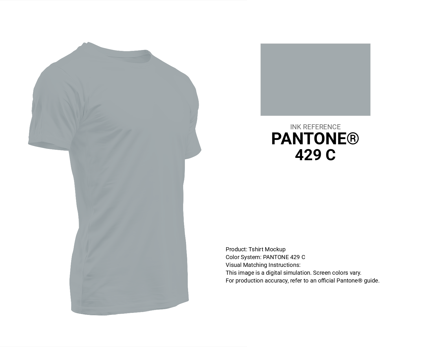
#a2aaad Pantone 429 C Color | Hex color Code #a2aaad T-Shirt Mockup
Download T-Shirt Mockup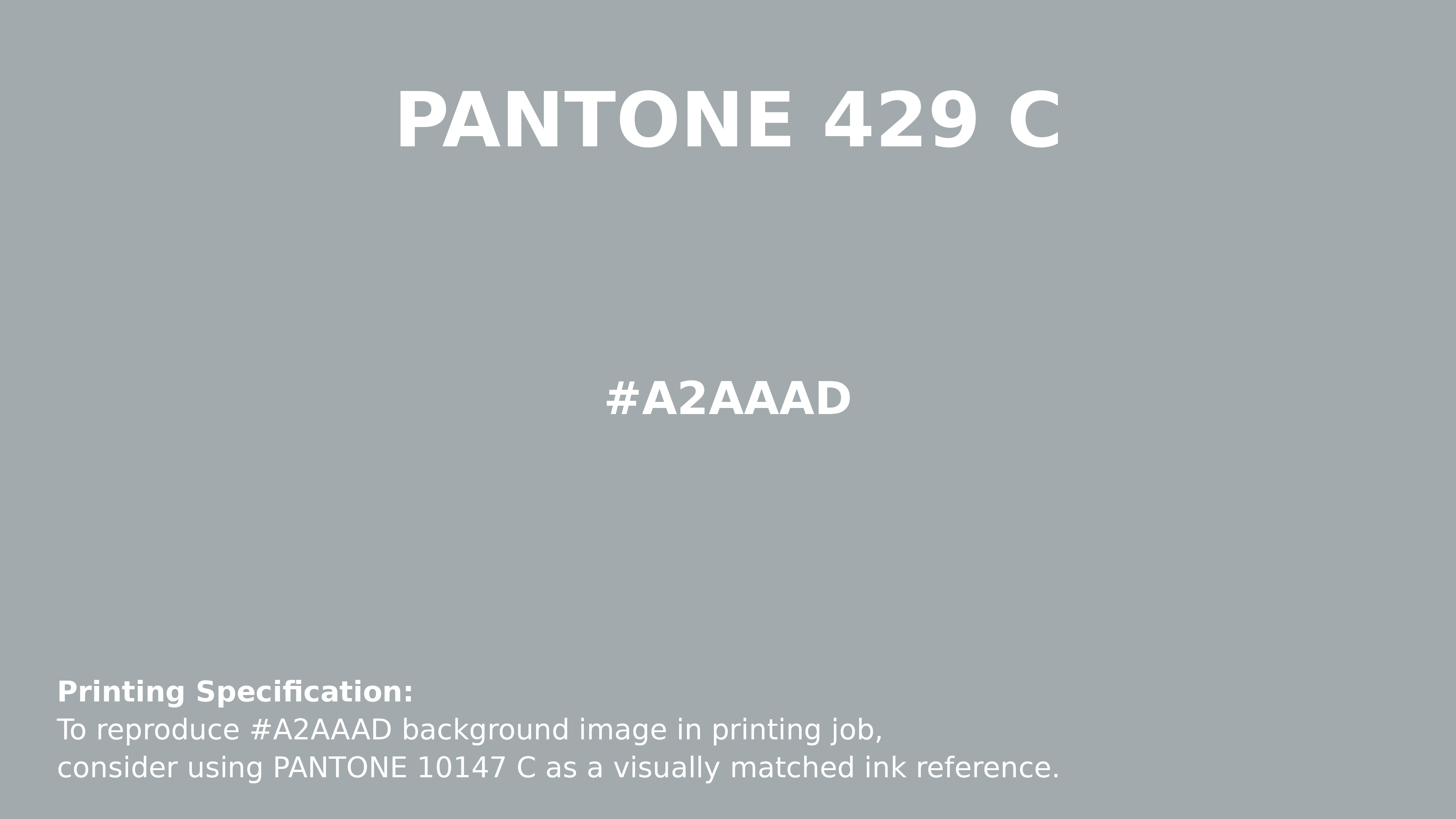
#a2aaad Pantone 429 C Color | Hex color Code #a2aaad Printing Artwork Pantone Reference
Download Pantone Printing ReferenceRelated Color Palettes
- Dim Gray and Khaki •
- Dim Gray and Forest Green •
- Navy and Dim Gray •
- Dim Gray and Light GoldenrodYellow •
- Maroon and Gray •
- Dark Slate Gray and Pale Goldenrod •
- Light Slate Gray and Olive •
- Light Sea Green and Dark Slate Gray •
- Dim Gray and Cadet Blue •
- Light Gray and Light Steel Blue •
- Light Slate Gray and Linen •
- Dark Gray and Dark Gray •
- Slate Blue and Light Slate Gray •
- Medium Purple and Gray •
- Dusty Gray and Gray
Color Palette Collection
15 Skin Tone Color Palettes
15 color palettes with 75 colors.

55 Nature Color Palettes
55 color palettes with 275 colors.

50 Green Color Palettes
50 color palettes with 250 colors.

89 Blue Color Palettes
89 color palettes with 445 colors.