#9BCBEB Color
Your all-in-one color resource. Download hex background images, Adobe swatches (ASE), PDF color sheets, and SVG files. Explore palettes, harmonies, accessibility, conversions, and professional exports — designed for designers, developers, and color perfectionists.
This gentle blue whispers of a serene morning, a sky just beginning to blush with the promise of light. It evokes feelings of optimism, hope, and a sense of spaciousness, like gazing at the horizon as the sun rises. The color is reminiscent of the crisp air of early spring, the dew-kissed petals of a forget-me-not, and the vastness of the open sky. It creates a mood of calmness, encouraging a feeling of ease and open-mindedness. In design, it would be well-suited for creating a light, airy atmosphere, perfect for bedrooms, nurseries, or any space intended for relaxation and contemplation. It suggests a sense of purity and innocence, often associated with new beginnings and fresh starts. Visually matched named color: Azure Dawn.
PANTONE 291 C
Choose Color
Selected Color
Recent Colors
Color Details
Similar Ink Alternatives for #9BCBEB color Alternative print inks for reproducing #9BCBEB background image with a similar visual appearance.
Disclaimer: The visually matched ink reference is an independent approximation intended as a guide only. Please be advised that this pantone colors is only intended as a guide, Actual colours will depend on screen calibration variances. The print ink suggestions provided are independent visual approximations and are not affiliated with or endorsed by Pantone LLC. For official color specifications, conversion factors, and comprehensive color system information, please visit Pantone Connect. Official Pantone products can be purchased at pantone.com.
Color Previews for #000000 See how this color looks as a background or as text.
Complete Guide to Your Color Laboratory
Everything you need to know about this professional color toolkit.
Use the Color Picker at the top to select any color. All modules below update instantly.
Workflow: Pick a color → Explore palettes & data → Download what you need (PDF, Image, or Adobe ASE).
Color Details — Your color in all formats: HEX, RGB, RGBA, HSL, HSLA, HSV, CMYK, CIELab, Hunter-Lab, XYZ, Yxy, YUV. One-click copy.
Color Psychology — Emotional impact, cultural meanings, physiological effects, branding applications, and historical significance.
Named Colors — Find official color names (HTML/CSS, Pantone) that match your selection with similarity percentages.
Light & Dark Shades
80-step gradient from black to white. Perfect for button states and component systems.
Tints
Color mixed with white → lighter, pastel variations for backgrounds and disabled states.
Monochromatic — 11 curated tints/shades from one color. Production-ready for design systems.
- Complementary — Opposite on wheel (180°). High contrast.
- Analogous — Neighbors (±30°). Harmonious flow.
- Triadic — Three colors (120° apart). Vibrant, balanced.
- Split-Complementary — Base + two near-complements. Softer contrast.
- Tetradic/Square — Four colors. Complex, maximum variety.
- Neutral — Desaturated versions. Subtle, sophisticated.
15 Professional Variations — Monochromatic, Analogous, Complementary, Warm/Cool/Earth Tones, Pastel, Vibrant, High Contrast, and more.
Color Infusion — 10 palettes showing your color morphing into each major hue. Find bridge colors.
Similar Colors — 60+ colors generated via CIELAB Delta E matching. Unexpected harmonious combinations.
18 Ready-to-Use Gradients — Complementary, Analogous, Triadic, Tint/Shade progressions, and more.
Downloads: PNG (2560×1440), CSS (production-ready code), SVG (scalable vector).
WCAG Contrast Checker — Tests your color against white, black, and custom colors for AA (4.5:1) and AAA (7:1) compliance. Large text thresholds included.
Harmony & Accessibility Guide — Tests against 10 canonical hues. Shows which pairs are both beautiful AND WCAG-compliant for text.
PNG/JPG — High-res images for presentations and mood boards.
PDF — Print-ready reports for clients and teams.
Adobe ASE — Direct import to Photoshop, Illustrator, InDesign, XD.
CSS/SVG — Gradients only. Production-ready code and vectors.
Color Science: Industry-standard conversions (HSL, CIELAB, CMYK, XYZ). WCAG 2.1 luminance formula. Delta E (ΔE76) for perceptual matching.
Direct Links: Share colors via icolorpalette.com/color/ff5733 or icolorpalette.com/color/red
Issues? Refresh the page, wait for rendering, try another browser, or check console (F12) for errors.
Printing Guide for #9bcbeb Background Image
Use PANTONE 291 C as a visually matched ink reference when printing this background image.
To print the #9bcbeb background image from our site, consider using PANTONE 291 C as a visually matched ink reference.
Download the background image, then provide this reference code to your print vendor to help achieve accurate color reproduction.
The visually matched ink reference for the #9bcbeb background image is PANTONE 291 C.
This color is commonly described as Azure Dawn.
This gentle blue whispers of a serene morning, a sky just beginning to blush with the promise of light. It evokes feelings of optimism, hope, and a sense of spaciousness, like gazing at the horizon as the sun rises. The color is reminiscent of the crisp air of early spring, the dew-kissed petals of a forget-me-not, and the vastness of the open sky. It creates a mood of calmness, encouraging a feeling of ease and open-mindedness. In design, it would be well-suited for creating a light, airy atmosphere, perfect for bedrooms, nurseries, or any space intended for relaxation and contemplation. It suggests a sense of purity and innocence, often associated with new beginnings and fresh starts.
We provide PANTONE 291 C as a visually matched ink reference to help you reproduce the #9bcbeb background image accurately in professional printing.
This reference code helps print vendors achieve consistent color output across different printing equipment and materials.
After downloading the #9bcbeb background image from our site:
- Include the visually matched ink reference PANTONE 291 C in your print order notes
- Inform your print vendor that this is your target color reference
- Request a proof print to verify the Azure Dawn color appearance before full production
The #9bcbeb background image with PANTONE 291 C as visually matched ink reference can be used for:
- Posters, banners, and backdrops
- Business cards, brochures, and flyers
- Packaging, labels, and stickers
- Signage and promotional materials
This is an independent visual approximation.
While PANTONE 291 C closely matches the #9bcbeb background image color, variations may exist between screen display and printed output.
We recommend requesting a proof print to verify the final appearance.
This gentle blue whispers of a serene morning, a sky just beginning to blush with the promise of light. It evokes feelings of optimism, hope, and a sense of spaciousness, like gazing at the horizon as the sun rises. The color is reminiscent of the crisp air of early spring, the dew-kissed petals of a forget-me-not, and the vastness of the open sky. It creates a mood of calmness, encouraging a feeling of ease and open-mindedness. In design, it would be well-suited for creating a light, airy atmosphere, perfect for bedrooms, nurseries, or any space intended for relaxation and contemplation. It suggests a sense of purity and innocence, often associated with new beginnings and fresh starts.
Understanding these associations helps ensure the #9bcbeb background image aligns with your intended message and brand impact.
Important Information
The visually matched ink reference is an independent approximation intended as a guide only.
Actual printed colors may vary depending on screen calibration, substrate material, ink type, and printing equipment used.
For official color specifications and certified color standards, visit Pantone Connect.
Official color guides and swatch books can be purchased from pantone.com.
Pantone 291 C Color: Serene Blue | #9BCBEB
Introduction:
Serene Blue, also known as Pantone 291 C, is a color that exudes calmness and tranquility. Its essence lies in its soft and soothing visual appeal, akin to the clear blue sky on a peaceful day.
Historical Significance:
Key moments: Throughout history, Serene Blue has been prominently used in artworks during the Renaissance period, particularly in the works of artists such as Leonardo da Vinci and Raphael. It also played a significant role in the creation of iconic blue and white porcelain during the Ming Dynasty in China.
Another moment: In the 20th century, Serene Blue gained popularity as a primary color in the modernist art movement, with artists like Piet Mondrian and Wassily Kandinsky incorporating it into their abstract compositions.
Symbolism and Meaning:
Symbolism: Serene Blue typically symbolizes serenity, harmony, and peacefulness. It is often associated with feelings of trust, loyalty, and stability. In some cultures, it represents spirituality and transcendence.
Another meaning: In color psychology, Serene Blue is believed to promote relaxation and clear thinking, making it suitable for environments where calmness and concentration are desired.
Serene Blue in Fashion:
Fashion impact: Serene Blue has a timeless appeal in the fashion world. It is often used in clothing and accessories to create elegant and sophisticated looks. It pairs well with neutrals and other shades of blue, allowing for versatile styling options.
Another impact: Serene Blue is commonly used in traditional and cultural attire, representing purity, spirituality, and gracefulness.
Serene Blue in Graphic Design:
Significance in design: In graphic design, Serene Blue is known for its calming and trustworthy qualities. It is often used in branding and marketing materials to evoke feelings of reliability and professionalism. The color's cool undertones create a sense of clarity and focus.
Another significance: Serene Blue is widely used in website and user interface design to provide a sense of tranquility and enhance the user experience.
Color Combinations:
Potential color combinations:
- Serene Blue and crisp white
- Serene Blue and warm gray
- Serene Blue and pale pink
- Serene Blue and mint green
These color combinations create a harmonious and balanced aesthetic, enhancing the calming effect of Serene Blue.
Nature’s Palette:
Natural occurrences: Serene Blue can be found in various natural elements such as the clear blue skies, serene bodies of water, and certain flowers like forget-me-nots and hydrangeas. It represents the serenity and tranquility of nature.
Artistic Representations:
Usage in art: Serene Blue has been widely used in various art forms, including paintings, ceramics, and sculptures. Artists often utilize the color to depict a sense of peace, harmony, and spirituality in their creations. Notable examples include Hokusai's "The Great Wave off Kanagawa" and Monet's "Water Lilies" series.
Movies and Cinematic Landscapes:
Cinematic utilization: Serene Blue often sets the tone or mood in movies, creating a tranquil and introspective atmosphere. Examples include the ocean scenes in "The Life Aquatic with Steve Zissou" and the dream sequences in "Eternal Sunshine of the Spotless Mind".
Products and Commercial Appeal:
Popular associations: Serene Blue is frequently used by brands that want to convey a sense of trust, reliability, and tranquility. It can be found in various product categories such as skincare, home decor, and travel accessories. Notable examples include the branding of skincare brand Aesop and the packaging of luxury bedding company Parachute.
National Symbols and Significance:
Cultural significance: In some cultures, Serene Blue holds special meaning and is associated with national symbols. For example, in Greece, the color represents the country's clear skies and the harmonious relationship between land and sea. In Japan, it symbolizes purity and is often used in traditional clothing and art.
The Psychological and Emotional Impact:
Psychological influence: Serene Blue has a calming effect on the mind and body. It promotes feelings of relaxation, serenity, and mental clarity. The color is often used in therapy and meditation spaces to create a tranquil environment that fosters emotional well-being.
Conclusion:
Serene Blue, also known as Pantone 291 C, is a color that holds historical significance and deep symbolism. Its timeless appeal can be seen in various creative fields, from fashion and graphic design to art and cinematography. With its calming and trustworthy qualities, Serene Blue continues to evoke a sense of peace and tranquility while leaving a lasting impression.
Pantone 291 C Color | Hex color Code #9bcbeb Image & Artwork
Download high-quality assets for your projects.

#9bcbeb Color Schemes
Download Color Schemes
#9bcbeb Color Shades
Download Color Shades
Pantone 291 C Color | Hex color Code #9bcbeb Solid Color Background
Download Solid Color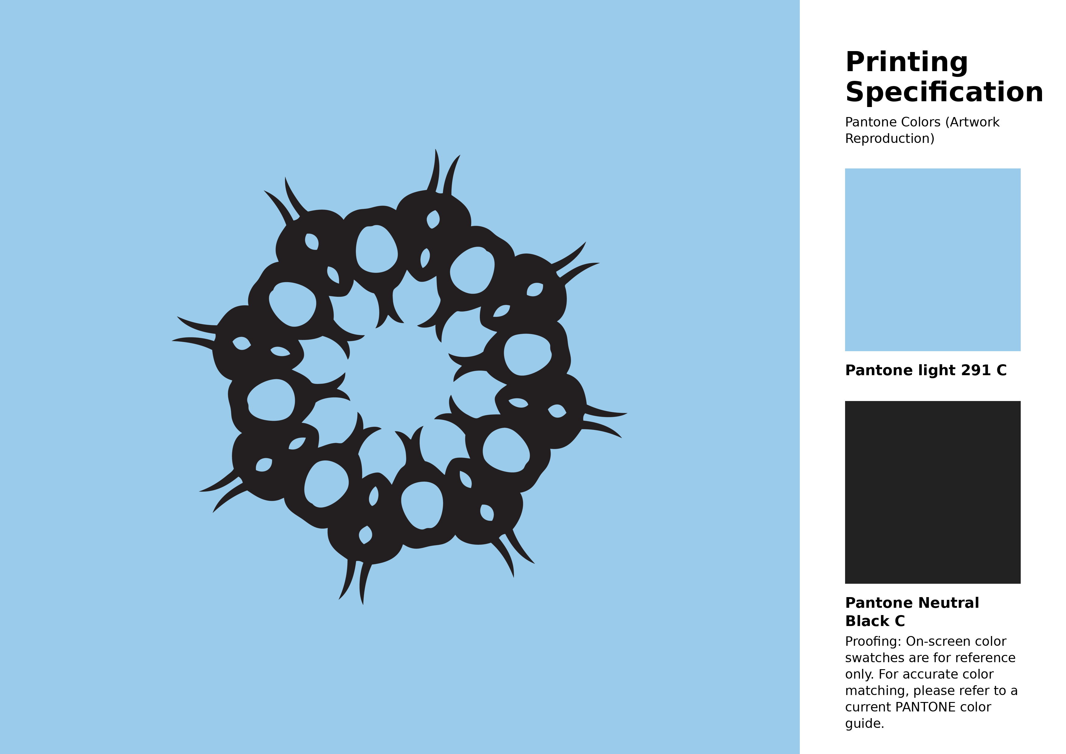
#9bcbeb Pantone 291 C Color | Hex color Code #9bcbeb Artwork Image (PNG)
Download Artwork (PNG)#9bcbeb Pantone 291 C Color | Hex color Code #9bcbeb Artwork Vector (PDF)
Download Artwork (PDF)#9bcbeb Pantone 291 C Color | Hex color Code #9bcbeb Artwork Vector (SVG)
Download Artwork (SVG)
#9bcbeb Pantone 291 C Color | Hex color Code #9bcbeb Pantone Swatch Artwork
Download Artwork Swatch
#9bcbeb Pantone 291 C Color | Hex color Code #9bcbeb Gradient Artwork (PNG)
Download Gradient (PNG)#9bcbeb Pantone 291 C Color | Hex color Code #9bcbeb Gradient Artwork (SVG)
Download Gradient (SVG)
#9bcbeb Pantone 291 C Color | Hex color Code #9bcbeb T-Shirt Mockup
Download T-Shirt Mockup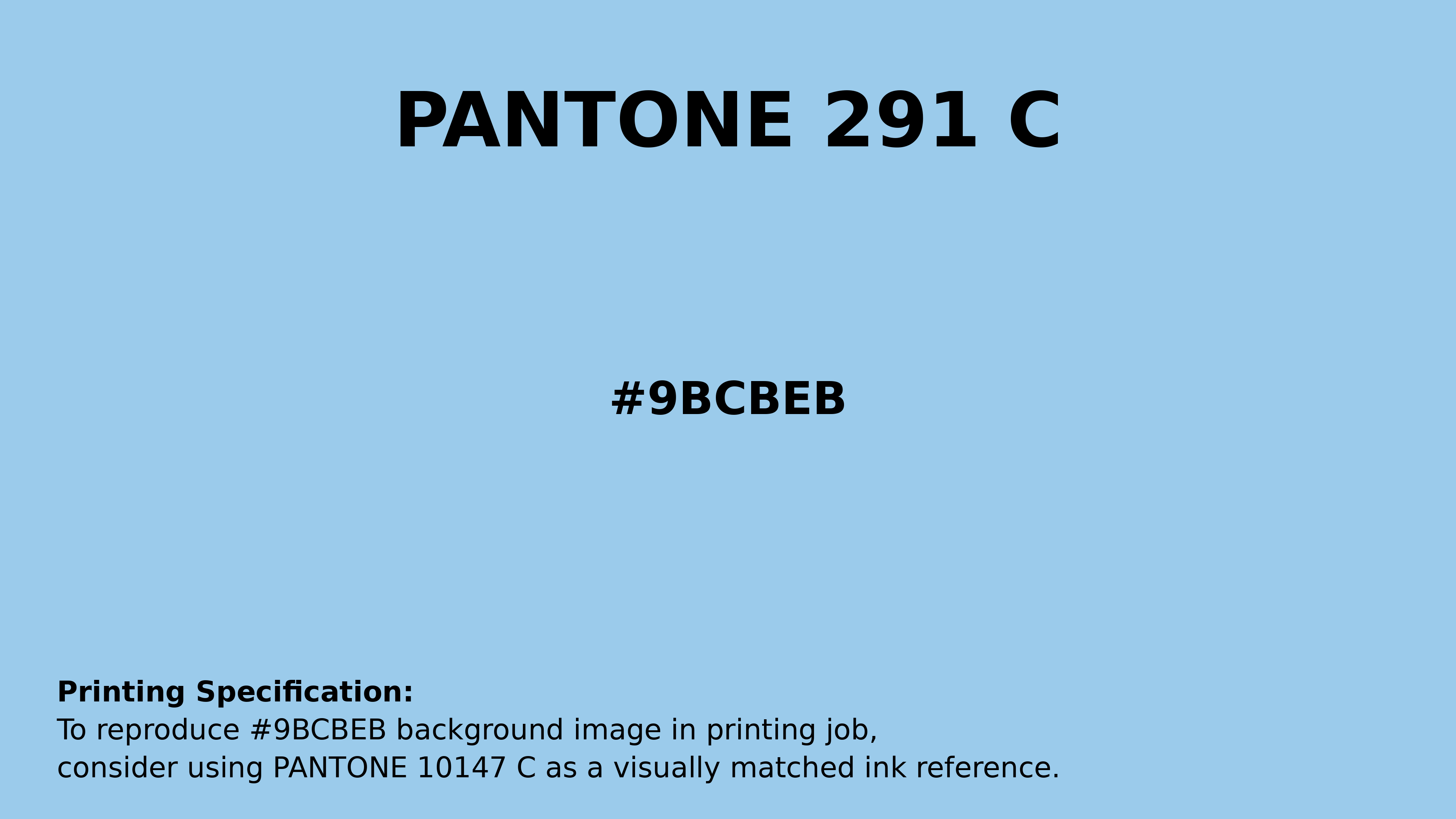
#9bcbeb Pantone 291 C Color | Hex color Code #9bcbeb Printing Artwork Pantone Reference
Download Pantone Printing ReferenceRelated Color Palettes
- Medium Purple and Lavender •
- Medium Purple and Medium Purple •
- Medium Purple and Dark Olive Green •
- Slate Gray and Medium Purple •
- Cold Purple •
- Slate Blue and Medium Purple •
- Medium Purple and Black •
- Dark Sea Green and Medium Purple •
- Medium Purple and Dim Gray •
- Medium Purple and Olive Drab •
- Dark Khaki and Medium Purple •
- Rosy Brown and Medium Purple •
- Black and Medium Purple •
- Medium Purple and Slate Gray •
- Medium Purple and Dark Khaki
Color Palette Collection
Summer Beach Vibes
1 color palettes with 5 colors.
ERGO
1 color palettes with 5 colors.
23 Light Blue Color Schemes
23 color palettes with 115 colors.

89 Blue Color Palettes
89 color palettes with 445 colors.