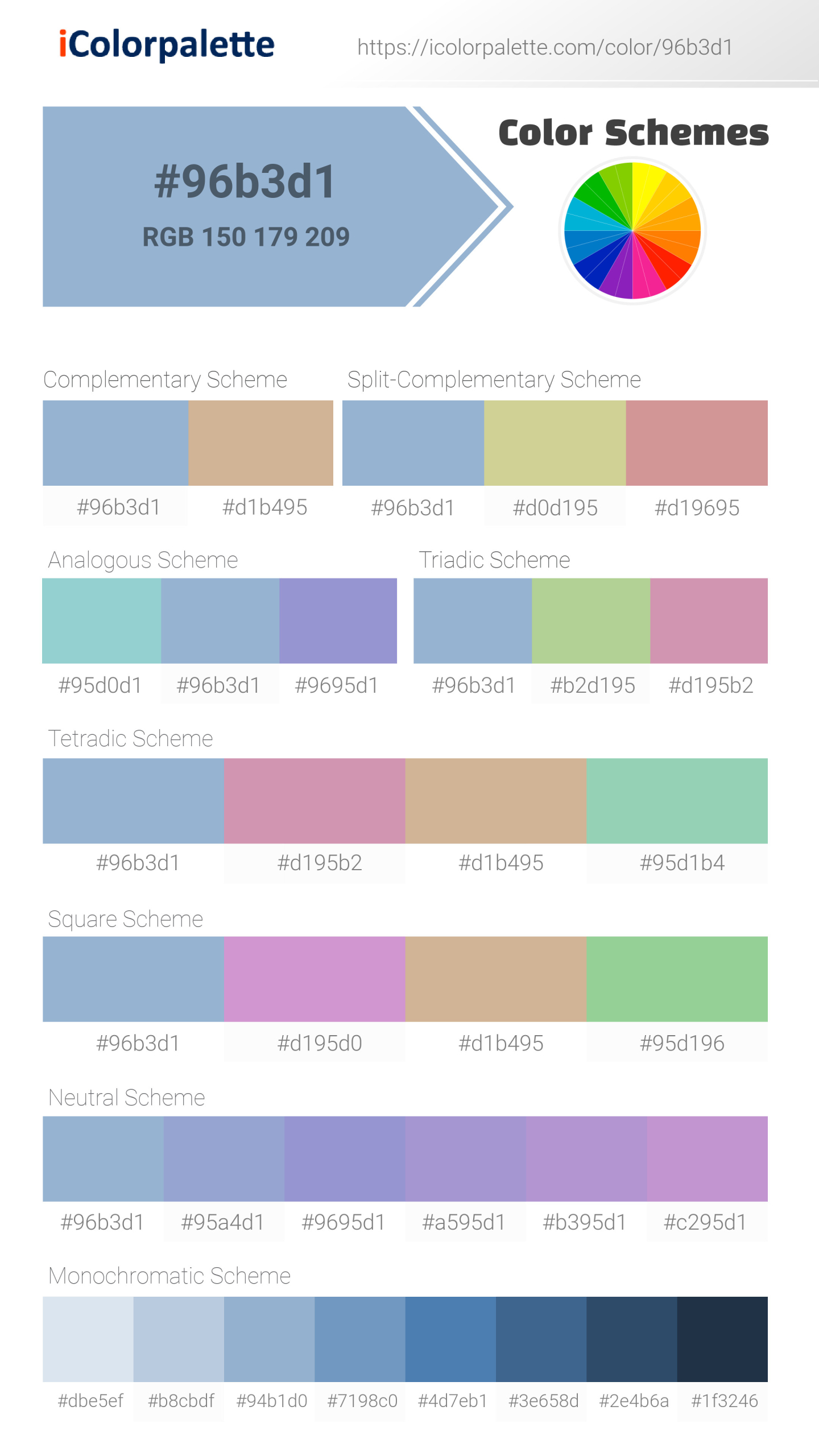
Pantone 14-4214 Tpx Powder Blue Color | #96b3d1
Pantone 14-4214 Tpx Powder Blue Color | #96b3d1 Color Shades Lighter / Darker shades of the color
Similar / Matching Pantone color(s) for Pantone 14-4214 Tpx Powder Blue Color | #96b3d1 Color | Hex code #96b3d1
Fashion, Home + Interiors
Fashion, Home + Interiors
Fashion, Home + Interiors
Solid Color Coated
Solid Color UnCoated
CMYK Color Guide Uncoated
CMYK Color Guide Coated
Color Bridge Uncoated
Color Bridge Coated
Pastels & Neons UnCoated
Premium Metallics Coated
Pastels & Neons Coated
Metallics Coated
Nylon Brights
Important: Colors are presented as a result of mathematical calculations. Conversions may be inaccurate/approximate. Please be advised that this pantone colors is only intended as a guide, Actual colours will depend on screen calibration variances. For best results use a Pantone Colour book
Color Schemes from #9695d1
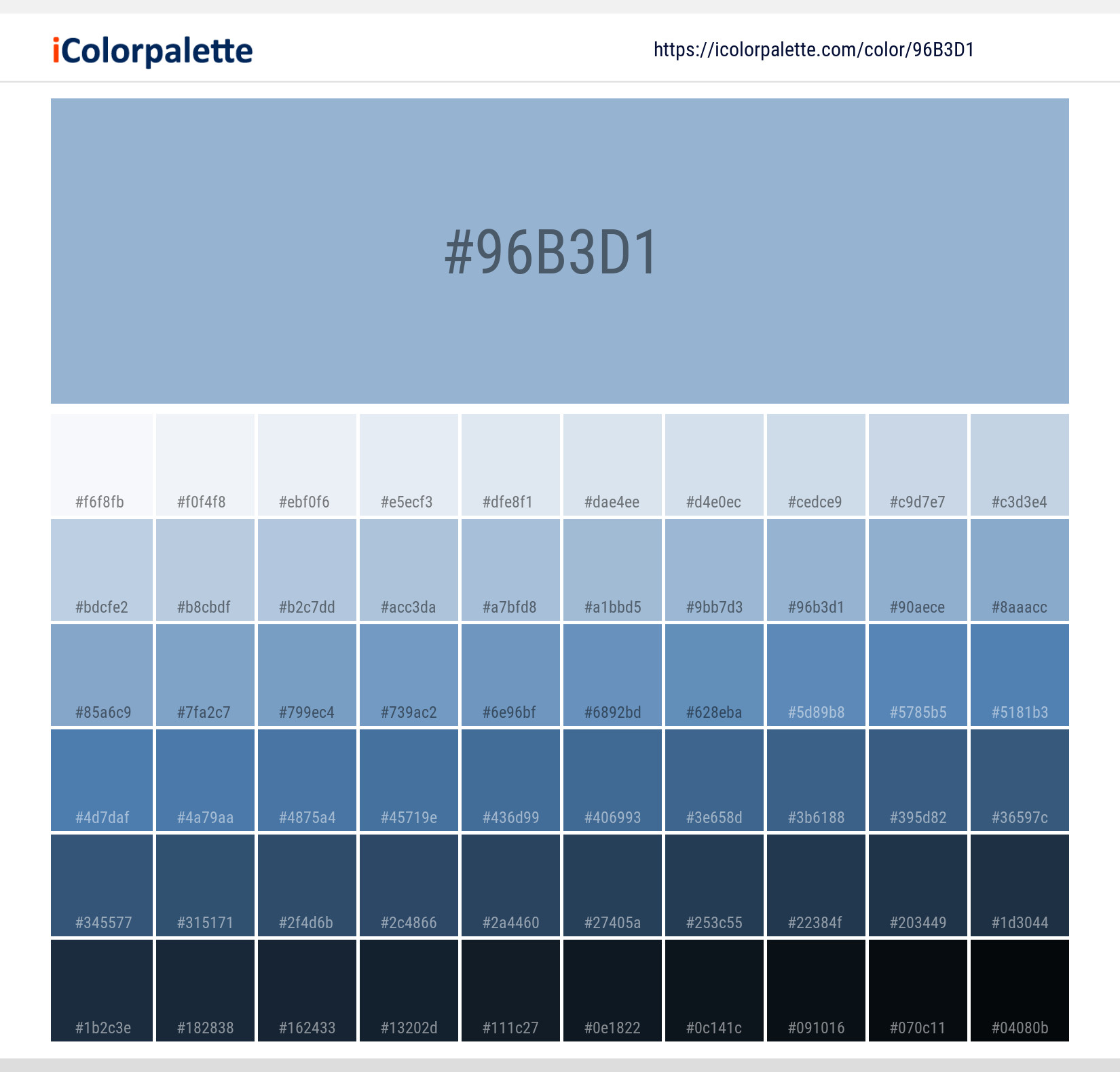
Pantone 14-4214 Tpx Powder Blue Color | #96b3d1 Monochromatic Color
Tones of Pantone 14-4214 Tpx Powder Blue Color | #96b3d1
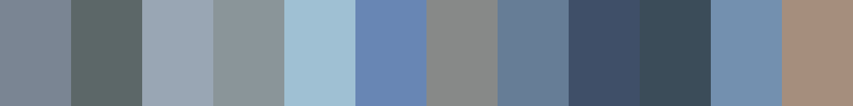
Similar Colors Pantone 14-4214 Tpx Powder Blue Color | #96b3d1
Powder Blue Color: A Refreshing Hue | #96B3D1
Introduction:
Powder Blue is a delicate and soothing color that embodies a sense of tranquility and calmness. With its soft and powdery appearance, this color creates a refreshing and serene atmosphere.
Historical Significance:
Early Use in Fashion: Powder Blue gained popularity in the 18th century as a fashionable color for women's clothing, particularly in France. It was often used for delicate dresses and gowns, symbolizing femininity and elegance.
Symbolism and Meaning:
Tranquility and Serenity: Powder Blue is commonly associated with feelings of peace, calmness, and relaxation. It evokes a sense of tranquility, making it an ideal color for creating a peaceful atmosphere.
Powder Blue in Fashion:
Elegant and Timeless: Powder Blue continues to be a popular color in the fashion industry. It is often used in formal wear and wedding dresses, adding a touch of sophistication and elegance to the garments.
Powder Blue in Graphic Design:
Aesthetic Appeal: In graphic design, Powder Blue is often used to create a clean and fresh look. It adds a sense of brightness and lightness to designs, making it suitable for various branding purposes.
Color Combinations:
Harmonious Pairings: Powder Blue goes well with a range of colors, including soft pastels like blush pink and mint green. It can also be paired with neutrals such as white and gray to create a balanced and soothing color palette.
Nature’s Palette:
Sky and Water: Powder Blue is reminiscent of the clear blue sky and calm waters, giving it a natural and serene quality. It can often be found in flowers like hydrangeas and forget-me-nots, adding a touch of delicate beauty to nature.
Artistic Representations:
In Impressionist Art: Powder Blue was frequently used by Impressionist painters to portray the ethereal qualities of light and atmosphere. It added a sense of dreaminess and softness to their art.
Movies and Cinematic Landscapes:
Ambience and Tranquility: Powder Blue has been used in movies to create a serene and calming atmosphere. It is often employed in scenes that depict peaceful landscapes or evoke a sense of tranquility.
Products and Commercial Appeal:
Wellness and Beauty: Many wellness and beauty products incorporate Powder Blue in their branding, as it represents a sense of relaxation and purity. It is commonly associated with spas, skincare, and holistic brands.
National Symbols and Significance:
Significance in Japan: In Japanese culture, Powder Blue is associated with spring and cherry blossoms. It represents new beginnings and renewal, making it a symbolic color during the cherry blossom season.
The Psychological and Emotional Impact:
Calmness and Relaxation: Powder Blue has a calming effect on the mind and body. It can help reduce stress and create a soothing environment, making it suitable for spaces where relaxation is desired.
Conclusion:
Powder Blue is a color that exudes tranquility and elegance. Its historical significance in fashion, its symbolism of peace and serenity, and its presence in various artistic forms make it a timeless and appealing hue. Whether used in fashion, graphic design, or as part of natural landscapes, Powder Blue has a soothing and calming impact on the viewer.
#96b3d1 Color Information
#96b3d1 color RGB value is (255,0,0). A hexadecimal color is specified with: #RRGGBB, where the RR (red), GG (green) and BB (blue) hexadecimal integers specify the components of the color. All values must be between 00 and FF.#96b3d1 Color Name(s)
#96b3d1 color name is Pantone 14-4214 Tpx Powder Blue Color | #96b3d1.RGB Colors
An RGB color value is specified with: rgb(red, green, blue). Each parameter (red, green, and blue) defines the intensity of the color and can be an integer between 0 and 255 or a percentage value (from 0% to 100%).Red value of its RGB is 150, Green value is 179 and blue value is 209.
RGBA Colors
alpha The rgba() function define colors using the Red-green-blue-alpha (RGBA) model. RGBA color values are an extension of RGB color values with an alpha channel - which specifies the opacity of the color.Red value of its RGBA is 150, Green value is 179, blue value is 209 and alpha value is 1.
HSL Colors
The hsl() function define colors using the Hue-saturation-lightness model (HSL). HSL stands for hue, saturation, and lightness - and represents a cylindrical-coordinate representation of colors.Hue value of its Hsl is 210.50847457627, Saturation value is 0.39072847682119, Lightness value is 0.70392156862745.
HSLA Colors
The hsla() function define colors using the Hue-saturation-lightness-alpha model (HSLA). HSLA color values are an extension of HSL color values with an alpha channel - which specifies the opacity of the color.Hue value of its Hsl is 210.50847457627, Saturation value is 0.39072847682119, Lightness value is 0.70392156862745 and alpha value is 1.
Preview #96b3d1
Color Preview with white background
Lorem Ipsum is simply dummy text of the printing and typesetting industry. Lorem Ipsum has been the industry's standard dummy text ever since the 1500s, when an unknown printer took a galley of type and scrambled it to make a type specimen book. It has survived not only five centuries, but also the leap into electronic typesetting, remaining essentially unchanged. It was popularised in the 1960s with the release of Letraset sheets containing Lorem Ipsum passages, and more recently with desktop publishing software like Aldus PageMaker including versions of Lorem Ipsum
.background {color:#96b3d1;}Color Preview with background color
Lorem Ipsum is simply dummy text of the printing and typesetting industry. Lorem Ipsum has been the industry's standard dummy text ever since the 1500s, when an unknown printer took a galley of type and scrambled it to make a type specimen book. It has survived not only five centuries, but also the leap into electronic typesetting, remaining essentially unchanged. It was popularised in the 1960s with the release of Letraset sheets containing Lorem Ipsum passages, and more recently with desktop publishing software like Aldus PageMaker including versions of Lorem Ipsum
.background {background-color:#96b3d1;}Color Palette Collection


Pantone 14-4214 Tpx Powder Blue Color | #96b3d1 Image Downloads

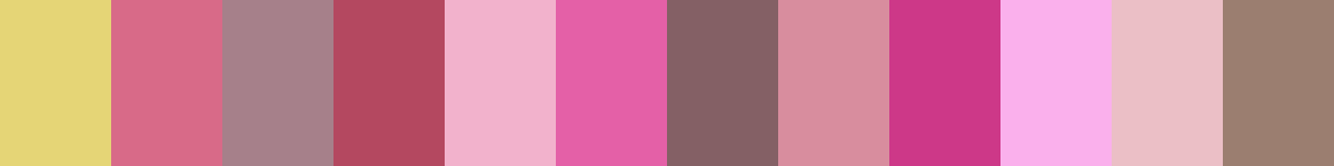
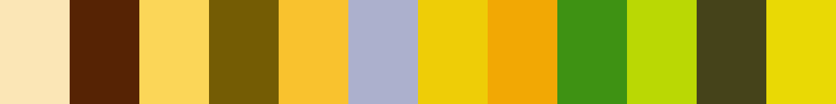
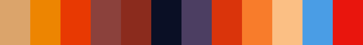
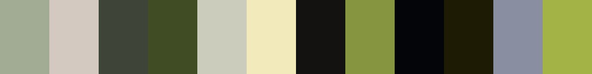
Related Color Palettes
- Purple Mountain's Majesty •
- Cold Purple •
- Medium Purple •
- Purple Heart •
- Lavender Purple •
- Royal Purple •
- Jacksons Purple •
- Purple •
- Medium Purple and Olive Drab •
- Medium Purple and Lavender •
- Medium Purple and Medium Purple •
- Medium Purple and Black •
- Lavender and Medium Purple •
- Dark Olive Green and Medium Purple •
- Dark Slate Blue and Medium Purple •


