#8A8D8F Color
Your all-in-one color resource. Download hex background images, Adobe swatches (ASE), PDF color sheets, and SVG files. Explore palettes, harmonies, accessibility, conversions, and professional exports — designed for designers, developers, and color perfectionists.
#8A8D8F, a muted grayish-silver, evokes a feeling of quiet contemplation and understated elegance. Its subtle coolness is reminiscent of a winter's twilight, the faint light reflecting off frosted ground or a moonlit, snow-dusted landscape. The color lacks vibrancy, promoting a sense of calm and neutrality, perhaps even a touch of melancholy. It suggests a feeling of timelessness and resilience, like weathered stone or aged silver. In design, this color works well as a neutral backdrop, allowing brighter accents to stand out. It suggests sophistication and understated luxury, appropriate for minimalist interiors or product design where a sense of quiet refinement is desired. There's a hint of formality and quiet dignity associated with the color, lending itself to classic and timeless aesthetics. It lacks strong cultural associations, but its neutrality allows it to blend seamlessly into various contexts. Visually matched named color: Silvered Dust.
PANTONE 877 C
Choose Color
Selected Color
Recent Colors
Color Details
Similar Ink Alternatives for #8A8D8F color Alternative print inks for reproducing #8A8D8F background image with a similar visual appearance.
Disclaimer: The visually matched ink reference is an independent approximation intended as a guide only. Please be advised that this pantone colors is only intended as a guide, Actual colours will depend on screen calibration variances. The print ink suggestions provided are independent visual approximations and are not affiliated with or endorsed by Pantone LLC. For official color specifications, conversion factors, and comprehensive color system information, please visit Pantone Connect. Official Pantone products can be purchased at pantone.com.
Color Previews for #000000 See how this color looks as a background or as text.
Complete Guide to Your Color Laboratory
Everything you need to know about this professional color toolkit.
Use the Color Picker at the top to select any color. All modules below update instantly.
Workflow: Pick a color → Explore palettes & data → Download what you need (PDF, Image, or Adobe ASE).
Color Details — Your color in all formats: HEX, RGB, RGBA, HSL, HSLA, HSV, CMYK, CIELab, Hunter-Lab, XYZ, Yxy, YUV. One-click copy.
Color Psychology — Emotional impact, cultural meanings, physiological effects, branding applications, and historical significance.
Named Colors — Find official color names (HTML/CSS, Pantone) that match your selection with similarity percentages.
Light & Dark Shades
80-step gradient from black to white. Perfect for button states and component systems.
Tints
Color mixed with white → lighter, pastel variations for backgrounds and disabled states.
Monochromatic — 11 curated tints/shades from one color. Production-ready for design systems.
- Complementary — Opposite on wheel (180°). High contrast.
- Analogous — Neighbors (±30°). Harmonious flow.
- Triadic — Three colors (120° apart). Vibrant, balanced.
- Split-Complementary — Base + two near-complements. Softer contrast.
- Tetradic/Square — Four colors. Complex, maximum variety.
- Neutral — Desaturated versions. Subtle, sophisticated.
15 Professional Variations — Monochromatic, Analogous, Complementary, Warm/Cool/Earth Tones, Pastel, Vibrant, High Contrast, and more.
Color Infusion — 10 palettes showing your color morphing into each major hue. Find bridge colors.
Similar Colors — 60+ colors generated via CIELAB Delta E matching. Unexpected harmonious combinations.
18 Ready-to-Use Gradients — Complementary, Analogous, Triadic, Tint/Shade progressions, and more.
Downloads: PNG (2560×1440), CSS (production-ready code), SVG (scalable vector).
WCAG Contrast Checker — Tests your color against white, black, and custom colors for AA (4.5:1) and AAA (7:1) compliance. Large text thresholds included.
Harmony & Accessibility Guide — Tests against 10 canonical hues. Shows which pairs are both beautiful AND WCAG-compliant for text.
PNG/JPG — High-res images for presentations and mood boards.
PDF — Print-ready reports for clients and teams.
Adobe ASE — Direct import to Photoshop, Illustrator, InDesign, XD.
CSS/SVG — Gradients only. Production-ready code and vectors.
Color Science: Industry-standard conversions (HSL, CIELAB, CMYK, XYZ). WCAG 2.1 luminance formula. Delta E (ΔE76) for perceptual matching.
Direct Links: Share colors via icolorpalette.com/color/ff5733 or icolorpalette.com/color/red
Issues? Refresh the page, wait for rendering, try another browser, or check console (F12) for errors.
Printing Guide for #8a8d8f Background Image
Use PANTONE 877 C as a visually matched ink reference when printing this background image.
To print the #8a8d8f background image from our site, consider using PANTONE 877 C as a visually matched ink reference.
Download the background image, then provide this reference code to your print vendor to help achieve accurate color reproduction.
The visually matched ink reference for the #8a8d8f background image is PANTONE 877 C.
This color is commonly described as Silvered Dust.
#8A8D8F, a muted grayish-silver, evokes a feeling of quiet contemplation and understated elegance. Its subtle coolness is reminiscent of a winter's twilight, the faint light reflecting off frosted ground or a moonlit, snow-dusted landscape. The color lacks vibrancy, promoting a sense of calm and neutrality, perhaps even a touch of melancholy. It suggests a feeling of timelessness and resilience, like weathered stone or aged silver. In design, this color works well as a neutral backdrop, allowing brighter accents to stand out. It suggests sophistication and understated luxury, appropriate for minimalist interiors or product design where a sense of quiet refinement is desired. There's a hint of formality and quiet dignity associated with the color, lending itself to classic and timeless aesthetics. It lacks strong cultural associations, but its neutrality allows it to blend seamlessly into various contexts.
We provide PANTONE 877 C as a visually matched ink reference to help you reproduce the #8a8d8f background image accurately in professional printing.
This reference code helps print vendors achieve consistent color output across different printing equipment and materials.
After downloading the #8a8d8f background image from our site:
- Include the visually matched ink reference PANTONE 877 C in your print order notes
- Inform your print vendor that this is your target color reference
- Request a proof print to verify the Silvered Dust color appearance before full production
The #8a8d8f background image with PANTONE 877 C as visually matched ink reference can be used for:
- Posters, banners, and backdrops
- Business cards, brochures, and flyers
- Packaging, labels, and stickers
- Signage and promotional materials
This is an independent visual approximation.
While PANTONE 877 C closely matches the #8a8d8f background image color, variations may exist between screen display and printed output.
We recommend requesting a proof print to verify the final appearance.
#8A8D8F, a muted grayish-silver, evokes a feeling of quiet contemplation and understated elegance. Its subtle coolness is reminiscent of a winter's twilight, the faint light reflecting off frosted ground or a moonlit, snow-dusted landscape. The color lacks vibrancy, promoting a sense of calm and neutrality, perhaps even a touch of melancholy. It suggests a feeling of timelessness and resilience, like weathered stone or aged silver. In design, this color works well as a neutral backdrop, allowing brighter accents to stand out. It suggests sophistication and understated luxury, appropriate for minimalist interiors or product design where a sense of quiet refinement is desired. There's a hint of formality and quiet dignity associated with the color, lending itself to classic and timeless aesthetics. It lacks strong cultural associations, but its neutrality allows it to blend seamlessly into various contexts.
Understanding these associations helps ensure the #8a8d8f background image aligns with your intended message and brand impact.
Important Information
The visually matched ink reference is an independent approximation intended as a guide only.
Actual printed colors may vary depending on screen calibration, substrate material, ink type, and printing equipment used.
For official color specifications and certified color standards, visit Pantone Connect.
Official color guides and swatch books can be purchased from pantone.com.
Pantone 877 C Color: Structured Gray | #8A8D8F
Introduction:
Structured Gray, also known as Pantone 877 C Color, is a deep and sophisticated shade that exudes elegance. With its subtle but captivating visual appeal, it adds a touch of refinement to any design.
Historical Significance:
Key moments in history: Throughout history, Structured Gray has been prominently used in architectural designs, particularly during the Modernist movement. Its cool and subdued tone symbolized simplicity, minimalism, and the pursuit of functionality.
Symbolism and Meaning:
Symbolism and Meaning: Structured Gray typically symbolizes stability, balance, and professionalism. In various cultures and contexts, it is associated with reliability and a sense of calmness.
Structured Gray in Fashion:
Structured Gray in Fashion: This color has a significant impact on styles and trends in the fashion world. It is often used in formal wear, adding a touch of sophistication and elegance to outfits. It can also be found in accessories and footwear, complementing various color palettes.
Structured Gray in Graphic Design:
Structured Gray in Graphic Design: In design aesthetics and branding, Structured Gray carries a sense of reliability and professionalism. It is often used in logos and corporate designs to convey a sense of trustworthiness and sophistication. Its neutral tone also allows it to work well in combination with other colors.
Color Combinations:
Color Combinations: Some potential color combinations that work well with Structured Gray include:
- Structured Gray and white
- Structured Gray and navy blue
- Structured Gray and burgundy
- Structured Gray and olive green
Nature’s Palette:
Nature’s Palette: Structured Gray can be found in nature, particularly in the colorings of certain stones, such as granite. It also resembles the gray tones of stormy skies and the gentle hue of morning fog.
Artistic Representations:
Artistic Representations: Structured Gray has been used in various forms of art to evoke a sense of depth and mystery. Artists often utilize this color to create a contrast within their compositions, adding a subtle and sophisticated touch to their artwork.
Movies and Cinematic Landscapes:
Movies and Cinematic Landscapes: Structured Gray is often used in movies to set a somber and introspective mood. It can be found in scenes depicting urban settings, adding a sense of urbanity and sophistication to the overall visual aesthetic.
Products and Commercial Appeal:
Products and Commercial Appeal: Many popular products and brands associate with Structured Gray or incorporate it in their branding. This color choice conveys a sense of timelessness, sophistication, and trustworthiness.
National Symbols and Significance:
National Symbols and Significance: Structured Gray does not hold any specific national or cultural significance.
The Psychological and Emotional Impact:
The Psychological and Emotional Impact: Structured Gray influences emotions and perceptions by creating a sense of calmness and stability. It is often associated with trustworthiness and professionalism.
Conclusion:
In conclusion, Pantone 877 C Color, also known as Structured Gray, holds a significant place in design and fashion with its timeless appeal. Its historical relevance and symbolism convey reliability, sophistication, and professionalism. With its versatile nature, Structured Gray is a go-to color for creating elegant and refined aesthetics.
Pantone 877 C Color | Hex color Code #8a8d8f Image & Artwork
Download high-quality assets for your projects.

#8a8d8f Color Schemes
Download Color Schemes
#8a8d8f Color Shades
Download Color Shades
Pantone 877 C Color | Hex color Code #8a8d8f Solid Color Background
Download Solid Color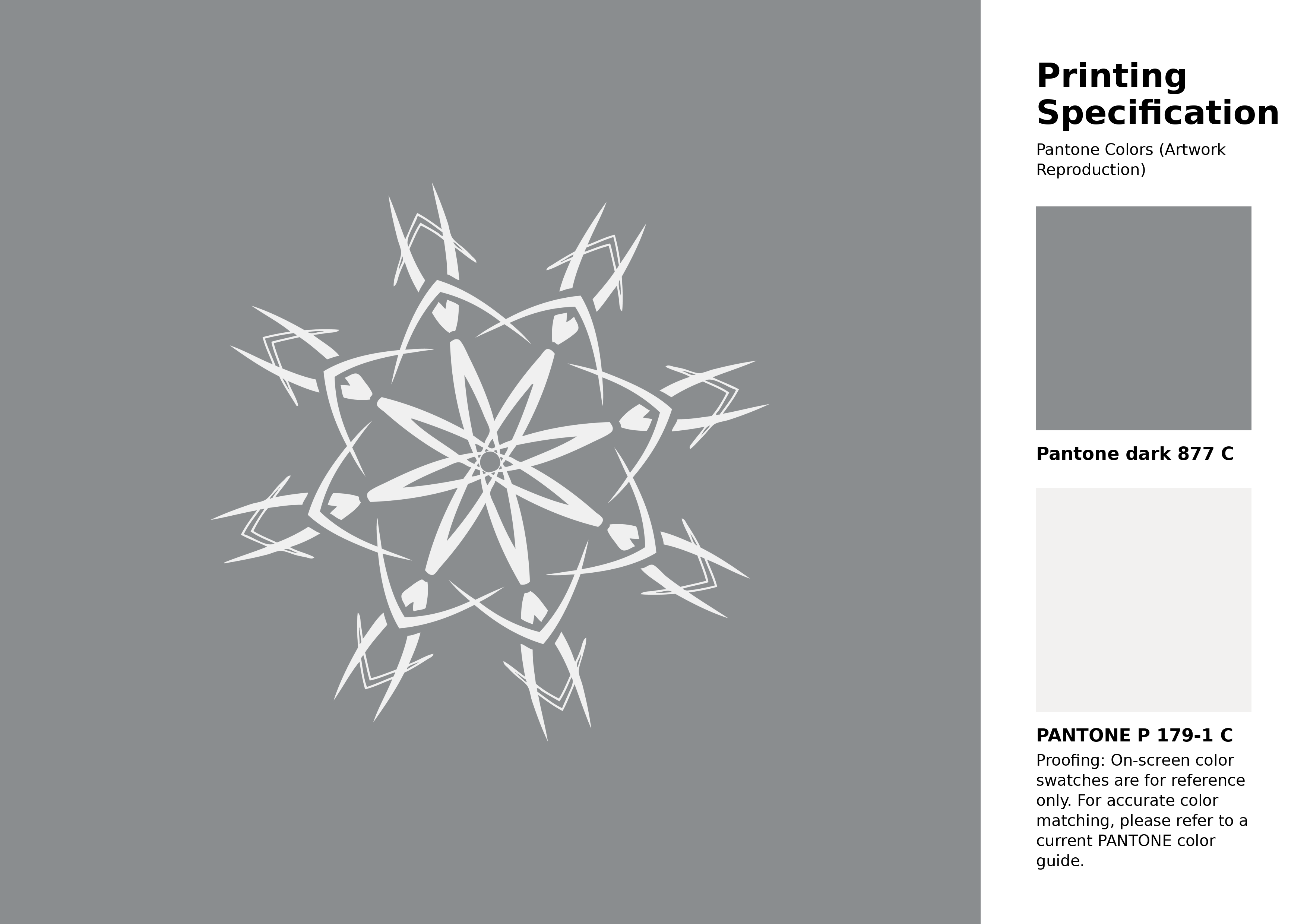
#8a8d8f Pantone 877 C Color | Hex color Code #8a8d8f Artwork Image (PNG)
Download Artwork (PNG)#8a8d8f Pantone 877 C Color | Hex color Code #8a8d8f Artwork Vector (PDF)
Download Artwork (PDF)#8a8d8f Pantone 877 C Color | Hex color Code #8a8d8f Artwork Vector (SVG)
Download Artwork (SVG)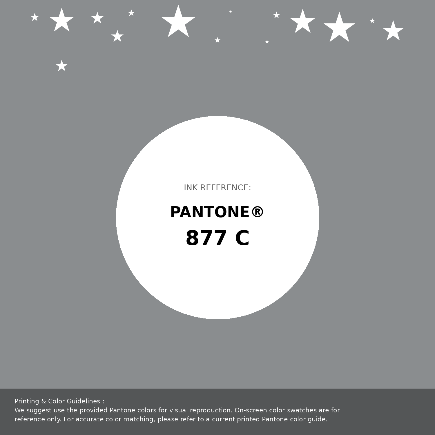
#8a8d8f Pantone 877 C Color | Hex color Code #8a8d8f Pantone Swatch Artwork
Download Artwork Swatch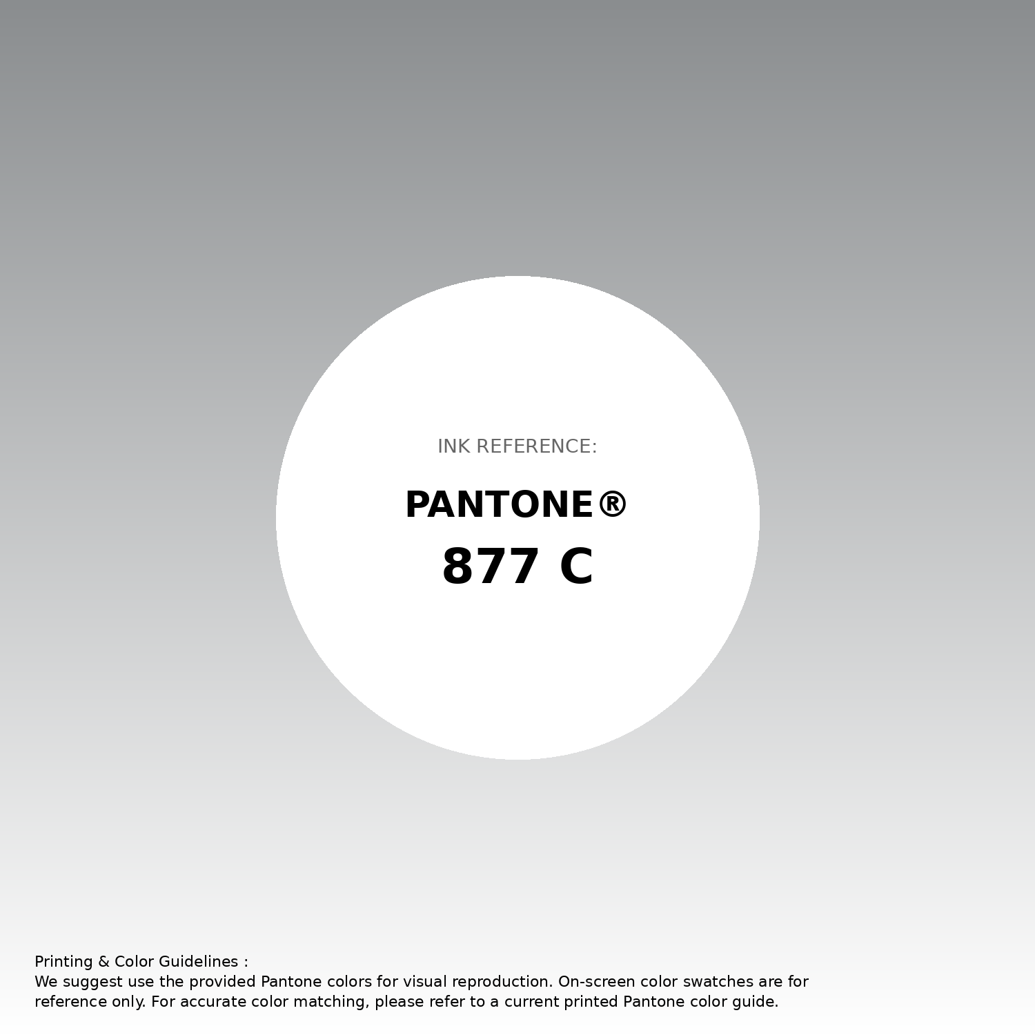
#8a8d8f Pantone 877 C Color | Hex color Code #8a8d8f Gradient Artwork (PNG)
Download Gradient (PNG)#8a8d8f Pantone 877 C Color | Hex color Code #8a8d8f Gradient Artwork (SVG)
Download Gradient (SVG)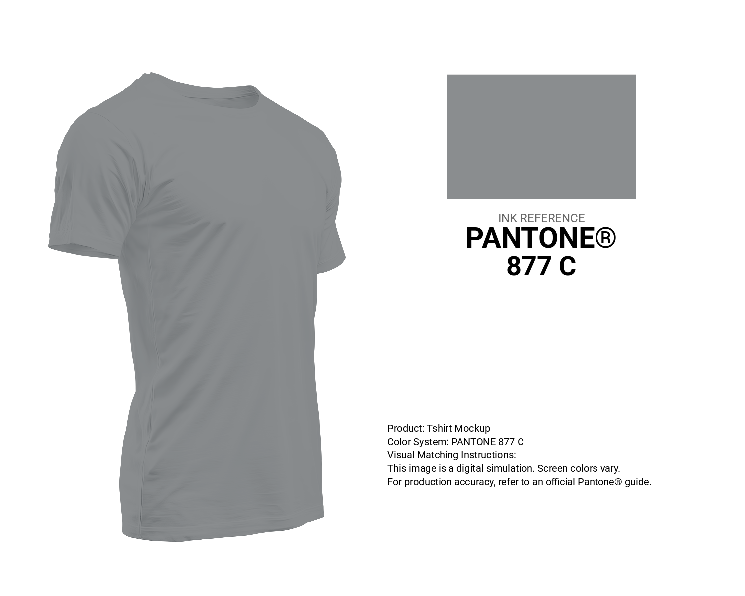
#8a8d8f Pantone 877 C Color | Hex color Code #8a8d8f T-Shirt Mockup
Download T-Shirt Mockup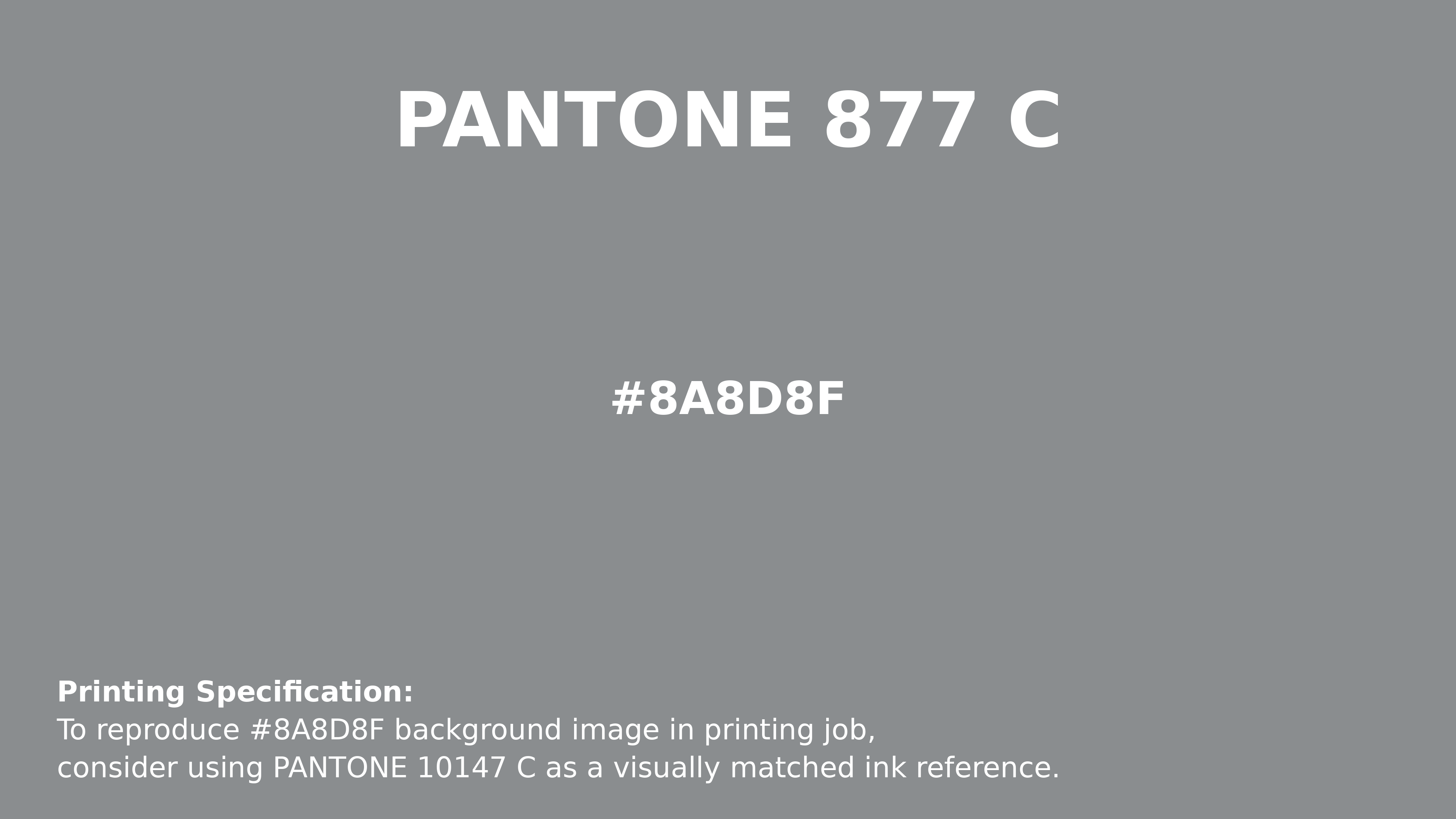
#8a8d8f Pantone 877 C Color | Hex color Code #8a8d8f Printing Artwork Pantone Reference
Download Pantone Printing ReferenceRelated Color Palettes
- Medium Violet Red and Slate Gray •
- Dim Gray and Maroon •
- Slate Gray and Pale Goldenrod •
- Gray Chateau •
- Dark Slate Gray and OrangeRed •
- Brown and Slate Gray •
- Dark Gray and Pale Goldenrod •
- Dark Slate Gray and Silver •
- Light Gray and Peru •
- Light Coral and Light Slate Gray •
- Rosy Brown and Gray •
- Gold and Dim Gray •
- Gray Nickel •
- Cornflower Blue and Gray •
- Silver and Slate Gray
Color Palette Collection
26 Brown Color Combinations
26 color palettes with 130 colors.

50 Red color palettes
50 color palettes with 250 colors.

31 Purple Color Combinations
31 color palettes with 155 colors.

Summer Color Palettes
28 color palettes with 140 colors.