#76232F Color
Your all-in-one color resource. Download hex background images, Adobe swatches (ASE), PDF color sheets, and SVG files. Explore palettes, harmonies, accessibility, conversions, and professional exports — designed for designers, developers, and color perfectionists.
This deep, reddish-brown evokes the feeling of a fiery sunset fading into the night. It suggests a sense of warmth transitioning to a quiet intensity, perhaps a feeling of completion or reflection. The color is reminiscent of the rich hues of autumn leaves and the deepening shadows of twilight. It creates a mood of introspection and grounded strength. In design, it can be used to create a sophisticated and dramatic ambiance, perhaps in a study or a living room where quiet contemplation is valued. The color might also evoke a sense of nostalgia or history, depending on the surrounding elements. Visually matched named color: Crimson Dusk.
PANTONE 188 C
Choose Color
Selected Color
Recent Colors
Color Details
Similar Ink Alternatives for #76232F color Alternative print inks for reproducing #76232F background image with a similar visual appearance.
Disclaimer: The visually matched ink reference is an independent approximation intended as a guide only. Please be advised that this pantone colors is only intended as a guide, Actual colours will depend on screen calibration variances. The print ink suggestions provided are independent visual approximations and are not affiliated with or endorsed by Pantone LLC. For official color specifications, conversion factors, and comprehensive color system information, please visit Pantone Connect. Official Pantone products can be purchased at pantone.com.
Color Previews for #000000 See how this color looks as a background or as text.
Complete Guide to Your Color Laboratory
Everything you need to know about this professional color toolkit.
Use the Color Picker at the top to select any color. All modules below update instantly.
Workflow: Pick a color → Explore palettes & data → Download what you need (PDF, Image, or Adobe ASE).
Color Details — Your color in all formats: HEX, RGB, RGBA, HSL, HSLA, HSV, CMYK, CIELab, Hunter-Lab, XYZ, Yxy, YUV. One-click copy.
Color Psychology — Emotional impact, cultural meanings, physiological effects, branding applications, and historical significance.
Named Colors — Find official color names (HTML/CSS, Pantone) that match your selection with similarity percentages.
Light & Dark Shades
80-step gradient from black to white. Perfect for button states and component systems.
Tints
Color mixed with white → lighter, pastel variations for backgrounds and disabled states.
Monochromatic — 11 curated tints/shades from one color. Production-ready for design systems.
- Complementary — Opposite on wheel (180°). High contrast.
- Analogous — Neighbors (±30°). Harmonious flow.
- Triadic — Three colors (120° apart). Vibrant, balanced.
- Split-Complementary — Base + two near-complements. Softer contrast.
- Tetradic/Square — Four colors. Complex, maximum variety.
- Neutral — Desaturated versions. Subtle, sophisticated.
15 Professional Variations — Monochromatic, Analogous, Complementary, Warm/Cool/Earth Tones, Pastel, Vibrant, High Contrast, and more.
Color Infusion — 10 palettes showing your color morphing into each major hue. Find bridge colors.
Similar Colors — 60+ colors generated via CIELAB Delta E matching. Unexpected harmonious combinations.
18 Ready-to-Use Gradients — Complementary, Analogous, Triadic, Tint/Shade progressions, and more.
Downloads: PNG (2560×1440), CSS (production-ready code), SVG (scalable vector).
WCAG Contrast Checker — Tests your color against white, black, and custom colors for AA (4.5:1) and AAA (7:1) compliance. Large text thresholds included.
Harmony & Accessibility Guide — Tests against 10 canonical hues. Shows which pairs are both beautiful AND WCAG-compliant for text.
PNG/JPG — High-res images for presentations and mood boards.
PDF — Print-ready reports for clients and teams.
Adobe ASE — Direct import to Photoshop, Illustrator, InDesign, XD.
CSS/SVG — Gradients only. Production-ready code and vectors.
Color Science: Industry-standard conversions (HSL, CIELAB, CMYK, XYZ). WCAG 2.1 luminance formula. Delta E (ΔE76) for perceptual matching.
Direct Links: Share colors via icolorpalette.com/color/ff5733 or icolorpalette.com/color/red
Issues? Refresh the page, wait for rendering, try another browser, or check console (F12) for errors.
Printing Guide for #76232f Background Image
Use PANTONE 188 C as a visually matched ink reference when printing this background image.
To print the #76232f background image from our site, consider using PANTONE 188 C as a visually matched ink reference.
Download the background image, then provide this reference code to your print vendor to help achieve accurate color reproduction.
The visually matched ink reference for the #76232f background image is PANTONE 188 C.
This color is commonly described as Crimson Dusk.
This deep, reddish-brown evokes the feeling of a fiery sunset fading into the night. It suggests a sense of warmth transitioning to a quiet intensity, perhaps a feeling of completion or reflection. The color is reminiscent of the rich hues of autumn leaves and the deepening shadows of twilight. It creates a mood of introspection and grounded strength. In design, it can be used to create a sophisticated and dramatic ambiance, perhaps in a study or a living room where quiet contemplation is valued. The color might also evoke a sense of nostalgia or history, depending on the surrounding elements.
We provide PANTONE 188 C as a visually matched ink reference to help you reproduce the #76232f background image accurately in professional printing.
This reference code helps print vendors achieve consistent color output across different printing equipment and materials.
After downloading the #76232f background image from our site:
- Include the visually matched ink reference PANTONE 188 C in your print order notes
- Inform your print vendor that this is your target color reference
- Request a proof print to verify the Crimson Dusk color appearance before full production
The #76232f background image with PANTONE 188 C as visually matched ink reference can be used for:
- Posters, banners, and backdrops
- Business cards, brochures, and flyers
- Packaging, labels, and stickers
- Signage and promotional materials
This is an independent visual approximation.
While PANTONE 188 C closely matches the #76232f background image color, variations may exist between screen display and printed output.
We recommend requesting a proof print to verify the final appearance.
This deep, reddish-brown evokes the feeling of a fiery sunset fading into the night. It suggests a sense of warmth transitioning to a quiet intensity, perhaps a feeling of completion or reflection. The color is reminiscent of the rich hues of autumn leaves and the deepening shadows of twilight. It creates a mood of introspection and grounded strength. In design, it can be used to create a sophisticated and dramatic ambiance, perhaps in a study or a living room where quiet contemplation is valued. The color might also evoke a sense of nostalgia or history, depending on the surrounding elements.
Understanding these associations helps ensure the #76232f background image aligns with your intended message and brand impact.
Important Information
The visually matched ink reference is an independent approximation intended as a guide only.
Actual printed colors may vary depending on screen calibration, substrate material, ink type, and printing equipment used.
For official color specifications and certified color standards, visit Pantone Connect.
Official color guides and swatch books can be purchased from pantone.com.
Pantone 188 C Color: Creativity-Boosting Scarlet | #76232F
Introduction:
Scarlet is a rich and vibrant color that exudes passion, energy, and boldness. Its deep red hue catches the eye and commands attention, making it a highly impactful color choice in various applications.
Historical Significance:
Significant Moments: Scarlet has a long history of being associated with power, desire, and luxury. It has been prominently used in various historical contexts, such as the red velvet used in royal garments and medieval tapestries. In addition, scarlet was a popular color in Renaissance art, symbolizing strength and passion.
Evolution of Use: Scarlet continued to play a significant role in cultural and political settings, representing revolution and radical ideas during periods such as the French Revolution and the Russian Revolution. It has also been associated with love and romance throughout history in art, literature, and symbolism.
Symbolism and Meaning:
Cultural Symbolism: Scarlet typically symbolizes passion, love, and courage across different cultures. It represents vitality and intensity, often associated with strong emotions and desires. In some cultures, scarlet is also associated with luck and prosperity. However, it can also carry negative connotations, such as danger or anger.
Scarlet in Fashion:
Influence on Fashion: Scarlet has always been a captivating color in the fashion industry. It adds a touch of drama and sophistication to any outfit, making it a popular choice for formalwear and evening attire. Scarlet dresses, suits, and accessories are often associated with confidence, power, and glamour.
Scarlet in Graphic Design:
Aesthetic Significance: Scarlet holds a powerful place in graphic design. Its boldness and intensity make it an attention-grabbing color choice for logos, branding, and advertisements. Scarlet can evoke strong emotions and create a sense of urgency or importance in visual communication. Its association with power and passion makes it a popular choice for industries like sports, entertainment, and technology.
Color Combinations:
Potential Combinations: Scarlet pairs well with various colors to create different effects and moods. Some popular combinations include:
- Scarlet and gold: for a regal and luxurious feel
- Scarlet and black: for a bold and edgy look
- Scarlet and white: for a clean and striking contrast
- Scarlet and navy blue: for a classic and sophisticated combination
Nature’s Palette:
Natural Occurrences: Scarlet is found in various natural elements, such as vibrant red flowers like roses and tulips, ripe fruits like apples and cherries, and the colorful plumage of birds like cardinals. It also represents the fiery sunsets and autumn leaves, bringing warmth and excitement to natural landscapes.
Artistic Representations:
In Art: Scarlet has been used by renowned artists throughout history to convey intensity, energy, and emotions. Paintings featuring scarlet can evoke passion and drama, capturing the viewer's attention and stirring their emotions. Artists like Vincent van Gogh and Henri Matisse have utilized scarlet as a focal point in their masterpieces, creating powerful visual impacts.
Movies and Cinematic Landscapes:
Tone-Setting Color: Scarlet plays a significant role in the world of cinema, setting the tone and mood of scenes. It is often used to portray passion, love, danger, and intensity. From iconic red dresses in classic films like "Gone with the Wind" to the mysterious red room in "Twin Peaks," scarlet creates memorable cinematic landscapes.
Products and Commercial Appeal:
Brands and Scarlet: Scarlet is a popular color choice for brands that aim to convey boldness, energy, and excitement. It is often used in sectors such as sports, beverages, and cosmetics. Brands like Coca-Cola, Ferrari, and Chanel incorporate scarlet into their logos and packaging, leveraging its strong visual impact to attract consumers.
National Symbols and Significance:
Cultural Significance: In some cultures, scarlet holds national or cultural significance. For example, in China, red (similar to scarlet) represents luck and prosperity and is frequently used during festive celebrations like Chinese New Year. In North America, scarlet can be associated with patriotism and national pride.
The Psychological and Emotional Impact:
Influence on Emotions: Scarlet has a strong psychological impact, evoking feelings of passion, excitement, and intensity. It can stimulate energy and enthusiasm, but it can also be associated with anger, danger, and impulsiveness. The color can create a sense of urgency and grab attention, making it effective for marketing and advertising.
Conclusion:
In summary, scarlet is a powerful and captivating color that has been significant throughout history. Its association with passion, power, and intensity makes it a popular choice in fashion, graphic design, and various industries. Scarlet's influence on emotions, its rich cultural symbolism, and its ability to create visual impact make it a timeless and versatile color.
Pantone 188 C Color | Hex color Code #76232f Image & Artwork
Download high-quality assets for your projects.

#76232f Color Schemes
Download Color Schemes
#76232f Color Shades
Download Color Shades
Pantone 188 C Color | Hex color Code #76232f Solid Color Background
Download Solid Color
#76232f Pantone 188 C Color | Hex color Code #76232f Artwork Image (PNG)
Download Artwork (PNG)#76232f Pantone 188 C Color | Hex color Code #76232f Artwork Vector (PDF)
Download Artwork (PDF)#76232f Pantone 188 C Color | Hex color Code #76232f Artwork Vector (SVG)
Download Artwork (SVG)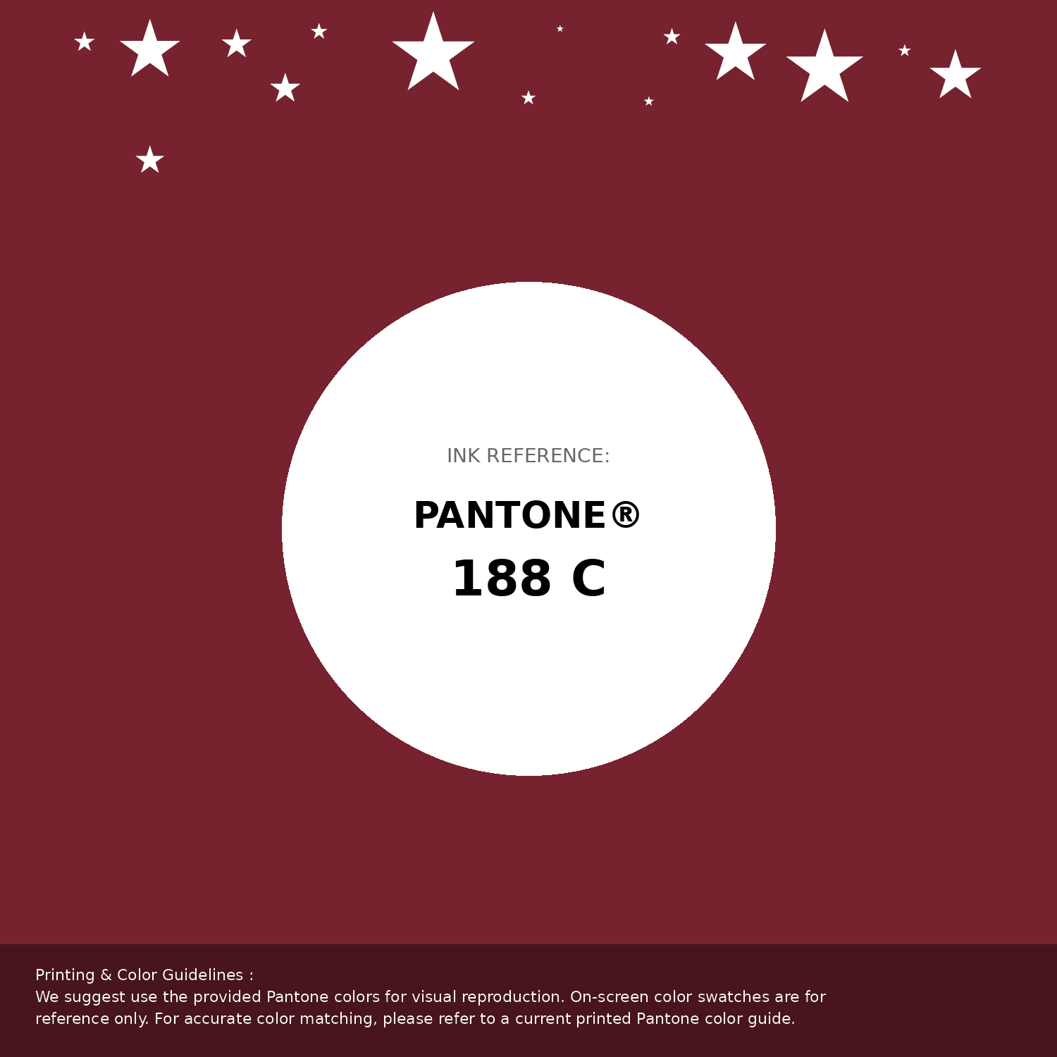
#76232f Pantone 188 C Color | Hex color Code #76232f Pantone Swatch Artwork
Download Artwork Swatch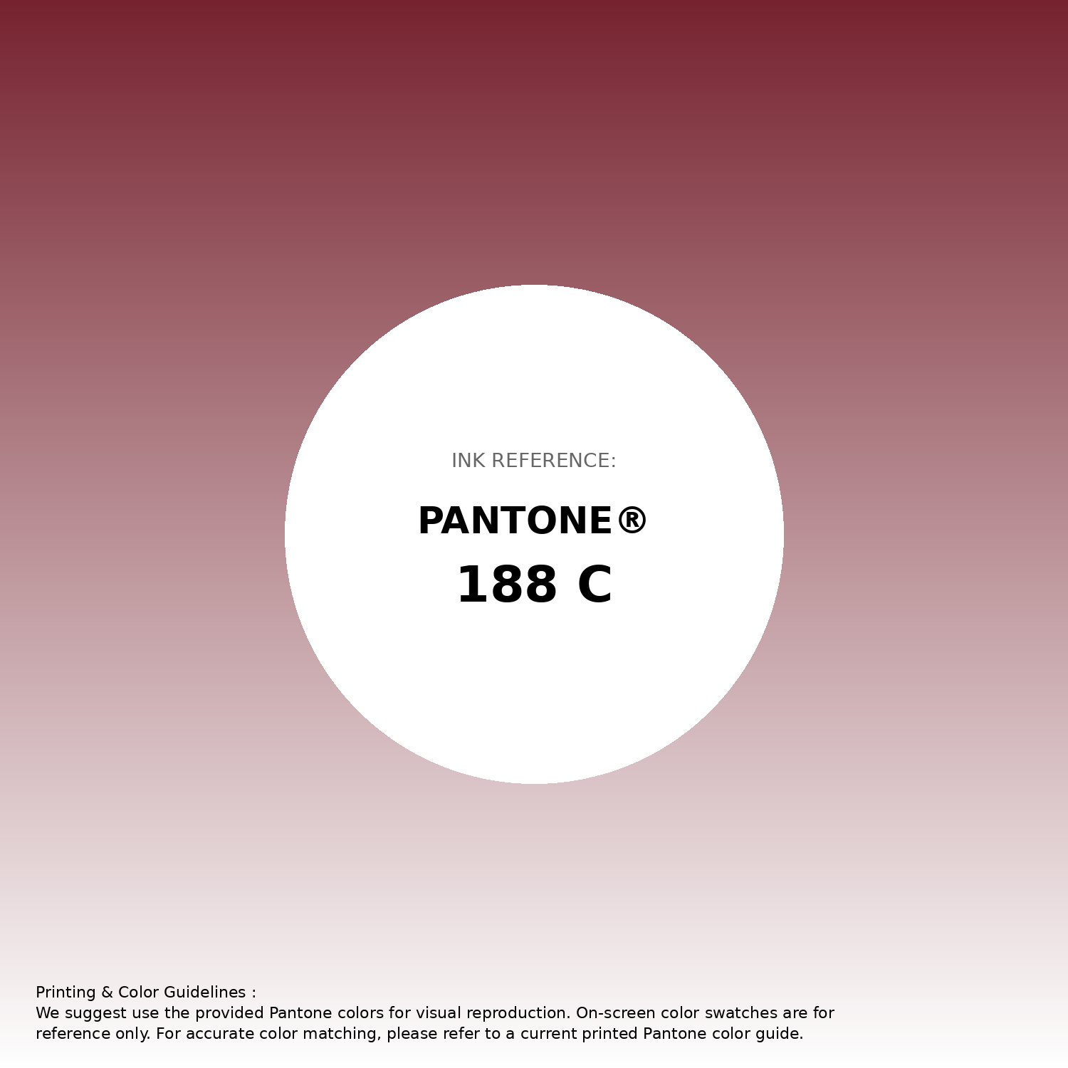
#76232f Pantone 188 C Color | Hex color Code #76232f Gradient Artwork (PNG)
Download Gradient (PNG)#76232f Pantone 188 C Color | Hex color Code #76232f Gradient Artwork (SVG)
Download Gradient (SVG)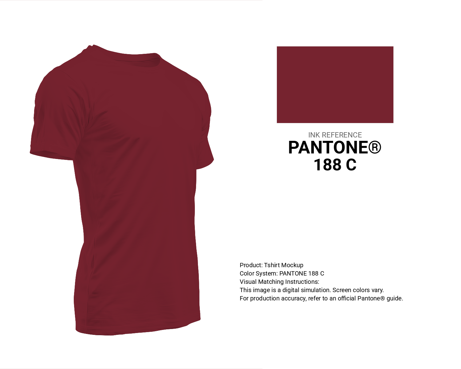
#76232f Pantone 188 C Color | Hex color Code #76232f T-Shirt Mockup
Download T-Shirt Mockup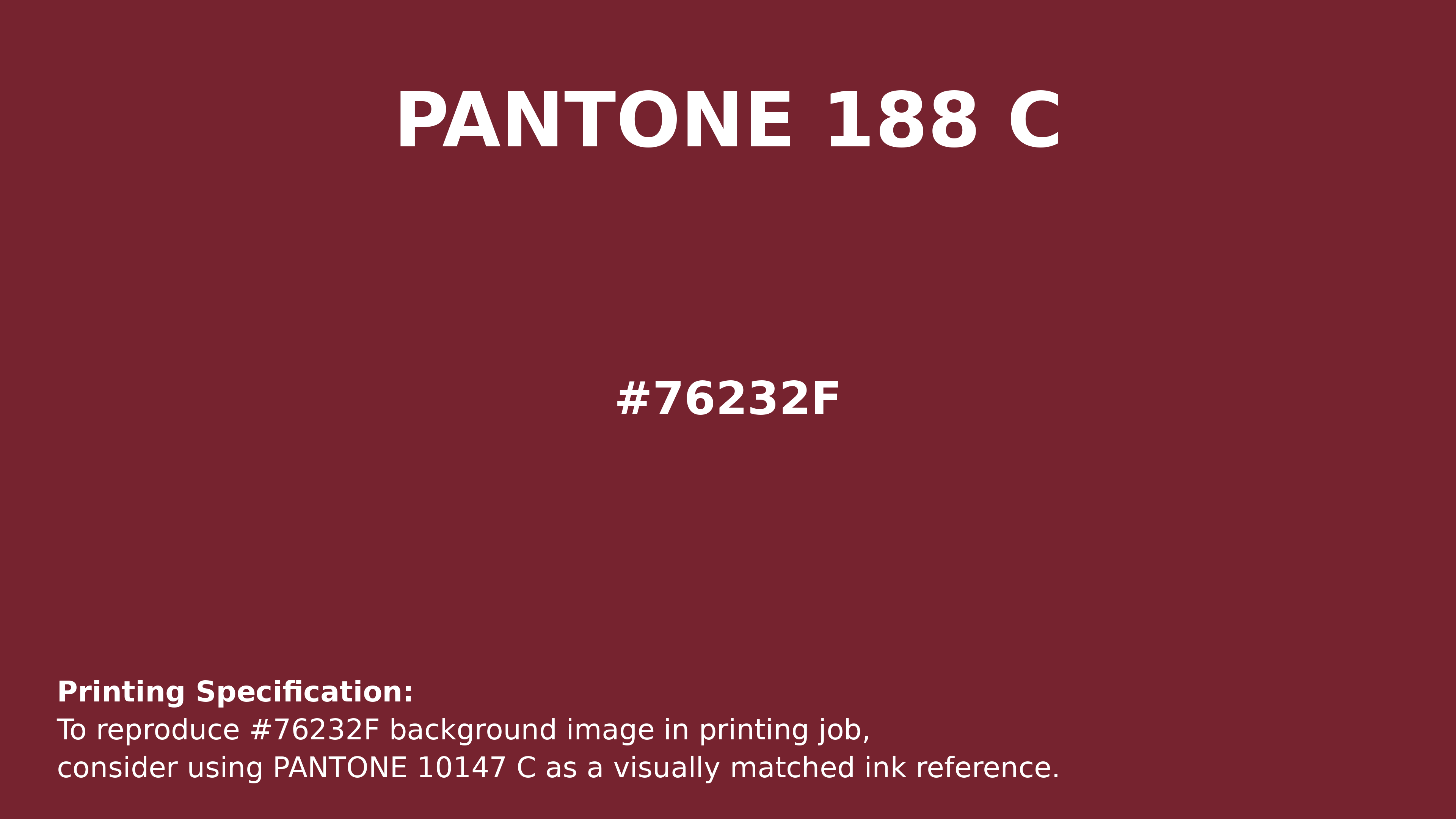
#76232f Pantone 188 C Color | Hex color Code #76232f Printing Artwork Pantone Reference
Download Pantone Printing ReferenceRelated Color Palettes
- Plum and Dark Gray •
- Dark Gray and Brown •
- Thistle and Dark Gray •
- Silver and Dark Gray •
- Dark Gray and Steel Blue •
- Dark Gray and Dark Slate Gray •
- Light Gray and Dark Gray •
- Dark Gray and Light Blue •
- Dark Gray and Yellow Green •
- White Smoke and Dark Gray •
- Cadet Blue and Dark Gray •
- Dark Gray and Sandy Brown •
- Yellow Green and Dark Gray •
- Dark Gray and Pale Violet Red •
- Dark Gray and Sienna
Color Palette Collection

55 Nature Color Palettes
55 color palettes with 275 colors.

29 Pink Color Palettes for your next design project
29 color palettes with 145 colors.

50 Red color palettes
50 color palettes with 250 colors.

25 Sunset Color Schemes
25 color palettes with 125 colors.