#71DBD4 Color
Your all-in-one color resource. Download hex background images, Adobe swatches (ASE), PDF color sheets, and SVG files. Explore palettes, harmonies, accessibility, conversions, and professional exports — designed for designers, developers, and color perfectionists.
This soft, light teal evokes a sense of springtime freshness and gentle renewal. It brings feelings of optimism, hope, and a quiet joy, reminiscent of blooming flowers and lush greenery. The color creates a peaceful and uplifting atmosphere, perfect for bedrooms or living rooms. It suggests new beginnings, growth, and a connection to nature. In design, it can be used to create a calming and inviting space, and might be associated with a sense of youthfulness and purity. Visually matched named color: Azure Bloom.
PANTONE 3242 C
Choose Color
Selected Color
Recent Colors
Color Details
Similar Ink Alternatives for #71DBD4 color Alternative print inks for reproducing #71DBD4 background image with a similar visual appearance.
Disclaimer: The visually matched ink reference is an independent approximation intended as a guide only. Please be advised that this pantone colors is only intended as a guide, Actual colours will depend on screen calibration variances. The print ink suggestions provided are independent visual approximations and are not affiliated with or endorsed by Pantone LLC. For official color specifications, conversion factors, and comprehensive color system information, please visit Pantone Connect. Official Pantone products can be purchased at pantone.com.
Color Previews for #000000 See how this color looks as a background or as text.
Complete Guide to Your Color Laboratory
Everything you need to know about this professional color toolkit.
Use the Color Picker at the top to select any color. All modules below update instantly.
Workflow: Pick a color → Explore palettes & data → Download what you need (PDF, Image, or Adobe ASE).
Color Details — Your color in all formats: HEX, RGB, RGBA, HSL, HSLA, HSV, CMYK, CIELab, Hunter-Lab, XYZ, Yxy, YUV. One-click copy.
Color Psychology — Emotional impact, cultural meanings, physiological effects, branding applications, and historical significance.
Named Colors — Find official color names (HTML/CSS, Pantone) that match your selection with similarity percentages.
Light & Dark Shades
80-step gradient from black to white. Perfect for button states and component systems.
Tints
Color mixed with white → lighter, pastel variations for backgrounds and disabled states.
Monochromatic — 11 curated tints/shades from one color. Production-ready for design systems.
- Complementary — Opposite on wheel (180°). High contrast.
- Analogous — Neighbors (±30°). Harmonious flow.
- Triadic — Three colors (120° apart). Vibrant, balanced.
- Split-Complementary — Base + two near-complements. Softer contrast.
- Tetradic/Square — Four colors. Complex, maximum variety.
- Neutral — Desaturated versions. Subtle, sophisticated.
15 Professional Variations — Monochromatic, Analogous, Complementary, Warm/Cool/Earth Tones, Pastel, Vibrant, High Contrast, and more.
Color Infusion — 10 palettes showing your color morphing into each major hue. Find bridge colors.
Similar Colors — 60+ colors generated via CIELAB Delta E matching. Unexpected harmonious combinations.
18 Ready-to-Use Gradients — Complementary, Analogous, Triadic, Tint/Shade progressions, and more.
Downloads: PNG (2560×1440), CSS (production-ready code), SVG (scalable vector).
WCAG Contrast Checker — Tests your color against white, black, and custom colors for AA (4.5:1) and AAA (7:1) compliance. Large text thresholds included.
Harmony & Accessibility Guide — Tests against 10 canonical hues. Shows which pairs are both beautiful AND WCAG-compliant for text.
PNG/JPG — High-res images for presentations and mood boards.
PDF — Print-ready reports for clients and teams.
Adobe ASE — Direct import to Photoshop, Illustrator, InDesign, XD.
CSS/SVG — Gradients only. Production-ready code and vectors.
Color Science: Industry-standard conversions (HSL, CIELAB, CMYK, XYZ). WCAG 2.1 luminance formula. Delta E (ΔE76) for perceptual matching.
Direct Links: Share colors via icolorpalette.com/color/ff5733 or icolorpalette.com/color/red
Issues? Refresh the page, wait for rendering, try another browser, or check console (F12) for errors.
Printing Guide for #71dbd4 Background Image
Use PANTONE 3242 C as a visually matched ink reference when printing this background image.
To print the #71dbd4 background image from our site, consider using PANTONE 3242 C as a visually matched ink reference.
Download the background image, then provide this reference code to your print vendor to help achieve accurate color reproduction.
The visually matched ink reference for the #71dbd4 background image is PANTONE 3242 C.
This color is commonly described as Azure Bloom.
This soft, light teal evokes a sense of springtime freshness and gentle renewal. It brings feelings of optimism, hope, and a quiet joy, reminiscent of blooming flowers and lush greenery. The color creates a peaceful and uplifting atmosphere, perfect for bedrooms or living rooms. It suggests new beginnings, growth, and a connection to nature. In design, it can be used to create a calming and inviting space, and might be associated with a sense of youthfulness and purity.
We provide PANTONE 3242 C as a visually matched ink reference to help you reproduce the #71dbd4 background image accurately in professional printing.
This reference code helps print vendors achieve consistent color output across different printing equipment and materials.
After downloading the #71dbd4 background image from our site:
- Include the visually matched ink reference PANTONE 3242 C in your print order notes
- Inform your print vendor that this is your target color reference
- Request a proof print to verify the Azure Bloom color appearance before full production
The #71dbd4 background image with PANTONE 3242 C as visually matched ink reference can be used for:
- Posters, banners, and backdrops
- Business cards, brochures, and flyers
- Packaging, labels, and stickers
- Signage and promotional materials
This is an independent visual approximation.
While PANTONE 3242 C closely matches the #71dbd4 background image color, variations may exist between screen display and printed output.
We recommend requesting a proof print to verify the final appearance.
This soft, light teal evokes a sense of springtime freshness and gentle renewal. It brings feelings of optimism, hope, and a quiet joy, reminiscent of blooming flowers and lush greenery. The color creates a peaceful and uplifting atmosphere, perfect for bedrooms or living rooms. It suggests new beginnings, growth, and a connection to nature. In design, it can be used to create a calming and inviting space, and might be associated with a sense of youthfulness and purity.
Understanding these associations helps ensure the #71dbd4 background image aligns with your intended message and brand impact.
Important Information
The visually matched ink reference is an independent approximation intended as a guide only.
Actual printed colors may vary depending on screen calibration, substrate material, ink type, and printing equipment used.
For official color specifications and certified color standards, visit Pantone Connect.
Official color guides and swatch books can be purchased from pantone.com.
Pantone 3242 C Color: Vibrant Oasis | #71DBD4
Introduction:
Vibrant Oasis (#71DBD4) is a vivid and eye-catching color that combines elements of blue and green. It exudes a sense of freshness, energy, and tranquility, making it a popular choice in various design applications.
Historical Significance:
Art Nouveau Movement: Vibrant Oasis became prominent in the late 19th and early 20th centuries during the Art Nouveau movement. Its vibrant and organic qualities perfectly matched the flowing lines and natural designs of this artistic style.
Symbolism and Meaning:
Harmony and Serenity: Vibrant Oasis is often associated with harmony and serenity. It symbolizes balance, peace, and a connection with nature. In some cultures, it represents healing and renewal.
Vibrant Oasis in Fashion:
Tropical Fashion Trends: Vibrant Oasis is a popular color in tropical fashion. It is often seen in beachwear, resort collections, and summer clothing. Its vibrant and refreshing qualities evoke a sense of exotic destinations and relaxation.
Vibrant Oasis in Graphic Design:
Refreshing Design Aesthetics: The color Vibrant Oasis is widely used in graphic design to create a fresh and vibrant visual impact. It is often used in logos, web design, and branding materials to convey energy, creativity, and modernity.
Color Combinations:
Color Combinations: Vibrant Oasis pairs well with other cool tones such as aqua, turquoise, and mint green. It also contrasts beautifully with warmer colors like coral and peach, creating a striking visual impact.
Nature’s Palette:
Underwater World: Vibrant Oasis is reminiscent of the vibrant colors found in underwater ecosystems. It is often found in coral reefs, tropical fish, and exotic marine life. It also reflects the shades of clear turquoise waters and lush green foliage.
Artistic Representations:
Abstract Art: Many abstract artists have used Vibrant Oasis in their works to depict emotions such as tranquility, harmony, and the beauty of nature. It is often used to create captivating landscapes and dreamy compositions.
Movies and Cinematic Landscapes:
Tropical Paradise: Vibrant Oasis is often featured in movies and cinematic landscapes that aim to portray idyllic tropical settings. It sets the tone for paradise-like destinations and creates a sense of relaxation and escape.
Products and Commercial Appeal:
Refreshing Beverages and Spa Products: Vibrant Oasis is frequently used in branding for refreshing beverages, spa products, and wellness brands. Its association with tranquility and energy makes it an excellent choice for products that aim to provide relaxation and rejuvenation.
National Symbols and Significance:
The Great Barrier Reef: In Australia, Vibrant Oasis is often linked to the Great Barrier Reef, one of the country's national treasures. It symbolizes the stunning beauty and ecological importance of this underwater wonderland.
The Psychological and Emotional Impact:
Relaxation and Inspiration: Vibrant Oasis has a psychological and emotional impact on individuals. It can evoke feelings of calmness, relaxation, and inspiration. Its refreshing qualities can uplift moods and encourage creativity.
Conclusion:
Vibrant Oasis (#71DBD4) is a color that exudes energy, tranquility, and a connection with nature. Its historical significance, symbolism, and visual appeal make it a timeless and versatile choice in various fields, including fashion, graphic design, and art.
Pantone 3242 C Color | Hex color Code #71dbd4 Image & Artwork
Download high-quality assets for your projects.

#71dbd4 Color Schemes
Download Color Schemes
#71dbd4 Color Shades
Download Color Shades
Pantone 3242 C Color | Hex color Code #71dbd4 Solid Color Background
Download Solid Color
#71dbd4 Pantone 3242 C Color | Hex color Code #71dbd4 Artwork Image (PNG)
Download Artwork (PNG)#71dbd4 Pantone 3242 C Color | Hex color Code #71dbd4 Artwork Vector (PDF)
Download Artwork (PDF)#71dbd4 Pantone 3242 C Color | Hex color Code #71dbd4 Artwork Vector (SVG)
Download Artwork (SVG)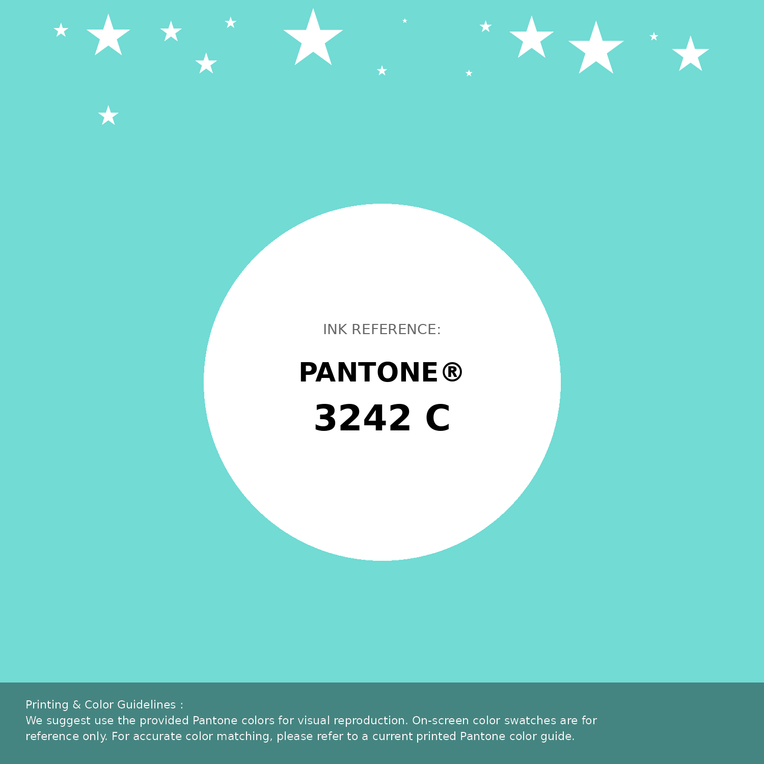
#71dbd4 Pantone 3242 C Color | Hex color Code #71dbd4 Pantone Swatch Artwork
Download Artwork Swatch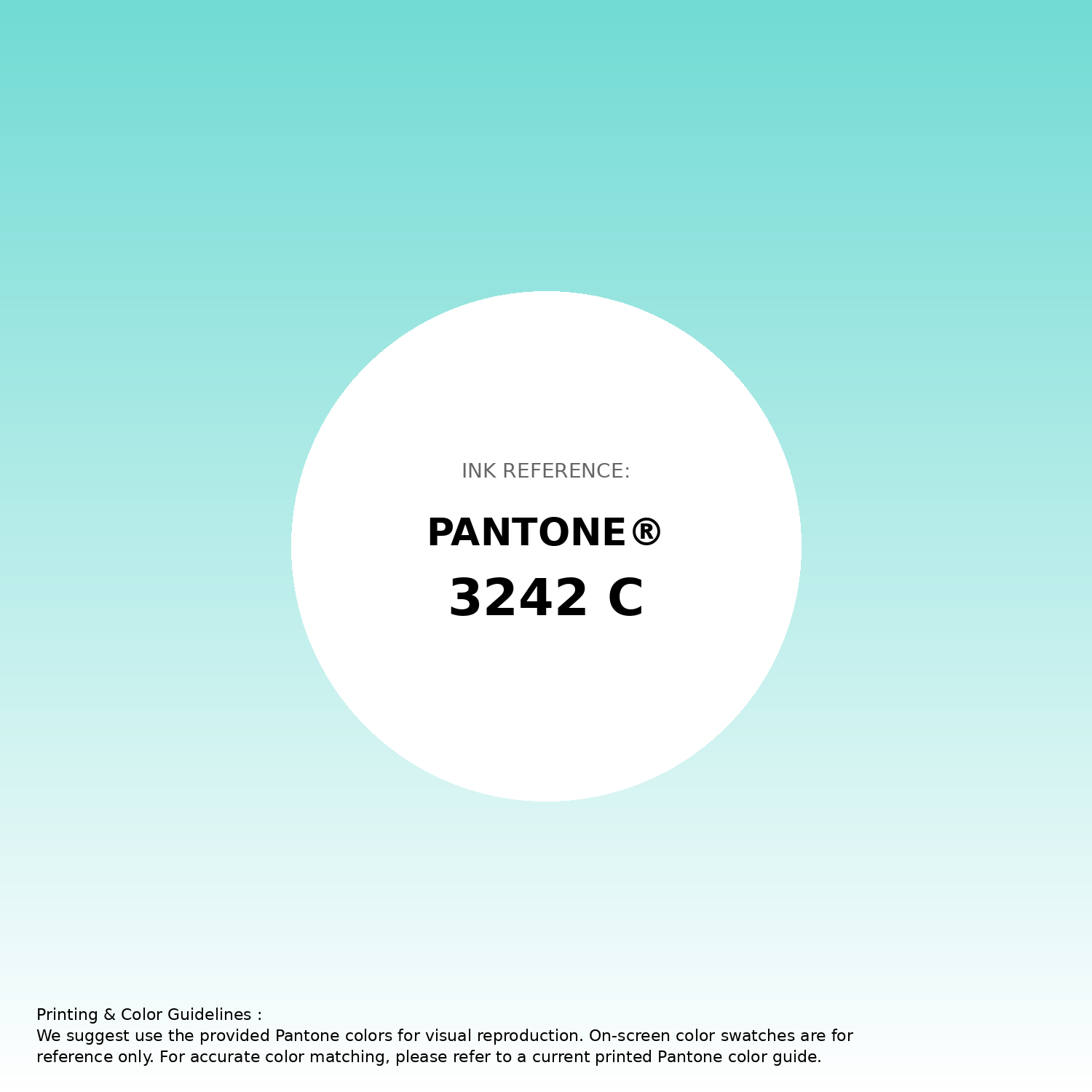
#71dbd4 Pantone 3242 C Color | Hex color Code #71dbd4 Gradient Artwork (PNG)
Download Gradient (PNG)#71dbd4 Pantone 3242 C Color | Hex color Code #71dbd4 Gradient Artwork (SVG)
Download Gradient (SVG)
#71dbd4 Pantone 3242 C Color | Hex color Code #71dbd4 T-Shirt Mockup
Download T-Shirt Mockup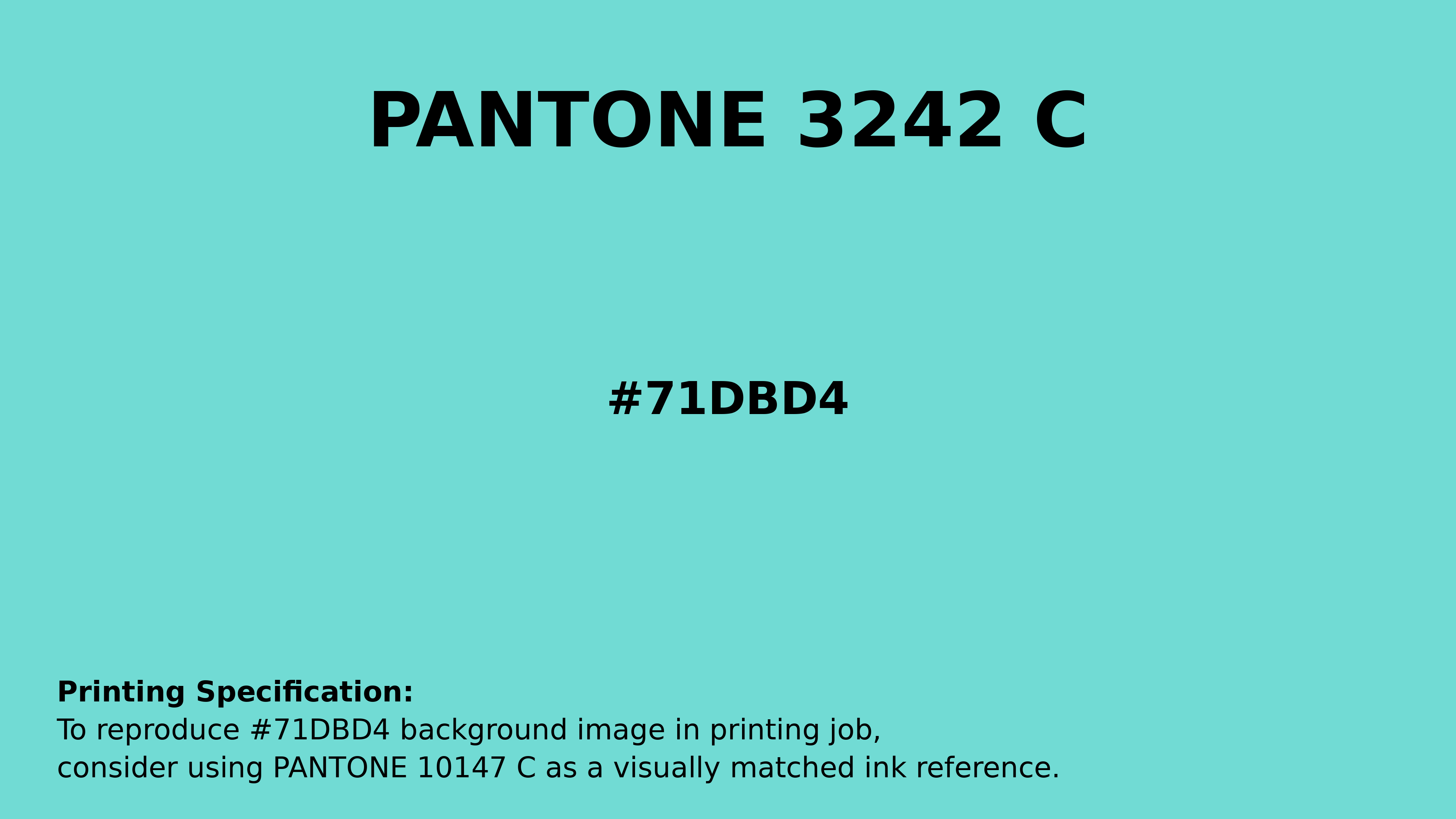
#71dbd4 Pantone 3242 C Color | Hex color Code #71dbd4 Printing Artwork Pantone Reference
Download Pantone Printing ReferenceRelated Color Palettes
- Medium Turquoise and Gray •
- Gray and Pale Turquoise •
- Light Steel Blue and Dark Turquoise •
- Pale Turquoise and Pale Turquoise •
- Slate Gray and Medium Turquoise •
- Cadet Blue and Medium Turquoise •
- Pale Turquoise and Dark Slate Gray •
- Turquoise and Light Steel Blue •
- SkyBlue and Pale Turquoise •
- Medium Turquoise and Medium Turquoise •
- Dark Khaki and Pale Turquoise •
- Steel Blue and Pale Turquoise •
- Pale Turquoise and Cornflower Blue •
- Medium Turquoise and Cadet Blue •
- Medium Turquoise and Dark Sea Green
Color Palette Collection
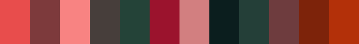
31 Autumn Color Palettes
31 color palettes with 155 colors.
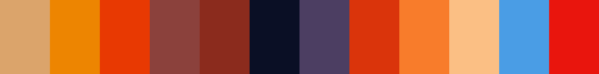
65 Red Color Palettes
65 color palettes with 325 colors.

100 Rose Flower Nature Color Palettes
100 color palettes with 500 colors.
46 Flower Inspired Color Schemes
46 color palettes with 230 colors.