#707372 Color
Your all-in-one color resource. Download hex background images, Adobe swatches (ASE), PDF color sheets, and SVG files. Explore palettes, harmonies, accessibility, conversions, and professional exports — designed for designers, developers, and color perfectionists.
This muted grey-green, #707372, evokes a feeling of quiet contemplation and subtle strength. It whispers of twilight hours, the soft light filtering through a forest canopy just before nightfall. The color feels grounded and stable, like weathered stone or the bark of an ancient tree. It suggests introspection, a gentle melancholy, and a sense of timelessness. It creates an atmosphere of understated elegance and serenity, suitable for spaces where focus and calmness are desired, like libraries or studies. In design, it can be used to evoke a sense of sophistication and naturalness, pairing well with warm wood tones or crisp whites. It lacks the vibrancy of brighter greens, offering a more subdued and introspective experience, subtly hinting at resilience and enduring beauty. Visually matched named color: Dusk's Embrace.
PANTONE 424 C
Choose Color
Selected Color
Recent Colors
Color Details
Similar Ink Alternatives for #707372 color Alternative print inks for reproducing #707372 background image with a similar visual appearance.
Disclaimer: The visually matched ink reference is an independent approximation intended as a guide only. Please be advised that this pantone colors is only intended as a guide, Actual colours will depend on screen calibration variances. The print ink suggestions provided are independent visual approximations and are not affiliated with or endorsed by Pantone LLC. For official color specifications, conversion factors, and comprehensive color system information, please visit Pantone Connect. Official Pantone products can be purchased at pantone.com.
Color Previews for #000000 See how this color looks as a background or as text.
Complete Guide to Your Color Laboratory
Everything you need to know about this professional color toolkit.
Use the Color Picker at the top to select any color. All modules below update instantly.
Workflow: Pick a color → Explore palettes & data → Download what you need (PDF, Image, or Adobe ASE).
Color Details — Your color in all formats: HEX, RGB, RGBA, HSL, HSLA, HSV, CMYK, CIELab, Hunter-Lab, XYZ, Yxy, YUV. One-click copy.
Color Psychology — Emotional impact, cultural meanings, physiological effects, branding applications, and historical significance.
Named Colors — Find official color names (HTML/CSS, Pantone) that match your selection with similarity percentages.
Light & Dark Shades
80-step gradient from black to white. Perfect for button states and component systems.
Tints
Color mixed with white → lighter, pastel variations for backgrounds and disabled states.
Monochromatic — 11 curated tints/shades from one color. Production-ready for design systems.
- Complementary — Opposite on wheel (180°). High contrast.
- Analogous — Neighbors (±30°). Harmonious flow.
- Triadic — Three colors (120° apart). Vibrant, balanced.
- Split-Complementary — Base + two near-complements. Softer contrast.
- Tetradic/Square — Four colors. Complex, maximum variety.
- Neutral — Desaturated versions. Subtle, sophisticated.
15 Professional Variations — Monochromatic, Analogous, Complementary, Warm/Cool/Earth Tones, Pastel, Vibrant, High Contrast, and more.
Color Infusion — 10 palettes showing your color morphing into each major hue. Find bridge colors.
Similar Colors — 60+ colors generated via CIELAB Delta E matching. Unexpected harmonious combinations.
18 Ready-to-Use Gradients — Complementary, Analogous, Triadic, Tint/Shade progressions, and more.
Downloads: PNG (2560×1440), CSS (production-ready code), SVG (scalable vector).
WCAG Contrast Checker — Tests your color against white, black, and custom colors for AA (4.5:1) and AAA (7:1) compliance. Large text thresholds included.
Harmony & Accessibility Guide — Tests against 10 canonical hues. Shows which pairs are both beautiful AND WCAG-compliant for text.
PNG/JPG — High-res images for presentations and mood boards.
PDF — Print-ready reports for clients and teams.
Adobe ASE — Direct import to Photoshop, Illustrator, InDesign, XD.
CSS/SVG — Gradients only. Production-ready code and vectors.
Color Science: Industry-standard conversions (HSL, CIELAB, CMYK, XYZ). WCAG 2.1 luminance formula. Delta E (ΔE76) for perceptual matching.
Direct Links: Share colors via icolorpalette.com/color/ff5733 or icolorpalette.com/color/red
Issues? Refresh the page, wait for rendering, try another browser, or check console (F12) for errors.
Printing Guide for #707372 Background Image
Use PANTONE 424 C as a visually matched ink reference when printing this background image.
To print the #707372 background image from our site, consider using PANTONE 424 C as a visually matched ink reference.
Download the background image, then provide this reference code to your print vendor to help achieve accurate color reproduction.
The visually matched ink reference for the #707372 background image is PANTONE 424 C.
This color is commonly described as Dusk's Embrace.
This muted grey-green, #707372, evokes a feeling of quiet contemplation and subtle strength. It whispers of twilight hours, the soft light filtering through a forest canopy just before nightfall. The color feels grounded and stable, like weathered stone or the bark of an ancient tree. It suggests introspection, a gentle melancholy, and a sense of timelessness. It creates an atmosphere of understated elegance and serenity, suitable for spaces where focus and calmness are desired, like libraries or studies. In design, it can be used to evoke a sense of sophistication and naturalness, pairing well with warm wood tones or crisp whites. It lacks the vibrancy of brighter greens, offering a more subdued and introspective experience, subtly hinting at resilience and enduring beauty.
We provide PANTONE 424 C as a visually matched ink reference to help you reproduce the #707372 background image accurately in professional printing.
This reference code helps print vendors achieve consistent color output across different printing equipment and materials.
After downloading the #707372 background image from our site:
- Include the visually matched ink reference PANTONE 424 C in your print order notes
- Inform your print vendor that this is your target color reference
- Request a proof print to verify the Dusk's Embrace color appearance before full production
The #707372 background image with PANTONE 424 C as visually matched ink reference can be used for:
- Posters, banners, and backdrops
- Business cards, brochures, and flyers
- Packaging, labels, and stickers
- Signage and promotional materials
This is an independent visual approximation.
While PANTONE 424 C closely matches the #707372 background image color, variations may exist between screen display and printed output.
We recommend requesting a proof print to verify the final appearance.
This muted grey-green, #707372, evokes a feeling of quiet contemplation and subtle strength. It whispers of twilight hours, the soft light filtering through a forest canopy just before nightfall. The color feels grounded and stable, like weathered stone or the bark of an ancient tree. It suggests introspection, a gentle melancholy, and a sense of timelessness. It creates an atmosphere of understated elegance and serenity, suitable for spaces where focus and calmness are desired, like libraries or studies. In design, it can be used to evoke a sense of sophistication and naturalness, pairing well with warm wood tones or crisp whites. It lacks the vibrancy of brighter greens, offering a more subdued and introspective experience, subtly hinting at resilience and enduring beauty.
Understanding these associations helps ensure the #707372 background image aligns with your intended message and brand impact.
Important Information
The visually matched ink reference is an independent approximation intended as a guide only.
Actual printed colors may vary depending on screen calibration, substrate material, ink type, and printing equipment used.
For official color specifications and certified color standards, visit Pantone Connect.
Official color guides and swatch books can be purchased from pantone.com.
Pantone 424 C Color: The Subtle Charcoal | #707372
Introduction:
Pantone 424 C Color, also known as The Subtle Charcoal, is a color that exudes a sense of refinement and sophistication. Its deep, muted gray tone adds depth and a touch of elegance to any visual composition.
Historical Significance:
Key moments in history: Throughout history, Pantone 424 C Color has been prominently used in architectural designs, traditional calligraphy, and ancient manuscripts. Its presence in these historical artifacts showcases its timelessness and enduring appeal.
Symbolism and Meaning:
Symbolism and Meaning: Pantone 424 C Color typically symbolizes strength, stability, and depth. It is often associated with professionalism, reliability, and a sense of gravitas. Its muted nature lends itself well to portraying a serious and mature tone.
Pantone 424 C Color in Fashion:
Pantone 424 C Color in Fashion: This color has made its mark in the world of fashion, being a staple choice for formal attire. It is often seen in tailored suits, evening gowns, and high-end accessories. The Subtle Charcoal lends an air of sophistication and elegance to any fashion ensemble.
Pantone 424 C Color in Graphic Design:
Pantone 424 C Color in Graphic Design: In design aesthetics and branding, Pantone 424 C Color is often used to convey professionalism, stability, and a sense of reliability. Its neutral and versatile nature makes it a popular choice for corporate identities, logos, and visual identities that aim to inspire trust and confidence.
Color Combinations:
Color Combinations: Pantone 424 C Color can be combined with various colors to create visually appealing compositions. Some potential color combinations include Pantone 424 C Color with Pantone 432 C Color, Pantone 7535 C Color, and Pantone 877 C Color. These combinations create a subtle and harmonious palette.
Nature's Palette:
Nature's Palette: Pantone 424 C Color can be found in natural occurrences such as the gray feathers of certain bird species, the bark of old trees, and the pebbles found along rocky shores. It harmonizes well with the natural world and blends seamlessly with various natural landscapes.
Artistic Representations:
Artistic Representations: Artists have used Pantone 424 C Color in paintings and other forms of art to convey a sense of depth, mystery, and elegance. Its neutral undertones allow it to complement and enhance other colors in a composition, creating a visually striking and balanced piece of artwork.
Movies and Cinematic Landscapes:
Movies and Cinematic Landscapes: Pantone 424 C Color is often used in movies and cinematic scenes to set a serious and somber mood. It is frequently seen in film noir classics, courtroom dramas, and introspective character-driven films. Its presence adds depth and emotional intensity to the visual storytelling.
Products and Commercial Appeal:
Products and Commercial Appeal: The Subtle Charcoal color has been widely used by luxury brands to convey elegance, sophistication, and high quality. It is often seen in high-end technological devices, luxury automobiles, and premium home decor products, adding a touch of refinement and exclusivity to these items.
National Symbols and Significance:
National Symbols and Significance: Pantone 424 C Color is often associated with national symbols that represent strength, stability, and resilience. Some countries incorporate this color in their flags or emblems to signify these qualities.
The Psychological and Emotional Impact:
The Psychological and Emotional Impact: Pantone 424 C Color evokes a sense of seriousness, professionalism, and reliability. It can create a calming and grounding effect, instilling a sense of stability and trust in individuals. This color is often used in environments where focus and concentration are paramount.
Conclusion:
Pantone 424 C Color, The Subtle Charcoal, holds historical significance, conveys stability and professionalism, and finds its place in various fields such as fashion, graphic design, and art. Its timeless appeal and versatility make it a go-to choice for expressing depth and sophistication in visual compositions.
Pantone 424 C Color | Hex color Code #707372 Image & Artwork
Download high-quality assets for your projects.

#707372 Color Schemes
Download Color Schemes
#707372 Color Shades
Download Color Shades
Pantone 424 C Color | Hex color Code #707372 Solid Color Background
Download Solid Color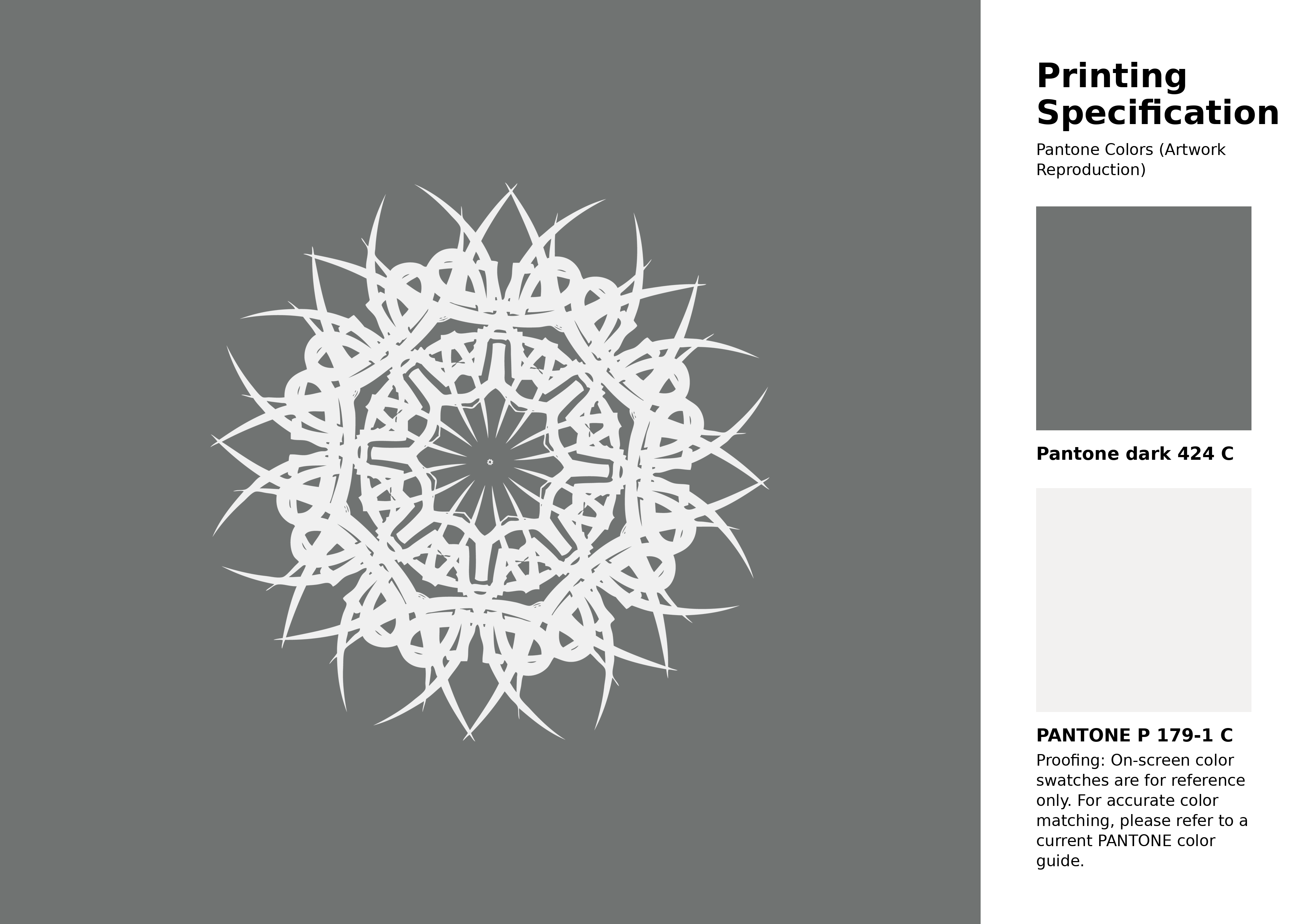
#707372 Pantone 424 C Color | Hex color Code #707372 Artwork Image (PNG)
Download Artwork (PNG)#707372 Pantone 424 C Color | Hex color Code #707372 Artwork Vector (PDF)
Download Artwork (PDF)#707372 Pantone 424 C Color | Hex color Code #707372 Artwork Vector (SVG)
Download Artwork (SVG)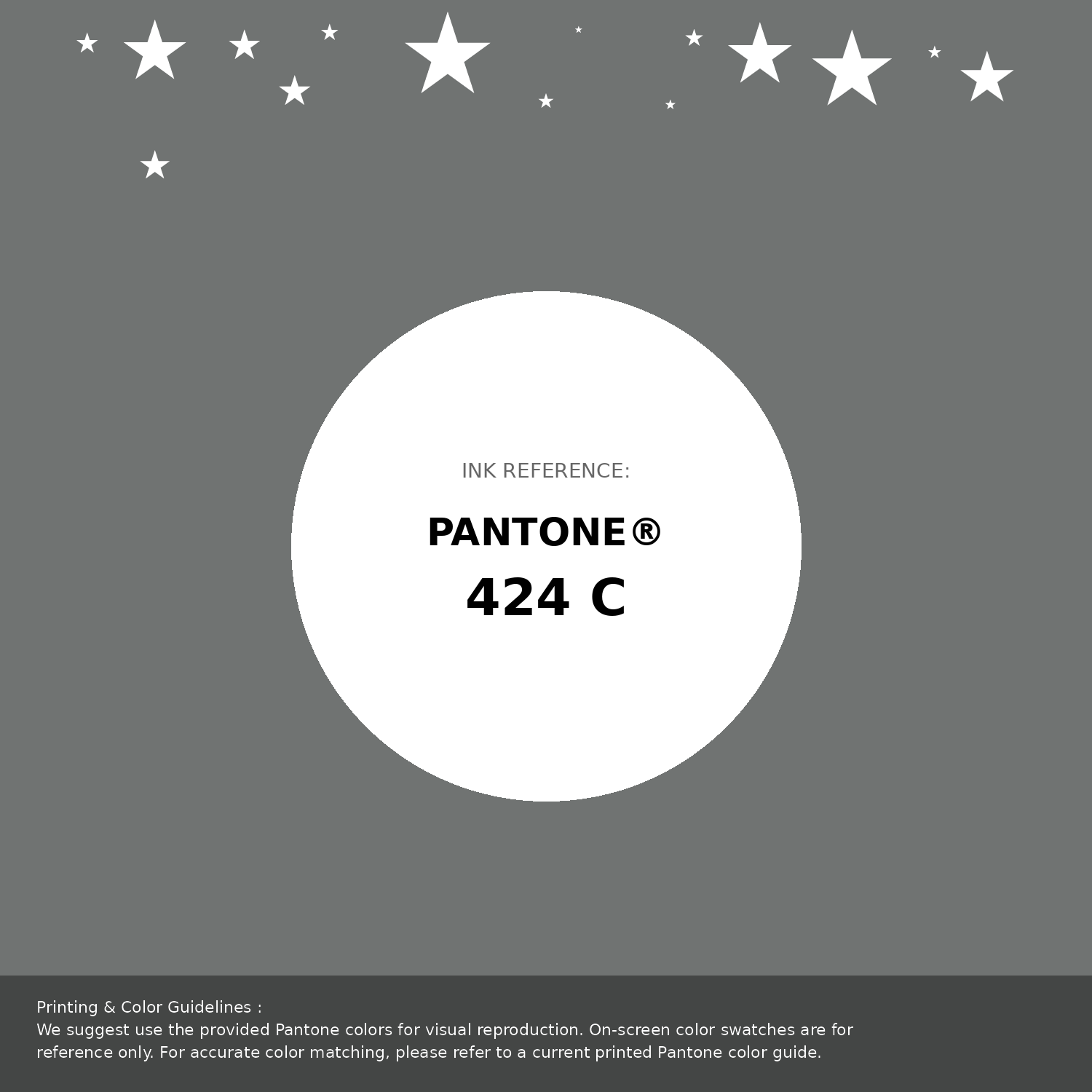
#707372 Pantone 424 C Color | Hex color Code #707372 Pantone Swatch Artwork
Download Artwork Swatch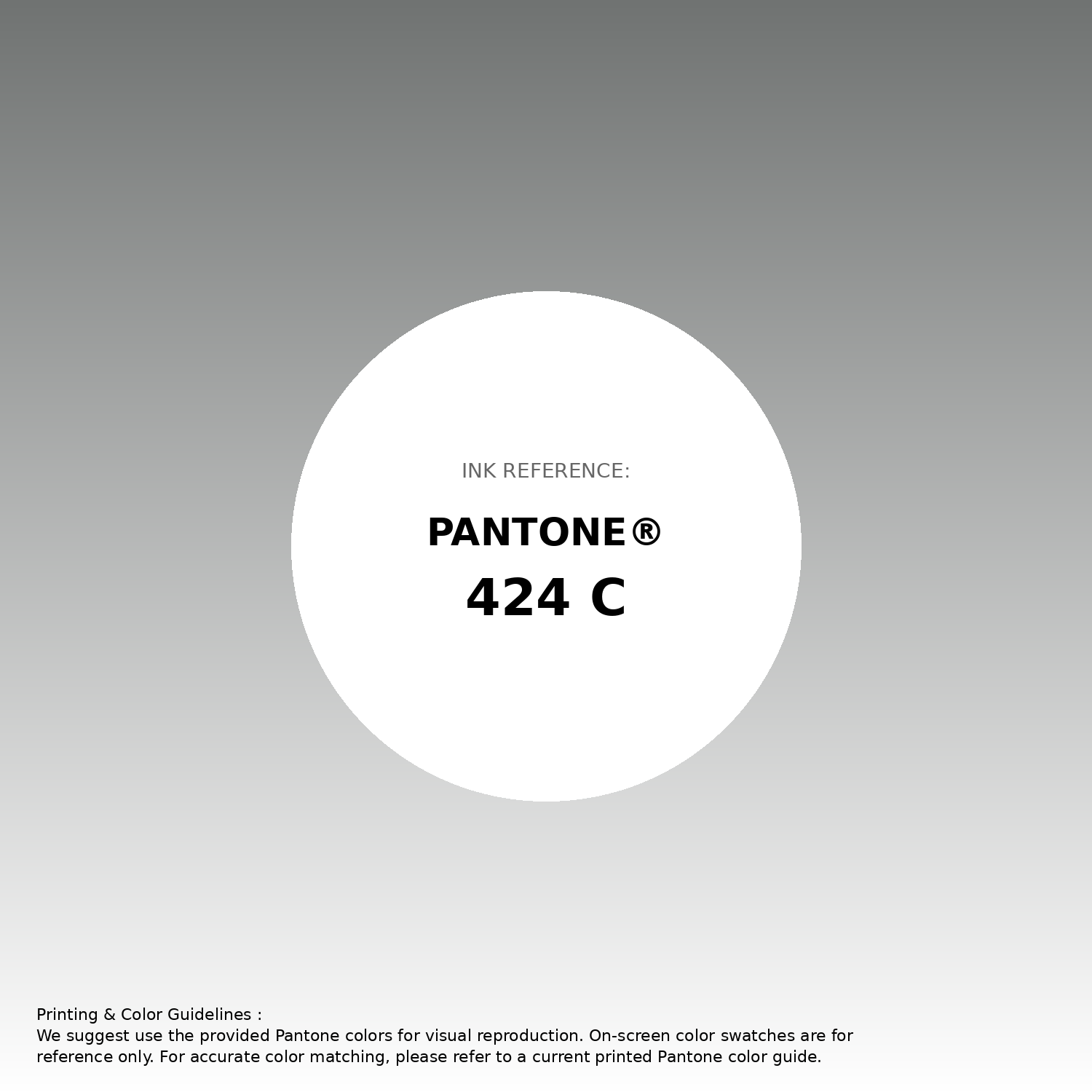
#707372 Pantone 424 C Color | Hex color Code #707372 Gradient Artwork (PNG)
Download Gradient (PNG)#707372 Pantone 424 C Color | Hex color Code #707372 Gradient Artwork (SVG)
Download Gradient (SVG)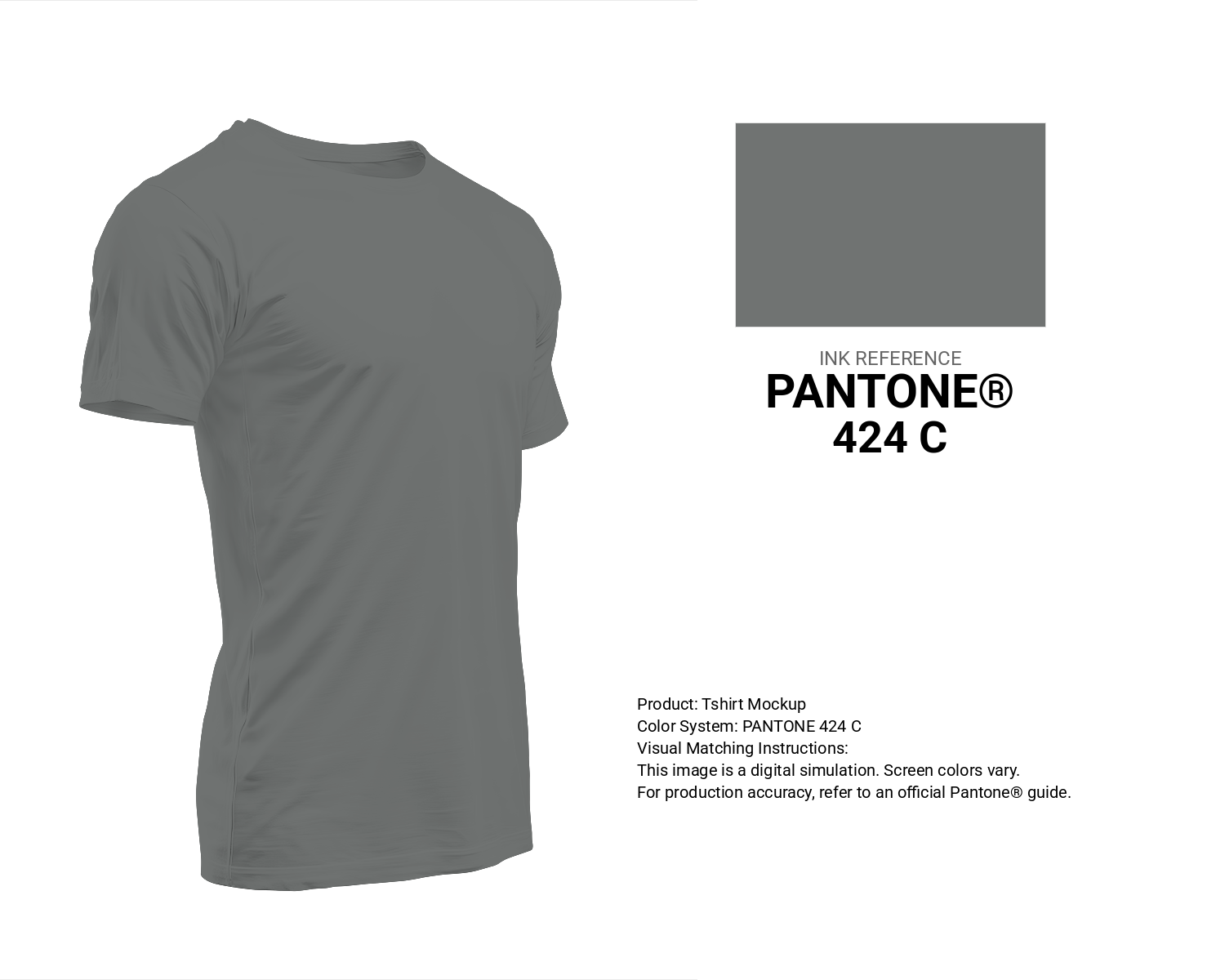
#707372 Pantone 424 C Color | Hex color Code #707372 T-Shirt Mockup
Download T-Shirt Mockup
#707372 Pantone 424 C Color | Hex color Code #707372 Printing Artwork Pantone Reference
Download Pantone Printing ReferenceRelated Color Palettes
- Gray Chateau •
- Dark Slate Gray and Plum •
- Gray and Medium Aquamarine •
- Medium Orchid and Dim Gray •
- Navy and Dark Slate Gray •
- Coral and Dark Slate Gray •
- Light Slate Gray and Linen •
- Teal and Dark Slate Gray •
- Pale Goldenrod and Dark Gray •
- OrangeRed and Gray •
- Cadet Blue and Slate Gray •
- Periwinkle Gray •
- Light Salmon and Gray •
- White Smoke and Light Gray •
- Light Gray and Tan
Color Palette Collection

500+ Popular Color Palette Collection
501 color palettes with 2505 colors.

265 Color Palettes
265 color palettes with 1325 colors.

31 Royal Blue Color Palette
31 color palettes with 155 colors.

50 Color Palettes inspired by Sky
50 color palettes with 250 colors.