#702F8A Color
Your all-in-one color resource. Download hex background images, Adobe swatches (ASE), PDF color sheets, and SVG files. Explore palettes, harmonies, accessibility, conversions, and professional exports — designed for designers, developers, and color perfectionists.
#702F8A is a deep, rich purple with a hint of gray, suggesting a twilight hour where the day transitions into night. The color evokes a sense of mystery, sophistication, and perhaps a touch of melancholy. It reminds one of amethyst gemstones, twilight skies, or the shadowy depths of a forest at dusk. The mood it creates is introspective and calming, yet also slightly dramatic. In design, it would be suitable for creating an atmosphere of luxury and elegance, perhaps used in accent pieces, or in spaces designed for contemplation and relaxation, such as a library or meditation room. The dark purple hues are often associated with royalty and power, yet the gray undertones temper this, adding a layer of quiet sophistication rather than overt dominance. The color doesn't scream for attention but instead invites closer inspection and deeper contemplation. Visually matched named color: Twilight Amethyst.
PANTONE 526 C
Choose Color
Selected Color
Recent Colors
Color Details
Similar Ink Alternatives for #702F8A color Alternative print inks for reproducing #702F8A background image with a similar visual appearance.
Disclaimer: The visually matched ink reference is an independent approximation intended as a guide only. Please be advised that this pantone colors is only intended as a guide, Actual colours will depend on screen calibration variances. The print ink suggestions provided are independent visual approximations and are not affiliated with or endorsed by Pantone LLC. For official color specifications, conversion factors, and comprehensive color system information, please visit Pantone Connect. Official Pantone products can be purchased at pantone.com.
Color Previews for #000000 See how this color looks as a background or as text.
Complete Guide to Your Color Laboratory
Everything you need to know about this professional color toolkit.
Use the Color Picker at the top to select any color. All modules below update instantly.
Workflow: Pick a color → Explore palettes & data → Download what you need (PDF, Image, or Adobe ASE).
Color Details — Your color in all formats: HEX, RGB, RGBA, HSL, HSLA, HSV, CMYK, CIELab, Hunter-Lab, XYZ, Yxy, YUV. One-click copy.
Color Psychology — Emotional impact, cultural meanings, physiological effects, branding applications, and historical significance.
Named Colors — Find official color names (HTML/CSS, Pantone) that match your selection with similarity percentages.
Light & Dark Shades
80-step gradient from black to white. Perfect for button states and component systems.
Tints
Color mixed with white → lighter, pastel variations for backgrounds and disabled states.
Monochromatic — 11 curated tints/shades from one color. Production-ready for design systems.
- Complementary — Opposite on wheel (180°). High contrast.
- Analogous — Neighbors (±30°). Harmonious flow.
- Triadic — Three colors (120° apart). Vibrant, balanced.
- Split-Complementary — Base + two near-complements. Softer contrast.
- Tetradic/Square — Four colors. Complex, maximum variety.
- Neutral — Desaturated versions. Subtle, sophisticated.
15 Professional Variations — Monochromatic, Analogous, Complementary, Warm/Cool/Earth Tones, Pastel, Vibrant, High Contrast, and more.
Color Infusion — 10 palettes showing your color morphing into each major hue. Find bridge colors.
Similar Colors — 60+ colors generated via CIELAB Delta E matching. Unexpected harmonious combinations.
18 Ready-to-Use Gradients — Complementary, Analogous, Triadic, Tint/Shade progressions, and more.
Downloads: PNG (2560×1440), CSS (production-ready code), SVG (scalable vector).
WCAG Contrast Checker — Tests your color against white, black, and custom colors for AA (4.5:1) and AAA (7:1) compliance. Large text thresholds included.
Harmony & Accessibility Guide — Tests against 10 canonical hues. Shows which pairs are both beautiful AND WCAG-compliant for text.
PNG/JPG — High-res images for presentations and mood boards.
PDF — Print-ready reports for clients and teams.
Adobe ASE — Direct import to Photoshop, Illustrator, InDesign, XD.
CSS/SVG — Gradients only. Production-ready code and vectors.
Color Science: Industry-standard conversions (HSL, CIELAB, CMYK, XYZ). WCAG 2.1 luminance formula. Delta E (ΔE76) for perceptual matching.
Direct Links: Share colors via icolorpalette.com/color/ff5733 or icolorpalette.com/color/red
Issues? Refresh the page, wait for rendering, try another browser, or check console (F12) for errors.
Printing Guide for #702f8a Background Image
Use PANTONE 526 C as a visually matched ink reference when printing this background image.
To print the #702f8a background image from our site, consider using PANTONE 526 C as a visually matched ink reference.
Download the background image, then provide this reference code to your print vendor to help achieve accurate color reproduction.
The visually matched ink reference for the #702f8a background image is PANTONE 526 C.
This color is commonly described as Twilight Amethyst.
#702F8A is a deep, rich purple with a hint of gray, suggesting a twilight hour where the day transitions into night. The color evokes a sense of mystery, sophistication, and perhaps a touch of melancholy. It reminds one of amethyst gemstones, twilight skies, or the shadowy depths of a forest at dusk. The mood it creates is introspective and calming, yet also slightly dramatic. In design, it would be suitable for creating an atmosphere of luxury and elegance, perhaps used in accent pieces, or in spaces designed for contemplation and relaxation, such as a library or meditation room. The dark purple hues are often associated with royalty and power, yet the gray undertones temper this, adding a layer of quiet sophistication rather than overt dominance. The color doesn't scream for attention but instead invites closer inspection and deeper contemplation.
We provide PANTONE 526 C as a visually matched ink reference to help you reproduce the #702f8a background image accurately in professional printing.
This reference code helps print vendors achieve consistent color output across different printing equipment and materials.
After downloading the #702f8a background image from our site:
- Include the visually matched ink reference PANTONE 526 C in your print order notes
- Inform your print vendor that this is your target color reference
- Request a proof print to verify the Twilight Amethyst color appearance before full production
The #702f8a background image with PANTONE 526 C as visually matched ink reference can be used for:
- Posters, banners, and backdrops
- Business cards, brochures, and flyers
- Packaging, labels, and stickers
- Signage and promotional materials
This is an independent visual approximation.
While PANTONE 526 C closely matches the #702f8a background image color, variations may exist between screen display and printed output.
We recommend requesting a proof print to verify the final appearance.
#702F8A is a deep, rich purple with a hint of gray, suggesting a twilight hour where the day transitions into night. The color evokes a sense of mystery, sophistication, and perhaps a touch of melancholy. It reminds one of amethyst gemstones, twilight skies, or the shadowy depths of a forest at dusk. The mood it creates is introspective and calming, yet also slightly dramatic. In design, it would be suitable for creating an atmosphere of luxury and elegance, perhaps used in accent pieces, or in spaces designed for contemplation and relaxation, such as a library or meditation room. The dark purple hues are often associated with royalty and power, yet the gray undertones temper this, adding a layer of quiet sophistication rather than overt dominance. The color doesn't scream for attention but instead invites closer inspection and deeper contemplation.
Understanding these associations helps ensure the #702f8a background image aligns with your intended message and brand impact.
Important Information
The visually matched ink reference is an independent approximation intended as a guide only.
Actual printed colors may vary depending on screen calibration, substrate material, ink type, and printing equipment used.
For official color specifications and certified color standards, visit Pantone Connect.
Official color guides and swatch books can be purchased from pantone.com.
Pantone 526 C Color: Royal Purple | #702F8A
Introduction:
Royal Purple is a deep shade of purple that exudes a sense of luxury, nobility, and elegance. Its rich hue and vibrant undertones make it visually captivating and sophisticated.
Historical Significance:
Regal Associations: Royal Purple has long been associated with royalty and power. It was used exclusively by aristocrats and monarchs throughout history to signify their wealth and status.
Noble Cloak: In ancient Rome, only the Emperor and certain high-ranking officials were allowed to wear garments dyed with Royal Purple. The dye was obtained from the glands of shellfish, making it expensive and difficult to procure.
Religious Symbolism: Royal Purple has also been closely associated with spirituality. In Byzantine culture, it symbolized divinity and was used to decorate religious manuscripts and artwork.
Symbolism and Meaning:
Majestic Power: Royal Purple is often associated with power, ambition, and luxury. It represents a sense of grandeur and superiority. In color psychology, it is believed to inspire creativity and generate a feeling of regality.
Spiritual Depth: Due to its historical association with religious art, Royal Purple also symbolizes spirituality and divine intervention. It can evoke a sense of mysticism and reverence.
Royal Purple in Fashion:
Opulent Attire: Royal Purple has long been a popular choice in the fashion world for evening wear and formal occasions. It adds a touch of elegance and sophistication to any outfit, making it a sought-after color for luxury brands and designer clothing.
Trendsetter: In recent years, Royal Purple has become a trendsetter in fashion shows and red carpets. Celebrities often choose this color to make a bold and stylish statement.
Royal Purple in Graphic Design:
Elevated Aesthetics: In graphic design, Royal Purple is often used to convey a sense of luxury, elegance, and sophistication. It is commonly seen in high-end branding, product packaging, and promotional materials.
Dramatic Impact: The deep hue and vibrant undertones of Royal Purple make it visually striking and attention-grabbing. It can add a sense of mystery and allure to any design.
Color Combinations:
Gold and Royal Purple: The combination of gold and Royal Purple creates a regal and opulent palette, often associated with luxury and extravagance.
Silver and Royal Purple: The combination of silver and Royal Purple creates a modern and sophisticated aesthetic, often used in high-end interior design and fashion.
Royal Purple and Ivory: The combination of Royal Purple and ivory creates a classical and elegant palette, reminiscent of ancient Rome and Byzantine art.
Black and Royal Purple: The combination of black and Royal Purple creates a dramatic and mysterious palette, often used in gothic and fantasy-themed designs.
Nature's Palette:
Lavender Flowers: Royal Purple can be found in the petals of certain lavender flowers, adding a sense of richness and depth to their natural beauty.
Amethyst: Amethyst, a semiprecious gemstone, often exhibits hues of Royal Purple, symbolizing spiritual and healing properties in many cultures.
Twilight Sky: The mesmerizing hues of purple that appear during the transition from day to night evoke a sense of serenity and tranquility.
Artistic Representations:
Historical Paintings: Royal Purple has been prominently used in historical paintings to depict royalty, power, and wealth. Artists often used expensive pigments to capture its vibrant hue accurately.
Fantasy Art: In fantasy art, Royal Purple is commonly used to represent magic, mysticism, and otherworldly realms. It adds a touch of enchantment and allure to the artwork.
Movies and Cinematic Landscapes:
The Crown: The Netflix series "The Crown" often features Royal Purple in its set design, costumes, and overall aesthetic to evoke the regal and noble atmosphere of the British monarchy.
The Great Gatsby: The film adaptation of F. Scott Fitzgerald's "The Great Gatsby" showcases Royal Purple in its lavish party scenes and luxurious costumes, representing the opulence and extravagance of the Roaring Twenties.
Products and Commercial Appeal:
Designer Perfumes: Many high-end perfume brands choose Royal Purple for their packaging and branding to convey a sense of luxury and sophistication.
Jewelry: Royal Purple gemstones, such as amethyst and tanzanite, are highly sought after for their exquisite beauty and regal appeal.
National Symbols and Significance:
The Purple Heart: The Purple Heart is a United States military decoration awarded to those wounded or killed while serving in the armed forces. It represents courage, sacrifice, and patriotism.
Purple in Ancient Rome: In ancient Rome, Royal Purple was associated with the ruling class and was used in the togas of senators and other high-ranking officials.
Purple in Buddhism: Purple is considered a sacred color in Buddhism and is often associated with spiritual enlightenment and the highest state of consciousness.
The Psychological and Emotional Impact:
Royalty and Power: Royal Purple can evoke feelings of authority, dignity, and strength. It can make individuals feel empowered and confident.
Richness and Luxury: The deep hue and opulent nature of Royal Purple can create a sense of wealth and luxury, allowing individuals to experience a touch of extravagance.
Mystery and Intrigue: The depth and complexity of Royal Purple can elicit a sense of mystery and intrigue, stimulating curiosity and fascination.
Creativity and Inspiration: Royal Purple is often associated with creativity and inspiration. It can stimulate imagination and encourage innovative thinking.
Conclusion:
Royal Purple, also known as Pantone 526 C, is a color that embodies opulence, power, and regality. Its historical significance, symbolic meaning, and impact in various fields such as fashion, graphic design, and art make it a timeless and captivating choice. Whether it's adorning a majestic piece of jewelry or setting the tone in a cinematic landscape, Royal Purple continues to evoke feelings of luxury and fascination.
Pantone 526 C Color | Hex color Code #702f8a Image & Artwork
Download high-quality assets for your projects.

#702f8a Color Schemes
Download Color Schemes
#702f8a Color Shades
Download Color Shades
Pantone 526 C Color | Hex color Code #702f8a Solid Color Background
Download Solid Color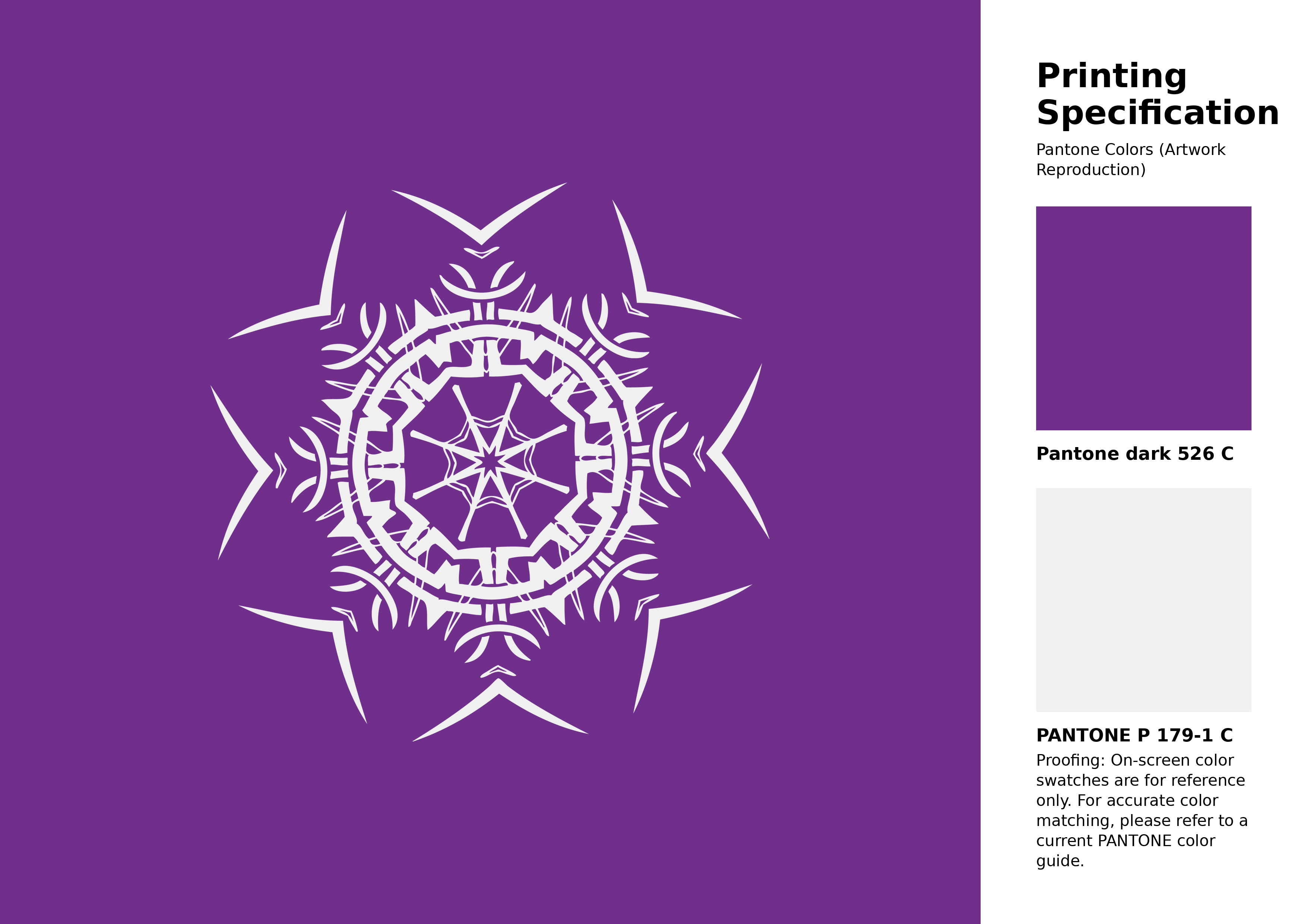
#702f8a Pantone 526 C Color | Hex color Code #702f8a Artwork Image (PNG)
Download Artwork (PNG)#702f8a Pantone 526 C Color | Hex color Code #702f8a Artwork Vector (PDF)
Download Artwork (PDF)#702f8a Pantone 526 C Color | Hex color Code #702f8a Artwork Vector (SVG)
Download Artwork (SVG)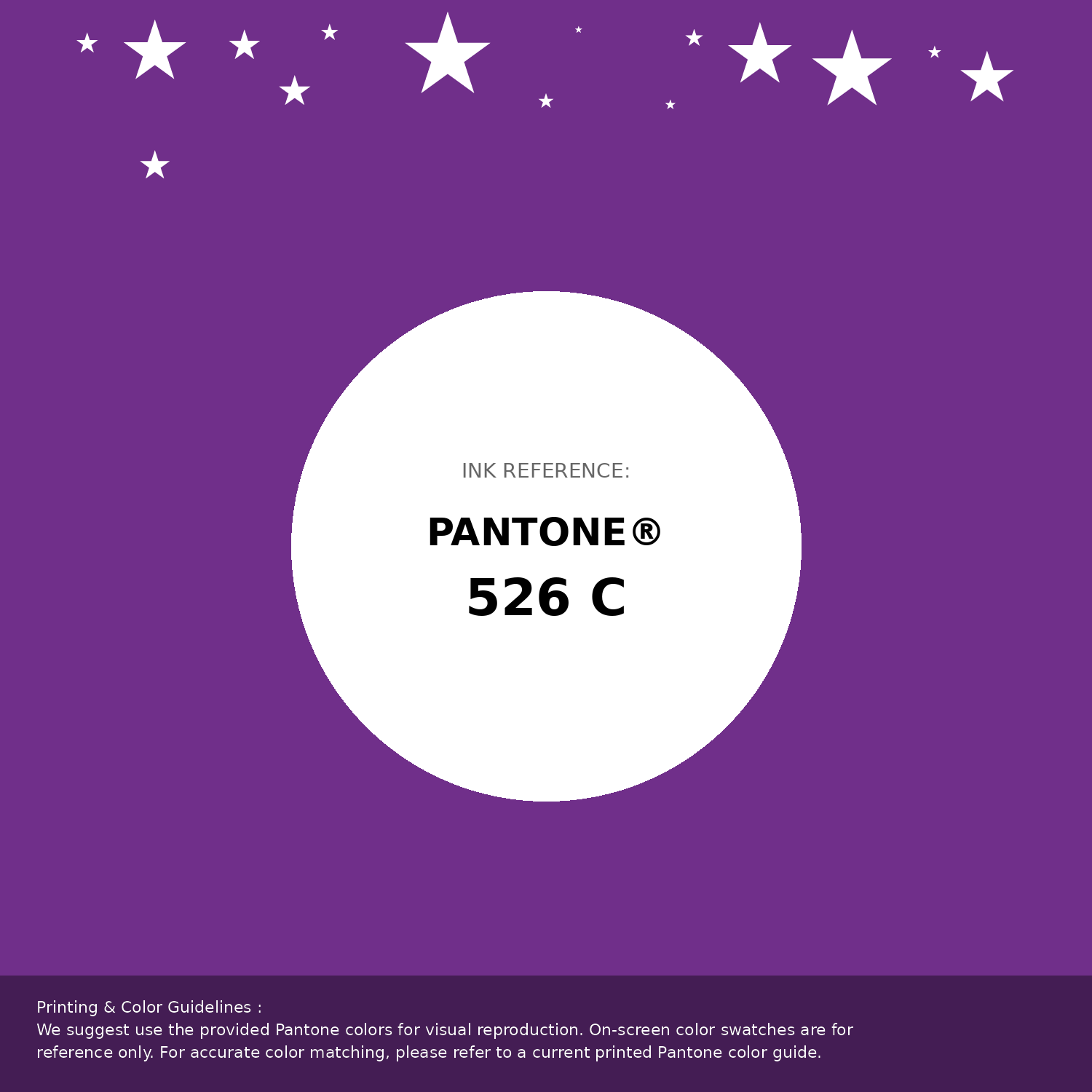
#702f8a Pantone 526 C Color | Hex color Code #702f8a Pantone Swatch Artwork
Download Artwork Swatch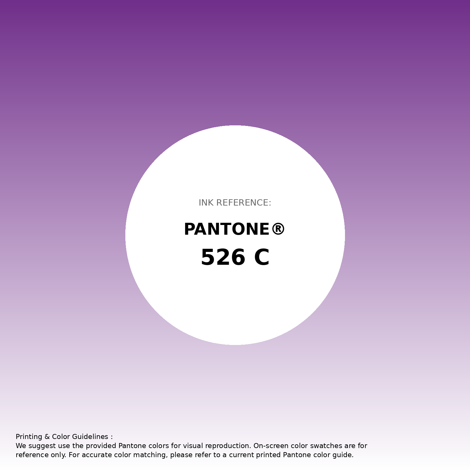
#702f8a Pantone 526 C Color | Hex color Code #702f8a Gradient Artwork (PNG)
Download Gradient (PNG)#702f8a Pantone 526 C Color | Hex color Code #702f8a Gradient Artwork (SVG)
Download Gradient (SVG)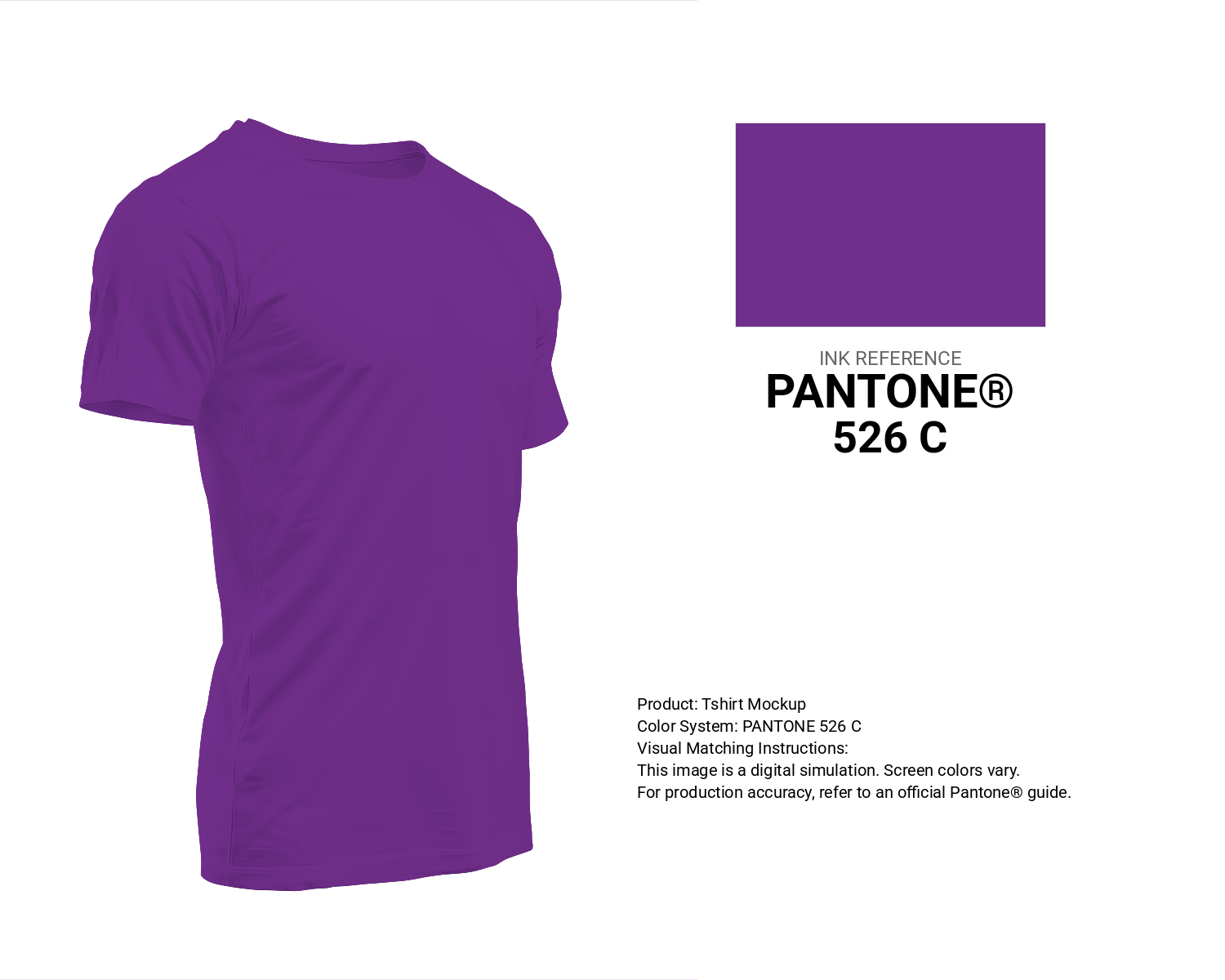
#702f8a Pantone 526 C Color | Hex color Code #702f8a T-Shirt Mockup
Download T-Shirt Mockup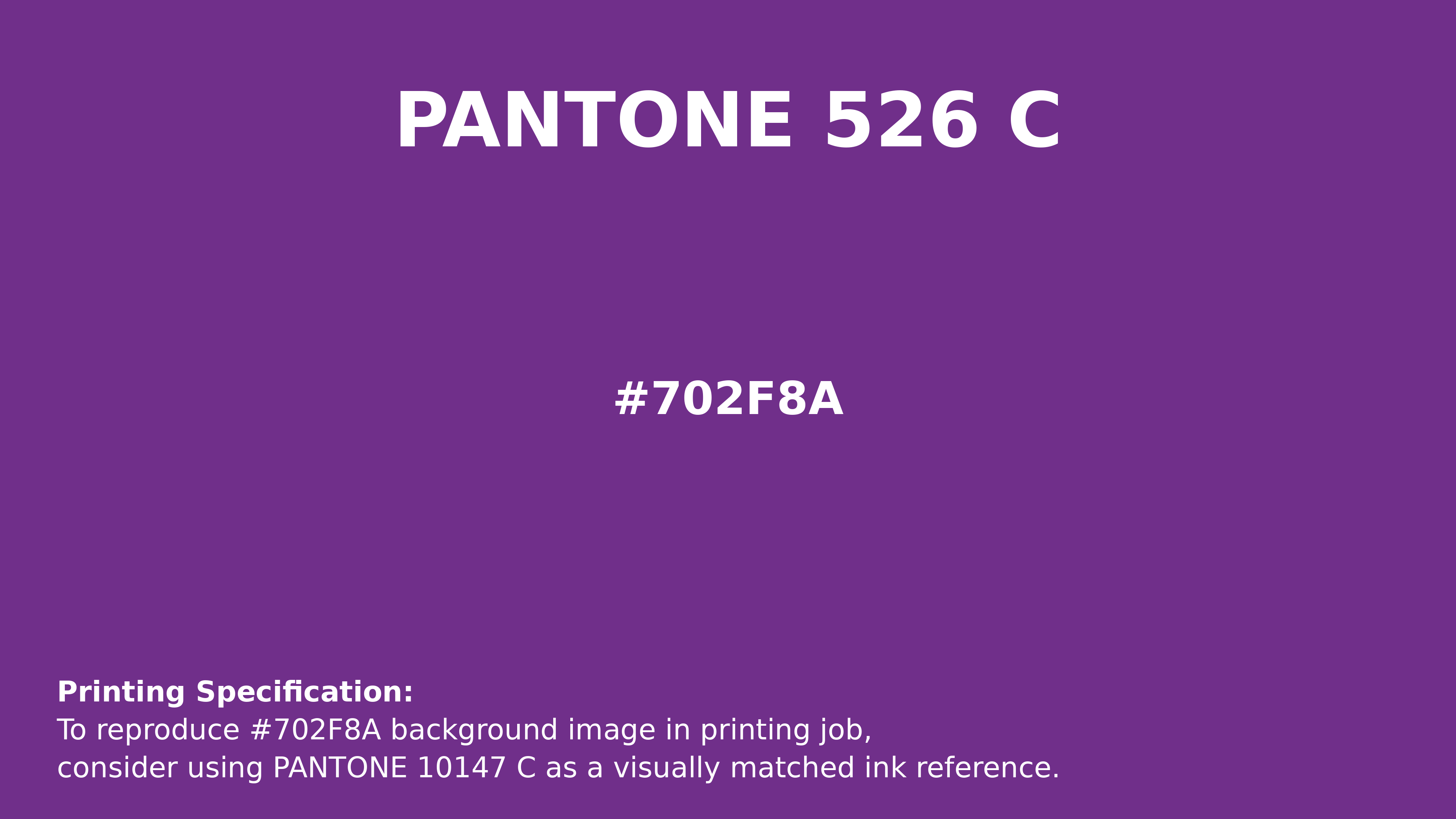
#702f8a Pantone 526 C Color | Hex color Code #702f8a Printing Artwork Pantone Reference
Download Pantone Printing ReferenceRelated Color Palettes
- Red Color Palettes • Green Color Palettes • Purple Color Palettes • Pink Color Palettes • Orange Color Palettes • Blue Color Palettes • Yellow Color Palettes • Brown Color Palettes • Gray Color Palettes • Beige Color Palettes • Turquoise Color Palettes
Color Palette Collection

Pink Colors
8 color palettes with 40 colors.

25 Shades of Orange color Palette Collection
25 color palettes with 125 colors.
75 Sunset Color Schemes
75 color palettes with 375 colors.

24 Summer Color Palettes
24 color palettes with 120 colors.