#6F263D Color
Your all-in-one color resource. Download hex background images, Adobe swatches (ASE), PDF color sheets, and SVG files. Explore palettes, harmonies, accessibility, conversions, and professional exports — designed for designers, developers, and color perfectionists.
#6F263D is a deep, dusky crimson, a color that sits somewhere between the vibrancy of red and the somberness of brown. It evokes a feeling of restrained passion, a simmering intensity held just below the surface. The color reminds me of twilight skies just after sunset, the final embers of the day fading into the approaching night. It suggests a mood of quiet contemplation, perhaps even melancholy, but with an underlying strength. The color's richness creates a sense of sophistication and mystery. In design, it could be used to create a dramatic and luxurious atmosphere, perhaps in accent pieces or in spaces meant for intimacy and reflection. It might also represent a sense of power, but a more controlled and understated power than a brighter red. There's a hint of vintage or antique feeling to it, reminiscent of old velvet fabrics or deeply stained wood. Visually matched named color: Crimson Dusk.
PANTONE 209 C
Choose Color
Selected Color
Recent Colors
Color Details
Similar Ink Alternatives for #6F263D color Alternative print inks for reproducing #6F263D background image with a similar visual appearance.
Disclaimer: The visually matched ink reference is an independent approximation intended as a guide only. Please be advised that this pantone colors is only intended as a guide, Actual colours will depend on screen calibration variances. The print ink suggestions provided are independent visual approximations and are not affiliated with or endorsed by Pantone LLC. For official color specifications, conversion factors, and comprehensive color system information, please visit Pantone Connect. Official Pantone products can be purchased at pantone.com.
Color Previews for #000000 See how this color looks as a background or as text.
Complete Guide to Your Color Laboratory
Everything you need to know about this professional color toolkit.
Use the Color Picker at the top to select any color. All modules below update instantly.
Workflow: Pick a color → Explore palettes & data → Download what you need (PDF, Image, or Adobe ASE).
Color Details — Your color in all formats: HEX, RGB, RGBA, HSL, HSLA, HSV, CMYK, CIELab, Hunter-Lab, XYZ, Yxy, YUV. One-click copy.
Color Psychology — Emotional impact, cultural meanings, physiological effects, branding applications, and historical significance.
Named Colors — Find official color names (HTML/CSS, Pantone) that match your selection with similarity percentages.
Light & Dark Shades
80-step gradient from black to white. Perfect for button states and component systems.
Tints
Color mixed with white → lighter, pastel variations for backgrounds and disabled states.
Monochromatic — 11 curated tints/shades from one color. Production-ready for design systems.
- Complementary — Opposite on wheel (180°). High contrast.
- Analogous — Neighbors (±30°). Harmonious flow.
- Triadic — Three colors (120° apart). Vibrant, balanced.
- Split-Complementary — Base + two near-complements. Softer contrast.
- Tetradic/Square — Four colors. Complex, maximum variety.
- Neutral — Desaturated versions. Subtle, sophisticated.
15 Professional Variations — Monochromatic, Analogous, Complementary, Warm/Cool/Earth Tones, Pastel, Vibrant, High Contrast, and more.
Color Infusion — 10 palettes showing your color morphing into each major hue. Find bridge colors.
Similar Colors — 60+ colors generated via CIELAB Delta E matching. Unexpected harmonious combinations.
18 Ready-to-Use Gradients — Complementary, Analogous, Triadic, Tint/Shade progressions, and more.
Downloads: PNG (2560×1440), CSS (production-ready code), SVG (scalable vector).
WCAG Contrast Checker — Tests your color against white, black, and custom colors for AA (4.5:1) and AAA (7:1) compliance. Large text thresholds included.
Harmony & Accessibility Guide — Tests against 10 canonical hues. Shows which pairs are both beautiful AND WCAG-compliant for text.
PNG/JPG — High-res images for presentations and mood boards.
PDF — Print-ready reports for clients and teams.
Adobe ASE — Direct import to Photoshop, Illustrator, InDesign, XD.
CSS/SVG — Gradients only. Production-ready code and vectors.
Color Science: Industry-standard conversions (HSL, CIELAB, CMYK, XYZ). WCAG 2.1 luminance formula. Delta E (ΔE76) for perceptual matching.
Direct Links: Share colors via icolorpalette.com/color/ff5733 or icolorpalette.com/color/red
Issues? Refresh the page, wait for rendering, try another browser, or check console (F12) for errors.
Printing Guide for #6f263d Background Image
Use PANTONE 209 C as a visually matched ink reference when printing this background image.
To print the #6f263d background image from our site, consider using PANTONE 209 C as a visually matched ink reference.
Download the background image, then provide this reference code to your print vendor to help achieve accurate color reproduction.
The visually matched ink reference for the #6f263d background image is PANTONE 209 C.
This color is commonly described as Crimson Dusk.
#6F263D is a deep, dusky crimson, a color that sits somewhere between the vibrancy of red and the somberness of brown. It evokes a feeling of restrained passion, a simmering intensity held just below the surface. The color reminds me of twilight skies just after sunset, the final embers of the day fading into the approaching night. It suggests a mood of quiet contemplation, perhaps even melancholy, but with an underlying strength. The color's richness creates a sense of sophistication and mystery. In design, it could be used to create a dramatic and luxurious atmosphere, perhaps in accent pieces or in spaces meant for intimacy and reflection. It might also represent a sense of power, but a more controlled and understated power than a brighter red. There's a hint of vintage or antique feeling to it, reminiscent of old velvet fabrics or deeply stained wood.
We provide PANTONE 209 C as a visually matched ink reference to help you reproduce the #6f263d background image accurately in professional printing.
This reference code helps print vendors achieve consistent color output across different printing equipment and materials.
After downloading the #6f263d background image from our site:
- Include the visually matched ink reference PANTONE 209 C in your print order notes
- Inform your print vendor that this is your target color reference
- Request a proof print to verify the Crimson Dusk color appearance before full production
The #6f263d background image with PANTONE 209 C as visually matched ink reference can be used for:
- Posters, banners, and backdrops
- Business cards, brochures, and flyers
- Packaging, labels, and stickers
- Signage and promotional materials
This is an independent visual approximation.
While PANTONE 209 C closely matches the #6f263d background image color, variations may exist between screen display and printed output.
We recommend requesting a proof print to verify the final appearance.
#6F263D is a deep, dusky crimson, a color that sits somewhere between the vibrancy of red and the somberness of brown. It evokes a feeling of restrained passion, a simmering intensity held just below the surface. The color reminds me of twilight skies just after sunset, the final embers of the day fading into the approaching night. It suggests a mood of quiet contemplation, perhaps even melancholy, but with an underlying strength. The color's richness creates a sense of sophistication and mystery. In design, it could be used to create a dramatic and luxurious atmosphere, perhaps in accent pieces or in spaces meant for intimacy and reflection. It might also represent a sense of power, but a more controlled and understated power than a brighter red. There's a hint of vintage or antique feeling to it, reminiscent of old velvet fabrics or deeply stained wood.
Understanding these associations helps ensure the #6f263d background image aligns with your intended message and brand impact.
Important Information
The visually matched ink reference is an independent approximation intended as a guide only.
Actual printed colors may vary depending on screen calibration, substrate material, ink type, and printing equipment used.
For official color specifications and certified color standards, visit Pantone Connect.
Official color guides and swatch books can be purchased from pantone.com.
Pantone 209 C Color: Rich Crimson | #6F263D
Introduction:
Rich Crimson is a deep, intense color that exudes elegance and sophistication. Its dark and rich shade adds a touch of glamour and mystery to any visual composition.
Historical Significance:
Portraits and Royalty: Rich Crimson was a popular color used in portraits during the Renaissance era, symbolizing wealth, power, and nobility. It was often associated with royalty and was used in the clothing of kings and queens.
Religious Art: In religious art, Rich Crimson was frequently used to represent the blood of Christ in scenes depicting crucifixion and martyrdom. It added a sense of sacredness and reverence to the artworks.
Fashion and Glamour: In the 20th century, Rich Crimson became synonymous with high fashion and glamour. It was prominently featured in couture collections and red-carpet events, symbolizing sophistication and allure.
Symbolism and Meaning:
Luxury and Power: Rich Crimson is often associated with luxury, power, and passion. It represents ambition, determination, and the pursuit of success. In various cultures, it symbolizes royalty and high social status.
Love and Desire: Rich Crimson also symbolizes intense love and desire. It is frequently used as a symbol of passion and romantic love.
Sensuality and Seduction: The deep, seductive tone of Rich Crimson evokes a sense of sensuality and seduction. It is often used in provocative and alluring contexts.
Rich Crimson in Fashion:
Runway Statement: Rich Crimson has been a staple color in the fashion industry, making bold statements on runways and red carpets. It adds drama and sophistication to clothing designs and accessories, making them stand out.
Alluring Evening Wear: Rich Crimson is often chosen for evening wear and formal occasions, bringing an air of elegance and allure. It is a popular choice for glamorous gowns, cocktail dresses, and accessories.
Rich Crimson in Graphic Design:
Aesthetics and Branding: Rich Crimson holds significant importance in graphic design, especially for luxury brands. It conveys opulence, sophistication, and exclusivity. The color is often used in logos, packaging, and marketing materials to create a sense of premium quality and desirability.
Visual Impact: Rich Crimson stands out in visual compositions due to its deep hue and strong contrast with other colors. It creates a focal point and adds a sense of drama and intensity to designs.
Color Combinations:
Rich Crimson and Gold: The combination of Rich Crimson and gold creates a luxurious and regal atmosphere, often associated with royalty and wealth.
Rich Crimson and Ivory: Pairing Rich Crimson with ivory creates an elegant and sophisticated color scheme, often used in weddings and formal events.
Rich Crimson and Black: The combination of Rich Crimson and black creates a bold, striking look with a touch of mystery and sophistication.
Nature’s Palette:
Exotic Flowers: Rich Crimson is often found in exotic flowers, such as the Red Torch Ginger and the Red Passionflower. Its vibrant and intense tone adds vibrancy to floral landscapes.
Foliage and Landscapes: In nature, the color Rich Crimson can be seen in the autumn foliage of certain trees, adding warmth and depth to landscapes.
Artistic Representations:
Expressionist Paintings: Rich Crimson has been used by expressionist artists to evoke strong emotions and create dramatic effects in their paintings. It adds intensity and depth to their artwork.
Modern Art Installations: In contemporary art installations, Rich Crimson is often used as a bold, eye-catching color to create visual impact and engage the viewers.
Movies and Cinematic Landscapes:
The Great Gatsby (2013): The movie "The Great Gatsby" directed by Baz Luhrmann prominently features Rich Crimson to capture the opulence and extravagance of the roaring 20s.
Black Swan (2010): In the psychological thriller "Black Swan," Rich Crimson creates a sense of passion, obsession, and turmoil, reflecting the intense emotions of the protagonist.
Products and Commercial Appeal:
Luxury Brands: Many luxury brands, such as Chanel, Valentino, and Gucci, incorporate Rich Crimson into their product designs and packaging to convey elegance, sophistication, and exclusivity.
Fragrances: Rich Crimson is often used in the packaging and branding of high-end perfumes and colognes, symbolizing sensuality, allure, and luxury.
National Symbols and Significance:
Japan: In Japan, Rich Crimson is associated with the national flag, symbolizing power, strength, and valor.
Spain: In Spain, Rich Crimson represents passion, love, and energy. It is commonly seen in traditional Spanish festivals and flamenco dancing costumes.
The Psychological and Emotional Impact:
Energizing and Stimulating: Rich Crimson is known to evoke feelings of energy, power, and excitement. It can stimulate the senses and create a sense of motivation and vitality.
Passionate and Intense: The deep hue of Rich Crimson creates a sense of passion and intensity. It can evoke strong emotions and elicit a sense of desire and boldness.
Sophistication and Elegance: Rich Crimson is often associated with sophistication, elegance, and luxury. It can create a sense of refinement and exclusivity.
Conclusion:
Rich Crimson, with its historical significance, symbolism, and aesthetic appeal, holds a timeless allure. This deep and intense color has been associated with power, luxury, and passion throughout history. Its presence in fashion, graphic design, art, and cinema further highlights its impact on various aspects of creative expression. With its ability to evoke emotions and create a sense of elegance, Rich Crimson continues to be a captivating choice in visual compositions.
Pantone 209 C Color | Hex color Code #6f263d Image & Artwork
Download high-quality assets for your projects.

#6f263d Color Schemes
Download Color Schemes
#6f263d Color Shades
Download Color Shades
Pantone 209 C Color | Hex color Code #6f263d Solid Color Background
Download Solid Color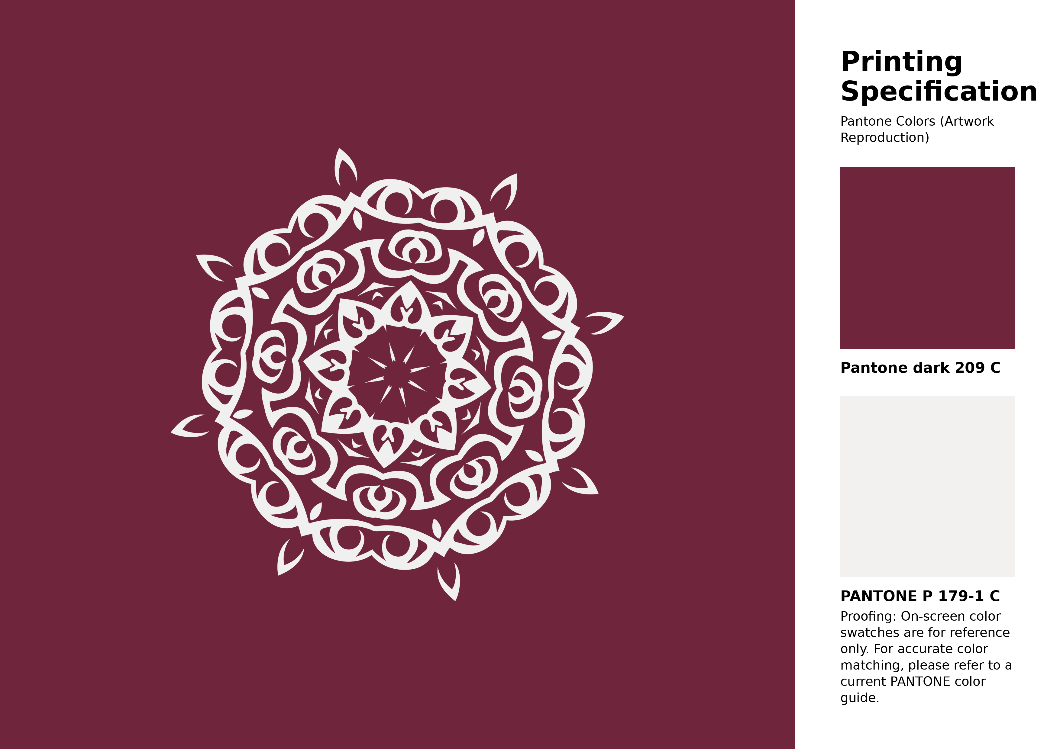
#6f263d Pantone 209 C Color | Hex color Code #6f263d Artwork Image (PNG)
Download Artwork (PNG)#6f263d Pantone 209 C Color | Hex color Code #6f263d Artwork Vector (PDF)
Download Artwork (PDF)#6f263d Pantone 209 C Color | Hex color Code #6f263d Artwork Vector (SVG)
Download Artwork (SVG)
#6f263d Pantone 209 C Color | Hex color Code #6f263d Pantone Swatch Artwork
Download Artwork Swatch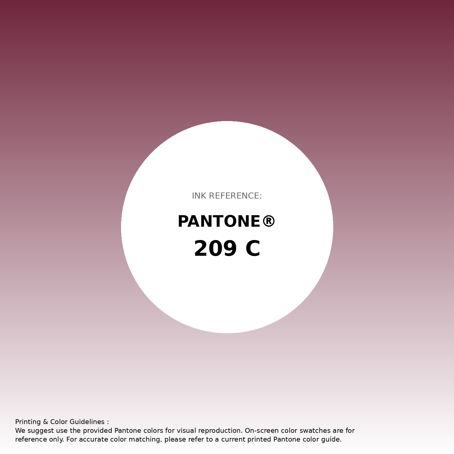
#6f263d Pantone 209 C Color | Hex color Code #6f263d Gradient Artwork (PNG)
Download Gradient (PNG)#6f263d Pantone 209 C Color | Hex color Code #6f263d Gradient Artwork (SVG)
Download Gradient (SVG)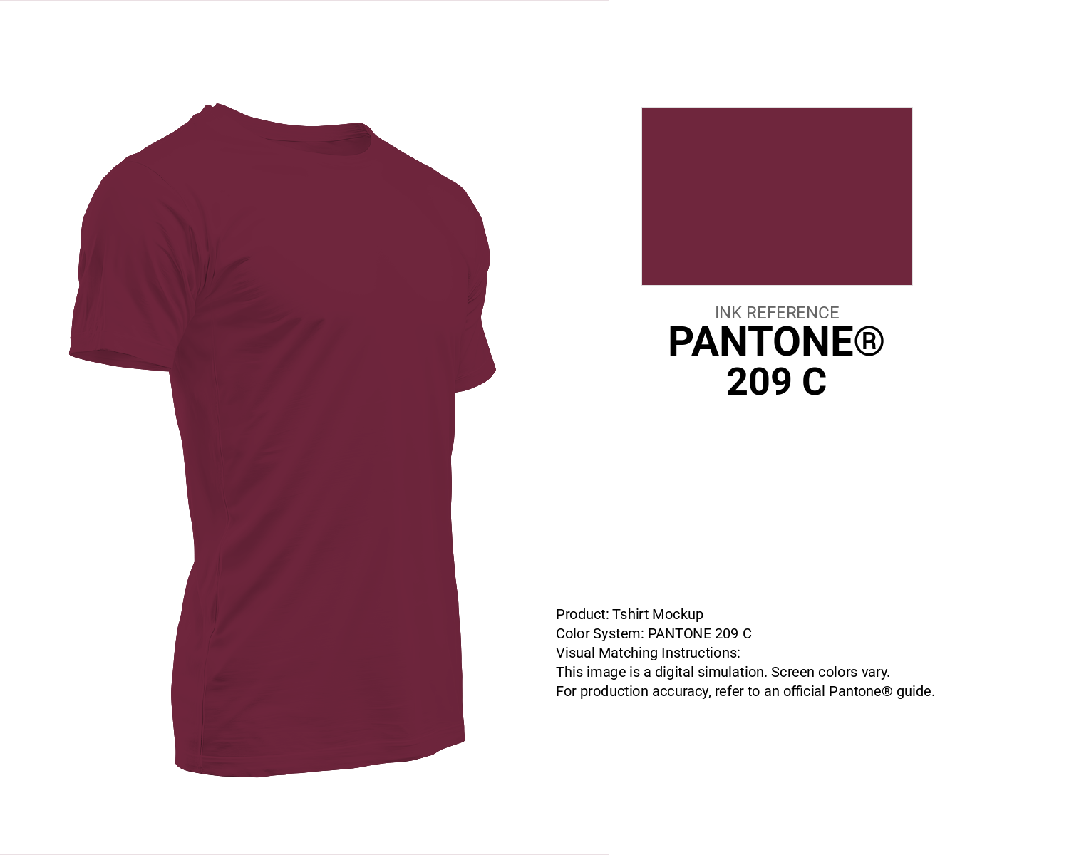
#6f263d Pantone 209 C Color | Hex color Code #6f263d T-Shirt Mockup
Download T-Shirt Mockup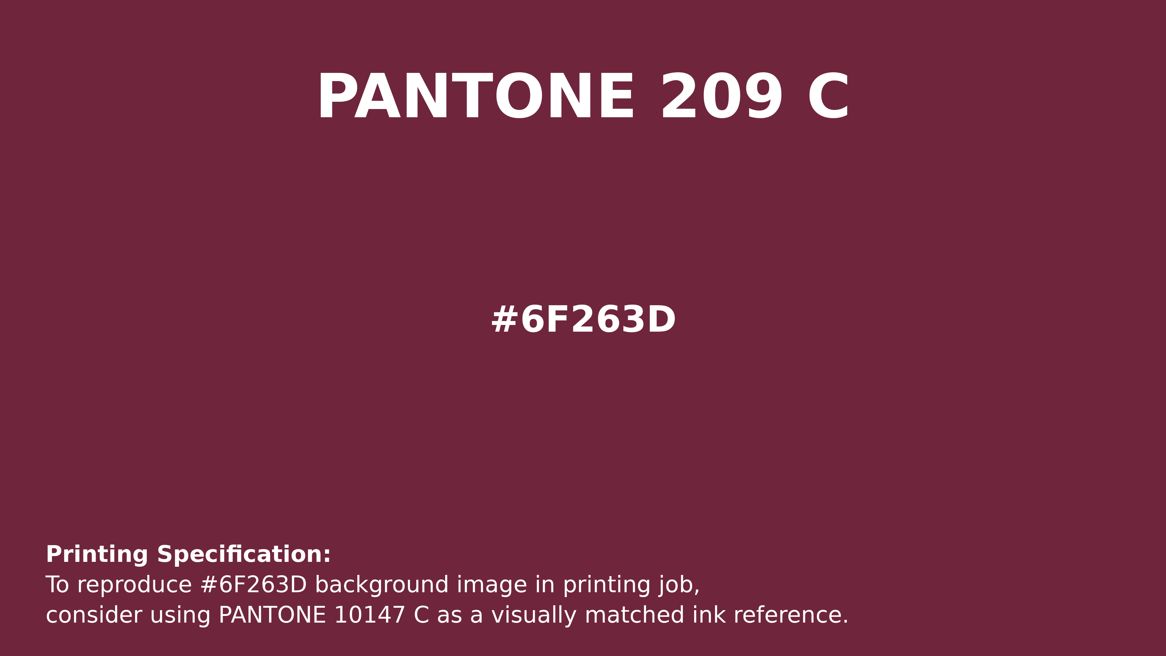
#6f263d Pantone 209 C Color | Hex color Code #6f263d Printing Artwork Pantone Reference
Download Pantone Printing ReferenceRelated Color Palettes
- Slate Gray and Dark Gray •
- Olive Drab and Dark Gray •
- Dark Gray and Lavender •
- Powder Blue and Dark Gray •
- Crimson and Dark Gray •
- Light Steel Blue and Dark Gray •
- Sienna and Dark Gray •
- Indian Red and Dark Gray •
- Dark Gray and Linen •
- Dark Gray and Dark Green •
- Dark Gray and Indian Red •
- Dark Gray and Saddle Brown •
- Dark Gray and Dark Salmon •
- Dark Gray / smoked •
- Dark Slate Gray and Dark Gray
Color Palette Collection
125 Yellow Color Palettes
125 color palettes with 625 colors.

Purple ideas
10 color palettes with 50 colors.

786 Popular Color Palettes
786 color palettes with 3930 colors.

500+ Popular Color Palette Collection
501 color palettes with 2505 colors.