#693F23 Color
Your all-in-one color resource. Download hex background images, Adobe swatches (ASE), PDF color sheets, and SVG files. Explore palettes, harmonies, accessibility, conversions, and professional exports — designed for designers, developers, and color perfectionists.
This rich, earthy tone evokes a sense of warmth and groundedness. It conjures images of aged terracotta pottery, sun-baked earth, and the warm hues of a late summer afternoon. The color suggests feelings of comfort, resilience, and connection to the natural world. It creates a cozy and inviting atmosphere, perfect for a rustic or bohemian style. In design, it can be used to create a sense of grounded stability and connection to nature. The color might be associated with autumnal foliage and the rich hues of a well-worn, leather-bound book. Visually matched named color: Burnt Terracotta.
PANTONE 469 C
Choose Color
Selected Color
Recent Colors
Color Details
Similar Ink Alternatives for #693F23 color Alternative print inks for reproducing #693F23 background image with a similar visual appearance.
Disclaimer: The visually matched ink reference is an independent approximation intended as a guide only. Please be advised that this pantone colors is only intended as a guide, Actual colours will depend on screen calibration variances. The print ink suggestions provided are independent visual approximations and are not affiliated with or endorsed by Pantone LLC. For official color specifications, conversion factors, and comprehensive color system information, please visit Pantone Connect. Official Pantone products can be purchased at pantone.com.
Color Previews for #000000 See how this color looks as a background or as text.
Complete Guide to Your Color Laboratory
Everything you need to know about this professional color toolkit.
Use the Color Picker at the top to select any color. All modules below update instantly.
Workflow: Pick a color → Explore palettes & data → Download what you need (PDF, Image, or Adobe ASE).
Color Details — Your color in all formats: HEX, RGB, RGBA, HSL, HSLA, HSV, CMYK, CIELab, Hunter-Lab, XYZ, Yxy, YUV. One-click copy.
Color Psychology — Emotional impact, cultural meanings, physiological effects, branding applications, and historical significance.
Named Colors — Find official color names (HTML/CSS, Pantone) that match your selection with similarity percentages.
Light & Dark Shades
80-step gradient from black to white. Perfect for button states and component systems.
Tints
Color mixed with white → lighter, pastel variations for backgrounds and disabled states.
Monochromatic — 11 curated tints/shades from one color. Production-ready for design systems.
- Complementary — Opposite on wheel (180°). High contrast.
- Analogous — Neighbors (±30°). Harmonious flow.
- Triadic — Three colors (120° apart). Vibrant, balanced.
- Split-Complementary — Base + two near-complements. Softer contrast.
- Tetradic/Square — Four colors. Complex, maximum variety.
- Neutral — Desaturated versions. Subtle, sophisticated.
15 Professional Variations — Monochromatic, Analogous, Complementary, Warm/Cool/Earth Tones, Pastel, Vibrant, High Contrast, and more.
Color Infusion — 10 palettes showing your color morphing into each major hue. Find bridge colors.
Similar Colors — 60+ colors generated via CIELAB Delta E matching. Unexpected harmonious combinations.
18 Ready-to-Use Gradients — Complementary, Analogous, Triadic, Tint/Shade progressions, and more.
Downloads: PNG (2560×1440), CSS (production-ready code), SVG (scalable vector).
WCAG Contrast Checker — Tests your color against white, black, and custom colors for AA (4.5:1) and AAA (7:1) compliance. Large text thresholds included.
Harmony & Accessibility Guide — Tests against 10 canonical hues. Shows which pairs are both beautiful AND WCAG-compliant for text.
PNG/JPG — High-res images for presentations and mood boards.
PDF — Print-ready reports for clients and teams.
Adobe ASE — Direct import to Photoshop, Illustrator, InDesign, XD.
CSS/SVG — Gradients only. Production-ready code and vectors.
Color Science: Industry-standard conversions (HSL, CIELAB, CMYK, XYZ). WCAG 2.1 luminance formula. Delta E (ΔE76) for perceptual matching.
Direct Links: Share colors via icolorpalette.com/color/ff5733 or icolorpalette.com/color/red
Issues? Refresh the page, wait for rendering, try another browser, or check console (F12) for errors.
Printing Guide for #693f23 Background Image
Use PANTONE 469 C as a visually matched ink reference when printing this background image.
To print the #693f23 background image from our site, consider using PANTONE 469 C as a visually matched ink reference.
Download the background image, then provide this reference code to your print vendor to help achieve accurate color reproduction.
The visually matched ink reference for the #693f23 background image is PANTONE 469 C.
This color is commonly described as Burnt Terracotta.
This rich, earthy tone evokes a sense of warmth and groundedness. It conjures images of aged terracotta pottery, sun-baked earth, and the warm hues of a late summer afternoon. The color suggests feelings of comfort, resilience, and connection to the natural world. It creates a cozy and inviting atmosphere, perfect for a rustic or bohemian style. In design, it can be used to create a sense of grounded stability and connection to nature. The color might be associated with autumnal foliage and the rich hues of a well-worn, leather-bound book.
We provide PANTONE 469 C as a visually matched ink reference to help you reproduce the #693f23 background image accurately in professional printing.
This reference code helps print vendors achieve consistent color output across different printing equipment and materials.
After downloading the #693f23 background image from our site:
- Include the visually matched ink reference PANTONE 469 C in your print order notes
- Inform your print vendor that this is your target color reference
- Request a proof print to verify the Burnt Terracotta color appearance before full production
The #693f23 background image with PANTONE 469 C as visually matched ink reference can be used for:
- Posters, banners, and backdrops
- Business cards, brochures, and flyers
- Packaging, labels, and stickers
- Signage and promotional materials
This is an independent visual approximation.
While PANTONE 469 C closely matches the #693f23 background image color, variations may exist between screen display and printed output.
We recommend requesting a proof print to verify the final appearance.
This rich, earthy tone evokes a sense of warmth and groundedness. It conjures images of aged terracotta pottery, sun-baked earth, and the warm hues of a late summer afternoon. The color suggests feelings of comfort, resilience, and connection to the natural world. It creates a cozy and inviting atmosphere, perfect for a rustic or bohemian style. In design, it can be used to create a sense of grounded stability and connection to nature. The color might be associated with autumnal foliage and the rich hues of a well-worn, leather-bound book.
Understanding these associations helps ensure the #693f23 background image aligns with your intended message and brand impact.
Important Information
The visually matched ink reference is an independent approximation intended as a guide only.
Actual printed colors may vary depending on screen calibration, substrate material, ink type, and printing equipment used.
For official color specifications and certified color standards, visit Pantone Connect.
Official color guides and swatch books can be purchased from pantone.com.
Pantone 469 C Color: Earthy Brown | #693F23
Introduction:
Earthy Brown (#693F23) is a rich, warm color that exudes a sense of grounding and stability. It is reminiscent of the natural hues found in earthy elements such as soil, clay, and tree bark. The color adds a touch of elegance and sophistication to any design or space.
Historical Significance:
Prehistoric Times: Earthy Brown was often used in ancient cave paintings to depict scenes from daily life and various hunting activities.
Middle Ages: Earthy Brown was commonly used in medieval artwork to represent earthy tones in religious paintings, tapestries, and illuminated manuscripts.
Symbolism and Meaning:
Warmth and Stability: Earthy Brown is often associated with feelings of stability, grounding, and warmth. It represents the solid foundation and security found in nature.
Earthy Brown in Fashion:
Natural and Organic Aesthetics: Earthy Brown is frequently used in fashion to create a natural and organic look. It is a popular color choice for earth-toned clothing and accessories.
Earthy Brown in Graphic Design:
Earthy and Organic Branding: Earthy Brown is often used in graphic design to evoke a sense of nature and environmental consciousness. It is commonly seen in logos and branding for eco-friendly or natural products.
Color Combinations:
Complementary Colors: Earthy Brown pairs well with colors such as creamy beige, moss green, and deep burgundy. This combination creates a harmonious and natural color palette.
Nature’s Palette:
Autumnal Colors: Earthy Brown can be found in the changing colors of autumn leaves, as well as the earthy tones of landscapes during this season. It is also present in the warm hues of certain flowers, such as sunflowers and marigolds.
Artistic Representations:
Impressionist Paintings: Earthy Brown was commonly used by impressionist painters such as Claude Monet and Camille Pissarro to depict natural landscapes and outdoor scenes.
Movies and Cinematic Landscapes:
The Lord of the Rings Trilogy: The earthy brown tones are prominently featured in the landscapes of Middle-earth, creating a sense of a vivid and immersive fantasy world.
Products and Commercial Appeal:
Hershey's Chocolate: Earthy Brown is associated with the Hershey's brand, which primarily produces chocolate products. The color represents the rich and indulgent experience of enjoying chocolate.
National Symbols and Significance:
Native American Culture: Earthy Brown holds significance in Native American culture, representing the earth and its connection to spirituality, rituals, and traditions.
The Psychological and Emotional Impact:
Grounding and Stability: Earthy Brown can create a sense of stability and grounding. It evokes feelings of comfort, reliability, and security.
Conclusion:
Earthy Brown (#693F23) is a color with a rich historical significance and deep symbolism. It is associated with stability, warmth, and a connection to the earth. In fashion, graphic design, and various art forms, Earthy Brown adds a touch of nature and organic beauty. It can evoke a sense of comfort and reliability, making it a timeless color choice in many different contexts.
Pantone 469 C Color | Hex color Code #693f23 Image & Artwork
Download high-quality assets for your projects.

#693f23 Color Schemes
Download Color Schemes
#693f23 Color Shades
Download Color Shades
Pantone 469 C Color | Hex color Code #693f23 Solid Color Background
Download Solid Color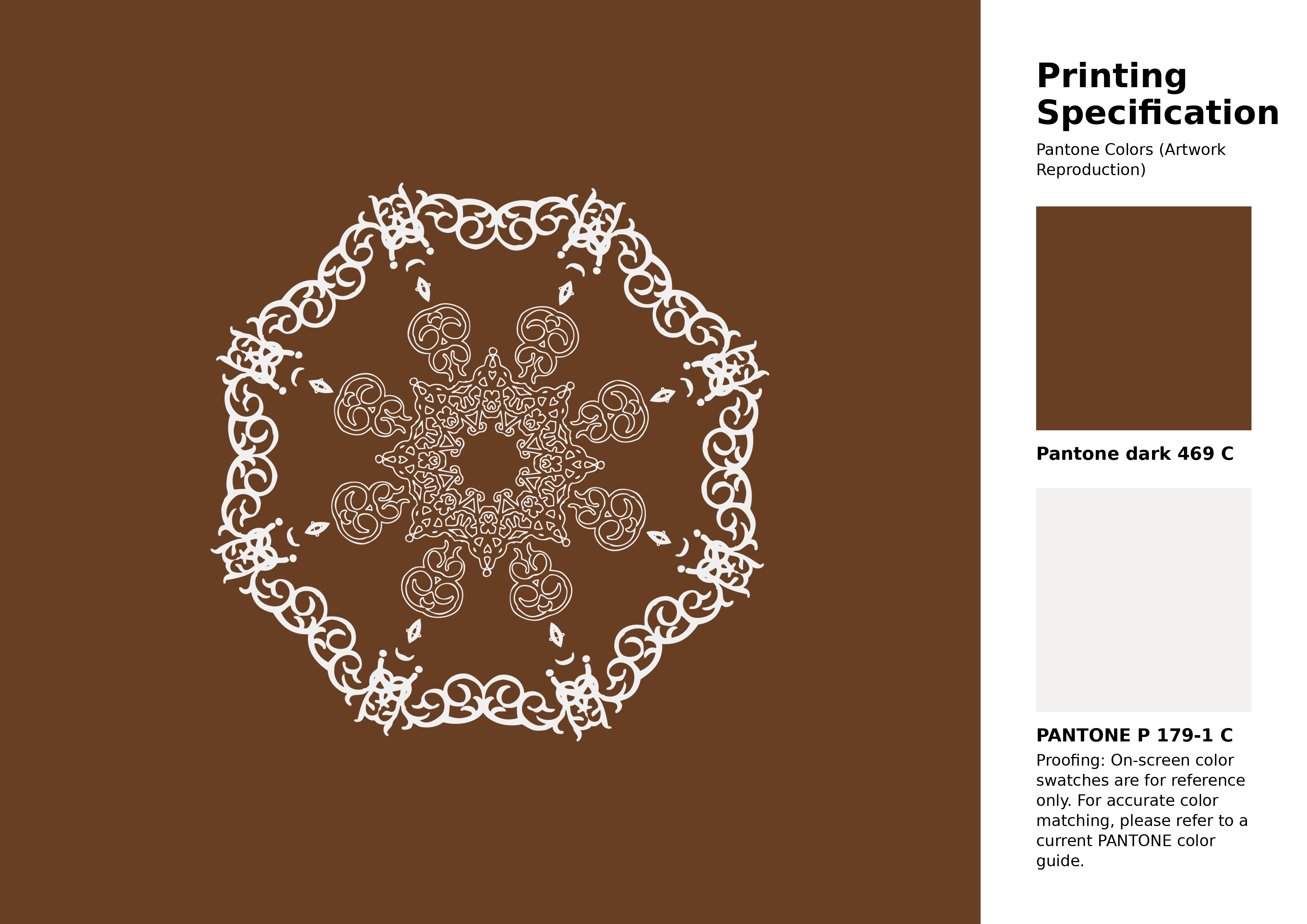
#693f23 Pantone 469 C Color | Hex color Code #693f23 Artwork Image (PNG)
Download Artwork (PNG)#693f23 Pantone 469 C Color | Hex color Code #693f23 Artwork Vector (PDF)
Download Artwork (PDF)#693f23 Pantone 469 C Color | Hex color Code #693f23 Artwork Vector (SVG)
Download Artwork (SVG)
#693f23 Pantone 469 C Color | Hex color Code #693f23 Pantone Swatch Artwork
Download Artwork Swatch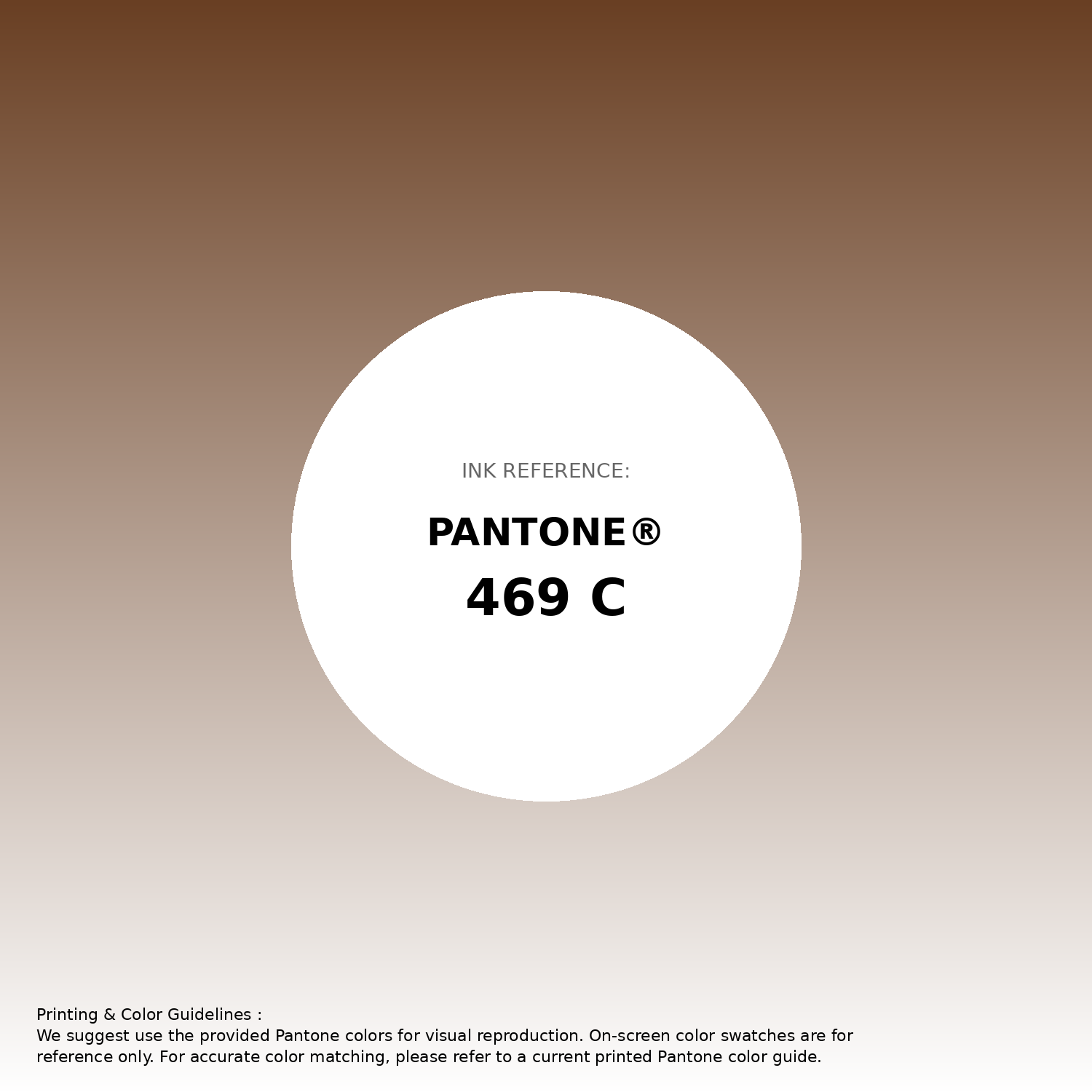
#693f23 Pantone 469 C Color | Hex color Code #693f23 Gradient Artwork (PNG)
Download Gradient (PNG)#693f23 Pantone 469 C Color | Hex color Code #693f23 Gradient Artwork (SVG)
Download Gradient (SVG)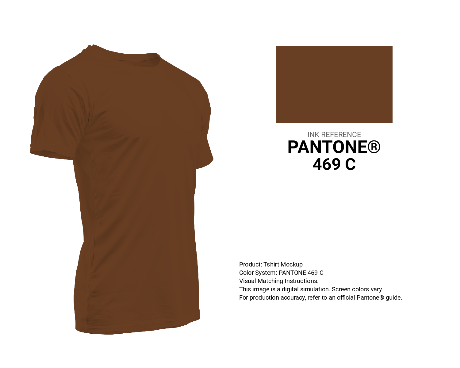
#693f23 Pantone 469 C Color | Hex color Code #693f23 T-Shirt Mockup
Download T-Shirt Mockup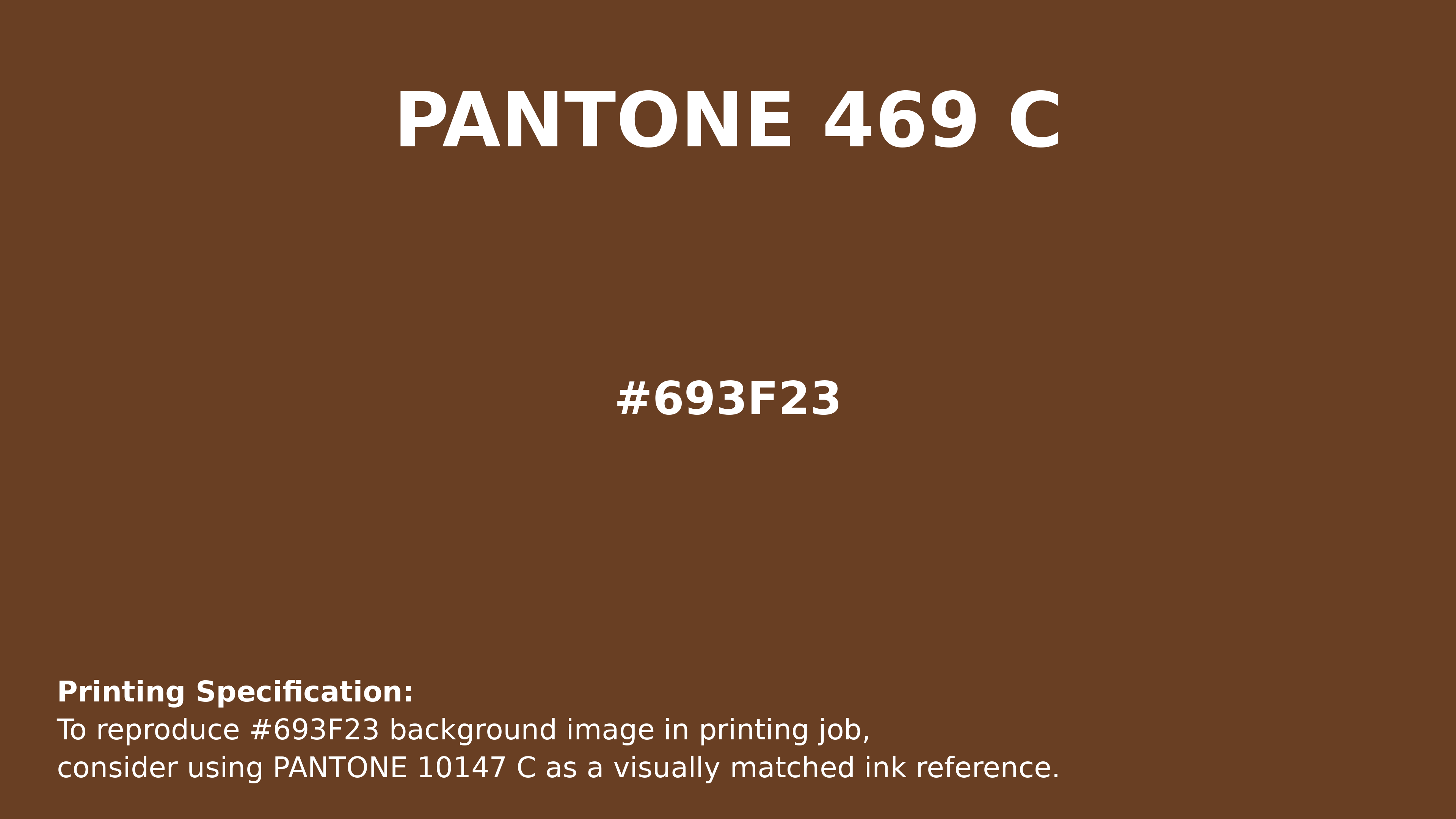
#693f23 Pantone 469 C Color | Hex color Code #693f23 Printing Artwork Pantone Reference
Download Pantone Printing ReferenceRelated Color Palettes
- Forest Green and Dark Gray •
- Dark Gray and White Smoke •
- White Smoke and Dark Gray •
- Beige and Dark Gray •
- Dark Gray and Cadet Blue •
- Linen and Dark Gray •
- Dark Gray and Pale Goldenrod •
- Light Gray and Dark Gray •
- Thistle and Dark Gray •
- Slate Gray and Dark Gray •
- Dark Gray and Dark Salmon •
- Dark Salmon and Dark Gray •
- Tan and Dark Gray •
- Dark Gray and Gray •
- Dark Slate Blue and Dark Gray
Color Palette Collection
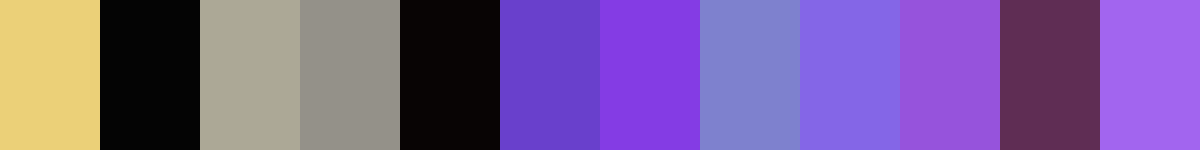
Purple ideas
12 color palettes with 60 colors.
Yadunna
1 color palettes with 5 colors.

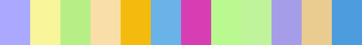
70 Winter Color Palette
70 color palettes with 350 colors.
Chardon
1 color palettes with 5 colors.