#68D2DF Color
Your all-in-one color resource. Download hex background images, Adobe swatches (ASE), PDF color sheets, and SVG files. Explore palettes, harmonies, accessibility, conversions, and professional exports — designed for designers, developers, and color perfectionists.
This color, a gentle blend of blue and green, whispers of early mornings on a tranquil bay. It evokes feelings of optimism, serenity, and a gentle awakening, like the first light kissing the water's surface. It calls to mind the vastness of the ocean and the freshness of a clear day, with hints of the sky just after sunrise. It creates a mood of calm and invigoration, a balance between the refreshing qualities of blue and the growth-oriented feel of green. In design, it would be ideal for spaces intended to inspire creativity, relaxation, or a sense of well-being, such as bedrooms, bathrooms, or creative studios. It subtly suggests trust, clarity, and a connection to nature. Visually matched named color: Azure Dawn.
PANTONE 3105 C
Choose Color
Selected Color
Recent Colors
Color Details
Similar Ink Alternatives for #68D2DF color Alternative print inks for reproducing #68D2DF background image with a similar visual appearance.
Disclaimer: The visually matched ink reference is an independent approximation intended as a guide only. Please be advised that this pantone colors is only intended as a guide, Actual colours will depend on screen calibration variances. The print ink suggestions provided are independent visual approximations and are not affiliated with or endorsed by Pantone LLC. For official color specifications, conversion factors, and comprehensive color system information, please visit Pantone Connect. Official Pantone products can be purchased at pantone.com.
Color Previews for #000000 See how this color looks as a background or as text.
Complete Guide to Your Color Laboratory
Everything you need to know about this professional color toolkit.
Use the Color Picker at the top to select any color. All modules below update instantly.
Workflow: Pick a color → Explore palettes & data → Download what you need (PDF, Image, or Adobe ASE).
Color Details — Your color in all formats: HEX, RGB, RGBA, HSL, HSLA, HSV, CMYK, CIELab, Hunter-Lab, XYZ, Yxy, YUV. One-click copy.
Color Psychology — Emotional impact, cultural meanings, physiological effects, branding applications, and historical significance.
Named Colors — Find official color names (HTML/CSS, Pantone) that match your selection with similarity percentages.
Light & Dark Shades
80-step gradient from black to white. Perfect for button states and component systems.
Tints
Color mixed with white → lighter, pastel variations for backgrounds and disabled states.
Monochromatic — 11 curated tints/shades from one color. Production-ready for design systems.
- Complementary — Opposite on wheel (180°). High contrast.
- Analogous — Neighbors (±30°). Harmonious flow.
- Triadic — Three colors (120° apart). Vibrant, balanced.
- Split-Complementary — Base + two near-complements. Softer contrast.
- Tetradic/Square — Four colors. Complex, maximum variety.
- Neutral — Desaturated versions. Subtle, sophisticated.
15 Professional Variations — Monochromatic, Analogous, Complementary, Warm/Cool/Earth Tones, Pastel, Vibrant, High Contrast, and more.
Color Infusion — 10 palettes showing your color morphing into each major hue. Find bridge colors.
Similar Colors — 60+ colors generated via CIELAB Delta E matching. Unexpected harmonious combinations.
18 Ready-to-Use Gradients — Complementary, Analogous, Triadic, Tint/Shade progressions, and more.
Downloads: PNG (2560×1440), CSS (production-ready code), SVG (scalable vector).
WCAG Contrast Checker — Tests your color against white, black, and custom colors for AA (4.5:1) and AAA (7:1) compliance. Large text thresholds included.
Harmony & Accessibility Guide — Tests against 10 canonical hues. Shows which pairs are both beautiful AND WCAG-compliant for text.
PNG/JPG — High-res images for presentations and mood boards.
PDF — Print-ready reports for clients and teams.
Adobe ASE — Direct import to Photoshop, Illustrator, InDesign, XD.
CSS/SVG — Gradients only. Production-ready code and vectors.
Color Science: Industry-standard conversions (HSL, CIELAB, CMYK, XYZ). WCAG 2.1 luminance formula. Delta E (ΔE76) for perceptual matching.
Direct Links: Share colors via icolorpalette.com/color/ff5733 or icolorpalette.com/color/red
Issues? Refresh the page, wait for rendering, try another browser, or check console (F12) for errors.
Printing Guide for #68d2df Background Image
Use PANTONE 3105 C as a visually matched ink reference when printing this background image.
To print the #68d2df background image from our site, consider using PANTONE 3105 C as a visually matched ink reference.
Download the background image, then provide this reference code to your print vendor to help achieve accurate color reproduction.
The visually matched ink reference for the #68d2df background image is PANTONE 3105 C.
This color is commonly described as Azure Dawn.
This color, a gentle blend of blue and green, whispers of early mornings on a tranquil bay. It evokes feelings of optimism, serenity, and a gentle awakening, like the first light kissing the water's surface. It calls to mind the vastness of the ocean and the freshness of a clear day, with hints of the sky just after sunrise. It creates a mood of calm and invigoration, a balance between the refreshing qualities of blue and the growth-oriented feel of green. In design, it would be ideal for spaces intended to inspire creativity, relaxation, or a sense of well-being, such as bedrooms, bathrooms, or creative studios. It subtly suggests trust, clarity, and a connection to nature.
We provide PANTONE 3105 C as a visually matched ink reference to help you reproduce the #68d2df background image accurately in professional printing.
This reference code helps print vendors achieve consistent color output across different printing equipment and materials.
After downloading the #68d2df background image from our site:
- Include the visually matched ink reference PANTONE 3105 C in your print order notes
- Inform your print vendor that this is your target color reference
- Request a proof print to verify the Azure Dawn color appearance before full production
The #68d2df background image with PANTONE 3105 C as visually matched ink reference can be used for:
- Posters, banners, and backdrops
- Business cards, brochures, and flyers
- Packaging, labels, and stickers
- Signage and promotional materials
This is an independent visual approximation.
While PANTONE 3105 C closely matches the #68d2df background image color, variations may exist between screen display and printed output.
We recommend requesting a proof print to verify the final appearance.
This color, a gentle blend of blue and green, whispers of early mornings on a tranquil bay. It evokes feelings of optimism, serenity, and a gentle awakening, like the first light kissing the water's surface. It calls to mind the vastness of the ocean and the freshness of a clear day, with hints of the sky just after sunrise. It creates a mood of calm and invigoration, a balance between the refreshing qualities of blue and the growth-oriented feel of green. In design, it would be ideal for spaces intended to inspire creativity, relaxation, or a sense of well-being, such as bedrooms, bathrooms, or creative studios. It subtly suggests trust, clarity, and a connection to nature.
Understanding these associations helps ensure the #68d2df background image aligns with your intended message and brand impact.
Important Information
The visually matched ink reference is an independent approximation intended as a guide only.
Actual printed colors may vary depending on screen calibration, substrate material, ink type, and printing equipment used.
For official color specifications and certified color standards, visit Pantone Connect.
Official color guides and swatch books can be purchased from pantone.com.
Pantone 3105 C Color: Creative Aquamarine | #68D2DF
Introduction:
Aquamarine, represented by the color Pantone 3105 C, is an eye-catching and vibrant shade that exudes a sense of tranquility and freshness. Its soothing blue-green hue creates a visually appealing contrast that captures attention and promotes a calming atmosphere.
Historical Significance:
Early Usage in Mediterranean Jewelry: Aquamarine has been valued since ancient times, particularly by the people of the Mediterranean region. It was often used in jewelry and accessories, symbolizing wealth, protection, and enhanced clarity of vision.
Popularity in Art Deco Era: During the Art Deco era of the 1920s and 1930s, aquamarine became a popular gemstone choice for glamorous and stylish jewelry pieces. Its elegant and modern appearance perfectly complemented the bold geometric designs of the time.
Symbolism and Meaning:
Tranquility and Serenity: Aquamarine represents tranquility, serenity, and inner peace. Its cool and soothing shade evokes the calming qualities of the ocean, bringing a sense of balance and harmony to various cultures and contexts.
Aquamarine in Fashion:
Elevated Style: Aquamarine is a versatile color in the fashion world. Its fresh and bright appearance adds a touch of elegance and sophistication to clothing, accessories, and runway designs. It is often used in spring and summer collections, reflecting a sense of lightness and optimism.
Aquamarine in Graphic Design:
Aesthetic Appeal: Aquamarine plays a significant role in graphic design aesthetics. Its vibrant and captivating shade adds energy and visual impact to branding, logos, and digital designs. It is commonly used in industries related to health, wellness, and water-related activities.
Color Combinations:
Complementary Colors: Aquamarine pairs well with colors such as white, silver, coral, and navy blue. These combinations create a harmonious and refreshing visual effect. Aquamarine also complements earthy tones like sand and beige, bringing a natural and beachy vibe.
Nature’s Palette:
Oceanic Inspiration: Aquamarine is inspired by the beauty of the ocean. It can be found in natural occurrences such as the blue shades of water bodies, tropical fish, and corals. The color represents the serenity and vibrancy of aquatic ecosystems.
Artistic Representations:
Depicting Water and Tranquility: Aquamarine has been used by artists to evoke the essence of water, creating serene and peaceful landscapes. It is often found in paintings, sculptures, and installations that aim to convey a sense of calmness and fluidity.
Movies and Cinematic Landscapes:
Immersive Underwater Scenes: Aquamarine often sets the tone for movies featuring underwater themes or breathtaking oceanic landscapes. It enhances the visual experience by capturing the mesmerizing shades of water and creating an immersive atmosphere.
Products and Commercial Appeal:
Jewelry and Accessories: Aquamarine is a popular choice for jewelry and accessories, especially in the form of earrings, necklaces, and rings. Its captivating color adds a touch of elegance and sophistication to various designs, making it highly desirable and commercially appealing.
National Symbols and Significance:
Symbolism in Brazil: Aquamarine holds cultural significance in Brazil, where it is considered a national gemstone. It is associated with the country's vast coastline, tropical landscapes, and vibrant Carnaval celebrations.
The Psychological and Emotional Impact:
Cooling and Calming: Aquamarine has a psychological and emotional impact, often evoking feelings of calmness, tranquility, and clarity. Its cool tones can help reduce stress and promote a sense of relaxation and rejuvenation.
Conclusion:
Aquamarine, represented by Pantone 3105 C, has a rich historical significance and a timeless appeal. Its tranquil and vibrant nature has made it a popular choice in fashion, graphic design, and artistic representations. Whether it's in jewelry, branding, or cinematic landscapes, aquamarine continues to captivate and inspire with its refreshing and calming aura.
Pantone 3105 C Color | Hex color Code #68d2df Image & Artwork
Download high-quality assets for your projects.

#68d2df Color Schemes
Download Color Schemes
#68d2df Color Shades
Download Color Shades
Pantone 3105 C Color | Hex color Code #68d2df Solid Color Background
Download Solid Color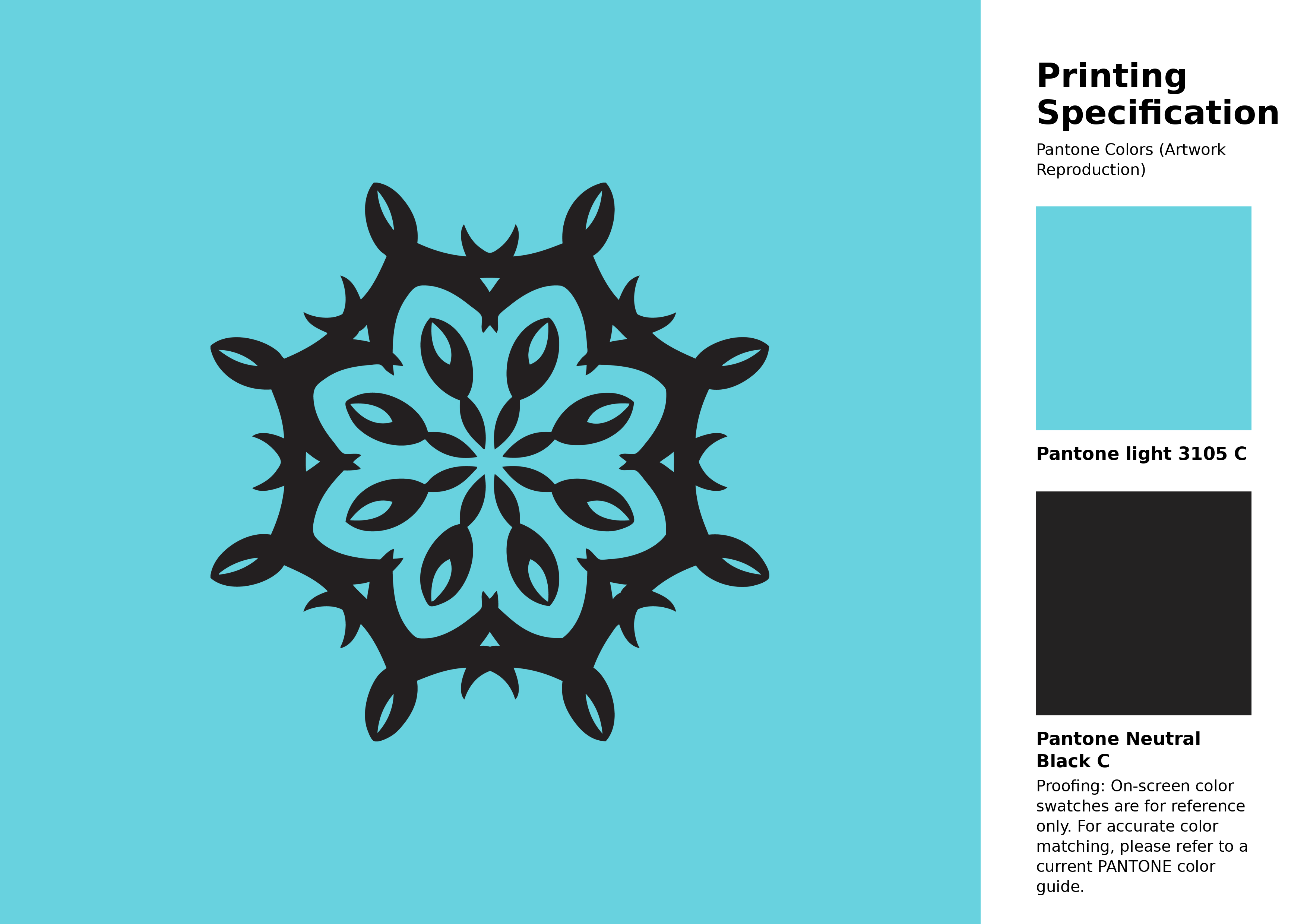
#68d2df Pantone 3105 C Color | Hex color Code #68d2df Artwork Image (PNG)
Download Artwork (PNG)#68d2df Pantone 3105 C Color | Hex color Code #68d2df Artwork Vector (PDF)
Download Artwork (PDF)#68d2df Pantone 3105 C Color | Hex color Code #68d2df Artwork Vector (SVG)
Download Artwork (SVG)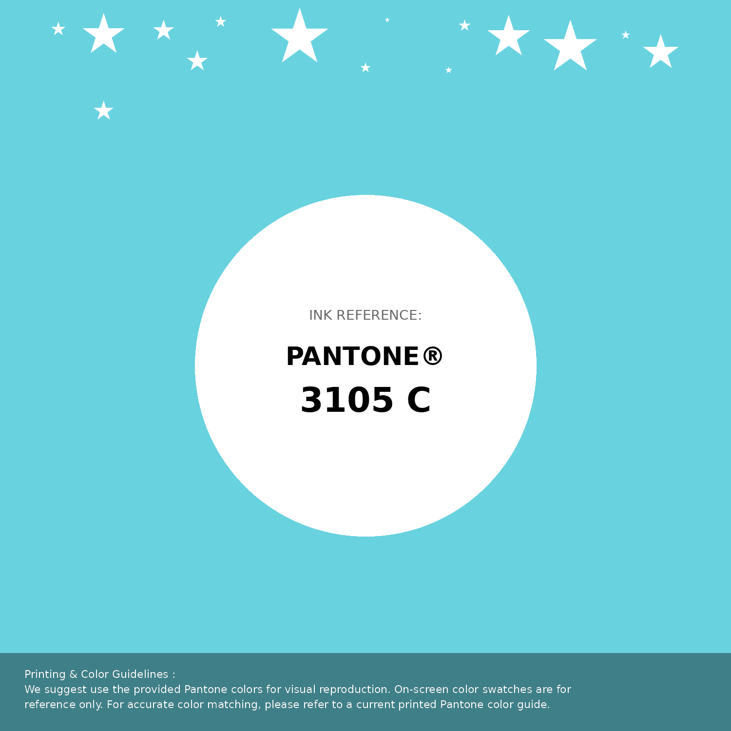
#68d2df Pantone 3105 C Color | Hex color Code #68d2df Pantone Swatch Artwork
Download Artwork Swatch
#68d2df Pantone 3105 C Color | Hex color Code #68d2df Gradient Artwork (PNG)
Download Gradient (PNG)#68d2df Pantone 3105 C Color | Hex color Code #68d2df Gradient Artwork (SVG)
Download Gradient (SVG)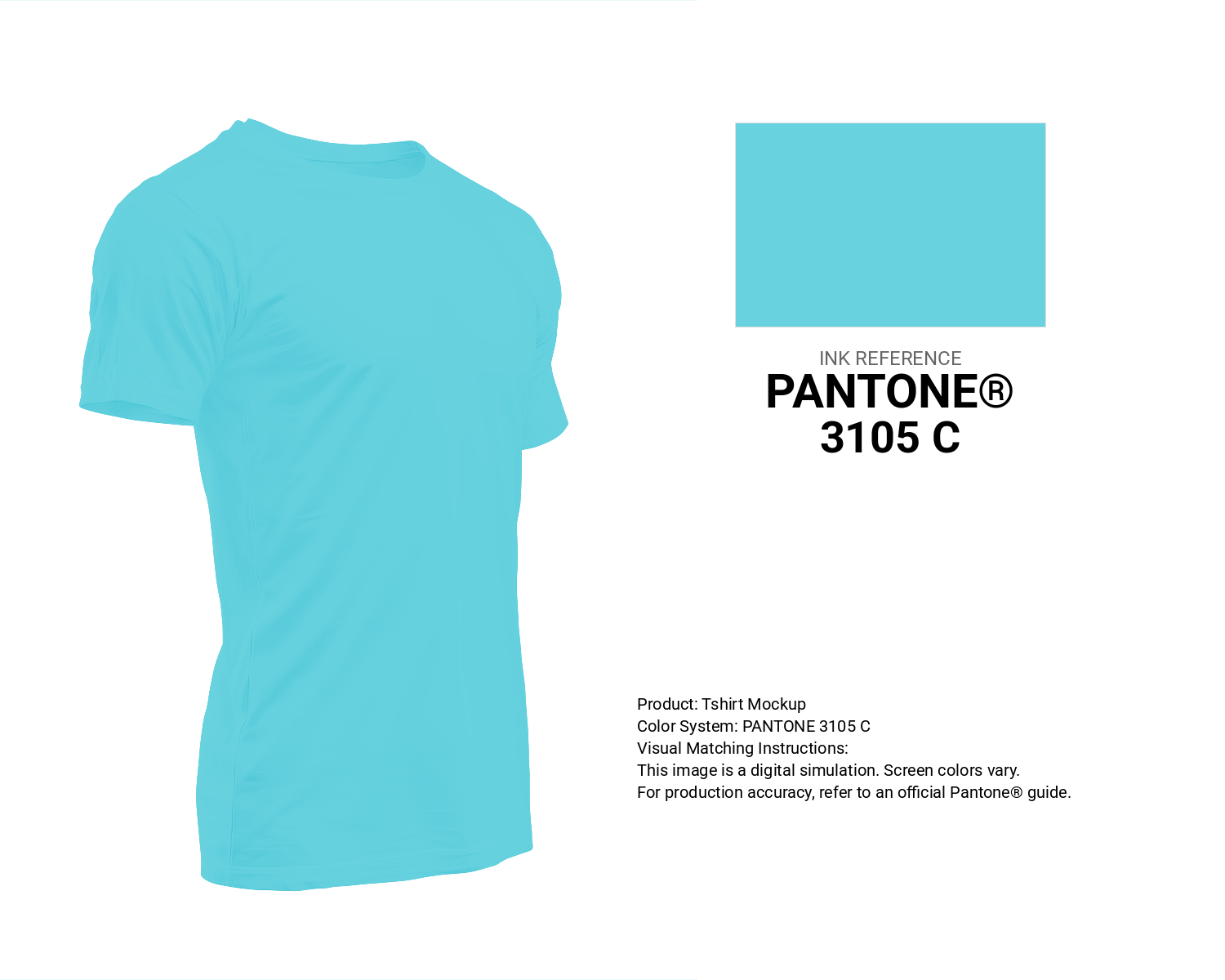
#68d2df Pantone 3105 C Color | Hex color Code #68d2df T-Shirt Mockup
Download T-Shirt Mockup
#68d2df Pantone 3105 C Color | Hex color Code #68d2df Printing Artwork Pantone Reference
Download Pantone Printing ReferenceRelated Color Palettes
- Light Slate Gray and Pale Turquoise •
- Medium Turquoise and Dark Olive Green •
- Light Sea Green and Turquoise •
- Cadet Blue and Medium Turquoise •
- Tan and Pale Turquoise •
- Light Steel Blue and Dark Turquoise •
- Medium Turquoise and Cadet Blue •
- Teal and Dark Turquoise •
- Light Steel Blue and Medium Turquoise •
- Pale Turquoise and SkyBlue •
- Pale Turquoise and Medium Aquamarine •
- Pale Turquoise and Midnight Blue •
- Midnight Blue and Dark Turquoise •
- Dark Turquoise •
- Pale Turquoise and Light Sky Blue
Color Palette Collection

Light Blue Palettes to Enhance Your Design
13 color palettes with 65 colors.

25 Sunset Color Schemes
25 color palettes with 125 colors.

The Color of Calm: 18 Blue Palettes to Enhance Your Design
18 color palettes with 90 colors.
65 Red Color Palettes
65 color palettes with 325 colors.