#685BC7 Color
Your all-in-one color resource. Download hex background images, Adobe swatches (ASE), PDF color sheets, and SVG files. Explore palettes, harmonies, accessibility, conversions, and professional exports — designed for designers, developers, and color perfectionists.
This deep, slightly violet-tinged blue evokes a sense of mystery and introspection. It's a color that whispers of twilight skies, the fading light of day, and the quiet contemplation of the evening hours. The color suggests a mood of thoughtful reflection and quiet strength. It can evoke feelings of confidence and wisdom. In design, it could be used to create a sophisticated and elegant atmosphere, perhaps in a library or study, or to highlight a sense of calm luxury. The color might also be associated with spirituality and a connection to the unseen. Visually matched named color: Indigo Twilight.
PANTONE 2725 C
Choose Color
Selected Color
Recent Colors
Color Details
Similar Ink Alternatives for #685BC7 color Alternative print inks for reproducing #685BC7 background image with a similar visual appearance.
Disclaimer: The visually matched ink reference is an independent approximation intended as a guide only. Please be advised that this pantone colors is only intended as a guide, Actual colours will depend on screen calibration variances. The print ink suggestions provided are independent visual approximations and are not affiliated with or endorsed by Pantone LLC. For official color specifications, conversion factors, and comprehensive color system information, please visit Pantone Connect. Official Pantone products can be purchased at pantone.com.
Color Previews for #000000 See how this color looks as a background or as text.
Complete Guide to Your Color Laboratory
Everything you need to know about this professional color toolkit.
Use the Color Picker at the top to select any color. All modules below update instantly.
Workflow: Pick a color → Explore palettes & data → Download what you need (PDF, Image, or Adobe ASE).
Color Details — Your color in all formats: HEX, RGB, RGBA, HSL, HSLA, HSV, CMYK, CIELab, Hunter-Lab, XYZ, Yxy, YUV. One-click copy.
Color Psychology — Emotional impact, cultural meanings, physiological effects, branding applications, and historical significance.
Named Colors — Find official color names (HTML/CSS, Pantone) that match your selection with similarity percentages.
Light & Dark Shades
80-step gradient from black to white. Perfect for button states and component systems.
Tints
Color mixed with white → lighter, pastel variations for backgrounds and disabled states.
Monochromatic — 11 curated tints/shades from one color. Production-ready for design systems.
- Complementary — Opposite on wheel (180°). High contrast.
- Analogous — Neighbors (±30°). Harmonious flow.
- Triadic — Three colors (120° apart). Vibrant, balanced.
- Split-Complementary — Base + two near-complements. Softer contrast.
- Tetradic/Square — Four colors. Complex, maximum variety.
- Neutral — Desaturated versions. Subtle, sophisticated.
15 Professional Variations — Monochromatic, Analogous, Complementary, Warm/Cool/Earth Tones, Pastel, Vibrant, High Contrast, and more.
Color Infusion — 10 palettes showing your color morphing into each major hue. Find bridge colors.
Similar Colors — 60+ colors generated via CIELAB Delta E matching. Unexpected harmonious combinations.
18 Ready-to-Use Gradients — Complementary, Analogous, Triadic, Tint/Shade progressions, and more.
Downloads: PNG (2560×1440), CSS (production-ready code), SVG (scalable vector).
WCAG Contrast Checker — Tests your color against white, black, and custom colors for AA (4.5:1) and AAA (7:1) compliance. Large text thresholds included.
Harmony & Accessibility Guide — Tests against 10 canonical hues. Shows which pairs are both beautiful AND WCAG-compliant for text.
PNG/JPG — High-res images for presentations and mood boards.
PDF — Print-ready reports for clients and teams.
Adobe ASE — Direct import to Photoshop, Illustrator, InDesign, XD.
CSS/SVG — Gradients only. Production-ready code and vectors.
Color Science: Industry-standard conversions (HSL, CIELAB, CMYK, XYZ). WCAG 2.1 luminance formula. Delta E (ΔE76) for perceptual matching.
Direct Links: Share colors via icolorpalette.com/color/ff5733 or icolorpalette.com/color/red
Issues? Refresh the page, wait for rendering, try another browser, or check console (F12) for errors.
Printing Guide for #685bc7 Background Image
Use PANTONE 2725 C as a visually matched ink reference when printing this background image.
To print the #685bc7 background image from our site, consider using PANTONE 2725 C as a visually matched ink reference.
Download the background image, then provide this reference code to your print vendor to help achieve accurate color reproduction.
The visually matched ink reference for the #685bc7 background image is PANTONE 2725 C.
This color is commonly described as Indigo Twilight.
This deep, slightly violet-tinged blue evokes a sense of mystery and introspection. It's a color that whispers of twilight skies, the fading light of day, and the quiet contemplation of the evening hours. The color suggests a mood of thoughtful reflection and quiet strength. It can evoke feelings of confidence and wisdom. In design, it could be used to create a sophisticated and elegant atmosphere, perhaps in a library or study, or to highlight a sense of calm luxury. The color might also be associated with spirituality and a connection to the unseen.
We provide PANTONE 2725 C as a visually matched ink reference to help you reproduce the #685bc7 background image accurately in professional printing.
This reference code helps print vendors achieve consistent color output across different printing equipment and materials.
After downloading the #685bc7 background image from our site:
- Include the visually matched ink reference PANTONE 2725 C in your print order notes
- Inform your print vendor that this is your target color reference
- Request a proof print to verify the Indigo Twilight color appearance before full production
The #685bc7 background image with PANTONE 2725 C as visually matched ink reference can be used for:
- Posters, banners, and backdrops
- Business cards, brochures, and flyers
- Packaging, labels, and stickers
- Signage and promotional materials
This is an independent visual approximation.
While PANTONE 2725 C closely matches the #685bc7 background image color, variations may exist between screen display and printed output.
We recommend requesting a proof print to verify the final appearance.
This deep, slightly violet-tinged blue evokes a sense of mystery and introspection. It's a color that whispers of twilight skies, the fading light of day, and the quiet contemplation of the evening hours. The color suggests a mood of thoughtful reflection and quiet strength. It can evoke feelings of confidence and wisdom. In design, it could be used to create a sophisticated and elegant atmosphere, perhaps in a library or study, or to highlight a sense of calm luxury. The color might also be associated with spirituality and a connection to the unseen.
Understanding these associations helps ensure the #685bc7 background image aligns with your intended message and brand impact.
Important Information
The visually matched ink reference is an independent approximation intended as a guide only.
Actual printed colors may vary depending on screen calibration, substrate material, ink type, and printing equipment used.
For official color specifications and certified color standards, visit Pantone Connect.
Official color guides and swatch books can be purchased from pantone.com.
Pantone 2725 C Color: Royal Purple | #685BC7
Introduction:
Royal Purple (Pantone 2725 C) is a deep shade of purple that exudes richness and luxury. It evokes a sense of elegance and regality, making it a popular choice in creative endeavors.
Historical Significance:
Historical Usage: Royal Purple has a long history dating back to ancient times. It was once a color reserved only for royalty and high-ranking officials. The dye used to create this color was derived from a specific type of shellfish, making it rare and expensive. This exclusivity heightened its association with power and wealth. Over time, the significance of Royal Purple continued, with kings and emperors often donning garments in this majestic hue.
Royal Purple in Art: Throughout art history, Royal Purple has been used to symbolize nobility and spirituality. It is often featured prominently in religious paintings, signifying divinity and transcendence. Artists such as Leonardo da Vinci and Vincent van Gogh incorporated this color into their masterpieces, adding depth and symbolism to their work.
Royal Purple in Modern Times: In contemporary culture, Royal Purple is still associated with luxury and sophistication. It is often seen in high-end fashion, interior design, and branding. The color's deep and intense pigmentation makes it a popular choice for creating a bold statement or conveying a sense of elegance.
Symbolism and Meaning:
Symbolic Associations: Royal Purple is commonly associated with power, wealth, and extravagance. It represents royalty, nobility, and high status. Additionally, it can symbolize creativity, spirituality, and imagination. In some cultures, it is also associated with mystery and magic.
Royal Purple in Fashion:
Influence on Fashion: Royal Purple is a popular choice in the fashion industry. It adds a touch of elegance and sophistication to any outfit. It is often used in evening gowns, suits, and accessories. Designers use Royal Purple to create a sense of luxury and opulence, making it a staple in couture collections.
Royal Purple in Graphic Design:
Influence on Graphic Design: Royal Purple is a versatile color in graphic design. It can evoke a wide range of emotions and moods, depending on its application. In branding, it is often used to convey a sense of luxury, sophistication, and exclusivity. It can be seen in logos, packaging, and advertisements for high-end products and services.
Color Combinations:
Potential Combinations: Royal Purple pairs well with various colors, creating visually appealing combinations. Some suggested combinations include:
- Royal Purple and Gold: A regal and opulent pairing often seen in heraldry and high-end design.
- Royal Purple and Silver: A modern and sleek combination that enhances the cool undertones of Royal Purple.
- Royal Purple and Ivory: A softer and more romantic combination suitable for weddings and elegant occasions.
Nature's Palette:
Natural Occurrences: While Royal Purple is not commonly found in nature, there are some examples of flowers and insects that showcase a similar shade. Some examples include Purple Irises, Lavender flowers, and certain species of butterflies.
Artistic Representations:
Use in Art: Royal Purple has been utilized by artists throughout history to convey a sense of grandeur and spirituality. It can be found in both classical and contemporary art, adding depth and richness to paintings, sculptures, and mixed media artwork. It is often employed to create a focal point or evoke a specific emotion.
Movies and Cinematic Landscapes:
Setting the Mood: Royal Purple is often used in movies and cinematic landscapes to enhance the atmosphere and evoke specific emotions. It can be seen in scenes depicting royalty, fantasy worlds, and dramatic moments. The color choice helps create a sense of awe, wonder, or mystery.
Products and Commercial Appeal:
Brands and Products: Many brands and products utilize Royal Purple in their branding to signify luxury, quality, and exclusivity. Some notable examples include Cadbury, Yahoo, and Hallmark. This color choice creates a sense of elegance and leaves a lasting impression on consumers.
National Symbols and Significance:
National and Cultural Associations: Royal Purple is often associated with monarchy and nobility in various cultures. It can symbolize power, authority, and national pride. In some countries, it may be reflected in their national flags or traditional ceremonial attire.
The Psychological and Emotional Impact:
Psychological Influence: Royal Purple can have an impact on emotions and perceptions. It is known to evoke feelings of luxury, creativity, and spirituality. It can also convey a sense of mystery and intrigue, as well as a regal and authoritative presence.
Conclusion:
In conclusion, Royal Purple (Pantone 2725 C) is a color that carries historical significance, symbolic associations, and a powerful visual impact. It has been used throughout history in art, fashion, and design to convey luxury, spirituality, and nobility. Its deep and rich tone makes it a desirable choice for various applications, leaving a lasting impression on all who encounter it.
Pantone 2725 C Color | Hex color Code #685bc7 Image & Artwork
Download high-quality assets for your projects.

#685bc7 Color Schemes
Download Color Schemes
#685bc7 Color Shades
Download Color Shades
Pantone 2725 C Color | Hex color Code #685bc7 Solid Color Background
Download Solid Color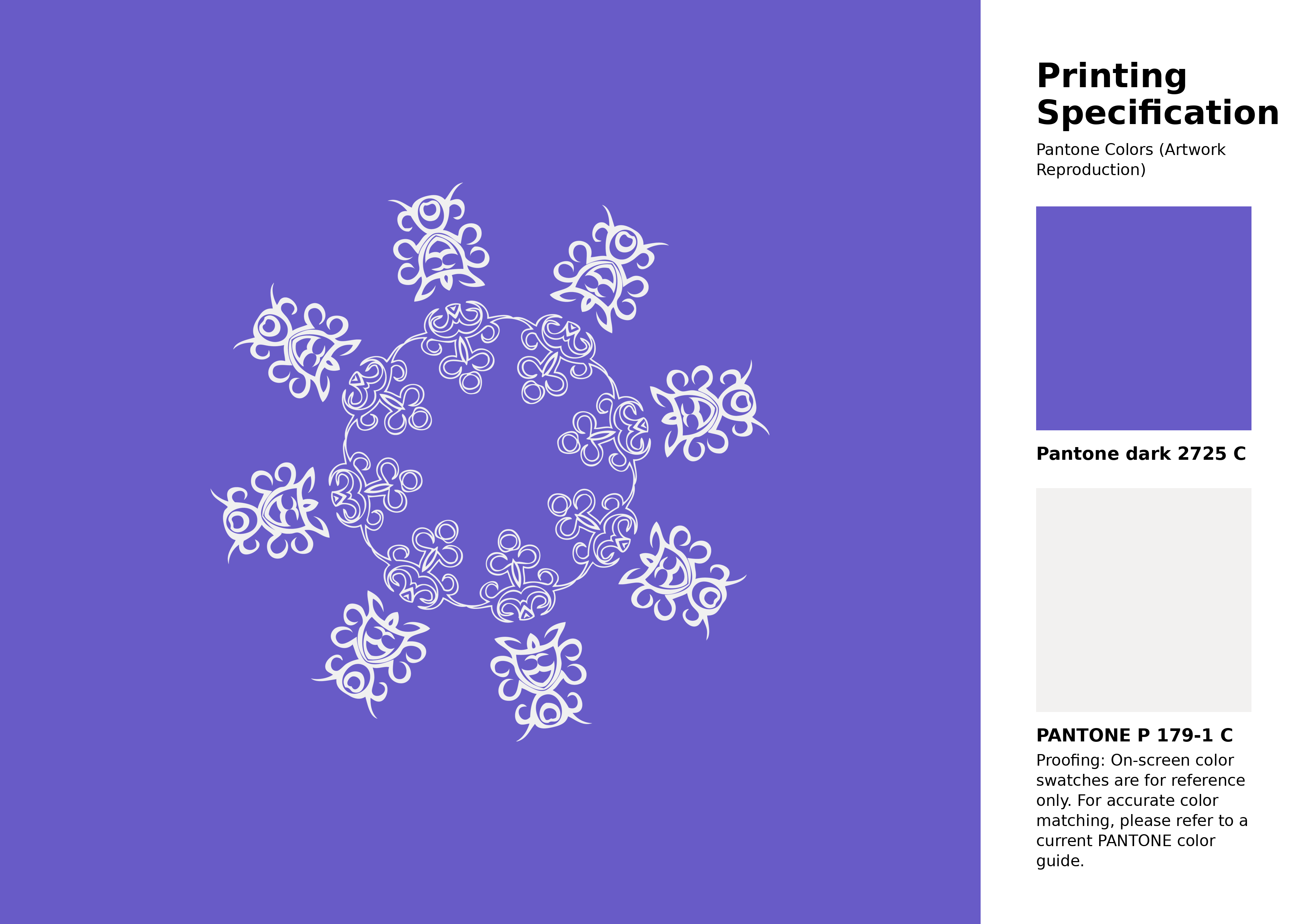
#685bc7 Pantone 2725 C Color | Hex color Code #685bc7 Artwork Image (PNG)
Download Artwork (PNG)#685bc7 Pantone 2725 C Color | Hex color Code #685bc7 Artwork Vector (PDF)
Download Artwork (PDF)#685bc7 Pantone 2725 C Color | Hex color Code #685bc7 Artwork Vector (SVG)
Download Artwork (SVG)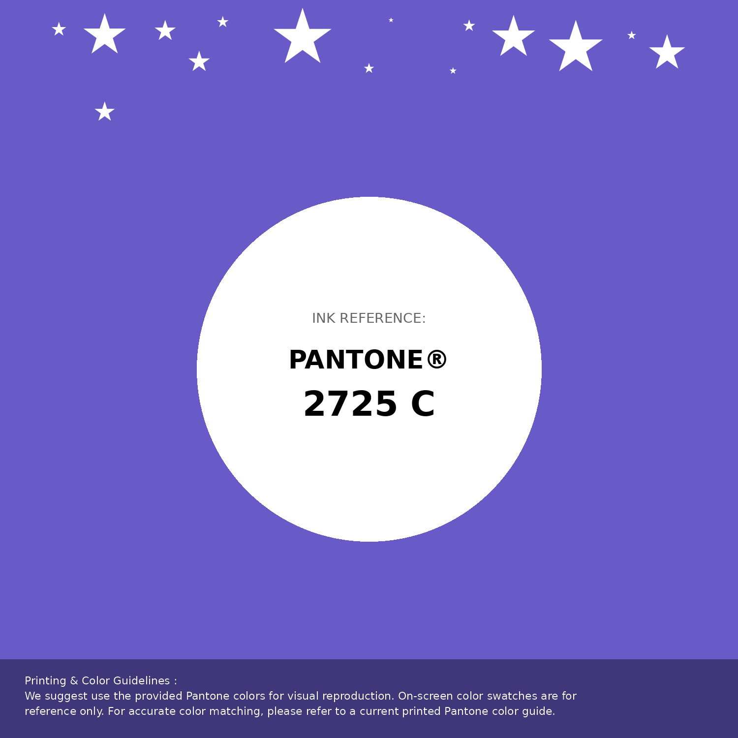
#685bc7 Pantone 2725 C Color | Hex color Code #685bc7 Pantone Swatch Artwork
Download Artwork Swatch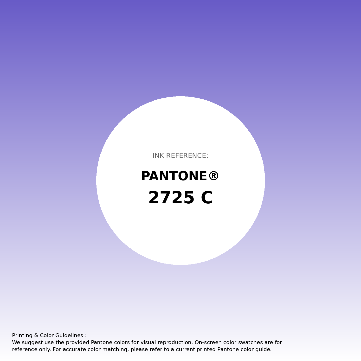
#685bc7 Pantone 2725 C Color | Hex color Code #685bc7 Gradient Artwork (PNG)
Download Gradient (PNG)#685bc7 Pantone 2725 C Color | Hex color Code #685bc7 Gradient Artwork (SVG)
Download Gradient (SVG)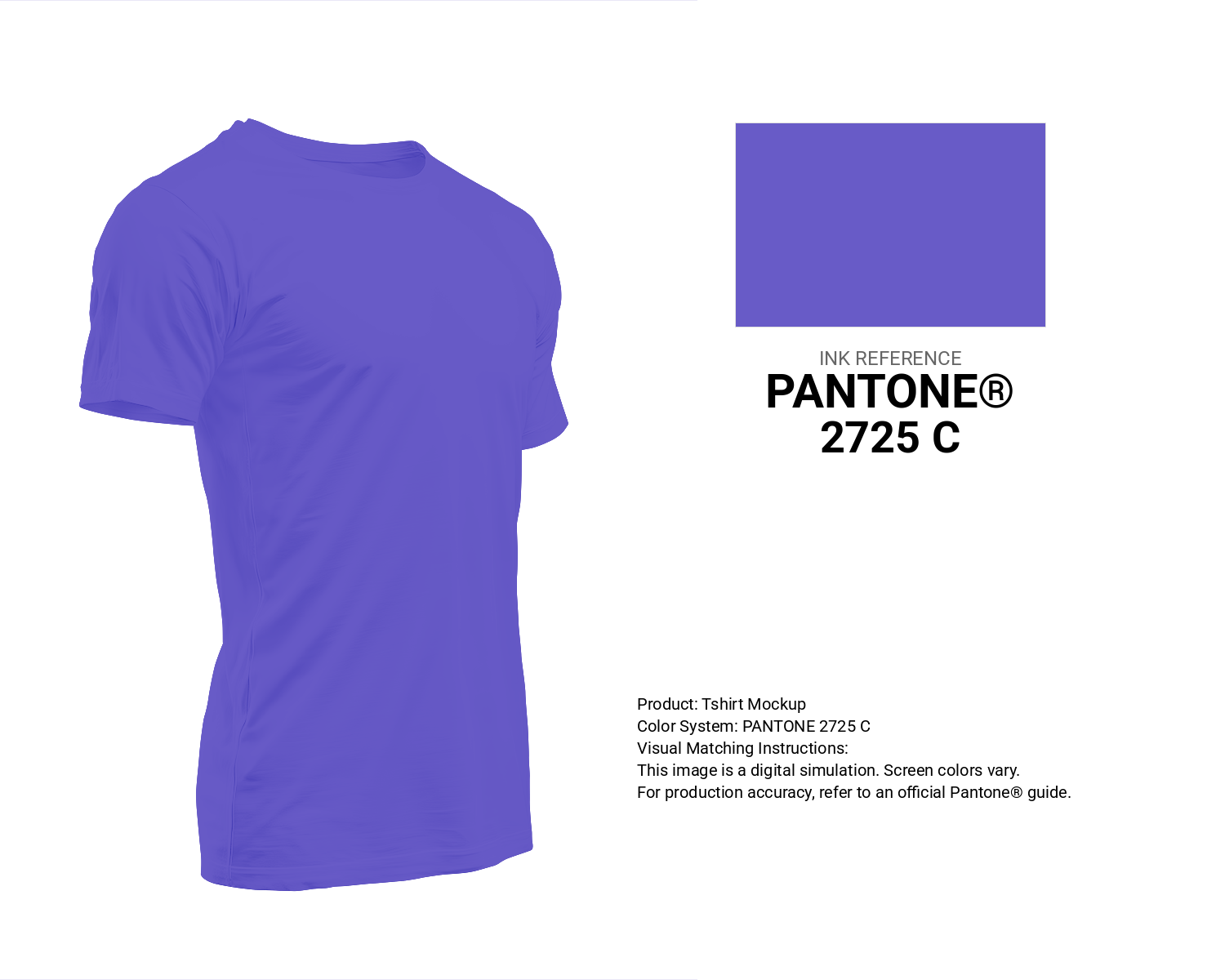
#685bc7 Pantone 2725 C Color | Hex color Code #685bc7 T-Shirt Mockup
Download T-Shirt Mockup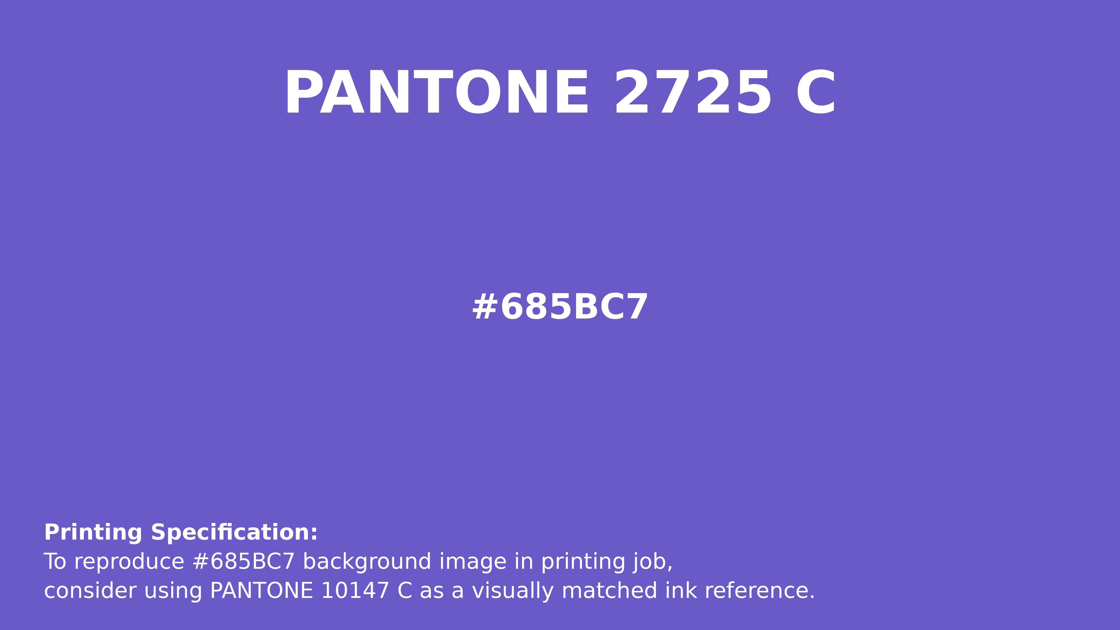
#685bc7 Pantone 2725 C Color | Hex color Code #685bc7 Printing Artwork Pantone Reference
Download Pantone Printing ReferenceRelated Color Palettes
- Purple and Maroon •
- Medium Purple and Steel Blue •
- Light Slate Gray and Medium Purple •
- Light Steel Blue and Medium Purple •
- Medium Purple and Light Slate Gray •
- Purple •
- Slate Blue and Medium Purple •
- Medium Purple and Gray •
- Medium Purple •
- Black and Medium Purple •
- Medium Purple and Midnight Blue •
- Medium Violet Red and Purple •
- Medium Orchid and Medium Purple •
- Medium Purple and Olive Drab •
- Medium Purple and Rosy Brown
Color Palette Collection

50 Color Palettes inspired by Sky
50 color palettes with 250 colors.
75 Sunset Color Schemes
75 color palettes with 375 colors.

49 Green Color Combinations
49 color palettes with 245 colors.

100+ Color palettes for background designs
113 color palettes with 565 colors.