#5F259F Color
Your all-in-one color resource. Download hex background images, Adobe swatches (ASE), PDF color sheets, and SVG files. Explore palettes, harmonies, accessibility, conversions, and professional exports — designed for designers, developers, and color perfectionists.
This deep purple-blue, #5F259F, conjures images of a twilight sky just after sunset, where the last rays of light bleed into the approaching night. It evokes feelings of introspection, mystery, and a touch of melancholy, similar to the feeling of quiet contemplation under a starry sky. The color reminds one of amethyst gemstones, velvet curtains in a dimly lit theatre, and the hushed anticipation before a grand event. It creates an atmosphere of sophistication, intrigue, and a hint of the unknown. In design, this color is suited for spaces that encourage creativity, contemplation, or a sense of luxury, such as a study, a bedroom, or a high-end boutique. It can also represent royalty, wisdom, and spirituality, making it a compelling choice for branding or artistic expression. Visually matched named color: Mystic Twilight.
PANTONE 267 C
Choose Color
Selected Color
Recent Colors
Color Details
Similar Ink Alternatives for #5F259F color Alternative print inks for reproducing #5F259F background image with a similar visual appearance.
Disclaimer: The visually matched ink reference is an independent approximation intended as a guide only. Please be advised that this pantone colors is only intended as a guide, Actual colours will depend on screen calibration variances. The print ink suggestions provided are independent visual approximations and are not affiliated with or endorsed by Pantone LLC. For official color specifications, conversion factors, and comprehensive color system information, please visit Pantone Connect. Official Pantone products can be purchased at pantone.com.
Color Previews for #000000 See how this color looks as a background or as text.
Complete Guide to Your Color Laboratory
Everything you need to know about this professional color toolkit.
Use the Color Picker at the top to select any color. All modules below update instantly.
Workflow: Pick a color → Explore palettes & data → Download what you need (PDF, Image, or Adobe ASE).
Color Details — Your color in all formats: HEX, RGB, RGBA, HSL, HSLA, HSV, CMYK, CIELab, Hunter-Lab, XYZ, Yxy, YUV. One-click copy.
Color Psychology — Emotional impact, cultural meanings, physiological effects, branding applications, and historical significance.
Named Colors — Find official color names (HTML/CSS, Pantone) that match your selection with similarity percentages.
Light & Dark Shades
80-step gradient from black to white. Perfect for button states and component systems.
Tints
Color mixed with white → lighter, pastel variations for backgrounds and disabled states.
Monochromatic — 11 curated tints/shades from one color. Production-ready for design systems.
- Complementary — Opposite on wheel (180°). High contrast.
- Analogous — Neighbors (±30°). Harmonious flow.
- Triadic — Three colors (120° apart). Vibrant, balanced.
- Split-Complementary — Base + two near-complements. Softer contrast.
- Tetradic/Square — Four colors. Complex, maximum variety.
- Neutral — Desaturated versions. Subtle, sophisticated.
15 Professional Variations — Monochromatic, Analogous, Complementary, Warm/Cool/Earth Tones, Pastel, Vibrant, High Contrast, and more.
Color Infusion — 10 palettes showing your color morphing into each major hue. Find bridge colors.
Similar Colors — 60+ colors generated via CIELAB Delta E matching. Unexpected harmonious combinations.
18 Ready-to-Use Gradients — Complementary, Analogous, Triadic, Tint/Shade progressions, and more.
Downloads: PNG (2560×1440), CSS (production-ready code), SVG (scalable vector).
WCAG Contrast Checker — Tests your color against white, black, and custom colors for AA (4.5:1) and AAA (7:1) compliance. Large text thresholds included.
Harmony & Accessibility Guide — Tests against 10 canonical hues. Shows which pairs are both beautiful AND WCAG-compliant for text.
PNG/JPG — High-res images for presentations and mood boards.
PDF — Print-ready reports for clients and teams.
Adobe ASE — Direct import to Photoshop, Illustrator, InDesign, XD.
CSS/SVG — Gradients only. Production-ready code and vectors.
Color Science: Industry-standard conversions (HSL, CIELAB, CMYK, XYZ). WCAG 2.1 luminance formula. Delta E (ΔE76) for perceptual matching.
Direct Links: Share colors via icolorpalette.com/color/ff5733 or icolorpalette.com/color/red
Issues? Refresh the page, wait for rendering, try another browser, or check console (F12) for errors.
Printing Guide for #5f259f Background Image
Use PANTONE 267 C as a visually matched ink reference when printing this background image.
To print the #5f259f background image from our site, consider using PANTONE 267 C as a visually matched ink reference.
Download the background image, then provide this reference code to your print vendor to help achieve accurate color reproduction.
The visually matched ink reference for the #5f259f background image is PANTONE 267 C.
This color is commonly described as Mystic Twilight.
This deep purple-blue, #5F259F, conjures images of a twilight sky just after sunset, where the last rays of light bleed into the approaching night. It evokes feelings of introspection, mystery, and a touch of melancholy, similar to the feeling of quiet contemplation under a starry sky. The color reminds one of amethyst gemstones, velvet curtains in a dimly lit theatre, and the hushed anticipation before a grand event. It creates an atmosphere of sophistication, intrigue, and a hint of the unknown. In design, this color is suited for spaces that encourage creativity, contemplation, or a sense of luxury, such as a study, a bedroom, or a high-end boutique. It can also represent royalty, wisdom, and spirituality, making it a compelling choice for branding or artistic expression.
We provide PANTONE 267 C as a visually matched ink reference to help you reproduce the #5f259f background image accurately in professional printing.
This reference code helps print vendors achieve consistent color output across different printing equipment and materials.
After downloading the #5f259f background image from our site:
- Include the visually matched ink reference PANTONE 267 C in your print order notes
- Inform your print vendor that this is your target color reference
- Request a proof print to verify the Mystic Twilight color appearance before full production
The #5f259f background image with PANTONE 267 C as visually matched ink reference can be used for:
- Posters, banners, and backdrops
- Business cards, brochures, and flyers
- Packaging, labels, and stickers
- Signage and promotional materials
This is an independent visual approximation.
While PANTONE 267 C closely matches the #5f259f background image color, variations may exist between screen display and printed output.
We recommend requesting a proof print to verify the final appearance.
This deep purple-blue, #5F259F, conjures images of a twilight sky just after sunset, where the last rays of light bleed into the approaching night. It evokes feelings of introspection, mystery, and a touch of melancholy, similar to the feeling of quiet contemplation under a starry sky. The color reminds one of amethyst gemstones, velvet curtains in a dimly lit theatre, and the hushed anticipation before a grand event. It creates an atmosphere of sophistication, intrigue, and a hint of the unknown. In design, this color is suited for spaces that encourage creativity, contemplation, or a sense of luxury, such as a study, a bedroom, or a high-end boutique. It can also represent royalty, wisdom, and spirituality, making it a compelling choice for branding or artistic expression.
Understanding these associations helps ensure the #5f259f background image aligns with your intended message and brand impact.
Important Information
The visually matched ink reference is an independent approximation intended as a guide only.
Actual printed colors may vary depending on screen calibration, substrate material, ink type, and printing equipment used.
For official color specifications and certified color standards, visit Pantone Connect.
Official color guides and swatch books can be purchased from pantone.com.
Pantone 267 C Color: Creative Purple | #5F259F
Introduction:
Purple, represented by the Pantone 267 C Color, is a captivating and enigmatic shade. Its deep and rich hue evokes a sense of mystery and creativity, making it a popular choice in design and artistic endeavors.
Historical Significance:
Usage in Renaissance Art: Purple pigment, extracted from murex sea snails, was expensive and rare, making it a symbol of power and wealth during the Renaissance period. Artists like Leonardo da Vinci and Michelangelo prominently featured purple in their artworks.
Association with Royalty: Purple has long been associated with royalty and nobility. In ancient times, purple dye was difficult to obtain, making it exclusive to kings and queens. The color symbolized luxury and elegance throughout history.
Symbolism and Meaning:
Spirituality and Imagination: Purple is often associated with spirituality, intuition, and the world of imagination. It represents mystery, magic, and the expansion of consciousness. In many cultures, purple is considered a sacred color.
Creative Expression: Being a unique and unconventional color, purple symbolizes individuality and creativity. It encourages originality and artistic expression in various creative fields.
Purple in Fashion:
Trendsetting Color: Purple has been a popular choice in the world of fashion throughout history. Whether in clothing, accessories, or makeup, purple adds a touch of elegance and sophistication to any ensemble.
Statement Making: Designers often use purple to make a bold fashion statement. It can be both regal and edgy, making it a versatile color that can be incorporated into various styles and trends.
Purple in Graphic Design:
Visual Impact: Purple is known for its striking visual impact. It adds a sense of sophistication and depth to graphic designs. When used intentionally, it can enhance branding and create a lasting impression on viewers.
Branding and Identity: Many brands incorporate purple into their logos and visual identity to convey a sense of luxury, creativity, and uniqueness. Purple is associated with innovative and imaginative qualities.
Color Combinations:
Purple and Gold: Purple pairs well with gold, creating a regal and luxurious color combination. This combination is often used in high-end branding and design.
Purple and Silver: Purple and silver complement each other and create a modern and elegant color scheme. This combination is often used in fashion and interior design.
Nature’s Palette:
Purple Flowers: Lavender, orchids, and violets are just a few examples of beautiful purple flowers found in nature. These flowers symbolize elegance, grace, and spirituality.
Natural Landscapes: Purple hues can be seen in breathtaking sunsets, mountain ranges, and other natural landscapes. They create a sense of serenity and tranquility in nature.
Artistic Representations:
Expressionism: Many expressionist artists, such as Vincent van Gogh, used purple to convey emotions and moods. Purple is often used to represent introspection and spiritual themes in art.
Fantasy Art: Purple plays a significant role in fantasy art, where it symbolizes magical realms, enchanted creatures, and the unknown. It adds an element of mystery and imagination to artistic creations.
Movies and Cinematic Landscapes:
Purple Night Scenes: In movies, purple is often used to depict nighttime scenes or create a dreamlike atmosphere. It adds a touch of mystique and enhances the visual allure of the film.
Science Fiction and Fantasy: Purple is frequently used in science fiction and fantasy movies to represent otherworldly landscapes, futuristic technologies, and supernatural elements.
Products and Commercial Appeal:
Prestige and Luxury Items: Purple is often associated with high-end and luxury products. It exudes a sense of exclusivity and sophistication, making it desirable in the commercial market.
Imaginative Brands: Brands catering to creative and imaginative individuals often utilize purple in their marketing and branding strategies. It appeals to those who seek uniqueness and self-expression.
National Symbols and Significance:
Reference in Historical Flags: Purple has been an important color in various historical flags, representing royalty, power, and authority. It is associated with nations and cultures that value these qualities.
Cultural Significance: In some cultures, purple is considered a sacred color associated with spirituality, rituals, and religious practices. It holds deep cultural and traditional meaning.
The Psychological and Emotional Impact:
Creativity and Imagination: Purple stimulates creativity and encourages innovative thinking. It inspires imagination and can be used to create a sense of artistic expression in various environments.
Calmness and Tranquility: Purple has a calming effect on the mind and body. It promotes relaxation, meditation, and introspection. It is often used in therapeutic environments to create a peaceful atmosphere.
Conclusion:
Purple, represented by the Pantone 267 C Color, holds a significant place in history, art, and symbolism. Its deep, mysterious hue has captivated people throughout the ages. With its associations with creativity, spirituality, and luxury, purple continues to be a timeless and influential color in design and various aspects of human expression.
Pantone 267 C Color | Hex color Code #5f259f Image & Artwork
Download high-quality assets for your projects.

#5f259f Color Schemes
Download Color Schemes
#5f259f Color Shades
Download Color Shades
Pantone 267 C Color | Hex color Code #5f259f Solid Color Background
Download Solid Color
#5f259f Pantone 267 C Color | Hex color Code #5f259f Artwork Image (PNG)
Download Artwork (PNG)#5f259f Pantone 267 C Color | Hex color Code #5f259f Artwork Vector (PDF)
Download Artwork (PDF)#5f259f Pantone 267 C Color | Hex color Code #5f259f Artwork Vector (SVG)
Download Artwork (SVG)
#5f259f Pantone 267 C Color | Hex color Code #5f259f Pantone Swatch Artwork
Download Artwork Swatch
#5f259f Pantone 267 C Color | Hex color Code #5f259f Gradient Artwork (PNG)
Download Gradient (PNG)#5f259f Pantone 267 C Color | Hex color Code #5f259f Gradient Artwork (SVG)
Download Gradient (SVG)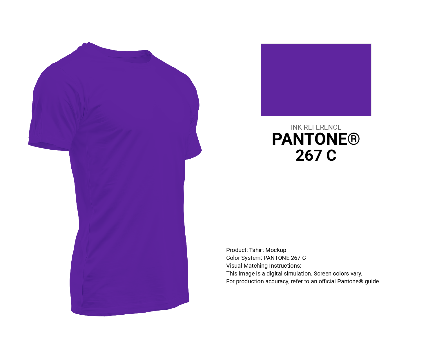
#5f259f Pantone 267 C Color | Hex color Code #5f259f T-Shirt Mockup
Download T-Shirt Mockup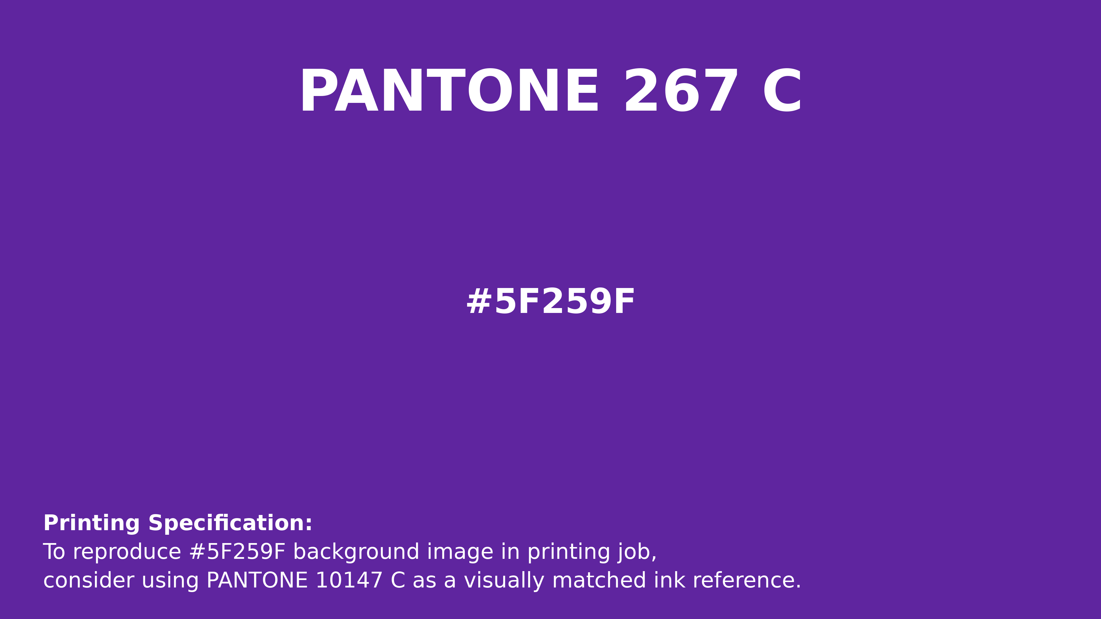
#5f259f Pantone 267 C Color | Hex color Code #5f259f Printing Artwork Pantone Reference
Download Pantone Printing ReferenceRelated Color Palettes
- Dim Gray and Pale Turquoise •
- Gray and Dark Slate Blue •
- Dark Sea Green and Light Gray •
- Khaki and Dim Gray •
- Medium Aquamarine and Light Slate Gray •
- Dark Slate Gray and Silver •
- Slate Gray and Light Sea Green •
- Dark Slate Gray and Dark Cyan •
- Dark Slate Gray and Royal Blue •
- Light Steel Blue and Dark Gray •
- Light Gray and Black •
- Forest Green and Light Slate Gray •
- OrangeRed and Dim Gray •
- Dark Gray and Rosy Brown •
- Light Sea Green and Dark Slate Gray
Color Palette Collection

49 Beautiful curated Color Schemes For Your Next Design Project
49 color palettes with 245 colors.
21 Pastel Yellow Color Schemes
21 color palettes with 105 colors.

23 Light Blue Color Schemes
23 color palettes with 115 colors.
50 Autumn / Fall Color Palettes
50 color palettes with 250 colors.