#54585A Color
Your all-in-one color resource. Download hex background images, Adobe swatches (ASE), PDF color sheets, and SVG files. Explore palettes, harmonies, accessibility, conversions, and professional exports — designed for designers, developers, and color perfectionists.
This muted gray-blue-toned color evokes a sense of quiet contemplation and understated elegance. It's reminiscent of a twilight sky, the stillness of a winter forest, or the calm before a storm. The subtle nature of the color creates a soothing and grounded atmosphere, perfect for bedrooms or study spaces. It suggests a sense of maturity, reliability, and a quiet strength. In design, this shade can be used to create a sophisticated and timeless feel, promoting a sense of peace and introspection. It's a color that doesn't demand attention but subtly enhances the environment. Visually matched named color: Neutral Dusk.
PANTONE 425 C
Choose Color
Selected Color
Recent Colors
Color Details
Similar Ink Alternatives for #54585A color Alternative print inks for reproducing #54585A background image with a similar visual appearance.
Disclaimer: The visually matched ink reference is an independent approximation intended as a guide only. Please be advised that this pantone colors is only intended as a guide, Actual colours will depend on screen calibration variances. The print ink suggestions provided are independent visual approximations and are not affiliated with or endorsed by Pantone LLC. For official color specifications, conversion factors, and comprehensive color system information, please visit Pantone Connect. Official Pantone products can be purchased at pantone.com.
Color Previews for #000000 See how this color looks as a background or as text.
Complete Guide to Your Color Laboratory
Everything you need to know about this professional color toolkit.
Use the Color Picker at the top to select any color. All modules below update instantly.
Workflow: Pick a color → Explore palettes & data → Download what you need (PDF, Image, or Adobe ASE).
Color Details — Your color in all formats: HEX, RGB, RGBA, HSL, HSLA, HSV, CMYK, CIELab, Hunter-Lab, XYZ, Yxy, YUV. One-click copy.
Color Psychology — Emotional impact, cultural meanings, physiological effects, branding applications, and historical significance.
Named Colors — Find official color names (HTML/CSS, Pantone) that match your selection with similarity percentages.
Light & Dark Shades
80-step gradient from black to white. Perfect for button states and component systems.
Tints
Color mixed with white → lighter, pastel variations for backgrounds and disabled states.
Monochromatic — 11 curated tints/shades from one color. Production-ready for design systems.
- Complementary — Opposite on wheel (180°). High contrast.
- Analogous — Neighbors (±30°). Harmonious flow.
- Triadic — Three colors (120° apart). Vibrant, balanced.
- Split-Complementary — Base + two near-complements. Softer contrast.
- Tetradic/Square — Four colors. Complex, maximum variety.
- Neutral — Desaturated versions. Subtle, sophisticated.
15 Professional Variations — Monochromatic, Analogous, Complementary, Warm/Cool/Earth Tones, Pastel, Vibrant, High Contrast, and more.
Color Infusion — 10 palettes showing your color morphing into each major hue. Find bridge colors.
Similar Colors — 60+ colors generated via CIELAB Delta E matching. Unexpected harmonious combinations.
18 Ready-to-Use Gradients — Complementary, Analogous, Triadic, Tint/Shade progressions, and more.
Downloads: PNG (2560×1440), CSS (production-ready code), SVG (scalable vector).
WCAG Contrast Checker — Tests your color against white, black, and custom colors for AA (4.5:1) and AAA (7:1) compliance. Large text thresholds included.
Harmony & Accessibility Guide — Tests against 10 canonical hues. Shows which pairs are both beautiful AND WCAG-compliant for text.
PNG/JPG — High-res images for presentations and mood boards.
PDF — Print-ready reports for clients and teams.
Adobe ASE — Direct import to Photoshop, Illustrator, InDesign, XD.
CSS/SVG — Gradients only. Production-ready code and vectors.
Color Science: Industry-standard conversions (HSL, CIELAB, CMYK, XYZ). WCAG 2.1 luminance formula. Delta E (ΔE76) for perceptual matching.
Direct Links: Share colors via icolorpalette.com/color/ff5733 or icolorpalette.com/color/red
Issues? Refresh the page, wait for rendering, try another browser, or check console (F12) for errors.
Printing Guide for #54585a Background Image
Use PANTONE 425 C as a visually matched ink reference when printing this background image.
To print the #54585a background image from our site, consider using PANTONE 425 C as a visually matched ink reference.
Download the background image, then provide this reference code to your print vendor to help achieve accurate color reproduction.
The visually matched ink reference for the #54585a background image is PANTONE 425 C.
This color is commonly described as Neutral Dusk.
This muted gray-blue-toned color evokes a sense of quiet contemplation and understated elegance. It's reminiscent of a twilight sky, the stillness of a winter forest, or the calm before a storm. The subtle nature of the color creates a soothing and grounded atmosphere, perfect for bedrooms or study spaces. It suggests a sense of maturity, reliability, and a quiet strength. In design, this shade can be used to create a sophisticated and timeless feel, promoting a sense of peace and introspection. It's a color that doesn't demand attention but subtly enhances the environment.
We provide PANTONE 425 C as a visually matched ink reference to help you reproduce the #54585a background image accurately in professional printing.
This reference code helps print vendors achieve consistent color output across different printing equipment and materials.
After downloading the #54585a background image from our site:
- Include the visually matched ink reference PANTONE 425 C in your print order notes
- Inform your print vendor that this is your target color reference
- Request a proof print to verify the Neutral Dusk color appearance before full production
The #54585a background image with PANTONE 425 C as visually matched ink reference can be used for:
- Posters, banners, and backdrops
- Business cards, brochures, and flyers
- Packaging, labels, and stickers
- Signage and promotional materials
This is an independent visual approximation.
While PANTONE 425 C closely matches the #54585a background image color, variations may exist between screen display and printed output.
We recommend requesting a proof print to verify the final appearance.
This muted gray-blue-toned color evokes a sense of quiet contemplation and understated elegance. It's reminiscent of a twilight sky, the stillness of a winter forest, or the calm before a storm. The subtle nature of the color creates a soothing and grounded atmosphere, perfect for bedrooms or study spaces. It suggests a sense of maturity, reliability, and a quiet strength. In design, this shade can be used to create a sophisticated and timeless feel, promoting a sense of peace and introspection. It's a color that doesn't demand attention but subtly enhances the environment.
Understanding these associations helps ensure the #54585a background image aligns with your intended message and brand impact.
Important Information
The visually matched ink reference is an independent approximation intended as a guide only.
Actual printed colors may vary depending on screen calibration, substrate material, ink type, and printing equipment used.
For official color specifications and certified color standards, visit Pantone Connect.
Official color guides and swatch books can be purchased from pantone.com.
Pantone 425 C Color: Subtle Charcoal Gray | #54585A
Introduction:
Subtle Charcoal Gray is a sophisticated color that combines elegance and versatility. It is a shade of gray with a hint of warmth, making it visually appealing.
Historical Significance:
Key moments in history: Subtle Charcoal Gray has been prominently used in various historical periods. For example, it was often seen in Victorian-era clothing, symbolizing formality and elegance. Additionally, it played a significant role in mid-century modern design, showcasing a sleek and timeless aesthetic.
Another subtopic heading: More content about historical significance...
Symbolism and Meaning:
Symbolism: Subtle Charcoal Gray typically symbolizes sophistication, professionalism, and neutrality. It is often associated with stability and balance, making it an ideal choice for corporate settings.
Another subtopic heading: More content about symbolism and meaning...
Subtle Charcoal Gray in Fashion:
Fashion impact: Subtle Charcoal Gray has a significant influence on styles and trends in the fashion world. It is often used in formal attire and can create a sophisticated and timeless look. The color also provides a versatile base for various outfit combinations.
Another subtopic heading: More content about the color in fashion...
Subtle Charcoal Gray in Graphic Design:
Design aesthetics: The significance of Subtle Charcoal Gray in graphic design lies in its ability to convey a sense of elegance, professionalism, and minimalism. It is often used in branding to create a sleek and sophisticated visual impact.
Another subtopic heading: More content about the color in graphic design...
Color Combinations:
Potential color combinations: Subtle Charcoal Gray pairs well with a range of colors, such as soft pastels like blush pink, dusty blue, or mint green. It also works harmoniously with other neutrals, such as white, beige, and taupe.
Another subtopic heading: More content about color combinations...
Nature's Palette:
Natural occurrences: Subtle Charcoal Gray can be found in nature in various forms. It often appears in the coloration of rocks, stones, and certain bird feathers. Additionally, it can be seen in the clouded sky during overcast days.
Another subtopic heading: More content about nature's palette...
Artistic Representations:
Artistic usage: Subtle Charcoal Gray has been utilized in various forms of art for its ability to evoke feelings of depth, mystery, and sophistication. It can be seen in grayscale photography, charcoal sketches, and abstract paintings.
Another subtopic heading: More content about artistic representations...
Movies and Cinematic Landscapes:
Set the tone or mood: Subtle Charcoal Gray is often used in movies and cinematic scenes to establish a sense of seriousness, elegance, or mystery. It can be seen in film noir classics, adding a touch of intrigue to the visual storytelling.
Another subtopic heading: More content about movies and cinematic landscapes...
Products and Commercial Appeal:
Associated products and brands: Subtle Charcoal Gray is often used by luxury brands to convey a sense of sophistication and high-end appeal. It can be found in products such as luxury cars, designer fashion, and high-quality home decor.
Another subtopic heading: More content about products and commercial appeal...
National Symbols and Significance:
Significance in national culture: In certain cultures, Subtle Charcoal Gray may hold specific significance, representing values such as tradition, dignity, or formality. For example, it may be incorporated into the national flag or traditional attire.
Another subtopic heading: More content about national symbols and significance...
The Psychological and Emotional Impact:
Influences on emotions and perceptions: Subtle Charcoal Gray is often associated with feelings of calmness, sophistication, and professionalism. It can create a sense of stability and trust, making it an excellent choice for branding or work environments.
Another subtopic heading: More content about the psychological and emotional impact...
Conclusion:
In conclusion, Subtle Charcoal Gray, also known as Pantone 425 C, exudes a timeless and versatile appeal. It has a rich historical significance, symbolizes sophistication and neutrality, and finds its place in various industries such as fashion, graphic design, and cinematography. With its ability to evoke emotions and create a sense of balance, Subtle Charcoal Gray remains a popular choice in both personal and professional settings.
Pantone 425 C Color | Hex color Code #54585a Image & Artwork
Download high-quality assets for your projects.

#54585a Color Schemes
Download Color Schemes
#54585a Color Shades
Download Color Shades
Pantone 425 C Color | Hex color Code #54585a Solid Color Background
Download Solid Color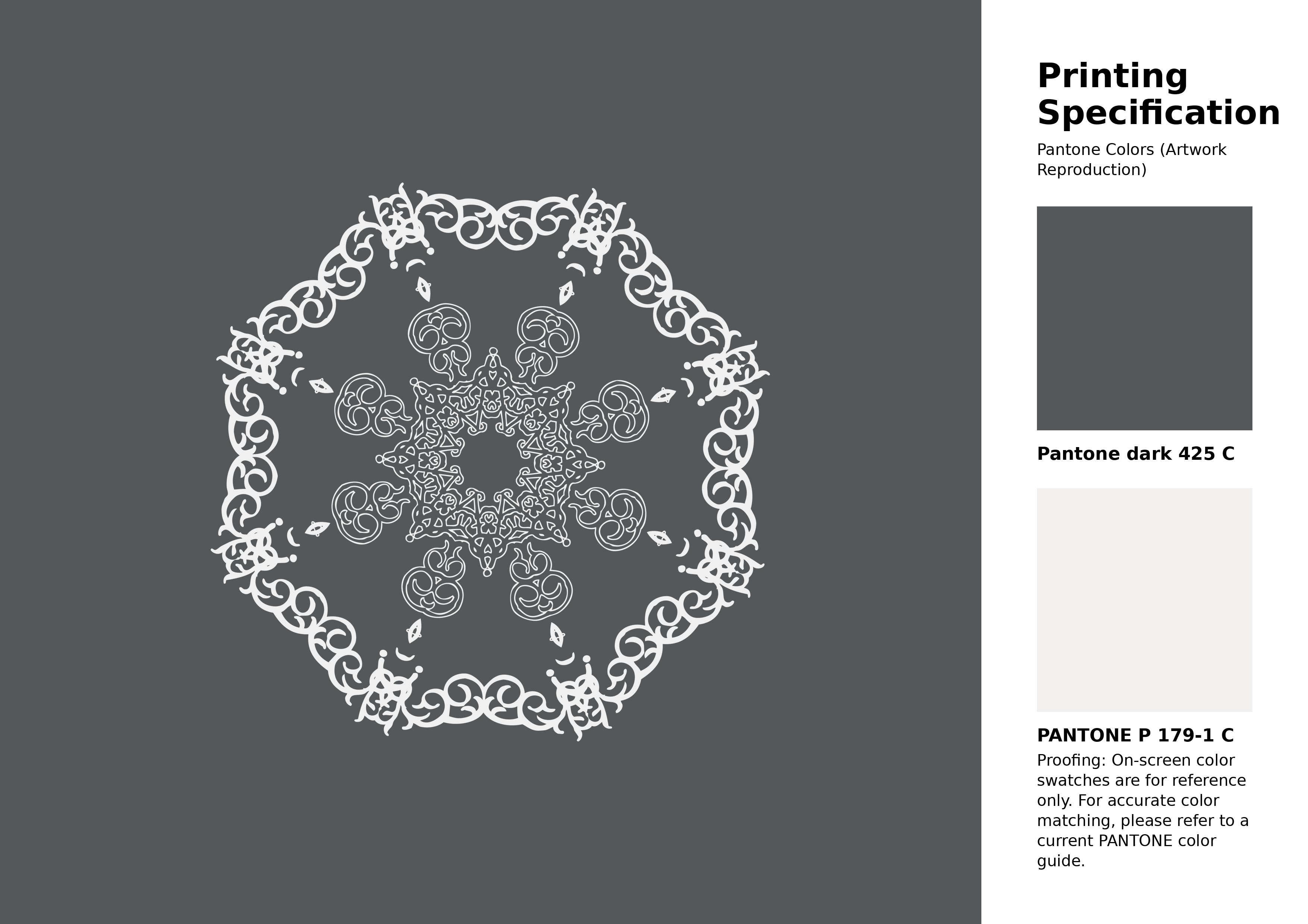
#54585a Pantone 425 C Color | Hex color Code #54585a Artwork Image (PNG)
Download Artwork (PNG)#54585a Pantone 425 C Color | Hex color Code #54585a Artwork Vector (PDF)
Download Artwork (PDF)#54585a Pantone 425 C Color | Hex color Code #54585a Artwork Vector (SVG)
Download Artwork (SVG)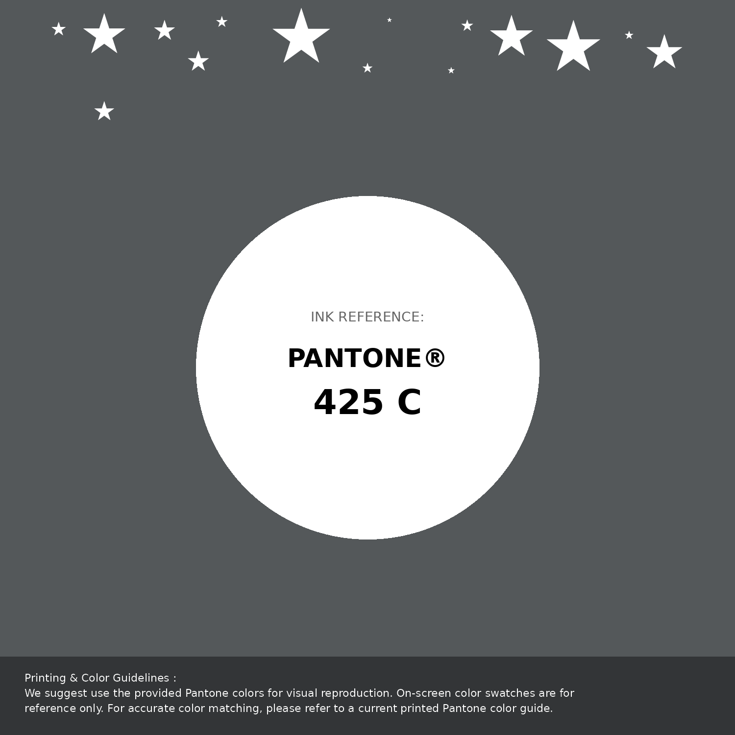
#54585a Pantone 425 C Color | Hex color Code #54585a Pantone Swatch Artwork
Download Artwork Swatch
#54585a Pantone 425 C Color | Hex color Code #54585a Gradient Artwork (PNG)
Download Gradient (PNG)#54585a Pantone 425 C Color | Hex color Code #54585a Gradient Artwork (SVG)
Download Gradient (SVG)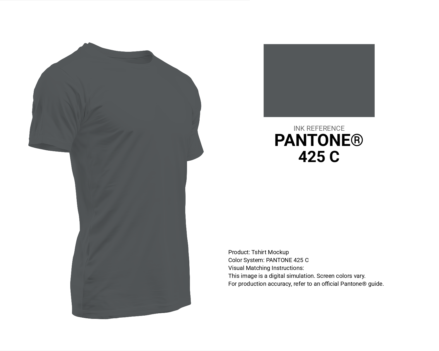
#54585a Pantone 425 C Color | Hex color Code #54585a T-Shirt Mockup
Download T-Shirt Mockup
#54585a Pantone 425 C Color | Hex color Code #54585a Printing Artwork Pantone Reference
Download Pantone Printing ReferenceRelated Color Palettes
- Dark Khaki and Dark Gray •
- Dark Gray and Goldenrod •
- Silver and Dark Gray •
- Dark Gray and Peru •
- Dark Gray and Tan •
- Dark Gray and Linen •
- Plum and Dark Gray •
- Pale Violet Red and Dark Gray •
- Olive Drab and Dark Gray •
- Dark Gray and Beige •
- Gainsboro and Dark Gray •
- Thistle and Dark Gray •
- Dark Olive Green and Dark Gray •
- Burly Wood and Dark Gray •
- Dark Gray and Dark Olive Green
Color Palette Collection
Light color Palettes
9 color palettes with 45 colors.

Home vibes
1 color palettes with 5 colors.

Light Blue Palettes to Enhance Your Design
13 color palettes with 65 colors.
125 Yellow Color Palettes
125 color palettes with 625 colors.