#4F2F7C Color
Your all-in-one color resource. Download hex background images, Adobe swatches (ASE), PDF color sheets, and SVG files. Explore palettes, harmonies, accessibility, conversions, and professional exports — designed for designers, developers, and color perfectionists.
This deep, rich hue of purple evokes feelings of luxury, mystery, and introspection. It's reminiscent of twilight skies just as the first stars appear, or the velvety petals of rare flowers. The color suggests a sense of wisdom, spirituality, and creative power. It can create an atmosphere of sophistication and calm, making it ideal for creating a sense of opulence in a bedroom or a contemplative space in a study. Culturally, deep purples have long been associated with royalty, nobility, and a connection to the divine. Visually matched named color: Royal Amethyst.
PANTONE P 96-8 C
Choose Color
Selected Color
Recent Colors
Color Details
Similar Ink Alternatives for #4F2F7C color Alternative print inks for reproducing #4F2F7C background image with a similar visual appearance.
Disclaimer: The visually matched ink reference is an independent approximation intended as a guide only. Please be advised that this pantone colors is only intended as a guide, Actual colours will depend on screen calibration variances. The print ink suggestions provided are independent visual approximations and are not affiliated with or endorsed by Pantone LLC. For official color specifications, conversion factors, and comprehensive color system information, please visit Pantone Connect. Official Pantone products can be purchased at pantone.com.
Color Previews for #000000 See how this color looks as a background or as text.
Complete Guide to Your Color Laboratory
Everything you need to know about this professional color toolkit.
Use the Color Picker at the top to select any color. All modules below update instantly.
Workflow: Pick a color → Explore palettes & data → Download what you need (PDF, Image, or Adobe ASE).
Color Details — Your color in all formats: HEX, RGB, RGBA, HSL, HSLA, HSV, CMYK, CIELab, Hunter-Lab, XYZ, Yxy, YUV. One-click copy.
Color Psychology — Emotional impact, cultural meanings, physiological effects, branding applications, and historical significance.
Named Colors — Find official color names (HTML/CSS, Pantone) that match your selection with similarity percentages.
Light & Dark Shades
80-step gradient from black to white. Perfect for button states and component systems.
Tints
Color mixed with white → lighter, pastel variations for backgrounds and disabled states.
Monochromatic — 11 curated tints/shades from one color. Production-ready for design systems.
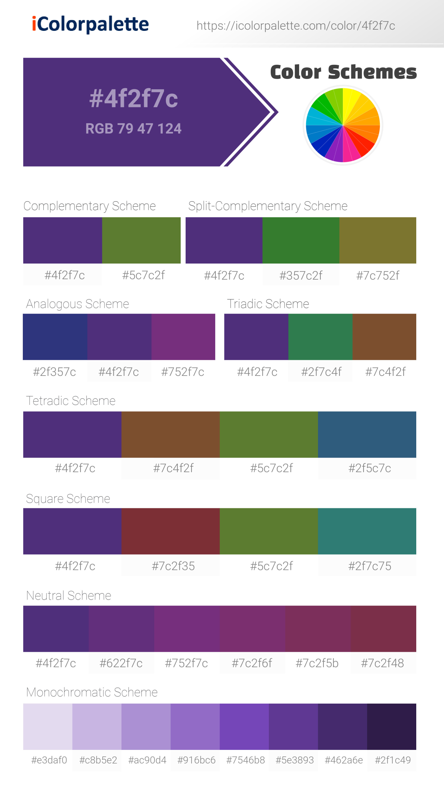
- Complementary — Opposite on wheel (180°). High contrast.
- Analogous — Neighbors (±30°). Harmonious flow.
- Triadic — Three colors (120° apart). Vibrant, balanced.
- Split-Complementary — Base + two near-complements. Softer contrast.
- Tetradic/Square — Four colors. Complex, maximum variety.
- Neutral — Desaturated versions. Subtle, sophisticated.
15 Professional Variations — Monochromatic, Analogous, Complementary, Warm/Cool/Earth Tones, Pastel, Vibrant, High Contrast, and more.
Color Infusion — 10 palettes showing your color morphing into each major hue. Find bridge colors.
Similar Colors — 60+ colors generated via CIELAB Delta E matching. Unexpected harmonious combinations.
18 Ready-to-Use Gradients — Complementary, Analogous, Triadic, Tint/Shade progressions, and more.
Downloads: PNG (2560×1440), CSS (production-ready code), SVG (scalable vector).
WCAG Contrast Checker — Tests your color against white, black, and custom colors for AA (4.5:1) and AAA (7:1) compliance. Large text thresholds included.
Harmony & Accessibility Guide — Tests against 10 canonical hues. Shows which pairs are both beautiful AND WCAG-compliant for text.
PNG/JPG — High-res images for presentations and mood boards.
PDF — Print-ready reports for clients and teams.
Adobe ASE — Direct import to Photoshop, Illustrator, InDesign, XD.
CSS/SVG — Gradients only. Production-ready code and vectors.
Color Science: Industry-standard conversions (HSL, CIELAB, CMYK, XYZ). WCAG 2.1 luminance formula. Delta E (ΔE76) for perceptual matching.
Direct Links: Share colors via icolorpalette.com/color/ff5733 or icolorpalette.com/color/red
Issues? Refresh the page, wait for rendering, try another browser, or check console (F12) for errors.
Printing Guide for #4f2f7c Background Image
Use PANTONE P 96-8 C as a visually matched ink reference when printing this background image.
To print the #4f2f7c background image from our site, consider using PANTONE P 96-8 C as a visually matched ink reference.
Download the background image, then provide this reference code to your print vendor to help achieve accurate color reproduction.
The visually matched ink reference for the #4f2f7c background image is PANTONE P 96-8 C.
This color is commonly described as Royal Amethyst.
This deep, rich hue of purple evokes feelings of luxury, mystery, and introspection. It's reminiscent of twilight skies just as the first stars appear, or the velvety petals of rare flowers. The color suggests a sense of wisdom, spirituality, and creative power. It can create an atmosphere of sophistication and calm, making it ideal for creating a sense of opulence in a bedroom or a contemplative space in a study. Culturally, deep purples have long been associated with royalty, nobility, and a connection to the divine.
We provide PANTONE P 96-8 C as a visually matched ink reference to help you reproduce the #4f2f7c background image accurately in professional printing.
This reference code helps print vendors achieve consistent color output across different printing equipment and materials.
After downloading the #4f2f7c background image from our site:
- Include the visually matched ink reference PANTONE P 96-8 C in your print order notes
- Inform your print vendor that this is your target color reference
- Request a proof print to verify the Royal Amethyst color appearance before full production
The #4f2f7c background image with PANTONE P 96-8 C as visually matched ink reference can be used for:
- Posters, banners, and backdrops
- Business cards, brochures, and flyers
- Packaging, labels, and stickers
- Signage and promotional materials
This is an independent visual approximation.
While PANTONE P 96-8 C closely matches the #4f2f7c background image color, variations may exist between screen display and printed output.
We recommend requesting a proof print to verify the final appearance.
This deep, rich hue of purple evokes feelings of luxury, mystery, and introspection. It's reminiscent of twilight skies just as the first stars appear, or the velvety petals of rare flowers. The color suggests a sense of wisdom, spirituality, and creative power. It can create an atmosphere of sophistication and calm, making it ideal for creating a sense of opulence in a bedroom or a contemplative space in a study. Culturally, deep purples have long been associated with royalty, nobility, and a connection to the divine.
Understanding these associations helps ensure the #4f2f7c background image aligns with your intended message and brand impact.
Important Information
The visually matched ink reference is an independent approximation intended as a guide only.
Actual printed colors may vary depending on screen calibration, substrate material, ink type, and printing equipment used.
For official color specifications and certified color standards, visit Pantone Connect.
Official color guides and swatch books can be purchased from pantone.com.
Pantone P 96-8 C Color: Deep Indigo | #4F2F7C
Introduction:
Deep Indigo is a rich and vivid shade of blue that exudes mystery and depth. Its dark hue captures attention and adds a touch of sophistication to any visual composition.
Historical Significance:
Significant Use in Royalty: Deep Indigo has long been associated with royalty and power. It was often used in the garments and regalia of ancient kings and queens, symbolizing their noble status.
Symbolism and Meaning:
Spiritual Depth and Intuition: In many cultures, Deep Indigo represents spiritual depth and intuition. It is often associated with wisdom, mystery, and introspection.
Deep Indigo in Fashion:
Elegant and Versatile: Deep Indigo is a popular choice in fashion due to its versatile nature. It can be used to create elegant evening wear or add a touch of sophistication to casual outfits.
Deep Indigo in Graphic Design:
Visual Impact and Branding: Deep Indigo is often used in graphic design to create a sense of depth and mystery. It can evoke feelings of trust, authority, and professionalism, making it a popular choice in branding and advertising.
Color Combinations:
Stylish Combinations: Deep Indigo pairs well with a variety of colors. Some popular combinations include Deep Indigo with silver for a modern and sleek look, Deep Indigo with gold for a luxurious touch, and Deep Indigo with white for a crisp and clean appearance.
Nature's Palette:
Night Skies and Ocean Depths: Deep Indigo can be found in nature, particularly in the vastness of night skies and the depths of the ocean. It represents the mystery and beauty of these natural elements.
Artistic Representations:
Depictions of Depth and Emotion: Deep Indigo has been used by artists to convey depth, emotions, and a sense of introspection. It is often seen in abstract and expressionist artworks.
Movies and Cinematic Landscapes:
Mysterious and Dramatic Scenes: Deep Indigo is often used in movies to set a mysterious and dramatic tone. It can be seen in scenes that evoke suspense, melancholy, or the unknown.
Products and Commercial Appeal:
Luxury and Elegance: Deep Indigo is often associated with luxury and elegance, making it a popular choice for high-end products and brands. It adds a touch of sophistication and exclusivity to their branding and packaging.
National Symbols and Significance:
Cultural Significance: In some cultures, Deep Indigo holds special significance and is associated with national identity or cultural traditions. For example, in Japan, indigo dyeing techniques have a long history and are considered a traditional craft.
The Psychological and Emotional Impact:
Serene and Calming: Deep Indigo has a calming effect on the mind and can evoke feelings of serenity and tranquility. It is also associated with introspection and deep thinking.
Conclusion:
Deep Indigo, with its rich and mysterious hue, has a long history of symbolism and significance. It represents power, wisdom, and depth while adding a touch of elegance to various forms of art, fashion, and design. Whether used in branding, fashion, or artistic compositions, Deep Indigo continues to captivate and inspire.
Pantone P 96-8 C Color | Hex color Code #4f2f7c Image & Artwork
Download high-quality assets for your projects.
#4f2f7c Color Schemes
Download Color Schemes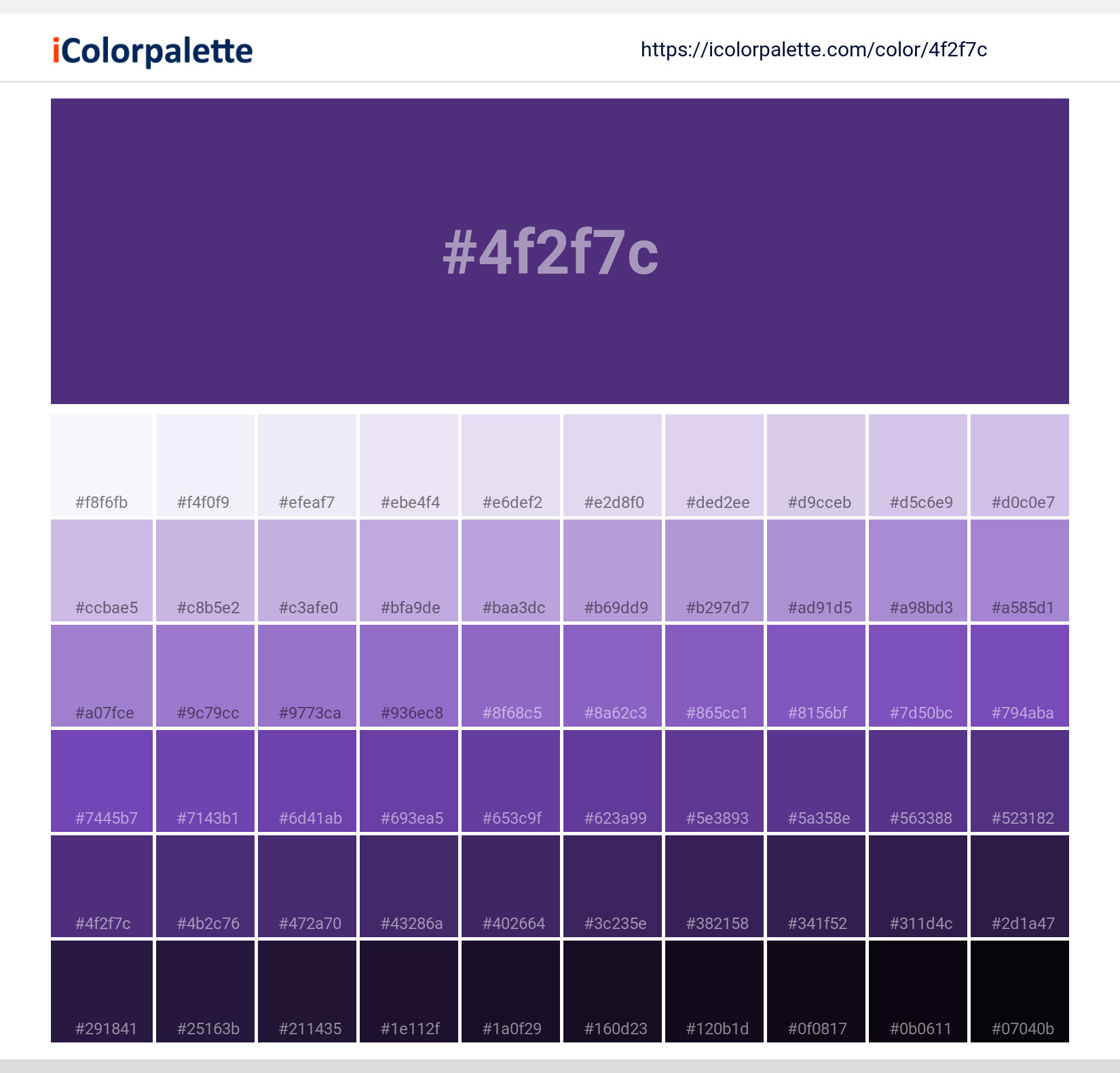
#4f2f7c Color Shades
Download Color Shades
Pantone P 96-8 C Color | Hex color Code #4f2f7c Solid Color Background
Download Solid Color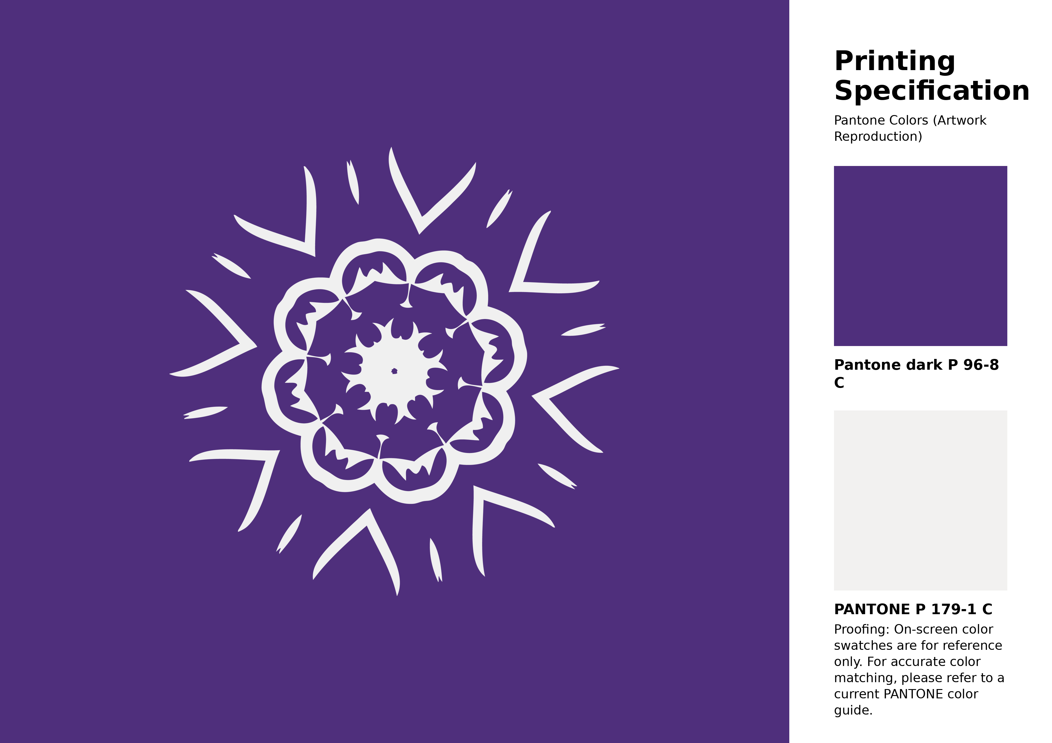
#4f2f7c Pantone P 96-8 C Color | Hex color Code #4f2f7c Artwork Image (PNG)
Download Artwork (PNG)#4f2f7c Pantone P 96-8 C Color | Hex color Code #4f2f7c Artwork Vector (PDF)
Download Artwork (PDF)#4f2f7c Pantone P 96-8 C Color | Hex color Code #4f2f7c Artwork Vector (SVG)
Download Artwork (SVG)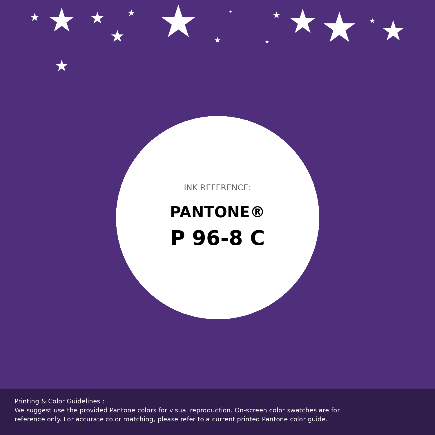
#4f2f7c Pantone P 96-8 C Color | Hex color Code #4f2f7c Pantone Swatch Artwork
Download Artwork Swatch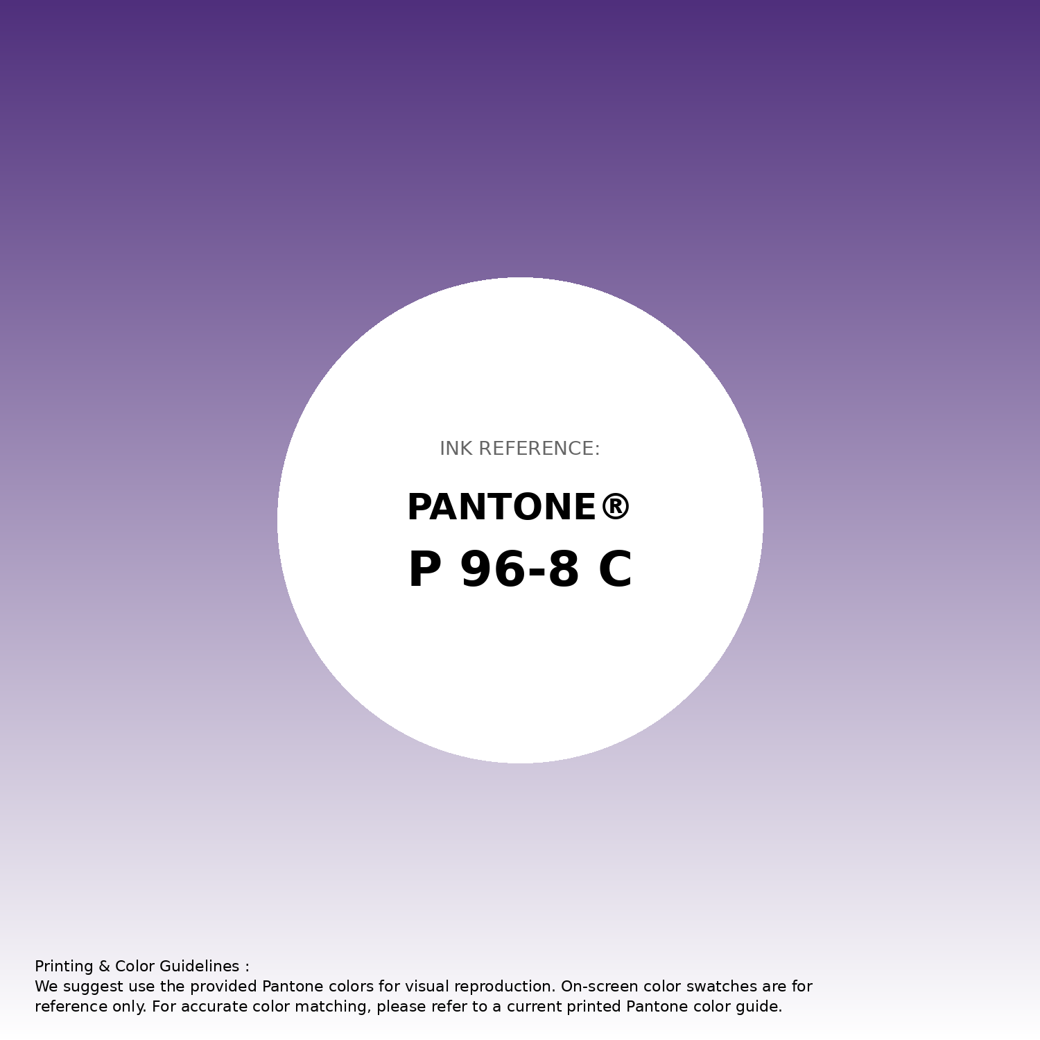
#4f2f7c Pantone P 96-8 C Color | Hex color Code #4f2f7c Gradient Artwork (PNG)
Download Gradient (PNG)#4f2f7c Pantone P 96-8 C Color | Hex color Code #4f2f7c Gradient Artwork (SVG)
Download Gradient (SVG)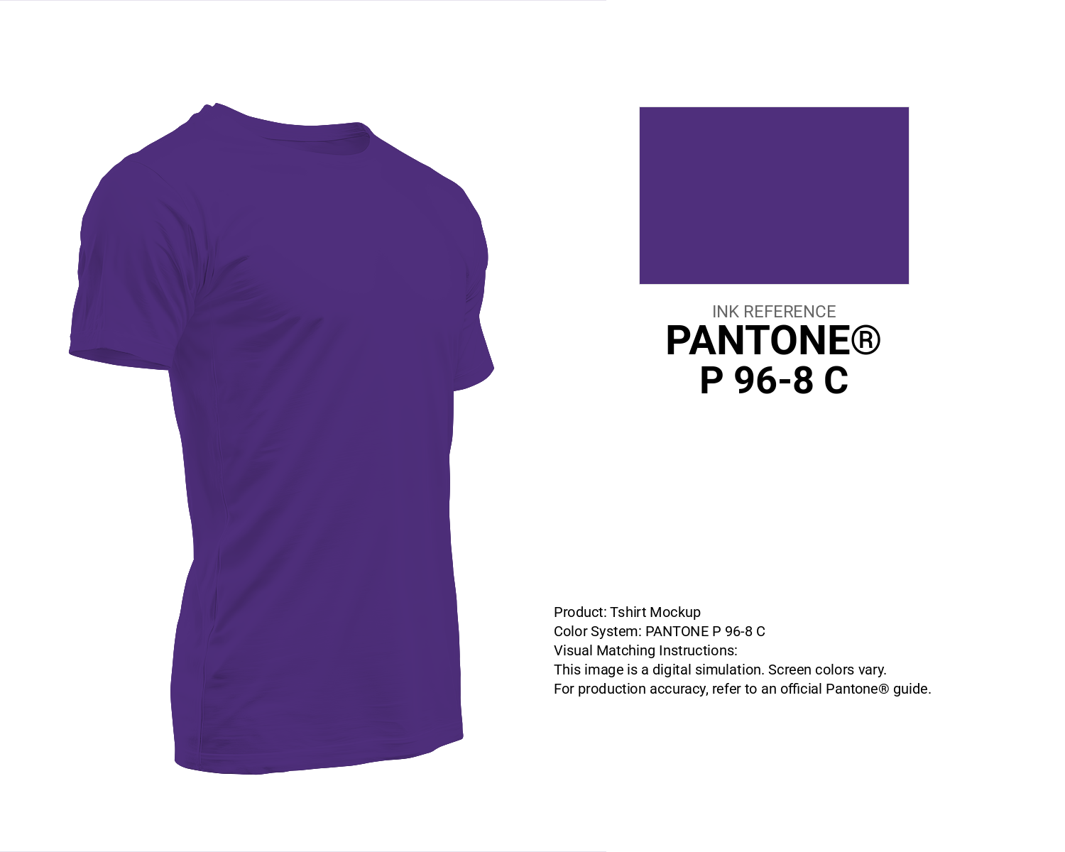
#4f2f7c Pantone P 96-8 C Color | Hex color Code #4f2f7c T-Shirt Mockup
Download T-Shirt Mockup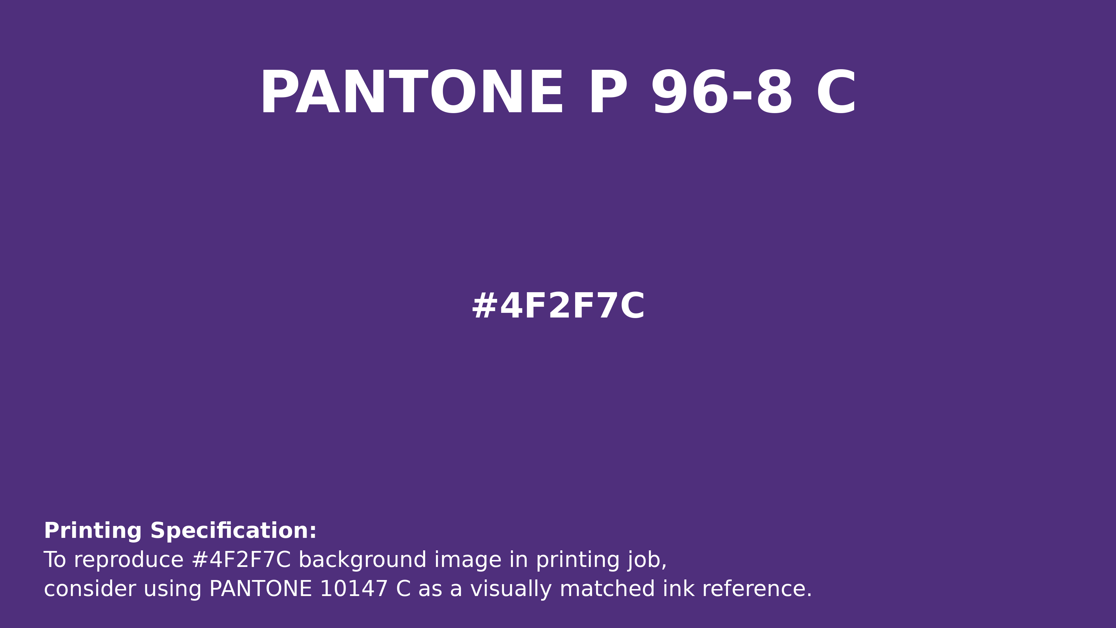
#4f2f7c Pantone P 96-8 C Color | Hex color Code #4f2f7c Printing Artwork Pantone Reference
Download Pantone Printing ReferenceRelated Color Palettes
- Plum and Dark Gray •
- Dim Gray and Dark Gray •
- Tan and Dark Gray •
- Dark Gray and White •
- Dark Gray and Light Blue •
- Dark Gray and Crimson •
- White Smoke and Dark Gray •
- Linen and Dark Gray •
- Dark Gray and Peru •
- Dark Gray and Sienna •
- Dark Olive Green and Dark Gray •
- Dark Green and Dark Gray •
- Dark Gray and Steel Blue •
- Dark Gray and Pale Goldenrod •
- Dark Gray and Lavender
Color Palette Collection

25 Blue Color Palettes
25 color palettes with 125 colors.
33 Nature Inspired Color Schemes
33 color palettes with 165 colors.

30 Pastel Pink Color Palette
30 color palettes with 150 colors.

66 Brown Color Palettes
66 color palettes with 330 colors.