#4E3524 Color
Your all-in-one color resource. Download hex background images, Adobe swatches (ASE), PDF color sheets, and SVG files. Explore palettes, harmonies, accessibility, conversions, and professional exports — designed for designers, developers, and color perfectionists.
This rich, dark brown-red evokes feelings of groundedness, warmth, and security. It's reminiscent of a forest floor after a rain, or the rich tones of autumn leaves. The deep color creates a cozy and inviting atmosphere, perfect for spaces designed for contemplation or relaxation. It might be used in a study to promote focus or in a living room to encourage conversation and togetherness. Its earthy tones connect to a sense of nature and the cycle of life, often symbolizing stability and longevity. Visually matched named color: Warm Earth.
PANTONE 2322 C
Choose Color
Selected Color
Recent Colors
Color Details
Similar Ink Alternatives for #4E3524 color Alternative print inks for reproducing #4E3524 background image with a similar visual appearance.
Disclaimer: The visually matched ink reference is an independent approximation intended as a guide only. Please be advised that this pantone colors is only intended as a guide, Actual colours will depend on screen calibration variances. The print ink suggestions provided are independent visual approximations and are not affiliated with or endorsed by Pantone LLC. For official color specifications, conversion factors, and comprehensive color system information, please visit Pantone Connect. Official Pantone products can be purchased at pantone.com.
Color Previews for #000000 See how this color looks as a background or as text.
Complete Guide to Your Color Laboratory
Everything you need to know about this professional color toolkit.
Use the Color Picker at the top to select any color. All modules below update instantly.
Workflow: Pick a color → Explore palettes & data → Download what you need (PDF, Image, or Adobe ASE).
Color Details — Your color in all formats: HEX, RGB, RGBA, HSL, HSLA, HSV, CMYK, CIELab, Hunter-Lab, XYZ, Yxy, YUV. One-click copy.
Color Psychology — Emotional impact, cultural meanings, physiological effects, branding applications, and historical significance.
Named Colors — Find official color names (HTML/CSS, Pantone) that match your selection with similarity percentages.
Light & Dark Shades
80-step gradient from black to white. Perfect for button states and component systems.
Tints
Color mixed with white → lighter, pastel variations for backgrounds and disabled states.
Monochromatic — 11 curated tints/shades from one color. Production-ready for design systems.
- Complementary — Opposite on wheel (180°). High contrast.
- Analogous — Neighbors (±30°). Harmonious flow.
- Triadic — Three colors (120° apart). Vibrant, balanced.
- Split-Complementary — Base + two near-complements. Softer contrast.
- Tetradic/Square — Four colors. Complex, maximum variety.
- Neutral — Desaturated versions. Subtle, sophisticated.
15 Professional Variations — Monochromatic, Analogous, Complementary, Warm/Cool/Earth Tones, Pastel, Vibrant, High Contrast, and more.
Color Infusion — 10 palettes showing your color morphing into each major hue. Find bridge colors.
Similar Colors — 60+ colors generated via CIELAB Delta E matching. Unexpected harmonious combinations.
18 Ready-to-Use Gradients — Complementary, Analogous, Triadic, Tint/Shade progressions, and more.
Downloads: PNG (2560×1440), CSS (production-ready code), SVG (scalable vector).
WCAG Contrast Checker — Tests your color against white, black, and custom colors for AA (4.5:1) and AAA (7:1) compliance. Large text thresholds included.
Harmony & Accessibility Guide — Tests against 10 canonical hues. Shows which pairs are both beautiful AND WCAG-compliant for text.
PNG/JPG — High-res images for presentations and mood boards.
PDF — Print-ready reports for clients and teams.
Adobe ASE — Direct import to Photoshop, Illustrator, InDesign, XD.
CSS/SVG — Gradients only. Production-ready code and vectors.
Color Science: Industry-standard conversions (HSL, CIELAB, CMYK, XYZ). WCAG 2.1 luminance formula. Delta E (ΔE76) for perceptual matching.
Direct Links: Share colors via icolorpalette.com/color/ff5733 or icolorpalette.com/color/red
Issues? Refresh the page, wait for rendering, try another browser, or check console (F12) for errors.
Printing Guide for #4e3524 Background Image
Use PANTONE 2322 C as a visually matched ink reference when printing this background image.
To print the #4e3524 background image from our site, consider using PANTONE 2322 C as a visually matched ink reference.
Download the background image, then provide this reference code to your print vendor to help achieve accurate color reproduction.
The visually matched ink reference for the #4e3524 background image is PANTONE 2322 C.
This color is commonly described as Warm Earth.
This rich, dark brown-red evokes feelings of groundedness, warmth, and security. It's reminiscent of a forest floor after a rain, or the rich tones of autumn leaves. The deep color creates a cozy and inviting atmosphere, perfect for spaces designed for contemplation or relaxation. It might be used in a study to promote focus or in a living room to encourage conversation and togetherness. Its earthy tones connect to a sense of nature and the cycle of life, often symbolizing stability and longevity.
We provide PANTONE 2322 C as a visually matched ink reference to help you reproduce the #4e3524 background image accurately in professional printing.
This reference code helps print vendors achieve consistent color output across different printing equipment and materials.
After downloading the #4e3524 background image from our site:
- Include the visually matched ink reference PANTONE 2322 C in your print order notes
- Inform your print vendor that this is your target color reference
- Request a proof print to verify the Warm Earth color appearance before full production
The #4e3524 background image with PANTONE 2322 C as visually matched ink reference can be used for:
- Posters, banners, and backdrops
- Business cards, brochures, and flyers
- Packaging, labels, and stickers
- Signage and promotional materials
This is an independent visual approximation.
While PANTONE 2322 C closely matches the #4e3524 background image color, variations may exist between screen display and printed output.
We recommend requesting a proof print to verify the final appearance.
This rich, dark brown-red evokes feelings of groundedness, warmth, and security. It's reminiscent of a forest floor after a rain, or the rich tones of autumn leaves. The deep color creates a cozy and inviting atmosphere, perfect for spaces designed for contemplation or relaxation. It might be used in a study to promote focus or in a living room to encourage conversation and togetherness. Its earthy tones connect to a sense of nature and the cycle of life, often symbolizing stability and longevity.
Understanding these associations helps ensure the #4e3524 background image aligns with your intended message and brand impact.
Important Information
The visually matched ink reference is an independent approximation intended as a guide only.
Actual printed colors may vary depending on screen calibration, substrate material, ink type, and printing equipment used.
For official color specifications and certified color standards, visit Pantone Connect.
Official color guides and swatch books can be purchased from pantone.com.
Pantone 2322 C Color: Warm Oak | #4E3524
Introduction:
Warm Oak (Pantone 2322 C) is a deep brown color with rich warm undertones. It exudes a sense of coziness and elegance, evoking the rustic charm of oak wood. The color is visually soothing and inviting, making it an ideal choice for creating a comfortable and welcoming atmosphere.
Historical Significance:
Significant Presence in History: Warm Oak has been used throughout history in various contexts and cultures. It has been prominently featured in traditional furniture, architecture, and artwork. In ancient times, oak wood was highly valued for its durability and strength, making it a symbol of resilience and longevity.
Symbolism and Meaning:
Cultural Symbolism: Warm Oak is often associated with stability, grounding, and reliability. It represents a connection to nature and the earth, bringing a sense of warmth and comfort. In some cultures, oak is considered sacred and symbolizes wisdom and strength.
Warm Oak in Fashion:
Influence on Fashion Trends: Warm Oak has made its mark in the fashion industry as a versatile and timeless color. It is often used in fall and winter collections, adding a touch of richness and sophistication to outfits. It complements a wide range of colors, making it a popular choice for accessories and outerwear.
Warm Oak in Graphic Design:
Visual Impact: Warm Oak is widely used in graphic design to create a sense of warmth, depth, and earthiness. It adds a touch of elegance and sophistication to designs, making it suitable for various branding and visual communication purposes. The color's warm undertones evoke a sense of familiarity and comfort.
Color Combinations:
Potential Color Combinations: Warm Oak pairs well with earthy tones such as olive green, golden yellow, and rusty orange. It also complements shades of cream, beige, and ivory. For a bolder look, it can be combined with deep blues or purples to create a striking contrast.
Nature’s Palette:
Natural Occurrences: Warm Oak can be found in the rich color palettes of autumn landscapes. The color is reminiscent of the vibrant hues of leaves during the fall season. It is also present in the bark of oak trees and various woods used in construction and furniture.
Artistic Representations:
In Art: Warm Oak has been utilized by artists to create depth, texture, and a sense of warmth in their works. It has been featured in paintings, sculptures, and other art forms to evoke a natural and earthy ambiance.
Movies and Cinematic Landscapes:
Mood-setting in Movies: Warm Oak is often used in movie sets and cinematic landscapes to create a cozy and rustic atmosphere. It sets the tone for scenes that require a sense of warmth, nostalgia, or a connection to nature.
Products and Commercial Appeal:
Popular Products: Warm Oak is frequently used in furniture, flooring, and interior design products. It adds a touch of sophistication and timelessness to commercial spaces and brands in various industries. Luxury brands often incorporate the color into their logos and packaging to convey a sense of elegance and prestige.
National Symbols and Significance:
Symbolic Significance: In some cultures, warm oak is associated with national symbols such as the oak leaf or tree. It represents strength, endurance, and national pride. Oak trees are often seen as iconic natural elements in countries with strong connections to nature and forestry.
The Psychological and Emotional Impact:
Emotional Influence: Warm Oak has a calming effect on emotions, promoting feelings of warmth, stability, and grounding. It can create a sense of comfort and security, making it an excellent choice for creating cozy and inviting spaces.
Conclusion:
Warm Oak (Pantone 2322 C) is a color that embodies both the natural beauty and enduring elegance of oak wood. With its rich and comforting presence, it has stood the test of time in various industries, from fashion and design to art and cinema. Its symbolism and emotional impact make it a versatile and timeless choice for creating welcoming and visually appealing environments.
Pantone 2322 C Color | Hex color Code #4e3524 Image & Artwork
Download high-quality assets for your projects.

#4e3524 Color Schemes
Download Color Schemes
#4e3524 Color Shades
Download Color Shades
Pantone 2322 C Color | Hex color Code #4e3524 Solid Color Background
Download Solid Color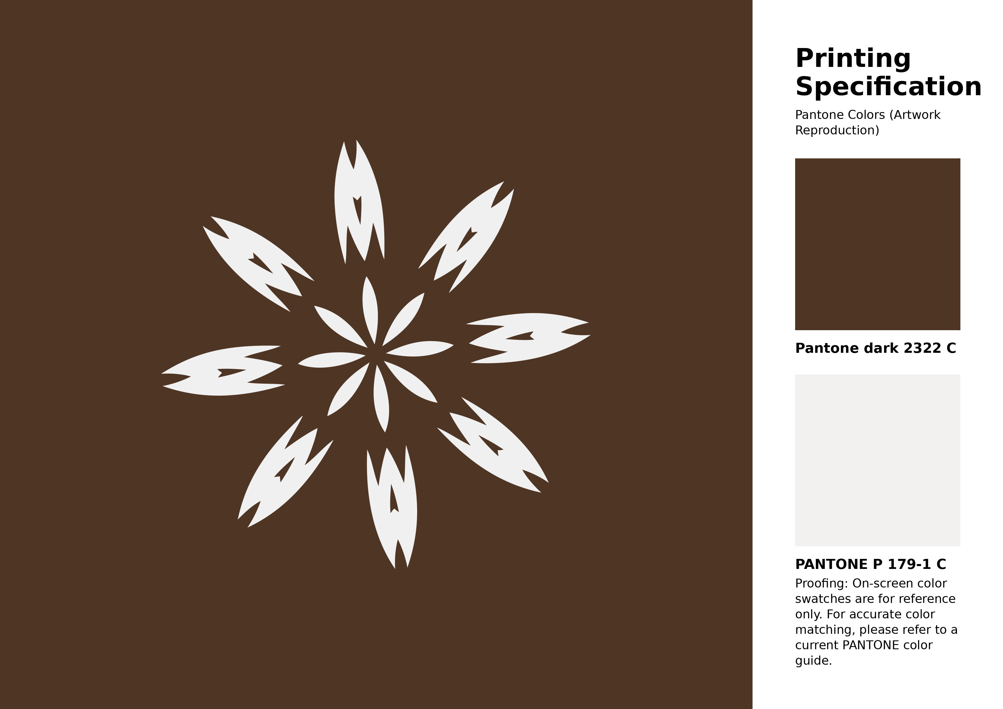
#4e3524 Pantone 2322 C Color | Hex color Code #4e3524 Artwork Image (PNG)
Download Artwork (PNG)#4e3524 Pantone 2322 C Color | Hex color Code #4e3524 Artwork Vector (PDF)
Download Artwork (PDF)#4e3524 Pantone 2322 C Color | Hex color Code #4e3524 Artwork Vector (SVG)
Download Artwork (SVG)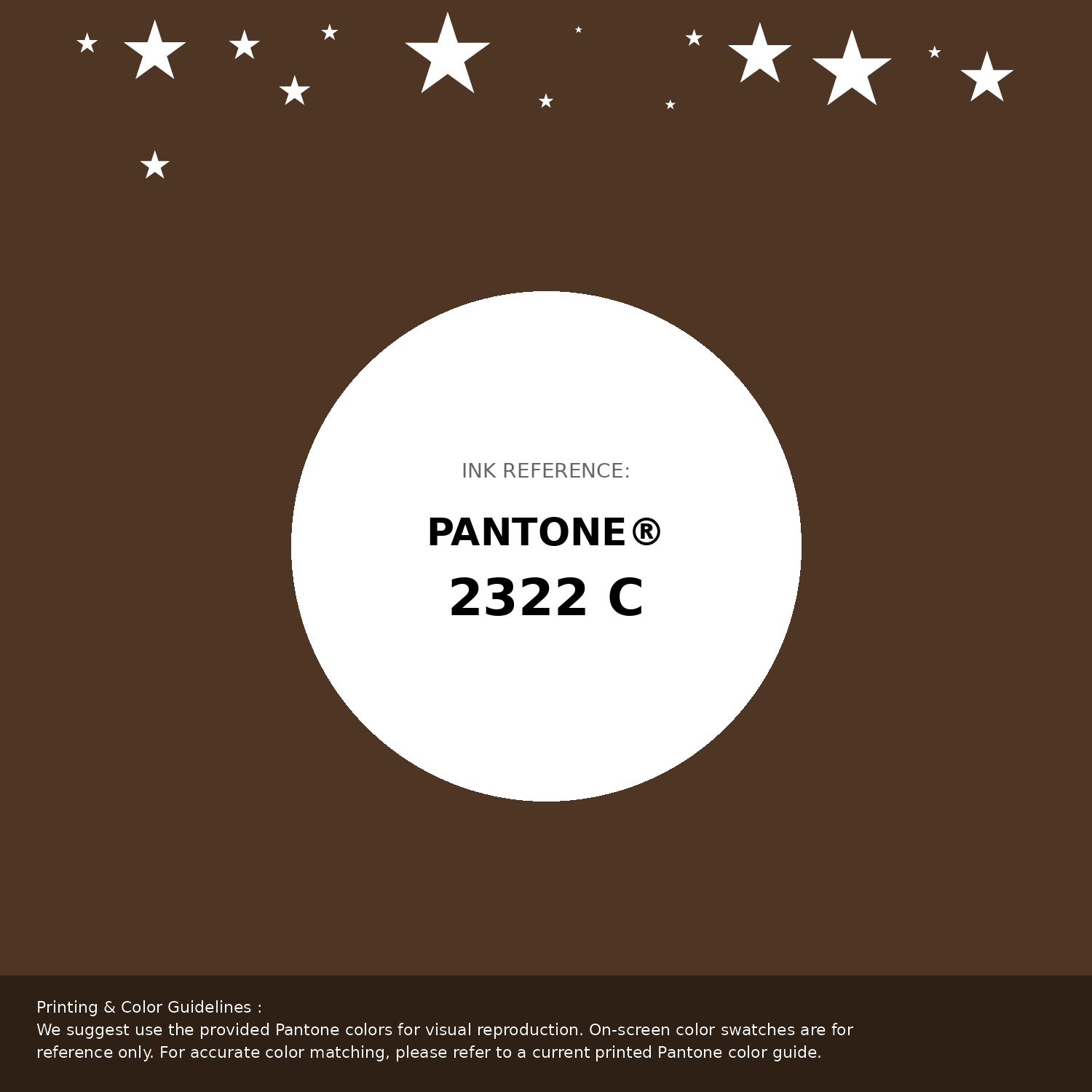
#4e3524 Pantone 2322 C Color | Hex color Code #4e3524 Pantone Swatch Artwork
Download Artwork Swatch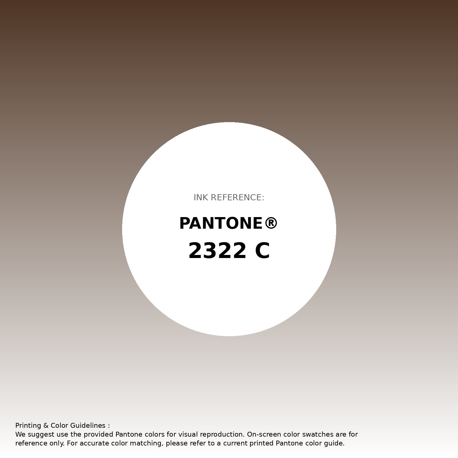
#4e3524 Pantone 2322 C Color | Hex color Code #4e3524 Gradient Artwork (PNG)
Download Gradient (PNG)#4e3524 Pantone 2322 C Color | Hex color Code #4e3524 Gradient Artwork (SVG)
Download Gradient (SVG)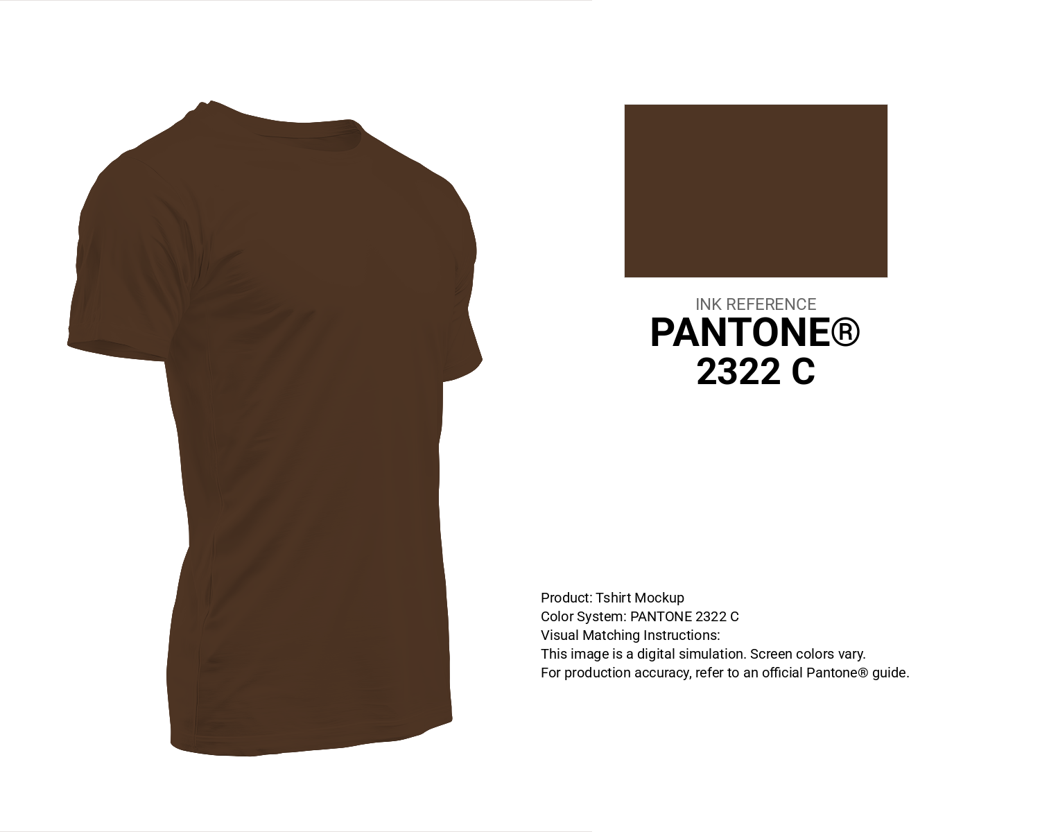
#4e3524 Pantone 2322 C Color | Hex color Code #4e3524 T-Shirt Mockup
Download T-Shirt Mockup
#4e3524 Pantone 2322 C Color | Hex color Code #4e3524 Printing Artwork Pantone Reference
Download Pantone Printing ReferenceRelated Color Palettes
- Slate Gray and Dark Gray •
- Dark Gray and Midnight Blue •
- Dark Gray and Sandy Brown •
- Dark Gray and Dark Khaki •
- Dark Gray and Dark Gray •
- Dark Gray and Slate Gray •
- Dark Slate Blue and Dark Gray •
- Light Blue and Dark Gray •
- Dark Gray and Saddle Brown •
- Thistle and Dark Gray •
- Light Steel Blue and Dark Gray •
- Dark Gray and Tan •
- Dark Gray and Sienna •
- Burly Wood and Dark Gray •
- Dark Gray and Wheat
Color Palette Collection

100 Rose Flower Nature Color Palettes
100 color palettes with 500 colors.

26 Brown Color Combinations
26 color palettes with 130 colors.

Home vibes
1 color palettes with 5 colors.

49 Beautiful curated Color Schemes For Your Next Design Project
49 color palettes with 245 colors.