#495E35 Color
Your all-in-one color resource. Download hex background images, Adobe swatches (ASE), PDF color sheets, and SVG files. Explore palettes, harmonies, accessibility, conversions, and professional exports — designed for designers, developers, and color perfectionists.
This olive-green suggests a sense of tranquility, growth, and harmony. It evokes images of sun-dappled meadows, sprawling gardens, and the gentle promise of spring. This color creates a mood of peace, rejuvenation, and a connection to the natural world. It's suitable for designs that want to convey naturalness and well-being. Culturally, it often symbolizes growth, fertility, and the beauty of the natural world. Visually matched named color: Mossy Meadow.
PANTONE 19-0230 TCX
Choose Color
Selected Color
Recent Colors
Color Details
Similar Ink Alternatives for #495E35 color Alternative print inks for reproducing #495E35 background image with a similar visual appearance.
Disclaimer: The visually matched ink reference is an independent approximation intended as a guide only. Please be advised that this pantone colors is only intended as a guide, Actual colours will depend on screen calibration variances. The print ink suggestions provided are independent visual approximations and are not affiliated with or endorsed by Pantone LLC. For official color specifications, conversion factors, and comprehensive color system information, please visit Pantone Connect. Official Pantone products can be purchased at pantone.com.
Color Previews for #000000 See how this color looks as a background or as text.
Complete Guide to Your Color Laboratory
Everything you need to know about this professional color toolkit.
Use the Color Picker at the top to select any color. All modules below update instantly.
Workflow: Pick a color → Explore palettes & data → Download what you need (PDF, Image, or Adobe ASE).
Color Details — Your color in all formats: HEX, RGB, RGBA, HSL, HSLA, HSV, CMYK, CIELab, Hunter-Lab, XYZ, Yxy, YUV. One-click copy.
Color Psychology — Emotional impact, cultural meanings, physiological effects, branding applications, and historical significance.
Named Colors — Find official color names (HTML/CSS, Pantone) that match your selection with similarity percentages.
Light & Dark Shades
80-step gradient from black to white. Perfect for button states and component systems.
Tints
Color mixed with white → lighter, pastel variations for backgrounds and disabled states.
Monochromatic — 11 curated tints/shades from one color. Production-ready for design systems.
- Complementary — Opposite on wheel (180°). High contrast.
- Analogous — Neighbors (±30°). Harmonious flow.
- Triadic — Three colors (120° apart). Vibrant, balanced.
- Split-Complementary — Base + two near-complements. Softer contrast.
- Tetradic/Square — Four colors. Complex, maximum variety.
- Neutral — Desaturated versions. Subtle, sophisticated.
15 Professional Variations — Monochromatic, Analogous, Complementary, Warm/Cool/Earth Tones, Pastel, Vibrant, High Contrast, and more.
Color Infusion — 10 palettes showing your color morphing into each major hue. Find bridge colors.
Similar Colors — 60+ colors generated via CIELAB Delta E matching. Unexpected harmonious combinations.
18 Ready-to-Use Gradients — Complementary, Analogous, Triadic, Tint/Shade progressions, and more.
Downloads: PNG (2560×1440), CSS (production-ready code), SVG (scalable vector).
WCAG Contrast Checker — Tests your color against white, black, and custom colors for AA (4.5:1) and AAA (7:1) compliance. Large text thresholds included.
Harmony & Accessibility Guide — Tests against 10 canonical hues. Shows which pairs are both beautiful AND WCAG-compliant for text.
PNG/JPG — High-res images for presentations and mood boards.
PDF — Print-ready reports for clients and teams.
Adobe ASE — Direct import to Photoshop, Illustrator, InDesign, XD.
CSS/SVG — Gradients only. Production-ready code and vectors.
Color Science: Industry-standard conversions (HSL, CIELAB, CMYK, XYZ). WCAG 2.1 luminance formula. Delta E (ΔE76) for perceptual matching.
Direct Links: Share colors via icolorpalette.com/color/ff5733 or icolorpalette.com/color/red
Issues? Refresh the page, wait for rendering, try another browser, or check console (F12) for errors.
Printing Guide for #495e35 Background Image
Use PANTONE 19-0230 TCX as a visually matched ink reference when printing this background image.
To print the #495e35 background image from our site, consider using PANTONE 19-0230 TCX as a visually matched ink reference.
Download the background image, then provide this reference code to your print vendor to help achieve accurate color reproduction.
The visually matched ink reference for the #495e35 background image is PANTONE 19-0230 TCX.
This color is commonly described as Mossy Meadow.
This olive-green suggests a sense of tranquility, growth, and harmony. It evokes images of sun-dappled meadows, sprawling gardens, and the gentle promise of spring. This color creates a mood of peace, rejuvenation, and a connection to the natural world. It's suitable for designs that want to convey naturalness and well-being. Culturally, it often symbolizes growth, fertility, and the beauty of the natural world.
We provide PANTONE 19-0230 TCX as a visually matched ink reference to help you reproduce the #495e35 background image accurately in professional printing.
This reference code helps print vendors achieve consistent color output across different printing equipment and materials.
After downloading the #495e35 background image from our site:
- Include the visually matched ink reference PANTONE 19-0230 TCX in your print order notes
- Inform your print vendor that this is your target color reference
- Request a proof print to verify the Mossy Meadow color appearance before full production
The #495e35 background image with PANTONE 19-0230 TCX as visually matched ink reference can be used for:
- Posters, banners, and backdrops
- Business cards, brochures, and flyers
- Packaging, labels, and stickers
- Signage and promotional materials
This is an independent visual approximation.
While PANTONE 19-0230 TCX closely matches the #495e35 background image color, variations may exist between screen display and printed output.
We recommend requesting a proof print to verify the final appearance.
This olive-green suggests a sense of tranquility, growth, and harmony. It evokes images of sun-dappled meadows, sprawling gardens, and the gentle promise of spring. This color creates a mood of peace, rejuvenation, and a connection to the natural world. It's suitable for designs that want to convey naturalness and well-being. Culturally, it often symbolizes growth, fertility, and the beauty of the natural world.
Understanding these associations helps ensure the #495e35 background image aligns with your intended message and brand impact.
Important Information
The visually matched ink reference is an independent approximation intended as a guide only.
Actual printed colors may vary depending on screen calibration, substrate material, ink type, and printing equipment used.
For official color specifications and certified color standards, visit Pantone Connect.
Official color guides and swatch books can be purchased from pantone.com.
Garden Green Color: A Fresh and Earthy Shade | #495e35
Introduction:
Garden Green Color, also known as #495e35, is a vivid and natural shade of green. It embodies the essence of lush gardens and the freshness of nature. The color evokes a sense of tranquility and serenity, creating a harmonious atmosphere.
Historical Significance:
Key moments in history: Garden Green Color has been prominently used in various historical periods, from ancient civilizations to modern times. It has been utilized in art, architecture, and fashion, symbolizing growth, renewal, and connection with nature.
Symbolism and Meaning:
Symbolism and Meaning: Garden Green Color typically symbolizes harmony, balance, and fertility. It is associated with growth, renewal, and prosperity in many cultures. The color is often regarded as a representation of abundance and hope.
Garden Green Color in Fashion:
Garden Green Color in Fashion: The color has a significant impact on fashion trends, often seen in clothing, accessories, and footwear. It adds a natural and refreshing touch to outfits, symbolizing a connection with nature and environmental consciousness.
Garden Green Color in Graphic Design:
Garden Green Color in Graphic Design: The color has a significant role in design aesthetics and branding. It is often used to convey freshness, health, and eco-friendliness. Garden Green Color adds a sense of tranquility and connection to nature in various visual artworks and designs.
Color Combinations:
Color Combinations: Garden Green Color can be combined with various shades to create appealing color palettes. Some popular combinations include Garden Green Color with cream, beige, or earthy browns. These combinations enhance the natural and organic feel of the color.
Nature’s Palette:
Nature’s Palette: Garden Green Color is often found in lush flora, such as leaves, grass, and moss. It is a common color in natural landscapes, symbolizing growth and vitality. Flowers like roses, lilies, and ferns also showcase Garden Green Color in their vibrant petals.
Artistic Representations:
Artistic Representations: Garden Green Color has been extensively used by artists in various forms of art. It is often seen in landscape paintings, depicting the beauty and tranquility of nature. The color also plays a significant role in abstract and modern art, representing a connection with the environment.
Movies and Cinematic Landscapes:
Movies and Cinematic Landscapes: Garden Green Color sets the tone and mood in many movies and scenes. It is often used to convey a sense of peace, tranquility, and natural beauty. Scenes shot in lush green landscapes or gardens often utilize Garden Green Color to create a visually captivating environment.
Products and Commercial Appeal:
Products and Commercial Appeal: Garden Green Color is often associated with products or brands that promote a natural and eco-friendly image. It can be seen in packaging, logos, and marketing materials, representing a connection with nature and an emphasis on sustainability.
National Symbols and Significance:
National Symbols and Significance: Garden Green Color is often tied to a nation's cultural identity and heritage. It may represent the country's rich landscapes, lush forests, or historical significance related to nature. Its presence in national symbols expresses a deep connection with the land and its resources.
The Psychological and Emotional Impact:
The Psychological and Emotional Impact: Garden Green Color has a positive psychological impact, often associated with feelings of calmness, harmony, and balance. It can evoke a sense of tranquility and reduce stress. The color also promotes a feeling of connection with nature and environmental consciousness.
Conclusion:
Garden Green Color, or #495e35, holds a significant historical and cultural relevance. It symbolizes growth, renewal, and a connection with nature across various contexts. The color's timeless appeal and subtle charm make it a popular choice in fashion, design, and art. Garden Green Color uplifts moods, creates a sense of tranquility, and represents a deep appreciation for the natural world.
Pantone 19-0230 Tcx Garden Green Color | Hex color Code #495e35 Image & Artwork
Download high-quality assets for your projects.

#495e35 Color Schemes
Download Color Schemes
#495e35 Color Shades
Download Color Shades
Pantone 19-0230 Tcx Garden Green Color | Hex color Code #495e35 Solid Color Background
Download Solid Color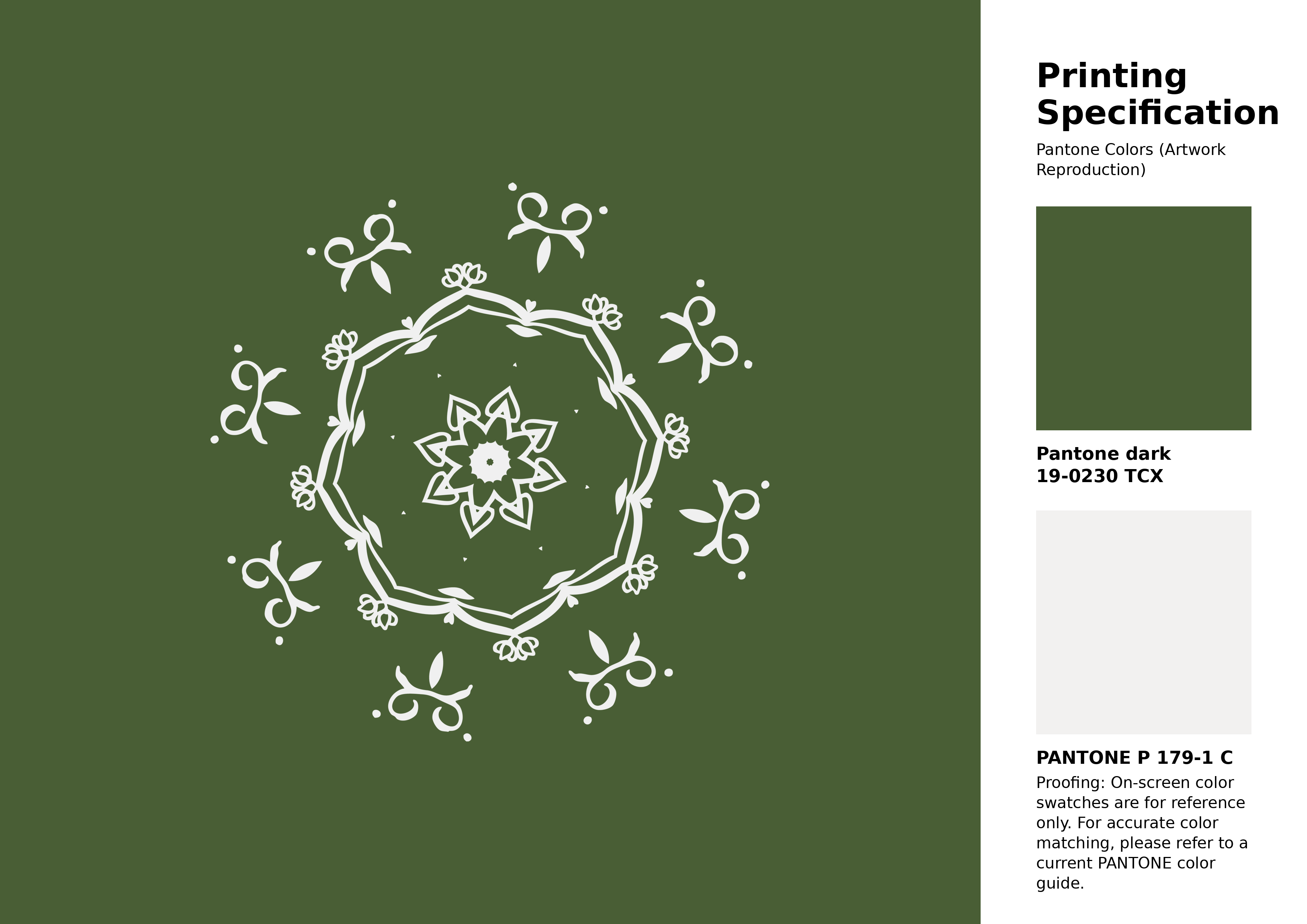
#495e35 Pantone 19-0230 Tcx Garden Green Color | Hex color Code #495e35 Artwork Image (PNG)
Download Artwork (PNG)#495e35 Pantone 19-0230 Tcx Garden Green Color | Hex color Code #495e35 Artwork Vector (PDF)
Download Artwork (PDF)#495e35 Pantone 19-0230 Tcx Garden Green Color | Hex color Code #495e35 Artwork Vector (SVG)
Download Artwork (SVG)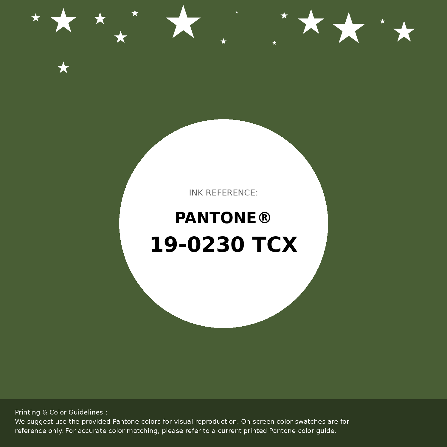
#495e35 Pantone 19-0230 Tcx Garden Green Color | Hex color Code #495e35 Pantone Swatch Artwork
Download Artwork Swatch
#495e35 Pantone 19-0230 Tcx Garden Green Color | Hex color Code #495e35 Gradient Artwork (PNG)
Download Gradient (PNG)#495e35 Pantone 19-0230 Tcx Garden Green Color | Hex color Code #495e35 Gradient Artwork (SVG)
Download Gradient (SVG)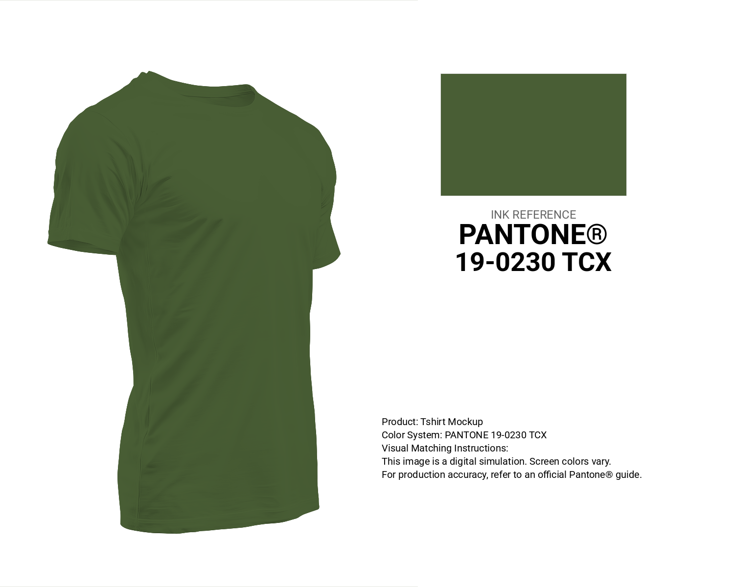
#495e35 Pantone 19-0230 Tcx Garden Green Color | Hex color Code #495e35 T-Shirt Mockup
Download T-Shirt Mockup
#495e35 Pantone 19-0230 Tcx Garden Green Color | Hex color Code #495e35 Printing Artwork Pantone Reference
Download Pantone Printing Reference
Garden Green - #495e35 Color Name
Download Color NameRelated Color Palettes
- Light Steel Blue and Dark Gray •
- Light Slate Gray and Dark Gray •
- Dark Gray and Goldenrod •
- Olive Drab and Dark Gray •
- Dark Gray and Dark Olive Green •
- Dark Gray and Peru •
- Dark Gray and Dark Salmon •
- Pale Violet Red and Dark Gray •
- Dark Gray and Gray •
- Dark Gray and Wheat •
- Dark Gray and Linen •
- Silver and Dark Gray •
- Fire Brick and Dark Gray •
- Dark Gray and Brown •
- Dark Gray and Rosy Brown
Color Palette Collection

My color palette 1
863 color palettes with 4315 colors.

28 Pink Color Combinations
28 color palettes with 140 colors.

81 Pink color palettes
81 color palettes with 405 colors.

38 Beautiful Color Palettes
38 color palettes with 190 colors.