#40312F Color
Your all-in-one color resource. Download hex background images, Adobe swatches (ASE), PDF color sheets, and SVG files. Explore palettes, harmonies, accessibility, conversions, and professional exports — designed for designers, developers, and color perfectionists.
This deep brown evokes the feeling of dried earth and ancient pottery. It creates a sense of history, and a feeling of grounding and security. In design, it can create a sense of warmth and earthiness. It has a connection to the past, and a sense of calm. Visually matched named color: Burnt Sienna.
PANTONE 19-0915 TCX
Choose Color
Selected Color
Recent Colors
Color Details
Similar Ink Alternatives for #40312F color Alternative print inks for reproducing #40312F background image with a similar visual appearance.
Disclaimer: The visually matched ink reference is an independent approximation intended as a guide only. Please be advised that this pantone colors is only intended as a guide, Actual colours will depend on screen calibration variances. The print ink suggestions provided are independent visual approximations and are not affiliated with or endorsed by Pantone LLC. For official color specifications, conversion factors, and comprehensive color system information, please visit Pantone Connect. Official Pantone products can be purchased at pantone.com.
Color Previews for #000000 See how this color looks as a background or as text.
Complete Guide to Your Color Laboratory
Everything you need to know about this professional color toolkit.
Use the Color Picker at the top to select any color. All modules below update instantly.
Workflow: Pick a color → Explore palettes & data → Download what you need (PDF, Image, or Adobe ASE).
Color Details — Your color in all formats: HEX, RGB, RGBA, HSL, HSLA, HSV, CMYK, CIELab, Hunter-Lab, XYZ, Yxy, YUV. One-click copy.
Color Psychology — Emotional impact, cultural meanings, physiological effects, branding applications, and historical significance.
Named Colors — Find official color names (HTML/CSS, Pantone) that match your selection with similarity percentages.
Light & Dark Shades
80-step gradient from black to white. Perfect for button states and component systems.
Tints
Color mixed with white → lighter, pastel variations for backgrounds and disabled states.
Monochromatic — 11 curated tints/shades from one color. Production-ready for design systems.
- Complementary — Opposite on wheel (180°). High contrast.
- Analogous — Neighbors (±30°). Harmonious flow.
- Triadic — Three colors (120° apart). Vibrant, balanced.
- Split-Complementary — Base + two near-complements. Softer contrast.
- Tetradic/Square — Four colors. Complex, maximum variety.
- Neutral — Desaturated versions. Subtle, sophisticated.
15 Professional Variations — Monochromatic, Analogous, Complementary, Warm/Cool/Earth Tones, Pastel, Vibrant, High Contrast, and more.
Color Infusion — 10 palettes showing your color morphing into each major hue. Find bridge colors.
Similar Colors — 60+ colors generated via CIELAB Delta E matching. Unexpected harmonious combinations.
18 Ready-to-Use Gradients — Complementary, Analogous, Triadic, Tint/Shade progressions, and more.
Downloads: PNG (2560×1440), CSS (production-ready code), SVG (scalable vector).
WCAG Contrast Checker — Tests your color against white, black, and custom colors for AA (4.5:1) and AAA (7:1) compliance. Large text thresholds included.
Harmony & Accessibility Guide — Tests against 10 canonical hues. Shows which pairs are both beautiful AND WCAG-compliant for text.
PNG/JPG — High-res images for presentations and mood boards.
PDF — Print-ready reports for clients and teams.
Adobe ASE — Direct import to Photoshop, Illustrator, InDesign, XD.
CSS/SVG — Gradients only. Production-ready code and vectors.
Color Science: Industry-standard conversions (HSL, CIELAB, CMYK, XYZ). WCAG 2.1 luminance formula. Delta E (ΔE76) for perceptual matching.
Direct Links: Share colors via icolorpalette.com/color/ff5733 or icolorpalette.com/color/red
Issues? Refresh the page, wait for rendering, try another browser, or check console (F12) for errors.
Printing Guide for #40312f Background Image
Use PANTONE 19-0915 TCX as a visually matched ink reference when printing this background image.
To print the #40312f background image from our site, consider using PANTONE 19-0915 TCX as a visually matched ink reference.
Download the background image, then provide this reference code to your print vendor to help achieve accurate color reproduction.
The visually matched ink reference for the #40312f background image is PANTONE 19-0915 TCX.
This color is commonly described as Burnt Sienna.
This deep brown evokes the feeling of dried earth and ancient pottery. It creates a sense of history, and a feeling of grounding and security. In design, it can create a sense of warmth and earthiness. It has a connection to the past, and a sense of calm.
We provide PANTONE 19-0915 TCX as a visually matched ink reference to help you reproduce the #40312f background image accurately in professional printing.
This reference code helps print vendors achieve consistent color output across different printing equipment and materials.
After downloading the #40312f background image from our site:
- Include the visually matched ink reference PANTONE 19-0915 TCX in your print order notes
- Inform your print vendor that this is your target color reference
- Request a proof print to verify the Burnt Sienna color appearance before full production
The #40312f background image with PANTONE 19-0915 TCX as visually matched ink reference can be used for:
- Posters, banners, and backdrops
- Business cards, brochures, and flyers
- Packaging, labels, and stickers
- Signage and promotional materials
This is an independent visual approximation.
While PANTONE 19-0915 TCX closely matches the #40312f background image color, variations may exist between screen display and printed output.
We recommend requesting a proof print to verify the final appearance.
This deep brown evokes the feeling of dried earth and ancient pottery. It creates a sense of history, and a feeling of grounding and security. In design, it can create a sense of warmth and earthiness. It has a connection to the past, and a sense of calm.
Understanding these associations helps ensure the #40312f background image aligns with your intended message and brand impact.
Important Information
The visually matched ink reference is an independent approximation intended as a guide only.
Actual printed colors may vary depending on screen calibration, substrate material, ink type, and printing equipment used.
For official color specifications and certified color standards, visit Pantone Connect.
Official color guides and swatch books can be purchased from pantone.com.
Coffee Bean Color: A Rich and Earthy Shade | #40312F
Introduction:
Coffee Bean Color, also known as Pantone 19-0915 TCX, is a deep and warm shade inspired by the color of roasted coffee beans. Its essence lies in its rich and earthy tones, evoking a sense of warmth, comfort, and sophistication.
Historical Significance:
Significance in Interior Design: Coffee Bean Color has been used prominently in various historical interior designs, adding a touch of elegance and sophistication to spaces. It has been a popular choice for creating a warm and cozy ambiance.
Usage in Ancient Art: Coffee Bean Color has been found in ancient artworks, particularly in pottery and paintings from civilizations that valued earthy and natural tones. It symbolized the connection to the earth and reverence for nature.
Adoption in Fashion: In recent years, designers have incorporated Coffee Bean Color into their collections, adding depth and richness to runway styles. It has become a statement color, symbolizing refinement and embracing natural beauty.
Symbolism and Meaning:
Natural and Earthy Vibes: Coffee Bean Color typically symbolizes warmth, grounding, and a connection to the natural world. It is often associated with stability, comfort, and a sense of belonging.
Cultural Significance: In some cultures, Coffee Bean Color is used in traditional ceremonies or as a symbol of hospitality. It represents the values of community, friendship, and togetherness.
Coffee Bean Color in Fashion:
Influencing Fashion Trends: Coffee Bean Color has made its mark on the fashion industry, influencing trends and styles. It is often seen in luxurious fabrics, such as velvet and suede, and is a popular choice for fall and winter collections.
Versatility and Pairings: Coffee Bean Color can be easily paired with neutral tones like cream, beige, and khaki. It also complements rich jewel tones like emerald green and deep burgundy, adding depth and sophistication to any outfit.
Coffee Bean Color in Graphic Design:
Aesthetic and Branding Impact: Coffee Bean Color is often used in graphic design to create a sense of warmth, reliability, and sophistication. It can be found in brands that aim to convey a natural and earthy image.
Enhancing Visual Impact: Coffee Bean Color is used strategically in designs to add contrast, depth, and a touch of elegance. It is often combined with lighter shades to create a visually appealing balance.
Color Combinations:
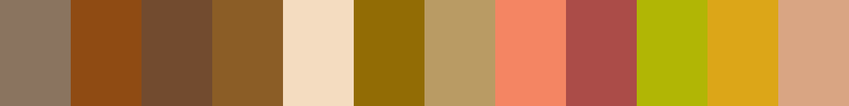
Nature-Inspired Palettes: Coffee Bean Color pairs well with natural shades such as forest green, burnt orange, and deep brown. These combinations evoke a sense of rustic beauty and bring the colors of nature into any design.
Elegant Neutrals: For a more sophisticated look, Coffee Bean Color can be paired with ivory, cream, and metallic accents like gold or bronze. These combinations create a timeless and refined aesthetic.
Nature’s Palette:
Inspired by Earth: Coffee Bean Color can often be found in nature, such as the bark of trees, natural stone formations, or the fur of certain animals. It is a color that resonates with the natural world and brings a sense of warmth and familiarity.
Autumnal Hues: During the fall season, Coffee Bean Color can be seen in the changing leaves, creating a cozy and comforting atmosphere in nature. It blends seamlessly with the vibrant reds, oranges, and golds of this season.
Artistic Representations:
Expression of Earthiness: Artists throughout history have used Coffee Bean Color in their artworks to depict the beauty and essence of nature. It adds depth and a sense of realism to landscapes, still life, and portraits.
Symbolic Meanings: In art, Coffee Bean Color can also represent themes like warmth, comfort, and rootedness. It adds a sense of familiarity and invites the viewer to connect with the painting on a deeper level.
Movies and Cinematic Landscapes:
Creating a Moody Atmosphere: Coffee Bean Color is often used in movies and cinematic landscapes to set a particular tone or mood. It is frequently seen in films that aim to evoke a sense of warmth, nostalgia, or intimacy.
Cozy Interior Settings: Coffee Bean Color can be found in scenes depicting intimate cafes, cozy living rooms, or inviting bedrooms. It helps to create a sense of comfort and invites the audience into the scene.
Products and Commercial Appeal:
A Sense of Luxury: Many high-end products and brands incorporate Coffee Bean Color in their branding and packaging. It adds a touch of elegance, sophistication, and exclusivity to the overall appeal.
Warm and Inviting: Coffee Bean Color is often used in marketing materials for products that aim to create a sense of warmth, comfort, and familiarity. It is frequently found in advertisements for coffee, chocolate, and cozy home goods.
National Symbols and Significance:
Cultural Significance: In some countries, Coffee Bean Color is tied to cultural traditions and symbols. It represents hospitality, unity, and a sense of community, often found in national flags, traditional clothing, or festivals.
Historical Connections: Coffee Bean Color may also hold historical significance in certain regions, representing the legacy of coffee cultivation or the impact of the coffee trade on local economies and cultures.
The Psychological and Emotional Impact:
Grounding and Stability: Coffee Bean Color has a calming and stabilizing effect on the mind. It promotes a sense of security, balance, and reliability. It can be used to create a comforting and harmonious environment.
Sophistication and Elegance: Coffee Bean Color is associated with a sense of luxury, refinement, and timeless beauty. It can evoke feelings of elegance, sophistication, and exclusivity.
Conclusion:
Coffee Bean Color, Pantone 19-0915 TCX, captures the essence of rich and earthy tones. Its historical significance, cultural symbolism, and impact in various industries, including fashion, graphic design, and interior styling, make it a timeless and versatile color. Whether used in nature-inspired designs or to convey warmth and luxury, Coffee Bean Color continues to be a powerful and captivating hue.
Pantone 19-0915 Tcx Coffee Bean Color | Hex color Code #40312f Image & Artwork
Download high-quality assets for your projects.

#40312f Color Schemes
Download Color Schemes
#40312f Color Shades
Download Color Shades
Pantone 19-0915 Tcx Coffee Bean Color | Hex color Code #40312f Solid Color Background
Download Solid Color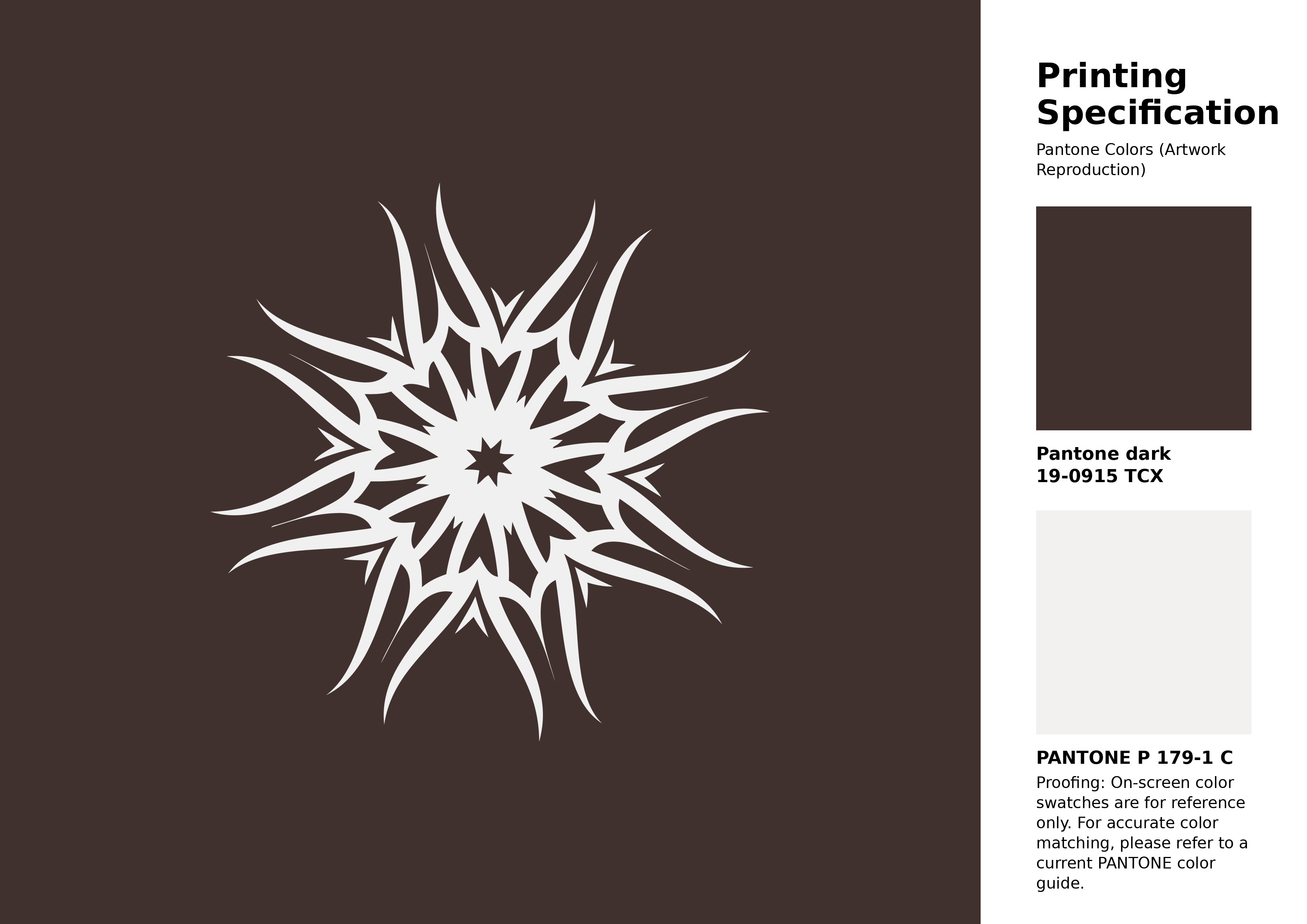
#40312f Pantone 19-0915 Tcx Coffee Bean Color | Hex color Code #40312f Artwork Image (PNG)
Download Artwork (PNG)#40312f Pantone 19-0915 Tcx Coffee Bean Color | Hex color Code #40312f Artwork Vector (PDF)
Download Artwork (PDF)#40312f Pantone 19-0915 Tcx Coffee Bean Color | Hex color Code #40312f Artwork Vector (SVG)
Download Artwork (SVG)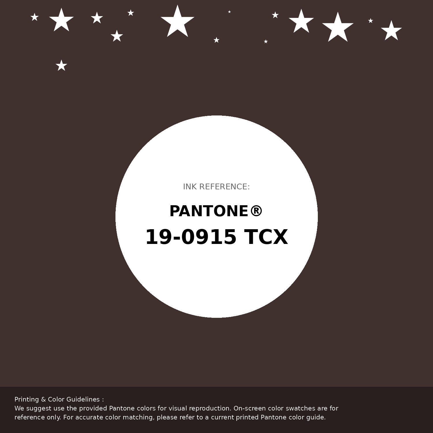
#40312f Pantone 19-0915 Tcx Coffee Bean Color | Hex color Code #40312f Pantone Swatch Artwork
Download Artwork Swatch
#40312f Pantone 19-0915 Tcx Coffee Bean Color | Hex color Code #40312f Gradient Artwork (PNG)
Download Gradient (PNG)#40312f Pantone 19-0915 Tcx Coffee Bean Color | Hex color Code #40312f Gradient Artwork (SVG)
Download Gradient (SVG)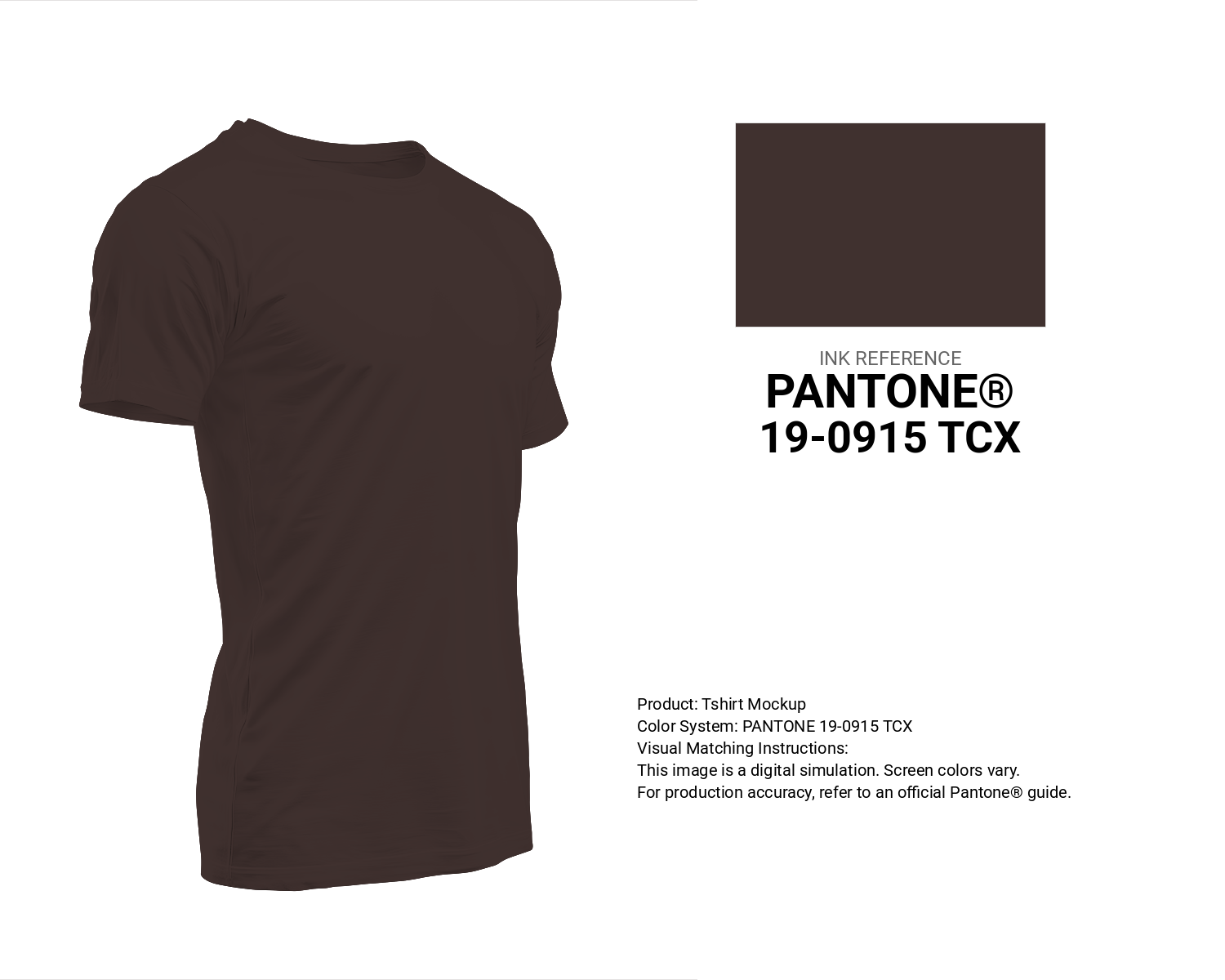
#40312f Pantone 19-0915 Tcx Coffee Bean Color | Hex color Code #40312f T-Shirt Mockup
Download T-Shirt Mockup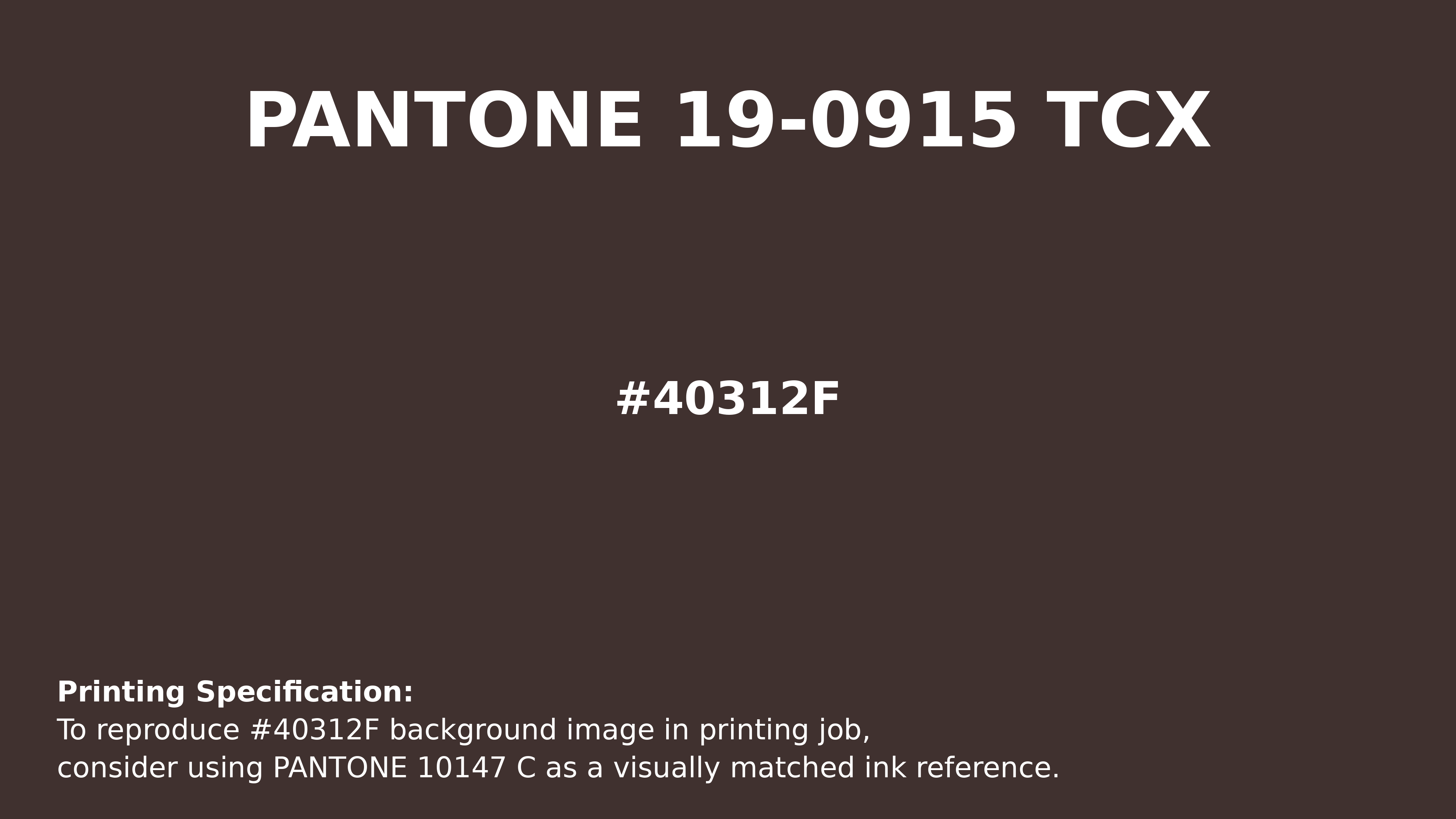
#40312f Pantone 19-0915 Tcx Coffee Bean Color | Hex color Code #40312f Printing Artwork Pantone Reference
Download Pantone Printing ReferenceRelated Color Palettes
- Dark Gray and Pale Goldenrod •
- Dark Gray and Indian Red •
- Dark Gray and Dark Slate Blue •
- Plum and Dark Gray •
- Dark Gray and Burly Wood •
- Goldenrod and Dark Gray •
- Beige and Dark Gray •
- Fire Brick and Dark Gray •
- Dark Gray and Rosy Brown •
- Dark Gray and Wheat •
- Dark Gray and Peru •
- Dark Gray and Saddle Brown •
- Dark Gray and Pale Violet Red •
- Burly Wood and Dark Gray •
- Cadet Blue and Dark Gray
Color Palette Collection
50 Autumn / Fall Color Palettes
50 color palettes with 250 colors.
Forest Theme colors
15 color palettes with 75 colors.
21 Pastel Yellow Color Schemes
21 color palettes with 105 colors.

30 Pink Color Combinations
30 color palettes with 150 colors.