#373A36 Color
Your all-in-one color resource. Download hex background images, Adobe swatches (ASE), PDF color sheets, and SVG files. Explore palettes, harmonies, accessibility, conversions, and professional exports — designed for designers, developers, and color perfectionists.
#373A36 is a dark, muted grayish-brown, reminiscent of twilight skies just before dawn or dusk. The emotional impact is one of quiet contemplation and subdued strength. It evokes a feeling of mystery and timelessness, associating with aged wood, weathered stone, or the stillness of a late-night forest. The mood is calm, serious, and sophisticated, lacking the coldness of pure gray or the heaviness of black. In design, it would work well as a neutral background, creating a sense of understated elegance and allowing brighter accents to pop. It suggests reliability, stability, and a connection to the natural world, potentially symbolizing resilience and enduring strength. The color lacks overt cheerfulness but offers a sense of quiet dignity. Visually matched named color: Twilight Ash.
PANTONE 447 C
Choose Color
Selected Color
Recent Colors
Color Details
Similar Ink Alternatives for #373A36 color Alternative print inks for reproducing #373A36 background image with a similar visual appearance.
Disclaimer: The visually matched ink reference is an independent approximation intended as a guide only. Please be advised that this pantone colors is only intended as a guide, Actual colours will depend on screen calibration variances. The print ink suggestions provided are independent visual approximations and are not affiliated with or endorsed by Pantone LLC. For official color specifications, conversion factors, and comprehensive color system information, please visit Pantone Connect. Official Pantone products can be purchased at pantone.com.
Color Previews for #000000 See how this color looks as a background or as text.
Complete Guide to Your Color Laboratory
Everything you need to know about this professional color toolkit.
Use the Color Picker at the top to select any color. All modules below update instantly.
Workflow: Pick a color → Explore palettes & data → Download what you need (PDF, Image, or Adobe ASE).
Color Details — Your color in all formats: HEX, RGB, RGBA, HSL, HSLA, HSV, CMYK, CIELab, Hunter-Lab, XYZ, Yxy, YUV. One-click copy.
Color Psychology — Emotional impact, cultural meanings, physiological effects, branding applications, and historical significance.
Named Colors — Find official color names (HTML/CSS, Pantone) that match your selection with similarity percentages.
Light & Dark Shades
80-step gradient from black to white. Perfect for button states and component systems.
Tints
Color mixed with white → lighter, pastel variations for backgrounds and disabled states.
Monochromatic — 11 curated tints/shades from one color. Production-ready for design systems.
- Complementary — Opposite on wheel (180°). High contrast.
- Analogous — Neighbors (±30°). Harmonious flow.
- Triadic — Three colors (120° apart). Vibrant, balanced.
- Split-Complementary — Base + two near-complements. Softer contrast.
- Tetradic/Square — Four colors. Complex, maximum variety.
- Neutral — Desaturated versions. Subtle, sophisticated.
15 Professional Variations — Monochromatic, Analogous, Complementary, Warm/Cool/Earth Tones, Pastel, Vibrant, High Contrast, and more.
Color Infusion — 10 palettes showing your color morphing into each major hue. Find bridge colors.
Similar Colors — 60+ colors generated via CIELAB Delta E matching. Unexpected harmonious combinations.
18 Ready-to-Use Gradients — Complementary, Analogous, Triadic, Tint/Shade progressions, and more.
Downloads: PNG (2560×1440), CSS (production-ready code), SVG (scalable vector).
WCAG Contrast Checker — Tests your color against white, black, and custom colors for AA (4.5:1) and AAA (7:1) compliance. Large text thresholds included.
Harmony & Accessibility Guide — Tests against 10 canonical hues. Shows which pairs are both beautiful AND WCAG-compliant for text.
PNG/JPG — High-res images for presentations and mood boards.
PDF — Print-ready reports for clients and teams.
Adobe ASE — Direct import to Photoshop, Illustrator, InDesign, XD.
CSS/SVG — Gradients only. Production-ready code and vectors.
Color Science: Industry-standard conversions (HSL, CIELAB, CMYK, XYZ). WCAG 2.1 luminance formula. Delta E (ΔE76) for perceptual matching.
Direct Links: Share colors via icolorpalette.com/color/ff5733 or icolorpalette.com/color/red
Issues? Refresh the page, wait for rendering, try another browser, or check console (F12) for errors.
Printing Guide for #373a36 Background Image
Use PANTONE 447 C as a visually matched ink reference when printing this background image.
To print the #373a36 background image from our site, consider using PANTONE 447 C as a visually matched ink reference.
Download the background image, then provide this reference code to your print vendor to help achieve accurate color reproduction.
The visually matched ink reference for the #373a36 background image is PANTONE 447 C.
This color is commonly described as Twilight Ash.
#373A36 is a dark, muted grayish-brown, reminiscent of twilight skies just before dawn or dusk. The emotional impact is one of quiet contemplation and subdued strength. It evokes a feeling of mystery and timelessness, associating with aged wood, weathered stone, or the stillness of a late-night forest. The mood is calm, serious, and sophisticated, lacking the coldness of pure gray or the heaviness of black. In design, it would work well as a neutral background, creating a sense of understated elegance and allowing brighter accents to pop. It suggests reliability, stability, and a connection to the natural world, potentially symbolizing resilience and enduring strength. The color lacks overt cheerfulness but offers a sense of quiet dignity.
We provide PANTONE 447 C as a visually matched ink reference to help you reproduce the #373a36 background image accurately in professional printing.
This reference code helps print vendors achieve consistent color output across different printing equipment and materials.
After downloading the #373a36 background image from our site:
- Include the visually matched ink reference PANTONE 447 C in your print order notes
- Inform your print vendor that this is your target color reference
- Request a proof print to verify the Twilight Ash color appearance before full production
The #373a36 background image with PANTONE 447 C as visually matched ink reference can be used for:
- Posters, banners, and backdrops
- Business cards, brochures, and flyers
- Packaging, labels, and stickers
- Signage and promotional materials
This is an independent visual approximation.
While PANTONE 447 C closely matches the #373a36 background image color, variations may exist between screen display and printed output.
We recommend requesting a proof print to verify the final appearance.
#373A36 is a dark, muted grayish-brown, reminiscent of twilight skies just before dawn or dusk. The emotional impact is one of quiet contemplation and subdued strength. It evokes a feeling of mystery and timelessness, associating with aged wood, weathered stone, or the stillness of a late-night forest. The mood is calm, serious, and sophisticated, lacking the coldness of pure gray or the heaviness of black. In design, it would work well as a neutral background, creating a sense of understated elegance and allowing brighter accents to pop. It suggests reliability, stability, and a connection to the natural world, potentially symbolizing resilience and enduring strength. The color lacks overt cheerfulness but offers a sense of quiet dignity.
Understanding these associations helps ensure the #373a36 background image aligns with your intended message and brand impact.
Important Information
The visually matched ink reference is an independent approximation intended as a guide only.
Actual printed colors may vary depending on screen calibration, substrate material, ink type, and printing equipment used.
For official color specifications and certified color standards, visit Pantone Connect.
Official color guides and swatch books can be purchased from pantone.com.
Pantone 447 C Color: Earthy Brown | #373A36
Introduction:
Earthy Brown, represented by the Pantone 447 C Color, is a deep, dark brown shade that exudes a warm and natural essence. Its deep hue and subtle undertones make it visually appealing and often associated with organic and rustic elements.
Historical Significance:
Use of Earthy Brown in Ancient Civilizations: Earthy Brown played a significant role in ancient civilizations, often used for cave paintings and early pottery. It symbolized earth, stability, and connection to the natural world.
Earthy Brown in Medieval Art and Architecture: During the medieval period, Earthy Brown was commonly used in art and architecture, representing simplicity, groundedness, and humility.
Symbolism and Meaning:
The Symbolism of Earthy Brown: Earthy Brown typically symbolizes warmth, stability, reliability, and a connection to nature. It is often associated with the earth, representing grounding and balance.
Earthy Brown in Cultural Contexts: In some Native American cultures, Earthy Brown represents the land, heritage, and ancestral ties. In Eastern philosophy, it symbolizes groundedness and harmony between mind, body, and spirit.
Earthy Brown in Fashion:
Earthy Brown has made a comeback in recent fashion trends, with designers incorporating it into their collections. It adds a touch of warmth and sophistication to clothing and accessories.
Styling with Earthy Brown: Earthy Brown pairs well with neutral tones, such as beige and cream, creating a natural and elegant look. It also complements earthy tones like olive green and mustard yellow, adding depth to an outfit.
Earthy Brown in Fall/Winter Fashion: Earthy Brown is commonly seen in fall and winter fashion, evoking a cozy and comforting vibe. It adds richness and depth to cold-weather outfits.
Earthy Brown in Graphic Design:
Significance of Earthy Brown in Design Aesthetics: Earthy Brown is often used in graphic design to create a natural and organic feel. It is commonly seen in eco-friendly and sustainable branding, as well as in designs related to nature and the outdoors.
Visual Impact of Earthy Brown: Earthy Brown has a grounding effect and can evoke feelings of trustworthiness and reliability. It adds depth and warmth to visuals, making them visually appealing and memorable.
Color Combinations:
Potential Color Combinations with Earthy Brown: Earthy Brown pairs well with a variety of colors, such as cream, beige, olive green, mustard yellow, and deep orange. These combinations create a harmonious and natural palette.
Example Color Combinations: - Earthy Brown and Cream - Earthy Brown and Beige - Earthy Brown and Olive Green - Earthy Brown and Mustard Yellow - Earthy Brown and Deep Orange
Nature’s Palette:
Natural Occurrences of Earthy Brown: Earthy Brown can be found in various elements of nature, such as soil, tree barks, fallen leaves, and certain types of rocks. It blends seamlessly with the earthy tones present in natural landscapes.
Earthy Brown in Flowers: Some flowers, like chocolate cosmos and chocolate lily, display shades of Earthy Brown, adding richness and depth to floral arrangements.
Artistic Representations:
Use of Earthy Brown in Art: Earthy Brown has been used in a variety of art forms, including paintings, sculptures, and pottery. Artists often incorporate Earthy Brown to convey a sense of rootedness and harmony with nature.
Earthy Brown in Contemporary Art: Many contemporary artists use Earthy Brown as a means of exploring themes such as identity, heritage, and environmentalism. It adds depth and a sense of connection to their artworks.
Movies and Cinematic Landscapes:
Movies Featuring Earthy Brown: Earthy Brown is often used in movies to create a rustic and natural ambiance. It sets the tone or mood in scenes depicting rural environments, historical settings, and earth-based narratives.
Examples of Earthy Brown in Cinematic Landscapes: - "The Revenant" (2015): Earthy Brown dominates the color palette in the wilderness, reflecting the harsh and untamed environment. - "Brokeback Mountain" (2005): Earthy Brown is seen in the rugged landscapes of Wyoming, symbolizing the connection to nature and the land. - "No Country for Old Men" (2007): Earthy Brown contributes to the gritty and desolate atmosphere of the film's Southwestern setting.
Products and Commercial Appeal:
Earthy Brown in Product Design: Earthy Brown is used in product design to evoke a sense of reliability, warmth, and a connection to nature. It can be found in furniture, home decor, and packaging for natural and organic products.
Brands Associated with Earthy Brown: Several brands incorporate Earthy Brown in their branding, representing their commitment to sustainability, simplicity, and a grounded approach. Examples include Patagonia and The North Face.
National Symbols and Significance:
Earthy Brown in National Symbols: Some countries have national symbols that incorporate Earthy Brown, representing their connection to the land and heritage. For example, the flag of Ireland features a brown harp on a green background, symbolizing the harmonious relationship between the land and its people.
Significance of Earthy Brown in Specific Cultures: In some African cultures, Earthy Brown represents fertility, the earth, and the ancestors. It is used in traditional ceremonies and rituals to honor their connection to the land.
The Psychological and Emotional Impact:
Psychological Influence of Earthy Brown: Earthy Brown evokes feelings of comfort, security, and stability. It has a grounding effect and can create a sense of reliability and trustworthiness.
Emotional Impact of Earthy Brown: Earthy Brown can evoke a sense of warmth and coziness, making people feel comfortable and at ease. It also represents a connection to nature, which can evoke a sense of serenity and peace.
Conclusion:
Earthy Brown, represented by the Pantone 447 C Color, holds historical significance and conveys a deep connection to the earth. It symbolizes stability, reliability, and warmth. In fashion, it adds depth and elegance to outfits, while in graphic design, it creates a natural and organic feel. Earthy Brown can be found in natural landscapes, art, movies, and commercial products, further emphasizing its timeless appeal. Its psychological and emotional impact evokes feelings of comfort, trust, and serenity. Overall, Earthy Brown remains a versatile color that continues to captivate and inspire.
Pantone 447 C Color | Hex color Code #373a36 Image & Artwork
Download high-quality assets for your projects.

#373a36 Color Schemes
Download Color Schemes
#373a36 Color Shades
Download Color Shades
Pantone 447 C Color | Hex color Code #373a36 Solid Color Background
Download Solid Color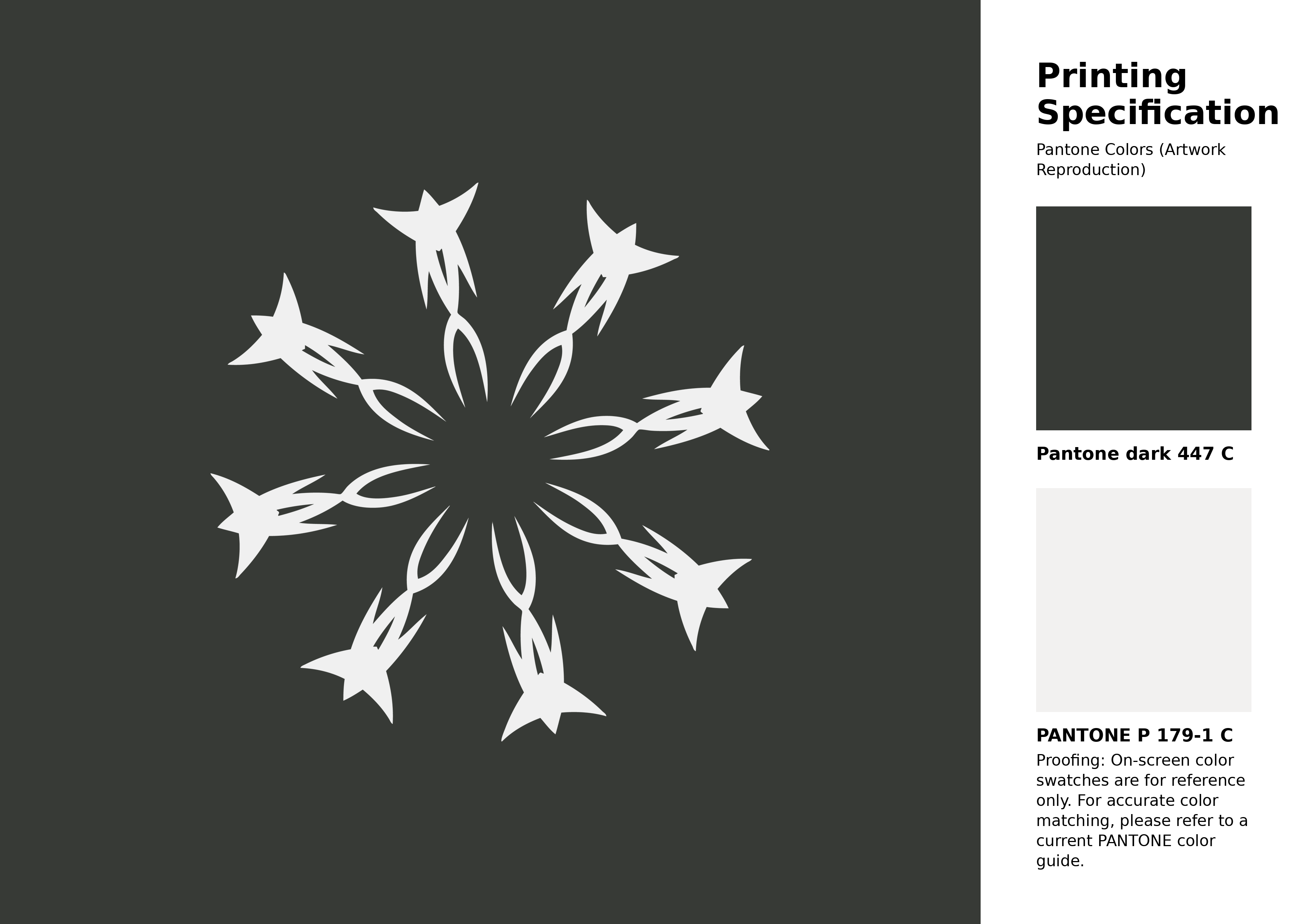
#373a36 Pantone 447 C Color | Hex color Code #373a36 Artwork Image (PNG)
Download Artwork (PNG)#373a36 Pantone 447 C Color | Hex color Code #373a36 Artwork Vector (PDF)
Download Artwork (PDF)#373a36 Pantone 447 C Color | Hex color Code #373a36 Artwork Vector (SVG)
Download Artwork (SVG)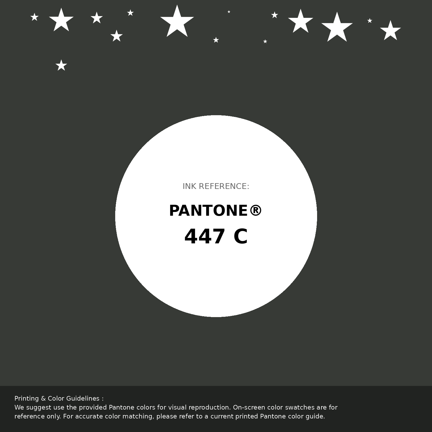
#373a36 Pantone 447 C Color | Hex color Code #373a36 Pantone Swatch Artwork
Download Artwork Swatch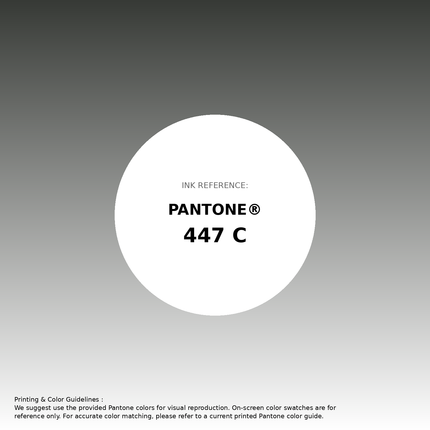
#373a36 Pantone 447 C Color | Hex color Code #373a36 Gradient Artwork (PNG)
Download Gradient (PNG)#373a36 Pantone 447 C Color | Hex color Code #373a36 Gradient Artwork (SVG)
Download Gradient (SVG)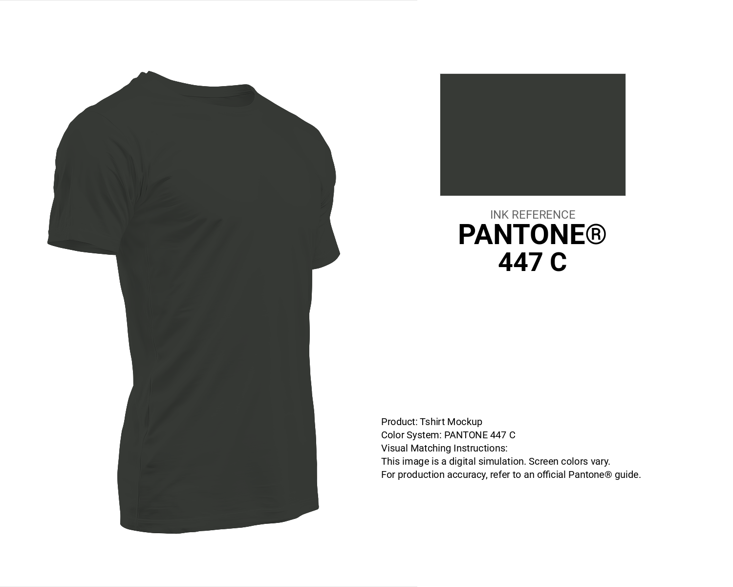
#373a36 Pantone 447 C Color | Hex color Code #373a36 T-Shirt Mockup
Download T-Shirt Mockup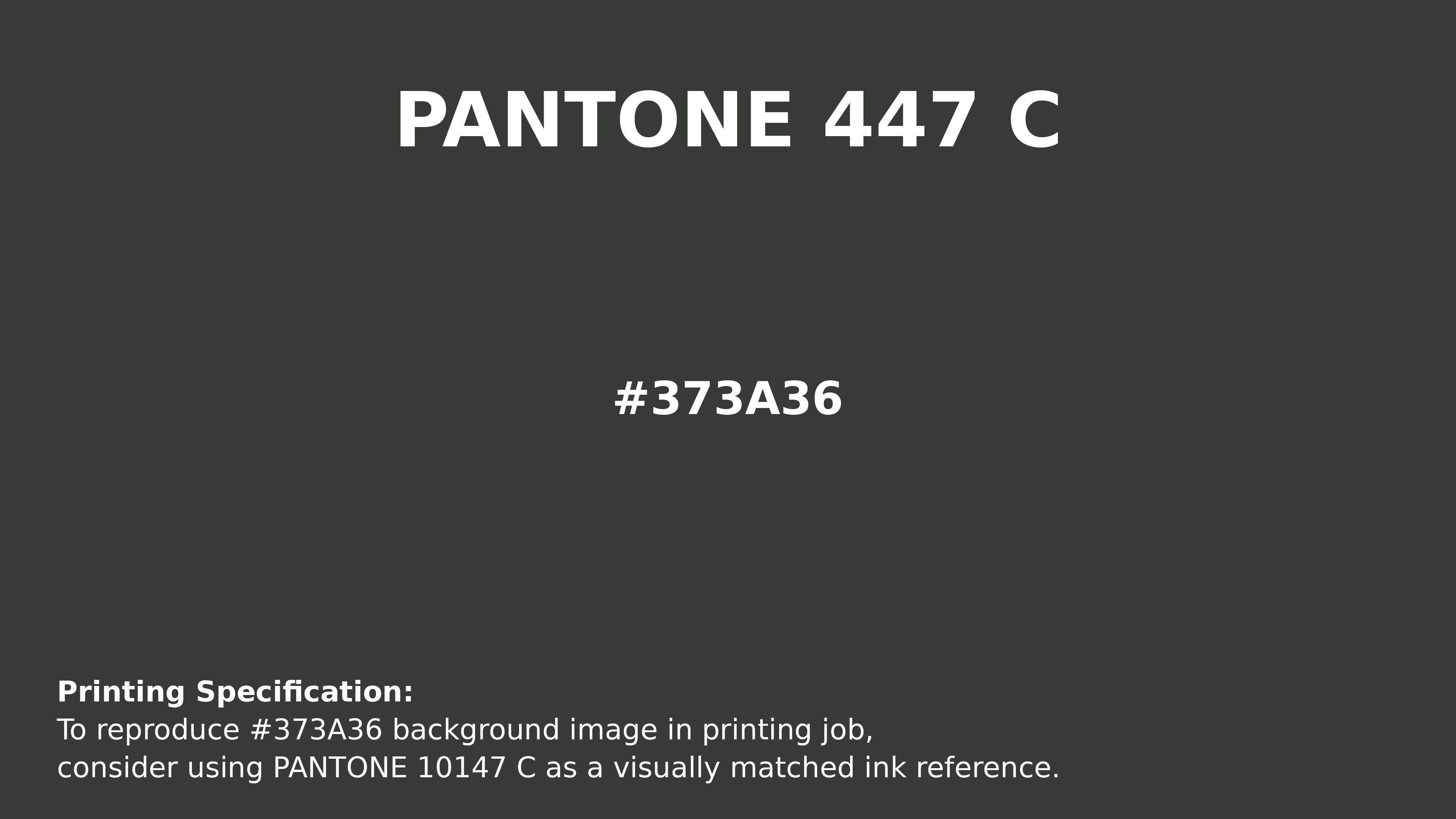
#373a36 Pantone 447 C Color | Hex color Code #373a36 Printing Artwork Pantone Reference
Download Pantone Printing ReferenceRelated Color Palettes
- Dark Gray and Light Gray •
- White Smoke and Dark Gray •
- Dark Gray and Rosy Brown •
- Brown and Dark Gray •
- Dark Gray and Dim Gray •
- Dark Gray / smoked •
- Goldenrod and Dark Gray •
- Powder Blue and Dark Gray •
- Dark Gray and Gainsboro •
- Crimson and Dark Gray •
- Dark Gray and Midnight Blue •
- Dark Gray and Brown •
- Dark Gray and Saddle Brown •
- Dark Gray and White •
- Cadet Blue and Dark Gray
Color Palette Collection

38 Beautiful Color Palettes
38 color palettes with 190 colors.

30+ Purple Color Palettes
31 color palettes with 155 colors.
ADC Website Accents
1 color palettes with 5 colors.

Child Theme Colors
5 color palettes with 25 colors.