#333F48 Color
Your all-in-one color resource. Download hex background images, Adobe swatches (ASE), PDF color sheets, and SVG files. Explore palettes, harmonies, accessibility, conversions, and professional exports — designed for designers, developers, and color perfectionists.
#333F48 is a deep, muted grayish-blue, possessing a quiet dignity. It evokes a feeling of subdued calmness, reminiscent of a twilight sky just after sunset or the deep shadows of a harbor at dusk. The color lacks vibrancy, suggesting a sense of mystery and introspection rather than overt cheerfulness. It reminds one of cool, smooth stones on a riverbed, or the dense foliage of a forest in late afternoon light. The mood it creates is contemplative and serene, perhaps slightly melancholic. In design, it would work well as a sophisticated neutral backdrop, lending an air of understated elegance to a space. It could be used in minimalist interiors, or to create a sense of calm in a workspace. It lacks strong cultural or symbolic associations, making it versatile and adaptable to various contexts. Visually matched named color: Twilight Harbor.
PANTONE 432 C
Choose Color
Selected Color
Recent Colors
Color Details
Similar Ink Alternatives for #333F48 color Alternative print inks for reproducing #333F48 background image with a similar visual appearance.
Disclaimer: The visually matched ink reference is an independent approximation intended as a guide only. Please be advised that this pantone colors is only intended as a guide, Actual colours will depend on screen calibration variances. The print ink suggestions provided are independent visual approximations and are not affiliated with or endorsed by Pantone LLC. For official color specifications, conversion factors, and comprehensive color system information, please visit Pantone Connect. Official Pantone products can be purchased at pantone.com.
Color Previews for #000000 See how this color looks as a background or as text.
Complete Guide to Your Color Laboratory
Everything you need to know about this professional color toolkit.
Use the Color Picker at the top to select any color. All modules below update instantly.
Workflow: Pick a color → Explore palettes & data → Download what you need (PDF, Image, or Adobe ASE).
Color Details — Your color in all formats: HEX, RGB, RGBA, HSL, HSLA, HSV, CMYK, CIELab, Hunter-Lab, XYZ, Yxy, YUV. One-click copy.
Color Psychology — Emotional impact, cultural meanings, physiological effects, branding applications, and historical significance.
Named Colors — Find official color names (HTML/CSS, Pantone) that match your selection with similarity percentages.
Light & Dark Shades
80-step gradient from black to white. Perfect for button states and component systems.
Tints
Color mixed with white → lighter, pastel variations for backgrounds and disabled states.
Monochromatic — 11 curated tints/shades from one color. Production-ready for design systems.
- Complementary — Opposite on wheel (180°). High contrast.
- Analogous — Neighbors (±30°). Harmonious flow.
- Triadic — Three colors (120° apart). Vibrant, balanced.
- Split-Complementary — Base + two near-complements. Softer contrast.
- Tetradic/Square — Four colors. Complex, maximum variety.
- Neutral — Desaturated versions. Subtle, sophisticated.
15 Professional Variations — Monochromatic, Analogous, Complementary, Warm/Cool/Earth Tones, Pastel, Vibrant, High Contrast, and more.
Color Infusion — 10 palettes showing your color morphing into each major hue. Find bridge colors.
Similar Colors — 60+ colors generated via CIELAB Delta E matching. Unexpected harmonious combinations.
18 Ready-to-Use Gradients — Complementary, Analogous, Triadic, Tint/Shade progressions, and more.
Downloads: PNG (2560×1440), CSS (production-ready code), SVG (scalable vector).
WCAG Contrast Checker — Tests your color against white, black, and custom colors for AA (4.5:1) and AAA (7:1) compliance. Large text thresholds included.
Harmony & Accessibility Guide — Tests against 10 canonical hues. Shows which pairs are both beautiful AND WCAG-compliant for text.
PNG/JPG — High-res images for presentations and mood boards.
PDF — Print-ready reports for clients and teams.
Adobe ASE — Direct import to Photoshop, Illustrator, InDesign, XD.
CSS/SVG — Gradients only. Production-ready code and vectors.
Color Science: Industry-standard conversions (HSL, CIELAB, CMYK, XYZ). WCAG 2.1 luminance formula. Delta E (ΔE76) for perceptual matching.
Direct Links: Share colors via icolorpalette.com/color/ff5733 or icolorpalette.com/color/red
Issues? Refresh the page, wait for rendering, try another browser, or check console (F12) for errors.
Printing Guide for #333f48 Background Image
Use PANTONE 432 C as a visually matched ink reference when printing this background image.
To print the #333f48 background image from our site, consider using PANTONE 432 C as a visually matched ink reference.
Download the background image, then provide this reference code to your print vendor to help achieve accurate color reproduction.
The visually matched ink reference for the #333f48 background image is PANTONE 432 C.
This color is commonly described as Twilight Harbor.
#333F48 is a deep, muted grayish-blue, possessing a quiet dignity. It evokes a feeling of subdued calmness, reminiscent of a twilight sky just after sunset or the deep shadows of a harbor at dusk. The color lacks vibrancy, suggesting a sense of mystery and introspection rather than overt cheerfulness. It reminds one of cool, smooth stones on a riverbed, or the dense foliage of a forest in late afternoon light. The mood it creates is contemplative and serene, perhaps slightly melancholic. In design, it would work well as a sophisticated neutral backdrop, lending an air of understated elegance to a space. It could be used in minimalist interiors, or to create a sense of calm in a workspace. It lacks strong cultural or symbolic associations, making it versatile and adaptable to various contexts.
We provide PANTONE 432 C as a visually matched ink reference to help you reproduce the #333f48 background image accurately in professional printing.
This reference code helps print vendors achieve consistent color output across different printing equipment and materials.
After downloading the #333f48 background image from our site:
- Include the visually matched ink reference PANTONE 432 C in your print order notes
- Inform your print vendor that this is your target color reference
- Request a proof print to verify the Twilight Harbor color appearance before full production
The #333f48 background image with PANTONE 432 C as visually matched ink reference can be used for:
- Posters, banners, and backdrops
- Business cards, brochures, and flyers
- Packaging, labels, and stickers
- Signage and promotional materials
This is an independent visual approximation.
While PANTONE 432 C closely matches the #333f48 background image color, variations may exist between screen display and printed output.
We recommend requesting a proof print to verify the final appearance.
#333F48 is a deep, muted grayish-blue, possessing a quiet dignity. It evokes a feeling of subdued calmness, reminiscent of a twilight sky just after sunset or the deep shadows of a harbor at dusk. The color lacks vibrancy, suggesting a sense of mystery and introspection rather than overt cheerfulness. It reminds one of cool, smooth stones on a riverbed, or the dense foliage of a forest in late afternoon light. The mood it creates is contemplative and serene, perhaps slightly melancholic. In design, it would work well as a sophisticated neutral backdrop, lending an air of understated elegance to a space. It could be used in minimalist interiors, or to create a sense of calm in a workspace. It lacks strong cultural or symbolic associations, making it versatile and adaptable to various contexts.
Understanding these associations helps ensure the #333f48 background image aligns with your intended message and brand impact.
Important Information
The visually matched ink reference is an independent approximation intended as a guide only.
Actual printed colors may vary depending on screen calibration, substrate material, ink type, and printing equipment used.
For official color specifications and certified color standards, visit Pantone Connect.
Official color guides and swatch books can be purchased from pantone.com.
Pantone 432 C Color: Muted Navy | #333F48
Introduction:
Muted Navy is a deep, sophisticated color that exudes a sense of understated elegance. Its rich and subtle hue is reminiscent of the night sky, offering a calming and serene visual experience.
Historical Significance:
Key Moments in History: Muted Navy has been prominently used in military uniforms, representing authority and strength. It has also been a popular choice for formal attire, symbolizing refinement and class.
Symbolism and Meaning:
Symbolism: Muted Navy is often associated with qualities such as confidence, stability, and reliability. It is also linked to professionalism and sophistication. In some cultures, it can symbolize wisdom and knowledge.
Muted Navy in Fashion:
Fashion Impact: Muted Navy is a timeless color in the fashion world. It is frequently used in formal and professional attire, adding a touch of sophistication to outfits. It is often seen in classic suits, elegant dresses, and accessories.
Muted Navy in Graphic Design:
Design Significance: Muted Navy is commonly used in graphic design to convey a sense of professionalism, stability, and trust. It is often seen in corporate logos, websites, and marketing materials.
Color Combinations:
Color Combinations: Muted Navy pairs well with colors like pale pink, light gray, and ivory. These combinations create a soft and elegant palette that exudes sophistication and class.
Nature’s Palette:
Natural Occurrences: Muted Navy can be found in the colors of the night sky, deep waters, and certain flowers like blue irises. Its presence in nature evokes a sense of tranquility and calmness.
Artistic Representations:
Artistic Usage: Artists have used Muted Navy in various forms of art, such as paintings and sculptures, to create depth and mood. Its dark and mysterious nature adds intrigue and intensity to artistic works.
Movies and Cinematic Landscapes:
Cinematic Impact: Muted Navy is often used in movies to set a somber or dramatic tone. It can be seen in film noir genres, adding an aura of mystery and suspense.
Products and Commercial Appeal:
Commercial Associations: Muted Navy is frequently used by luxury brands and high-end products to communicate sophistication and quality. It is found in designer fashion, premium cosmetics, and upscale furniture.
National Symbols and Significance:
National Significance: Muted Navy is often associated with national symbols representing strength, loyalty, and patriotism. It can be found in flags, emblems, and official seals of various countries.
The Psychological and Emotional Impact:
Psychological Influence: Muted Navy has a calming and grounding effect on emotions. It promotes feelings of stability, trust, and reliability. It can also evoke a sense of introspection and depth.
Conclusion:
Muted Navy, also known as Pantone 432 C Color, is a versatile and timeless color that holds historical significance and embodies sophistication. Its association with authority, stability, and elegance make it a popular choice in various industries, including fashion, design, and branding.
Pantone 432 C Color | Hex color Code #333f48 Image & Artwork
Download high-quality assets for your projects.

#333f48 Color Schemes
Download Color Schemes
#333f48 Color Shades
Download Color Shades
Pantone 432 C Color | Hex color Code #333f48 Solid Color Background
Download Solid Color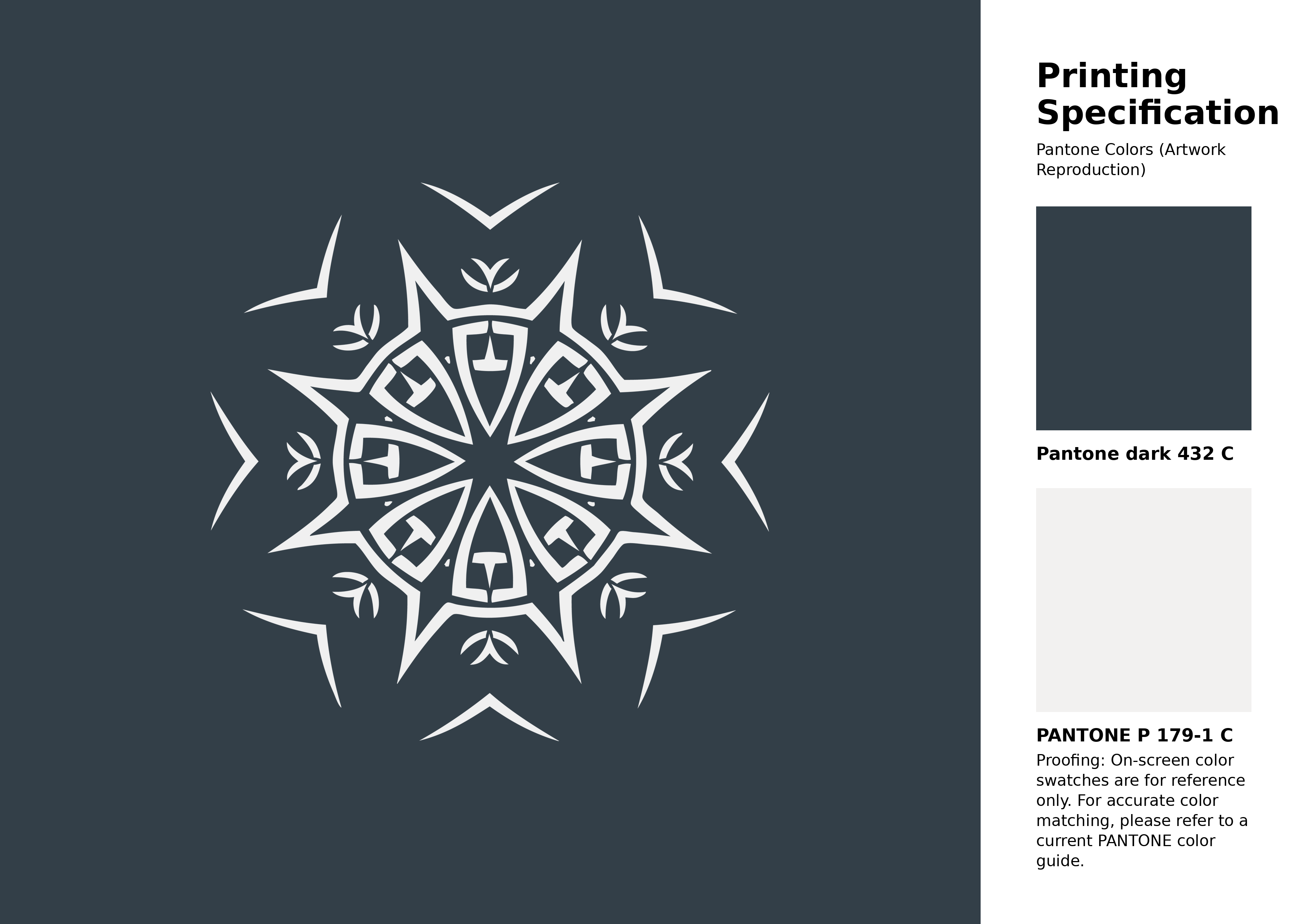
#333f48 Pantone 432 C Color | Hex color Code #333f48 Artwork Image (PNG)
Download Artwork (PNG)#333f48 Pantone 432 C Color | Hex color Code #333f48 Artwork Vector (PDF)
Download Artwork (PDF)#333f48 Pantone 432 C Color | Hex color Code #333f48 Artwork Vector (SVG)
Download Artwork (SVG)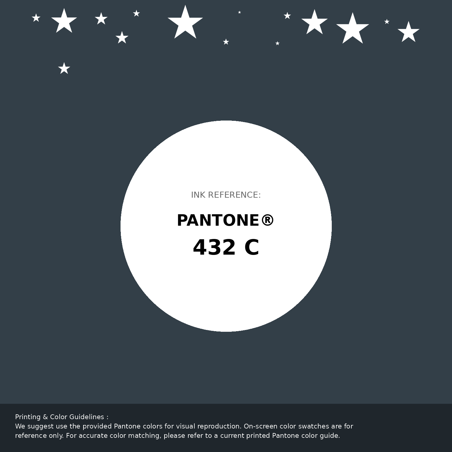
#333f48 Pantone 432 C Color | Hex color Code #333f48 Pantone Swatch Artwork
Download Artwork Swatch
#333f48 Pantone 432 C Color | Hex color Code #333f48 Gradient Artwork (PNG)
Download Gradient (PNG)#333f48 Pantone 432 C Color | Hex color Code #333f48 Gradient Artwork (SVG)
Download Gradient (SVG)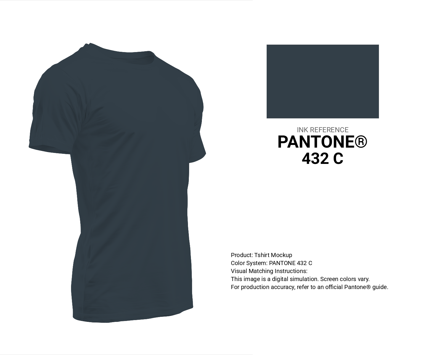
#333f48 Pantone 432 C Color | Hex color Code #333f48 T-Shirt Mockup
Download T-Shirt Mockup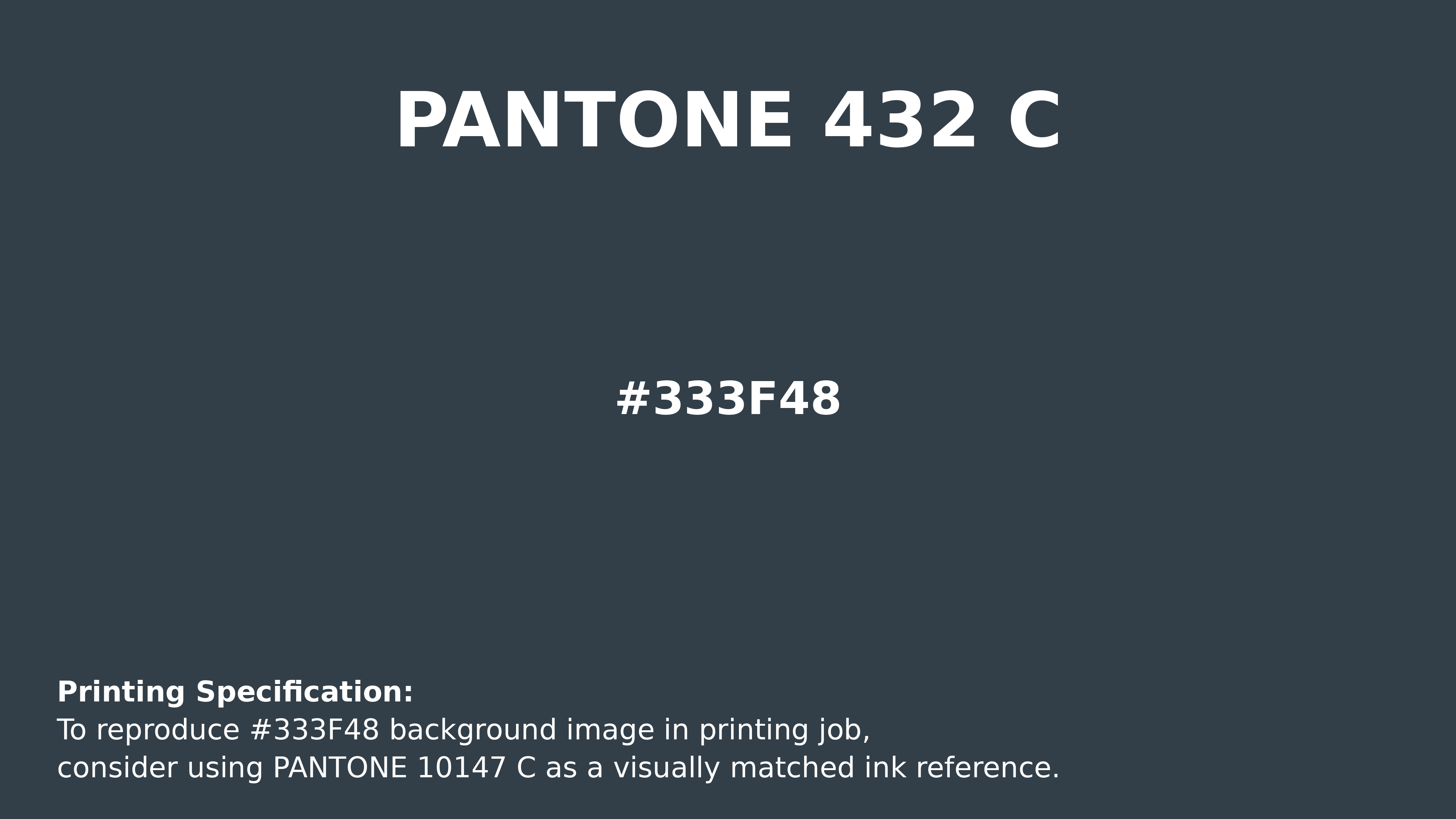
#333f48 Pantone 432 C Color | Hex color Code #333f48 Printing Artwork Pantone Reference
Download Pantone Printing ReferenceRelated Color Palettes
- Dark Gray and Dark Slate Gray •
- Dark Gray and Midnight Blue •
- Tan and Dark Gray •
- Slate Gray and Dark Gray •
- Dark Gray and Saddle Brown •
- Plum and Dark Gray •
- Dark Gray and Pale Goldenrod •
- Dark Gray and Chocolate •
- Dark Gray and Dark Olive Green •
- Dark Gray and Gainsboro •
- Dark Gray and Goldenrod •
- Dark Gray and Dark Slate Blue •
- Dark Gray and Crimson •
- Dark Gray and Dark Sea Green •
- Dark Gray and Brown
Color Palette Collection

50 Green Color Palettes
50 color palettes with 250 colors.

50 Beige Color Palettes
50 color palettes with 250 colors.
My Red Color Palettes
20 color palettes with 100 colors.

Orange Palette Collection
10 color palettes with 50 colors.