#326295 Color
Your all-in-one color resource. Download hex background images, Adobe swatches (ASE), PDF color sheets, and SVG files. Explore palettes, harmonies, accessibility, conversions, and professional exports — designed for designers, developers, and color perfectionists.
This color, #326295, evokes the hushed stillness of dusk settling over a vast expanse. It's the deep, shadowed blue of the sky just after sunset, before the stars fully emerge, carrying a sense of mystery and introspection. It whispers of quiet contemplation, of secrets held within the fading light. The color reminds of the ocean's depths, where the surface reflects the darkening sky, and of winter evenings spent by a cozy fire. It creates a mood of calm sophistication, a space for focused thought and gentle reflection. In design, it lends itself well to spaces intended for relaxation and focus, such as studies, bedrooms, or areas designed for creative work. It suggests trustworthiness and depth, often used in interiors to add a sense of stability and refinement. Visually matched named color: Deep Twilight Serenity.
PANTONE 653 C
Choose Color
Selected Color
Recent Colors
Color Details
Similar Ink Alternatives for #326295 color Alternative print inks for reproducing #326295 background image with a similar visual appearance.
Disclaimer: The visually matched ink reference is an independent approximation intended as a guide only. Please be advised that this pantone colors is only intended as a guide, Actual colours will depend on screen calibration variances. The print ink suggestions provided are independent visual approximations and are not affiliated with or endorsed by Pantone LLC. For official color specifications, conversion factors, and comprehensive color system information, please visit Pantone Connect. Official Pantone products can be purchased at pantone.com.
Color Previews for #000000 See how this color looks as a background or as text.
Complete Guide to Your Color Laboratory
Everything you need to know about this professional color toolkit.
Use the Color Picker at the top to select any color. All modules below update instantly.
Workflow: Pick a color → Explore palettes & data → Download what you need (PDF, Image, or Adobe ASE).
Color Details — Your color in all formats: HEX, RGB, RGBA, HSL, HSLA, HSV, CMYK, CIELab, Hunter-Lab, XYZ, Yxy, YUV. One-click copy.
Color Psychology — Emotional impact, cultural meanings, physiological effects, branding applications, and historical significance.
Named Colors — Find official color names (HTML/CSS, Pantone) that match your selection with similarity percentages.
Light & Dark Shades
80-step gradient from black to white. Perfect for button states and component systems.
Tints
Color mixed with white → lighter, pastel variations for backgrounds and disabled states.
Monochromatic — 11 curated tints/shades from one color. Production-ready for design systems.
- Complementary — Opposite on wheel (180°). High contrast.
- Analogous — Neighbors (±30°). Harmonious flow.
- Triadic — Three colors (120° apart). Vibrant, balanced.
- Split-Complementary — Base + two near-complements. Softer contrast.
- Tetradic/Square — Four colors. Complex, maximum variety.
- Neutral — Desaturated versions. Subtle, sophisticated.
15 Professional Variations — Monochromatic, Analogous, Complementary, Warm/Cool/Earth Tones, Pastel, Vibrant, High Contrast, and more.
Color Infusion — 10 palettes showing your color morphing into each major hue. Find bridge colors.
Similar Colors — 60+ colors generated via CIELAB Delta E matching. Unexpected harmonious combinations.
18 Ready-to-Use Gradients — Complementary, Analogous, Triadic, Tint/Shade progressions, and more.
Downloads: PNG (2560×1440), CSS (production-ready code), SVG (scalable vector).
WCAG Contrast Checker — Tests your color against white, black, and custom colors for AA (4.5:1) and AAA (7:1) compliance. Large text thresholds included.
Harmony & Accessibility Guide — Tests against 10 canonical hues. Shows which pairs are both beautiful AND WCAG-compliant for text.
PNG/JPG — High-res images for presentations and mood boards.
PDF — Print-ready reports for clients and teams.
Adobe ASE — Direct import to Photoshop, Illustrator, InDesign, XD.
CSS/SVG — Gradients only. Production-ready code and vectors.
Color Science: Industry-standard conversions (HSL, CIELAB, CMYK, XYZ). WCAG 2.1 luminance formula. Delta E (ΔE76) for perceptual matching.
Direct Links: Share colors via icolorpalette.com/color/ff5733 or icolorpalette.com/color/red
Issues? Refresh the page, wait for rendering, try another browser, or check console (F12) for errors.
Printing Guide for #326295 Background Image
Use PANTONE 653 C as a visually matched ink reference when printing this background image.
To print the #326295 background image from our site, consider using PANTONE 653 C as a visually matched ink reference.
Download the background image, then provide this reference code to your print vendor to help achieve accurate color reproduction.
The visually matched ink reference for the #326295 background image is PANTONE 653 C.
This color is commonly described as Deep Twilight Serenity.
This color, #326295, evokes the hushed stillness of dusk settling over a vast expanse. It's the deep, shadowed blue of the sky just after sunset, before the stars fully emerge, carrying a sense of mystery and introspection. It whispers of quiet contemplation, of secrets held within the fading light. The color reminds of the ocean's depths, where the surface reflects the darkening sky, and of winter evenings spent by a cozy fire. It creates a mood of calm sophistication, a space for focused thought and gentle reflection. In design, it lends itself well to spaces intended for relaxation and focus, such as studies, bedrooms, or areas designed for creative work. It suggests trustworthiness and depth, often used in interiors to add a sense of stability and refinement.
We provide PANTONE 653 C as a visually matched ink reference to help you reproduce the #326295 background image accurately in professional printing.
This reference code helps print vendors achieve consistent color output across different printing equipment and materials.
After downloading the #326295 background image from our site:
- Include the visually matched ink reference PANTONE 653 C in your print order notes
- Inform your print vendor that this is your target color reference
- Request a proof print to verify the Deep Twilight Serenity color appearance before full production
The #326295 background image with PANTONE 653 C as visually matched ink reference can be used for:
- Posters, banners, and backdrops
- Business cards, brochures, and flyers
- Packaging, labels, and stickers
- Signage and promotional materials
This is an independent visual approximation.
While PANTONE 653 C closely matches the #326295 background image color, variations may exist between screen display and printed output.
We recommend requesting a proof print to verify the final appearance.
This color, #326295, evokes the hushed stillness of dusk settling over a vast expanse. It's the deep, shadowed blue of the sky just after sunset, before the stars fully emerge, carrying a sense of mystery and introspection. It whispers of quiet contemplation, of secrets held within the fading light. The color reminds of the ocean's depths, where the surface reflects the darkening sky, and of winter evenings spent by a cozy fire. It creates a mood of calm sophistication, a space for focused thought and gentle reflection. In design, it lends itself well to spaces intended for relaxation and focus, such as studies, bedrooms, or areas designed for creative work. It suggests trustworthiness and depth, often used in interiors to add a sense of stability and refinement.
Understanding these associations helps ensure the #326295 background image aligns with your intended message and brand impact.
Important Information
The visually matched ink reference is an independent approximation intended as a guide only.
Actual printed colors may vary depending on screen calibration, substrate material, ink type, and printing equipment used.
For official color specifications and certified color standards, visit Pantone Connect.
Official color guides and swatch books can be purchased from pantone.com.
Pantone 653 C Color: Serene Seas | #326295
Introduction:
Serene Seas is a soothing color that captures the essence of calm and tranquility. Its deep blue hue reminds of peaceful waters and creates a sense of harmony and relaxation.
Historical Significance:
Key moments in history where Serene Seas was prominently used: Serene Seas has been used in various historical contexts to convey a sense of elegance and sophistication. Notably, it was frequently used in Renaissance art to depict oceans and seas, symbolizing the vastness of the unknown and the tranquility of nature.
Symbolism and Meaning:
What Serene Seas typically symbolizes: Serene Seas symbolizes calmness, peace, and stability. It is often associated with trust, reliability, and confidence. In different cultures, it can also represent depth, wisdom, and spirituality.
Serene Seas in Fashion:
How Serene Seas impacts styles and trends in the fashion world: Serene Seas is a popular color in the fashion industry, especially in spring and summer collections. It is often used in clothing, swimwear, and accessories to evoke a sense of calmness and relaxation. It pairs well with neutrals and other shades of blue.
Serene Seas in Graphic Design:
Significance of Serene Seas in design aesthetics and branding: Serene Seas is often used in graphic design to create a sense of tranquility and sophistication. It is frequently employed in branding related to travel, wellness, and luxury products. The color's cool undertones and calming effect make it an excellent choice for creating a visually appealing and relaxing atmosphere.
Color Combinations:
Potential color combinations with Serene Seas: Serene Seas pairs well with other shades of blue, such as sky blue or navy blue. It also complements earthy tones like sandy beige or soft gray. For a bolder combination, it can be paired with a vibrant yellow or coral.
Nature’s Palette:
Natural occurrences of Serene Seas: Serene Seas reflects the color of calm and tranquil waters, giving a sense of relaxation. It can be found in beautiful natural landscapes, like clear blue skies, serene lakes, and deep oceans.
Artistic Representations:
How Serene Seas has been used in various forms of art over time: Serene Seas has been a popular color choice for artists throughout history. It has been used to create serene seascapes, symbolize the vastness of the ocean, and convey a sense of tranquility and peace. Artists often use different shades of blue to capture the essence of calmness and serenity.
Movies and Cinematic Landscapes:
Movies or scenes where Serene Seas sets the tone or mood: Serene Seas is often used in movies to create a calming and peaceful atmosphere. It is frequently seen in beach scenes, underwater sequences, or whenever a sense of tranquility is needed to convey a certain mood.
Products and Commercial Appeal:
Popular products or brands associated with Serene Seas: Serene Seas is often used in branding related to travel, hospitality, and wellness industries. It can be found in logo designs, packaging, and marketing materials of various products or services that aim to evoke a sense of calmness, relaxation, and tranquility.
National Symbols and Significance:
Any national or cultural significance tied to Serene Seas: Serene Seas does not have specific national or cultural significance in terms of being tied to a particular country. However, it is a color that is universally appreciated for its calming and soothing qualities.
The Psychological and Emotional Impact:
How Serene Seas influences emotions or perceptions psychologically: Serene Seas has a profound psychological impact as it is known to promote a sense of relaxation, calmness, and well-being. It can help reduce stress and anxiety, creating a peaceful and harmonious environment.
Conclusion:
Serene Seas, with its rich blue hue and calming effect, holds historical significance and represents calmness, peace, and stability. It has been widely used in various art forms, fashion, graphic design, and commercial branding. Its universal appeal and soothing impact make it a timeless and versatile color choice.
Pantone 653 C Color | Hex color Code #326295 Image & Artwork
Download high-quality assets for your projects.

#326295 Color Schemes
Download Color Schemes
#326295 Color Shades
Download Color Shades
Pantone 653 C Color | Hex color Code #326295 Solid Color Background
Download Solid Color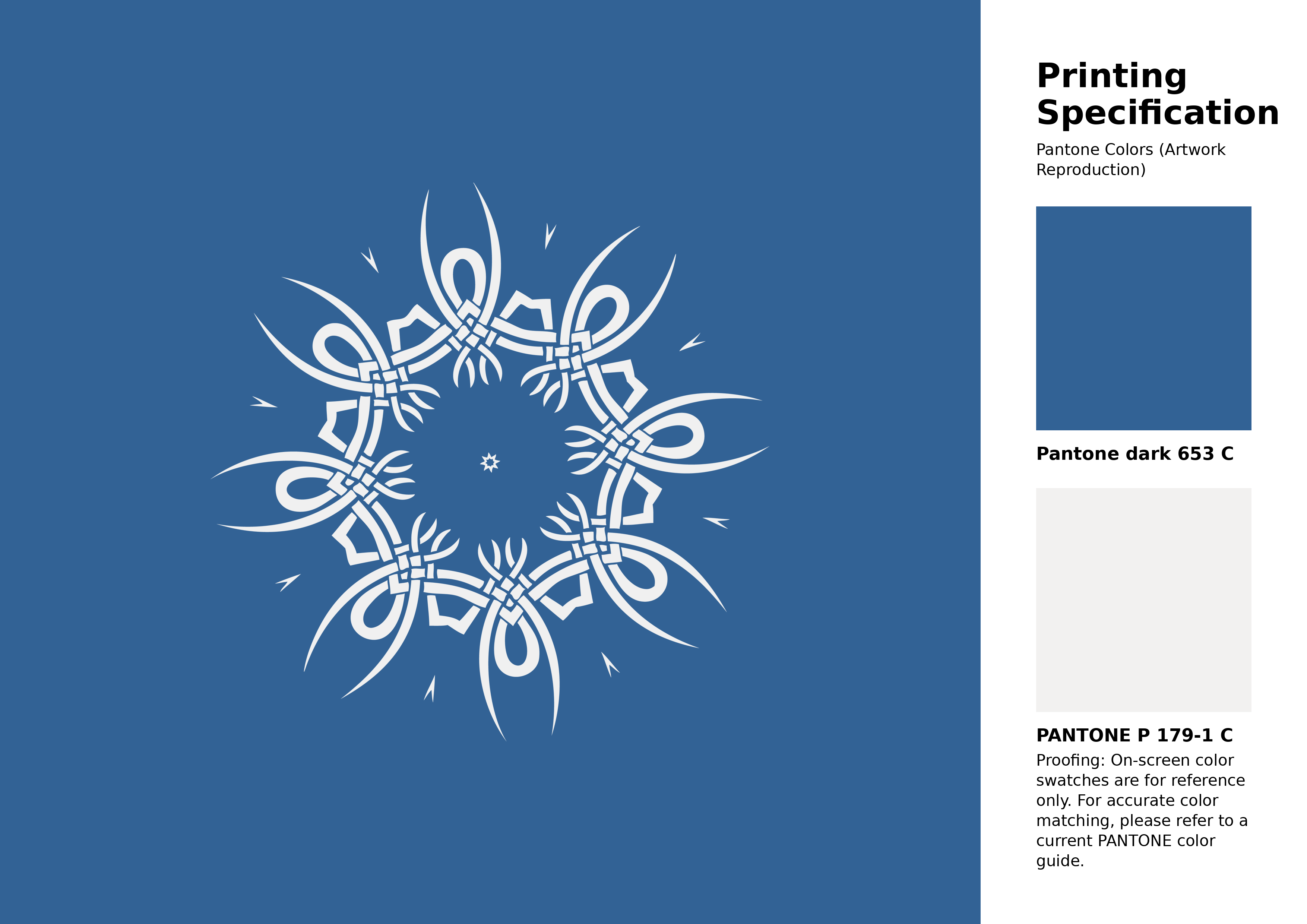
#326295 Pantone 653 C Color | Hex color Code #326295 Artwork Image (PNG)
Download Artwork (PNG)#326295 Pantone 653 C Color | Hex color Code #326295 Artwork Vector (PDF)
Download Artwork (PDF)#326295 Pantone 653 C Color | Hex color Code #326295 Artwork Vector (SVG)
Download Artwork (SVG)
#326295 Pantone 653 C Color | Hex color Code #326295 Pantone Swatch Artwork
Download Artwork Swatch
#326295 Pantone 653 C Color | Hex color Code #326295 Gradient Artwork (PNG)
Download Gradient (PNG)#326295 Pantone 653 C Color | Hex color Code #326295 Gradient Artwork (SVG)
Download Gradient (SVG)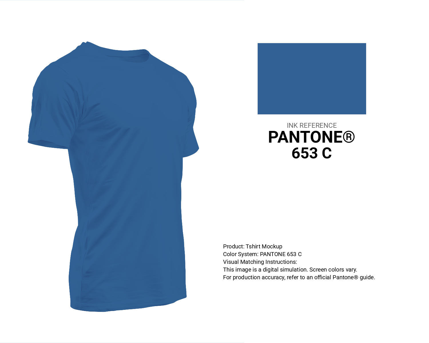
#326295 Pantone 653 C Color | Hex color Code #326295 T-Shirt Mockup
Download T-Shirt Mockup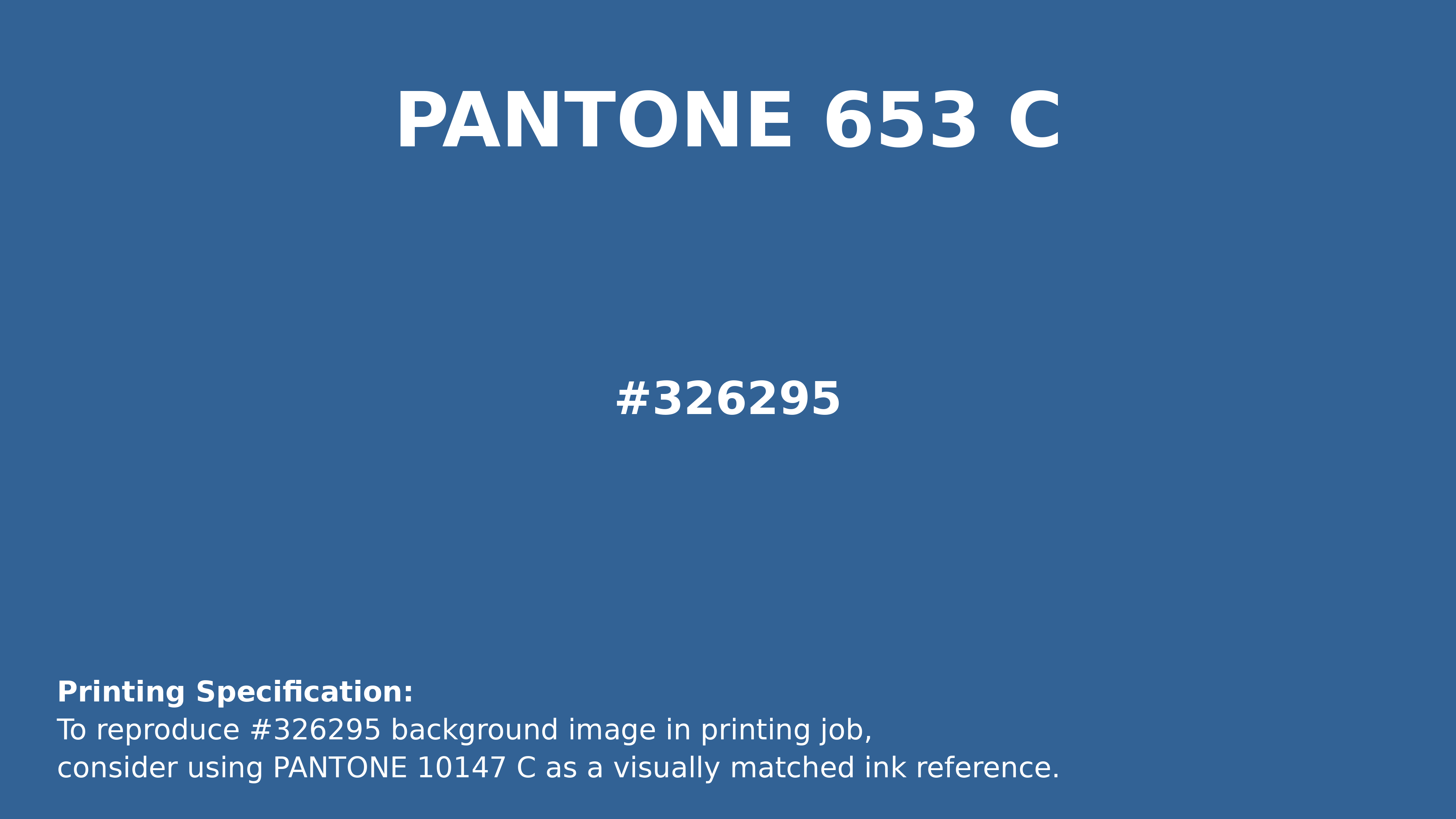
#326295 Pantone 653 C Color | Hex color Code #326295 Printing Artwork Pantone Reference
Download Pantone Printing ReferenceRelated Color Palettes
- Dark Gray / smoked •
- Dark Slate Gray and Salmon •
- Thistle and Gray •
- Dark Slate Gray and Royal Blue •
- Light Slate Gray and Light Gray •
- Thistle and Dim Gray •
- Dim Gray and Violet •
- Brown and Light Slate Gray •
- White Smoke and Dark Slate Gray •
- Dark Slate Gray and SkyBlue •
- Dark Slate Gray and Steel Blue •
- Cadet Blue and Dark Gray •
- Steel Blue and Dim Gray •
- Linen and Slate Gray •
- Khaki and Light Slate Gray
Color Palette Collection
50 Winter Color Palettes
50 color palettes with 250 colors.

50 Beige Color Palettes
50 color palettes with 250 colors.

20 Pink Color Schemes
20 color palettes with 100 colors.

31 Royal Blue Color Palette
31 color palettes with 155 colors.