#2DCCD3 Color
Your all-in-one color resource. Download hex background images, Adobe swatches (ASE), PDF color sheets, and SVG files. Explore palettes, harmonies, accessibility, conversions, and professional exports — designed for designers, developers, and color perfectionists.
The hex code #2DCCD3 presents a refreshing and calming aqua, a gentle blend of blue and green. It evokes feelings of peace, tranquility, and a sense of spaciousness, reminiscent of a clear, shallow sea on a sunny day or a tranquil spring-fed pool. The color suggests cleanliness, purity, and rejuvenation. It's associated with nature, particularly water, and promotes a sense of calm and optimism. The mood it creates is serene and inviting, conducive to relaxation and contemplation. In design, it would work well in bathrooms, spas, or any space intended for relaxation and rejuvenation. Its light and airy quality also makes it suitable for children's spaces or creating a feeling of airy openness in smaller rooms. Culturally, aqua is often associated with water, life, and growth. Visually matched named color: Aqua Serenity.
PANTONE 319 C
Choose Color
Selected Color
Recent Colors
Color Details
Similar Ink Alternatives for #2DCCD3 color Alternative print inks for reproducing #2DCCD3 background image with a similar visual appearance.
Disclaimer: The visually matched ink reference is an independent approximation intended as a guide only. Please be advised that this pantone colors is only intended as a guide, Actual colours will depend on screen calibration variances. The print ink suggestions provided are independent visual approximations and are not affiliated with or endorsed by Pantone LLC. For official color specifications, conversion factors, and comprehensive color system information, please visit Pantone Connect. Official Pantone products can be purchased at pantone.com.
Color Previews for #000000 See how this color looks as a background or as text.
Complete Guide to Your Color Laboratory
Everything you need to know about this professional color toolkit.
Use the Color Picker at the top to select any color. All modules below update instantly.
Workflow: Pick a color → Explore palettes & data → Download what you need (PDF, Image, or Adobe ASE).
Color Details — Your color in all formats: HEX, RGB, RGBA, HSL, HSLA, HSV, CMYK, CIELab, Hunter-Lab, XYZ, Yxy, YUV. One-click copy.
Color Psychology — Emotional impact, cultural meanings, physiological effects, branding applications, and historical significance.
Named Colors — Find official color names (HTML/CSS, Pantone) that match your selection with similarity percentages.
Light & Dark Shades
80-step gradient from black to white. Perfect for button states and component systems.
Tints
Color mixed with white → lighter, pastel variations for backgrounds and disabled states.
Monochromatic — 11 curated tints/shades from one color. Production-ready for design systems.
- Complementary — Opposite on wheel (180°). High contrast.
- Analogous — Neighbors (±30°). Harmonious flow.
- Triadic — Three colors (120° apart). Vibrant, balanced.
- Split-Complementary — Base + two near-complements. Softer contrast.
- Tetradic/Square — Four colors. Complex, maximum variety.
- Neutral — Desaturated versions. Subtle, sophisticated.
15 Professional Variations — Monochromatic, Analogous, Complementary, Warm/Cool/Earth Tones, Pastel, Vibrant, High Contrast, and more.
Color Infusion — 10 palettes showing your color morphing into each major hue. Find bridge colors.
Similar Colors — 60+ colors generated via CIELAB Delta E matching. Unexpected harmonious combinations.
18 Ready-to-Use Gradients — Complementary, Analogous, Triadic, Tint/Shade progressions, and more.
Downloads: PNG (2560×1440), CSS (production-ready code), SVG (scalable vector).
WCAG Contrast Checker — Tests your color against white, black, and custom colors for AA (4.5:1) and AAA (7:1) compliance. Large text thresholds included.
Harmony & Accessibility Guide — Tests against 10 canonical hues. Shows which pairs are both beautiful AND WCAG-compliant for text.
PNG/JPG — High-res images for presentations and mood boards.
PDF — Print-ready reports for clients and teams.
Adobe ASE — Direct import to Photoshop, Illustrator, InDesign, XD.
CSS/SVG — Gradients only. Production-ready code and vectors.
Color Science: Industry-standard conversions (HSL, CIELAB, CMYK, XYZ). WCAG 2.1 luminance formula. Delta E (ΔE76) for perceptual matching.
Direct Links: Share colors via icolorpalette.com/color/ff5733 or icolorpalette.com/color/red
Issues? Refresh the page, wait for rendering, try another browser, or check console (F12) for errors.
Printing Guide for #2dccd3 Background Image
Use PANTONE 319 C as a visually matched ink reference when printing this background image.
To print the #2dccd3 background image from our site, consider using PANTONE 319 C as a visually matched ink reference.
Download the background image, then provide this reference code to your print vendor to help achieve accurate color reproduction.
The visually matched ink reference for the #2dccd3 background image is PANTONE 319 C.
This color is commonly described as Aqua Serenity.
The hex code #2DCCD3 presents a refreshing and calming aqua, a gentle blend of blue and green. It evokes feelings of peace, tranquility, and a sense of spaciousness, reminiscent of a clear, shallow sea on a sunny day or a tranquil spring-fed pool. The color suggests cleanliness, purity, and rejuvenation. It's associated with nature, particularly water, and promotes a sense of calm and optimism. The mood it creates is serene and inviting, conducive to relaxation and contemplation. In design, it would work well in bathrooms, spas, or any space intended for relaxation and rejuvenation. Its light and airy quality also makes it suitable for children's spaces or creating a feeling of airy openness in smaller rooms. Culturally, aqua is often associated with water, life, and growth.
We provide PANTONE 319 C as a visually matched ink reference to help you reproduce the #2dccd3 background image accurately in professional printing.
This reference code helps print vendors achieve consistent color output across different printing equipment and materials.
After downloading the #2dccd3 background image from our site:
- Include the visually matched ink reference PANTONE 319 C in your print order notes
- Inform your print vendor that this is your target color reference
- Request a proof print to verify the Aqua Serenity color appearance before full production
The #2dccd3 background image with PANTONE 319 C as visually matched ink reference can be used for:
- Posters, banners, and backdrops
- Business cards, brochures, and flyers
- Packaging, labels, and stickers
- Signage and promotional materials
This is an independent visual approximation.
While PANTONE 319 C closely matches the #2dccd3 background image color, variations may exist between screen display and printed output.
We recommend requesting a proof print to verify the final appearance.
The hex code #2DCCD3 presents a refreshing and calming aqua, a gentle blend of blue and green. It evokes feelings of peace, tranquility, and a sense of spaciousness, reminiscent of a clear, shallow sea on a sunny day or a tranquil spring-fed pool. The color suggests cleanliness, purity, and rejuvenation. It's associated with nature, particularly water, and promotes a sense of calm and optimism. The mood it creates is serene and inviting, conducive to relaxation and contemplation. In design, it would work well in bathrooms, spas, or any space intended for relaxation and rejuvenation. Its light and airy quality also makes it suitable for children's spaces or creating a feeling of airy openness in smaller rooms. Culturally, aqua is often associated with water, life, and growth.
Understanding these associations helps ensure the #2dccd3 background image aligns with your intended message and brand impact.
Important Information
The visually matched ink reference is an independent approximation intended as a guide only.
Actual printed colors may vary depending on screen calibration, substrate material, ink type, and printing equipment used.
For official color specifications and certified color standards, visit Pantone Connect.
Official color guides and swatch books can be purchased from pantone.com.
Pantone 319 C Color: Serene Sky Blue | #2DCCD3
Introduction:
Serene Sky Blue, also known as Pantone 319 C, is a soothing color that evokes a sense of calm and tranquility with its light blue hue. Its soft and delicate appearance makes it an appealing choice in various design applications.
Historical Significance:
Key Moments in History: Serene Sky Blue has been used prominently throughout history, particularly in religious art and stained glass windows during the Renaissance period. It was also featured in neoclassical paintings, symbolizing the ethereal and heavenly realms.
Symbolism and Meaning:
Symbolism: Serene Sky Blue typically symbolizes peace, tranquility, and serenity in various cultures. It represents the clear blue sky and the vastness of the sea, conveying a sense of expansiveness and calmness.
Serene Sky Blue in Fashion:
Fashion Impact: Serene Sky Blue has a gentle and refreshing quality that makes it a popular choice in clothing and accessories. It is often associated with summertime fashion and beachwear, as well as casual and relaxed styles.
Serene Sky Blue in Graphic Design:
Design Significance: Serene Sky Blue is widely used in graphic design to convey a sense of calmness and professionalism. Its cool undertones make it suitable for corporate branding, particularly in industries related to technology, healthcare, and lifestyle.
Color Combinations:
Potential Color Combinations: Serene Sky Blue can be paired with complementary colors such as white, light gray, and soft pastel shades to create a harmonious and peaceful color palette. Other possible combinations include Serene Sky Blue with pale yellow or mint green for a fresh and vibrant look.
Nature’s Palette:
Natural Occurrences: Serene Sky Blue can be found in nature in the form of clear skies, serene bodies of water, and delicate flowers such as forget-me-nots and hydrangeas. It blends seamlessly with the natural elements, creating a sense of tranquility in landscapes and gardens.
Artistic Representations:
Artistic Usage: Serene Sky Blue has been utilized by artists throughout history to create serene and harmonious artwork. It has been depicted in watercolor paintings, abstract compositions, and serene landscapes, capturing the beauty and tranquility of the natural world.
Movies and Cinematic Landscapes:
Cinematic Tones: Serene Sky Blue is often used in movies to evoke a sense of peace, tranquility, and calmness. It can be seen in scenes depicting serene landscapes, dream sequences, or moments of introspection.
Products and Commercial Appeal:
Commercial Associations: Serene Sky Blue is commonly used in the branding and packaging of products related to relaxation, wellness, and luxury. It conveys a sense of sophistication and a calming experience, making it appealing to consumers looking for a serene and premium lifestyle.
National Symbols and Significance:
National Symbolism: Serene Sky Blue holds significance in various national flags and symbols, representing qualities such as peace, unity, and freedom. It is often associated with open skies and expansive landscapes, highlighting the connection between the nation and nature.
The Psychological and Emotional Impact:
Psychological Influence: Serene Sky Blue has a soothing and calming effect on emotions. It promotes relaxation, clarity, and a sense of stability. It can also enhance feelings of trust and reliability, making it an ideal choice for creating a peaceful atmosphere.
Conclusion:
Serene Sky Blue, with its calming and tranquil nature, has a timeless appeal that has been recognized throughout history. Its associations with peace, serenity, and natural beauty make it a versatile color choice in various design fields.
Pantone 319 C Color | Hex color Code #2dccd3 Image & Artwork
Download high-quality assets for your projects.

#2dccd3 Color Schemes
Download Color Schemes
#2dccd3 Color Shades
Download Color Shades
Pantone 319 C Color | Hex color Code #2dccd3 Solid Color Background
Download Solid Color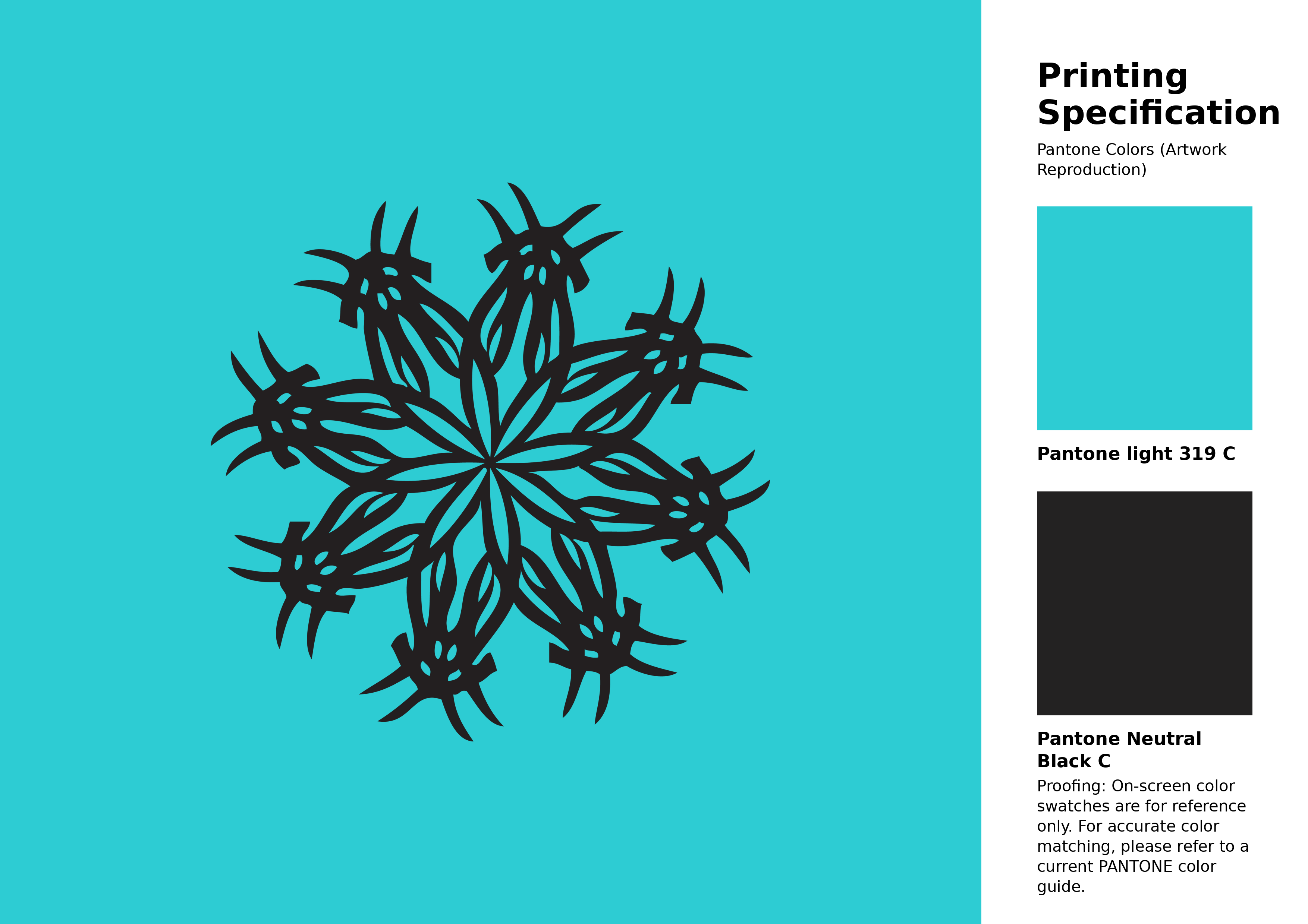
#2dccd3 Pantone 319 C Color | Hex color Code #2dccd3 Artwork Image (PNG)
Download Artwork (PNG)#2dccd3 Pantone 319 C Color | Hex color Code #2dccd3 Artwork Vector (PDF)
Download Artwork (PDF)#2dccd3 Pantone 319 C Color | Hex color Code #2dccd3 Artwork Vector (SVG)
Download Artwork (SVG)
#2dccd3 Pantone 319 C Color | Hex color Code #2dccd3 Pantone Swatch Artwork
Download Artwork Swatch
#2dccd3 Pantone 319 C Color | Hex color Code #2dccd3 Gradient Artwork (PNG)
Download Gradient (PNG)#2dccd3 Pantone 319 C Color | Hex color Code #2dccd3 Gradient Artwork (SVG)
Download Gradient (SVG)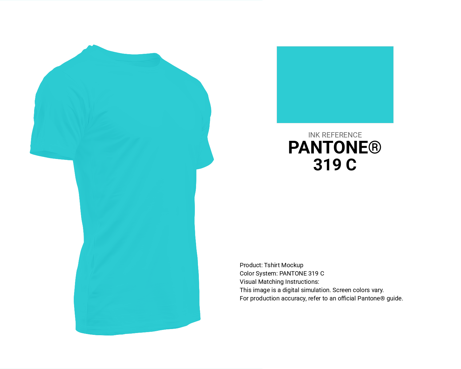
#2dccd3 Pantone 319 C Color | Hex color Code #2dccd3 T-Shirt Mockup
Download T-Shirt Mockup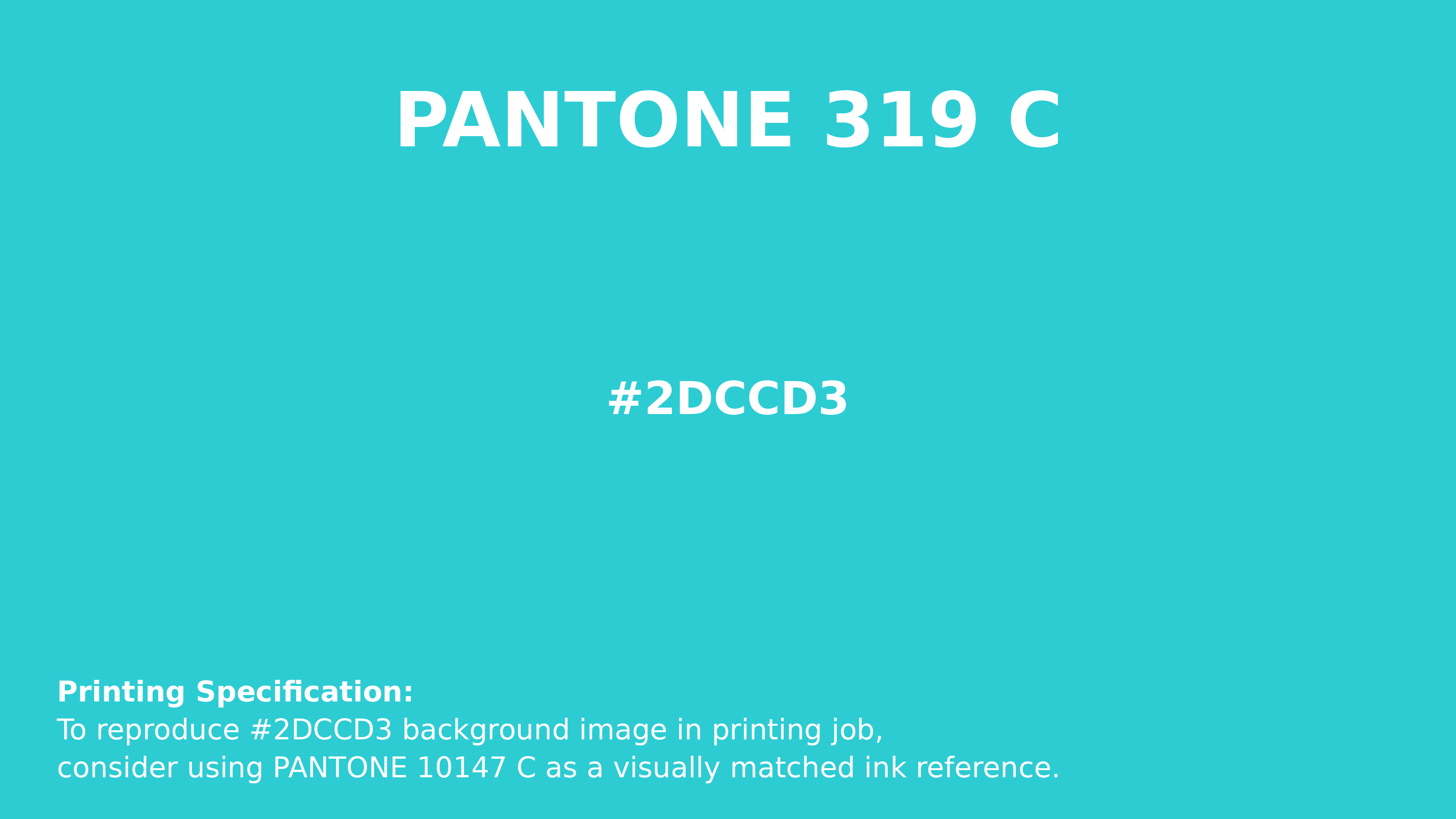
#2dccd3 Pantone 319 C Color | Hex color Code #2dccd3 Printing Artwork Pantone Reference
Download Pantone Printing ReferenceRelated Color Palettes
- Rosy Brown and Medium Turquoise •
- Pale Turquoise and Rosy Brown •
- Turquoise Blue •
- Light Steel Blue and Dark Turquoise •
- Pale Turquoise and Light Slate Gray •
- Light Blue and Pale Turquoise •
- Midnight Blue and Dark Turquoise •
- Dark Khaki and Pale Turquoise •
- Pale Turquoise and Lavender •
- Medium Turquoise and Tan •
- Pale Turquoise and Medium Aquamarine •
- Pale Turquoise and Tan •
- Medium Aquamarine and Pale Turquoise •
- Dark Turquoise and Dark Slate Gray •
- Medium Turquoise and Gray
Color Palette Collection

Summer Color Palettes
28 color palettes with 140 colors.

55 Nature Color Palettes
55 color palettes with 275 colors.

50 Red color palettes
50 color palettes with 250 colors.

35 Light Blue Color Palette
35 color palettes with 175 colors.