#2CD5C4 Color
Your all-in-one color resource. Download hex background images, Adobe swatches (ASE), PDF color sheets, and SVG files. Explore palettes, harmonies, accessibility, conversions, and professional exports — designed for designers, developers, and color perfectionists.
The color #2CD5C4, a vibrant aqua, breathes with the freshness of a morning mist rising over a tranquil lake. It evokes feelings of optimism, clarity, and a gentle sense of awakening. This hue reminds one of the crisp air of early spring, the playful dance of sunlight on water, and the promise of new beginnings. It creates a mood of calm energy, stimulating creativity without overwhelming the senses. In design, it lends itself well to spaces meant to inspire focus and well-being, such as offices or bathrooms, suggesting cleanliness and a connection to nature. It carries associations with healing and balance, often symbolizing new growth and the harmonious blend of earth and sky. Culturally, it can represent a sense of hope and the boundless potential of a clear horizon. Visually matched named color: Serene Aqua Dawn.
PANTONE 3255 C
Choose Color
Selected Color
Recent Colors
Color Details
Similar Ink Alternatives for #2CD5C4 color Alternative print inks for reproducing #2CD5C4 background image with a similar visual appearance.
Disclaimer: The visually matched ink reference is an independent approximation intended as a guide only. Please be advised that this pantone colors is only intended as a guide, Actual colours will depend on screen calibration variances. The print ink suggestions provided are independent visual approximations and are not affiliated with or endorsed by Pantone LLC. For official color specifications, conversion factors, and comprehensive color system information, please visit Pantone Connect. Official Pantone products can be purchased at pantone.com.
Color Previews for #000000 See how this color looks as a background or as text.
Complete Guide to Your Color Laboratory
Everything you need to know about this professional color toolkit.
Use the Color Picker at the top to select any color. All modules below update instantly.
Workflow: Pick a color → Explore palettes & data → Download what you need (PDF, Image, or Adobe ASE).
Color Details — Your color in all formats: HEX, RGB, RGBA, HSL, HSLA, HSV, CMYK, CIELab, Hunter-Lab, XYZ, Yxy, YUV. One-click copy.
Color Psychology — Emotional impact, cultural meanings, physiological effects, branding applications, and historical significance.
Named Colors — Find official color names (HTML/CSS, Pantone) that match your selection with similarity percentages.
Light & Dark Shades
80-step gradient from black to white. Perfect for button states and component systems.
Tints
Color mixed with white → lighter, pastel variations for backgrounds and disabled states.
Monochromatic — 11 curated tints/shades from one color. Production-ready for design systems.
- Complementary — Opposite on wheel (180°). High contrast.
- Analogous — Neighbors (±30°). Harmonious flow.
- Triadic — Three colors (120° apart). Vibrant, balanced.
- Split-Complementary — Base + two near-complements. Softer contrast.
- Tetradic/Square — Four colors. Complex, maximum variety.
- Neutral — Desaturated versions. Subtle, sophisticated.
15 Professional Variations — Monochromatic, Analogous, Complementary, Warm/Cool/Earth Tones, Pastel, Vibrant, High Contrast, and more.
Color Infusion — 10 palettes showing your color morphing into each major hue. Find bridge colors.
Similar Colors — 60+ colors generated via CIELAB Delta E matching. Unexpected harmonious combinations.
18 Ready-to-Use Gradients — Complementary, Analogous, Triadic, Tint/Shade progressions, and more.
Downloads: PNG (2560×1440), CSS (production-ready code), SVG (scalable vector).
WCAG Contrast Checker — Tests your color against white, black, and custom colors for AA (4.5:1) and AAA (7:1) compliance. Large text thresholds included.
Harmony & Accessibility Guide — Tests against 10 canonical hues. Shows which pairs are both beautiful AND WCAG-compliant for text.
PNG/JPG — High-res images for presentations and mood boards.
PDF — Print-ready reports for clients and teams.
Adobe ASE — Direct import to Photoshop, Illustrator, InDesign, XD.
CSS/SVG — Gradients only. Production-ready code and vectors.
Color Science: Industry-standard conversions (HSL, CIELAB, CMYK, XYZ). WCAG 2.1 luminance formula. Delta E (ΔE76) for perceptual matching.
Direct Links: Share colors via icolorpalette.com/color/ff5733 or icolorpalette.com/color/red
Issues? Refresh the page, wait for rendering, try another browser, or check console (F12) for errors.
Printing Guide for #2cd5c4 Background Image
Use PANTONE 3255 C as a visually matched ink reference when printing this background image.
To print the #2cd5c4 background image from our site, consider using PANTONE 3255 C as a visually matched ink reference.
Download the background image, then provide this reference code to your print vendor to help achieve accurate color reproduction.
The visually matched ink reference for the #2cd5c4 background image is PANTONE 3255 C.
This color is commonly described as Serene Aqua Dawn.
The color #2CD5C4, a vibrant aqua, breathes with the freshness of a morning mist rising over a tranquil lake. It evokes feelings of optimism, clarity, and a gentle sense of awakening. This hue reminds one of the crisp air of early spring, the playful dance of sunlight on water, and the promise of new beginnings. It creates a mood of calm energy, stimulating creativity without overwhelming the senses. In design, it lends itself well to spaces meant to inspire focus and well-being, such as offices or bathrooms, suggesting cleanliness and a connection to nature. It carries associations with healing and balance, often symbolizing new growth and the harmonious blend of earth and sky. Culturally, it can represent a sense of hope and the boundless potential of a clear horizon.
We provide PANTONE 3255 C as a visually matched ink reference to help you reproduce the #2cd5c4 background image accurately in professional printing.
This reference code helps print vendors achieve consistent color output across different printing equipment and materials.
After downloading the #2cd5c4 background image from our site:
- Include the visually matched ink reference PANTONE 3255 C in your print order notes
- Inform your print vendor that this is your target color reference
- Request a proof print to verify the Serene Aqua Dawn color appearance before full production
The #2cd5c4 background image with PANTONE 3255 C as visually matched ink reference can be used for:
- Posters, banners, and backdrops
- Business cards, brochures, and flyers
- Packaging, labels, and stickers
- Signage and promotional materials
This is an independent visual approximation.
While PANTONE 3255 C closely matches the #2cd5c4 background image color, variations may exist between screen display and printed output.
We recommend requesting a proof print to verify the final appearance.
The color #2CD5C4, a vibrant aqua, breathes with the freshness of a morning mist rising over a tranquil lake. It evokes feelings of optimism, clarity, and a gentle sense of awakening. This hue reminds one of the crisp air of early spring, the playful dance of sunlight on water, and the promise of new beginnings. It creates a mood of calm energy, stimulating creativity without overwhelming the senses. In design, it lends itself well to spaces meant to inspire focus and well-being, such as offices or bathrooms, suggesting cleanliness and a connection to nature. It carries associations with healing and balance, often symbolizing new growth and the harmonious blend of earth and sky. Culturally, it can represent a sense of hope and the boundless potential of a clear horizon.
Understanding these associations helps ensure the #2cd5c4 background image aligns with your intended message and brand impact.
Important Information
The visually matched ink reference is an independent approximation intended as a guide only.
Actual printed colors may vary depending on screen calibration, substrate material, ink type, and printing equipment used.
For official color specifications and certified color standards, visit Pantone Connect.
Official color guides and swatch books can be purchased from pantone.com.
Pantone 3255 C Color: The Essence of Vibrant Ocean | #2CD5C4
Introduction:
Pantone 3255 C is a color that represents the vibrant nature of the ocean. It is a bright and refreshing color that catches the eye and evokes a sense of calmness and tranquility.
Historical Significance:
Key moments in history: Pantone 3255 C has been prominently used in various historical moments, such as ocean-themed art movements and maritime explorations.
Symbolism and Meaning:
Symbolism and Meaning: Pantone 3255 C typically symbolizes peace, harmony, and the vastness of the ocean. It is often associated with feelings of serenity and tranquility.
Pantone 3255 C in Fashion:
Pantone 3255 C in Fashion: The color has influenced fashion trends, particularly in the swimwear industry, where it represents a natural and refreshing style.
Pantone 3255 C in Graphic Design:
Pantone 3255 C in Graphic Design: The color is widely used in graphic design to convey a sense of calmness and freshness. It is often employed in branding and visual aesthetics associated with nature, water, and wellness.
Color Combinations:
Color Combinations: Pantone 3255 C pairs well with complementary colors such as coral, soft pink, and sandy beige. These combinations create a harmonious and beach-like atmosphere.
Nature’s Palette:
Nature’s Palette: Pantone 3255 C can be found in the colors of tropical fish, coral reefs, and clear ocean waters. It is a color that is intertwined with nature and the wonders of the sea.
Artistic Representations:
Artistic Representations: Pantone 3255 C has been used in various forms of art, such as marine-themed paintings, underwater photography, and abstract ocean-inspired sculptures.
Movies and Cinematic Landscapes:
Movies and Cinematic Landscapes: Pantone 3255 C sets the tone in movies and scenes that depict coastal locations, exotic beaches, and underwater adventures. It creates an immersive and dreamy visual experience.
Products and Commercial Appeal:
Products and Commercial Appeal: Many brands in the beauty, travel, and wellness industries use Pantone 3255 C in their product packaging and marketing materials to evoke feelings of relaxation, rejuvenation, and escape.
National Symbols and Significance:
National Symbols and Significance: Pantone 3255 C is tied to the national symbols of countries with coastlines, representing their connection to the sea and their reliance on maritime resources.
The Psychological and Emotional Impact:
The Psychological and Emotional Impact: Pantone 3255 C has a soothing effect on emotions, promoting feelings of serenity, relaxation, and inner peace. It is often used in therapy and wellness environments.
Conclusion:
Pantone 3255 C, with its vibrant ocean hue, holds historical significance in various art forms, has symbolic meaning related to peace and tranquility, and influences fashion, design, and commercial branding. Its presence in nature and its psychological impact make it an enduring and timeless color.
Pantone 3255 C Color | Hex color Code #2cd5c4 Image & Artwork
Download high-quality assets for your projects.

#2cd5c4 Color Schemes
Download Color Schemes
#2cd5c4 Color Shades
Download Color Shades
Pantone 3255 C Color | Hex color Code #2cd5c4 Solid Color Background
Download Solid Color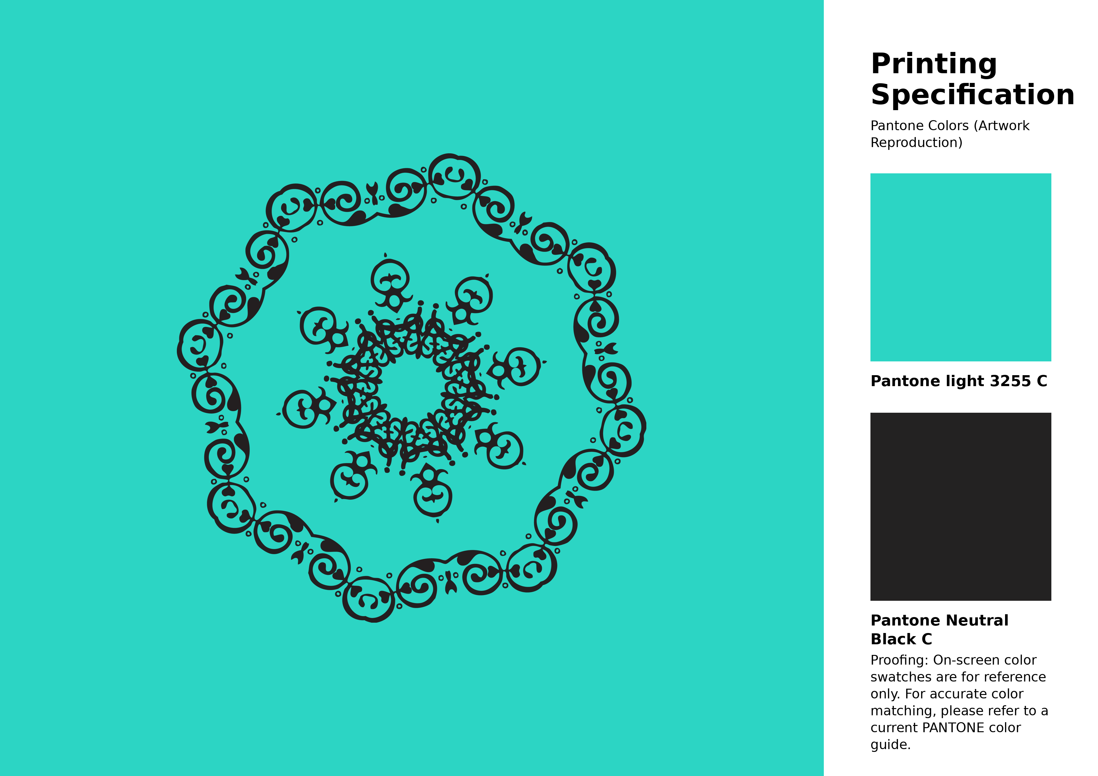
#2cd5c4 Pantone 3255 C Color | Hex color Code #2cd5c4 Artwork Image (PNG)
Download Artwork (PNG)#2cd5c4 Pantone 3255 C Color | Hex color Code #2cd5c4 Artwork Vector (PDF)
Download Artwork (PDF)#2cd5c4 Pantone 3255 C Color | Hex color Code #2cd5c4 Artwork Vector (SVG)
Download Artwork (SVG)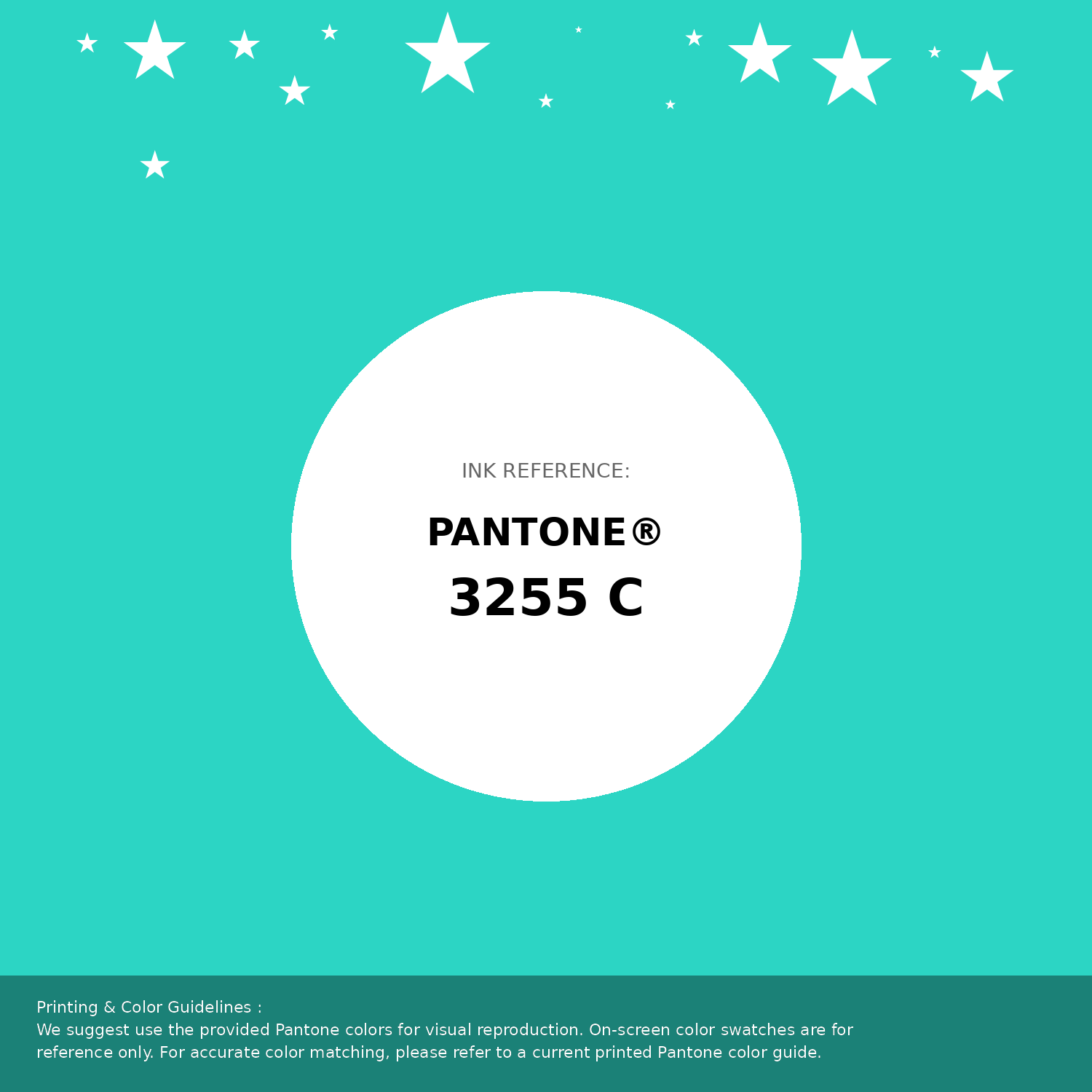
#2cd5c4 Pantone 3255 C Color | Hex color Code #2cd5c4 Pantone Swatch Artwork
Download Artwork Swatch
#2cd5c4 Pantone 3255 C Color | Hex color Code #2cd5c4 Gradient Artwork (PNG)
Download Gradient (PNG)#2cd5c4 Pantone 3255 C Color | Hex color Code #2cd5c4 Gradient Artwork (SVG)
Download Gradient (SVG)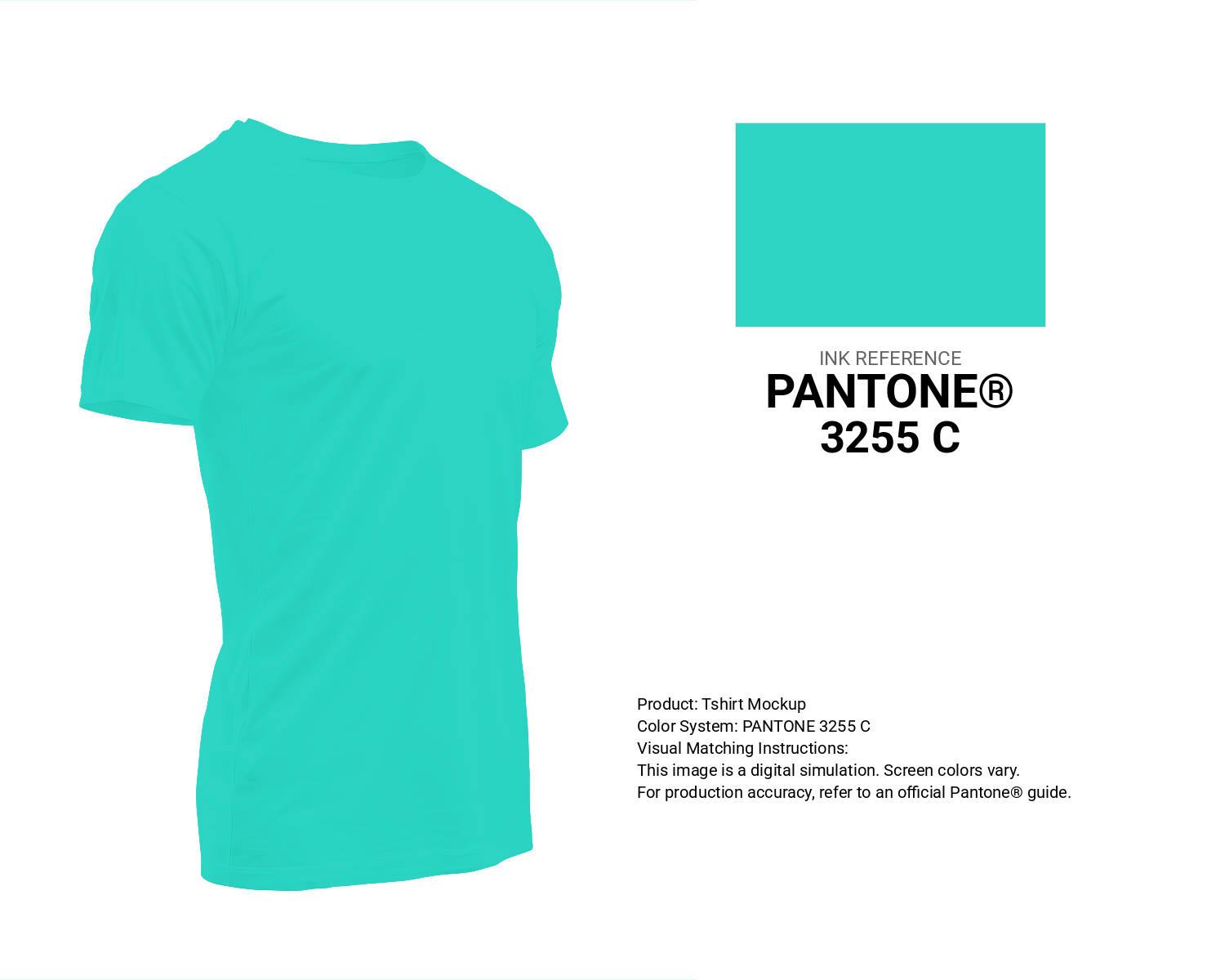
#2cd5c4 Pantone 3255 C Color | Hex color Code #2cd5c4 T-Shirt Mockup
Download T-Shirt Mockup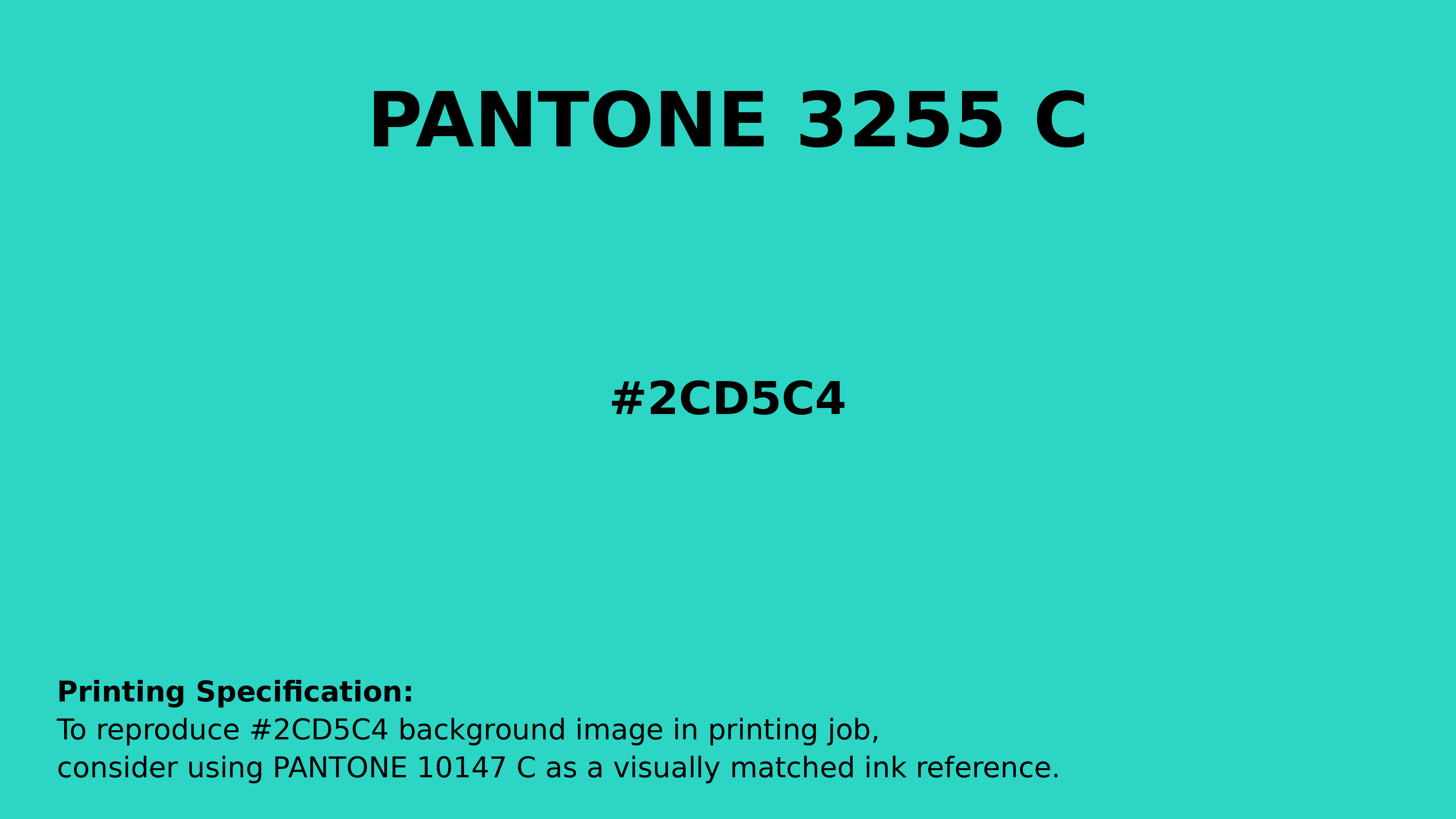
#2cd5c4 Pantone 3255 C Color | Hex color Code #2cd5c4 Printing Artwork Pantone Reference
Download Pantone Printing ReferenceRelated Color Palettes
- Dark Slate Gray and Dark Turquoise •
- Gray and Pale Turquoise •
- Medium Turquoise •
- Medium Turquoise and Rosy Brown •
- Medium Turquoise and Slate Gray •
- Pale Turquoise and Beige •
- Medium Turquoise and Dim Gray •
- Dark Slate Gray and Medium Turquoise •
- Pale Turquoise and Dark Khaki •
- Turquoise and Midnight Blue •
- Medium Turquoise and Gray •
- Bright Turquoise •
- Turquoise Blue •
- Pale Turquoise and Steel Blue •
- Pale Turquoise and Powder Blue
Color Palette Collection

24 Summer Color Palettes
24 color palettes with 120 colors.
28 Pink Color Combinations
28 color palettes with 140 colors.

The Color of Calm: 18 Blue Palettes to Enhance Your Design
18 color palettes with 90 colors.

45 Gold Color Palettes
45 color palettes with 225 colors.