#28282D Color
Your all-in-one color resource. Download hex background images, Adobe swatches (ASE), PDF color sheets, and SVG files. Explore palettes, harmonies, accessibility, conversions, and professional exports — designed for designers, developers, and color perfectionists.
This color evokes feelings of protection, strength, and a sense of quiet contemplation. It suggests a sense of mystery and the unknown. It reminds one of a shadowed pathway. In design, it creates a sense of stability and can be used to create a sophisticated, modern aesthetic. It can be used as a background or supporting color. Visually matched named color: Smoky Obsidian.
PANTONE 19-4007 TCX
Choose Color
Selected Color
Recent Colors
Color Details
Similar Ink Alternatives for #28282D color Alternative print inks for reproducing #28282D background image with a similar visual appearance.
Disclaimer: The visually matched ink reference is an independent approximation intended as a guide only. Please be advised that this pantone colors is only intended as a guide, Actual colours will depend on screen calibration variances. The print ink suggestions provided are independent visual approximations and are not affiliated with or endorsed by Pantone LLC. For official color specifications, conversion factors, and comprehensive color system information, please visit Pantone Connect. Official Pantone products can be purchased at pantone.com.
Color Previews for #000000 See how this color looks as a background or as text.
Complete Guide to Your Color Laboratory
Everything you need to know about this professional color toolkit.
Use the Color Picker at the top to select any color. All modules below update instantly.
Workflow: Pick a color → Explore palettes & data → Download what you need (PDF, Image, or Adobe ASE).
Color Details — Your color in all formats: HEX, RGB, RGBA, HSL, HSLA, HSV, CMYK, CIELab, Hunter-Lab, XYZ, Yxy, YUV. One-click copy.
Color Psychology — Emotional impact, cultural meanings, physiological effects, branding applications, and historical significance.
Named Colors — Find official color names (HTML/CSS, Pantone) that match your selection with similarity percentages.
Light & Dark Shades
80-step gradient from black to white. Perfect for button states and component systems.
Tints
Color mixed with white → lighter, pastel variations for backgrounds and disabled states.
Monochromatic — 11 curated tints/shades from one color. Production-ready for design systems.
- Complementary — Opposite on wheel (180°). High contrast.
- Analogous — Neighbors (±30°). Harmonious flow.
- Triadic — Three colors (120° apart). Vibrant, balanced.
- Split-Complementary — Base + two near-complements. Softer contrast.
- Tetradic/Square — Four colors. Complex, maximum variety.
- Neutral — Desaturated versions. Subtle, sophisticated.
15 Professional Variations — Monochromatic, Analogous, Complementary, Warm/Cool/Earth Tones, Pastel, Vibrant, High Contrast, and more.
Color Infusion — 10 palettes showing your color morphing into each major hue. Find bridge colors.
Similar Colors — 60+ colors generated via CIELAB Delta E matching. Unexpected harmonious combinations.
18 Ready-to-Use Gradients — Complementary, Analogous, Triadic, Tint/Shade progressions, and more.
Downloads: PNG (2560×1440), CSS (production-ready code), SVG (scalable vector).
WCAG Contrast Checker — Tests your color against white, black, and custom colors for AA (4.5:1) and AAA (7:1) compliance. Large text thresholds included.
Harmony & Accessibility Guide — Tests against 10 canonical hues. Shows which pairs are both beautiful AND WCAG-compliant for text.
PNG/JPG — High-res images for presentations and mood boards.
PDF — Print-ready reports for clients and teams.
Adobe ASE — Direct import to Photoshop, Illustrator, InDesign, XD.
CSS/SVG — Gradients only. Production-ready code and vectors.
Color Science: Industry-standard conversions (HSL, CIELAB, CMYK, XYZ). WCAG 2.1 luminance formula. Delta E (ΔE76) for perceptual matching.
Direct Links: Share colors via icolorpalette.com/color/ff5733 or icolorpalette.com/color/red
Issues? Refresh the page, wait for rendering, try another browser, or check console (F12) for errors.
Printing Guide for #28282d Background Image
Use PANTONE 19-4007 TCX as a visually matched ink reference when printing this background image.
To print the #28282d background image from our site, consider using PANTONE 19-4007 TCX as a visually matched ink reference.
Download the background image, then provide this reference code to your print vendor to help achieve accurate color reproduction.
The visually matched ink reference for the #28282d background image is PANTONE 19-4007 TCX.
This color is commonly described as Smoky Obsidian.
This color evokes feelings of protection, strength, and a sense of quiet contemplation. It suggests a sense of mystery and the unknown. It reminds one of a shadowed pathway. In design, it creates a sense of stability and can be used to create a sophisticated, modern aesthetic. It can be used as a background or supporting color.
We provide PANTONE 19-4007 TCX as a visually matched ink reference to help you reproduce the #28282d background image accurately in professional printing.
This reference code helps print vendors achieve consistent color output across different printing equipment and materials.
After downloading the #28282d background image from our site:
- Include the visually matched ink reference PANTONE 19-4007 TCX in your print order notes
- Inform your print vendor that this is your target color reference
- Request a proof print to verify the Smoky Obsidian color appearance before full production
The #28282d background image with PANTONE 19-4007 TCX as visually matched ink reference can be used for:
- Posters, banners, and backdrops
- Business cards, brochures, and flyers
- Packaging, labels, and stickers
- Signage and promotional materials
This is an independent visual approximation.
While PANTONE 19-4007 TCX closely matches the #28282d background image color, variations may exist between screen display and printed output.
We recommend requesting a proof print to verify the final appearance.
This color evokes feelings of protection, strength, and a sense of quiet contemplation. It suggests a sense of mystery and the unknown. It reminds one of a shadowed pathway. In design, it creates a sense of stability and can be used to create a sophisticated, modern aesthetic. It can be used as a background or supporting color.
Understanding these associations helps ensure the #28282d background image aligns with your intended message and brand impact.
Important Information
The visually matched ink reference is an independent approximation intended as a guide only.
Actual printed colors may vary depending on screen calibration, substrate material, ink type, and printing equipment used.
For official color specifications and certified color standards, visit Pantone Connect.
Official color guides and swatch books can be purchased from pantone.com.
Anthracite Color: A Sophisticated Shade of Gray | #28282d
Introduction:
Anthracite Color is a deep and rich shade of gray. Its essence lies in its ability to evoke a sense of sophistication and elegance. With its dark and mysterious nature, Anthracite Color adds depth and a touch of luxury to any visual composition.
Historical Significance:
The Use of Anthracite Color in Industrial Revolution: Anthracite Color rose to prominence during the Industrial Revolution, where it was widely used in the mining industry due to its association with coal. This color became a symbol of the booming industrial era and the rapid growth of cities.
Symbolism and Meaning:
Dependability and Strength: Anthracite Color typically symbolizes dependability and strength. It is often used to represent stability and reliability in various cultures. The color's dark and solid appearance also gives it an aura of power and authority.
Anthracite Color in Fashion:
A Timeless Shade: Anthracite Color has a significant impact on styles and trends in the fashion world. It is commonly used in formal wear, as it adds a touch of sophistication and elegance to any outfit. This color is considered timeless and versatile, making it a popular choice among designers.
Anthracite Color in Graphic Design:
A Bold and Striking Choice: Anthracite Color holds great significance in design aesthetics and branding. Its dark and intense hue enables it to create a powerful visual impact. Anthracite Color is often used to convey a sense of luxury and professionalism in graphic design.
Color Combinations:
Color Combinations with Anthracite Color: Some potential color combinations that work well with Anthracite Color are: - Anthracite Color and Gold - Anthracite Color and Silver - Anthracite Color and Ivory - Anthracite Color and Deep Red
Nature’s Palette:
A Rare Natural Occurrence: Anthracite Color can be found in natural occurrences such as certain types of stone and minerals. However, it is not a color commonly seen in nature's palette. Its rarity adds to its allure and exclusivity.
Artistic Representations:
Depicting Depth and Mystery: Anthracite Color has been used in various forms of art to depict depth and mystery. Artists often utilize this dark shade of gray to create contrast and evoke emotions in their artwork.
Movies and Cinematic Landscapes:
An Atmosphere of Intrigue: Anthracite Color is frequently used in movies to set a tone of mystery and intrigue. It is often seen in film noir genres and scenes that require a dark and atmospheric ambiance.
Products and Commercial Appeal:
Premium Brands and Products: Anthracite Color is associated with premium and luxury products. Many high-end brands use this color in their branding to convey a sense of sophistication and exclusivity.
National Symbols and Significance:
No National Symbols: Anthracite Color does not hold any specific national or cultural significance. However, its association with industrialization and coal mining can be seen as a symbol of technological advancement in certain regions.
The Psychological and Emotional Impact:
Ambiance of Elegance: Anthracite Color can influence emotions and perceptions psychologically. It can evoke feelings of elegance, sophistication, and authority. However, due to its dark nature, it may also be associated with mystery and darkness.
Conclusion:
Anthracite Color, with its deep and rich shade of gray, holds a timeless appeal and historical relevance. It symbolizes dependability, strength, and sophistication. Whether in fashion, graphic design, or artistic representations, Anthracite Color adds a touch of luxury and elegance. With its deep and mysterious nature, this color continues to captivate and inspire.
Pantone 19-4007 Tcx Anthracite Color | Hex color Code #28282d Image & Artwork
Download high-quality assets for your projects.

#28282d Color Schemes
Download Color Schemes
#28282d Color Shades
Download Color Shades
Pantone 19-4007 Tcx Anthracite Color | Hex color Code #28282d Solid Color Background
Download Solid Color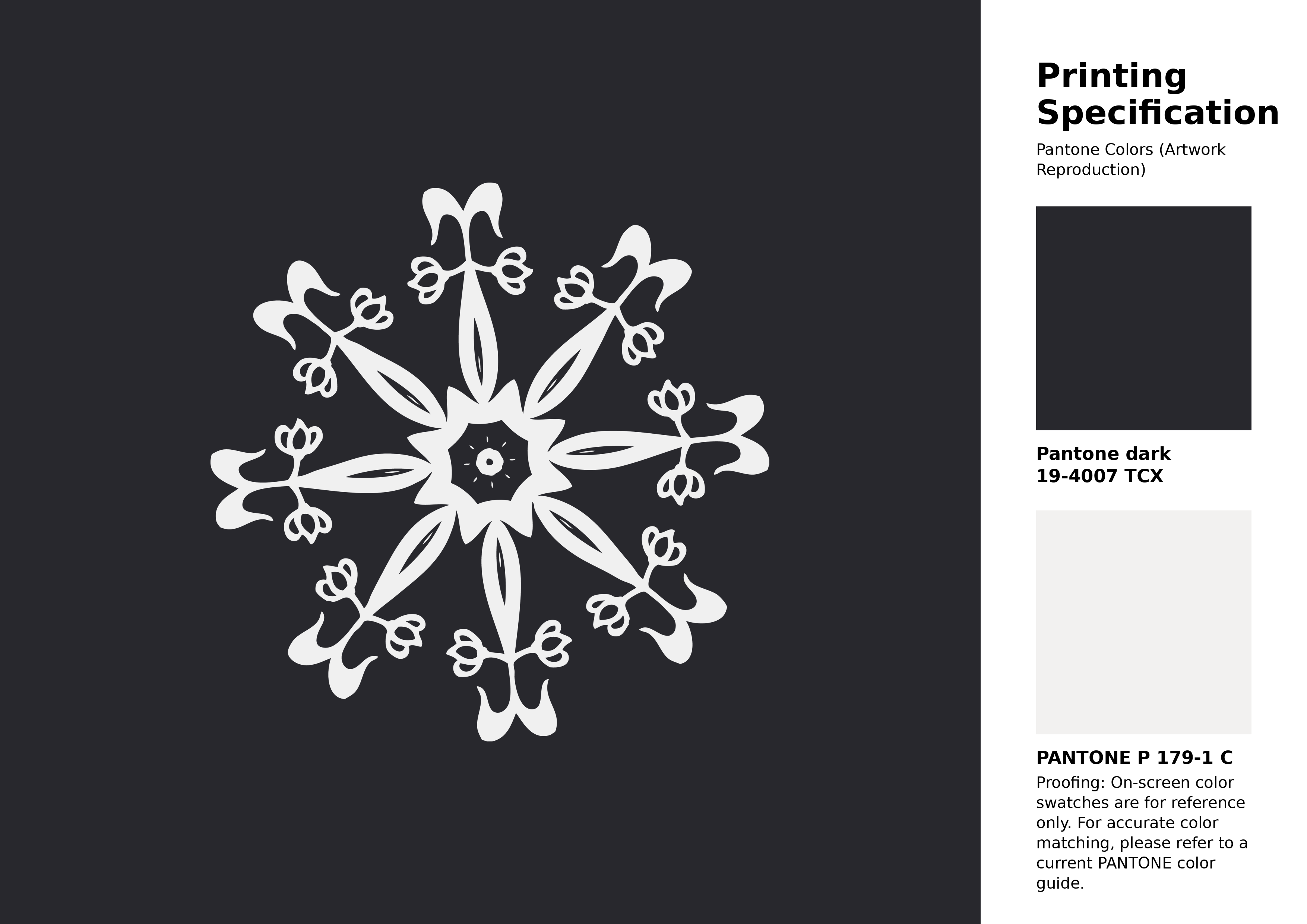
#28282d Pantone 19-4007 Tcx Anthracite Color | Hex color Code #28282d Artwork Image (PNG)
Download Artwork (PNG)#28282d Pantone 19-4007 Tcx Anthracite Color | Hex color Code #28282d Artwork Vector (PDF)
Download Artwork (PDF)#28282d Pantone 19-4007 Tcx Anthracite Color | Hex color Code #28282d Artwork Vector (SVG)
Download Artwork (SVG)
#28282d Pantone 19-4007 Tcx Anthracite Color | Hex color Code #28282d Pantone Swatch Artwork
Download Artwork Swatch
#28282d Pantone 19-4007 Tcx Anthracite Color | Hex color Code #28282d Gradient Artwork (PNG)
Download Gradient (PNG)#28282d Pantone 19-4007 Tcx Anthracite Color | Hex color Code #28282d Gradient Artwork (SVG)
Download Gradient (SVG)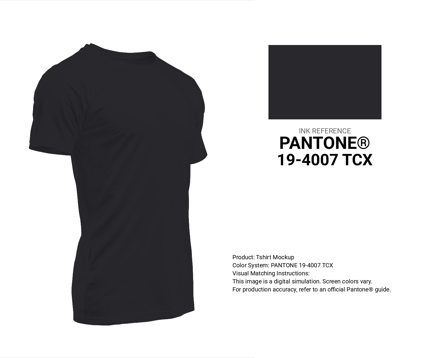
#28282d Pantone 19-4007 Tcx Anthracite Color | Hex color Code #28282d T-Shirt Mockup
Download T-Shirt Mockup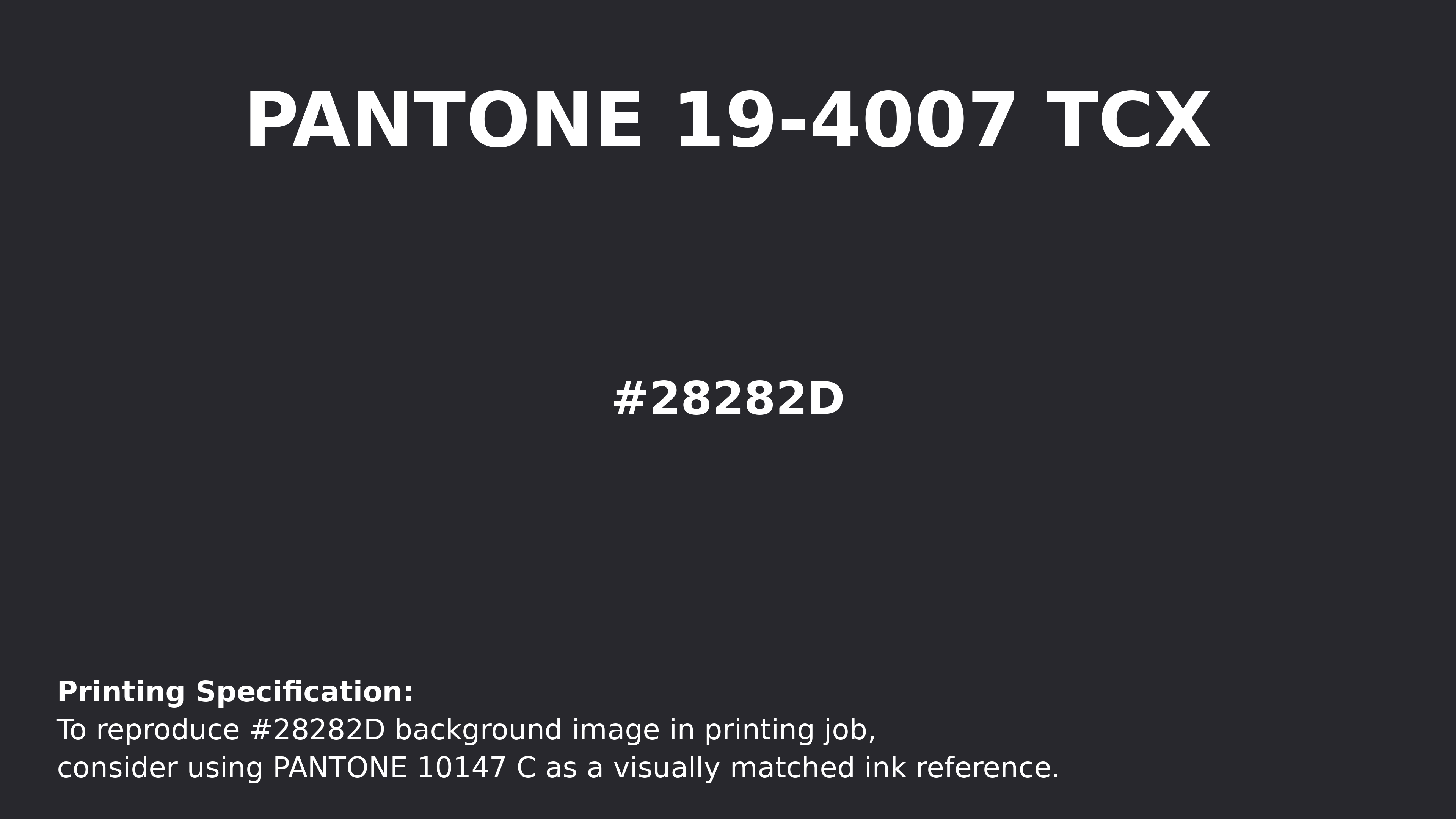
#28282d Pantone 19-4007 Tcx Anthracite Color | Hex color Code #28282d Printing Artwork Pantone Reference
Download Pantone Printing Reference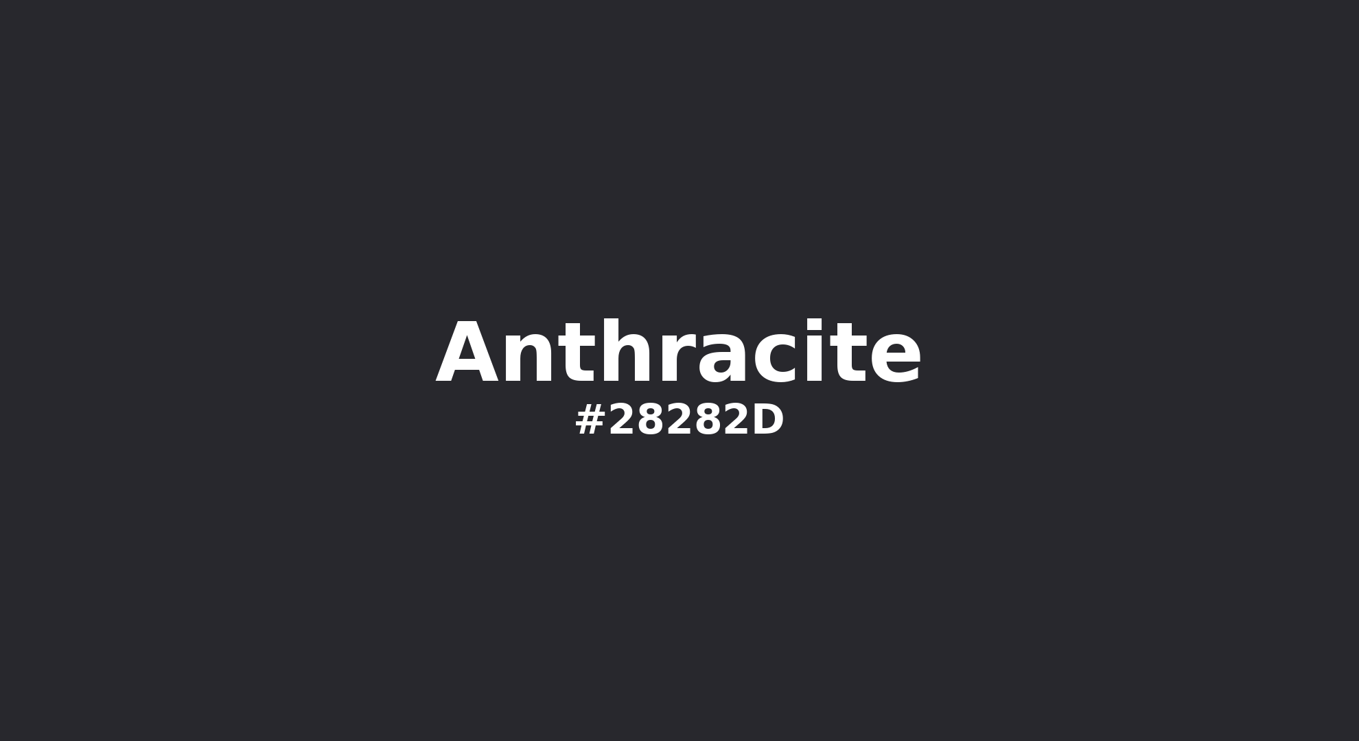
Anthracite - #28282d Color Name
Download Color NameRelated Color Palettes
- Dark Gray and Silver •
- Dim Gray and Dark Gray •
- Dark Gray and Light Blue •
- Dark Gray and Midnight Blue •
- Dark Gray •
- Dark Gray and Dark Gray •
- Black and Dark Gray •
- Dark Gray and Light Steel Blue •
- Light Gray and Dark Gray •
- Dark Gray and Light Slate Gray •
- Dark Gray and Dim Gray •
- Powder Blue and Dark Gray •
- Dark Gray and Linen •
- Dark Gray and Light Gray •
- Dark Gray and Yellow Green
Color Palette Collection

26 Pastel Color Schemes
26 color palettes with 130 colors.

49 Green Color Combinations
49 color palettes with 245 colors.
Home vibes
1 color palettes with 5 colors.
Summer Beach Vibes
1 color palettes with 5 colors.