#205C40 Color
Your all-in-one color resource. Download hex background images, Adobe swatches (ASE), PDF color sheets, and SVG files. Explore palettes, harmonies, accessibility, conversions, and professional exports — designed for designers, developers, and color perfectionists.
#205C40 is a deep, muted green, reminiscent of a lush forest canopy. The color's subdued tones evoke a sense of calm and groundedness, suggesting stability and connection to nature. It conjures images of dense woodland, dappled sunlight filtering through leaves, and the quiet stillness of a forest floor. The emotional impact is one of tranquility and serenity, a sense of peace and security. The mood it creates is contemplative and introspective, promoting relaxation and focus. In design, it works well in spaces intended for relaxation or concentration a study, a meditation room, or even a calming bedroom. It represents natural growth, resilience, and renewal. It lacks the vibrancy associated with spring greens, instead conveying a more mature, seasoned sense of nature's enduring power. Visually matched named color: Forest Canopy.
PANTONE 554 C
Choose Color
Selected Color
Recent Colors
Color Details
Similar Ink Alternatives for #205C40 color Alternative print inks for reproducing #205C40 background image with a similar visual appearance.
Disclaimer: The visually matched ink reference is an independent approximation intended as a guide only. Please be advised that this pantone colors is only intended as a guide, Actual colours will depend on screen calibration variances. The print ink suggestions provided are independent visual approximations and are not affiliated with or endorsed by Pantone LLC. For official color specifications, conversion factors, and comprehensive color system information, please visit Pantone Connect. Official Pantone products can be purchased at pantone.com.
Color Previews for #000000 See how this color looks as a background or as text.
Complete Guide to Your Color Laboratory
Everything you need to know about this professional color toolkit.
Use the Color Picker at the top to select any color. All modules below update instantly.
Workflow: Pick a color → Explore palettes & data → Download what you need (PDF, Image, or Adobe ASE).
Color Details — Your color in all formats: HEX, RGB, RGBA, HSL, HSLA, HSV, CMYK, CIELab, Hunter-Lab, XYZ, Yxy, YUV. One-click copy.
Color Psychology — Emotional impact, cultural meanings, physiological effects, branding applications, and historical significance.
Named Colors — Find official color names (HTML/CSS, Pantone) that match your selection with similarity percentages.
Light & Dark Shades
80-step gradient from black to white. Perfect for button states and component systems.
Tints
Color mixed with white → lighter, pastel variations for backgrounds and disabled states.
Monochromatic — 11 curated tints/shades from one color. Production-ready for design systems.
- Complementary — Opposite on wheel (180°). High contrast.
- Analogous — Neighbors (±30°). Harmonious flow.
- Triadic — Three colors (120° apart). Vibrant, balanced.
- Split-Complementary — Base + two near-complements. Softer contrast.
- Tetradic/Square — Four colors. Complex, maximum variety.
- Neutral — Desaturated versions. Subtle, sophisticated.
15 Professional Variations — Monochromatic, Analogous, Complementary, Warm/Cool/Earth Tones, Pastel, Vibrant, High Contrast, and more.
Color Infusion — 10 palettes showing your color morphing into each major hue. Find bridge colors.
Similar Colors — 60+ colors generated via CIELAB Delta E matching. Unexpected harmonious combinations.
18 Ready-to-Use Gradients — Complementary, Analogous, Triadic, Tint/Shade progressions, and more.
Downloads: PNG (2560×1440), CSS (production-ready code), SVG (scalable vector).
WCAG Contrast Checker — Tests your color against white, black, and custom colors for AA (4.5:1) and AAA (7:1) compliance. Large text thresholds included.
Harmony & Accessibility Guide — Tests against 10 canonical hues. Shows which pairs are both beautiful AND WCAG-compliant for text.
PNG/JPG — High-res images for presentations and mood boards.
PDF — Print-ready reports for clients and teams.
Adobe ASE — Direct import to Photoshop, Illustrator, InDesign, XD.
CSS/SVG — Gradients only. Production-ready code and vectors.
Color Science: Industry-standard conversions (HSL, CIELAB, CMYK, XYZ). WCAG 2.1 luminance formula. Delta E (ΔE76) for perceptual matching.
Direct Links: Share colors via icolorpalette.com/color/ff5733 or icolorpalette.com/color/red
Issues? Refresh the page, wait for rendering, try another browser, or check console (F12) for errors.
Printing Guide for #205c40 Background Image
Use PANTONE 554 C as a visually matched ink reference when printing this background image.
To print the #205c40 background image from our site, consider using PANTONE 554 C as a visually matched ink reference.
Download the background image, then provide this reference code to your print vendor to help achieve accurate color reproduction.
The visually matched ink reference for the #205c40 background image is PANTONE 554 C.
This color is commonly described as Forest Canopy.
#205C40 is a deep, muted green, reminiscent of a lush forest canopy. The color's subdued tones evoke a sense of calm and groundedness, suggesting stability and connection to nature. It conjures images of dense woodland, dappled sunlight filtering through leaves, and the quiet stillness of a forest floor. The emotional impact is one of tranquility and serenity, a sense of peace and security. The mood it creates is contemplative and introspective, promoting relaxation and focus. In design, it works well in spaces intended for relaxation or concentration a study, a meditation room, or even a calming bedroom. It represents natural growth, resilience, and renewal. It lacks the vibrancy associated with spring greens, instead conveying a more mature, seasoned sense of nature's enduring power.
We provide PANTONE 554 C as a visually matched ink reference to help you reproduce the #205c40 background image accurately in professional printing.
This reference code helps print vendors achieve consistent color output across different printing equipment and materials.
After downloading the #205c40 background image from our site:
- Include the visually matched ink reference PANTONE 554 C in your print order notes
- Inform your print vendor that this is your target color reference
- Request a proof print to verify the Forest Canopy color appearance before full production
The #205c40 background image with PANTONE 554 C as visually matched ink reference can be used for:
- Posters, banners, and backdrops
- Business cards, brochures, and flyers
- Packaging, labels, and stickers
- Signage and promotional materials
This is an independent visual approximation.
While PANTONE 554 C closely matches the #205c40 background image color, variations may exist between screen display and printed output.
We recommend requesting a proof print to verify the final appearance.
#205C40 is a deep, muted green, reminiscent of a lush forest canopy. The color's subdued tones evoke a sense of calm and groundedness, suggesting stability and connection to nature. It conjures images of dense woodland, dappled sunlight filtering through leaves, and the quiet stillness of a forest floor. The emotional impact is one of tranquility and serenity, a sense of peace and security. The mood it creates is contemplative and introspective, promoting relaxation and focus. In design, it works well in spaces intended for relaxation or concentration a study, a meditation room, or even a calming bedroom. It represents natural growth, resilience, and renewal. It lacks the vibrancy associated with spring greens, instead conveying a more mature, seasoned sense of nature's enduring power.
Understanding these associations helps ensure the #205c40 background image aligns with your intended message and brand impact.
Important Information
The visually matched ink reference is an independent approximation intended as a guide only.
Actual printed colors may vary depending on screen calibration, substrate material, ink type, and printing equipment used.
For official color specifications and certified color standards, visit Pantone Connect.
Official color guides and swatch books can be purchased from pantone.com.
Pantone 554 C Color: Verdant Green | #205C40
Introduction:
Verdant Green, also known as Pantone 554 C, is a color that embodies lusciousness and freshness. Its deep green hue with hints of blue evokes a sense of nature and tranquility.
Historical Significance:
Verdant Green has been prominently used throughout history in various cultural and artistic contexts. It has been a symbol of rebirth and growth, often associated with spring and renewal. Notable moments where Verdant Green played a significant role include Renaissance paintings depicting lush landscapes and the use of this color in traditional Japanese art.
Symbolism and Meaning:
Verdant Green symbolizes harmony, balance, and abundance. In many cultures, it represents the natural world and is associated with fertility, prosperity, and good luck. The color also suggests a sense of freshness, new beginnings, and a connection to the earth.
Verdant Green in Fashion:
Verdant Green has a strong presence in the world of fashion. It is often used to create vibrant and eye-catching looks, especially during the spring and summer seasons. It works well as a statement color or as a neutral base for other bold colors and patterns. Designers often incorporate this shade into their collections to add a touch of nature-inspired elegance.
Verdant Green in Graphic Design:
Verdant Green holds significance in graphic design, particularly in conveying a sense of freshness, eco-friendliness, and health. It is commonly used in branding related to organic and sustainable products. This color choice helps create a visual impact that aligns with concepts of nature and well-being.
Color Combinations:
Verdant Green pairs well with complementary colors such as warm earthy tones like beige and brown. It also works harmoniously with lighter shades of green, blues, and purples. Additionally, it can create contrast when paired with vibrant colors like yellow or red.
Nature’s Palette:
Verdant Green is a color commonly found in nature. It can be seen in lush forests, verdant fields, and vibrant foliage. Many flowers, such as ferns or tropical plants, showcase this deep green shade. It is also representative of various fauna, including certain reptiles, frogs, and birds.
Artistic Representations:
Verdant Green has been used in various forms of art throughout history. It has been a popular choice for landscape paintings, as it captures the essence of nature and the beauty of verdant scenes. Artists often utilize this color to depict tranquility and serenity.
Movies and Cinematic Landscapes:
Verdant Green is often incorporated into movies and cinematic landscapes to create a sense of calm and tranquility. It can be found in scenes depicting lush forests, peaceful meadows, and serene natural environments. This color helps set the tone and mood of a scene.
Products and Commercial Appeal:
Verdant Green is commonly associated with natural and organic products. It is often utilized in branding to convey a sense of health, freshness, and environmental consciousness. Many cosmetic, skincare, and food brands incorporate this color to enhance their products' appeal.
National Symbols and Significance:
While Verdant Green does not have direct national or cultural significance tied to it, its representation of nature and growth resonates with various cultures worldwide. It symbolizes the importance of environmental preservation and a connection to the earth.
The Psychological and Emotional Impact:
Verdant Green has a calming and soothing effect on emotions. It promotes a sense of relaxation, harmony, and balance. This color encourages feelings of renewal and growth, fostering a refreshing and positive mindset.
Conclusion:
Verdant Green, represented by Pantone 554 C, holds a deep historical and cultural significance. Its association with nature, tranquility, and abundance gives it a timeless appeal. This color influences various aspects of design, including fashion, graphic design, and branding. With its calming and refreshing qualities, Verdant Green continues to captivate and inspire.
Pantone 554 C Color | Hex color Code #205c40 Image & Artwork
Download high-quality assets for your projects.

#205c40 Color Schemes
Download Color Schemes
#205c40 Color Shades
Download Color Shades
Pantone 554 C Color | Hex color Code #205c40 Solid Color Background
Download Solid Color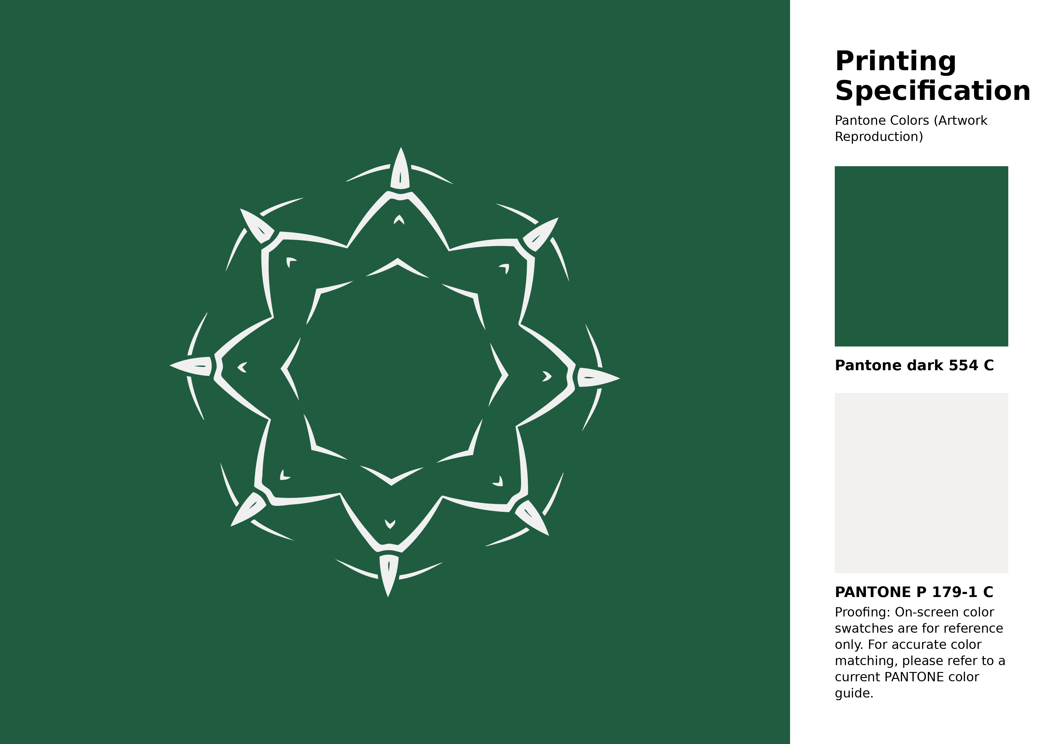
#205c40 Pantone 554 C Color | Hex color Code #205c40 Artwork Image (PNG)
Download Artwork (PNG)#205c40 Pantone 554 C Color | Hex color Code #205c40 Artwork Vector (PDF)
Download Artwork (PDF)#205c40 Pantone 554 C Color | Hex color Code #205c40 Artwork Vector (SVG)
Download Artwork (SVG)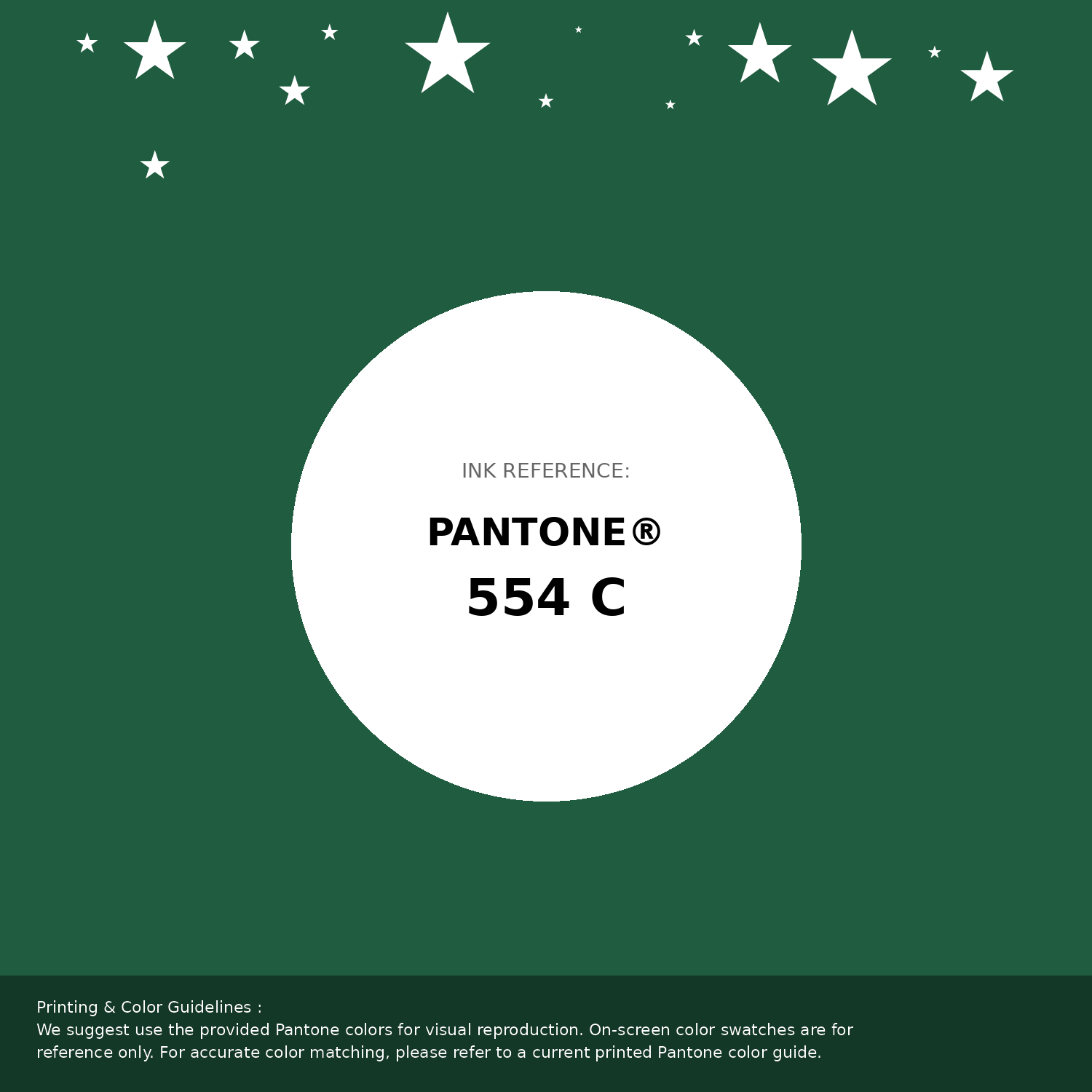
#205c40 Pantone 554 C Color | Hex color Code #205c40 Pantone Swatch Artwork
Download Artwork Swatch
#205c40 Pantone 554 C Color | Hex color Code #205c40 Gradient Artwork (PNG)
Download Gradient (PNG)#205c40 Pantone 554 C Color | Hex color Code #205c40 Gradient Artwork (SVG)
Download Gradient (SVG)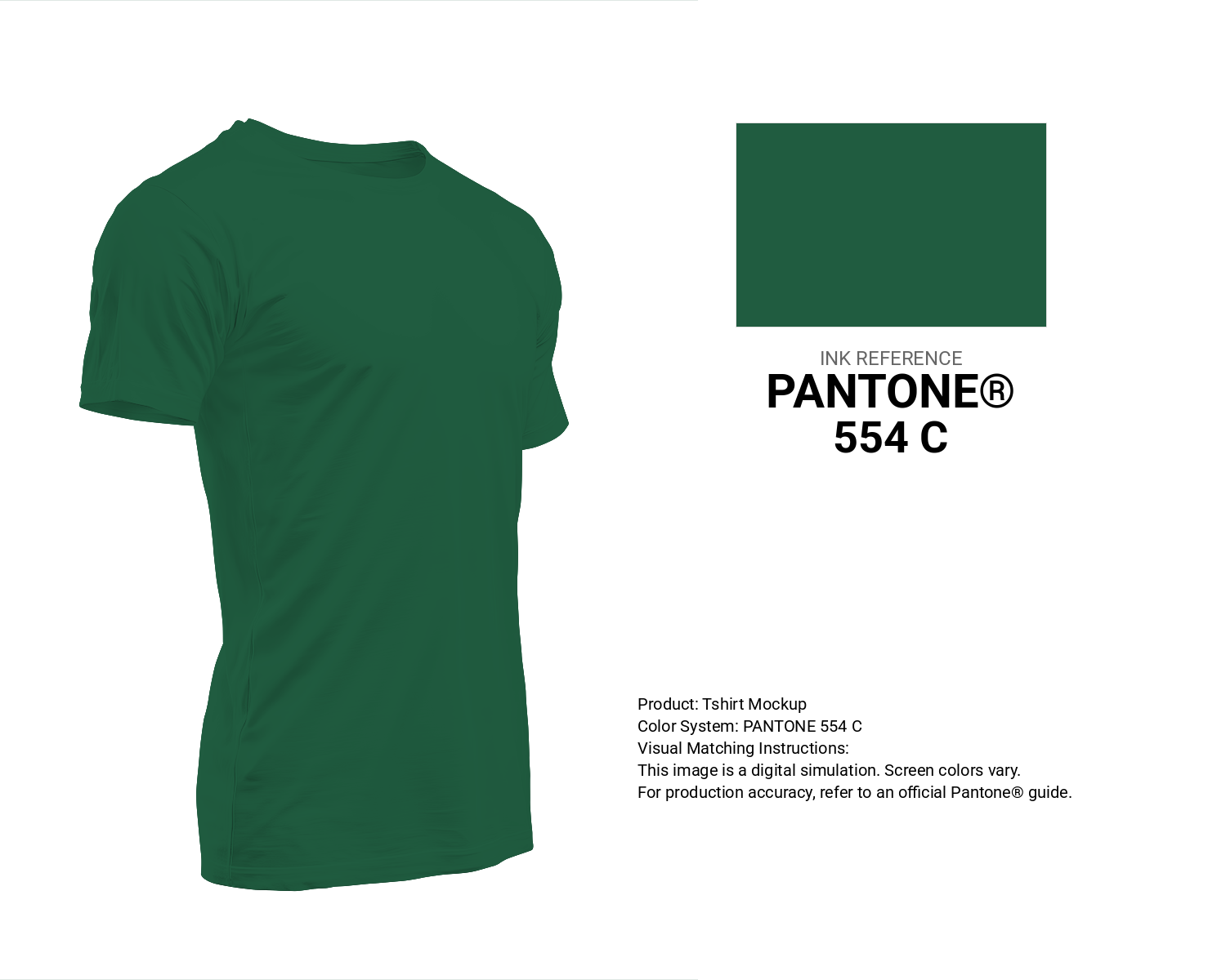
#205c40 Pantone 554 C Color | Hex color Code #205c40 T-Shirt Mockup
Download T-Shirt Mockup
#205c40 Pantone 554 C Color | Hex color Code #205c40 Printing Artwork Pantone Reference
Download Pantone Printing ReferenceRelated Color Palettes
- Dark Gray and Sienna •
- Peru and Dark Gray •
- Dark Gray / smoked •
- Dark Gray and Dim Gray •
- Olive Drab and Dark Gray •
- Dark Slate Blue and Dark Gray •
- Dark Salmon and Dark Gray •
- Dark Gray and Fire Brick •
- Dark Gray and Dark Slate Blue •
- Dark Gray and Tan •
- Crimson and Dark Gray •
- Dark Gray and Linen •
- Dark Olive Green and Dark Gray •
- Dark Gray and Dark Green •
- Beige and Dark Gray
Color Palette Collection

500+ Popular Color Palette Collection
501 color palettes with 2505 colors.
21 Pastel Yellow Color Schemes
21 color palettes with 105 colors.

Summer Color Palettes
28 color palettes with 140 colors.

50 Red color palettes
50 color palettes with 250 colors.