#151F6D Color
Your all-in-one color resource. Download hex background images, Adobe swatches (ASE), PDF color sheets, and SVG files. Explore palettes, harmonies, accessibility, conversions, and professional exports — designed for designers, developers, and color perfectionists.
This deep, saturated blue, #151F6D, evokes a sense of profound mystery and quiet authority. It plunges the viewer into the depths, reminiscent of the twilight ocean or the vast expanse of the night sky just after sunset. The emotional impact is one of introspection, contemplation, and perhaps a hint of melancholy. It feels both regal and reserved, fostering a mood of sophistication and understated elegance. It might be associated with formal attire, expensive jewelry, or the quiet reverence of a dimly lit library. In design, it could be employed to create a sense of luxury and depth, ideal for accent walls, sophisticated websites, or branding that aims for trustworthiness and a touch of the dramatic. Culturally, this shade often symbolizes wisdom, stability, and the enduring power of the night. Visually matched named color: Dark Sapphire Depths.
PANTONE 2756 C
Choose Color
Selected Color
Recent Colors
Color Details
Similar Ink Alternatives for #151F6D color Alternative print inks for reproducing #151F6D background image with a similar visual appearance.
Disclaimer: The visually matched ink reference is an independent approximation intended as a guide only. Please be advised that this pantone colors is only intended as a guide, Actual colours will depend on screen calibration variances. The print ink suggestions provided are independent visual approximations and are not affiliated with or endorsed by Pantone LLC. For official color specifications, conversion factors, and comprehensive color system information, please visit Pantone Connect. Official Pantone products can be purchased at pantone.com.
Color Previews for #000000 See how this color looks as a background or as text.
Complete Guide to Your Color Laboratory
Everything you need to know about this professional color toolkit.
Use the Color Picker at the top to select any color. All modules below update instantly.
Workflow: Pick a color → Explore palettes & data → Download what you need (PDF, Image, or Adobe ASE).
Color Details — Your color in all formats: HEX, RGB, RGBA, HSL, HSLA, HSV, CMYK, CIELab, Hunter-Lab, XYZ, Yxy, YUV. One-click copy.
Color Psychology — Emotional impact, cultural meanings, physiological effects, branding applications, and historical significance.
Named Colors — Find official color names (HTML/CSS, Pantone) that match your selection with similarity percentages.
Light & Dark Shades
80-step gradient from black to white. Perfect for button states and component systems.
Tints
Color mixed with white → lighter, pastel variations for backgrounds and disabled states.
Monochromatic — 11 curated tints/shades from one color. Production-ready for design systems.
- Complementary — Opposite on wheel (180°). High contrast.
- Analogous — Neighbors (±30°). Harmonious flow.
- Triadic — Three colors (120° apart). Vibrant, balanced.
- Split-Complementary — Base + two near-complements. Softer contrast.
- Tetradic/Square — Four colors. Complex, maximum variety.
- Neutral — Desaturated versions. Subtle, sophisticated.
15 Professional Variations — Monochromatic, Analogous, Complementary, Warm/Cool/Earth Tones, Pastel, Vibrant, High Contrast, and more.
Color Infusion — 10 palettes showing your color morphing into each major hue. Find bridge colors.
Similar Colors — 60+ colors generated via CIELAB Delta E matching. Unexpected harmonious combinations.
18 Ready-to-Use Gradients — Complementary, Analogous, Triadic, Tint/Shade progressions, and more.
Downloads: PNG (2560×1440), CSS (production-ready code), SVG (scalable vector).
WCAG Contrast Checker — Tests your color against white, black, and custom colors for AA (4.5:1) and AAA (7:1) compliance. Large text thresholds included.
Harmony & Accessibility Guide — Tests against 10 canonical hues. Shows which pairs are both beautiful AND WCAG-compliant for text.
PNG/JPG — High-res images for presentations and mood boards.
PDF — Print-ready reports for clients and teams.
Adobe ASE — Direct import to Photoshop, Illustrator, InDesign, XD.
CSS/SVG — Gradients only. Production-ready code and vectors.
Color Science: Industry-standard conversions (HSL, CIELAB, CMYK, XYZ). WCAG 2.1 luminance formula. Delta E (ΔE76) for perceptual matching.
Direct Links: Share colors via icolorpalette.com/color/ff5733 or icolorpalette.com/color/red
Issues? Refresh the page, wait for rendering, try another browser, or check console (F12) for errors.
Printing Guide for #151f6d Background Image
Use PANTONE 2756 C as a visually matched ink reference when printing this background image.
To print the #151f6d background image from our site, consider using PANTONE 2756 C as a visually matched ink reference.
Download the background image, then provide this reference code to your print vendor to help achieve accurate color reproduction.
The visually matched ink reference for the #151f6d background image is PANTONE 2756 C.
This color is commonly described as Dark Sapphire Depths.
This deep, saturated blue, #151F6D, evokes a sense of profound mystery and quiet authority. It plunges the viewer into the depths, reminiscent of the twilight ocean or the vast expanse of the night sky just after sunset. The emotional impact is one of introspection, contemplation, and perhaps a hint of melancholy. It feels both regal and reserved, fostering a mood of sophistication and understated elegance. It might be associated with formal attire, expensive jewelry, or the quiet reverence of a dimly lit library. In design, it could be employed to create a sense of luxury and depth, ideal for accent walls, sophisticated websites, or branding that aims for trustworthiness and a touch of the dramatic. Culturally, this shade often symbolizes wisdom, stability, and the enduring power of the night.
We provide PANTONE 2756 C as a visually matched ink reference to help you reproduce the #151f6d background image accurately in professional printing.
This reference code helps print vendors achieve consistent color output across different printing equipment and materials.
After downloading the #151f6d background image from our site:
- Include the visually matched ink reference PANTONE 2756 C in your print order notes
- Inform your print vendor that this is your target color reference
- Request a proof print to verify the Dark Sapphire Depths color appearance before full production
The #151f6d background image with PANTONE 2756 C as visually matched ink reference can be used for:
- Posters, banners, and backdrops
- Business cards, brochures, and flyers
- Packaging, labels, and stickers
- Signage and promotional materials
This is an independent visual approximation.
While PANTONE 2756 C closely matches the #151f6d background image color, variations may exist between screen display and printed output.
We recommend requesting a proof print to verify the final appearance.
This deep, saturated blue, #151F6D, evokes a sense of profound mystery and quiet authority. It plunges the viewer into the depths, reminiscent of the twilight ocean or the vast expanse of the night sky just after sunset. The emotional impact is one of introspection, contemplation, and perhaps a hint of melancholy. It feels both regal and reserved, fostering a mood of sophistication and understated elegance. It might be associated with formal attire, expensive jewelry, or the quiet reverence of a dimly lit library. In design, it could be employed to create a sense of luxury and depth, ideal for accent walls, sophisticated websites, or branding that aims for trustworthiness and a touch of the dramatic. Culturally, this shade often symbolizes wisdom, stability, and the enduring power of the night.
Understanding these associations helps ensure the #151f6d background image aligns with your intended message and brand impact.
Important Information
The visually matched ink reference is an independent approximation intended as a guide only.
Actual printed colors may vary depending on screen calibration, substrate material, ink type, and printing equipment used.
For official color specifications and certified color standards, visit Pantone Connect.
Official color guides and swatch books can be purchased from pantone.com.
Pantone 2756 C Color: Indigo | #151F6D
Introduction:
Indigo is a deep blue color that exudes a sense of mystery and sophistication. Its rich hue has a captivating visual appeal that makes it stand out.
Historical Significance:
Throughout history, indigo has played a significant role. It was once a prized natural dye and was used prominently in textiles and clothing. Indigo was also associated with nobility and luxury during certain periods.
Symbolism and Meaning:
Indigo typically symbolizes intuition, spirituality, and deep inner knowledge. It is often associated with wisdom, mysticism, and the search for truth.
Indigo in Fashion:
Indigo has a strong influence on styles and trends in the fashion world. It is often used in denim and is a popular color for a variety of clothing designs.
Indigo in Graphic Design:
Indigo holds significance in design aesthetics and branding. It is known for its visual impact and is often used to convey sophistication and elegance.
Color Combinations:
Indigo can be combined with a range of colors to create beautiful color palettes. Some potential combinations include indigo and gold, indigo and silver, and indigo and white.
Nature’s Palette:
Indigo can be found in the natural world in various forms. It can be seen in flowers like the iris, or in the vibrant plumage of certain birds. Additionally, indigo can be found in the deep blue hues of the ocean and the evening sky.
Artistic Representations:
Indigo has been used by artists in various forms of art throughout history. It has been featured in paintings, sculptures, and textile arts, showcasing its versatility and timeless appeal.
Movies and Cinematic Landscapes:
Indigo is often used in movies and cinematic scenes to set a specific tone or mood. It can be seen in atmospheric and dramatic settings, creating a sense of depth and intensity.
Products and Commercial Appeal:
Indigo is associated with popular products and brands that aim to portray a sense of sophistication and quality. It is commonly used in branding for luxury items, cosmetics, and high-end fashion.
National Symbols and Significance:
Indigo holds cultural significance in certain countries and is often used in national symbols and flags. It represents qualities such as integrity, devotion, and patriotism.
The Psychological and Emotional Impact:
Indigo has a psychological and emotional impact, often evoking feelings of calmness, introspection, and deep focus. It can also stimulate creativity and inspire a sense of spirituality.
Conclusion:
Indigo is a color that has stood the test of time. Its historical relevance, symbolism, and timeless appeal make it a captivating choice in various contexts. From fashion to graphic design, indigo continues to leave a lasting impression.
Pantone 2756 C Color | Hex color Code #151f6d Image & Artwork
Download high-quality assets for your projects.

#151f6d Color Schemes
Download Color Schemes
#151f6d Color Shades
Download Color Shades
Pantone 2756 C Color | Hex color Code #151f6d Solid Color Background
Download Solid Color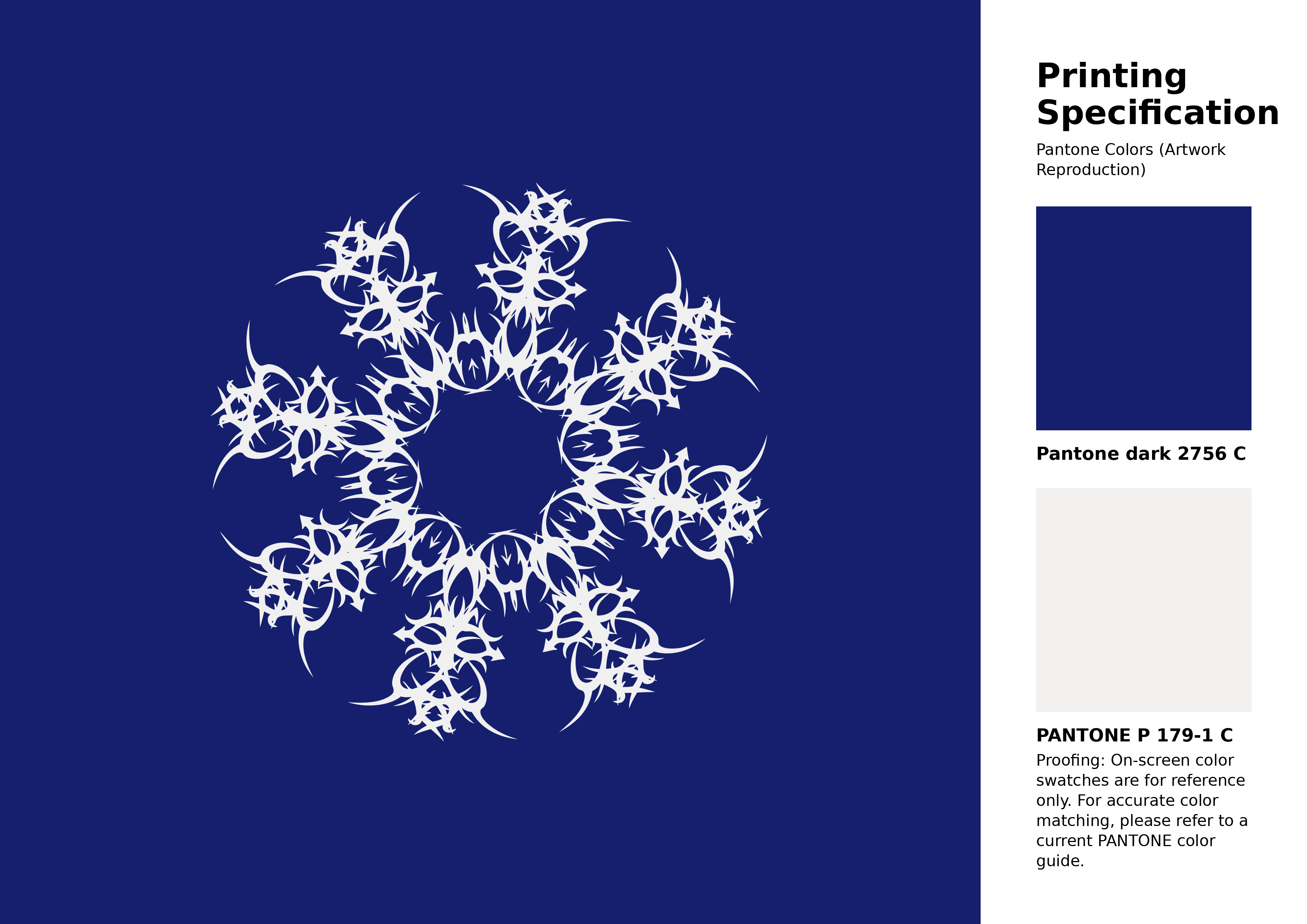
#151f6d Pantone 2756 C Color | Hex color Code #151f6d Artwork Image (PNG)
Download Artwork (PNG)#151f6d Pantone 2756 C Color | Hex color Code #151f6d Artwork Vector (PDF)
Download Artwork (PDF)#151f6d Pantone 2756 C Color | Hex color Code #151f6d Artwork Vector (SVG)
Download Artwork (SVG)
#151f6d Pantone 2756 C Color | Hex color Code #151f6d Pantone Swatch Artwork
Download Artwork Swatch
#151f6d Pantone 2756 C Color | Hex color Code #151f6d Gradient Artwork (PNG)
Download Gradient (PNG)#151f6d Pantone 2756 C Color | Hex color Code #151f6d Gradient Artwork (SVG)
Download Gradient (SVG)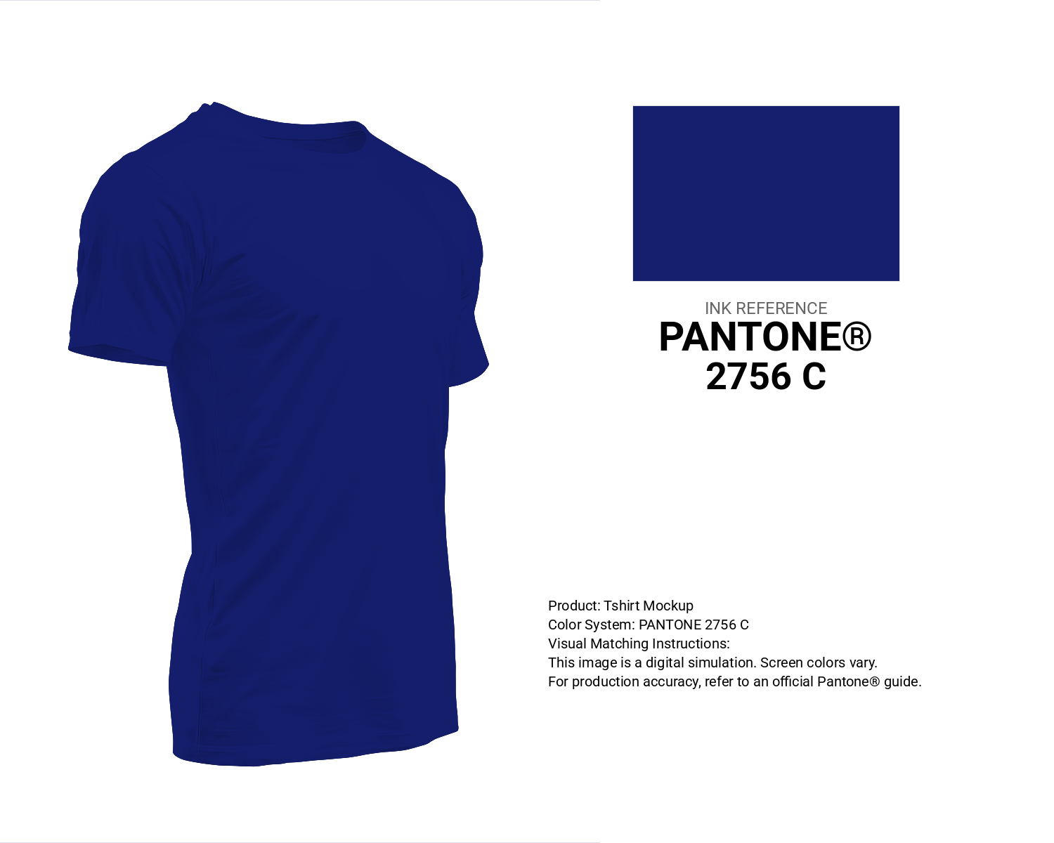
#151f6d Pantone 2756 C Color | Hex color Code #151f6d T-Shirt Mockup
Download T-Shirt Mockup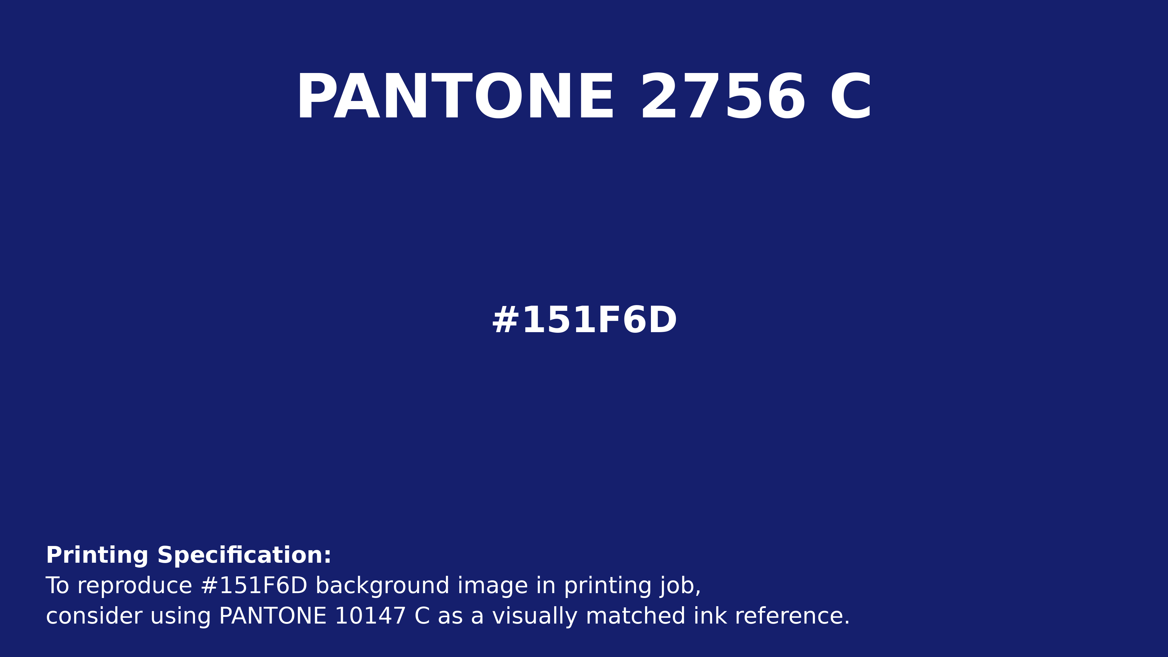
#151f6d Pantone 2756 C Color | Hex color Code #151f6d Printing Artwork Pantone Reference
Download Pantone Printing ReferenceRelated Color Palettes
- Dark Goldenrod and Dark Gray •
- Dark Gray and Rosy Brown •
- Gray and Dark Gray •
- Dark Gray and Dark Slate Blue •
- Dark Gray and Sienna •
- Dark Olive Green and Dark Gray •
- Dark Gray and Light Blue •
- Dark Gray and Slate Gray •
- Chocolate and Dark Gray •
- Light Gray and Dark Gray •
- Fire Brick and Dark Gray •
- Dark Gray and Burly Wood •
- Dark Gray and Dim Gray •
- Powder Blue and Dark Gray •
- SkyBlue and Dark Gray
Color Palette Collection

29 Pink Color Palettes for your next design project
29 color palettes with 145 colors.
46 Flower Inspired Color Schemes
46 color palettes with 230 colors.
17 Christmas Color Palettes Ideas
17 color palettes with 85 colors.

38 Beautiful Color Palettes
38 color palettes with 190 colors.