#0C2340 Color
Your all-in-one color resource. Download hex background images, Adobe swatches (ASE), PDF color sheets, and SVG files. Explore palettes, harmonies, accessibility, conversions, and professional exports — designed for designers, developers, and color perfectionists.
#0C2340 is a deep, dark blue-toned color that evokes a sense of mystery and quiet intensity. The muted, almost somber tone suggests the depths of the ocean, a place of both beauty and unknown dangers. It reminds one of twilight skies, shadowy caverns, or the unexplored depths of a vast sea. The color creates a mood of seriousness, contemplation, and perhaps even a touch of melancholy. In design, it could be used to create a sophisticated and refined atmosphere, perhaps in a study, library, or high-end menswear store. Its subdued nature lends itself to creating a sense of calm and focus, but its darkness also holds a certain power and intrigue. It avoids feeling cold due to the subtle presence of a dark teal. There's a hint of the unknown, reflecting the vastness and power of the ocean, making it both fascinating and slightly unsettling. Visually matched named color: Deep Sea Mystery.
PANTONE 289 C
Choose Color
Selected Color
Recent Colors
Color Details
Similar Ink Alternatives for #0C2340 color Alternative print inks for reproducing #0C2340 background image with a similar visual appearance.
Disclaimer: The visually matched ink reference is an independent approximation intended as a guide only. Please be advised that this pantone colors is only intended as a guide, Actual colours will depend on screen calibration variances. The print ink suggestions provided are independent visual approximations and are not affiliated with or endorsed by Pantone LLC. For official color specifications, conversion factors, and comprehensive color system information, please visit Pantone Connect. Official Pantone products can be purchased at pantone.com.
Color Previews for #000000 See how this color looks as a background or as text.
Complete Guide to Your Color Laboratory
Everything you need to know about this professional color toolkit.
Use the Color Picker at the top to select any color. All modules below update instantly.
Workflow: Pick a color → Explore palettes & data → Download what you need (PDF, Image, or Adobe ASE).
Color Details — Your color in all formats: HEX, RGB, RGBA, HSL, HSLA, HSV, CMYK, CIELab, Hunter-Lab, XYZ, Yxy, YUV. One-click copy.
Color Psychology — Emotional impact, cultural meanings, physiological effects, branding applications, and historical significance.
Named Colors — Find official color names (HTML/CSS, Pantone) that match your selection with similarity percentages.
Light & Dark Shades
80-step gradient from black to white. Perfect for button states and component systems.
Tints
Color mixed with white → lighter, pastel variations for backgrounds and disabled states.
Monochromatic — 11 curated tints/shades from one color. Production-ready for design systems.
- Complementary — Opposite on wheel (180°). High contrast.
- Analogous — Neighbors (±30°). Harmonious flow.
- Triadic — Three colors (120° apart). Vibrant, balanced.
- Split-Complementary — Base + two near-complements. Softer contrast.
- Tetradic/Square — Four colors. Complex, maximum variety.
- Neutral — Desaturated versions. Subtle, sophisticated.
15 Professional Variations — Monochromatic, Analogous, Complementary, Warm/Cool/Earth Tones, Pastel, Vibrant, High Contrast, and more.
Color Infusion — 10 palettes showing your color morphing into each major hue. Find bridge colors.
Similar Colors — 60+ colors generated via CIELAB Delta E matching. Unexpected harmonious combinations.
18 Ready-to-Use Gradients — Complementary, Analogous, Triadic, Tint/Shade progressions, and more.
Downloads: PNG (2560×1440), CSS (production-ready code), SVG (scalable vector).
WCAG Contrast Checker — Tests your color against white, black, and custom colors for AA (4.5:1) and AAA (7:1) compliance. Large text thresholds included.
Harmony & Accessibility Guide — Tests against 10 canonical hues. Shows which pairs are both beautiful AND WCAG-compliant for text.
PNG/JPG — High-res images for presentations and mood boards.
PDF — Print-ready reports for clients and teams.
Adobe ASE — Direct import to Photoshop, Illustrator, InDesign, XD.
CSS/SVG — Gradients only. Production-ready code and vectors.
Color Science: Industry-standard conversions (HSL, CIELAB, CMYK, XYZ). WCAG 2.1 luminance formula. Delta E (ΔE76) for perceptual matching.
Direct Links: Share colors via icolorpalette.com/color/ff5733 or icolorpalette.com/color/red
Issues? Refresh the page, wait for rendering, try another browser, or check console (F12) for errors.
Printing Guide for #0c2340 Background Image
Use PANTONE 289 C as a visually matched ink reference when printing this background image.
To print the #0c2340 background image from our site, consider using PANTONE 289 C as a visually matched ink reference.
Download the background image, then provide this reference code to your print vendor to help achieve accurate color reproduction.
The visually matched ink reference for the #0c2340 background image is PANTONE 289 C.
This color is commonly described as Deep Sea Mystery.
#0C2340 is a deep, dark blue-toned color that evokes a sense of mystery and quiet intensity. The muted, almost somber tone suggests the depths of the ocean, a place of both beauty and unknown dangers. It reminds one of twilight skies, shadowy caverns, or the unexplored depths of a vast sea. The color creates a mood of seriousness, contemplation, and perhaps even a touch of melancholy. In design, it could be used to create a sophisticated and refined atmosphere, perhaps in a study, library, or high-end menswear store. Its subdued nature lends itself to creating a sense of calm and focus, but its darkness also holds a certain power and intrigue. It avoids feeling cold due to the subtle presence of a dark teal. There's a hint of the unknown, reflecting the vastness and power of the ocean, making it both fascinating and slightly unsettling.
We provide PANTONE 289 C as a visually matched ink reference to help you reproduce the #0c2340 background image accurately in professional printing.
This reference code helps print vendors achieve consistent color output across different printing equipment and materials.
After downloading the #0c2340 background image from our site:
- Include the visually matched ink reference PANTONE 289 C in your print order notes
- Inform your print vendor that this is your target color reference
- Request a proof print to verify the Deep Sea Mystery color appearance before full production
The #0c2340 background image with PANTONE 289 C as visually matched ink reference can be used for:
- Posters, banners, and backdrops
- Business cards, brochures, and flyers
- Packaging, labels, and stickers
- Signage and promotional materials
This is an independent visual approximation.
While PANTONE 289 C closely matches the #0c2340 background image color, variations may exist between screen display and printed output.
We recommend requesting a proof print to verify the final appearance.
#0C2340 is a deep, dark blue-toned color that evokes a sense of mystery and quiet intensity. The muted, almost somber tone suggests the depths of the ocean, a place of both beauty and unknown dangers. It reminds one of twilight skies, shadowy caverns, or the unexplored depths of a vast sea. The color creates a mood of seriousness, contemplation, and perhaps even a touch of melancholy. In design, it could be used to create a sophisticated and refined atmosphere, perhaps in a study, library, or high-end menswear store. Its subdued nature lends itself to creating a sense of calm and focus, but its darkness also holds a certain power and intrigue. It avoids feeling cold due to the subtle presence of a dark teal. There's a hint of the unknown, reflecting the vastness and power of the ocean, making it both fascinating and slightly unsettling.
Understanding these associations helps ensure the #0c2340 background image aligns with your intended message and brand impact.
Important Information
The visually matched ink reference is an independent approximation intended as a guide only.
Actual printed colors may vary depending on screen calibration, substrate material, ink type, and printing equipment used.
For official color specifications and certified color standards, visit Pantone Connect.
Official color guides and swatch books can be purchased from pantone.com.
Pantone 289 C: Navy Blue | #0C2340
Introduction:
Navy Blue is a rich, deep shade of blue that exudes sophistication and elegance. Its dark hue conveys a sense of authority and seriousness, while its cool undertones evoke a calm and serene atmosphere.
Historical Significance:
The British Royal Navy: Navy Blue gained prominence through its association with the British Royal Navy, which traditionally used this color for their uniforms. This connection solidified the color's image as a symbol of strength and reliability.
Symbolism and Meaning:
Dependability and Trust: Navy Blue is often associated with qualities such as dependability, trustworthiness, and professionalism. It symbolizes stability and steadfastness, making it a popular choice in corporate branding and formal settings.
Navy Blue in Fashion:
Elegant and Timeless: In the world of fashion, Navy Blue is considered a classic color that never goes out of style. It is frequently used in formal attire, such as suits and evening gowns, as it adds a touch of sophistication and refinement.
Navy Blue in Graphic Design:
A Sense of Authority: Navy Blue is often used in graphic design to convey a sense of authority and professionalism. It is commonly seen in corporate logos and branding materials, as it promotes trust and reliability.
Color Combinations:
Harmonious Pairings: Navy Blue pairs well with a variety of colors. Some popular combinations include: - Navy Blue and white: A classic and timeless duo with a nautical theme. - Navy Blue and gold: Evokes a sense of luxury and opulence. - Navy Blue and silver: Creates a sleek and modern aesthetic.
Nature’s Palette:
Twilight Sky: Navy Blue is often seen in the natural world, particularly during dusk and twilight. It can be found in the deep blue hues of the evening sky, giving a sense of tranquility and calmness.
Artistic Representations:
Famous Paintings: Navy Blue has been used in various forms of art throughout history. It can be seen in notable paintings, such as "Starry Night" by Vincent van Gogh, adding depth and contrast to the composition.
Movies and Cinematic Landscapes:
The Dark Knight: The movie "The Dark Knight" prominently features Navy Blue tones to create a dark and brooding atmosphere. This color choice reinforces the film's serious and intense themes.
Products and Commercial Appeal:
Luxury Brands: Navy Blue is often associated with luxury products and high-end brands. It is frequently used in the packaging and branding of luxurious items such as watches, perfumes, and designer clothing.
National Symbols and Significance:
United States: Navy Blue is one of the colors featured in the flag of the United States. It represents vigilance, perseverance, and justice, making it an integral part of the country's national identity.
The Psychological and Emotional Impact:
Calming and Professional: Navy Blue has a calming effect on the mind and is often associated with feelings of trust, stability, and security. It is frequently used in professional settings to create a sense of professionalism and reliability.
Conclusion:
Navy Blue, also known as Pantone 289 C, is a timeless and versatile color with a rich history and symbolic significance. Its deep hue and cool undertones make it a popular choice in various industries, from fashion and graphic design to national symbolism. Navy Blue's association with trust, elegance, and authority ensures its continued relevance and appeal.
Pantone 289 C Color | Hex color Code #0c2340 Image & Artwork
Download high-quality assets for your projects.

#0c2340 Color Schemes
Download Color Schemes
#0c2340 Color Shades
Download Color Shades
Pantone 289 C Color | Hex color Code #0c2340 Solid Color Background
Download Solid Color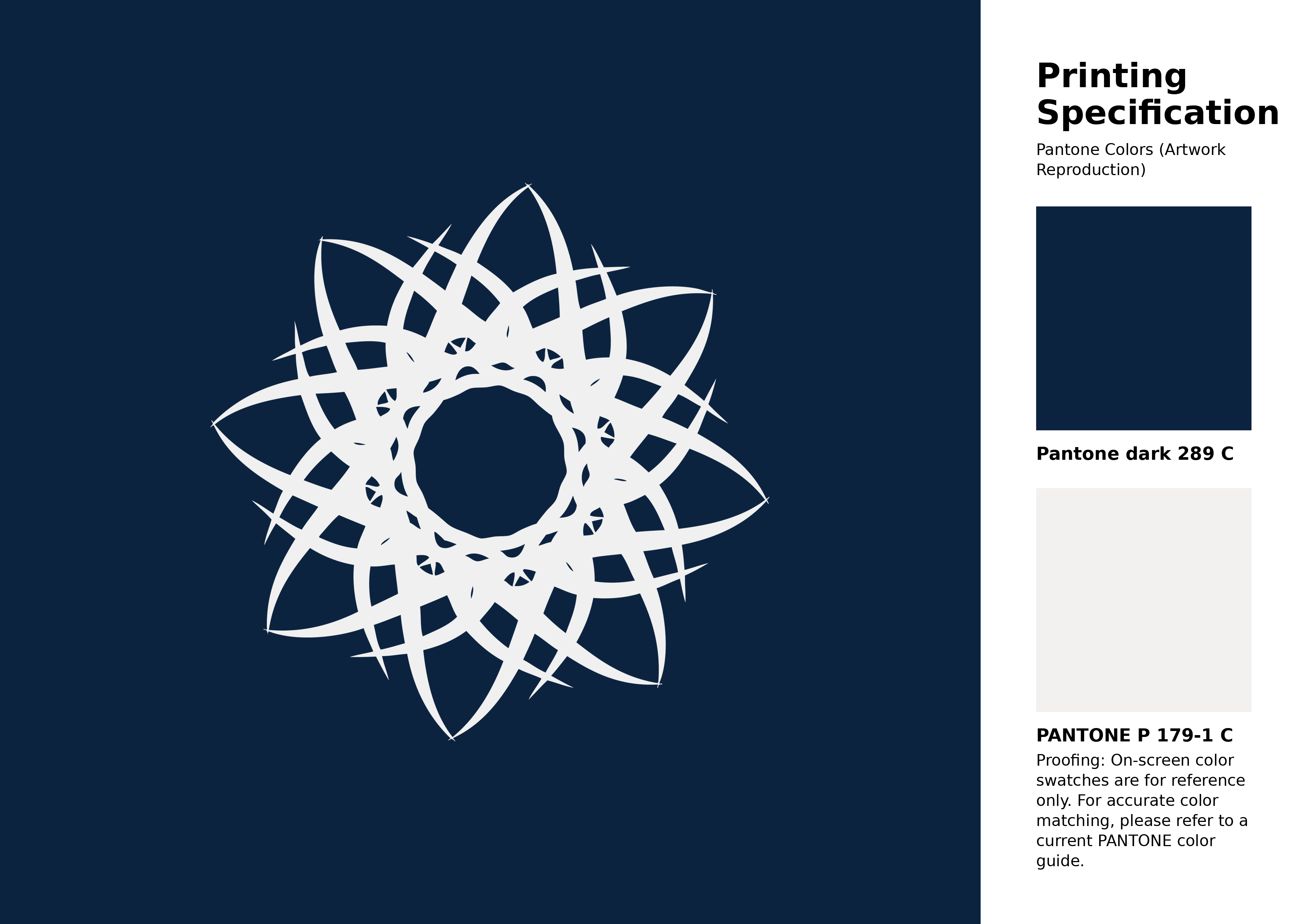
#0c2340 Pantone 289 C Color | Hex color Code #0c2340 Artwork Image (PNG)
Download Artwork (PNG)#0c2340 Pantone 289 C Color | Hex color Code #0c2340 Artwork Vector (PDF)
Download Artwork (PDF)#0c2340 Pantone 289 C Color | Hex color Code #0c2340 Artwork Vector (SVG)
Download Artwork (SVG)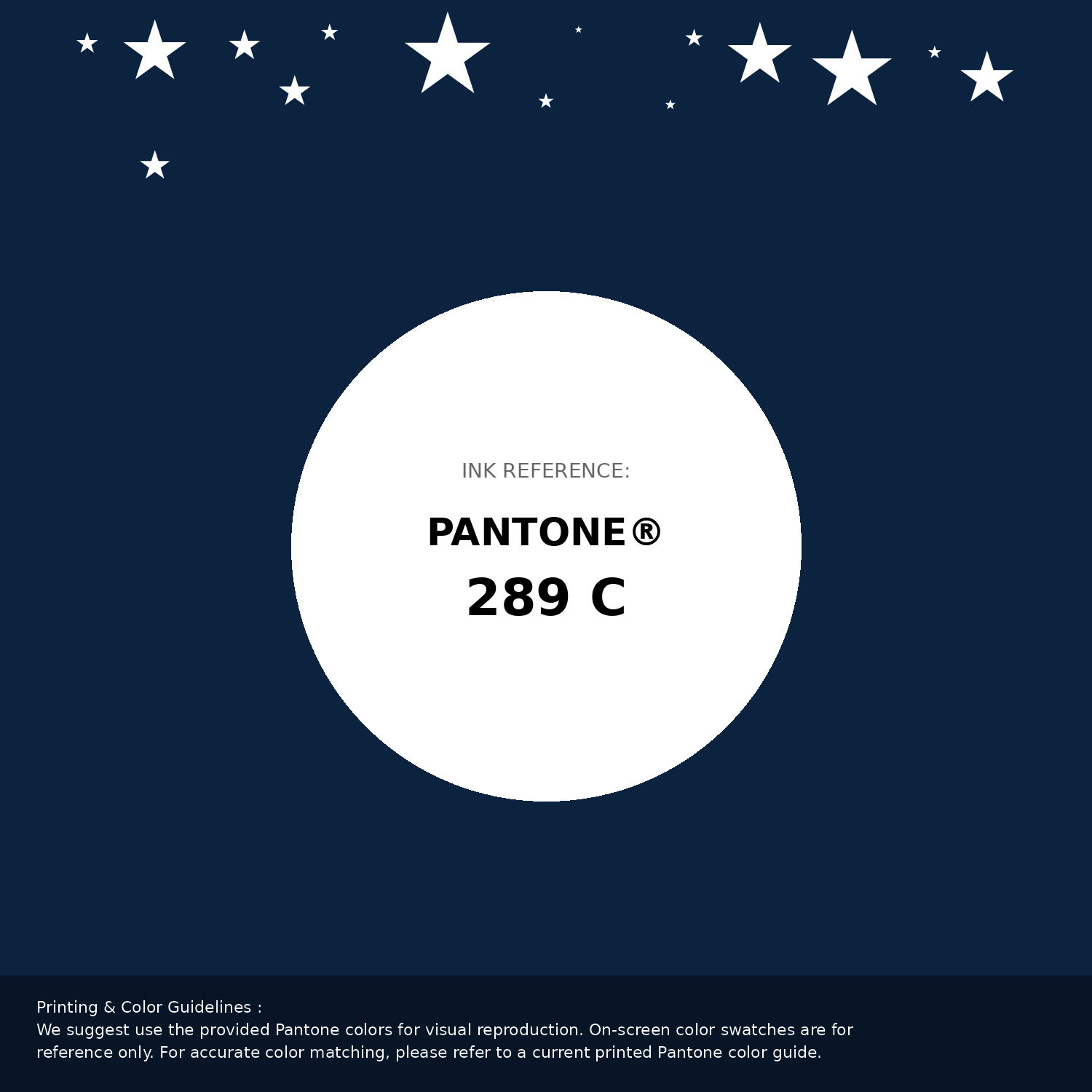
#0c2340 Pantone 289 C Color | Hex color Code #0c2340 Pantone Swatch Artwork
Download Artwork Swatch
#0c2340 Pantone 289 C Color | Hex color Code #0c2340 Gradient Artwork (PNG)
Download Gradient (PNG)#0c2340 Pantone 289 C Color | Hex color Code #0c2340 Gradient Artwork (SVG)
Download Gradient (SVG)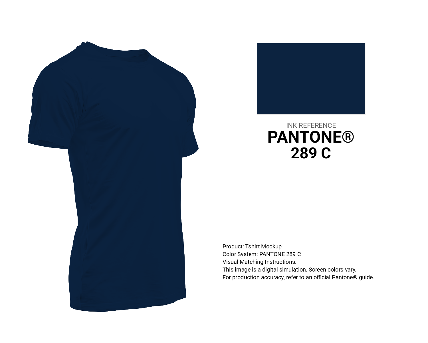
#0c2340 Pantone 289 C Color | Hex color Code #0c2340 T-Shirt Mockup
Download T-Shirt Mockup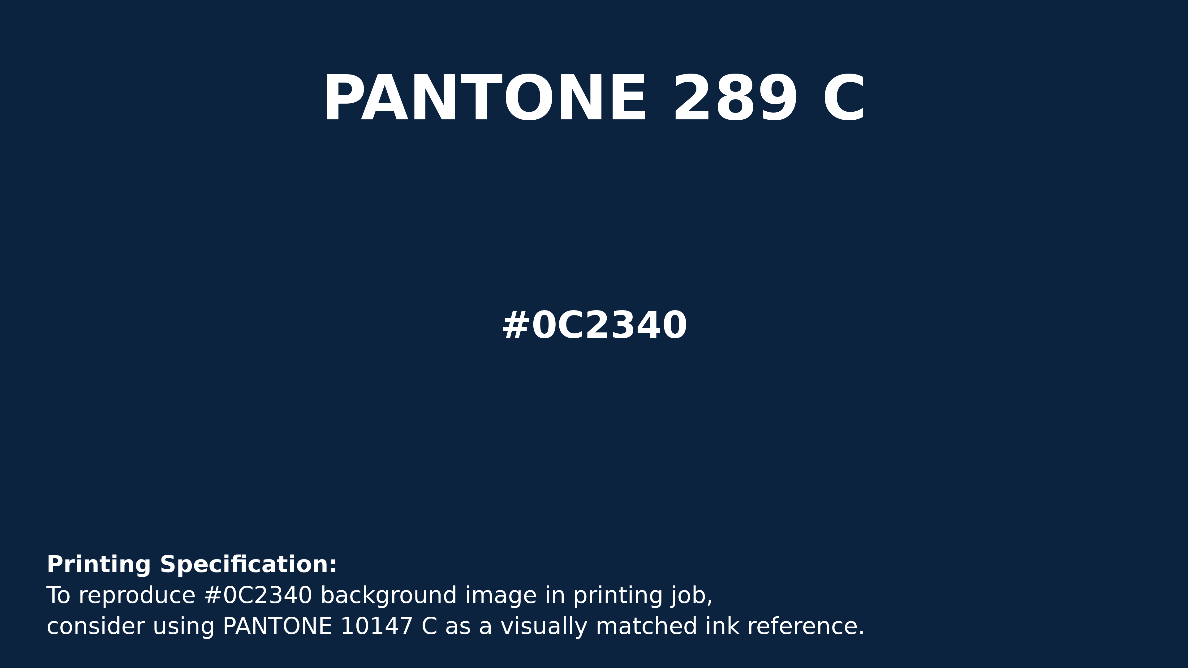
#0c2340 Pantone 289 C Color | Hex color Code #0c2340 Printing Artwork Pantone Reference
Download Pantone Printing ReferenceRelated Color Palettes
- Dark Sea Green and Dark Gray •
- Dark Slate Blue and Dark Gray •
- Beige and Dark Gray •
- SkyBlue and Dark Gray •
- Dark Gray and Fire Brick •
- Dark Gray and Indian Red •
- Dark Gray and Maroon •
- Midnight Blue and Dark Gray •
- Dark Gray and Pale Violet Red •
- Dark Gray and Dark Slate Gray •
- Dark Gray and Cadet Blue •
- Saddle Brown and Dark Gray •
- Light Blue and Dark Gray •
- Light Steel Blue and Dark Gray •
- Dark Gray and Light Slate Gray
Color Palette Collection
Purple ideas
12 color palettes with 60 colors.
26 Brown Color Combinations
26 color palettes with 130 colors.

Pink Colors
8 color palettes with 40 colors.

46 Indigo Color Palettes
46 color palettes with 230 colors.