#00B89F Color
Your all-in-one color resource. Download hex background images, Adobe swatches (ASE), PDF color sheets, and SVG files. Explore palettes, harmonies, accessibility, conversions, and professional exports — designed for designers, developers, and color perfectionists.
This vibrant teal evokes a sense of invigorating freshness and serene depth. It immediately brings to mind lush, tropical lagoons, where sunlight dances on the water's surface, revealing hidden life below. The color inspires feelings of optimism, growth, and balance. It suggests a connection to nature, promoting a sense of calm and rejuvenation, similar to a breath of fresh air. This hue creates a modern, sophisticated atmosphere, ideal for spaces seeking a touch of elegance and natural beauty. In design, it can symbolize health, vitality, and eco-consciousness, often used to represent sustainability and wellness. The color's association with water suggests fluidity, creativity, and a sense of adventure. Visually matched named color: Emerald Lagoon.
PANTONE 15-5421 TCX
Choose Color
Selected Color
Recent Colors
Color Details
Similar Ink Alternatives for #00B89F color Alternative print inks for reproducing #00B89F background image with a similar visual appearance.
Disclaimer: The visually matched ink reference is an independent approximation intended as a guide only. Please be advised that this pantone colors is only intended as a guide, Actual colours will depend on screen calibration variances. The print ink suggestions provided are independent visual approximations and are not affiliated with or endorsed by Pantone LLC. For official color specifications, conversion factors, and comprehensive color system information, please visit Pantone Connect. Official Pantone products can be purchased at pantone.com.
Color Previews for #000000 See how this color looks as a background or as text.
Complete Guide to Your Color Laboratory
Everything you need to know about this professional color toolkit.
Use the Color Picker at the top to select any color. All modules below update instantly.
Workflow: Pick a color → Explore palettes & data → Download what you need (PDF, Image, or Adobe ASE).
Color Details — Your color in all formats: HEX, RGB, RGBA, HSL, HSLA, HSV, CMYK, CIELab, Hunter-Lab, XYZ, Yxy, YUV. One-click copy.
Color Psychology — Emotional impact, cultural meanings, physiological effects, branding applications, and historical significance.
Named Colors — Find official color names (HTML/CSS, Pantone) that match your selection with similarity percentages.
Light & Dark Shades
80-step gradient from black to white. Perfect for button states and component systems.
Tints
Color mixed with white → lighter, pastel variations for backgrounds and disabled states.
Monochromatic — 11 curated tints/shades from one color. Production-ready for design systems.
- Complementary — Opposite on wheel (180°). High contrast.
- Analogous — Neighbors (±30°). Harmonious flow.
- Triadic — Three colors (120° apart). Vibrant, balanced.
- Split-Complementary — Base + two near-complements. Softer contrast.
- Tetradic/Square — Four colors. Complex, maximum variety.
- Neutral — Desaturated versions. Subtle, sophisticated.
15 Professional Variations — Monochromatic, Analogous, Complementary, Warm/Cool/Earth Tones, Pastel, Vibrant, High Contrast, and more.
Color Infusion — 10 palettes showing your color morphing into each major hue. Find bridge colors.
Similar Colors — 60+ colors generated via CIELAB Delta E matching. Unexpected harmonious combinations.
18 Ready-to-Use Gradients — Complementary, Analogous, Triadic, Tint/Shade progressions, and more.
Downloads: PNG (2560×1440), CSS (production-ready code), SVG (scalable vector).
WCAG Contrast Checker — Tests your color against white, black, and custom colors for AA (4.5:1) and AAA (7:1) compliance. Large text thresholds included.
Harmony & Accessibility Guide — Tests against 10 canonical hues. Shows which pairs are both beautiful AND WCAG-compliant for text.
PNG/JPG — High-res images for presentations and mood boards.
PDF — Print-ready reports for clients and teams.
Adobe ASE — Direct import to Photoshop, Illustrator, InDesign, XD.
CSS/SVG — Gradients only. Production-ready code and vectors.
Color Science: Industry-standard conversions (HSL, CIELAB, CMYK, XYZ). WCAG 2.1 luminance formula. Delta E (ΔE76) for perceptual matching.
Direct Links: Share colors via icolorpalette.com/color/ff5733 or icolorpalette.com/color/red
Issues? Refresh the page, wait for rendering, try another browser, or check console (F12) for errors.
Printing Guide for #00b89f Background Image
Use PANTONE 15-5421 TCX as a visually matched ink reference when printing this background image.
To print the #00b89f background image from our site, consider using PANTONE 15-5421 TCX as a visually matched ink reference.
Download the background image, then provide this reference code to your print vendor to help achieve accurate color reproduction.
The visually matched ink reference for the #00b89f background image is PANTONE 15-5421 TCX.
This color is commonly described as Emerald Lagoon.
This vibrant teal evokes a sense of invigorating freshness and serene depth. It immediately brings to mind lush, tropical lagoons, where sunlight dances on the water's surface, revealing hidden life below. The color inspires feelings of optimism, growth, and balance. It suggests a connection to nature, promoting a sense of calm and rejuvenation, similar to a breath of fresh air. This hue creates a modern, sophisticated atmosphere, ideal for spaces seeking a touch of elegance and natural beauty. In design, it can symbolize health, vitality, and eco-consciousness, often used to represent sustainability and wellness. The color's association with water suggests fluidity, creativity, and a sense of adventure.
We provide PANTONE 15-5421 TCX as a visually matched ink reference to help you reproduce the #00b89f background image accurately in professional printing.
This reference code helps print vendors achieve consistent color output across different printing equipment and materials.
After downloading the #00b89f background image from our site:
- Include the visually matched ink reference PANTONE 15-5421 TCX in your print order notes
- Inform your print vendor that this is your target color reference
- Request a proof print to verify the Emerald Lagoon color appearance before full production
The #00b89f background image with PANTONE 15-5421 TCX as visually matched ink reference can be used for:
- Posters, banners, and backdrops
- Business cards, brochures, and flyers
- Packaging, labels, and stickers
- Signage and promotional materials
This is an independent visual approximation.
While PANTONE 15-5421 TCX closely matches the #00b89f background image color, variations may exist between screen display and printed output.
We recommend requesting a proof print to verify the final appearance.
This vibrant teal evokes a sense of invigorating freshness and serene depth. It immediately brings to mind lush, tropical lagoons, where sunlight dances on the water's surface, revealing hidden life below. The color inspires feelings of optimism, growth, and balance. It suggests a connection to nature, promoting a sense of calm and rejuvenation, similar to a breath of fresh air. This hue creates a modern, sophisticated atmosphere, ideal for spaces seeking a touch of elegance and natural beauty. In design, it can symbolize health, vitality, and eco-consciousness, often used to represent sustainability and wellness. The color's association with water suggests fluidity, creativity, and a sense of adventure.
Understanding these associations helps ensure the #00b89f background image aligns with your intended message and brand impact.
Important Information
The visually matched ink reference is an independent approximation intended as a guide only.
Actual printed colors may vary depending on screen calibration, substrate material, ink type, and printing equipment used.
For official color specifications and certified color standards, visit Pantone Connect.
Official color guides and swatch books can be purchased from pantone.com.
Pantone 15-5421 TCX Aqua Green Color: Calming and Refreshing | #00B89F
Introduction:
Aqua Green is a shade of green that leans towards blue, creating a unique and soothing color. It combines the tranquility of blue with the refreshing qualities of green. Aqua Green is commonly associated with the calmness of water and the renewal of nature. Its visual appeal lies in its ability to evoke a sense of serenity and relaxation.
Historical Significance:
Use in Ancient Egypt: Aqua Green was often used in ancient Egyptian art and paintings to represent the Nile River, which was of great significance to their civilization.
Symbolism and Meaning:
Tranquility and Healing: Aqua Green typically symbolizes tranquility, peace, and healing. It is associated with feelings of calmness and serenity, making it a popular choice in wellness and spa industries.
Aqua Green in Fashion:
Cool and Refreshing: In the fashion world, Aqua Green is often used to create cool and refreshing looks. It is a versatile color that can be used as a statement color or as an accent in various fashion pieces.
Aqua Green in Graphic Design:
Branding and Visual Impact: Aqua Green is often used in graphic design to evoke a sense of freshness and tranquility. It can be used to create a calming and inviting visual experience for brands and their customers.
Color Combinations:
Complementary Colors: Aqua Green pairs well with complementary colors such as coral, peach, and pink. It also works well with neutrals like white, beige, and gray, creating a balanced and harmonious color palette.
Nature's Palette:
Aqua Green in Nature: Aqua Green can be found in various natural elements such as turquoise waters, tropical fishes, and lush green landscapes.
Artistic Representations:
Expression of Serenity: Artists often use Aqua Green in their paintings and artworks to express serenity and tranquility. It is a color that can evoke a sense of calmness and peacefulness.
Movies and Cinematic Landscapes:
Aqua Green in Cinematic Scenes: Aqua Green is often used in cinematic scenes to portray dreamy and ethereal landscapes. It sets the tone for visually captivating and serene moments.
Products and Commercial Appeal:
Wellness and Natural Products: Aqua Green is commonly used in product packaging and branding for wellness and natural products. Its association with calmness and renewal makes it appealing to consumers in these industries.
National Symbols and Significance:
National Significance: Aqua Green is not commonly associated with any specific national or cultural significance.
The Psychological and Emotional Impact:
Calm and Relaxation: Aqua Green has a psychological impact of promoting calmness and relaxation. It can help reduce stress and create a peaceful environment.
Conclusion:
Aqua Green is a calming and refreshing color that holds historical significance in ancient Egyptian art. It symbolizes tranquility and healing and is commonly used in fashion and graphic design. Aqua Green can be paired with complementary colors to create a balanced color palette. It is found in nature and has been used in artistic representations to express serenity. In movies, Aqua Green sets a dreamy and ethereal tone. It is often associated with wellness and natural products in commercial appeal. Aqua Green has a psychological impact of promoting calmness and relaxation. Overall, Aqua Green is a versatile and visually appealing color that brings a sense of peace and renewal.
Pantone 15-5421 Tcx Aqua Green Color | Hex color Code #00b89f Image & Artwork
Download high-quality assets for your projects.

#00b89f Color Schemes
Download Color Schemes
#00b89f Color Shades
Download Color Shades
Pantone 15-5421 Tcx Aqua Green Color | Hex color Code #00b89f Solid Color Background
Download Solid Color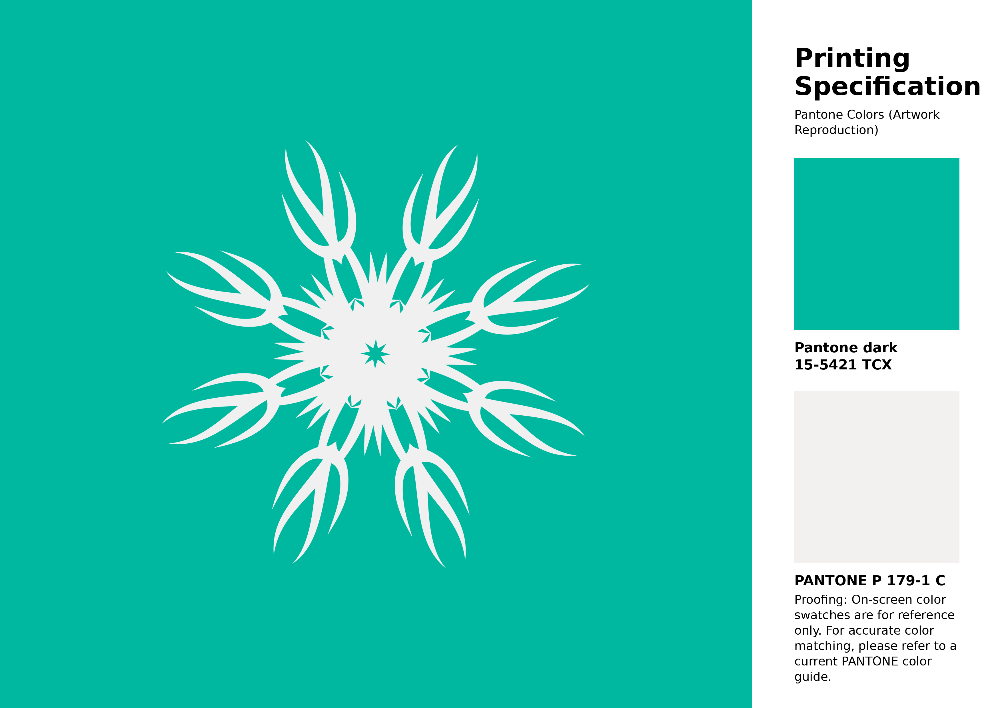
#00b89f Pantone 15-5421 Tcx Aqua Green Color | Hex color Code #00b89f Artwork Image (PNG)
Download Artwork (PNG)#00b89f Pantone 15-5421 Tcx Aqua Green Color | Hex color Code #00b89f Artwork Vector (PDF)
Download Artwork (PDF)#00b89f Pantone 15-5421 Tcx Aqua Green Color | Hex color Code #00b89f Artwork Vector (SVG)
Download Artwork (SVG)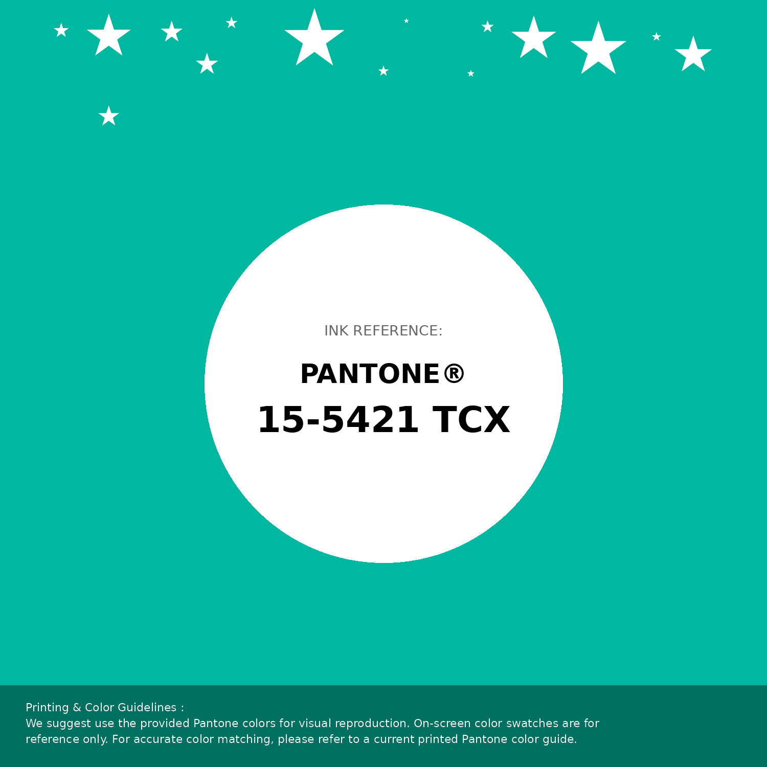
#00b89f Pantone 15-5421 Tcx Aqua Green Color | Hex color Code #00b89f Pantone Swatch Artwork
Download Artwork Swatch
#00b89f Pantone 15-5421 Tcx Aqua Green Color | Hex color Code #00b89f Gradient Artwork (PNG)
Download Gradient (PNG)#00b89f Pantone 15-5421 Tcx Aqua Green Color | Hex color Code #00b89f Gradient Artwork (SVG)
Download Gradient (SVG)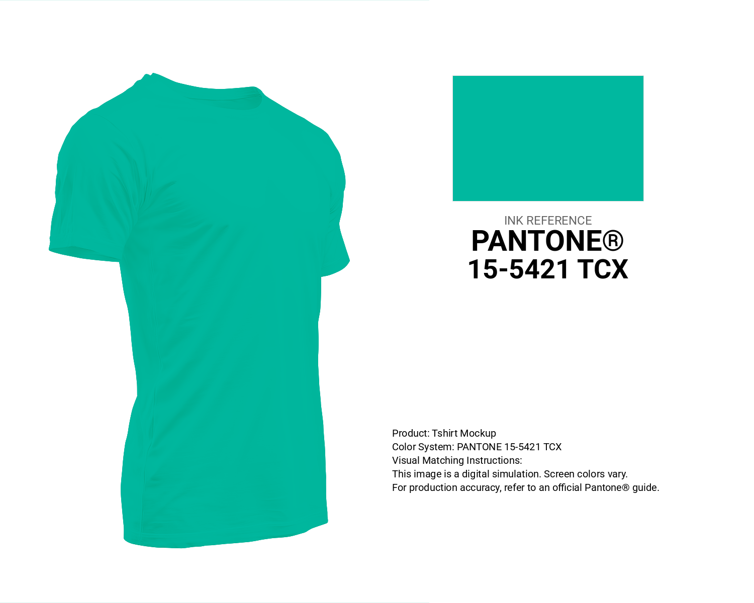
#00b89f Pantone 15-5421 Tcx Aqua Green Color | Hex color Code #00b89f T-Shirt Mockup
Download T-Shirt Mockup
#00b89f Pantone 15-5421 Tcx Aqua Green Color | Hex color Code #00b89f Printing Artwork Pantone Reference
Download Pantone Printing Reference
Aare River - #00b89f Color Name
Download Color NameRelated Color Palettes
- Dark Slate Gray and Pale Turquoise •
- Rosy Brown and Medium Turquoise •
- Steel Blue and Medium Turquoise •
- Dark Slate Gray and Dark Turquoise •
- Dark Turquoise and Dark Slate Gray •
- Pale Turquoise and Slate Gray •
- Medium Turquoise and Tan •
- Turquoise and Dark Slate Gray •
- Medium Turquoise •
- Pale Turquoise and Light Sky Blue •
- Steel Blue and Pale Turquoise •
- Light Sky Blue and Pale Turquoise •
- Pale Turquoise and Steel Blue •
- Medium Turquoise and Dark Olive Green •
- Light Steel Blue and Pale Turquoise
Color Palette Collection

The Color of Calm: 18 Blue Palettes to Enhance Your Design
18 color palettes with 90 colors.

38 Purple Color Schemes
38 color palettes with 190 colors.

31 Purple Color Combinations
31 color palettes with 155 colors.
21 Pastel Yellow Color Schemes
21 color palettes with 105 colors.