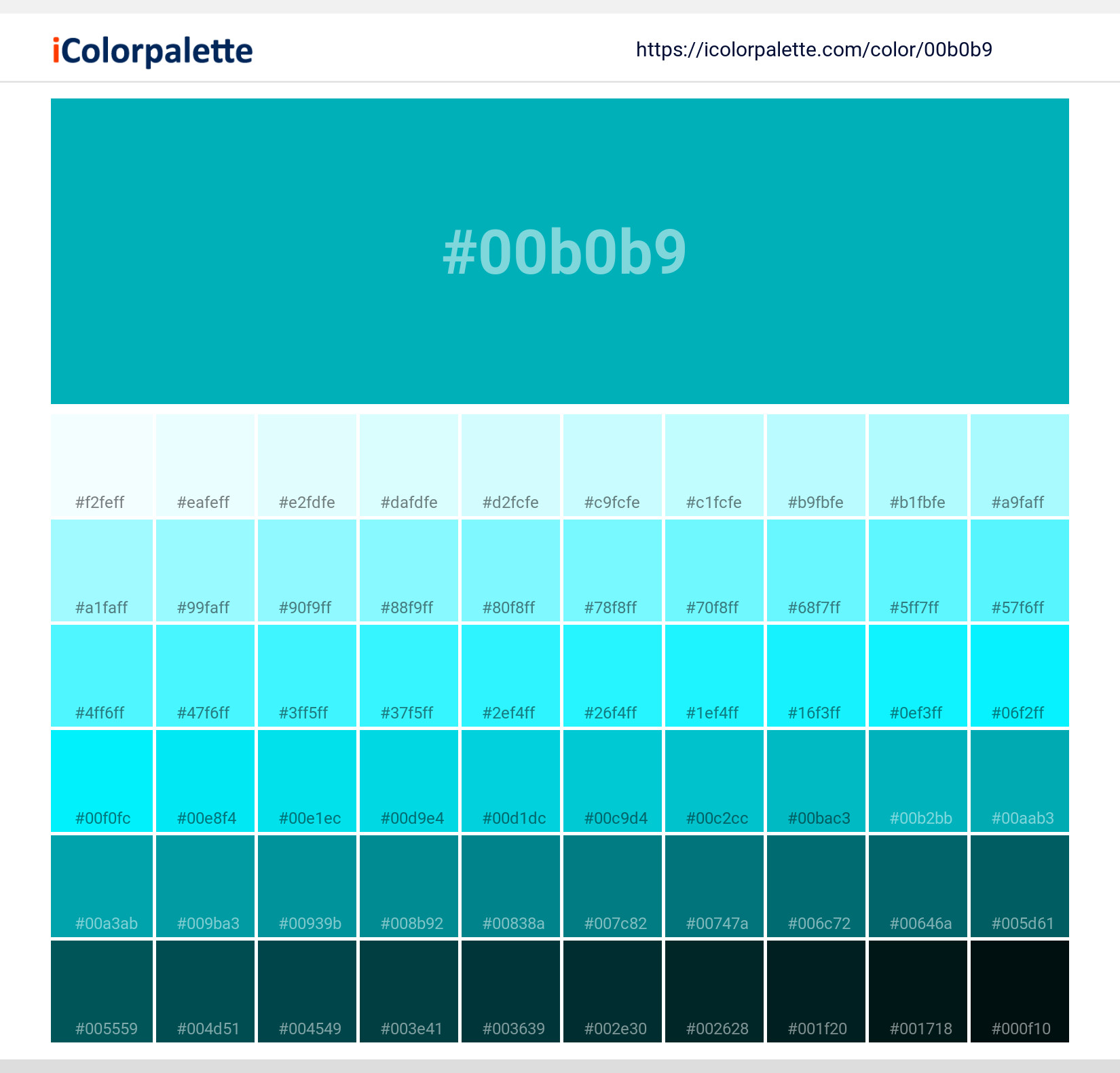
Pantone 7466 C Color | #00b0b9
Pantone 7466 C Color | #00b0b9 Color Shades Lighter / Darker shades of the color
Similar / Matching Pantone color(s) for Pantone 7466 C Color | #00b0b9 Color | Hex code #00b0b9
Solid Color Coated
Solid Color UnCoated
CMYK Color Guide Coated
Color Bridge Coated
Fashion, Home + Interiors
Fashion, Home + Interiors
Fashion, Home + Interiors
Color Bridge Uncoated
CMYK Color Guide Uncoated
Pastels & Neons Coated
Pastels & Neons UnCoated
Premium Metallics Coated
Nylon Brights
Metallics Coated
Important: Colors are presented as a result of mathematical calculations. Conversions may be inaccurate/approximate. Please be advised that this pantone colors is only intended as a guide, Actual colours will depend on screen calibration variances. For best results use a Pantone Colour book
Color Schemes from #0053b9
Pantone 7466 C Color | #00b0b9 Monochromatic Color
Tones of Pantone 7466 C Color | #00b0b9
Similar Colors Pantone 7466 C Color | #00b0b9
Pantone 7466 C Color: Aquamarine | #00B0B9
Introduction:
Aquamarine is a cool and refreshing color that resembles the hues of the ocean. It is known for its calming and soothing qualities, making it a popular choice in various design fields.
Historical Significance:
Antique Use: Aquamarine was believed to have protective powers and was often worn by sailors and travelers during ancient times. It was also used in jewelry and decorative art, symbolizing purity and tranquility.
Symbolism and Meaning:
Serenity and Calm: Aquamarine is often associated with serenity, calmness, and clarity. It represents tranquility and is believed to promote inner peace and harmony. In some cultures, it is also associated with courage and protection.
Aquamarine in Fashion:
Elegant and Fresh: Aquamarine is a popular choice in fashion, especially during spring and summer seasons. It is often used in dresses, accessories, and swimwear due to its fresh and vibrant appeal. It adds a touch of elegance and sophistication to any outfit.
Aquamarine in Graphic Design:
Aesthetic Appeal: Aquamarine is widely used in graphic design as it creates a sense of tranquility and sophistication. It is often employed in branding and advertising to convey a sense of calmness and trustworthiness. Its cool tones make it versatile and suitable for various design styles.
Color Combinations:
Complementary Colors: Aquamarine pairs well with colors such as white, silver, gray, and coral. The combination of aquamarine with white creates a fresh and clean look, while silver and gray add a touch of sophistication. Coral adds a vibrant contrast, creating a lively color scheme.
Nature’s Palette:
Oceanic Vibes: Aquamarine can be found in nature, particularly in the colors of the ocean and tropical seas. It is reminiscent of crystal-clear waters, coral reefs, and exotic marine life. Its connection to water and nature adds a sense of serenity and tranquility.
Artistic Representations:
Artistic Expressions: Aquamarine has been used by various artists throughout history. It has been featured in paintings, sculptures, and other forms of art to represent the calmness and beauty of the sea. It adds an element of tranquility and serenity to artistic compositions.
Movies and Cinematic Landscapes:
Scenes of Tranquility: Aquamarine is often used in movies and cinematic landscapes to create a calming and serene atmosphere. It is often seen in beach scenes or underwater sequences, emphasizing the beauty and tranquility of the natural world.
Products and Commercial Appeal:
Brands and Charm: Aquamarine is commonly used by brands to convey a sense of elegance and freshness. It is often seen in packaging, logos, and advertisements for products related to travel, beauty, and wellness. Its gentle and soothing qualities appeal to a wide audience.
National Symbols and Significance:
Symbol of Hope: In some cultures, aquamarine is associated with hope and new beginnings. It is considered a national gemstone in certain countries and is often used in ceremonial jewelry and national emblems.
The Psychological and Emotional Impact:
Calmness and Tranquility: Aquamarine has a psychological and emotional impact on individuals. It is known to promote feelings of calmness, tranquility, and relaxation. Its soothing qualities can help reduce stress and anxiety, promoting a sense of well-being.
Conclusion:
Aquamarine, with its serene and calming qualities, has been appreciated throughout history. From its use in ancient folklore to its prominent place in fashion and design, this color continues to evoke a sense of tranquility and sophistication. Its association with water and nature adds to its timeless appeal.
#00b0b9 Color Information
#00b0b9 color RGB value is (255,0,0). A hexadecimal color is specified with: #RRGGBB, where the RR (red), GG (green) and BB (blue) hexadecimal integers specify the components of the color. All values must be between 00 and FF.#00b0b9 Color Name(s)
#00b0b9 color name is Pantone 7466 C Color | #00b0b9.RGB Colors
An RGB color value is specified with: rgb(red, green, blue). Each parameter (red, green, and blue) defines the intensity of the color and can be an integer between 0 and 255 or a percentage value (from 0% to 100%).Red value of its RGB is 0, Green value is 176 and blue value is 185.
RGBA Colors
alpha The rgba() function define colors using the Red-green-blue-alpha (RGBA) model. RGBA color values are an extension of RGB color values with an alpha channel - which specifies the opacity of the color.Red value of its RGBA is 0, Green value is 176, blue value is 185 and alpha value is 1.
HSL Colors
The hsl() function define colors using the Hue-saturation-lightness model (HSL). HSL stands for hue, saturation, and lightness - and represents a cylindrical-coordinate representation of colors.Hue value of its Hsl is 182.91891891892, Saturation value is 1, Lightness value is 0.36274509803922.
HSLA Colors
The hsla() function define colors using the Hue-saturation-lightness-alpha model (HSLA). HSLA color values are an extension of HSL color values with an alpha channel - which specifies the opacity of the color.Hue value of its Hsl is 182.91891891892, Saturation value is 1, Lightness value is 0.36274509803922 and alpha value is 1.
Preview #00b0b9
Color Preview with white background
Lorem Ipsum is simply dummy text of the printing and typesetting industry. Lorem Ipsum has been the industry's standard dummy text ever since the 1500s, when an unknown printer took a galley of type and scrambled it to make a type specimen book. It has survived not only five centuries, but also the leap into electronic typesetting, remaining essentially unchanged. It was popularised in the 1960s with the release of Letraset sheets containing Lorem Ipsum passages, and more recently with desktop publishing software like Aldus PageMaker including versions of Lorem Ipsum
.background {color:#00b0b9;}Color Preview with background color
Lorem Ipsum is simply dummy text of the printing and typesetting industry. Lorem Ipsum has been the industry's standard dummy text ever since the 1500s, when an unknown printer took a galley of type and scrambled it to make a type specimen book. It has survived not only five centuries, but also the leap into electronic typesetting, remaining essentially unchanged. It was popularised in the 1960s with the release of Letraset sheets containing Lorem Ipsum passages, and more recently with desktop publishing software like Aldus PageMaker including versions of Lorem Ipsum
.background {background-color:#00b0b9;}Color Palette Collection


Pantone 7466 C Color | #00b0b9 Image Downloads


Related Color Palettes
- Bright Turquoise •
- Turquoise •
- Turquoise Blue •
- Pale Turquoise •
- Light Sea Green and Pale Turquoise •
- Pale Turquoise and Dark Slate Blue •
- Midnight Blue and Pale Turquoise •
- Steel Blue and Pale Turquoise •
- Pale Turquoise and Midnight Blue •
- Rosy Brown and Pale Turquoise •
- Dark Olive Green and Pale Turquoise •
- Pale Turquoise and Dim Gray •
- Medium Turquoise •
- SkyBlue and Medium Turquoise •
- SkyBlue and Pale Turquoise •


