#00A4B4 Color
Your all-in-one color resource. Download hex background images, Adobe swatches (ASE), PDF color sheets, and SVG files. Explore palettes, harmonies, accessibility, conversions, and professional exports — designed for designers, developers, and color perfectionists.
This color evokes a sense of calm and clarity, reminiscent of clear, shallow waters on a tropical beach. The blue undertones instill feelings of tranquility, peace, and stability, while the subtle green hints at growth, renewal, and harmony with nature. It suggests a refreshing and revitalizing experience, like a dip in a cool, pristine pool. The mood created is serene and balanced, promoting relaxation and mental focus. This color would be well-suited for spaces intended for meditation, healing, or creative work, such as spas, yoga studios, or home offices. In design, it communicates trustworthiness, openness, and a connection to the natural world. Visually matched named color: Tranquil Teal Waters.
PANTONE 221 UP
Choose Color
Selected Color
Recent Colors
Color Details
Similar Ink Alternatives for #00A4B4 color Alternative print inks for reproducing #00A4B4 background image with a similar visual appearance.
Disclaimer: The visually matched ink reference is an independent approximation intended as a guide only. Please be advised that this pantone colors is only intended as a guide, Actual colours will depend on screen calibration variances. The print ink suggestions provided are independent visual approximations and are not affiliated with or endorsed by Pantone LLC. For official color specifications, conversion factors, and comprehensive color system information, please visit Pantone Connect. Official Pantone products can be purchased at pantone.com.
Color Previews for #000000 See how this color looks as a background or as text.
Complete Guide to Your Color Laboratory
Everything you need to know about this professional color toolkit.
Use the Color Picker at the top to select any color. All modules below update instantly.
Workflow: Pick a color → Explore palettes & data → Download what you need (PDF, Image, or Adobe ASE).
Color Details — Your color in all formats: HEX, RGB, RGBA, HSL, HSLA, HSV, CMYK, CIELab, Hunter-Lab, XYZ, Yxy, YUV. One-click copy.
Color Psychology — Emotional impact, cultural meanings, physiological effects, branding applications, and historical significance.
Named Colors — Find official color names (HTML/CSS, Pantone) that match your selection with similarity percentages.
Light & Dark Shades
80-step gradient from black to white. Perfect for button states and component systems.
Tints
Color mixed with white → lighter, pastel variations for backgrounds and disabled states.
Monochromatic — 11 curated tints/shades from one color. Production-ready for design systems.
- Complementary — Opposite on wheel (180°). High contrast.
- Analogous — Neighbors (±30°). Harmonious flow.
- Triadic — Three colors (120° apart). Vibrant, balanced.
- Split-Complementary — Base + two near-complements. Softer contrast.
- Tetradic/Square — Four colors. Complex, maximum variety.
- Neutral — Desaturated versions. Subtle, sophisticated.
15 Professional Variations — Monochromatic, Analogous, Complementary, Warm/Cool/Earth Tones, Pastel, Vibrant, High Contrast, and more.
Color Infusion — 10 palettes showing your color morphing into each major hue. Find bridge colors.
Similar Colors — 60+ colors generated via CIELAB Delta E matching. Unexpected harmonious combinations.
18 Ready-to-Use Gradients — Complementary, Analogous, Triadic, Tint/Shade progressions, and more.
Downloads: PNG (2560×1440), CSS (production-ready code), SVG (scalable vector).
WCAG Contrast Checker — Tests your color against white, black, and custom colors for AA (4.5:1) and AAA (7:1) compliance. Large text thresholds included.
Harmony & Accessibility Guide — Tests against 10 canonical hues. Shows which pairs are both beautiful AND WCAG-compliant for text.
PNG/JPG — High-res images for presentations and mood boards.
PDF — Print-ready reports for clients and teams.
Adobe ASE — Direct import to Photoshop, Illustrator, InDesign, XD.
CSS/SVG — Gradients only. Production-ready code and vectors.
Color Science: Industry-standard conversions (HSL, CIELAB, CMYK, XYZ). WCAG 2.1 luminance formula. Delta E (ΔE76) for perceptual matching.
Direct Links: Share colors via icolorpalette.com/color/ff5733 or icolorpalette.com/color/red
Issues? Refresh the page, wait for rendering, try another browser, or check console (F12) for errors.
Printing Guide for #00a4b4 Background Image
Use PANTONE 221 UP as a visually matched ink reference when printing this background image.
To print the #00a4b4 background image from our site, consider using PANTONE 221 UP as a visually matched ink reference.
Download the background image, then provide this reference code to your print vendor to help achieve accurate color reproduction.
The visually matched ink reference for the #00a4b4 background image is PANTONE 221 UP.
This color is commonly described as Tranquil Teal Waters.
This color evokes a sense of calm and clarity, reminiscent of clear, shallow waters on a tropical beach. The blue undertones instill feelings of tranquility, peace, and stability, while the subtle green hints at growth, renewal, and harmony with nature. It suggests a refreshing and revitalizing experience, like a dip in a cool, pristine pool. The mood created is serene and balanced, promoting relaxation and mental focus. This color would be well-suited for spaces intended for meditation, healing, or creative work, such as spas, yoga studios, or home offices. In design, it communicates trustworthiness, openness, and a connection to the natural world.
We provide PANTONE 221 UP as a visually matched ink reference to help you reproduce the #00a4b4 background image accurately in professional printing.
This reference code helps print vendors achieve consistent color output across different printing equipment and materials.
After downloading the #00a4b4 background image from our site:
- Include the visually matched ink reference PANTONE 221 UP in your print order notes
- Inform your print vendor that this is your target color reference
- Request a proof print to verify the Tranquil Teal Waters color appearance before full production
The #00a4b4 background image with PANTONE 221 UP as visually matched ink reference can be used for:
- Posters, banners, and backdrops
- Business cards, brochures, and flyers
- Packaging, labels, and stickers
- Signage and promotional materials
This is an independent visual approximation.
While PANTONE 221 UP closely matches the #00a4b4 background image color, variations may exist between screen display and printed output.
We recommend requesting a proof print to verify the final appearance.
This color evokes a sense of calm and clarity, reminiscent of clear, shallow waters on a tropical beach. The blue undertones instill feelings of tranquility, peace, and stability, while the subtle green hints at growth, renewal, and harmony with nature. It suggests a refreshing and revitalizing experience, like a dip in a cool, pristine pool. The mood created is serene and balanced, promoting relaxation and mental focus. This color would be well-suited for spaces intended for meditation, healing, or creative work, such as spas, yoga studios, or home offices. In design, it communicates trustworthiness, openness, and a connection to the natural world.
Understanding these associations helps ensure the #00a4b4 background image aligns with your intended message and brand impact.
Important Information
The visually matched ink reference is an independent approximation intended as a guide only.
Actual printed colors may vary depending on screen calibration, substrate material, ink type, and printing equipment used.
For official color specifications and certified color standards, visit Pantone Connect.
Official color guides and swatch books can be purchased from pantone.com.
Pantone 16-4728 TPX Peacock Blue Color: A Captivating Shade of Blue | #00a4b4
Introduction:
Peacock Blue is a deep, vibrant shade of blue that exudes elegance and charm. Its intense yet enchanting hue makes it a popular choice in various design industries. This captivating color is sure to capture attention and create a lasting impression.
Historical Significance:
Significant Use in Art Nouveau Movement: Peacock Blue gained popularity during the Art Nouveau movement in the late 19th and early 20th centuries. The color was often used in decorative arts, architecture, and fashion, symbolizing opulence, and luxury.
Symbolism and Meaning:
Symbol of Royalty and Sophistication: Peacock Blue is often associated with royalty, nobility, and sophistication. It represents abundance, integrity, and beauty. In many cultures, peacocks are revered for their vibrant blue feathers, which embody grace and elegance.
Peacock Blue in Fashion:
Influence on Fashion Trends: Peacock Blue has made its mark in the fashion world, inspiring designers with its rich and striking color. It adds a touch of luxury and glamour to clothing, accessories, and runway shows, and is often seen as a statement color for formal occasions.
Peacock Blue in Graphic Design:
Aesthetic Appeal in Design: Peacock Blue has a strong presence in graphic design due to its eye-catching nature. It is often used to create logos, packaging, and promotional materials, as it conveys trust, reliability, and a sense of artistry.
Color Combinations:
Stylish Color Combinations: Peacock Blue pairs well with colors such as gold, silver, ivory, and white, creating elegant and sophisticated color combinations. It can also be combined with shades of green and teal for a nature-inspired palette.
Nature’s Palette:
A Beautiful Presence in Nature: Peacock Blue can be found in various natural elements, such as the feathers of peacocks, vibrant flowers like the Himalayan blue poppy, and the shimmering blue of pristine oceans and lakes.
Artistic Representations:
Inspiring Artistic Expression: Peacock Blue has been used by artists throughout history to depict natural beauty, evoke emotions, and add depth to their works. It is often seen in paintings, sculptures, and other forms of visual art.
Movies and Cinematic Landscapes:
Elevating Cinematic Scenes: Peacock Blue is used in movies and cinematic landscapes to set a mood of elegance and intrigue. It can be seen in costumes, set designs, and lighting, creating a captivating visual experience for viewers.
Products and Commercial Appeal:
Associated with Luxury and Quality: Many luxury brands and products incorporate Peacock Blue into their branding and packaging. It is often used to convey sophistication, exclusivity, and a sense of timeless beauty.
National Symbols and Significance:
Symbol of Multiculturalism: Peacock Blue holds cultural significance in various countries. In India, for example, peacocks are considered sacred and are the national bird. The color represents cultural heritage and diversity.
The Psychological and Emotional Impact:
Evoke Calmness and Balance: Peacock Blue has a soothing and calming effect on individuals. It can promote feelings of tranquility, harmony, and balance. The color is also associated with trust, loyalty, and confidence.
Conclusion:
Peacock Blue, with its deep and captivating hue, has a rich historical significance and holds cultural symbolism in various contexts. It has made a significant impact in fashion, graphic design, art, and cinema, adding a touch of elegance and sophistication wherever it is seen. This timeless color continues to inspire creativity and evoke emotions, making it a cherished choice for designers and artists.
Pantone 16-4728 Tpx Peacock Blue Color | Hex color Code #00a4b4 Image & Artwork
Download high-quality assets for your projects.

#00a4b4 Color Schemes
Download Color Schemes
#00a4b4 Color Shades
Download Color Shades
Pantone 16-4728 Tpx Peacock Blue Color | Hex color Code #00a4b4 Solid Color Background
Download Solid Color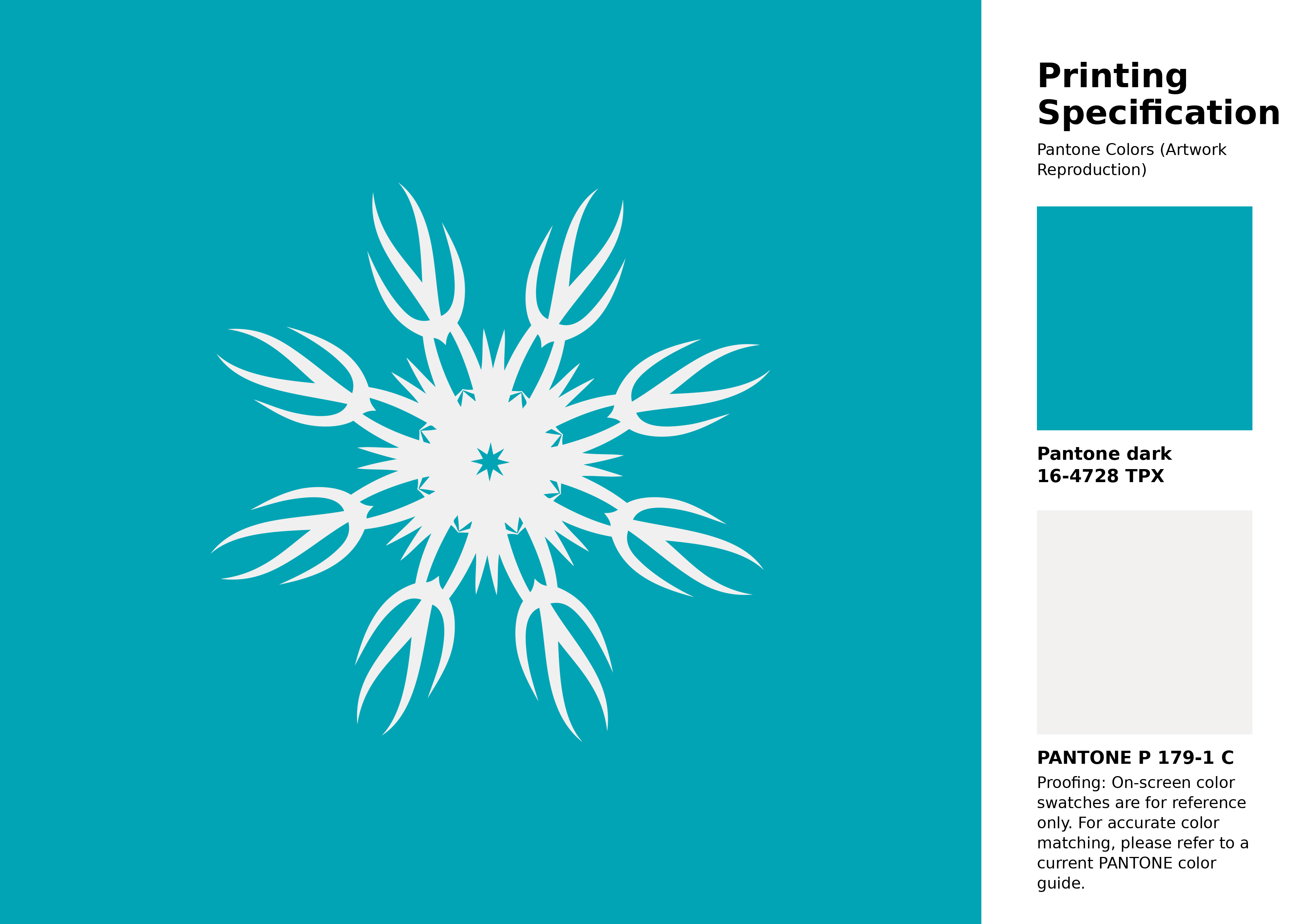
#00a4b4 Pantone 16-4728 Tpx Peacock Blue Color | Hex color Code #00a4b4 Artwork Image (PNG)
Download Artwork (PNG)#00a4b4 Pantone 16-4728 Tpx Peacock Blue Color | Hex color Code #00a4b4 Artwork Vector (PDF)
Download Artwork (PDF)#00a4b4 Pantone 16-4728 Tpx Peacock Blue Color | Hex color Code #00a4b4 Artwork Vector (SVG)
Download Artwork (SVG)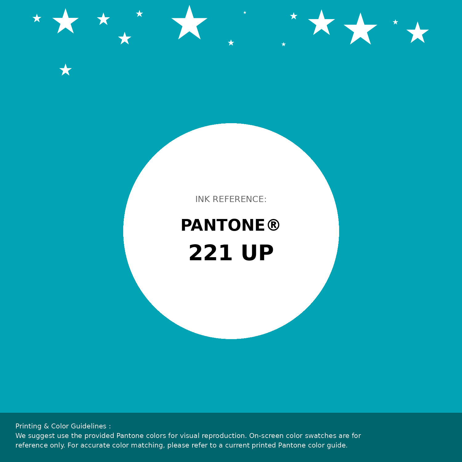
#00a4b4 Pantone 16-4728 Tpx Peacock Blue Color | Hex color Code #00a4b4 Pantone Swatch Artwork
Download Artwork Swatch
#00a4b4 Pantone 16-4728 Tpx Peacock Blue Color | Hex color Code #00a4b4 Gradient Artwork (PNG)
Download Gradient (PNG)#00a4b4 Pantone 16-4728 Tpx Peacock Blue Color | Hex color Code #00a4b4 Gradient Artwork (SVG)
Download Gradient (SVG)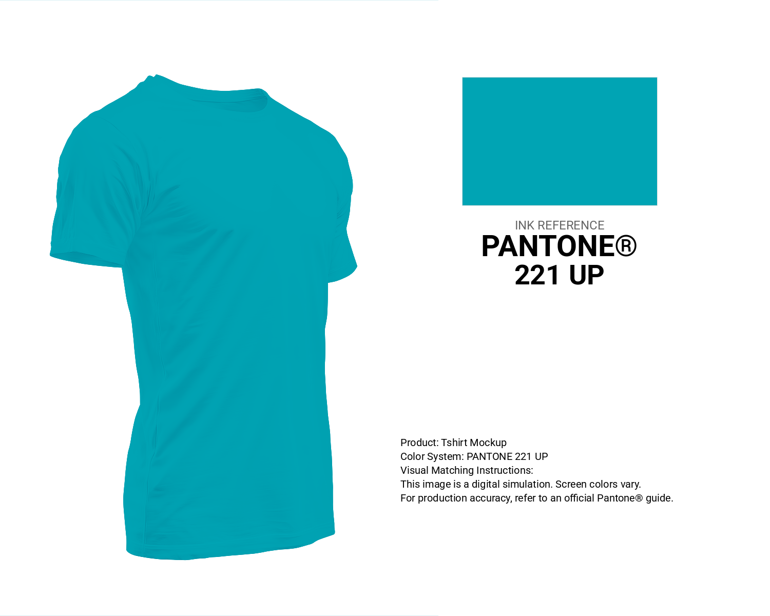
#00a4b4 Pantone 16-4728 Tpx Peacock Blue Color | Hex color Code #00a4b4 T-Shirt Mockup
Download T-Shirt Mockup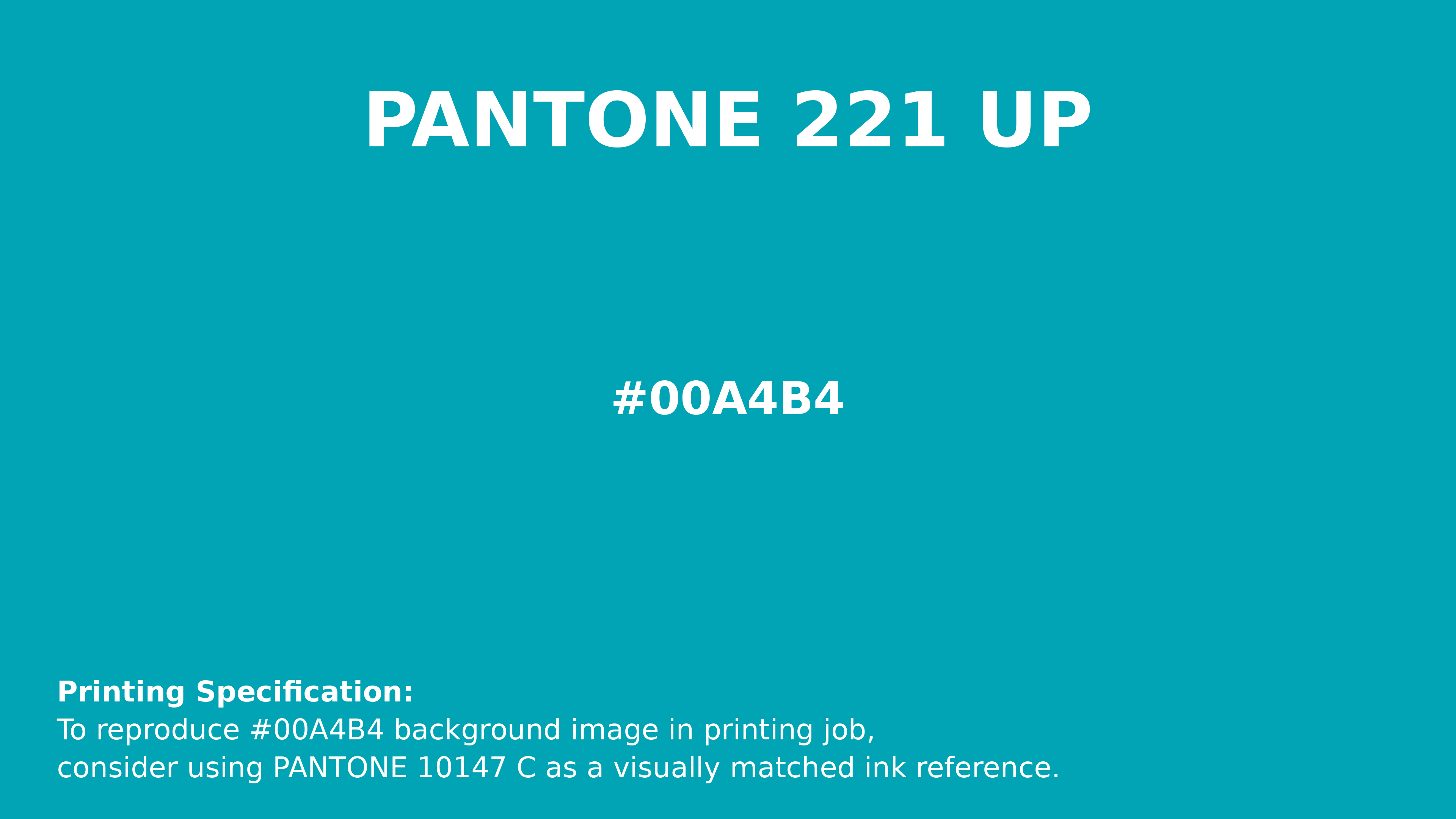
#00a4b4 Pantone 16-4728 Tpx Peacock Blue Color | Hex color Code #00a4b4 Printing Artwork Pantone Reference
Download Pantone Printing ReferenceRelated Color Palettes
- Pale Turquoise and Cornflower Blue •
- Midnight Blue and Pale Turquoise •
- Pale Turquoise and Pale Turquoise •
- Lavender and Pale Turquoise •
- Cadet Blue and Pale Turquoise •
- Pale Turquoise and Light Slate Gray •
- Pale Turquoise and Dim Gray •
- Medium Turquoise and Midnight Blue •
- Turquoise and Midnight Blue •
- Pale Turquoise and SkyBlue •
- Turquoise and Dark Slate Gray •
- Medium Turquoise and Dim Gray •
- Pale Turquoise and Dark Slate Gray •
- Turquoise and Light Steel Blue •
- Pale Turquoise and Midnight Blue
Color Palette Collection
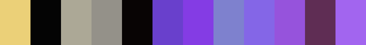
Purple ideas
12 color palettes with 60 colors.

31 Purple Color Combinations
31 color palettes with 155 colors.

744 Color Palettes
744 color palettes with 3720 colors.
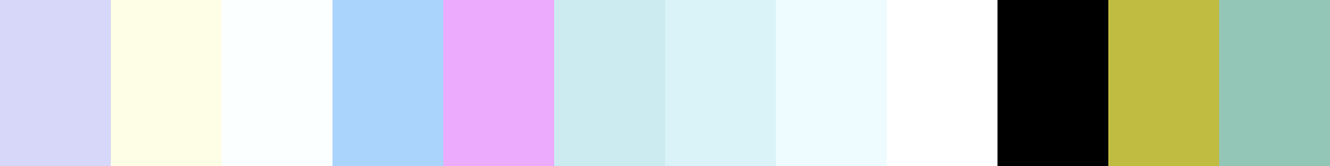
23 Light Blue Color Schemes
23 color palettes with 115 colors.