#0091DA Color
Your all-in-one color resource. Download hex background images, Adobe swatches (ASE), PDF color sheets, and SVG files. Explore palettes, harmonies, accessibility, conversions, and professional exports — designed for designers, developers, and color perfectionists.
This light, airy blue evokes a sense of vastness and openness, like a clear summer sky. It's associated with optimism, hope, and a feeling of freedom. The color is reminiscent of a serene lake or a cloudless afternoon. It creates a refreshing and uplifting mood, perfect for spaces aiming to promote creativity and inspire positive thoughts. In design, it suggests clarity, trustworthiness, and calmness, often used in corporate settings or spaces for relaxation. It also connects to the feeling of fresh beginnings and new possibilities. Visually matched named color: Azure Sky.
PANTONE 2192 C
Choose Color
Selected Color
Recent Colors
Color Details
Similar Ink Alternatives for #0091DA color Alternative print inks for reproducing #0091DA background image with a similar visual appearance.
Disclaimer: The visually matched ink reference is an independent approximation intended as a guide only. Please be advised that this pantone colors is only intended as a guide, Actual colours will depend on screen calibration variances. The print ink suggestions provided are independent visual approximations and are not affiliated with or endorsed by Pantone LLC. For official color specifications, conversion factors, and comprehensive color system information, please visit Pantone Connect. Official Pantone products can be purchased at pantone.com.
Color Previews for #000000 See how this color looks as a background or as text.
Complete Guide to Your Color Laboratory
Everything you need to know about this professional color toolkit.
Use the Color Picker at the top to select any color. All modules below update instantly.
Workflow: Pick a color → Explore palettes & data → Download what you need (PDF, Image, or Adobe ASE).
Color Details — Your color in all formats: HEX, RGB, RGBA, HSL, HSLA, HSV, CMYK, CIELab, Hunter-Lab, XYZ, Yxy, YUV. One-click copy.
Color Psychology — Emotional impact, cultural meanings, physiological effects, branding applications, and historical significance.
Named Colors — Find official color names (HTML/CSS, Pantone) that match your selection with similarity percentages.
Light & Dark Shades
80-step gradient from black to white. Perfect for button states and component systems.
Tints
Color mixed with white → lighter, pastel variations for backgrounds and disabled states.
Monochromatic — 11 curated tints/shades from one color. Production-ready for design systems.
- Complementary — Opposite on wheel (180°). High contrast.
- Analogous — Neighbors (±30°). Harmonious flow.
- Triadic — Three colors (120° apart). Vibrant, balanced.
- Split-Complementary — Base + two near-complements. Softer contrast.
- Tetradic/Square — Four colors. Complex, maximum variety.
- Neutral — Desaturated versions. Subtle, sophisticated.
15 Professional Variations — Monochromatic, Analogous, Complementary, Warm/Cool/Earth Tones, Pastel, Vibrant, High Contrast, and more.
Color Infusion — 10 palettes showing your color morphing into each major hue. Find bridge colors.
Similar Colors — 60+ colors generated via CIELAB Delta E matching. Unexpected harmonious combinations.
18 Ready-to-Use Gradients — Complementary, Analogous, Triadic, Tint/Shade progressions, and more.
Downloads: PNG (2560×1440), CSS (production-ready code), SVG (scalable vector).
WCAG Contrast Checker — Tests your color against white, black, and custom colors for AA (4.5:1) and AAA (7:1) compliance. Large text thresholds included.
Harmony & Accessibility Guide — Tests against 10 canonical hues. Shows which pairs are both beautiful AND WCAG-compliant for text.
PNG/JPG — High-res images for presentations and mood boards.
PDF — Print-ready reports for clients and teams.
Adobe ASE — Direct import to Photoshop, Illustrator, InDesign, XD.
CSS/SVG — Gradients only. Production-ready code and vectors.
Color Science: Industry-standard conversions (HSL, CIELAB, CMYK, XYZ). WCAG 2.1 luminance formula. Delta E (ΔE76) for perceptual matching.
Direct Links: Share colors via icolorpalette.com/color/ff5733 or icolorpalette.com/color/red
Issues? Refresh the page, wait for rendering, try another browser, or check console (F12) for errors.
Printing Guide for #0091da Background Image
Use PANTONE 2192 C as a visually matched ink reference when printing this background image.
To print the #0091da background image from our site, consider using PANTONE 2192 C as a visually matched ink reference.
Download the background image, then provide this reference code to your print vendor to help achieve accurate color reproduction.
The visually matched ink reference for the #0091da background image is PANTONE 2192 C.
This color is commonly described as Azure Sky.
This light, airy blue evokes a sense of vastness and openness, like a clear summer sky. It's associated with optimism, hope, and a feeling of freedom. The color is reminiscent of a serene lake or a cloudless afternoon. It creates a refreshing and uplifting mood, perfect for spaces aiming to promote creativity and inspire positive thoughts. In design, it suggests clarity, trustworthiness, and calmness, often used in corporate settings or spaces for relaxation. It also connects to the feeling of fresh beginnings and new possibilities.
We provide PANTONE 2192 C as a visually matched ink reference to help you reproduce the #0091da background image accurately in professional printing.
This reference code helps print vendors achieve consistent color output across different printing equipment and materials.
After downloading the #0091da background image from our site:
- Include the visually matched ink reference PANTONE 2192 C in your print order notes
- Inform your print vendor that this is your target color reference
- Request a proof print to verify the Azure Sky color appearance before full production
The #0091da background image with PANTONE 2192 C as visually matched ink reference can be used for:
- Posters, banners, and backdrops
- Business cards, brochures, and flyers
- Packaging, labels, and stickers
- Signage and promotional materials
This is an independent visual approximation.
While PANTONE 2192 C closely matches the #0091da background image color, variations may exist between screen display and printed output.
We recommend requesting a proof print to verify the final appearance.
This light, airy blue evokes a sense of vastness and openness, like a clear summer sky. It's associated with optimism, hope, and a feeling of freedom. The color is reminiscent of a serene lake or a cloudless afternoon. It creates a refreshing and uplifting mood, perfect for spaces aiming to promote creativity and inspire positive thoughts. In design, it suggests clarity, trustworthiness, and calmness, often used in corporate settings or spaces for relaxation. It also connects to the feeling of fresh beginnings and new possibilities.
Understanding these associations helps ensure the #0091da background image aligns with your intended message and brand impact.
Important Information
The visually matched ink reference is an independent approximation intended as a guide only.
Actual printed colors may vary depending on screen calibration, substrate material, ink type, and printing equipment used.
For official color specifications and certified color standards, visit Pantone Connect.
Official color guides and swatch books can be purchased from pantone.com.
Pantone 2192 C Color: Creative Blue | #0091DA
Introduction:
Creative Blue, also known as Pantone 2192 C Color, is a vibrant shade of blue that is visually appealing and captures attention. It has a refreshing essence that evokes a sense of creativity and imagination.
Historical Significance:
Key historical moments: Throughout history, Pantone 2192 C Color has been prominently used in various artistic movements, such as the Cubist period in the early 20th century. It was also utilized in mid-century modern design, particularly in the vibrant graphics of the 1960s.
Symbolism and Meaning:
Symbolism and Meaning: Pantone 2192 C Color is often associated with trust, communication, and intelligence. Its calm and cool nature represents reliability and loyalty. Additionally, it can symbolize the endless possibilities of the sky and the vastness of the ocean.
Pantone 2192 C Color in Fashion:
Influence in fashion: Pantone 2192 C Color has a significant impact on fashion trends. It is often used in clothing designs to portray a sense of elegance and sophistication. It is frequently seen on runways during spring and summer collections for its fresh and eye-catching appeal.
Pantone 2192 C Color in Graphic Design:
Significance in graphic design: In graphic design, Pantone 2192 C Color is widely used to create visually striking visuals. Its bold and vibrant nature makes it an excellent choice for logos, branding, and advertisements. It adds an element of excitement and grabs the viewer's attention.
Color Combinations:
Color combinations: Pantone 2192 C Color pairs well with complementary colors such as white (#FFFFFF), silver (#C0C0C0), and navy blue (#000080). It also creates a stunning contrast when combined with warm tones like coral (#FF7F50) or yellow (#FFFF00).
Nature’s Palette:
Natural occurrences: Pantone 2192 C Color can be found in nature in vibrant flowers like the cornflower and forget-me-nots. It is also often seen in clear skies and tropical waters, creating a sense of tranquility and serenity.
Artistic Representations:
Artistic use: Pantone 2192 C Color has been utilized by various artists across different art forms. It has been seen in abstract paintings, digital art, and sculptures, adding depth and dimension to the artistic representation.
Movies and Cinematic Landscapes:
Movies and cinematography: Pantone 2192 C Color often sets the tone or mood in movies and cinematic landscapes. It is frequently used in dream sequences or fantasy worlds to create a magical and otherworldly atmosphere.
Products and Commercial Appeal:
Commercial appeal: Many popular brands and products incorporate Pantone 2192 C Color in their branding. It is often associated with innovation and modernity, making it a preferred choice for technology companies and fashion-forward brands.
National Symbols and Significance:
National and cultural significance: Pantone 2192 C Color is not specifically tied to any particular national symbols or cultural significance. However, its universal appeal and versatile nature make it well-received across different cultures.
The Psychological and Emotional Impact:
Psychological impact: Pantone 2192 C Color has a positive impact on emotions and perceptions. It is often associated with feelings of calmness, trust, and creativity. It can also evoke a sense of freedom and expansiveness.
Conclusion:
Pantone 2192 C Color, also known as Creative Blue, has a rich historical relevance and timeless appeal. Its vibrant nature and versatile use in various fields make it a popular choice for designers and artists. Whether it's in fashion, graphic design, or artistic representations, Pantone 2192 C Color offers a visually striking and emotionally impactful experience.
Pantone 2192 C Color | Hex color Code #0091da Image & Artwork
Download high-quality assets for your projects.

#0091da Color Schemes
Download Color Schemes
#0091da Color Shades
Download Color Shades
Pantone 2192 C Color | Hex color Code #0091da Solid Color Background
Download Solid Color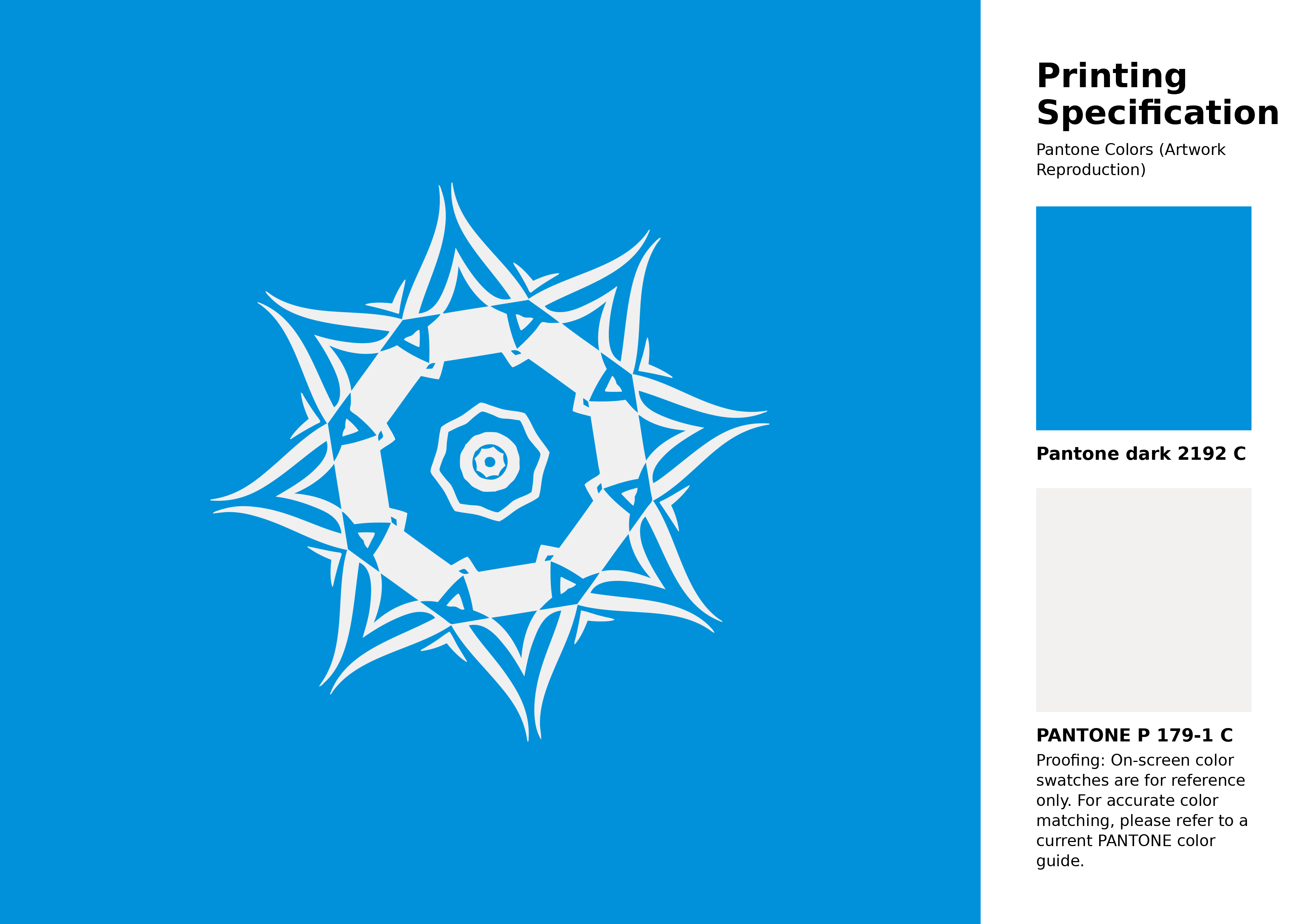
#0091da Pantone 2192 C Color | Hex color Code #0091da Artwork Image (PNG)
Download Artwork (PNG)#0091da Pantone 2192 C Color | Hex color Code #0091da Artwork Vector (PDF)
Download Artwork (PDF)#0091da Pantone 2192 C Color | Hex color Code #0091da Artwork Vector (SVG)
Download Artwork (SVG)
#0091da Pantone 2192 C Color | Hex color Code #0091da Pantone Swatch Artwork
Download Artwork Swatch
#0091da Pantone 2192 C Color | Hex color Code #0091da Gradient Artwork (PNG)
Download Gradient (PNG)#0091da Pantone 2192 C Color | Hex color Code #0091da Gradient Artwork (SVG)
Download Gradient (SVG)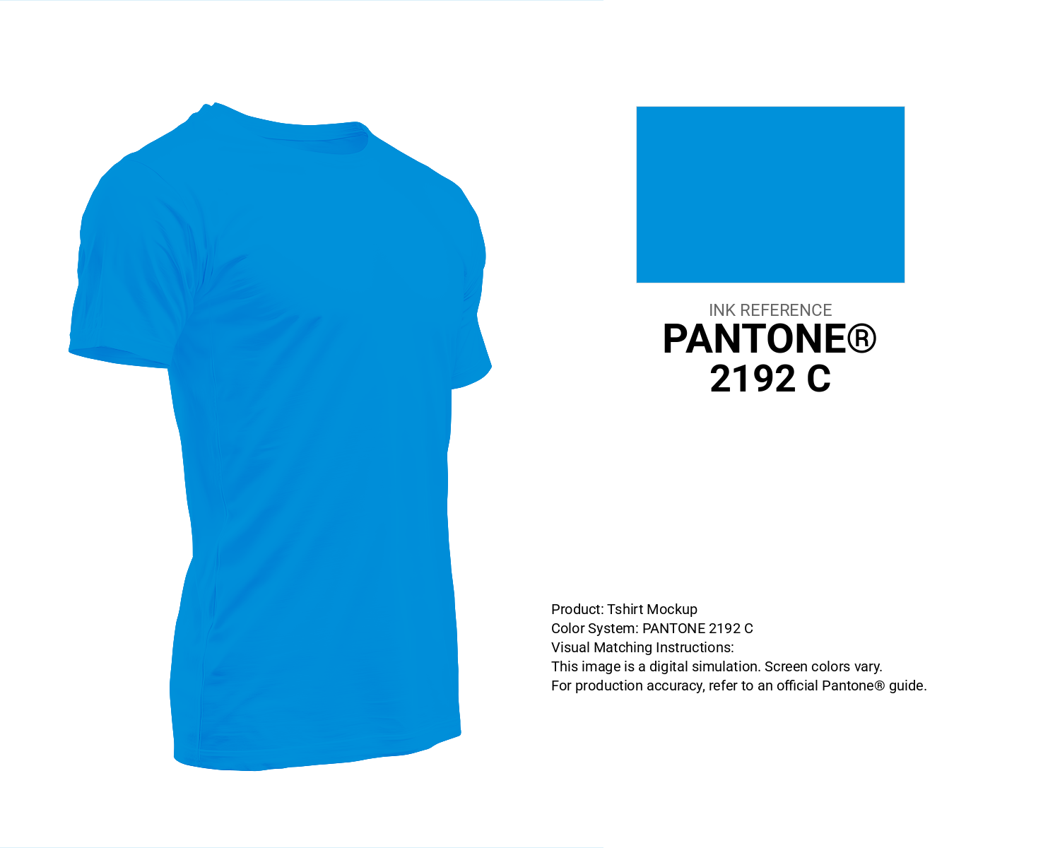
#0091da Pantone 2192 C Color | Hex color Code #0091da T-Shirt Mockup
Download T-Shirt Mockup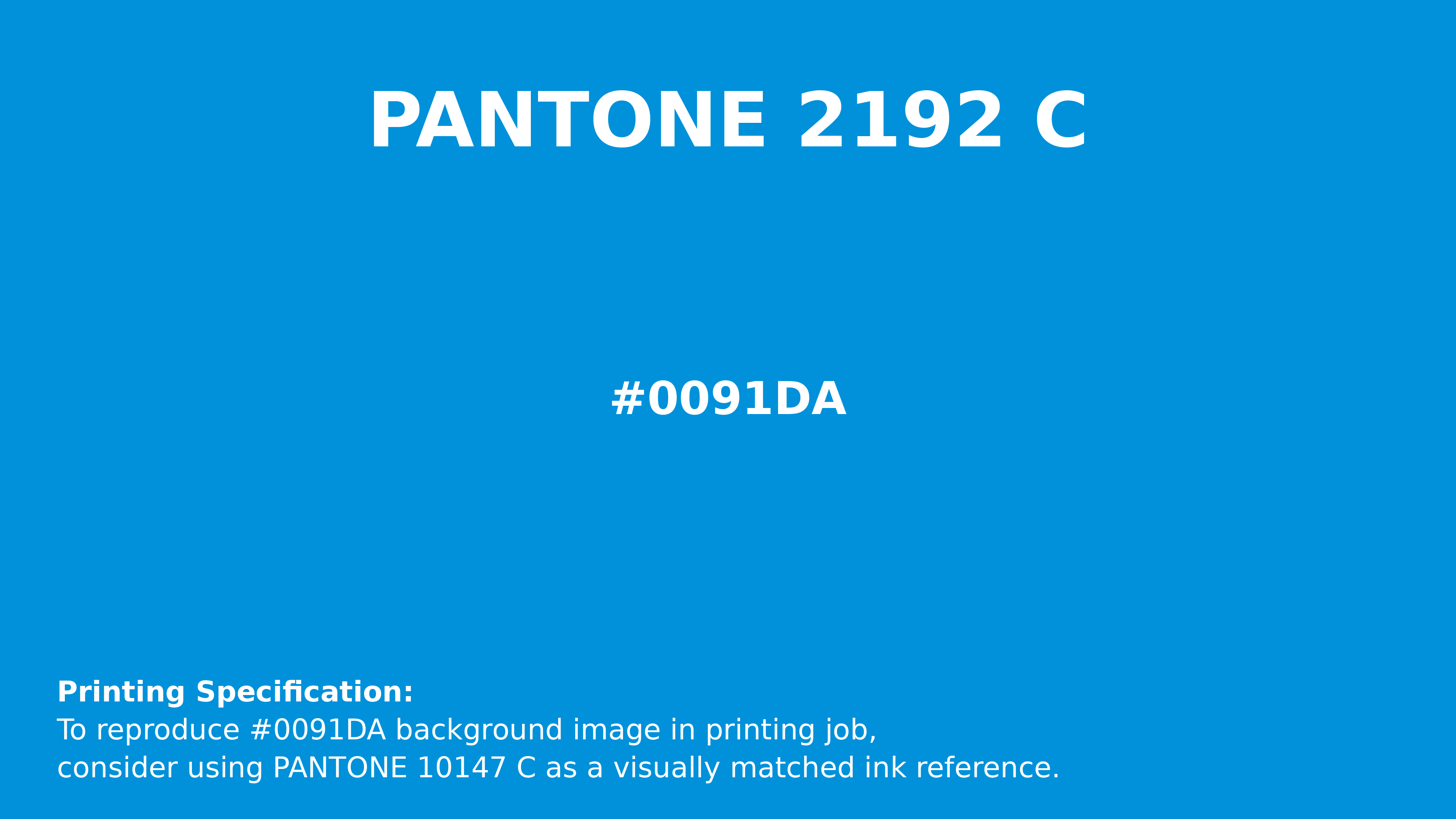
#0091da Pantone 2192 C Color | Hex color Code #0091da Printing Artwork Pantone Reference
Download Pantone Printing ReferenceRelated Color Palettes
- Black and Turquoise •
- Slate Gray and Pale Turquoise •
- Dim Gray and Medium Turquoise •
- Midnight Blue and Dark Turquoise •
- SkyBlue and Pale Turquoise •
- Dark Turquoise •
- Dark Sea Green and Medium Turquoise •
- Pale Turquoise and Steel Blue •
- Medium Turquoise and Slate Gray •
- Medium Turquoise and Dark Olive Green •
- Pale Turquoise and Cornflower Blue •
- Bright Turquoise •
- Turquoise •
- Pale Turquoise and Slate Gray •
- Light Steel Blue and Medium Turquoise
Color Palette Collection

70 Winter Color Palette
70 color palettes with 350 colors.

25 Sunset Color Schemes
25 color palettes with 125 colors.

265 Color Palettes
265 color palettes with 1325 colors.
23 Light Blue Color Schemes
23 color palettes with 115 colors.