#0085CA Color
Your all-in-one color resource. Download hex background images, Adobe swatches (ASE), PDF color sheets, and SVG files. Explore palettes, harmonies, accessibility, conversions, and professional exports — designed for designers, developers, and color perfectionists.
This vibrant blue evokes the feeling of a clear, sunlit sky stretching endlessly above. It speaks of trustworthiness, stability, and calm authority, similar to the expansive view from a mountain peak. This color often brings to mind the refreshing coolness of a deep lake, the vastness of the ocean, and the dependable nature of a clear day. It fosters a sense of hope, optimism, and intellectual stimulation. In design, #0085CA could be utilized to create a professional yet approachable atmosphere, ideal for corporate branding, educational settings, or spaces designed to promote focus and concentration. Culturally, it often symbolizes truth, loyalty, and the vast unknown, connecting to themes of exploration and discovery. Visually matched named color: Azure Serenity.
PANTONE PROCESS BLUE C
Choose Color
Selected Color
Recent Colors
Color Details
Similar Ink Alternatives for #0085CA color Alternative print inks for reproducing #0085CA background image with a similar visual appearance.
Disclaimer: The visually matched ink reference is an independent approximation intended as a guide only. Please be advised that this pantone colors is only intended as a guide, Actual colours will depend on screen calibration variances. The print ink suggestions provided are independent visual approximations and are not affiliated with or endorsed by Pantone LLC. For official color specifications, conversion factors, and comprehensive color system information, please visit Pantone Connect. Official Pantone products can be purchased at pantone.com.
Color Previews for #000000 See how this color looks as a background or as text.
Complete Guide to Your Color Laboratory
Everything you need to know about this professional color toolkit.
Use the Color Picker at the top to select any color. All modules below update instantly.
Workflow: Pick a color → Explore palettes & data → Download what you need (PDF, Image, or Adobe ASE).
Color Details — Your color in all formats: HEX, RGB, RGBA, HSL, HSLA, HSV, CMYK, CIELab, Hunter-Lab, XYZ, Yxy, YUV. One-click copy.
Color Psychology — Emotional impact, cultural meanings, physiological effects, branding applications, and historical significance.
Named Colors — Find official color names (HTML/CSS, Pantone) that match your selection with similarity percentages.
Light & Dark Shades
80-step gradient from black to white. Perfect for button states and component systems.
Tints
Color mixed with white → lighter, pastel variations for backgrounds and disabled states.
Monochromatic — 11 curated tints/shades from one color. Production-ready for design systems.
- Complementary — Opposite on wheel (180°). High contrast.
- Analogous — Neighbors (±30°). Harmonious flow.
- Triadic — Three colors (120° apart). Vibrant, balanced.
- Split-Complementary — Base + two near-complements. Softer contrast.
- Tetradic/Square — Four colors. Complex, maximum variety.
- Neutral — Desaturated versions. Subtle, sophisticated.
15 Professional Variations — Monochromatic, Analogous, Complementary, Warm/Cool/Earth Tones, Pastel, Vibrant, High Contrast, and more.
Color Infusion — 10 palettes showing your color morphing into each major hue. Find bridge colors.
Similar Colors — 60+ colors generated via CIELAB Delta E matching. Unexpected harmonious combinations.
18 Ready-to-Use Gradients — Complementary, Analogous, Triadic, Tint/Shade progressions, and more.
Downloads: PNG (2560×1440), CSS (production-ready code), SVG (scalable vector).
WCAG Contrast Checker — Tests your color against white, black, and custom colors for AA (4.5:1) and AAA (7:1) compliance. Large text thresholds included.
Harmony & Accessibility Guide — Tests against 10 canonical hues. Shows which pairs are both beautiful AND WCAG-compliant for text.
PNG/JPG — High-res images for presentations and mood boards.
PDF — Print-ready reports for clients and teams.
Adobe ASE — Direct import to Photoshop, Illustrator, InDesign, XD.
CSS/SVG — Gradients only. Production-ready code and vectors.
Color Science: Industry-standard conversions (HSL, CIELAB, CMYK, XYZ). WCAG 2.1 luminance formula. Delta E (ΔE76) for perceptual matching.
Direct Links: Share colors via icolorpalette.com/color/ff5733 or icolorpalette.com/color/red
Issues? Refresh the page, wait for rendering, try another browser, or check console (F12) for errors.
Printing Guide for #0085ca Background Image
Use PANTONE PROCESS BLUE C as a visually matched ink reference when printing this background image.
To print the #0085ca background image from our site, consider using PANTONE PROCESS BLUE C as a visually matched ink reference.
Download the background image, then provide this reference code to your print vendor to help achieve accurate color reproduction.
The visually matched ink reference for the #0085ca background image is PANTONE PROCESS BLUE C.
This color is commonly described as Azure Serenity.
This vibrant blue evokes the feeling of a clear, sunlit sky stretching endlessly above. It speaks of trustworthiness, stability, and calm authority, similar to the expansive view from a mountain peak. This color often brings to mind the refreshing coolness of a deep lake, the vastness of the ocean, and the dependable nature of a clear day. It fosters a sense of hope, optimism, and intellectual stimulation. In design, #0085CA could be utilized to create a professional yet approachable atmosphere, ideal for corporate branding, educational settings, or spaces designed to promote focus and concentration. Culturally, it often symbolizes truth, loyalty, and the vast unknown, connecting to themes of exploration and discovery.
We provide PANTONE PROCESS BLUE C as a visually matched ink reference to help you reproduce the #0085ca background image accurately in professional printing.
This reference code helps print vendors achieve consistent color output across different printing equipment and materials.
After downloading the #0085ca background image from our site:
- Include the visually matched ink reference PANTONE PROCESS BLUE C in your print order notes
- Inform your print vendor that this is your target color reference
- Request a proof print to verify the Azure Serenity color appearance before full production
The #0085ca background image with PANTONE PROCESS BLUE C as visually matched ink reference can be used for:
- Posters, banners, and backdrops
- Business cards, brochures, and flyers
- Packaging, labels, and stickers
- Signage and promotional materials
This is an independent visual approximation.
While PANTONE PROCESS BLUE C closely matches the #0085ca background image color, variations may exist between screen display and printed output.
We recommend requesting a proof print to verify the final appearance.
This vibrant blue evokes the feeling of a clear, sunlit sky stretching endlessly above. It speaks of trustworthiness, stability, and calm authority, similar to the expansive view from a mountain peak. This color often brings to mind the refreshing coolness of a deep lake, the vastness of the ocean, and the dependable nature of a clear day. It fosters a sense of hope, optimism, and intellectual stimulation. In design, #0085CA could be utilized to create a professional yet approachable atmosphere, ideal for corporate branding, educational settings, or spaces designed to promote focus and concentration. Culturally, it often symbolizes truth, loyalty, and the vast unknown, connecting to themes of exploration and discovery.
Understanding these associations helps ensure the #0085ca background image aligns with your intended message and brand impact.
Important Information
The visually matched ink reference is an independent approximation intended as a guide only.
Actual printed colors may vary depending on screen calibration, substrate material, ink type, and printing equipment used.
For official color specifications and certified color standards, visit Pantone Connect.
Official color guides and swatch books can be purchased from pantone.com.
Pantone Process Blue C Color: A Bold and Dynamic Shade of Blue | #0085CA
Introduction:
Pantone Process Blue C is a vibrant shade of blue that exudes confidence and energy. It is often described as a vivid and bold color that catches the eye. Its rich hue and high saturation make it a popular choice in various industries.
Historical Significance:
In the history of design and art, Pantone Process Blue C has been prominently used in various iconic moments. It has been featured in famous paintings and artworks, contributing to its recognition as a classic color in the artistic world. Additionally, it has been utilized in influential graphic design movements, leaving a lasting impact on the field.
Symbolism and Meaning:
Pantone Process Blue C typically symbolizes trust, stability, and confidence. It is often associated with professionalism and authority. In different cultures, blue can also represent calmness and serenity. Its deep and intense shade adds a sense of power and strength to its symbolic meaning.
Pantone Process Blue C in Fashion:
Pantone Process Blue C has a significant influence on fashion trends. It is frequently used in clothing and accessories to evoke a sense of sophistication and elegance. Many designers incorporate this intense blue shade into their collections to create a bold and eye-catching look.
Pantone Process Blue C in Graphic Design:
Pantone Process Blue C plays a vital role in graphic design aesthetics. Its vibrant and powerful nature helps create impactful visual designs. It is often used in branding, logos, and marketing materials to convey a sense of professionalism and reliability.
Color Combinations:
Pantone Process Blue C pairs well with a range of colors, including white, gray, and silver. The contrast between this vibrant blue and neutral tones creates a visually appealing combination. It also complements other bold colors like yellow and orange, creating a striking and energetic color palette.
Nature’s Palette:
Pantone Process Blue C can be found in the beauty of nature, such as the vibrant blue petals of certain flowers and the majestic blue skies. It is also reflected in the color of some marine life, adding a touch of wonder and tranquility to natural landscapes.
Artistic Representations:
Throughout art history, Pantone Process Blue C has been used by artists to capture and evoke different emotions. It has been utilized in abstract paintings, expressionist works, and modern art installations. Its intense and captivating hue helps artists create impactful and visually stimulating pieces.
Movies and Cinematic Landscapes:
Pantone Process Blue C has been utilized in various movies and cinematic landscapes to set the tone and mood of scenes. It is often seen in action-packed sequences or to establish a futuristic atmosphere. Its vibrant and dynamic nature adds depth and intensity to cinematic visuals.
Products and Commercial Appeal:
Many popular products and brands incorporate Pantone Process Blue C in their logo and branding. This color helps create a strong visual identity and attracts attention. It is often associated with reliability and quality, making it a desirable choice for commercial appeal.
National Symbols and Significance:
Pantone Process Blue C holds national significance in certain countries, where it is featured in flags and represents important national values. It symbolizes patriotism, loyalty, and unity in these contexts.
The Psychological and Emotional Impact:
The color Pantone Process Blue C can influence emotions and perceptions psychologically. It is known to evoke feelings of trust, stability, and reliability. Its vibrant and intense nature also adds excitement and energy to visual experiences.
Conclusion:
Pantone Process Blue C is a timeless color that holds historical significance and continues to have a powerful impact in various industries. Its bold and dynamic nature, along with its symbolic meaning, makes it a versatile choice for designers, artists, and marketers alike. Whether used in fashion, graphic design, or visual arts, this vibrant blue shade adds depth, impact, and a touch of sophistication.
Pantone Process Blue C Color | Hex color Code #0085ca Image & Artwork
Download high-quality assets for your projects.

#0085ca Color Schemes
Download Color Schemes
#0085ca Color Shades
Download Color Shades
Pantone Process Blue C Color | Hex color Code #0085ca Solid Color Background
Download Solid Color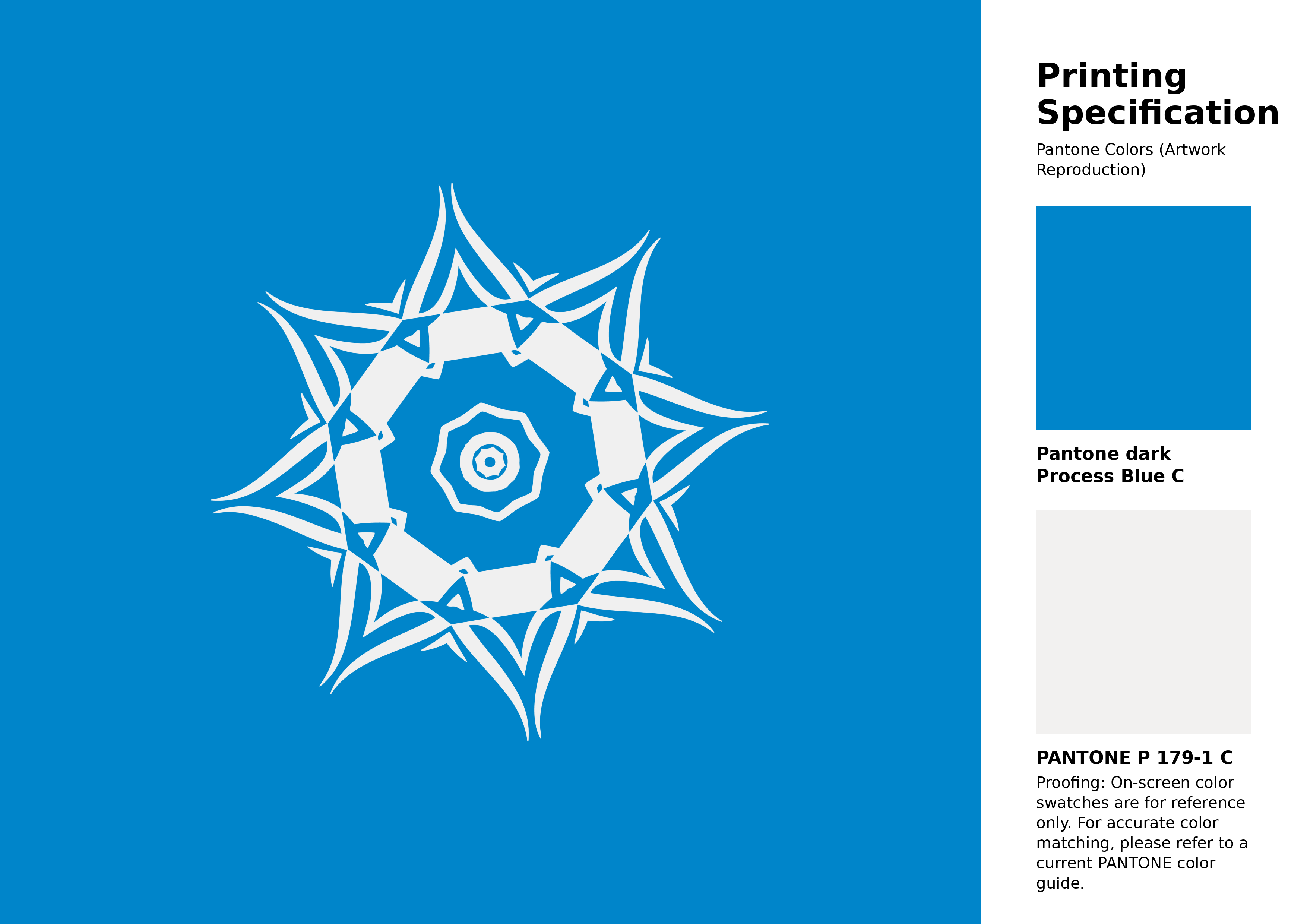
#0085ca Pantone Process Blue C Color | Hex color Code #0085ca Artwork Image (PNG)
Download Artwork (PNG)#0085ca Pantone Process Blue C Color | Hex color Code #0085ca Artwork Vector (PDF)
Download Artwork (PDF)#0085ca Pantone Process Blue C Color | Hex color Code #0085ca Artwork Vector (SVG)
Download Artwork (SVG)
#0085ca Pantone Process Blue C Color | Hex color Code #0085ca Pantone Swatch Artwork
Download Artwork Swatch
#0085ca Pantone Process Blue C Color | Hex color Code #0085ca Gradient Artwork (PNG)
Download Gradient (PNG)#0085ca Pantone Process Blue C Color | Hex color Code #0085ca Gradient Artwork (SVG)
Download Gradient (SVG)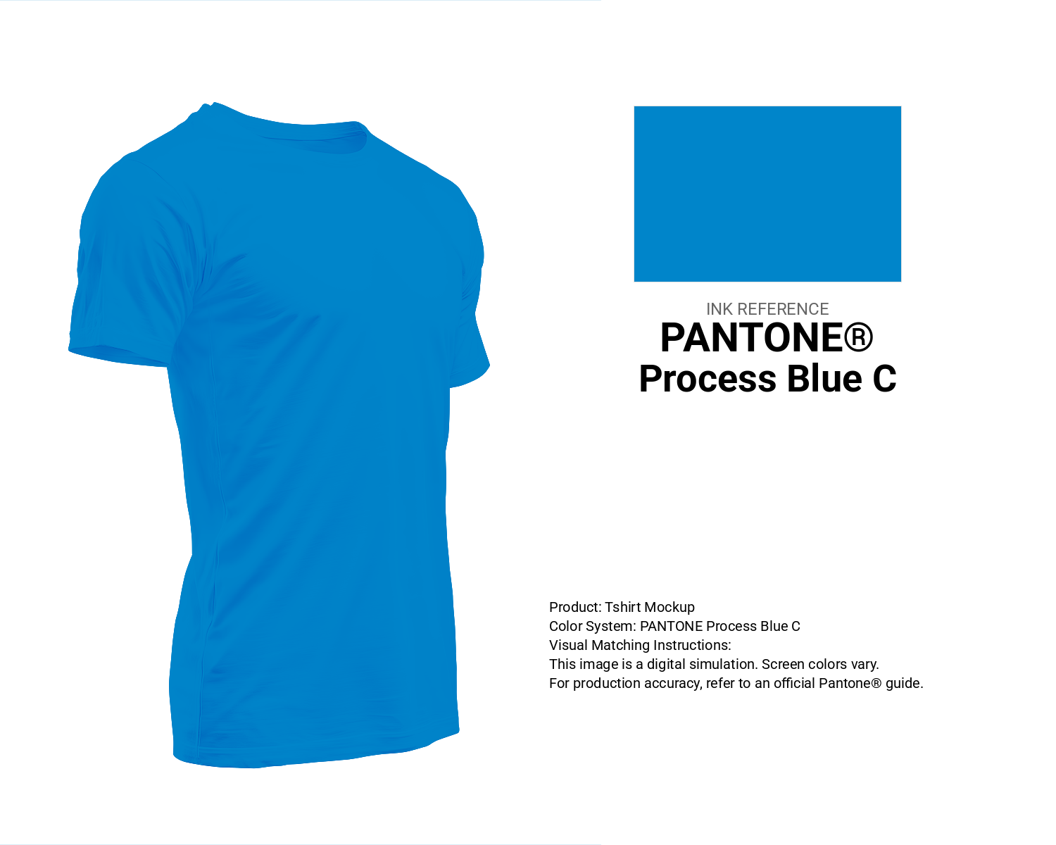
#0085ca Pantone Process Blue C Color | Hex color Code #0085ca T-Shirt Mockup
Download T-Shirt Mockup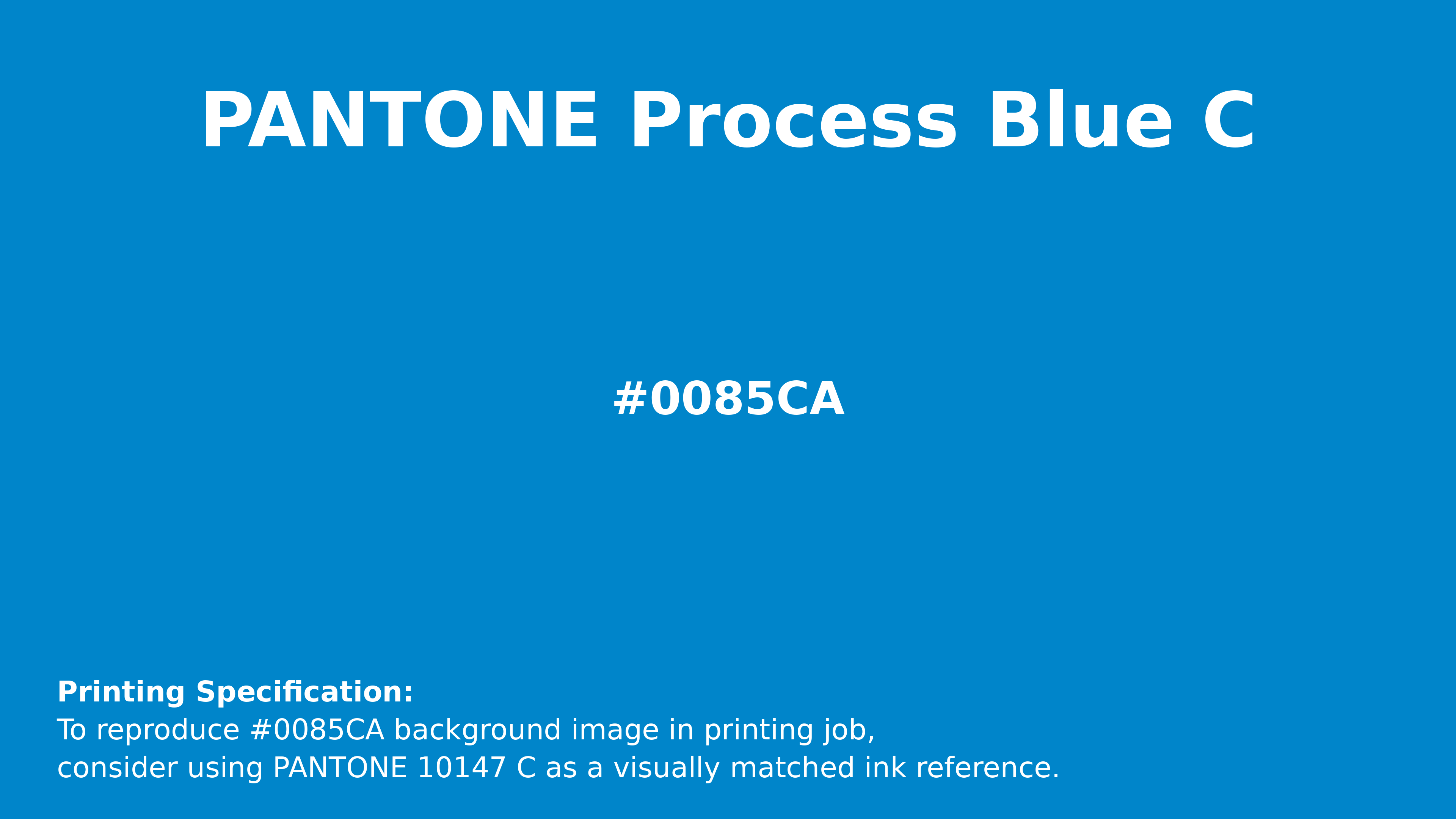
#0085ca Pantone Process Blue C Color | Hex color Code #0085ca Printing Artwork Pantone Reference
Download Pantone Printing ReferenceRelated Color Palettes
- Pale Turquoise and Light Sky Blue •
- Pale Turquoise and Slate Gray •
- Pale Turquoise and Light Steel Blue •
- Pale Turquoise and Royal Blue •
- Medium Turquoise and Dim Gray •
- Pale Turquoise and Dark Olive Green •
- Light Blue and Pale Turquoise •
- Pale Turquoise and Lavender •
- Turquoise and Dark Slate Gray •
- Medium Turquoise and Light Sea Green •
- Light Slate Gray and Medium Turquoise •
- Tan and Pale Turquoise •
- Light Steel Blue and Dark Turquoise •
- Pale Turquoise and Dark Slate Gray •
- Dark Slate Blue and Medium Turquoise
Color Palette Collection

25 Blue Color Palettes
25 color palettes with 125 colors.

80 Pastel Light color Palettes
80 color palettes with 400 colors.

52 Orange Color Palettes
52 color palettes with 260 colors.
17 Christmas Color Palettes Ideas
17 color palettes with 85 colors.