#006272 Color
Your all-in-one color resource. Download hex background images, Adobe swatches (ASE), PDF color sheets, and SVG files. Explore palettes, harmonies, accessibility, conversions, and professional exports — designed for designers, developers, and color perfectionists.
This rich, slightly muted teal evokes a sense of quiet depth and serene contemplation. It brings to mind the still waters of a deep lagoon, or the mossy banks of a shaded forest stream. The color subtly hints at trustworthiness and stability, inducing feelings of calm and introspection. Its cool tones create a soothing atmosphere, perfect for bedrooms or study spaces. In design, this color can be used to create a feeling of grounded tranquility and natural elegance, potentially evoking a sense of the cool, quiet, and restorative aspects of nature. Visually matched named color: Deep Lagoon.
PANTONE 3155 C
Choose Color
Selected Color
Recent Colors
Color Details
Similar Ink Alternatives for #006272 color Alternative print inks for reproducing #006272 background image with a similar visual appearance.
Disclaimer: The visually matched ink reference is an independent approximation intended as a guide only. Please be advised that this pantone colors is only intended as a guide, Actual colours will depend on screen calibration variances. The print ink suggestions provided are independent visual approximations and are not affiliated with or endorsed by Pantone LLC. For official color specifications, conversion factors, and comprehensive color system information, please visit Pantone Connect. Official Pantone products can be purchased at pantone.com.
Color Previews for #000000 See how this color looks as a background or as text.
Complete Guide to Your Color Laboratory
Everything you need to know about this professional color toolkit.
Use the Color Picker at the top to select any color. All modules below update instantly.
Workflow: Pick a color → Explore palettes & data → Download what you need (PDF, Image, or Adobe ASE).
Color Details — Your color in all formats: HEX, RGB, RGBA, HSL, HSLA, HSV, CMYK, CIELab, Hunter-Lab, XYZ, Yxy, YUV. One-click copy.
Color Psychology — Emotional impact, cultural meanings, physiological effects, branding applications, and historical significance.
Named Colors — Find official color names (HTML/CSS, Pantone) that match your selection with similarity percentages.
Light & Dark Shades
80-step gradient from black to white. Perfect for button states and component systems.
Tints
Color mixed with white → lighter, pastel variations for backgrounds and disabled states.
Monochromatic — 11 curated tints/shades from one color. Production-ready for design systems.
- Complementary — Opposite on wheel (180°). High contrast.
- Analogous — Neighbors (±30°). Harmonious flow.
- Triadic — Three colors (120° apart). Vibrant, balanced.
- Split-Complementary — Base + two near-complements. Softer contrast.
- Tetradic/Square — Four colors. Complex, maximum variety.
- Neutral — Desaturated versions. Subtle, sophisticated.
15 Professional Variations — Monochromatic, Analogous, Complementary, Warm/Cool/Earth Tones, Pastel, Vibrant, High Contrast, and more.
Color Infusion — 10 palettes showing your color morphing into each major hue. Find bridge colors.
Similar Colors — 60+ colors generated via CIELAB Delta E matching. Unexpected harmonious combinations.
18 Ready-to-Use Gradients — Complementary, Analogous, Triadic, Tint/Shade progressions, and more.
Downloads: PNG (2560×1440), CSS (production-ready code), SVG (scalable vector).
WCAG Contrast Checker — Tests your color against white, black, and custom colors for AA (4.5:1) and AAA (7:1) compliance. Large text thresholds included.
Harmony & Accessibility Guide — Tests against 10 canonical hues. Shows which pairs are both beautiful AND WCAG-compliant for text.
PNG/JPG — High-res images for presentations and mood boards.
PDF — Print-ready reports for clients and teams.
Adobe ASE — Direct import to Photoshop, Illustrator, InDesign, XD.
CSS/SVG — Gradients only. Production-ready code and vectors.
Color Science: Industry-standard conversions (HSL, CIELAB, CMYK, XYZ). WCAG 2.1 luminance formula. Delta E (ΔE76) for perceptual matching.
Direct Links: Share colors via icolorpalette.com/color/ff5733 or icolorpalette.com/color/red
Issues? Refresh the page, wait for rendering, try another browser, or check console (F12) for errors.
Printing Guide for #006272 Background Image
Use PANTONE 3155 C as a visually matched ink reference when printing this background image.
To print the #006272 background image from our site, consider using PANTONE 3155 C as a visually matched ink reference.
Download the background image, then provide this reference code to your print vendor to help achieve accurate color reproduction.
The visually matched ink reference for the #006272 background image is PANTONE 3155 C.
This color is commonly described as Deep Lagoon.
This rich, slightly muted teal evokes a sense of quiet depth and serene contemplation. It brings to mind the still waters of a deep lagoon, or the mossy banks of a shaded forest stream. The color subtly hints at trustworthiness and stability, inducing feelings of calm and introspection. Its cool tones create a soothing atmosphere, perfect for bedrooms or study spaces. In design, this color can be used to create a feeling of grounded tranquility and natural elegance, potentially evoking a sense of the cool, quiet, and restorative aspects of nature.
We provide PANTONE 3155 C as a visually matched ink reference to help you reproduce the #006272 background image accurately in professional printing.
This reference code helps print vendors achieve consistent color output across different printing equipment and materials.
After downloading the #006272 background image from our site:
- Include the visually matched ink reference PANTONE 3155 C in your print order notes
- Inform your print vendor that this is your target color reference
- Request a proof print to verify the Deep Lagoon color appearance before full production
The #006272 background image with PANTONE 3155 C as visually matched ink reference can be used for:
- Posters, banners, and backdrops
- Business cards, brochures, and flyers
- Packaging, labels, and stickers
- Signage and promotional materials
This is an independent visual approximation.
While PANTONE 3155 C closely matches the #006272 background image color, variations may exist between screen display and printed output.
We recommend requesting a proof print to verify the final appearance.
This rich, slightly muted teal evokes a sense of quiet depth and serene contemplation. It brings to mind the still waters of a deep lagoon, or the mossy banks of a shaded forest stream. The color subtly hints at trustworthiness and stability, inducing feelings of calm and introspection. Its cool tones create a soothing atmosphere, perfect for bedrooms or study spaces. In design, this color can be used to create a feeling of grounded tranquility and natural elegance, potentially evoking a sense of the cool, quiet, and restorative aspects of nature.
Understanding these associations helps ensure the #006272 background image aligns with your intended message and brand impact.
Important Information
The visually matched ink reference is an independent approximation intended as a guide only.
Actual printed colors may vary depending on screen calibration, substrate material, ink type, and printing equipment used.
For official color specifications and certified color standards, visit Pantone Connect.
Official color guides and swatch books can be purchased from pantone.com.
Pantone 3155 C Color: Ocean Blue | #006272
Introduction:
Ocean Blue, represented by the Pantone 3155 C color code #006272, is a vibrant and rich shade of blue that embodies the essence of the ocean. Its visual appeal is striking, evoking feelings of tranquility and depth.
Historical Significance:
Key moments in history: Ocean Blue has been used throughout history in various ways. It has been prominently featured in maritime art, symbolizing the vastness and majesty of the sea. Additionally, it has been used to represent calm and tranquility in numerous historical paintings and sculptures.
Symbolism and Meaning:
Symbolism and Meaning: Ocean Blue is often associated with feelings of peace, serenity, and stability. In various cultures, it represents tranquility, depth, and the vastness of the sea. It is also commonly associated with trust, reliability, and loyalty.
Ocean Blue in Fashion:
Ocean Blue in Fashion: Ocean Blue is a versatile color that has made its mark in the world of fashion. It is often used in clothing and accessories to create a sense of elegance and sophistication. Its deep and vibrant hue adds a touch of freshness and modernity to any outfit.
Ocean Blue in Graphic Design:
Ocean Blue in Graphic Design: The color Ocean Blue holds significant value in design aesthetics and branding. Its deep yet soothing hue gives a sense of professionalism and trustworthiness, making it a popular choice for logos, websites, and marketing materials.
Color Combinations:
Color Combinations: Ocean Blue can be beautifully paired with complementary colors such as sandy beige, coral pink, sunny yellow, and crisp white. These combinations evoke a sense of coastal beauty and create a visually enticing palette.
Nature’s Palette:
Nature’s Palette: Ocean Blue can be found in various natural elements such as the deep blue waters of the ocean, vibrant blue skies, and the delicate petals of blue flowers like forget-me-nots. It is a color that reflects the beauty and serenity of nature.
Artistic Representations:
Artistic Representations: Ocean Blue has been used by artists throughout history to depict the beauty and vastness of the sea. It has been featured in paintings, sculptures, and other art forms, capturing the essence of the ocean and its captivating blue hues.
Movies and Cinematic Landscapes:
Movies and Cinematic Landscapes: Ocean Blue often sets the tone and mood in movies, particularly in scenes depicting tranquil seaside locations. It creates a sense of calm, peace, and cinematic beauty, transporting audiences to captivating coastal landscapes.
Products and Commercial Appeal:
Products and Commercial Appeal: Many popular brands and products have incorporated Ocean Blue into their branding to evoke a sense of trust, reliability, and elegance. It is often used in cosmetics, home decor, and luxury goods to enhance their appeal.
National Symbols and Significance:
National Symbols and Significance: Ocean Blue holds national and cultural significance in countries with strong ties to the sea. It is often used to represent national maritime heritage and the importance of oceans in the cultural identity of these nations.
The Psychological and Emotional Impact:
The Psychological and Emotional Impact: Ocean Blue has a calming and soothing effect on the mind. It promotes feelings of tranquility, relaxation, and serenity. It is often used to create a peaceful and harmonious atmosphere.
Conclusion:
Ocean Blue, represented by the Pantone 3155 C color, is a color with a rich historical significance and a timeless appeal. Its deep and vibrant hue, combined with its associations with the ocean, symbolism, and commercial appeal, makes it a versatile and impactful color in various aspects of life, including fashion, design, art, and cinema.
Pantone 3155 C Color | Hex color Code #006272 Image & Artwork
Download high-quality assets for your projects.

#006272 Color Schemes
Download Color Schemes
#006272 Color Shades
Download Color Shades
Pantone 3155 C Color | Hex color Code #006272 Solid Color Background
Download Solid Color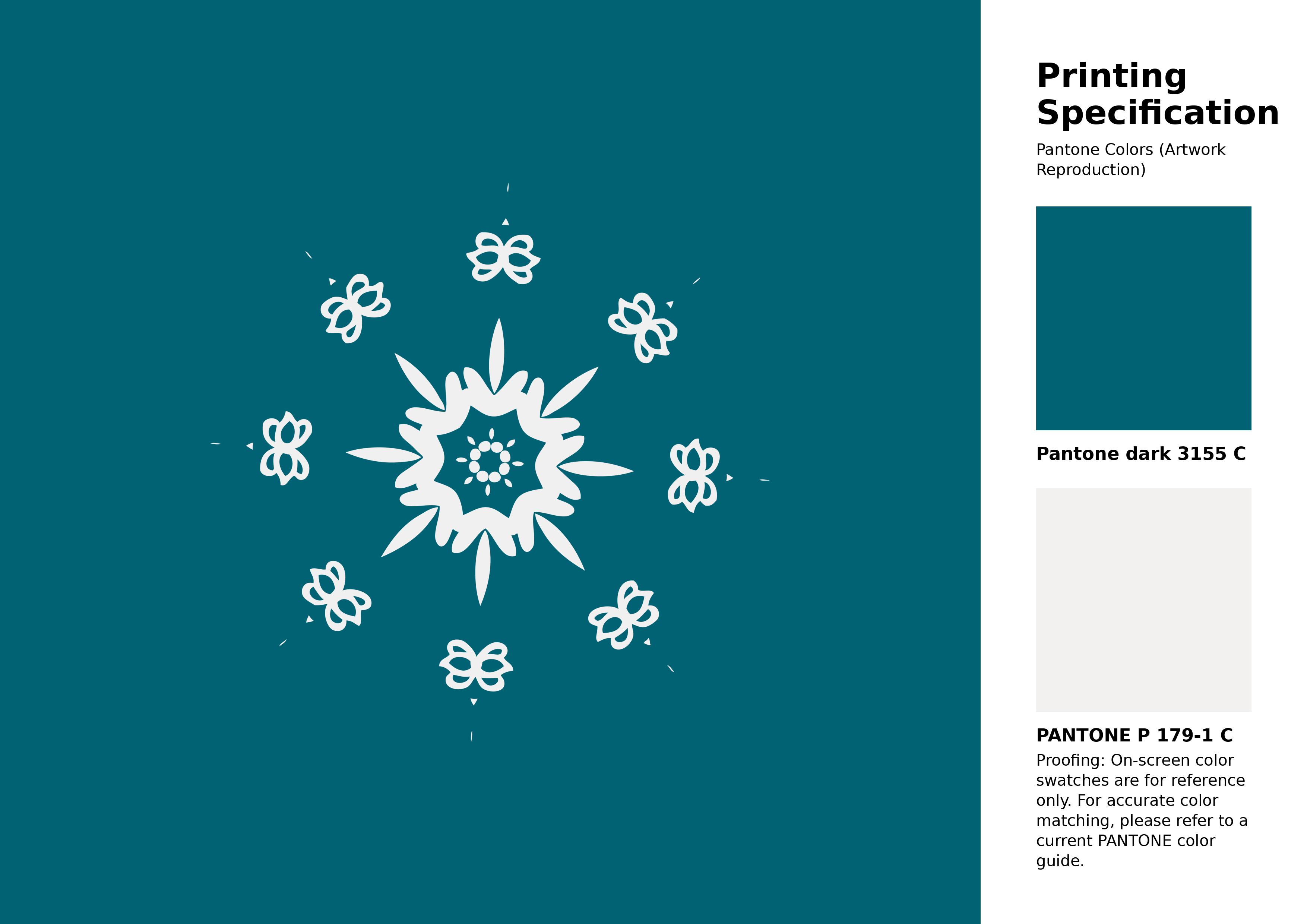
#006272 Pantone 3155 C Color | Hex color Code #006272 Artwork Image (PNG)
Download Artwork (PNG)#006272 Pantone 3155 C Color | Hex color Code #006272 Artwork Vector (PDF)
Download Artwork (PDF)#006272 Pantone 3155 C Color | Hex color Code #006272 Artwork Vector (SVG)
Download Artwork (SVG)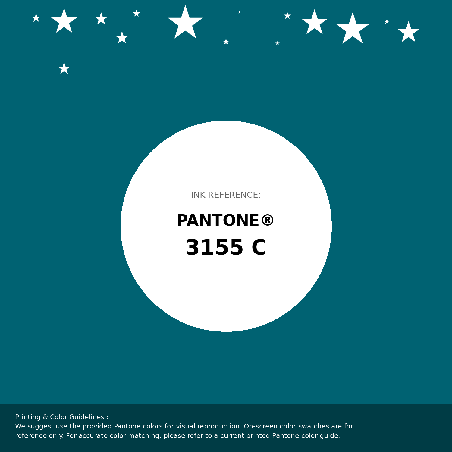
#006272 Pantone 3155 C Color | Hex color Code #006272 Pantone Swatch Artwork
Download Artwork Swatch
#006272 Pantone 3155 C Color | Hex color Code #006272 Gradient Artwork (PNG)
Download Gradient (PNG)#006272 Pantone 3155 C Color | Hex color Code #006272 Gradient Artwork (SVG)
Download Gradient (SVG)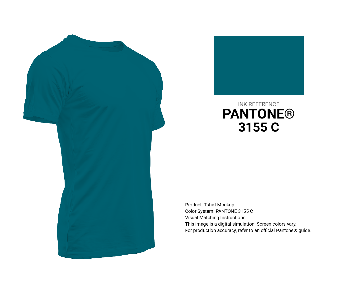
#006272 Pantone 3155 C Color | Hex color Code #006272 T-Shirt Mockup
Download T-Shirt Mockup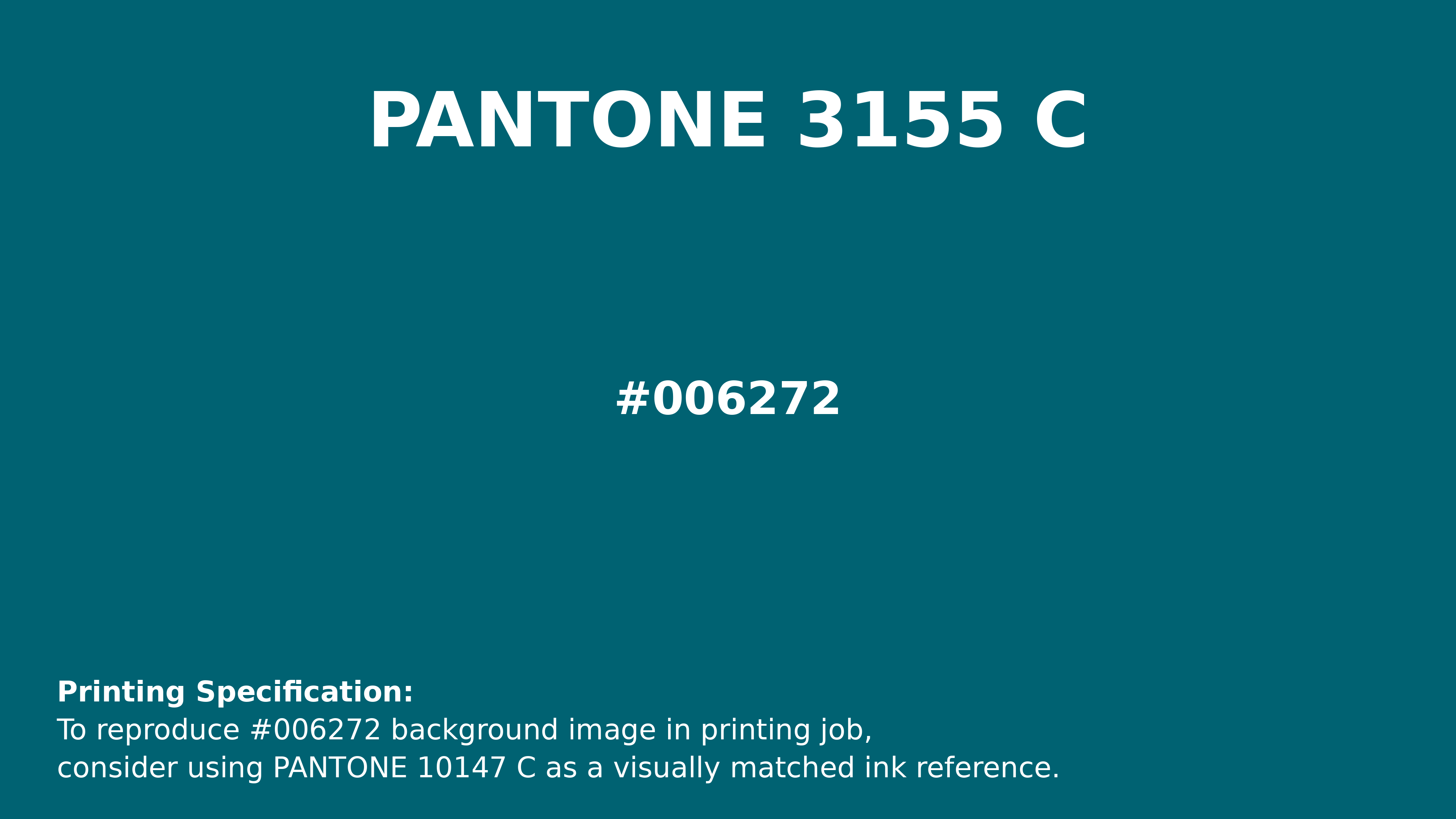
#006272 Pantone 3155 C Color | Hex color Code #006272 Printing Artwork Pantone Reference
Download Pantone Printing ReferenceRelated Color Palettes
- Dark Gray and Pale Violet Red •
- Dark Gray and Linen •
- Dark Gray and Light Steel Blue •
- Pale Goldenrod and Dark Gray •
- Dark Gray and White Smoke •
- White Smoke and Dark Gray •
- Dark Gray and Wheat •
- Dark Gray and Silver •
- Dark Gray and Black •
- Dark Gray and Dark Slate Gray •
- Light Steel Blue and Dark Gray •
- Olive Drab and Dark Gray •
- Sienna and Dark Gray •
- Gray and Dark Gray •
- Silver and Dark Gray
Color Palette Collection

20 Pink Color Schemes
20 color palettes with 100 colors.

42 Green Color Schemes
42 color palettes with 210 colors.
26 Brown Color Combinations
26 color palettes with 130 colors.

46 Indigo Color Palettes
46 color palettes with 230 colors.