#003DA5 Color
Your all-in-one color resource. Download hex background images, Adobe swatches (ASE), PDF color sheets, and SVG files. Explore palettes, harmonies, accessibility, conversions, and professional exports — designed for designers, developers, and color perfectionists.
The hex code #003DA5 presents a deep, rich blue, evocative of a calm, clear ocean on a slightly overcast day. The color carries a sense of tranquility and stability, hinting at the vastness and mystery of the deep sea. It's a serious yet peaceful tone, suggesting reliability and trust. Psychologically, it promotes feelings of security and contemplation, perhaps even a touch of melancholy. It reminds one of a twilight sky, the depths of a clear lake, or the cool shade under a dense forest canopy. In design, this color would be suitable for creating a sophisticated and calming atmosphere, perhaps in corporate settings to convey professionalism and trustworthiness, or in a home environment to promote relaxation and focus. The colors depth prevents it from feeling cold, instead conveying a sense of quiet strength and enduring presence. Culturally, blue is often associated with peace and harmony across many societies. Visually matched named color: Deep Ocean Calm.
PANTONE 293 C
Choose Color
Selected Color
Recent Colors
Color Details
Similar Ink Alternatives for #003DA5 color Alternative print inks for reproducing #003DA5 background image with a similar visual appearance.
Disclaimer: The visually matched ink reference is an independent approximation intended as a guide only. Please be advised that this pantone colors is only intended as a guide, Actual colours will depend on screen calibration variances. The print ink suggestions provided are independent visual approximations and are not affiliated with or endorsed by Pantone LLC. For official color specifications, conversion factors, and comprehensive color system information, please visit Pantone Connect. Official Pantone products can be purchased at pantone.com.
Color Previews for #000000 See how this color looks as a background or as text.
Complete Guide to Your Color Laboratory
Everything you need to know about this professional color toolkit.
Use the Color Picker at the top to select any color. All modules below update instantly.
Workflow: Pick a color → Explore palettes & data → Download what you need (PDF, Image, or Adobe ASE).
Color Details — Your color in all formats: HEX, RGB, RGBA, HSL, HSLA, HSV, CMYK, CIELab, Hunter-Lab, XYZ, Yxy, YUV. One-click copy.
Color Psychology — Emotional impact, cultural meanings, physiological effects, branding applications, and historical significance.
Named Colors — Find official color names (HTML/CSS, Pantone) that match your selection with similarity percentages.
Light & Dark Shades
80-step gradient from black to white. Perfect for button states and component systems.
Tints
Color mixed with white → lighter, pastel variations for backgrounds and disabled states.
Monochromatic — 11 curated tints/shades from one color. Production-ready for design systems.
- Complementary — Opposite on wheel (180°). High contrast.
- Analogous — Neighbors (±30°). Harmonious flow.
- Triadic — Three colors (120° apart). Vibrant, balanced.
- Split-Complementary — Base + two near-complements. Softer contrast.
- Tetradic/Square — Four colors. Complex, maximum variety.
- Neutral — Desaturated versions. Subtle, sophisticated.
15 Professional Variations — Monochromatic, Analogous, Complementary, Warm/Cool/Earth Tones, Pastel, Vibrant, High Contrast, and more.
Color Infusion — 10 palettes showing your color morphing into each major hue. Find bridge colors.
Similar Colors — 60+ colors generated via CIELAB Delta E matching. Unexpected harmonious combinations.
18 Ready-to-Use Gradients — Complementary, Analogous, Triadic, Tint/Shade progressions, and more.
Downloads: PNG (2560×1440), CSS (production-ready code), SVG (scalable vector).
WCAG Contrast Checker — Tests your color against white, black, and custom colors for AA (4.5:1) and AAA (7:1) compliance. Large text thresholds included.
Harmony & Accessibility Guide — Tests against 10 canonical hues. Shows which pairs are both beautiful AND WCAG-compliant for text.
PNG/JPG — High-res images for presentations and mood boards.
PDF — Print-ready reports for clients and teams.
Adobe ASE — Direct import to Photoshop, Illustrator, InDesign, XD.
CSS/SVG — Gradients only. Production-ready code and vectors.
Color Science: Industry-standard conversions (HSL, CIELAB, CMYK, XYZ). WCAG 2.1 luminance formula. Delta E (ΔE76) for perceptual matching.
Direct Links: Share colors via icolorpalette.com/color/ff5733 or icolorpalette.com/color/red
Issues? Refresh the page, wait for rendering, try another browser, or check console (F12) for errors.
Printing Guide for #003da5 Background Image
Use PANTONE 293 C as a visually matched ink reference when printing this background image.
To print the #003da5 background image from our site, consider using PANTONE 293 C as a visually matched ink reference.
Download the background image, then provide this reference code to your print vendor to help achieve accurate color reproduction.
The visually matched ink reference for the #003da5 background image is PANTONE 293 C.
This color is commonly described as Deep Ocean Calm.
The hex code #003DA5 presents a deep, rich blue, evocative of a calm, clear ocean on a slightly overcast day. The color carries a sense of tranquility and stability, hinting at the vastness and mystery of the deep sea. It's a serious yet peaceful tone, suggesting reliability and trust. Psychologically, it promotes feelings of security and contemplation, perhaps even a touch of melancholy. It reminds one of a twilight sky, the depths of a clear lake, or the cool shade under a dense forest canopy. In design, this color would be suitable for creating a sophisticated and calming atmosphere, perhaps in corporate settings to convey professionalism and trustworthiness, or in a home environment to promote relaxation and focus. The colors depth prevents it from feeling cold, instead conveying a sense of quiet strength and enduring presence. Culturally, blue is often associated with peace and harmony across many societies.
We provide PANTONE 293 C as a visually matched ink reference to help you reproduce the #003da5 background image accurately in professional printing.
This reference code helps print vendors achieve consistent color output across different printing equipment and materials.
After downloading the #003da5 background image from our site:
- Include the visually matched ink reference PANTONE 293 C in your print order notes
- Inform your print vendor that this is your target color reference
- Request a proof print to verify the Deep Ocean Calm color appearance before full production
The #003da5 background image with PANTONE 293 C as visually matched ink reference can be used for:
- Posters, banners, and backdrops
- Business cards, brochures, and flyers
- Packaging, labels, and stickers
- Signage and promotional materials
This is an independent visual approximation.
While PANTONE 293 C closely matches the #003da5 background image color, variations may exist between screen display and printed output.
We recommend requesting a proof print to verify the final appearance.
The hex code #003DA5 presents a deep, rich blue, evocative of a calm, clear ocean on a slightly overcast day. The color carries a sense of tranquility and stability, hinting at the vastness and mystery of the deep sea. It's a serious yet peaceful tone, suggesting reliability and trust. Psychologically, it promotes feelings of security and contemplation, perhaps even a touch of melancholy. It reminds one of a twilight sky, the depths of a clear lake, or the cool shade under a dense forest canopy. In design, this color would be suitable for creating a sophisticated and calming atmosphere, perhaps in corporate settings to convey professionalism and trustworthiness, or in a home environment to promote relaxation and focus. The colors depth prevents it from feeling cold, instead conveying a sense of quiet strength and enduring presence. Culturally, blue is often associated with peace and harmony across many societies.
Understanding these associations helps ensure the #003da5 background image aligns with your intended message and brand impact.
Important Information
The visually matched ink reference is an independent approximation intended as a guide only.
Actual printed colors may vary depending on screen calibration, substrate material, ink type, and printing equipment used.
For official color specifications and certified color standards, visit Pantone Connect.
Official color guides and swatch books can be purchased from pantone.com.
Pantone 293 C Color: A Refreshing Blue | #003DA5
Introduction:
Pantone 293 C is a vibrant blue color that exudes a sense of refreshment and tranquility. Its deep and rich hue captures attention and creates a feeling of calmness.
Historical Significance:
Blue in Art History: Blue has been used throughout history in various art forms, symbolizing different emotions and concepts. From Renaissance paintings to contemporary artworks, blue has played a significant role in artistic expression.
Blue in Exploration: Blue has also been associated with exploration and discovery. It was the color of the ocean that early explorers braved to embark on their journeys, symbolizing the unknown and the spirit of adventure.
Symbolism and Meaning:
Tranquility: Pantone 293 C is often associated with tranquility and peace. It brings a sense of serenity and calmness, allowing individuals to relax and find inner peace amidst the chaos of the world.
Trust: The color blue is commonly associated with trustworthiness and reliability. It evokes a sense of dependability, making it a popular choice for brands and businesses that want to build trust with their customers.
Pantone 293 C in Fashion:
Timeless Elegance: Pantone 293 C is often used in fashion to create elegant and sophisticated looks. It can be seen in formal dresses, accessories, and even in casual attire, adding a touch of class to any ensemble.
Pantone 293 C in Graphic Design:
Aesthetic Appeal: Pantone 293 C is a versatile color in graphic design. It can be used to create eye-catching visuals, evoke specific emotions, and enhance the overall aesthetic appeal of any design project.
Color Combinations:
Complementary Colors: Pantone 293 C pairs well with white, creating a clean and crisp look. It also harmonizes with shades of gray, adding depth and sophistication to the color palette.
Nature’s Palette:
Blue Skies: Pantone 293 C reflects the vibrant blue color of clear skies on a sunny day. It can be found in nature, from the stunning blue of the ocean to the delicate petals of certain flowers.
Artistic Representations:
Blue in Impressionism: Pantone 293 C is reminiscent of the blue hues used by Impressionist painters to capture the essence of light and atmosphere. It has been a go-to color for artists looking to evoke a sense of tranquility and beauty in their work.
Movies and Cinematic Landscapes:
Oceanic Scenes: Pantone 293 C is often used in movies to depict vast oceanic landscapes or scenes set near bodies of water. It creates a sense of serenity and majesty, immersing viewers in the beauty of the natural world.
Products and Commercial Appeal:
Fitness and Wellness: Pantone 293 C is commonly used in the branding and packaging of fitness and wellness products. It conveys a sense of health and vitality, appealing to individuals seeking a balanced lifestyle.
National Symbols and Significance:
Flags and Patriotism: Pantone 293 C can be found in the flags of several countries, symbolizing patriotism, loyalty, and national identity. It is often associated with unity and pride for one's nation.
The Psychological and Emotional Impact:
Calmness and Serenity: Pantone 293 C has a calming effect on the mind and body, promoting feelings of serenity and tranquility. It can help reduce stress and anxiety, creating a sense of inner peace.
Conclusion:
Pantone 293 C is a refreshing blue color that has been used throughout history to evoke a sense of tranquility, trust, and elegance. It finds its place in various industries, from fashion and graphic design to art and national symbolism. Its timeless appeal and psychological impact make Pantone 293 C a versatile and captivating color choice.
Pantone 293 C Color | Hex color Code #003da5 Image & Artwork
Download high-quality assets for your projects.

#003da5 Color Schemes
Download Color Schemes
#003da5 Color Shades
Download Color Shades
Pantone 293 C Color | Hex color Code #003da5 Solid Color Background
Download Solid Color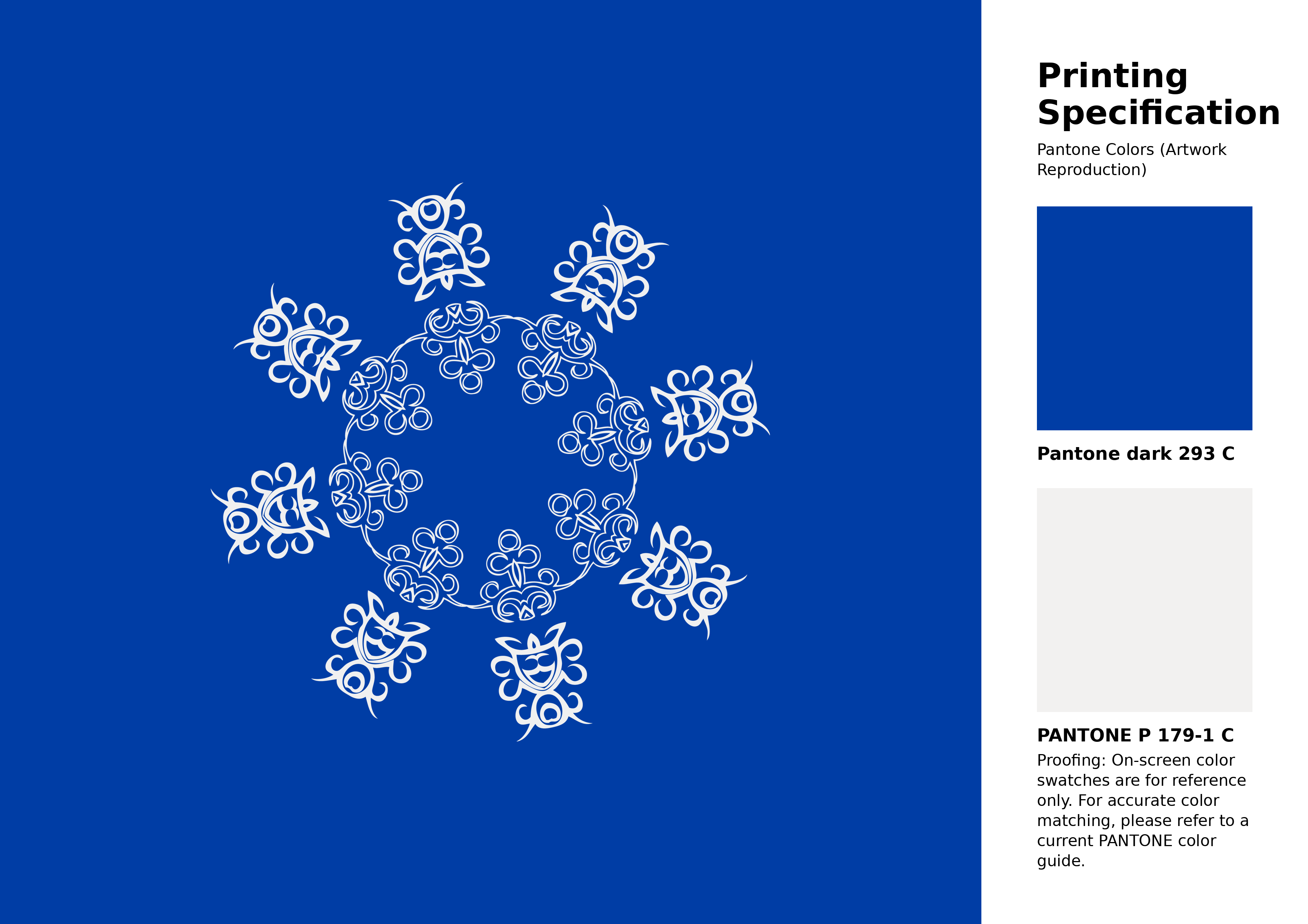
#003da5 Pantone 293 C Color | Hex color Code #003da5 Artwork Image (PNG)
Download Artwork (PNG)#003da5 Pantone 293 C Color | Hex color Code #003da5 Artwork Vector (PDF)
Download Artwork (PDF)#003da5 Pantone 293 C Color | Hex color Code #003da5 Artwork Vector (SVG)
Download Artwork (SVG)
#003da5 Pantone 293 C Color | Hex color Code #003da5 Pantone Swatch Artwork
Download Artwork Swatch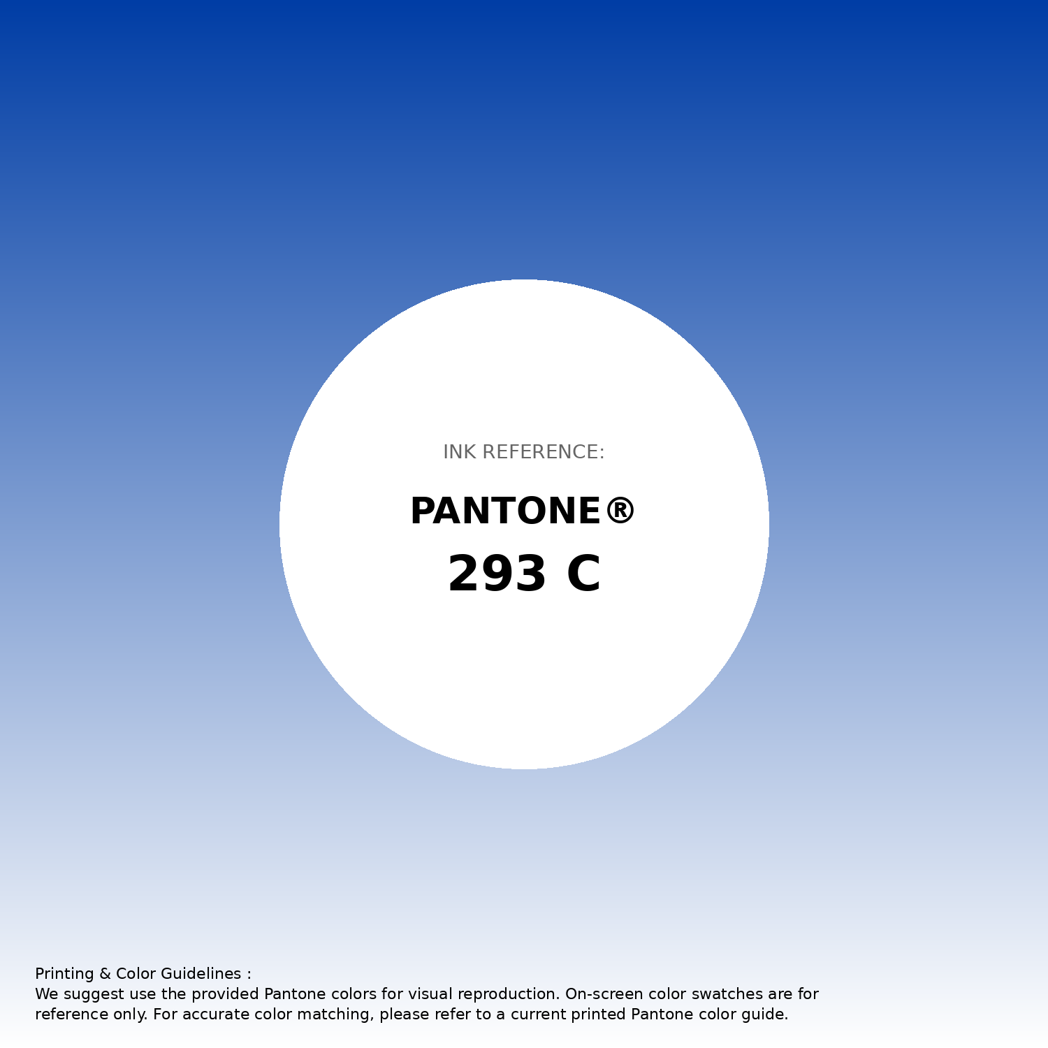
#003da5 Pantone 293 C Color | Hex color Code #003da5 Gradient Artwork (PNG)
Download Gradient (PNG)#003da5 Pantone 293 C Color | Hex color Code #003da5 Gradient Artwork (SVG)
Download Gradient (SVG)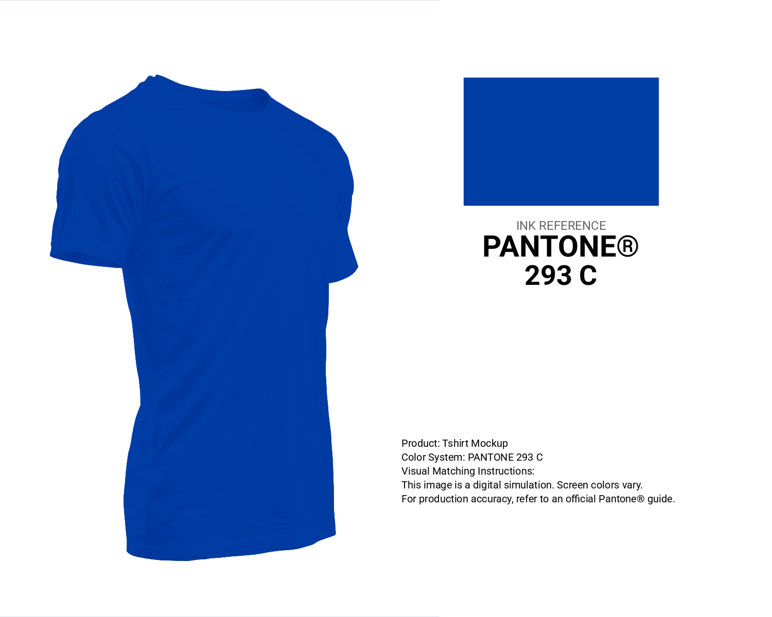
#003da5 Pantone 293 C Color | Hex color Code #003da5 T-Shirt Mockup
Download T-Shirt Mockup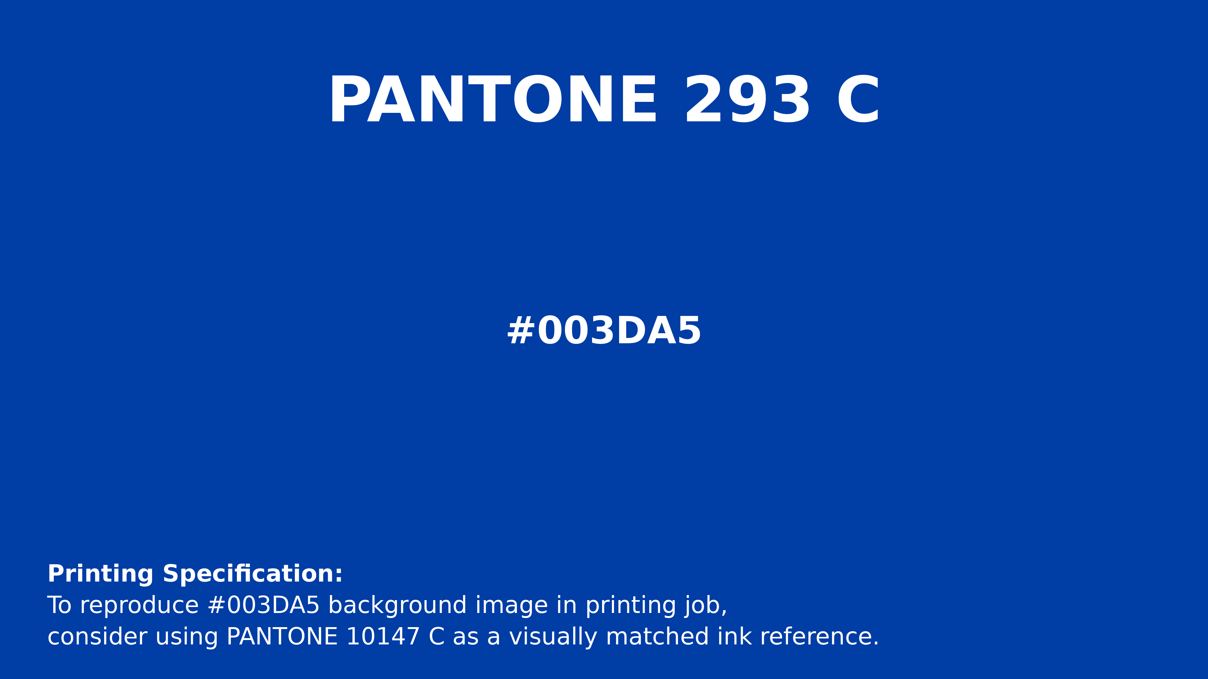
#003da5 Pantone 293 C Color | Hex color Code #003da5 Printing Artwork Pantone Reference
Download Pantone Printing ReferenceRelated Color Palettes
- Blue Lagoon •
- Midnight Blue and Light Sea Green •
- Pickled Bluewood •
- Midnight Blue and Black •
- Steel Blue and Sienna •
- Silver and Midnight Blue •
- Dark Khaki and Cornflower Blue •
- Sandy Brown and Light Steel Blue •
- Light Gray and Steel Blue •
- Cornflower Blue and Light Sky Blue •
- Dark Red and Midnight Blue •
- Tan and Powder Blue •
- Midnight Blue and Fire Brick •
- Light Steel Blue and Tomato •
- Dark Slate Blue and Cadet Blue
Color Palette Collection
Pink color palettes
15 color palettes with 75 colors.

500+ Popular Color Palette Collection
501 color palettes with 2505 colors.
Chardon
1 color palettes with 5 colors.

Color palettes for tshirt
12 color palettes with 60 colors.