#003B49 Color
Your all-in-one color resource. Download hex background images, Adobe swatches (ASE), PDF color sheets, and SVG files. Explore palettes, harmonies, accessibility, conversions, and professional exports — designed for designers, developers, and color perfectionists.
This deep, muted teal evokes the tranquil depths of a twilight ocean, reflecting the last light of day. It stirs feelings of introspection, wisdom, and a quiet strength, reminiscent of vast, unexplored waters and the hushed stillness before a storm. The color's intensity hints at hidden depths and a sense of mystery, creating an atmosphere of sophistication and understated elegance. It suggests a need for contemplation and a retreat from the everyday. Used in design, it can lend a feeling of stability and trust, often found in spaces promoting focus and mental wellness. It could be used to create a sense of luxury and sophistication in home decor or branding. Culturally, it can imply knowledge and a connection to the subconscious. Visually matched named color: Deep Azure Calm.
PANTONE 309 C
Choose Color
Selected Color
Recent Colors
Color Details
Similar Ink Alternatives for #003B49 color Alternative print inks for reproducing #003B49 background image with a similar visual appearance.
Disclaimer: The visually matched ink reference is an independent approximation intended as a guide only. Please be advised that this pantone colors is only intended as a guide, Actual colours will depend on screen calibration variances. The print ink suggestions provided are independent visual approximations and are not affiliated with or endorsed by Pantone LLC. For official color specifications, conversion factors, and comprehensive color system information, please visit Pantone Connect. Official Pantone products can be purchased at pantone.com.
Color Previews for #000000 See how this color looks as a background or as text.
Complete Guide to Your Color Laboratory
Everything you need to know about this professional color toolkit.
Use the Color Picker at the top to select any color. All modules below update instantly.
Workflow: Pick a color → Explore palettes & data → Download what you need (PDF, Image, or Adobe ASE).
Color Details — Your color in all formats: HEX, RGB, RGBA, HSL, HSLA, HSV, CMYK, CIELab, Hunter-Lab, XYZ, Yxy, YUV. One-click copy.
Color Psychology — Emotional impact, cultural meanings, physiological effects, branding applications, and historical significance.
Named Colors — Find official color names (HTML/CSS, Pantone) that match your selection with similarity percentages.
Light & Dark Shades
80-step gradient from black to white. Perfect for button states and component systems.
Tints
Color mixed with white → lighter, pastel variations for backgrounds and disabled states.
Monochromatic — 11 curated tints/shades from one color. Production-ready for design systems.
- Complementary — Opposite on wheel (180°). High contrast.
- Analogous — Neighbors (±30°). Harmonious flow.
- Triadic — Three colors (120° apart). Vibrant, balanced.
- Split-Complementary — Base + two near-complements. Softer contrast.
- Tetradic/Square — Four colors. Complex, maximum variety.
- Neutral — Desaturated versions. Subtle, sophisticated.
15 Professional Variations — Monochromatic, Analogous, Complementary, Warm/Cool/Earth Tones, Pastel, Vibrant, High Contrast, and more.
Color Infusion — 10 palettes showing your color morphing into each major hue. Find bridge colors.
Similar Colors — 60+ colors generated via CIELAB Delta E matching. Unexpected harmonious combinations.
18 Ready-to-Use Gradients — Complementary, Analogous, Triadic, Tint/Shade progressions, and more.
Downloads: PNG (2560×1440), CSS (production-ready code), SVG (scalable vector).
WCAG Contrast Checker — Tests your color against white, black, and custom colors for AA (4.5:1) and AAA (7:1) compliance. Large text thresholds included.
Harmony & Accessibility Guide — Tests against 10 canonical hues. Shows which pairs are both beautiful AND WCAG-compliant for text.
PNG/JPG — High-res images for presentations and mood boards.
PDF — Print-ready reports for clients and teams.
Adobe ASE — Direct import to Photoshop, Illustrator, InDesign, XD.
CSS/SVG — Gradients only. Production-ready code and vectors.
Color Science: Industry-standard conversions (HSL, CIELAB, CMYK, XYZ). WCAG 2.1 luminance formula. Delta E (ΔE76) for perceptual matching.
Direct Links: Share colors via icolorpalette.com/color/ff5733 or icolorpalette.com/color/red
Issues? Refresh the page, wait for rendering, try another browser, or check console (F12) for errors.
Printing Guide for #003b49 Background Image
Use PANTONE 309 C as a visually matched ink reference when printing this background image.
To print the #003b49 background image from our site, consider using PANTONE 309 C as a visually matched ink reference.
Download the background image, then provide this reference code to your print vendor to help achieve accurate color reproduction.
The visually matched ink reference for the #003b49 background image is PANTONE 309 C.
This color is commonly described as Deep Azure Calm.
This deep, muted teal evokes the tranquil depths of a twilight ocean, reflecting the last light of day. It stirs feelings of introspection, wisdom, and a quiet strength, reminiscent of vast, unexplored waters and the hushed stillness before a storm. The color's intensity hints at hidden depths and a sense of mystery, creating an atmosphere of sophistication and understated elegance. It suggests a need for contemplation and a retreat from the everyday. Used in design, it can lend a feeling of stability and trust, often found in spaces promoting focus and mental wellness. It could be used to create a sense of luxury and sophistication in home decor or branding. Culturally, it can imply knowledge and a connection to the subconscious.
We provide PANTONE 309 C as a visually matched ink reference to help you reproduce the #003b49 background image accurately in professional printing.
This reference code helps print vendors achieve consistent color output across different printing equipment and materials.
After downloading the #003b49 background image from our site:
- Include the visually matched ink reference PANTONE 309 C in your print order notes
- Inform your print vendor that this is your target color reference
- Request a proof print to verify the Deep Azure Calm color appearance before full production
The #003b49 background image with PANTONE 309 C as visually matched ink reference can be used for:
- Posters, banners, and backdrops
- Business cards, brochures, and flyers
- Packaging, labels, and stickers
- Signage and promotional materials
This is an independent visual approximation.
While PANTONE 309 C closely matches the #003b49 background image color, variations may exist between screen display and printed output.
We recommend requesting a proof print to verify the final appearance.
This deep, muted teal evokes the tranquil depths of a twilight ocean, reflecting the last light of day. It stirs feelings of introspection, wisdom, and a quiet strength, reminiscent of vast, unexplored waters and the hushed stillness before a storm. The color's intensity hints at hidden depths and a sense of mystery, creating an atmosphere of sophistication and understated elegance. It suggests a need for contemplation and a retreat from the everyday. Used in design, it can lend a feeling of stability and trust, often found in spaces promoting focus and mental wellness. It could be used to create a sense of luxury and sophistication in home decor or branding. Culturally, it can imply knowledge and a connection to the subconscious.
Understanding these associations helps ensure the #003b49 background image aligns with your intended message and brand impact.
Important Information
The visually matched ink reference is an independent approximation intended as a guide only.
Actual printed colors may vary depending on screen calibration, substrate material, ink type, and printing equipment used.
For official color specifications and certified color standards, visit Pantone Connect.
Official color guides and swatch books can be purchased from pantone.com.
Pantone 309 C Color: Deep Sea Blue | #003B49
Introduction:
Deep Sea Blue is a rich, dark shade of blue that evokes the depth and mystery of the ocean. Its deep and serene appearance makes it visually appealing, especially in combination with lighter shades.
Historical Significance:
Usage in Famous Artworks: Deep Sea Blue has been prominently used in famous pieces of art throughout history, such as Picasso's "The Old Guitarist" and Monet's "Water Lilies."
Symbolism in Maritime History: Deep Sea Blue has been historically associated with maritime industries, symbolizing trust, reliability, and the vastness of the sea.
Symbolism and Meaning:
Cultural Associations: Deep Sea Blue typically symbolizes calmness, depth, and stability in various cultures. In some cultures, it is also associated with wisdom and introspection.
Deep Sea Blue in Fashion:
Trendsetting Style: Deep Sea Blue has become a popular color in the fashion industry, often used in elegant evening wear and accessories. Its deep hue adds sophistication to any outfit.
Deep Sea Blue in Graphic Design:
Impact on Visual Aesthetics: Deep Sea Blue is frequently used in graphic design to create a sense of depth, calmness, and professionalism. It is often used in branding for industries related to travel and technology.
Color Combinations:
Complementary Colors: Deep Sea Blue pairs well with lighter shades such as sky blue and white, creating a harmonious and refreshing color combination.
Analogous Colors: Deep Sea Blue also works well with other shades of blue, such as navy or teal, creating a monochromatic color palette with varying depths.
Nature's Palette:
Oceanic Vibes: Deep Sea Blue is often found in natural elements like the ocean, representing its vastness and the depth of its waters. It can also be seen in the colors of certain marine flora and fauna.
Artistic Representations:
Usage in Abstract Art: Deep Sea Blue has been showcased in various abstract art pieces, representing emotions, depth, and the unpredictable nature of the ocean.
Movies and Cinematic Landscapes:
Mood Setting: Deep Sea Blue is often used in movies to create a mysterious, dramatic, or calming atmosphere. It can be seen in scenes set in underwater or coastal locations.
Products and Commercial Appeal:
Luxury Branding: Deep Sea Blue is frequently used in branding for high-end products and services, as it conveys a sense of elegance and sophistication.
National Symbols and Significance:
Symbolic Associations: In some countries, Deep Sea Blue holds national significance, representing qualities such as patriotism, stability, and unity.
The Psychological and Emotional Impact:
Tranquility and Trust: Deep Sea Blue has a calming effect on the mind and can evoke feelings of trust, relaxation, and introspection. It is often used in therapeutic environments.
Conclusion:
Deep Sea Blue, with its deep and mysterious allure, has played a prominent role in various aspects of human expression. Its historical significance, cultural symbolism, and visual appeal make it a timeless and versatile color.
Pantone 309 C Color | Hex color Code #003b49 Image & Artwork
Download high-quality assets for your projects.

#003b49 Color Schemes
Download Color Schemes
#003b49 Color Shades
Download Color Shades
Pantone 309 C Color | Hex color Code #003b49 Solid Color Background
Download Solid Color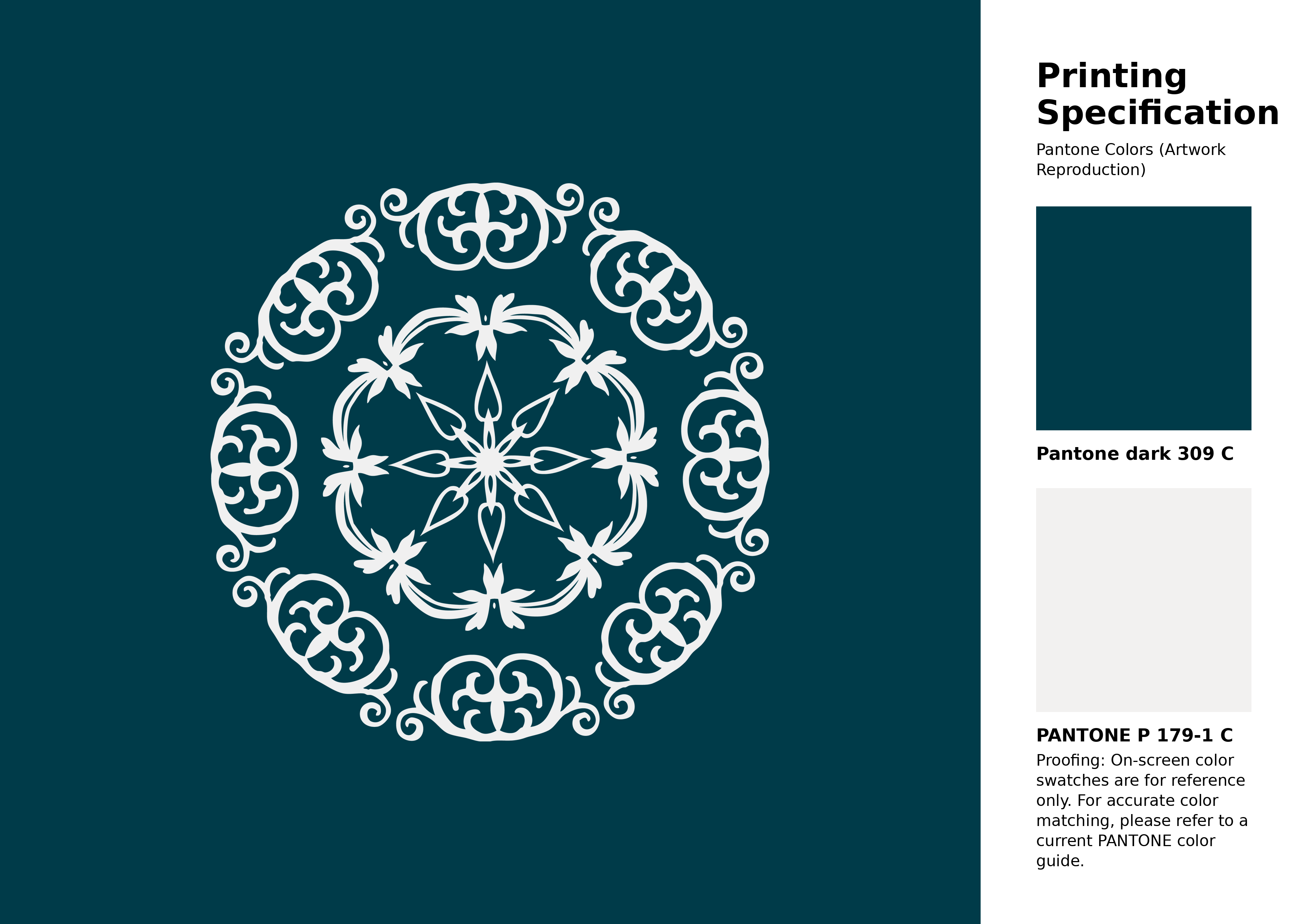
#003b49 Pantone 309 C Color | Hex color Code #003b49 Artwork Image (PNG)
Download Artwork (PNG)#003b49 Pantone 309 C Color | Hex color Code #003b49 Artwork Vector (PDF)
Download Artwork (PDF)#003b49 Pantone 309 C Color | Hex color Code #003b49 Artwork Vector (SVG)
Download Artwork (SVG)
#003b49 Pantone 309 C Color | Hex color Code #003b49 Pantone Swatch Artwork
Download Artwork Swatch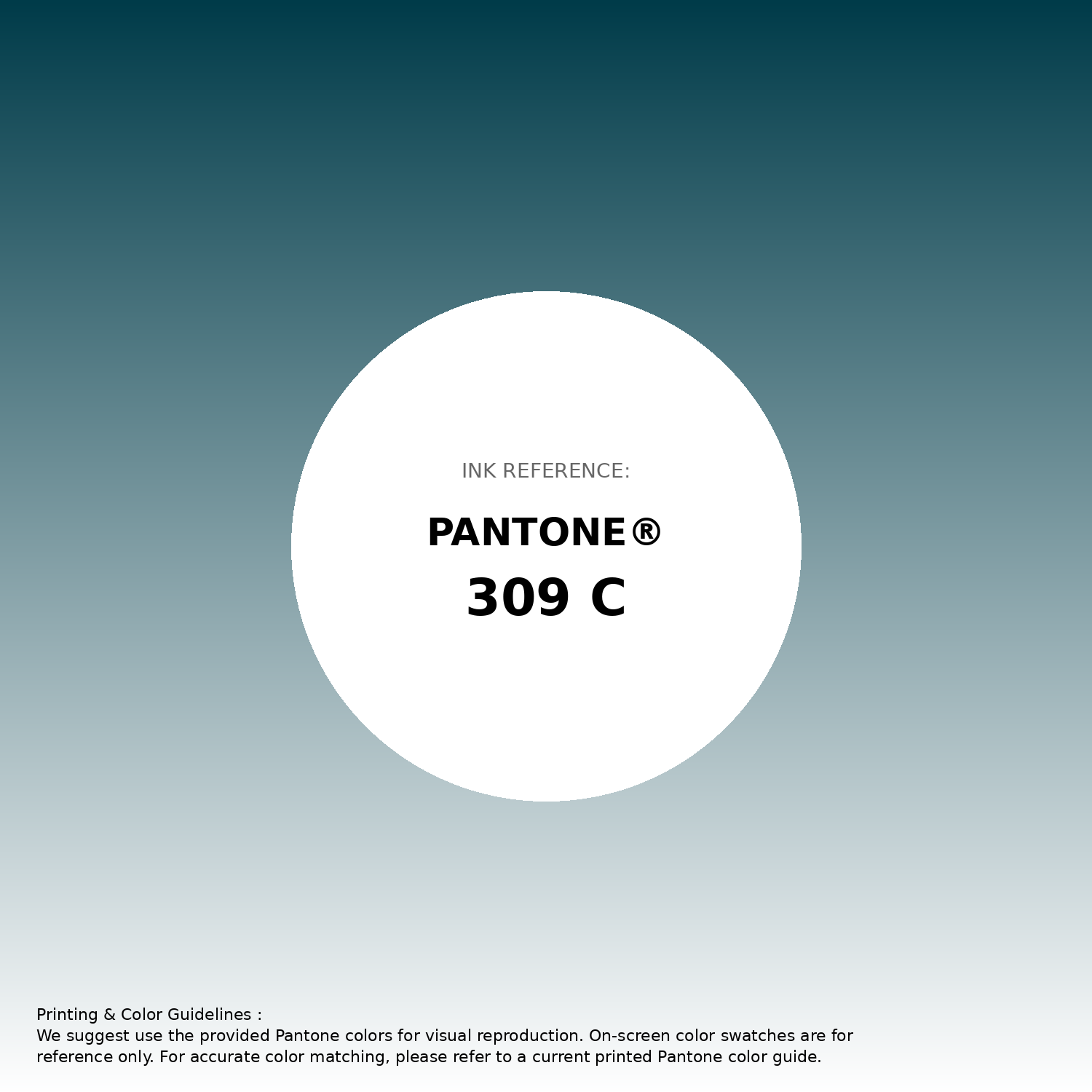
#003b49 Pantone 309 C Color | Hex color Code #003b49 Gradient Artwork (PNG)
Download Gradient (PNG)#003b49 Pantone 309 C Color | Hex color Code #003b49 Gradient Artwork (SVG)
Download Gradient (SVG)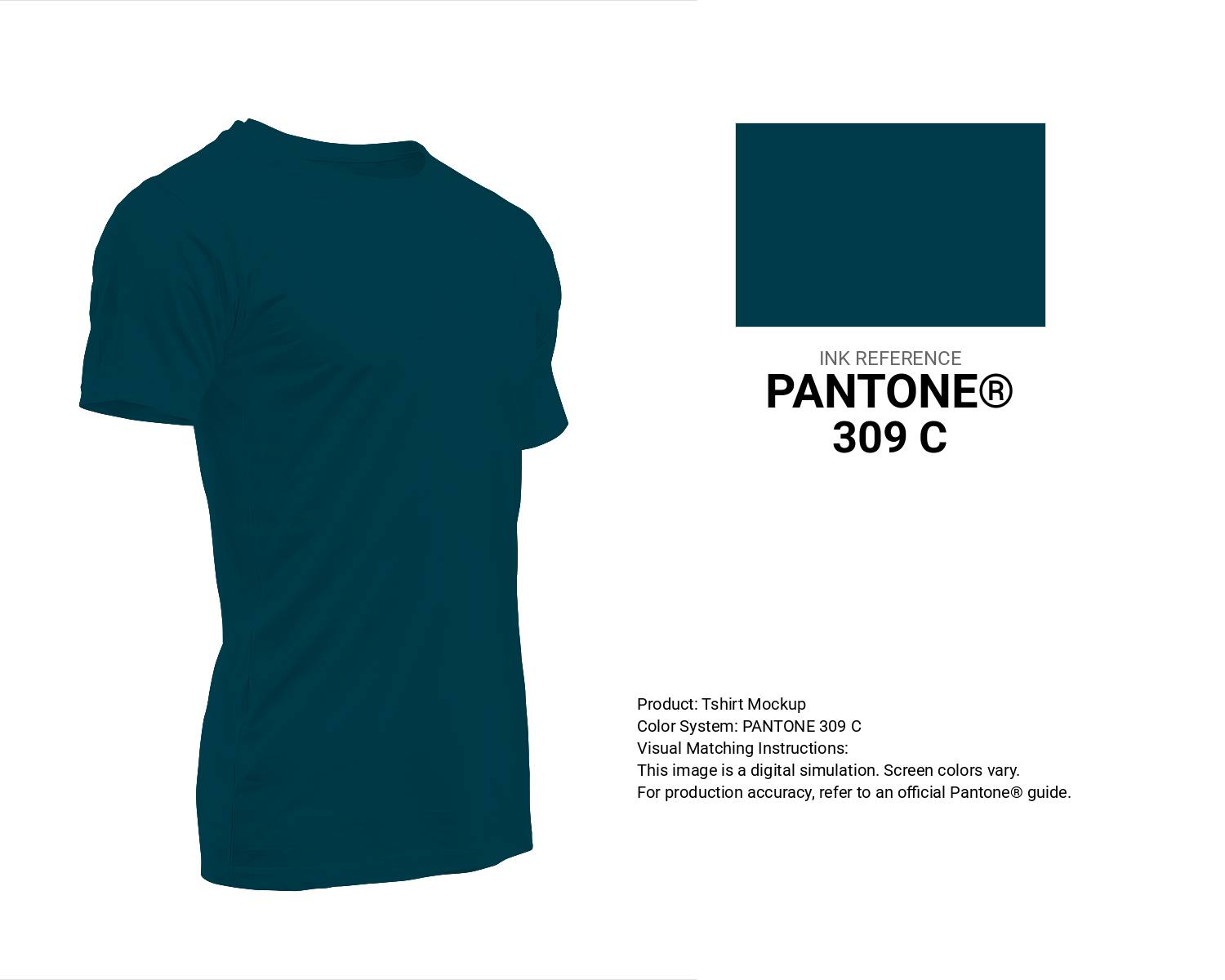
#003b49 Pantone 309 C Color | Hex color Code #003b49 T-Shirt Mockup
Download T-Shirt Mockup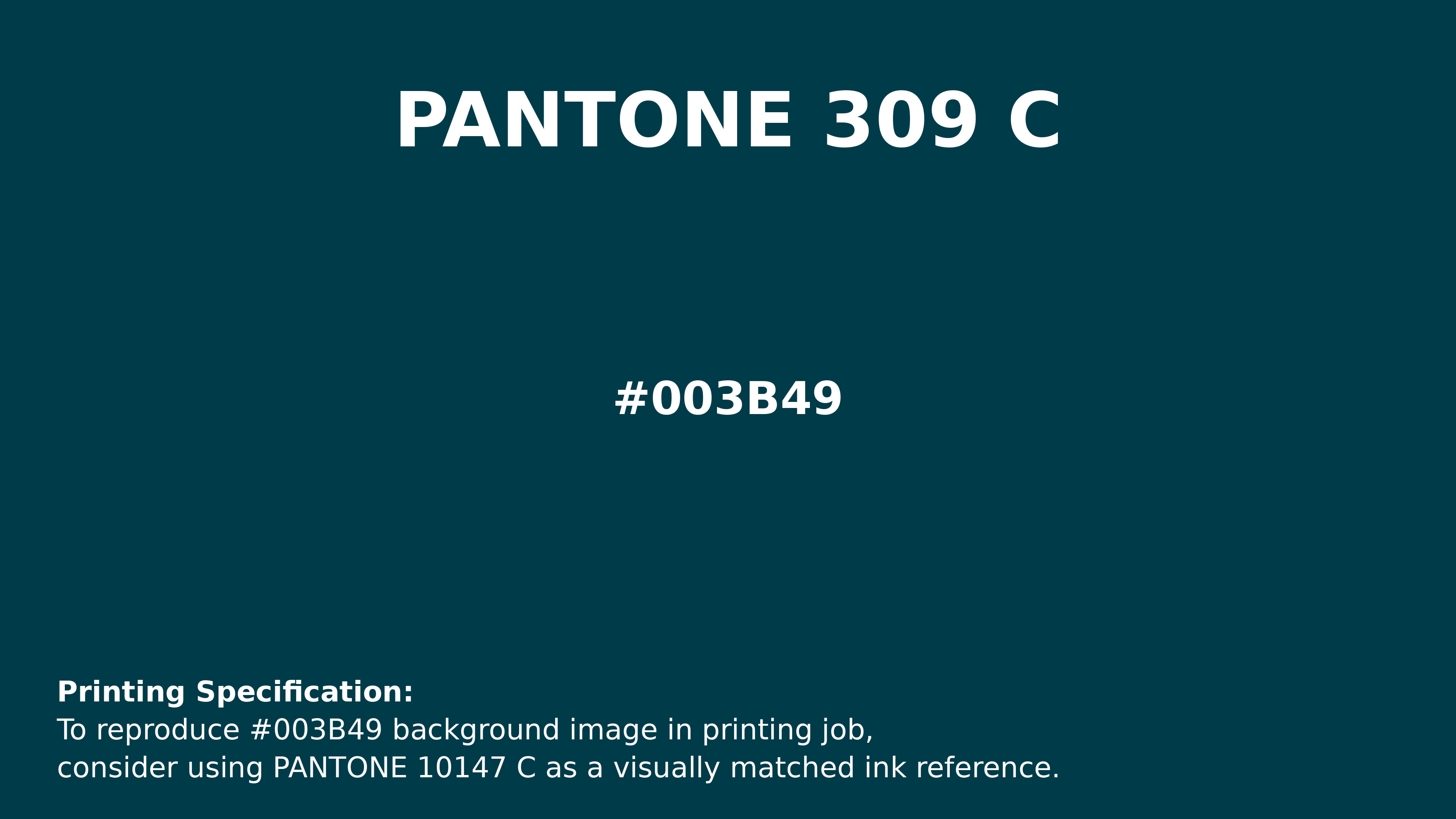
#003b49 Pantone 309 C Color | Hex color Code #003b49 Printing Artwork Pantone Reference
Download Pantone Printing ReferenceRelated Color Palettes
- Steel Blue and Dark Gray •
- Dark Gray and Silver •
- Dark Gray and Beige •
- Light Steel Blue and Dark Gray •
- Chocolate and Dark Gray •
- Dark Gray and White Smoke •
- Gainsboro and Dark Gray •
- Dark Olive Green and Dark Gray •
- Yellow Green and Dark Gray •
- Beige and Dark Gray •
- Dark Gray and Brown •
- Powder Blue and Dark Gray •
- Burly Wood and Dark Gray •
- Pale Goldenrod and Dark Gray •
- Wheat and Dark Gray
Color Palette Collection

Light Blue Palettes to Enhance Your Design
13 color palettes with 65 colors.

25 Blue Color Palettes
25 color palettes with 125 colors.

89 Blue Color Palettes
89 color palettes with 445 colors.

26 Pastel Color Schemes
26 color palettes with 130 colors.