#002D72 Color
Your all-in-one color resource. Download hex background images, Adobe swatches (ASE), PDF color sheets, and SVG files. Explore palettes, harmonies, accessibility, conversions, and professional exports — designed for designers, developers, and color perfectionists.
This deep blue, #002D72, casts a veil of profound introspection and quiet authority. It evokes the vast, unknowable depths of the ocean at twilight, or the solemn expanse of the night sky punctuated by distant stars. The color elicits feelings of wisdom, trust, and a sense of the serious, hinting at hidden knowledge and the weight of responsibility. It suggests stability and reliability, making it suitable for creating an atmosphere of professionalism and sophistication. It can be used in design to convey power and elegance, often employed in corporate branding, formal wear, or spaces designed to inspire focused thought. Culturally, it can be associated with royalty, tradition, and the enduring strength of established institutions. Visually matched named color: Deep Indigo Veil.
PANTONE 288 C
Choose Color
Selected Color
Recent Colors
Color Details
Similar Ink Alternatives for #002D72 color Alternative print inks for reproducing #002D72 background image with a similar visual appearance.
Disclaimer: The visually matched ink reference is an independent approximation intended as a guide only. Please be advised that this pantone colors is only intended as a guide, Actual colours will depend on screen calibration variances. The print ink suggestions provided are independent visual approximations and are not affiliated with or endorsed by Pantone LLC. For official color specifications, conversion factors, and comprehensive color system information, please visit Pantone Connect. Official Pantone products can be purchased at pantone.com.
Color Previews for #000000 See how this color looks as a background or as text.
Complete Guide to Your Color Laboratory
Everything you need to know about this professional color toolkit.
Use the Color Picker at the top to select any color. All modules below update instantly.
Workflow: Pick a color → Explore palettes & data → Download what you need (PDF, Image, or Adobe ASE).
Color Details — Your color in all formats: HEX, RGB, RGBA, HSL, HSLA, HSV, CMYK, CIELab, Hunter-Lab, XYZ, Yxy, YUV. One-click copy.
Color Psychology — Emotional impact, cultural meanings, physiological effects, branding applications, and historical significance.
Named Colors — Find official color names (HTML/CSS, Pantone) that match your selection with similarity percentages.
Light & Dark Shades
80-step gradient from black to white. Perfect for button states and component systems.
Tints
Color mixed with white → lighter, pastel variations for backgrounds and disabled states.
Monochromatic — 11 curated tints/shades from one color. Production-ready for design systems.
- Complementary — Opposite on wheel (180°). High contrast.
- Analogous — Neighbors (±30°). Harmonious flow.
- Triadic — Three colors (120° apart). Vibrant, balanced.
- Split-Complementary — Base + two near-complements. Softer contrast.
- Tetradic/Square — Four colors. Complex, maximum variety.
- Neutral — Desaturated versions. Subtle, sophisticated.
15 Professional Variations — Monochromatic, Analogous, Complementary, Warm/Cool/Earth Tones, Pastel, Vibrant, High Contrast, and more.
Color Infusion — 10 palettes showing your color morphing into each major hue. Find bridge colors.
Similar Colors — 60+ colors generated via CIELAB Delta E matching. Unexpected harmonious combinations.
18 Ready-to-Use Gradients — Complementary, Analogous, Triadic, Tint/Shade progressions, and more.
Downloads: PNG (2560×1440), CSS (production-ready code), SVG (scalable vector).
WCAG Contrast Checker — Tests your color against white, black, and custom colors for AA (4.5:1) and AAA (7:1) compliance. Large text thresholds included.
Harmony & Accessibility Guide — Tests against 10 canonical hues. Shows which pairs are both beautiful AND WCAG-compliant for text.
PNG/JPG — High-res images for presentations and mood boards.
PDF — Print-ready reports for clients and teams.
Adobe ASE — Direct import to Photoshop, Illustrator, InDesign, XD.
CSS/SVG — Gradients only. Production-ready code and vectors.
Color Science: Industry-standard conversions (HSL, CIELAB, CMYK, XYZ). WCAG 2.1 luminance formula. Delta E (ΔE76) for perceptual matching.
Direct Links: Share colors via icolorpalette.com/color/ff5733 or icolorpalette.com/color/red
Issues? Refresh the page, wait for rendering, try another browser, or check console (F12) for errors.
Printing Guide for #002d72 Background Image
Use PANTONE 288 C as a visually matched ink reference when printing this background image.
To print the #002d72 background image from our site, consider using PANTONE 288 C as a visually matched ink reference.
Download the background image, then provide this reference code to your print vendor to help achieve accurate color reproduction.
The visually matched ink reference for the #002d72 background image is PANTONE 288 C.
This color is commonly described as Deep Indigo Veil.
This deep blue, #002D72, casts a veil of profound introspection and quiet authority. It evokes the vast, unknowable depths of the ocean at twilight, or the solemn expanse of the night sky punctuated by distant stars. The color elicits feelings of wisdom, trust, and a sense of the serious, hinting at hidden knowledge and the weight of responsibility. It suggests stability and reliability, making it suitable for creating an atmosphere of professionalism and sophistication. It can be used in design to convey power and elegance, often employed in corporate branding, formal wear, or spaces designed to inspire focused thought. Culturally, it can be associated with royalty, tradition, and the enduring strength of established institutions.
We provide PANTONE 288 C as a visually matched ink reference to help you reproduce the #002d72 background image accurately in professional printing.
This reference code helps print vendors achieve consistent color output across different printing equipment and materials.
After downloading the #002d72 background image from our site:
- Include the visually matched ink reference PANTONE 288 C in your print order notes
- Inform your print vendor that this is your target color reference
- Request a proof print to verify the Deep Indigo Veil color appearance before full production
The #002d72 background image with PANTONE 288 C as visually matched ink reference can be used for:
- Posters, banners, and backdrops
- Business cards, brochures, and flyers
- Packaging, labels, and stickers
- Signage and promotional materials
This is an independent visual approximation.
While PANTONE 288 C closely matches the #002d72 background image color, variations may exist between screen display and printed output.
We recommend requesting a proof print to verify the final appearance.
This deep blue, #002D72, casts a veil of profound introspection and quiet authority. It evokes the vast, unknowable depths of the ocean at twilight, or the solemn expanse of the night sky punctuated by distant stars. The color elicits feelings of wisdom, trust, and a sense of the serious, hinting at hidden knowledge and the weight of responsibility. It suggests stability and reliability, making it suitable for creating an atmosphere of professionalism and sophistication. It can be used in design to convey power and elegance, often employed in corporate branding, formal wear, or spaces designed to inspire focused thought. Culturally, it can be associated with royalty, tradition, and the enduring strength of established institutions.
Understanding these associations helps ensure the #002d72 background image aligns with your intended message and brand impact.
Important Information
The visually matched ink reference is an independent approximation intended as a guide only.
Actual printed colors may vary depending on screen calibration, substrate material, ink type, and printing equipment used.
For official color specifications and certified color standards, visit Pantone Connect.
Official color guides and swatch books can be purchased from pantone.com.
Pantone 288 C Color: Vibrant Blue | #002D72
Introduction:
Vibrant Blue is a rich and deep color that is visually appealing. It exudes confidence and inspires a sense of energy and vitality.
Historical Significance:
Significance in Historical Events: Vibrant Blue has been prominently used in various historical events, such as the national flag of several countries and as a symbol of freedom and loyalty. It has also been associated with significant moments in art, literature, and political movements.
Symbolism and Meaning:
Symbolic Representations: Vibrant Blue typically symbolizes stability, trust, and wisdom. It is often associated with the sky, sea, and open spaces, representing freedom and tranquility. In different cultures, it may also carry religious or cultural meanings.
Vibrant Blue in Fashion:
Influence on Fashion Trends: Vibrant Blue is a popular color in the fashion industry, often used in clothing and accessories. It adds a vibrant touch to outfits and is frequently associated with sophistication, elegance, and confidence.
Vibrant Blue in Graphic Design:
Design Aesthetic and Visual Impact: Vibrant Blue is widely used in graphic design for its striking visual appeal. It can convey a sense of professionalism, creativity, and trustworthiness. It is often utilized in branding to create a memorable and impactful visual identity.
Color Combinations:
Potential Color Combinations: Vibrant Blue works well with complementary colors such as white, yellow, and orange. It can also be paired with neutrals like gray or black for a more sophisticated look.
Nature’s Palette:
Natural Occurrences: Vibrant Blue is commonly found in nature, from clear blue skies to vibrant blue flowers and bodies of water. It represents the natural beauty and serenity of the world around us.
Artistic Representations:
Influence in Art: Vibrant Blue has been utilized in various forms of art throughout history. Artists have used it to evoke emotions, create depth, and symbolize different concepts or scenes. It is a versatile and impactful color in artistic expressions.
Movies and Cinematic Landscapes:
Cinematic Impact: Vibrant Blue is often used in movies to set a specific tone or mood. It can create a sense of calmness, mystery, or depth depending on its context within the film. It adds visual interest and enhances the overall cinematic experience.
Products and Commercial Appeal:
Brands and Color Associations: Many popular products and brands have incorporated Vibrant Blue into their logos and branding. It is often associated with professionalism, reliability, and modernity, making it an appealing choice for commercial purposes.
National Symbols and Significance:
National and Cultural Significance: Vibrant Blue holds significance as a national color in certain countries, representing patriotism and national identity. It is also used in cultural celebrations and ceremonies to symbolize tradition and heritage.
The Psychological and Emotional Impact:
Psychological Influence: Vibrant Blue can have a calming effect on the mind and is often associated with feelings of tranquility, harmony, and trust. It can also stimulate creativity and promote clear thinking.
Conclusion:
Vibrant Blue is a color that has had a significant impact throughout history and across various industries. Its deep and vibrant hue symbolizes stability, trust, and freedom. It is a versatile color that is used in fashion, graphic design, and various forms of art. Whether in nature, commercial branding, or cultural symbolism, Vibrant Blue continues to capture attention and evoke emotions.
Pantone 288 C Color | Hex color Code #002d72 Image & Artwork
Download high-quality assets for your projects.

#002d72 Color Schemes
Download Color Schemes
#002d72 Color Shades
Download Color Shades
Pantone 288 C Color | Hex color Code #002d72 Solid Color Background
Download Solid Color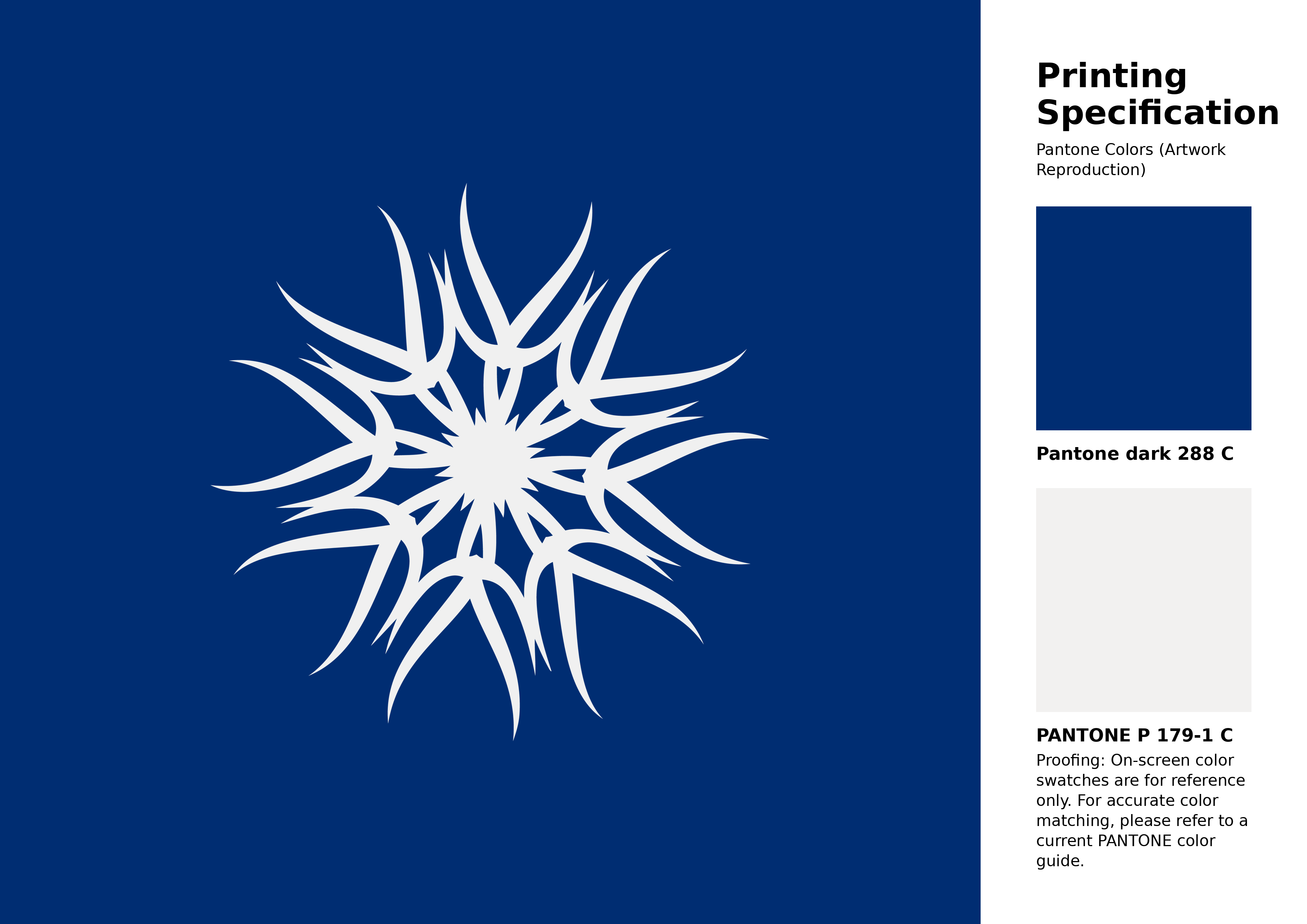
#002d72 Pantone 288 C Color | Hex color Code #002d72 Artwork Image (PNG)
Download Artwork (PNG)#002d72 Pantone 288 C Color | Hex color Code #002d72 Artwork Vector (PDF)
Download Artwork (PDF)#002d72 Pantone 288 C Color | Hex color Code #002d72 Artwork Vector (SVG)
Download Artwork (SVG)
#002d72 Pantone 288 C Color | Hex color Code #002d72 Pantone Swatch Artwork
Download Artwork Swatch
#002d72 Pantone 288 C Color | Hex color Code #002d72 Gradient Artwork (PNG)
Download Gradient (PNG)#002d72 Pantone 288 C Color | Hex color Code #002d72 Gradient Artwork (SVG)
Download Gradient (SVG)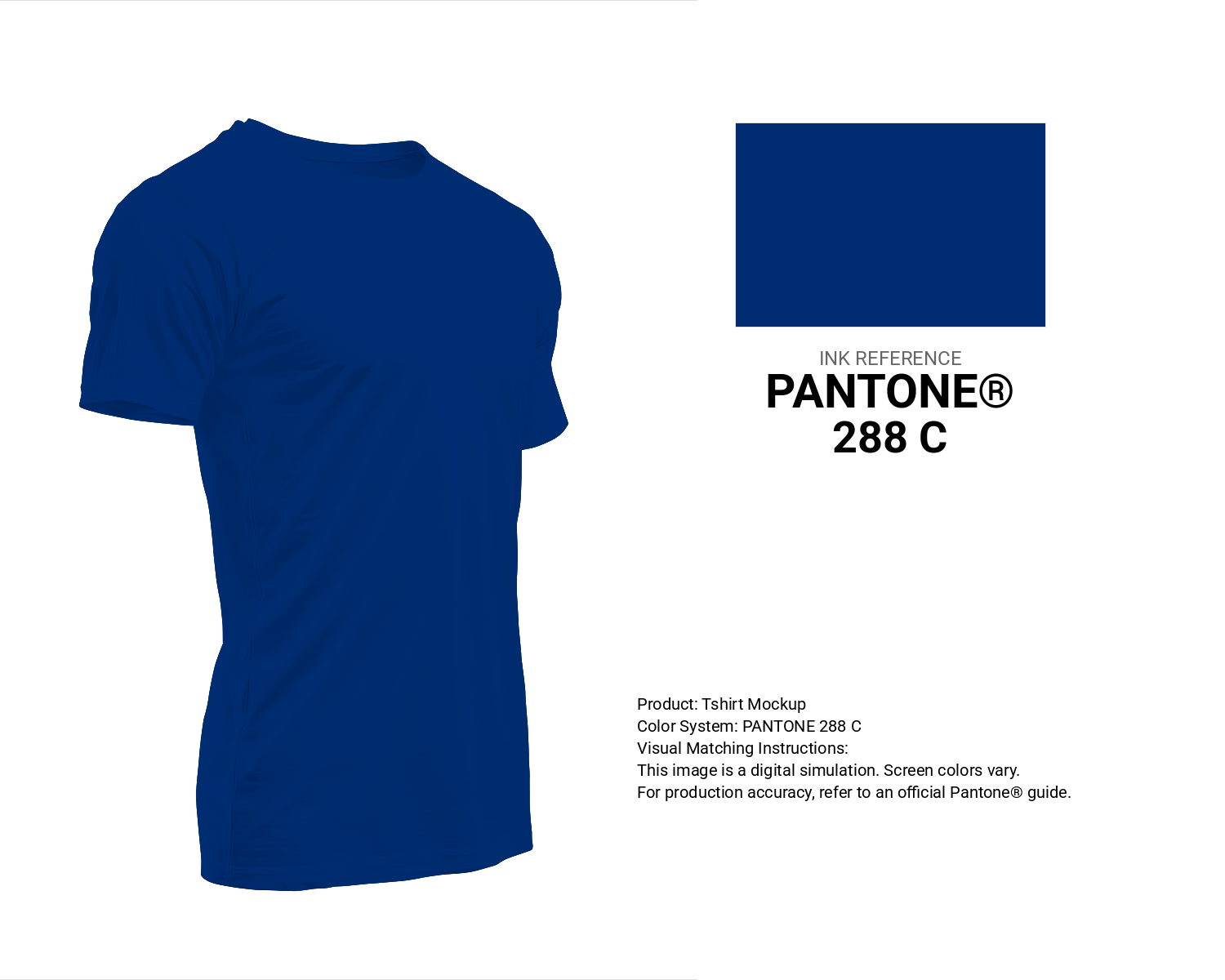
#002d72 Pantone 288 C Color | Hex color Code #002d72 T-Shirt Mockup
Download T-Shirt Mockup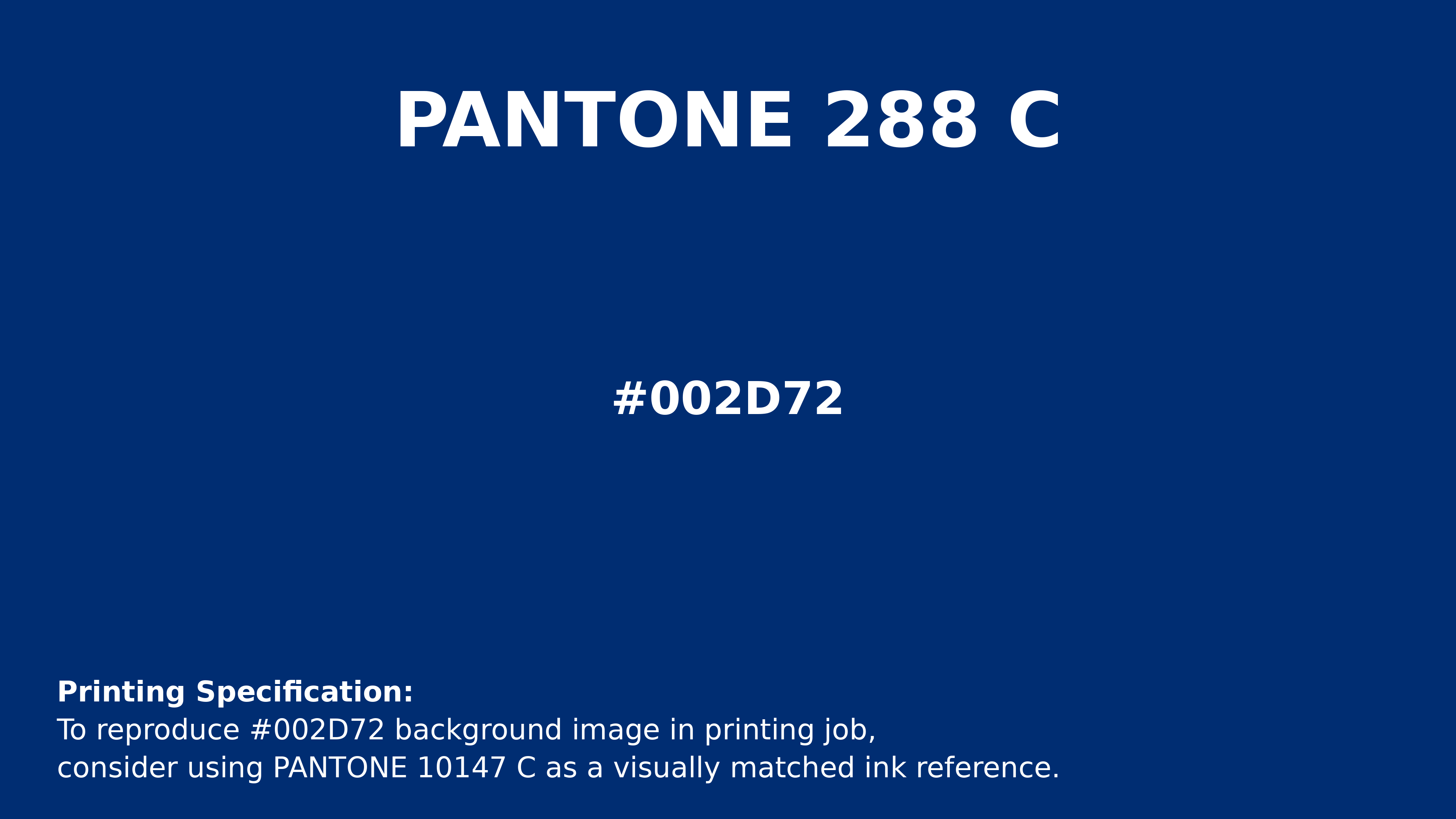
#002d72 Pantone 288 C Color | Hex color Code #002d72 Printing Artwork Pantone Reference
Download Pantone Printing ReferenceRelated Color Palettes
- Dark Gray and Pale Goldenrod •
- Dark Gray and Dark Gray •
- Dark Gray and Linen •
- Steel Blue and Dark Gray •
- Dark Gray •
- Dark Olive Green and Dark Gray •
- Dark Gray and Thistle •
- Indian Red and Dark Gray •
- Cadet Blue and Dark Gray •
- Dark Gray and Forest Green •
- Dark Gray and Light Steel Blue •
- Light Slate Gray and Dark Gray •
- Dark Gray and Slate Gray •
- Wheat and Dark Gray •
- Dark Gray and Indian Red
Color Palette Collection
15 Skin Tone Color Palettes
15 color palettes with 75 colors.
Light color Palettes
9 color palettes with 45 colors.
23 Light Blue Color Schemes
23 color palettes with 115 colors.
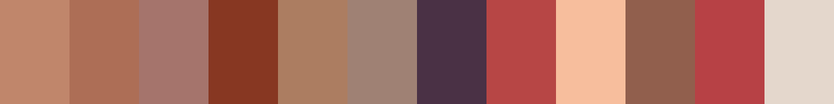
26 Brown Color Combinations
26 color palettes with 130 colors.