#00263A Color
Your all-in-one color resource. Download hex background images, Adobe swatches (ASE), PDF color sheets, and SVG files. Explore palettes, harmonies, accessibility, conversions, and professional exports — designed for designers, developers, and color perfectionists.
This deep, rich blue-black evokes a sense of mystery and quiet contemplation. It's reminiscent of a starlit night sky, the depths of the ocean, and the stillness of a moonlit forest. The color creates a sophisticated and introspective atmosphere, perfect for rooms needing a touch of elegance and a calming, almost regal ambiance. It suggests a sense of security and profoundness. In design, it can be used to create a dramatic backdrop for highlighting other elements, or to add a touch of understated luxury. While not overtly symbolic, it carries a sense of permanence and the passage of time. Visually matched named color: Midnight Depth.
PANTONE 539 C
Choose Color
Selected Color
Recent Colors
Color Details
Similar Ink Alternatives for #00263A color Alternative print inks for reproducing #00263A background image with a similar visual appearance.
Disclaimer: The visually matched ink reference is an independent approximation intended as a guide only. Please be advised that this pantone colors is only intended as a guide, Actual colours will depend on screen calibration variances. The print ink suggestions provided are independent visual approximations and are not affiliated with or endorsed by Pantone LLC. For official color specifications, conversion factors, and comprehensive color system information, please visit Pantone Connect. Official Pantone products can be purchased at pantone.com.
Color Previews for #000000 See how this color looks as a background or as text.
Complete Guide to Your Color Laboratory
Everything you need to know about this professional color toolkit.
Use the Color Picker at the top to select any color. All modules below update instantly.
Workflow: Pick a color → Explore palettes & data → Download what you need (PDF, Image, or Adobe ASE).
Color Details — Your color in all formats: HEX, RGB, RGBA, HSL, HSLA, HSV, CMYK, CIELab, Hunter-Lab, XYZ, Yxy, YUV. One-click copy.
Color Psychology — Emotional impact, cultural meanings, physiological effects, branding applications, and historical significance.
Named Colors — Find official color names (HTML/CSS, Pantone) that match your selection with similarity percentages.
Light & Dark Shades
80-step gradient from black to white. Perfect for button states and component systems.
Tints
Color mixed with white → lighter, pastel variations for backgrounds and disabled states.
Monochromatic — 11 curated tints/shades from one color. Production-ready for design systems.
- Complementary — Opposite on wheel (180°). High contrast.
- Analogous — Neighbors (±30°). Harmonious flow.
- Triadic — Three colors (120° apart). Vibrant, balanced.
- Split-Complementary — Base + two near-complements. Softer contrast.
- Tetradic/Square — Four colors. Complex, maximum variety.
- Neutral — Desaturated versions. Subtle, sophisticated.
15 Professional Variations — Monochromatic, Analogous, Complementary, Warm/Cool/Earth Tones, Pastel, Vibrant, High Contrast, and more.
Color Infusion — 10 palettes showing your color morphing into each major hue. Find bridge colors.
Similar Colors — 60+ colors generated via CIELAB Delta E matching. Unexpected harmonious combinations.
18 Ready-to-Use Gradients — Complementary, Analogous, Triadic, Tint/Shade progressions, and more.
Downloads: PNG (2560×1440), CSS (production-ready code), SVG (scalable vector).
WCAG Contrast Checker — Tests your color against white, black, and custom colors for AA (4.5:1) and AAA (7:1) compliance. Large text thresholds included.
Harmony & Accessibility Guide — Tests against 10 canonical hues. Shows which pairs are both beautiful AND WCAG-compliant for text.
PNG/JPG — High-res images for presentations and mood boards.
PDF — Print-ready reports for clients and teams.
Adobe ASE — Direct import to Photoshop, Illustrator, InDesign, XD.
CSS/SVG — Gradients only. Production-ready code and vectors.
Color Science: Industry-standard conversions (HSL, CIELAB, CMYK, XYZ). WCAG 2.1 luminance formula. Delta E (ΔE76) for perceptual matching.
Direct Links: Share colors via icolorpalette.com/color/ff5733 or icolorpalette.com/color/red
Issues? Refresh the page, wait for rendering, try another browser, or check console (F12) for errors.
Printing Guide for #00263a Background Image
Use PANTONE 539 C as a visually matched ink reference when printing this background image.
To print the #00263a background image from our site, consider using PANTONE 539 C as a visually matched ink reference.
Download the background image, then provide this reference code to your print vendor to help achieve accurate color reproduction.
The visually matched ink reference for the #00263a background image is PANTONE 539 C.
This color is commonly described as Midnight Depth.
This deep, rich blue-black evokes a sense of mystery and quiet contemplation. It's reminiscent of a starlit night sky, the depths of the ocean, and the stillness of a moonlit forest. The color creates a sophisticated and introspective atmosphere, perfect for rooms needing a touch of elegance and a calming, almost regal ambiance. It suggests a sense of security and profoundness. In design, it can be used to create a dramatic backdrop for highlighting other elements, or to add a touch of understated luxury. While not overtly symbolic, it carries a sense of permanence and the passage of time.
We provide PANTONE 539 C as a visually matched ink reference to help you reproduce the #00263a background image accurately in professional printing.
This reference code helps print vendors achieve consistent color output across different printing equipment and materials.
After downloading the #00263a background image from our site:
- Include the visually matched ink reference PANTONE 539 C in your print order notes
- Inform your print vendor that this is your target color reference
- Request a proof print to verify the Midnight Depth color appearance before full production
The #00263a background image with PANTONE 539 C as visually matched ink reference can be used for:
- Posters, banners, and backdrops
- Business cards, brochures, and flyers
- Packaging, labels, and stickers
- Signage and promotional materials
This is an independent visual approximation.
While PANTONE 539 C closely matches the #00263a background image color, variations may exist between screen display and printed output.
We recommend requesting a proof print to verify the final appearance.
This deep, rich blue-black evokes a sense of mystery and quiet contemplation. It's reminiscent of a starlit night sky, the depths of the ocean, and the stillness of a moonlit forest. The color creates a sophisticated and introspective atmosphere, perfect for rooms needing a touch of elegance and a calming, almost regal ambiance. It suggests a sense of security and profoundness. In design, it can be used to create a dramatic backdrop for highlighting other elements, or to add a touch of understated luxury. While not overtly symbolic, it carries a sense of permanence and the passage of time.
Understanding these associations helps ensure the #00263a background image aligns with your intended message and brand impact.
Important Information
The visually matched ink reference is an independent approximation intended as a guide only.
Actual printed colors may vary depending on screen calibration, substrate material, ink type, and printing equipment used.
For official color specifications and certified color standards, visit Pantone Connect.
Official color guides and swatch books can be purchased from pantone.com.
Pantone 539 C Color: Tranquil Sea | #00263A
Introduction:
Tranquil Sea (Pantone 539 C) is a deep blue-green color that evokes a sense of tranquility and calmness. Its rich hue and subtle intensity make it visually appealing and soothing to the eye.
Historical Significance:
Key moments in history: Tranquil Sea has been prominently used in various historical events, such as ocean exploration and maritime traditions. It symbolizes the vastness and mystery of the sea and has been featured in paintings, nautical flags, and naval uniforms.
Symbolism and Meaning:
Symbolism and Meaning: Tranquil Sea typically symbolizes harmony, balance, and peacefulness. In different cultures, it represents the calming effects of water and is associated with relaxation, serenity, and introspection.
Tranquil Sea in Fashion:
Tranquil Sea in Fashion: This color has a significant impact on styles and trends in the fashion world. It is often used in elegant evening gowns, accessories, and swimwear, adding a touch of sophistication and serenity to various outfits.
Tranquil Sea in Graphic Design:
Significance in design aesthetics: Tranquil Sea is widely used in graphic design to create a sense of calmness and tranquility. It adds depth and sophistication to visual compositions, especially in branding and marketing materials related to travel, wellness, and nature.
Color Combinations:
Potential color combinations: Tranquil Sea pairs well with shades of white, light gray, coral, and gold. This color combination creates a harmonious and serene visual experience, perfect for a beach-themed design or a soothing interior space.
Nature’s Palette:
Natural occurrences: Tranquil Sea can be found in nature in various forms, such as the color of the ocean on a calm day, certain species of tropical fish, and the leaves of specific aquatic plants. It is also present in natural landscapes, like secluded lagoons and serene waterfalls.
Artistic Representations:
Artistic usage: Tranquil Sea has been used by artists in paintings and sculptures to depict tranquil and serene settings. It captures the essence of peacefulness in landscapes, seascapes, and abstract art.
Movies and Cinematic Landscapes:
Movies and scenes: Tranquil Sea sets the tone or mood in movies or scenes that aim to evoke a sense of calmness and tranquility. It is often utilized in coastal or underwater scenes to create a peaceful and serene atmosphere.
Products and Commercial Appeal:
Popular products and brands: Tranquil Sea is associated with several popular products and brands that promote relaxation, well-being, and nature-inspired themes. It is commonly used in skincare, home decor, and travel-related industries.
National Symbols and Significance:
National Symbols and Significance: Tranquil Sea holds cultural significance in countries with strong maritime traditions. It may be incorporated into national symbols such as flags, representing the country's connection to the sea and its peaceful nature.
The Psychological and Emotional Impact:
Psychological and Emotional Impact: Tranquil Sea influences emotions and perceptions by promoting a sense of calmness and relaxation. It can help reduce stress, promote focus, and create a serene atmosphere, making it suitable for spaces intended for relaxation and meditation.
Conclusion:
Tranquil Sea (Pantone 539 C) is a color that combines the calming effects of blue and green. Its historical significance, symbolism, and association with nature make it a timeless and versatile color. Whether used in fashion, graphic design, or various forms of art, Tranquil Sea has a profound impact on visual aesthetics and emotional well-being.
Pantone 539 C Color | Hex color Code #00263a Image & Artwork
Download high-quality assets for your projects.

#00263a Color Schemes
Download Color Schemes
#00263a Color Shades
Download Color Shades
Pantone 539 C Color | Hex color Code #00263a Solid Color Background
Download Solid Color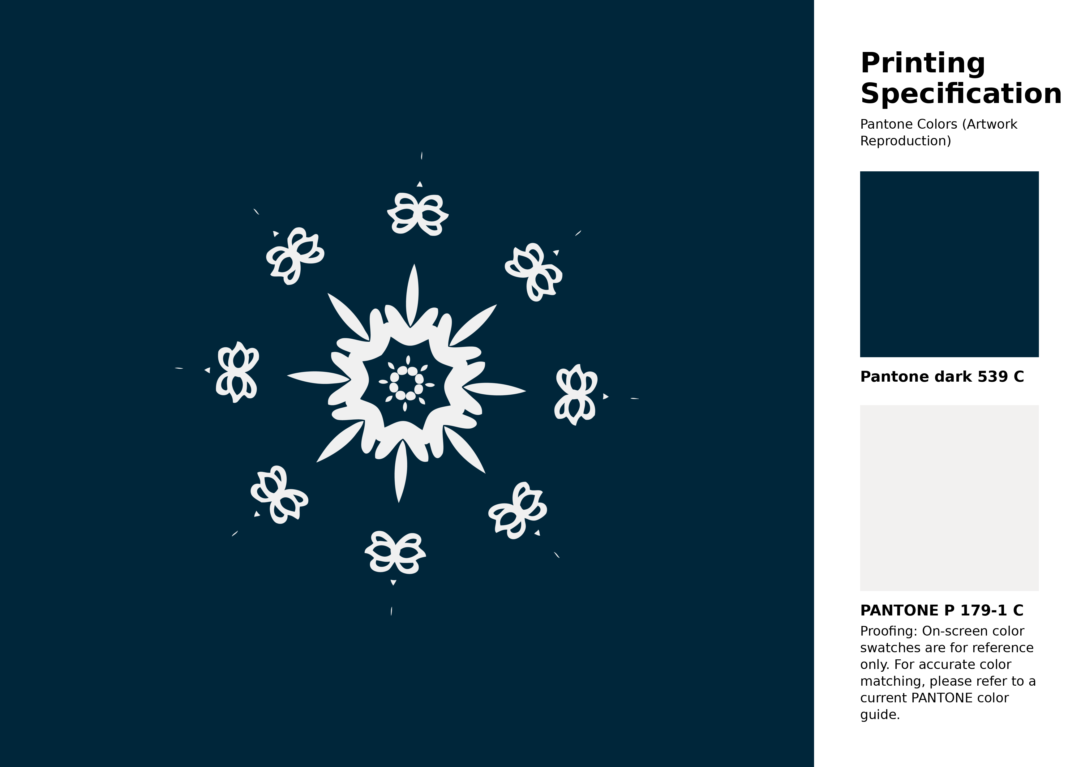
#00263a Pantone 539 C Color | Hex color Code #00263a Artwork Image (PNG)
Download Artwork (PNG)#00263a Pantone 539 C Color | Hex color Code #00263a Artwork Vector (PDF)
Download Artwork (PDF)#00263a Pantone 539 C Color | Hex color Code #00263a Artwork Vector (SVG)
Download Artwork (SVG)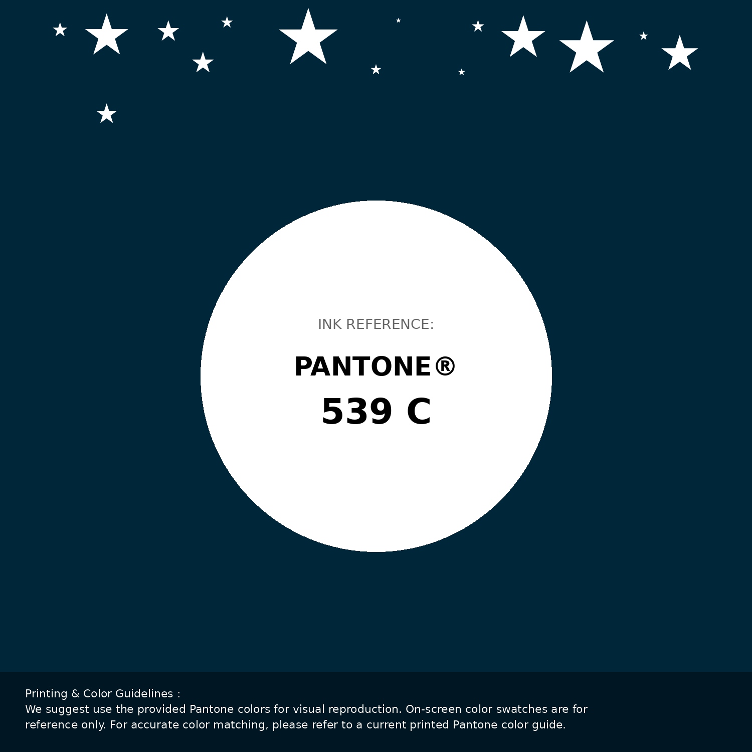
#00263a Pantone 539 C Color | Hex color Code #00263a Pantone Swatch Artwork
Download Artwork Swatch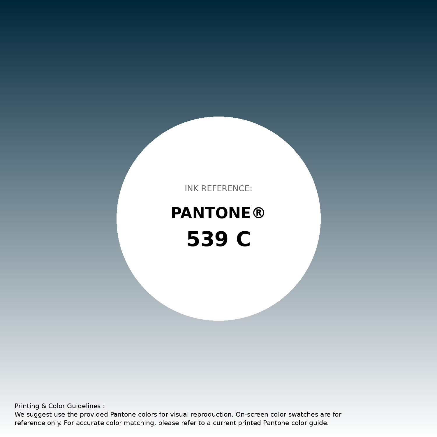
#00263a Pantone 539 C Color | Hex color Code #00263a Gradient Artwork (PNG)
Download Gradient (PNG)#00263a Pantone 539 C Color | Hex color Code #00263a Gradient Artwork (SVG)
Download Gradient (SVG)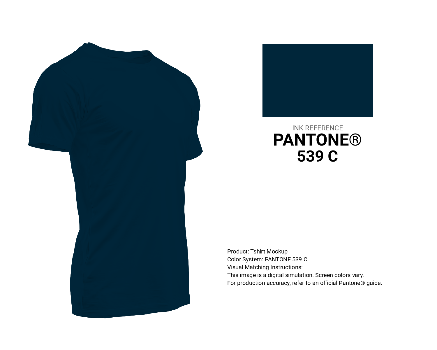
#00263a Pantone 539 C Color | Hex color Code #00263a T-Shirt Mockup
Download T-Shirt Mockup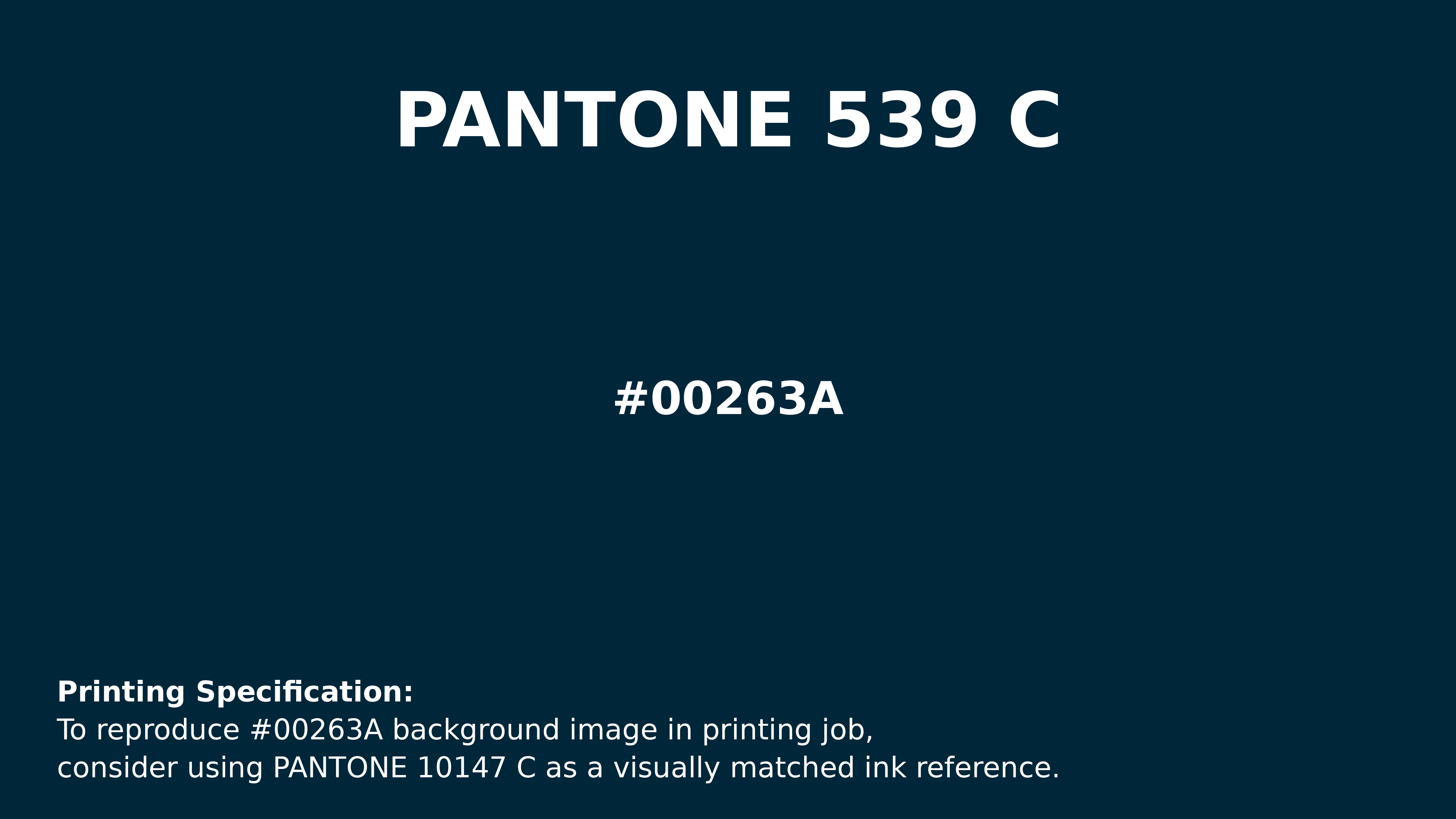
#00263a Pantone 539 C Color | Hex color Code #00263a Printing Artwork Pantone Reference
Download Pantone Printing ReferenceRelated Color Palettes
- Dark Gray and Dark Salmon •
- Light Blue and Dark Gray •
- Goldenrod and Dark Gray •
- Dark Gray and Black •
- Dark Gray and Cadet Blue •
- Dark Gray and Dark Olive Green •
- Dark Gray and Saddle Brown •
- Dark Gray and Fire Brick •
- Dark Gray and Gainsboro •
- Dark Gray and Forest Green •
- Light Gray and Dark Gray •
- Dark Gray and Midnight Blue •
- Plum and Dark Gray •
- Dark Gray and Crimson •
- Black and Dark Gray
Color Palette Collection

Astronomy Color Palettes
11 color palettes with 55 colors.

265 Color Palettes
265 color palettes with 1325 colors.
75 Sunset Color Schemes
75 color palettes with 375 colors.

20 Pink Color Schemes
20 color palettes with 100 colors.