Orange Color | ffa500
Your all-in-one color resource. Download hex background images, Adobe swatches (ASE), PDF color sheets, and SVG files. Explore palettes, harmonies, accessibility, conversions, and professional exports — designed for designers, developers, and color perfectionists.
This vibrant orange, #FFA500, ignites a feeling of warmth, energy, and enthusiasm. It evokes the sun's radiant glow, the crackling embers of a fire, and the rich hues of autumn leaves. The color is inherently optimistic, associated with joy, creativity, and a sense of adventure. It stimulates the senses and can be both inviting and stimulating. In design, it can be used to draw attention, create a lively atmosphere, and convey a sense of boldness. Culturally, it can symbolize courage, passion, and celebration, often seen in festive decorations and artistic expression. It creates a mood of excitement and vibrancy, perfect for spaces meant to inspire activity and engagement. Visually matched named color: Golden Blaze.
PANTONE 14-1064 TCX
Choose Color
Selected Color
Recent Colors
Color Details
Similar Ink Alternatives for #FFA500 color Alternative print inks for reproducing #FFA500 background image with a similar visual appearance.
Disclaimer: The visually matched ink reference is an independent approximation intended as a guide only. Please be advised that this pantone colors is only intended as a guide, Actual colours will depend on screen calibration variances. The print ink suggestions provided are independent visual approximations and are not affiliated with or endorsed by Pantone LLC. For official color specifications, conversion factors, and comprehensive color system information, please visit Pantone Connect. Official Pantone products can be purchased at pantone.com.
Color Previews for #000000 See how this color looks as a background or as text.
Complete Guide to Your Color Laboratory
Everything you need to know about this professional color toolkit.
Use the Color Picker at the top to select any color. All modules below update instantly.
Workflow: Pick a color → Explore palettes & data → Download what you need (PDF, Image, or Adobe ASE).
Color Details — Your color in all formats: HEX, RGB, RGBA, HSL, HSLA, HSV, CMYK, CIELab, Hunter-Lab, XYZ, Yxy, YUV. One-click copy.
Color Psychology — Emotional impact, cultural meanings, physiological effects, branding applications, and historical significance.
Named Colors — Find official color names (HTML/CSS, Pantone) that match your selection with similarity percentages.
Light & Dark Shades
80-step gradient from black to white. Perfect for button states and component systems.
Tints
Color mixed with white → lighter, pastel variations for backgrounds and disabled states.
Monochromatic — 11 curated tints/shades from one color. Production-ready for design systems.
- Complementary — Opposite on wheel (180°). High contrast.
- Analogous — Neighbors (±30°). Harmonious flow.
- Triadic — Three colors (120° apart). Vibrant, balanced.
- Split-Complementary — Base + two near-complements. Softer contrast.
- Tetradic/Square — Four colors. Complex, maximum variety.
- Neutral — Desaturated versions. Subtle, sophisticated.
15 Professional Variations — Monochromatic, Analogous, Complementary, Warm/Cool/Earth Tones, Pastel, Vibrant, High Contrast, and more.
Color Infusion — 10 palettes showing your color morphing into each major hue. Find bridge colors.
Similar Colors — 60+ colors generated via CIELAB Delta E matching. Unexpected harmonious combinations.
18 Ready-to-Use Gradients — Complementary, Analogous, Triadic, Tint/Shade progressions, and more.
Downloads: PNG (2560×1440), CSS (production-ready code), SVG (scalable vector).
WCAG Contrast Checker — Tests your color against white, black, and custom colors for AA (4.5:1) and AAA (7:1) compliance. Large text thresholds included.
Harmony & Accessibility Guide — Tests against 10 canonical hues. Shows which pairs are both beautiful AND WCAG-compliant for text.
PNG/JPG — High-res images for presentations and mood boards.
PDF — Print-ready reports for clients and teams.
Adobe ASE — Direct import to Photoshop, Illustrator, InDesign, XD.
CSS/SVG — Gradients only. Production-ready code and vectors.
Color Science: Industry-standard conversions (HSL, CIELAB, CMYK, XYZ). WCAG 2.1 luminance formula. Delta E (ΔE76) for perceptual matching.
Direct Links: Share colors via icolorpalette.com/color/ff5733 or icolorpalette.com/color/red
Issues? Refresh the page, wait for rendering, try another browser, or check console (F12) for errors.
Printing Guide for #ffa500 Background Image
Use PANTONE 14-1064 TCX as a visually matched ink reference when printing this background image.
To print the #ffa500 background image from our site, consider using PANTONE 14-1064 TCX as a visually matched ink reference.
Download the background image, then provide this reference code to your print vendor to help achieve accurate color reproduction.
The visually matched ink reference for the #ffa500 background image is PANTONE 14-1064 TCX.
This color is commonly described as Golden Blaze.
This vibrant orange, #FFA500, ignites a feeling of warmth, energy, and enthusiasm. It evokes the sun's radiant glow, the crackling embers of a fire, and the rich hues of autumn leaves. The color is inherently optimistic, associated with joy, creativity, and a sense of adventure. It stimulates the senses and can be both inviting and stimulating. In design, it can be used to draw attention, create a lively atmosphere, and convey a sense of boldness. Culturally, it can symbolize courage, passion, and celebration, often seen in festive decorations and artistic expression. It creates a mood of excitement and vibrancy, perfect for spaces meant to inspire activity and engagement.
We provide PANTONE 14-1064 TCX as a visually matched ink reference to help you reproduce the #ffa500 background image accurately in professional printing.
This reference code helps print vendors achieve consistent color output across different printing equipment and materials.
After downloading the #ffa500 background image from our site:
- Include the visually matched ink reference PANTONE 14-1064 TCX in your print order notes
- Inform your print vendor that this is your target color reference
- Request a proof print to verify the Golden Blaze color appearance before full production
The #ffa500 background image with PANTONE 14-1064 TCX as visually matched ink reference can be used for:
- Posters, banners, and backdrops
- Business cards, brochures, and flyers
- Packaging, labels, and stickers
- Signage and promotional materials
This is an independent visual approximation.
While PANTONE 14-1064 TCX closely matches the #ffa500 background image color, variations may exist between screen display and printed output.
We recommend requesting a proof print to verify the final appearance.
This vibrant orange, #FFA500, ignites a feeling of warmth, energy, and enthusiasm. It evokes the sun's radiant glow, the crackling embers of a fire, and the rich hues of autumn leaves. The color is inherently optimistic, associated with joy, creativity, and a sense of adventure. It stimulates the senses and can be both inviting and stimulating. In design, it can be used to draw attention, create a lively atmosphere, and convey a sense of boldness. Culturally, it can symbolize courage, passion, and celebration, often seen in festive decorations and artistic expression. It creates a mood of excitement and vibrancy, perfect for spaces meant to inspire activity and engagement.
Understanding these associations helps ensure the #ffa500 background image aligns with your intended message and brand impact.
Important Information
The visually matched ink reference is an independent approximation intended as a guide only.
Actual printed colors may vary depending on screen calibration, substrate material, ink type, and printing equipment used.
For official color specifications and certified color standards, visit Pantone Connect.
Official color guides and swatch books can be purchased from pantone.com.
Orange Color: The Vibrant and Energetic Color | #FFA500
Introduction:
Orange color is a vibrant and energetic color that is often associated with enthusiasm, creativity, and warmth. Its bright and bold nature makes it stand out and catch attention. The color orange sits between red and yellow on the color spectrum, combining the energy of red with the happiness of yellow.
Historical Significance:
Throughout history, the color orange has been used in various cultures and contexts. In ancient Egypt, orange was associated with the sun god, Ra, and was considered a symbol of power and eternity. In Hinduism, orange is a sacred color and is often associated with purity and spirituality.
Symbolism and Meaning:
Orange color typically symbolizes energy, enthusiasm, and creativity. It represents warmth, happiness, and optimism. In some cultures, orange is also associated with change and ambition. The color orange can evoke strong emotions and grab attention, making it a popular choice for advertising and marketing.
Orange Color in Fashion:
In the fashion world, the color orange is often used to make a bold statement. It can be seen in clothing, accessories, and footwear. Orange is a versatile color that can be paired with other vibrant colors or used as an accent color to add a pop of brightness to an outfit.
Orange Color in Graphic Design:
The color orange is widely used in graphic design due to its visibility and ability to grab attention. It is often used in logos, advertisements, and web design to create a sense of energy and excitement. Orange can also be used to convey a warm and inviting feeling.
Color Combinations:
Orange color can be combined with various colors to create different effects. Some popular color combinations with orange include: - Orange and blue: A vibrant and complementary color combination that creates a sense of balance and contrast. - Orange and white: A clean and fresh color combination that evokes a sense of simplicity and purity. - Orange and green: A nature-inspired color combination that represents growth and harmony. - Orange and purple: A bold and dramatic color combination that creates a sense of luxury and royalty.
Nature’s Palette:
In nature, the color orange can be found in vibrant sunsets, autumn leaves, and tropical fruits like oranges and mangoes. It is also present in certain flowers such as marigolds, poppies, and lilies. The color orange in nature often represents warmth, energy, and the changing seasons.
Artistic Representations:
Artists have used the color orange in various forms of art to evoke different emotions and create visual impact. It has been used in paintings to represent warmth, energy, and passion. Orange can also be used to create bold and eye-catching color contrasts in abstract art.
Movies and Cinematic Landscapes:
In movies and cinematic landscapes, the color orange is often used to set the tone or mood of a scene. It can be used to represent warmth, intensity, or danger. The color orange is frequently seen in action movies, sunsets, or scenes set in deserts.
Products and Commercial Appeal:
Many products and brands use the color orange in their branding and marketing to create a sense of energy, excitement, and enthusiasm. Orange is often associated with youthfulness and innovation, making it a popular choice for technology companies, sports brands, and food and beverage companies.
National Symbols and Significance:
In some countries, the color orange holds national or cultural significance. For example, the color orange is prominently featured in the national flag of the Netherlands and is associated with Dutch national pride. In Irish culture, orange is associated with Protestantism and is part of the Irish flag.
The Psychological and Emotional Impact:
The color orange has a psychological and emotional impact on individuals. It is often associated with feelings of happiness, joy, and enthusiasm. Orange can also stimulate appetite and represent a sense of adventure and excitement. However, too much orange color can evoke feelings of restlessness and agitation.
Conclusion:
In conclusion, orange color is a vibrant and energetic color that has been historically significant in various cultures. It symbolizes enthusiasm, creativity, and warmth. Orange has a strong presence in fashion, graphic design, and commercial branding. Its psychological and emotional impact is associated with happiness and excitement. Overall, orange color continues to have a timeless appeal in art, design, and everyday life.
Pantone 14-1064 Tcx Saffron Color | Hex color Code #ffa500 Image & Artwork
Download high-quality assets for your projects.

#ffa500 Color Schemes
Download Color Schemes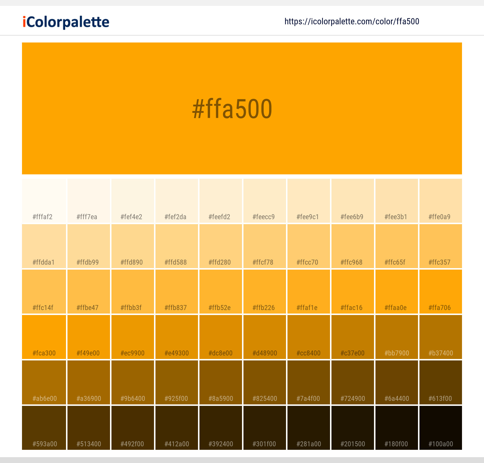
#ffa500 Color Shades
Download Color Shades
Pantone 14-1064 Tcx Saffron Color | Hex color Code #ffa500 Solid Color Background
Download Solid Color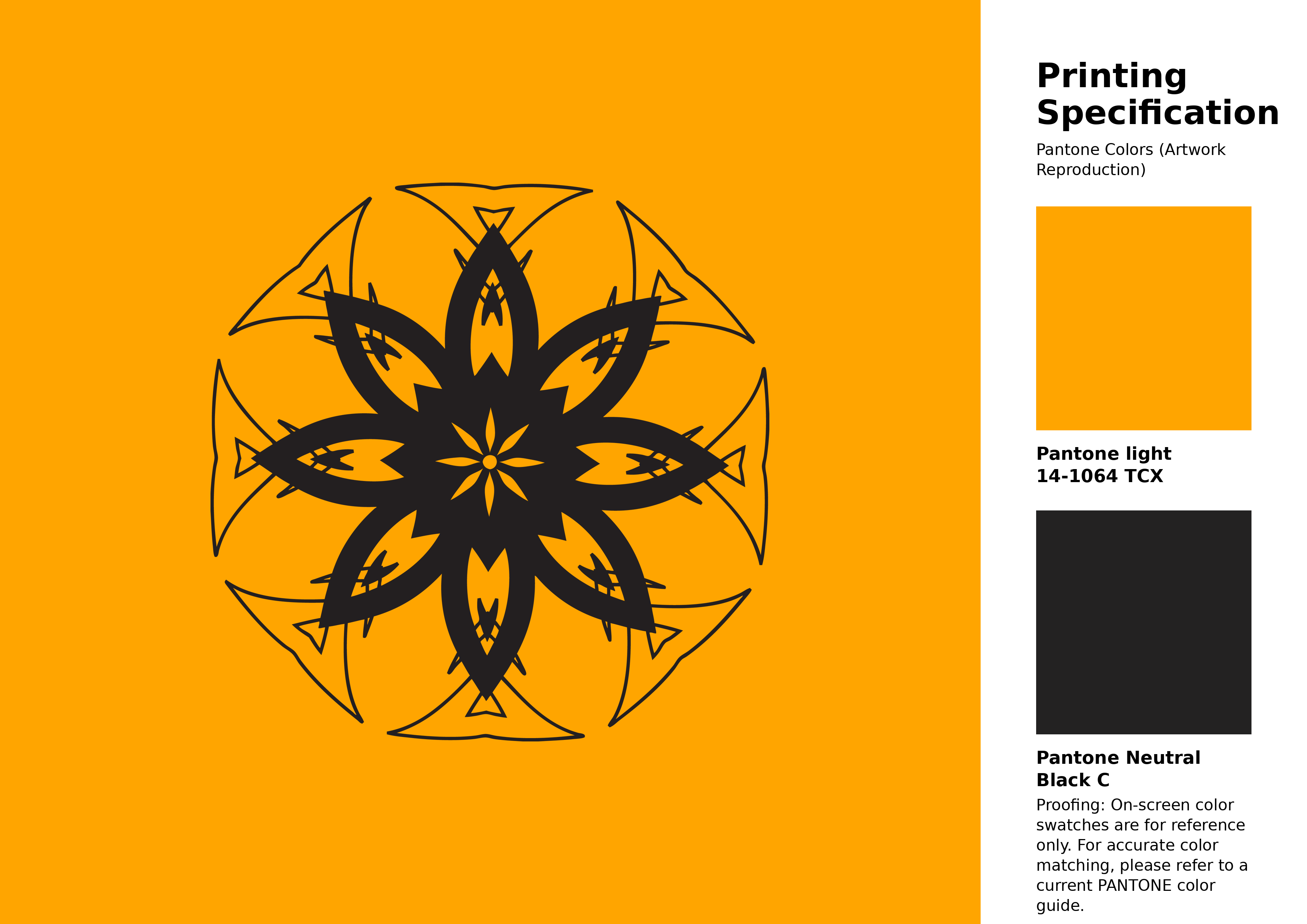
#ffa500 Pantone 14-1064 Tcx Saffron Color | Hex color Code #ffa500 Artwork Image (PNG)
Download Artwork (PNG)#ffa500 Pantone 14-1064 Tcx Saffron Color | Hex color Code #ffa500 Artwork Vector (PDF)
Download Artwork (PDF)#ffa500 Pantone 14-1064 Tcx Saffron Color | Hex color Code #ffa500 Artwork Vector (SVG)
Download Artwork (SVG)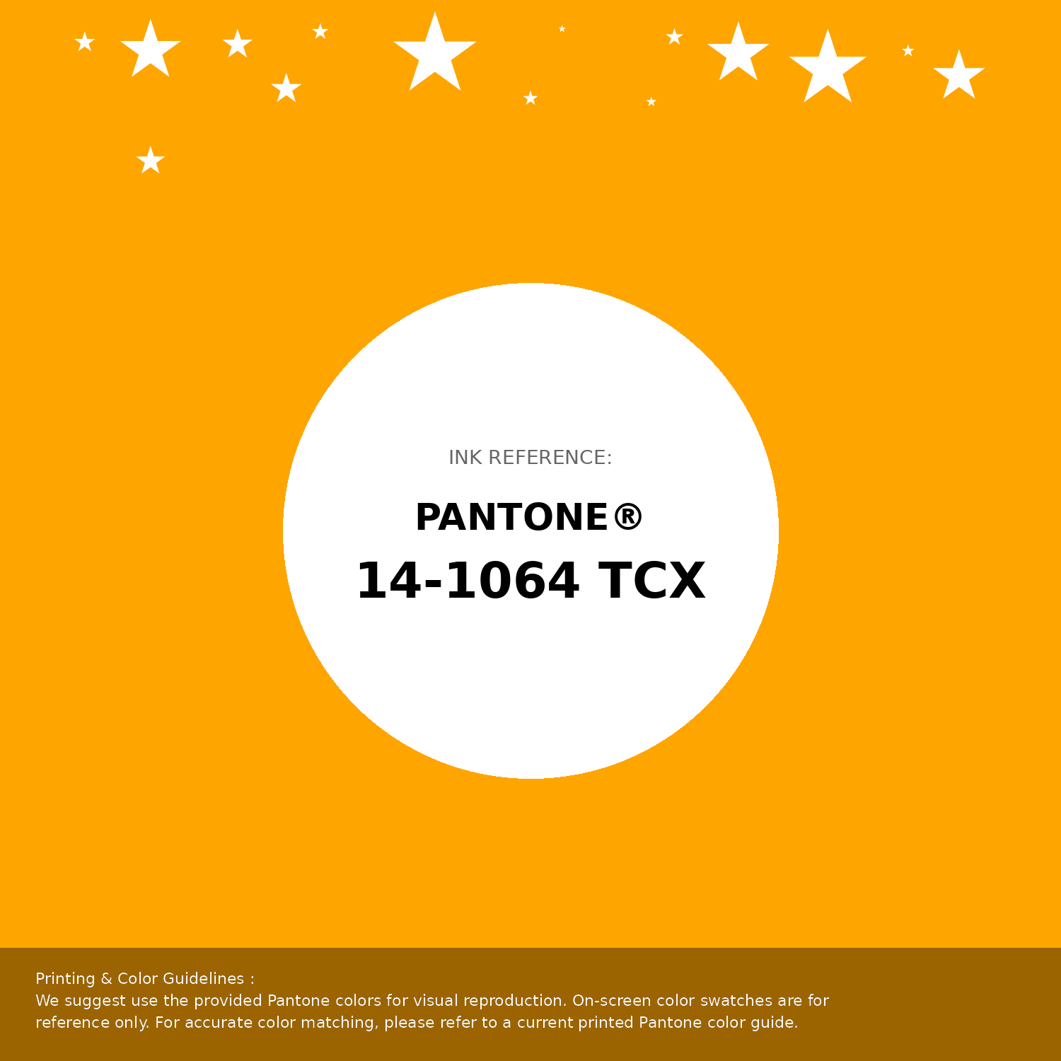
#ffa500 Pantone 14-1064 Tcx Saffron Color | Hex color Code #ffa500 Pantone Swatch Artwork
Download Artwork Swatch
#ffa500 Pantone 14-1064 Tcx Saffron Color | Hex color Code #ffa500 Gradient Artwork (PNG)
Download Gradient (PNG)#ffa500 Pantone 14-1064 Tcx Saffron Color | Hex color Code #ffa500 Gradient Artwork (SVG)
Download Gradient (SVG)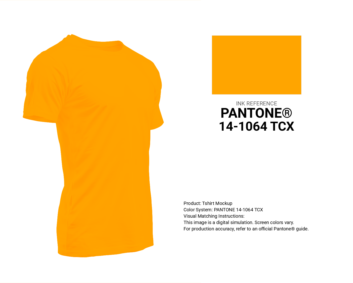
#ffa500 Pantone 14-1064 Tcx Saffron Color | Hex color Code #ffa500 T-Shirt Mockup
Download T-Shirt Mockup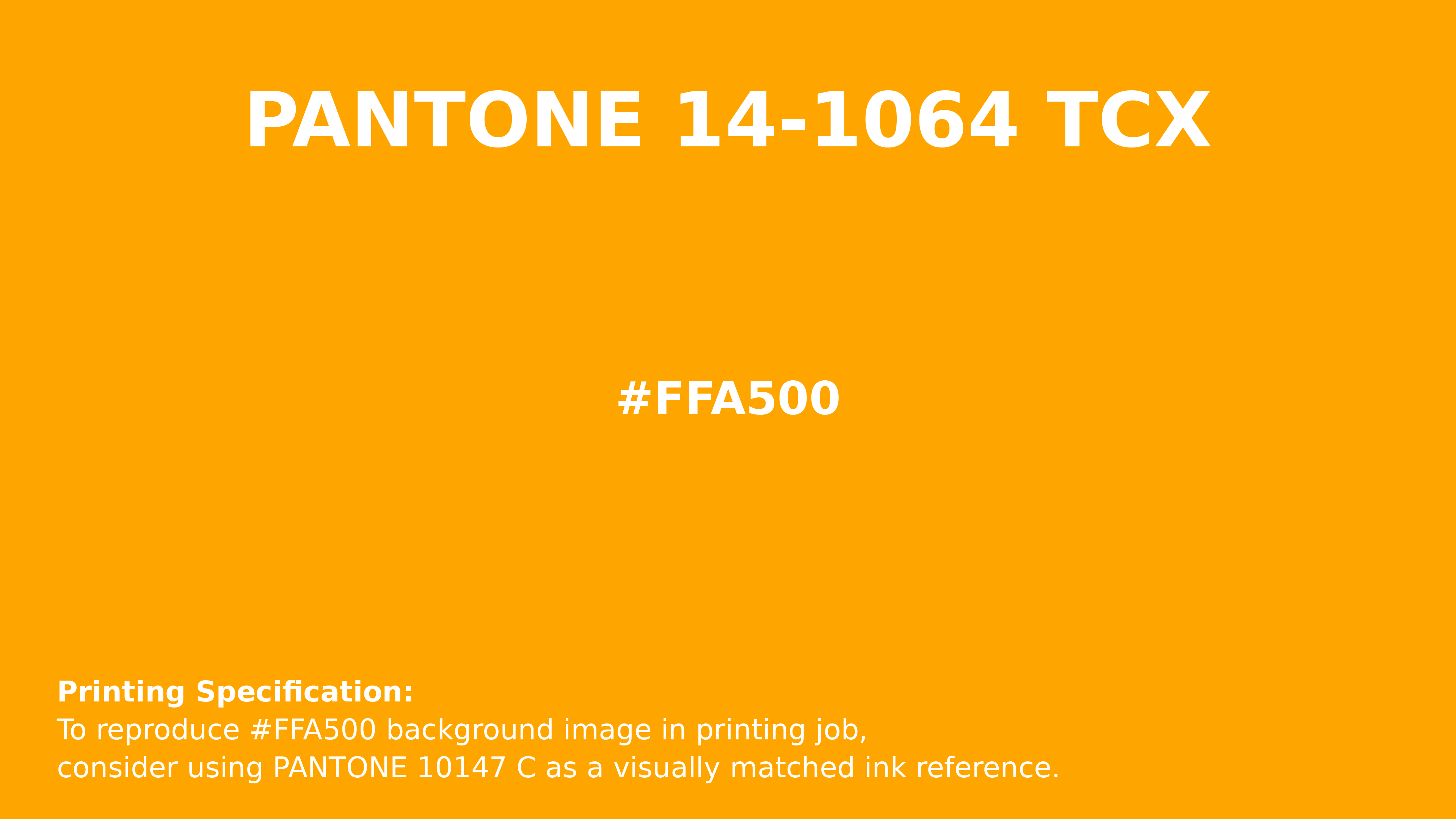
#ffa500 Pantone 14-1064 Tcx Saffron Color | Hex color Code #ffa500 Printing Artwork Pantone Reference
Download Pantone Printing Reference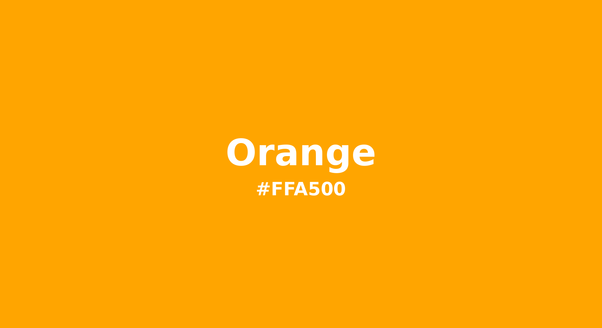
Orange - #ffa500 Color Name
Download Color NameRelated Color Palettes
- Dim Gray and Orange •
- Gold and OrangeRed •
- Flush Orange •
- Dark Orange and Slate Gray •
- Rosy Brown and OrangeRed •
- OrangeRed and Tomato •
- Dark Khaki and Orange •
- Orange and Midnight Blue •
- Orange and Olive Drab •
- Orange and Chocolate •
- Dark Green and OrangeRed •
- Orange and Tomato •
- Dark Orange and OrangeRed •
- Dark Goldenrod and Orange •
- Saddle Brown and OrangeRed
Color Palette Collection

Light Blue Palettes to Enhance Your Design
13 color palettes with 65 colors.

100 Rose Flower Nature Color Palettes
100 color palettes with 500 colors.

Pink Colors
8 color palettes with 40 colors.

30 Pastel Pink Color Palette
30 color palettes with 150 colors.