#FF8F1C Color
Your all-in-one color resource. Download hex background images, Adobe swatches (ASE), PDF color sheets, and SVG files. Explore palettes, harmonies, accessibility, conversions, and professional exports — designed for designers, developers, and color perfectionists.
This vibrant orange-yellow, #FF8F1C, ignites a feeling of warmth and optimism. It evokes the image of a glowing hearth, a welcoming fire on a crisp autumn evening. The color radiates energy and enthusiasm, reminiscent of ripe citrus fruits, the changing leaves of fall, and the sun's warm embrace. It stirs feelings of creativity, joy, and confidence, while also hinting at comfort and security. In design, Golden Hearth is ideal for creating energetic and engaging spaces, especially those meant for socializing or productivity. It can be used to add a pop of brightness and personality, or to create a sense of inviting warmth in home dcor, advertising, or branding. The color suggests activity, celebration, and a bold, forward-thinking approach. Visually matched named color: Golden Hearth.
PANTONE 1495 C
Choose Color
Selected Color
Recent Colors
Color Details
Similar Ink Alternatives for #FF8F1C color Alternative print inks for reproducing #FF8F1C background image with a similar visual appearance.
Disclaimer: The visually matched ink reference is an independent approximation intended as a guide only. Please be advised that this pantone colors is only intended as a guide, Actual colours will depend on screen calibration variances. The print ink suggestions provided are independent visual approximations and are not affiliated with or endorsed by Pantone LLC. For official color specifications, conversion factors, and comprehensive color system information, please visit Pantone Connect. Official Pantone products can be purchased at pantone.com.
Color Previews for #000000 See how this color looks as a background or as text.
Complete Guide to Your Color Laboratory
Everything you need to know about this professional color toolkit.
Use the Color Picker at the top to select any color. All modules below update instantly.
Workflow: Pick a color → Explore palettes & data → Download what you need (PDF, Image, or Adobe ASE).
Color Details — Your color in all formats: HEX, RGB, RGBA, HSL, HSLA, HSV, CMYK, CIELab, Hunter-Lab, XYZ, Yxy, YUV. One-click copy.
Color Psychology — Emotional impact, cultural meanings, physiological effects, branding applications, and historical significance.
Named Colors — Find official color names (HTML/CSS, Pantone) that match your selection with similarity percentages.
Light & Dark Shades
80-step gradient from black to white. Perfect for button states and component systems.
Tints
Color mixed with white → lighter, pastel variations for backgrounds and disabled states.
Monochromatic — 11 curated tints/shades from one color. Production-ready for design systems.
- Complementary — Opposite on wheel (180°). High contrast.
- Analogous — Neighbors (±30°). Harmonious flow.
- Triadic — Three colors (120° apart). Vibrant, balanced.
- Split-Complementary — Base + two near-complements. Softer contrast.
- Tetradic/Square — Four colors. Complex, maximum variety.
- Neutral — Desaturated versions. Subtle, sophisticated.
15 Professional Variations — Monochromatic, Analogous, Complementary, Warm/Cool/Earth Tones, Pastel, Vibrant, High Contrast, and more.
Color Infusion — 10 palettes showing your color morphing into each major hue. Find bridge colors.
Similar Colors — 60+ colors generated via CIELAB Delta E matching. Unexpected harmonious combinations.
18 Ready-to-Use Gradients — Complementary, Analogous, Triadic, Tint/Shade progressions, and more.
Downloads: PNG (2560×1440), CSS (production-ready code), SVG (scalable vector).
WCAG Contrast Checker — Tests your color against white, black, and custom colors for AA (4.5:1) and AAA (7:1) compliance. Large text thresholds included.
Harmony & Accessibility Guide — Tests against 10 canonical hues. Shows which pairs are both beautiful AND WCAG-compliant for text.
PNG/JPG — High-res images for presentations and mood boards.
PDF — Print-ready reports for clients and teams.
Adobe ASE — Direct import to Photoshop, Illustrator, InDesign, XD.
CSS/SVG — Gradients only. Production-ready code and vectors.
Color Science: Industry-standard conversions (HSL, CIELAB, CMYK, XYZ). WCAG 2.1 luminance formula. Delta E (ΔE76) for perceptual matching.
Direct Links: Share colors via icolorpalette.com/color/ff5733 or icolorpalette.com/color/red
Issues? Refresh the page, wait for rendering, try another browser, or check console (F12) for errors.
Printing Guide for #ff8f1c Background Image
Use PANTONE 1495 C as a visually matched ink reference when printing this background image.
To print the #ff8f1c background image from our site, consider using PANTONE 1495 C as a visually matched ink reference.
Download the background image, then provide this reference code to your print vendor to help achieve accurate color reproduction.
The visually matched ink reference for the #ff8f1c background image is PANTONE 1495 C.
This color is commonly described as Golden Hearth.
This vibrant orange-yellow, #FF8F1C, ignites a feeling of warmth and optimism. It evokes the image of a glowing hearth, a welcoming fire on a crisp autumn evening. The color radiates energy and enthusiasm, reminiscent of ripe citrus fruits, the changing leaves of fall, and the sun's warm embrace. It stirs feelings of creativity, joy, and confidence, while also hinting at comfort and security. In design, Golden Hearth is ideal for creating energetic and engaging spaces, especially those meant for socializing or productivity. It can be used to add a pop of brightness and personality, or to create a sense of inviting warmth in home dcor, advertising, or branding. The color suggests activity, celebration, and a bold, forward-thinking approach.
We provide PANTONE 1495 C as a visually matched ink reference to help you reproduce the #ff8f1c background image accurately in professional printing.
This reference code helps print vendors achieve consistent color output across different printing equipment and materials.
After downloading the #ff8f1c background image from our site:
- Include the visually matched ink reference PANTONE 1495 C in your print order notes
- Inform your print vendor that this is your target color reference
- Request a proof print to verify the Golden Hearth color appearance before full production
The #ff8f1c background image with PANTONE 1495 C as visually matched ink reference can be used for:
- Posters, banners, and backdrops
- Business cards, brochures, and flyers
- Packaging, labels, and stickers
- Signage and promotional materials
This is an independent visual approximation.
While PANTONE 1495 C closely matches the #ff8f1c background image color, variations may exist between screen display and printed output.
We recommend requesting a proof print to verify the final appearance.
This vibrant orange-yellow, #FF8F1C, ignites a feeling of warmth and optimism. It evokes the image of a glowing hearth, a welcoming fire on a crisp autumn evening. The color radiates energy and enthusiasm, reminiscent of ripe citrus fruits, the changing leaves of fall, and the sun's warm embrace. It stirs feelings of creativity, joy, and confidence, while also hinting at comfort and security. In design, Golden Hearth is ideal for creating energetic and engaging spaces, especially those meant for socializing or productivity. It can be used to add a pop of brightness and personality, or to create a sense of inviting warmth in home dcor, advertising, or branding. The color suggests activity, celebration, and a bold, forward-thinking approach.
Understanding these associations helps ensure the #ff8f1c background image aligns with your intended message and brand impact.
Important Information
The visually matched ink reference is an independent approximation intended as a guide only.
Actual printed colors may vary depending on screen calibration, substrate material, ink type, and printing equipment used.
For official color specifications and certified color standards, visit Pantone Connect.
Official color guides and swatch books can be purchased from pantone.com.
Pantone 1495 C Color: Vibrant Orange | #FF8F1C
Introduction:
Vibrant Orange, represented by Pantone 1495 C, is a bold and energetic color that exudes warmth and enthusiasm. Its vibrant hue instantly catches the eye and adds a lively and confident touch to any visual composition.
Historical Significance:
Key moments in history: Vibrant Orange has been prominently used in various historical events to symbolize energy, excitement, and enthusiasm. It has been utilized in art movements and cultural festivities to evoke passion and creativity.
Symbolism and Meaning:
Symbolism and Meaning: Vibrant Orange typically symbolizes joy, optimism, and adventure. It represents warmth, happiness, and a sense of vitality. In some cultures, it is associated with celebration and abundance.
Vibrant Orange in Fashion:
Vibrant Orange in Fashion: This bold color makes a statement in the fashion world. It is often used to create eye-catching outfits and accessories, and it is particularly popular during the warm seasons. Vibrant Orange brings energy and vibrancy to runway shows and street style.
Vibrant Orange in Graphic Design:
Vibrant Orange in Graphic Design: In design aesthetics, Vibrant Orange is often used to evoke excitement and grab attention. It is commonly utilized in branding to create a sense of enthusiasm and boldness. Its vibrancy and warmth make it a popular choice for logos, advertisements, and promotional materials.
Color Combinations:
Color Combinations: Vibrant Orange pairs well with a variety of colors. Some popular combinations include: - Vibrant Orange and Navy Blue: a striking contrast of boldness and depth. - Vibrant Orange and White: a clean and fresh look with a pop of color. - Vibrant Orange and Yellow: a vibrant and energetic combination. - Vibrant Orange and Teal: a modern and tropical mix. - Vibrant Orange and Purple: a bold and regal pairing. - Vibrant Orange and Green: a vibrant and nature-inspired combination.
Nature’s Palette:
Nature’s Palette: Vibrant Orange can be found in nature in the vibrant colors of autumn leaves, sunsets, and various fruits and flowers. It often represents warmth, energy, and the changing seasons.
Artistic Representations:
Artistic Representations: Vibrant Orange has been used in various forms of art to convey passion, excitement, and intensity. It has been incorporated in paintings, sculptures, and installations to create visual impact and evoke strong emotions.
Movies and Cinematic Landscapes:
Movies and Cinematic Landscapes: Vibrant Orange is often used in movies and cinematic landscapes to set the tone and create an energetic atmosphere. It is utilized to depict enthusiasm, vitality, and intense emotions in various scenes and genres.
Products and Commercial Appeal:
Products and Commercial Appeal: Many popular products and brands use Vibrant Orange in their branding to stand out and grab attention. It is commonly seen in sports gear, food and beverage packaging, and tech products that want to evoke energy and excitement.
National Symbols and Significance:
National Symbols and Significance: Vibrant Orange may hold national or cultural significance in various countries. It can be seen in national flags, traditional textiles, and cultural celebrations where it represents national pride, energy, and cultural identity.
The Psychological and Emotional Impact:
The Psychological and Emotional Impact: Vibrant Orange has a stimulating effect on emotions and perception. It is often associated with joy, warmth, and optimism. It can inspire creativity, boost confidence, and create a sense of excitement and adventure.
Conclusion:
In conclusion, Vibrant Orange (Pantone 1495 C) is a color that captivates with its energy and vibrancy. It has a rich historical significance and has been utilized in various domains, including fashion, graphic design, and art. Its symbolism and meaning evoke joy, optimism, and adventure. Vibrant Orange finds its place in nature, movies, and commercial branding, symbolizing warmth, passion, and excitement. Its psychological impact stimulates emotions and creativity. Overall, Vibrant Orange is a timeless color that adds a bold touch to any composition and leaves a lasting impression.
Pantone 1495 C Color | Hex color Code #ff8f1c Image & Artwork
Download high-quality assets for your projects.

#ff8f1c Color Schemes
Download Color Schemes
#ff8f1c Color Shades
Download Color Shades
Pantone 1495 C Color | Hex color Code #ff8f1c Solid Color Background
Download Solid Color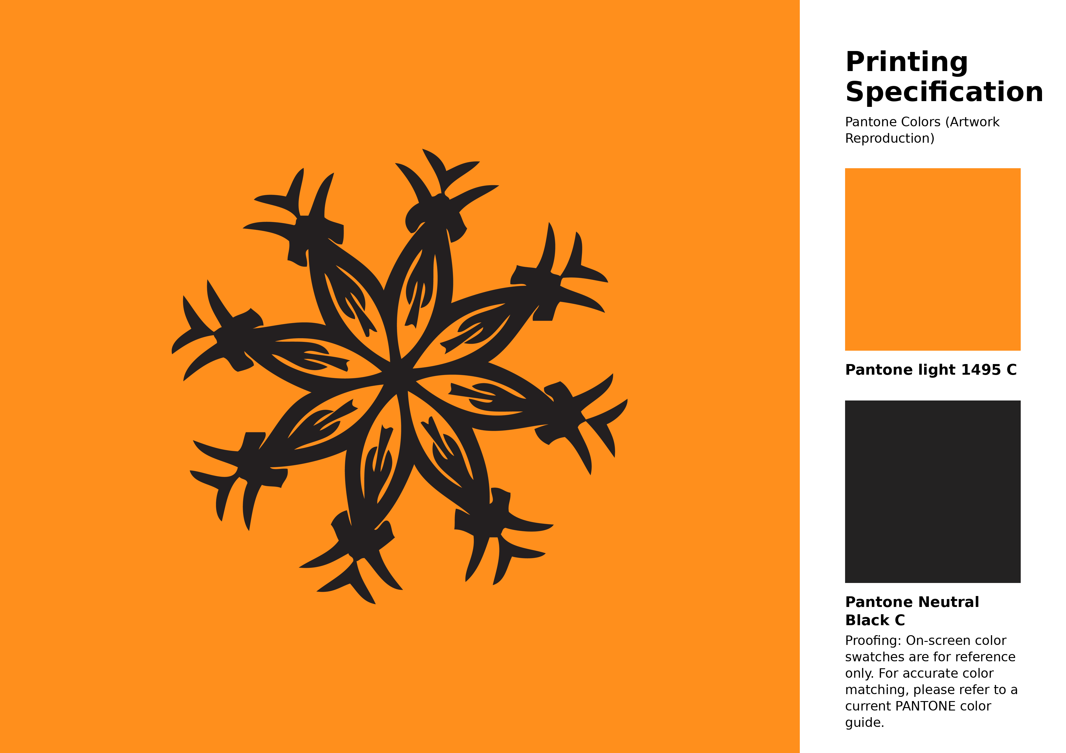
#ff8f1c Pantone 1495 C Color | Hex color Code #ff8f1c Artwork Image (PNG)
Download Artwork (PNG)#ff8f1c Pantone 1495 C Color | Hex color Code #ff8f1c Artwork Vector (PDF)
Download Artwork (PDF)#ff8f1c Pantone 1495 C Color | Hex color Code #ff8f1c Artwork Vector (SVG)
Download Artwork (SVG)
#ff8f1c Pantone 1495 C Color | Hex color Code #ff8f1c Pantone Swatch Artwork
Download Artwork Swatch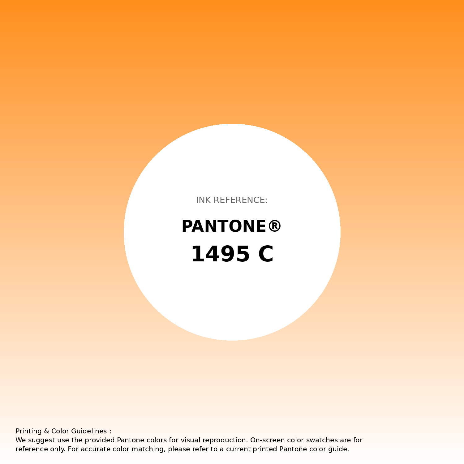
#ff8f1c Pantone 1495 C Color | Hex color Code #ff8f1c Gradient Artwork (PNG)
Download Gradient (PNG)#ff8f1c Pantone 1495 C Color | Hex color Code #ff8f1c Gradient Artwork (SVG)
Download Gradient (SVG)
#ff8f1c Pantone 1495 C Color | Hex color Code #ff8f1c T-Shirt Mockup
Download T-Shirt Mockup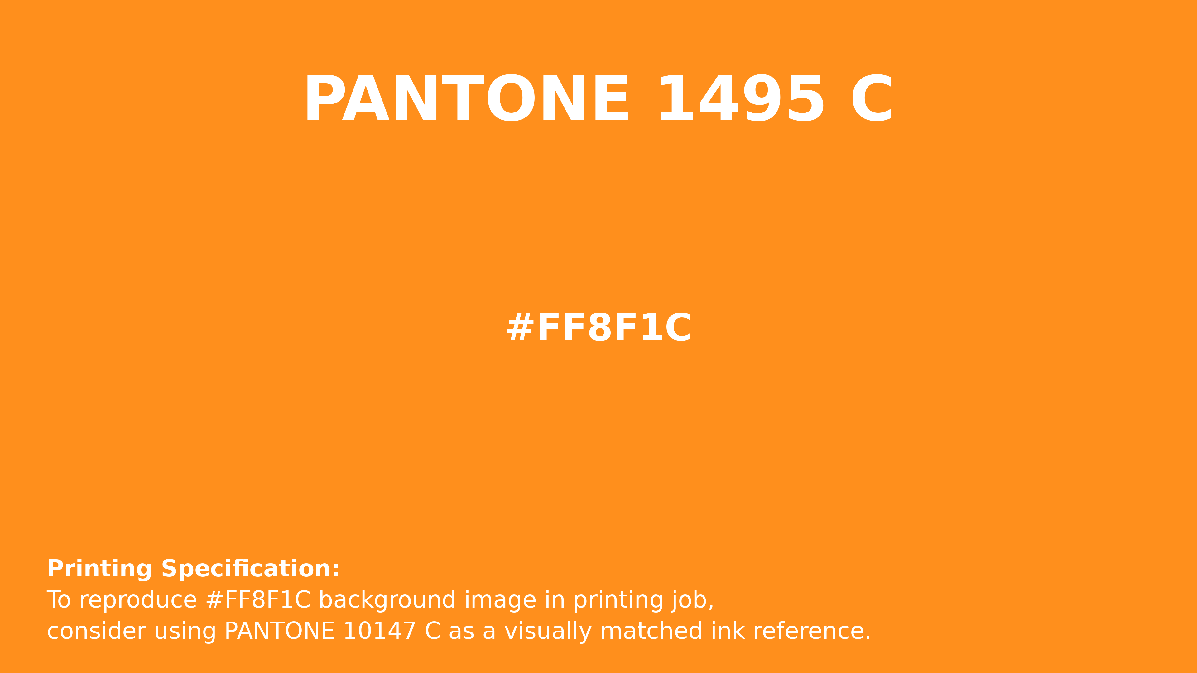
#ff8f1c Pantone 1495 C Color | Hex color Code #ff8f1c Printing Artwork Pantone Reference
Download Pantone Printing ReferenceRelated Color Palettes
- Tan and Orange •
- Sienna and OrangeRed •
- Dark Orange and Brown •
- Orange and Dark Orange •
- Dark Slate Gray and Orange •
- Maroon and Dark Orange •
- Orange and Dark Olive Green •
- Dim Gray and Orange •
- Dark Green and OrangeRed •
- Dark Olive Green and OrangeRed •
- Orange and Midnight Blue •
- Orange and Brown •
- Dark Orange and Dark Slate Gray •
- Orange and Crimson •
- Orange and Tan
Color Palette Collection
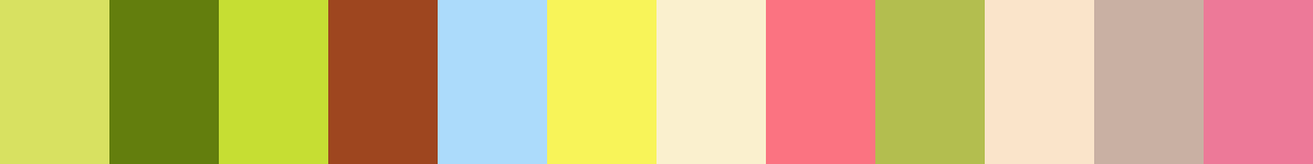
17 Christmas Color Palettes Ideas
17 color palettes with 85 colors.
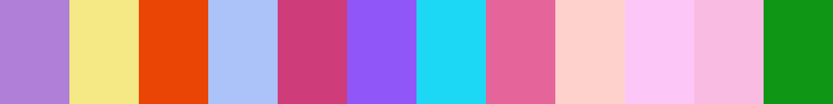
Pink color palettes
15 color palettes with 75 colors.

81 Pink color palettes
81 color palettes with 405 colors.
ERGO
1 color palettes with 5 colors.