#FF5F00 Color
Your all-in-one color resource. Download hex background images, Adobe swatches (ASE), PDF color sheets, and SVG files. Explore palettes, harmonies, accessibility, conversions, and professional exports — designed for designers, developers, and color perfectionists.
#ff5f00, a vibrant orange-red, evokes feelings of warmth, energy, and excitement. Its fiery hue immediately brings to mind a setting sun, blazing across the horizon, or perhaps a bonfire crackling on a cool evening. The color radiates a sense of optimism and enthusiasm, but also carries a hint of urgency and intensity. It reminds one of autumn leaves, vibrant and slightly aggressive before falling. Psychologically, it can be stimulating and even slightly aggressive, depending on its application. In design, it can be used to draw attention, create a sense of energy, and convey warmth in spaces like restaurants or entertainment venues. Culturally, orange and red are often associated with celebration and festivity in many cultures. Visually matched named color: Sunset Blaze.
BRIGHT ORANGE C
Choose Color
Selected Color
Recent Colors
Color Details
Similar Ink Alternatives for #FF5F00 color Alternative print inks for reproducing #FF5F00 background image with a similar visual appearance.
Disclaimer: The visually matched ink reference is an independent approximation intended as a guide only. Please be advised that this pantone colors is only intended as a guide, Actual colours will depend on screen calibration variances. The print ink suggestions provided are independent visual approximations and are not affiliated with or endorsed by Pantone LLC. For official color specifications, conversion factors, and comprehensive color system information, please visit Pantone Connect. Official Pantone products can be purchased at pantone.com.
Color Previews for #000000 See how this color looks as a background or as text.
Complete Guide to Your Color Laboratory
Everything you need to know about this professional color toolkit.
Use the Color Picker at the top to select any color. All modules below update instantly.
Workflow: Pick a color → Explore palettes & data → Download what you need (PDF, Image, or Adobe ASE).
Color Details — Your color in all formats: HEX, RGB, RGBA, HSL, HSLA, HSV, CMYK, CIELab, Hunter-Lab, XYZ, Yxy, YUV. One-click copy.
Color Psychology — Emotional impact, cultural meanings, physiological effects, branding applications, and historical significance.
Named Colors — Find official color names (HTML/CSS, Pantone) that match your selection with similarity percentages.
Light & Dark Shades
80-step gradient from black to white. Perfect for button states and component systems.
Tints
Color mixed with white → lighter, pastel variations for backgrounds and disabled states.
Monochromatic — 11 curated tints/shades from one color. Production-ready for design systems.
- Complementary — Opposite on wheel (180°). High contrast.
- Analogous — Neighbors (±30°). Harmonious flow.
- Triadic — Three colors (120° apart). Vibrant, balanced.
- Split-Complementary — Base + two near-complements. Softer contrast.
- Tetradic/Square — Four colors. Complex, maximum variety.
- Neutral — Desaturated versions. Subtle, sophisticated.
15 Professional Variations — Monochromatic, Analogous, Complementary, Warm/Cool/Earth Tones, Pastel, Vibrant, High Contrast, and more.
Color Infusion — 10 palettes showing your color morphing into each major hue. Find bridge colors.
Similar Colors — 60+ colors generated via CIELAB Delta E matching. Unexpected harmonious combinations.
18 Ready-to-Use Gradients — Complementary, Analogous, Triadic, Tint/Shade progressions, and more.
Downloads: PNG (2560×1440), CSS (production-ready code), SVG (scalable vector).
WCAG Contrast Checker — Tests your color against white, black, and custom colors for AA (4.5:1) and AAA (7:1) compliance. Large text thresholds included.
Harmony & Accessibility Guide — Tests against 10 canonical hues. Shows which pairs are both beautiful AND WCAG-compliant for text.
PNG/JPG — High-res images for presentations and mood boards.
PDF — Print-ready reports for clients and teams.
Adobe ASE — Direct import to Photoshop, Illustrator, InDesign, XD.
CSS/SVG — Gradients only. Production-ready code and vectors.
Color Science: Industry-standard conversions (HSL, CIELAB, CMYK, XYZ). WCAG 2.1 luminance formula. Delta E (ΔE76) for perceptual matching.
Direct Links: Share colors via icolorpalette.com/color/ff5733 or icolorpalette.com/color/red
Issues? Refresh the page, wait for rendering, try another browser, or check console (F12) for errors.
Printing Guide for #ff5f00 Background Image
Use BRIGHT ORANGE C as a visually matched ink reference when printing this background image.
To print the #ff5f00 background image from our site, consider using BRIGHT ORANGE C as a visually matched ink reference.
Download the background image, then provide this reference code to your print vendor to help achieve accurate color reproduction.
The visually matched ink reference for the #ff5f00 background image is BRIGHT ORANGE C.
This color is commonly described as Sunset Blaze.
#ff5f00, a vibrant orange-red, evokes feelings of warmth, energy, and excitement. Its fiery hue immediately brings to mind a setting sun, blazing across the horizon, or perhaps a bonfire crackling on a cool evening. The color radiates a sense of optimism and enthusiasm, but also carries a hint of urgency and intensity. It reminds one of autumn leaves, vibrant and slightly aggressive before falling. Psychologically, it can be stimulating and even slightly aggressive, depending on its application. In design, it can be used to draw attention, create a sense of energy, and convey warmth in spaces like restaurants or entertainment venues. Culturally, orange and red are often associated with celebration and festivity in many cultures.
We provide BRIGHT ORANGE C as a visually matched ink reference to help you reproduce the #ff5f00 background image accurately in professional printing.
This reference code helps print vendors achieve consistent color output across different printing equipment and materials.
After downloading the #ff5f00 background image from our site:
- Include the visually matched ink reference BRIGHT ORANGE C in your print order notes
- Inform your print vendor that this is your target color reference
- Request a proof print to verify the Sunset Blaze color appearance before full production
The #ff5f00 background image with BRIGHT ORANGE C as visually matched ink reference can be used for:
- Posters, banners, and backdrops
- Business cards, brochures, and flyers
- Packaging, labels, and stickers
- Signage and promotional materials
This is an independent visual approximation.
While BRIGHT ORANGE C closely matches the #ff5f00 background image color, variations may exist between screen display and printed output.
We recommend requesting a proof print to verify the final appearance.
#ff5f00, a vibrant orange-red, evokes feelings of warmth, energy, and excitement. Its fiery hue immediately brings to mind a setting sun, blazing across the horizon, or perhaps a bonfire crackling on a cool evening. The color radiates a sense of optimism and enthusiasm, but also carries a hint of urgency and intensity. It reminds one of autumn leaves, vibrant and slightly aggressive before falling. Psychologically, it can be stimulating and even slightly aggressive, depending on its application. In design, it can be used to draw attention, create a sense of energy, and convey warmth in spaces like restaurants or entertainment venues. Culturally, orange and red are often associated with celebration and festivity in many cultures.
Understanding these associations helps ensure the #ff5f00 background image aligns with your intended message and brand impact.
Important Information
The visually matched ink reference is an independent approximation intended as a guide only.
Actual printed colors may vary depending on screen calibration, substrate material, ink type, and printing equipment used.
For official color specifications and certified color standards, visit Pantone Connect.
Official color guides and swatch books can be purchased from pantone.com.
Bright Orange C Color: The Vibrant Creative Hue | #ff5f00
Introduction:
Bright Orange C is a vivid and eye-catching color that commands attention. It exudes energy, warmth, and a sense of excitement. Its radiant hue stands out in any visual context, making it a popular choice for creative endeavors.
Historical Significance:
Earliest Uses: Bright Orange C first gained prominence in ancient Egyptian art, where it was often used to depict the sun and fire. Its bold and lively nature made it a fitting choice for representing power and energy in various artistic forms.
Renaissance Era: During the Renaissance period, Bright Orange C became a popular color among artists, particularly in their depictions of vibrant landscapes, sunsets, and natural elements. Its warm and intense properties allowed painters to create dynamic and captivating scenes.
Modern Pop Culture: In recent times, Bright Orange C has been widely embraced in pop culture, thanks to its association with energy, enthusiasm, and creativity. This vibrant hue is often used in advertising, graphic design, and fashion to make a bold statement and attract attention.
Symbolism and Meaning:
Cultural Significance: Bright Orange C symbolizes various meanings across different cultures. In Western cultures, it is often associated with warmth, energy, and optimism. In Eastern cultures, it can represent good luck, abundance, and spirituality. Furthermore, this color is often used in autumn-themed celebrations and signifies the transition from summer to winter.
Bright Orange C in Fashion:
Impact on Fashion Trends: Bright Orange C has made waves in the fashion world due to its bold and energetic nature. Designers often incorporate this color into their collections to create eye-catching and unique looks. It is particularly popular in streetwear and activewear, as it exudes a sense of vibrancy and dynamism.
Bright Orange C in Graphic Design:
Aesthetic Significance: In graphic design, Bright Orange C holds significant value. Its bold and attention-grabbing nature makes it an excellent choice for creating visually impactful designs. It is often used to highlight important elements and create a sense of urgency or excitement in advertisements, logos, and branding.
Color Combinations:
Potential Color Combinations: Bright Orange C pairs well with various colors, creating striking and harmonious combinations. Some popular combinations include:
- Bright Orange C and Deep Blue
- Bright Orange C and Neon Green
- Bright Orange C and Bold Yellow
Nature’s Palette:
Presence in Nature: Bright Orange C can be found abundantly in nature, particularly in vibrant flowers such as marigolds, poppies, and tulips. It is also a dominant color in autumn foliage, adding warmth and vibrancy to landscapes.
Artistic Representations:
Aesthetic Exploration: Artists have used Bright Orange C extensively throughout history to create captivating and visually stimulating artworks. It has been utilized in various forms, such as paintings, sculptures, and installations, to convey energy, passion, and intensity. Notable artists who have incorporated Bright Orange C include Vincent van Gogh and Mark Rothko.
Movies and Cinematic Landscapes:
Setting the Mood: Bright Orange C is often utilized in movies and cinematic scenes to evoke specific emotions or set the tone. It might symbolize warmth, enthusiasm, or even danger, depending on the context. Films like "Blade Runner 2049" and "Amelie" effectively use this color to create memorable and visually striking moments.
Products and Commercial Appeal:
Brand Association: Bright Orange C is often associated with popular products and brands, as it helps create a strong visual identity. Companies like Fanta, Nickelodeon, and Harley-Davidson incorporate this color in their branding to convey energy, youthfulness, and excitement.
National Symbols and Significance:
Cultural Representation: In some countries, Bright Orange C holds cultural and historical significance. For example, it is a prominent color in the Dutch national flag, representing the Dutch Royal Family. In India, it is associated with various festivals, including Holi, symbolizing joy, celebration, and new beginnings.
The Psychological and Emotional Impact:
Emotional Influence: Bright Orange C has a significant impact on our emotions and perceptions. It is often associated with feelings of enthusiasm, excitement, and happiness. This vibrant hue can uplift moods, stimulate creativity, and create a sense of warmth and positivity.
Conclusion:
In conclusion, Bright Orange C is a color that exudes creativity, energy, and positivity. Throughout history, it has been used in art, fashion, and design to create eye-catching and impactful visuals. Its cultural and emotional significance, as well as its association with various brands and natural elements, make it a timeless and vibrant color choice.
Bright Orange C Color | Hex color Code #ff5f00 Image & Artwork
Download high-quality assets for your projects.

#ff5f00 Color Schemes
Download Color Schemes
#ff5f00 Color Shades
Download Color Shades
Bright Orange C Color | Hex color Code #ff5f00 Solid Color Background
Download Solid Color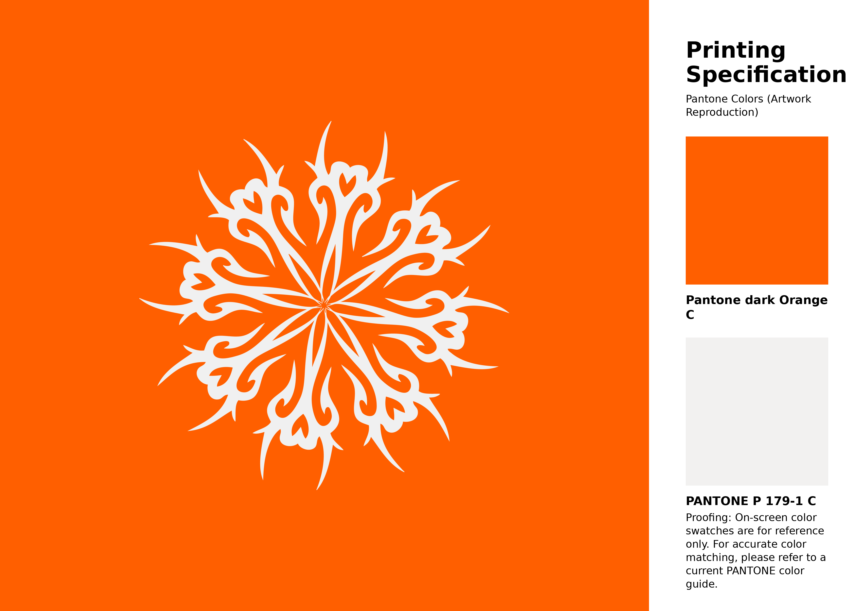
#ff5f00 Bright Orange C Color | Hex color Code #ff5f00 Artwork Image (PNG)
Download Artwork (PNG)#ff5f00 Bright Orange C Color | Hex color Code #ff5f00 Artwork Vector (PDF)
Download Artwork (PDF)#ff5f00 Bright Orange C Color | Hex color Code #ff5f00 Artwork Vector (SVG)
Download Artwork (SVG)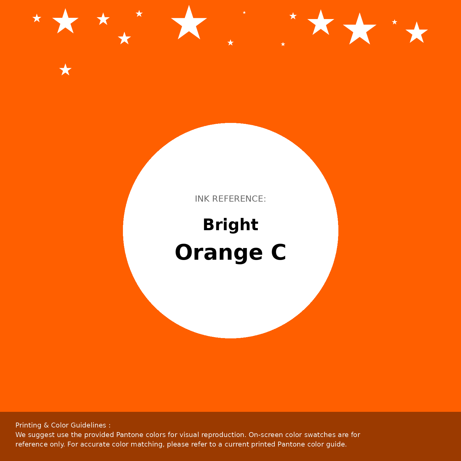
#ff5f00 Bright Orange C Color | Hex color Code #ff5f00 Pantone Swatch Artwork
Download Artwork Swatch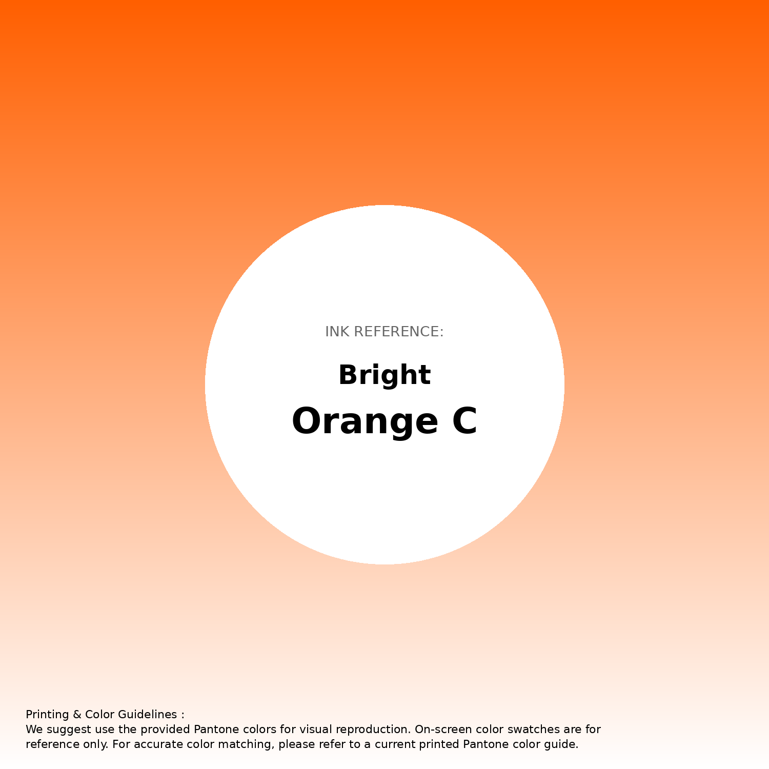
#ff5f00 Bright Orange C Color | Hex color Code #ff5f00 Gradient Artwork (PNG)
Download Gradient (PNG)#ff5f00 Bright Orange C Color | Hex color Code #ff5f00 Gradient Artwork (SVG)
Download Gradient (SVG)
#ff5f00 Bright Orange C Color | Hex color Code #ff5f00 T-Shirt Mockup
Download T-Shirt Mockup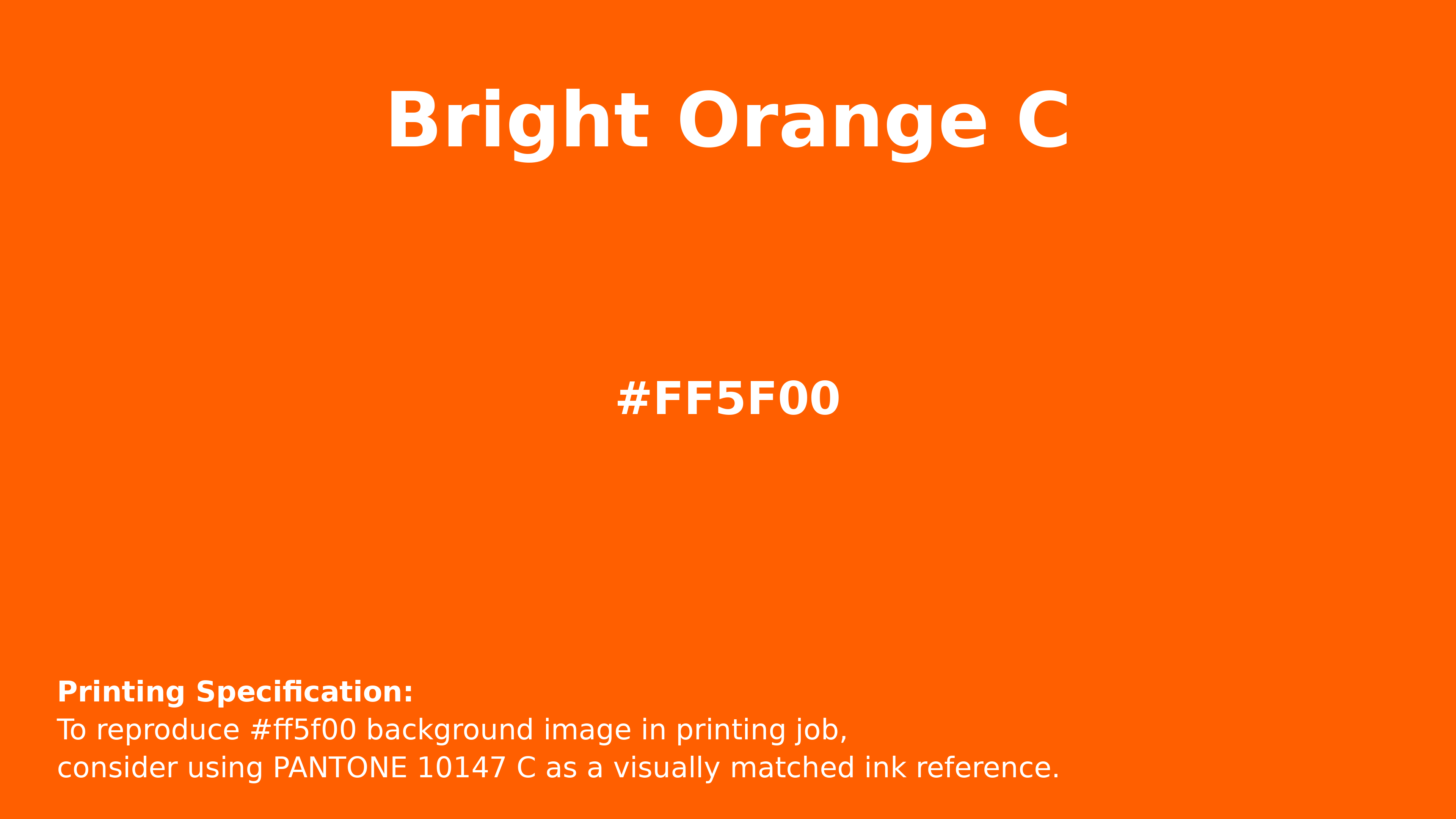
#ff5f00 Bright Orange C Color | Hex color Code #ff5f00 Printing Artwork Pantone Reference
Download Pantone Printing Reference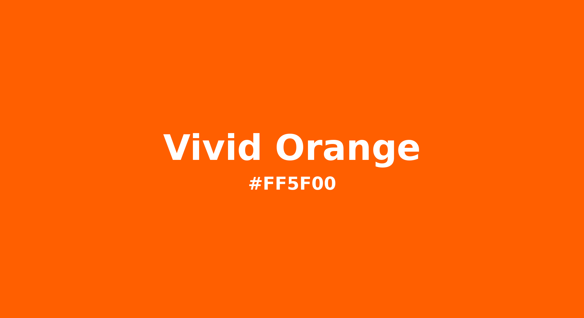
Vivid Orange - #ff5f00 Color Name
Download Color NameRelated Color Palettes
- Dark Slate Blue and Orange •
- International Orange •
- Dark Orange and Dark Olive Green •
- OrangeRed and Sienna •
- Orange and Crimson •
- Saddle Brown and OrangeRed •
- Dark Orange and Brown •
- Red and Orange •
- Dark Khaki and OrangeRed •
- Orange and Midnight Blue •
- Maroon and OrangeRed •
- OrangeRed and Orange •
- OrangeRed and Dark Sea Green •
- Yellow Orange •
- Orange and Orange
Color Palette Collection

Light Blue Palettes to Enhance Your Design
13 color palettes with 65 colors.

55 Nature Color Palettes
55 color palettes with 275 colors.
31 Autumn Color Palettes
31 color palettes with 155 colors.
Home vibes
1 color palettes with 5 colors.