#F8485E Color
Your all-in-one color resource. Download hex background images, Adobe swatches (ASE), PDF color sheets, and SVG files. Explore palettes, harmonies, accessibility, conversions, and professional exports — designed for designers, developers, and color perfectionists.
This vibrant, fiery mix of red and orange evokes a sense of passion, energy, and excitement. It conjures images of a blazing sunset, a vibrant autumn leaf, or the intense heat of a summer day. The color feels bold and assertive, creating a dynamic and engaging atmosphere. It might be used in design to highlight key elements or create a sense of urgency or excitement, such as in fashion, advertising, or a bold accent wall. In some cultures, red often symbolizes strength and good fortune. Visually matched named color: Crimson Blaze.
PANTONE 1785 C
Choose Color
Selected Color
Recent Colors
Color Details
Similar Ink Alternatives for #F8485E color Alternative print inks for reproducing #F8485E background image with a similar visual appearance.
Disclaimer: The visually matched ink reference is an independent approximation intended as a guide only. Please be advised that this pantone colors is only intended as a guide, Actual colours will depend on screen calibration variances. The print ink suggestions provided are independent visual approximations and are not affiliated with or endorsed by Pantone LLC. For official color specifications, conversion factors, and comprehensive color system information, please visit Pantone Connect. Official Pantone products can be purchased at pantone.com.
Color Previews for #000000 See how this color looks as a background or as text.
Complete Guide to Your Color Laboratory
Everything you need to know about this professional color toolkit.
Use the Color Picker at the top to select any color. All modules below update instantly.
Workflow: Pick a color → Explore palettes & data → Download what you need (PDF, Image, or Adobe ASE).
Color Details — Your color in all formats: HEX, RGB, RGBA, HSL, HSLA, HSV, CMYK, CIELab, Hunter-Lab, XYZ, Yxy, YUV. One-click copy.
Color Psychology — Emotional impact, cultural meanings, physiological effects, branding applications, and historical significance.
Named Colors — Find official color names (HTML/CSS, Pantone) that match your selection with similarity percentages.
Light & Dark Shades
80-step gradient from black to white. Perfect for button states and component systems.
Tints
Color mixed with white → lighter, pastel variations for backgrounds and disabled states.
Monochromatic — 11 curated tints/shades from one color. Production-ready for design systems.
- Complementary — Opposite on wheel (180°). High contrast.
- Analogous — Neighbors (±30°). Harmonious flow.
- Triadic — Three colors (120° apart). Vibrant, balanced.
- Split-Complementary — Base + two near-complements. Softer contrast.
- Tetradic/Square — Four colors. Complex, maximum variety.
- Neutral — Desaturated versions. Subtle, sophisticated.
15 Professional Variations — Monochromatic, Analogous, Complementary, Warm/Cool/Earth Tones, Pastel, Vibrant, High Contrast, and more.
Color Infusion — 10 palettes showing your color morphing into each major hue. Find bridge colors.
Similar Colors — 60+ colors generated via CIELAB Delta E matching. Unexpected harmonious combinations.
18 Ready-to-Use Gradients — Complementary, Analogous, Triadic, Tint/Shade progressions, and more.
Downloads: PNG (2560×1440), CSS (production-ready code), SVG (scalable vector).
WCAG Contrast Checker — Tests your color against white, black, and custom colors for AA (4.5:1) and AAA (7:1) compliance. Large text thresholds included.
Harmony & Accessibility Guide — Tests against 10 canonical hues. Shows which pairs are both beautiful AND WCAG-compliant for text.
PNG/JPG — High-res images for presentations and mood boards.
PDF — Print-ready reports for clients and teams.
Adobe ASE — Direct import to Photoshop, Illustrator, InDesign, XD.
CSS/SVG — Gradients only. Production-ready code and vectors.
Color Science: Industry-standard conversions (HSL, CIELAB, CMYK, XYZ). WCAG 2.1 luminance formula. Delta E (ΔE76) for perceptual matching.
Direct Links: Share colors via icolorpalette.com/color/ff5733 or icolorpalette.com/color/red
Issues? Refresh the page, wait for rendering, try another browser, or check console (F12) for errors.
Printing Guide for #f8485e Background Image
Use PANTONE 1785 C as a visually matched ink reference when printing this background image.
To print the #f8485e background image from our site, consider using PANTONE 1785 C as a visually matched ink reference.
Download the background image, then provide this reference code to your print vendor to help achieve accurate color reproduction.
The visually matched ink reference for the #f8485e background image is PANTONE 1785 C.
This color is commonly described as Crimson Blaze.
This vibrant, fiery mix of red and orange evokes a sense of passion, energy, and excitement. It conjures images of a blazing sunset, a vibrant autumn leaf, or the intense heat of a summer day. The color feels bold and assertive, creating a dynamic and engaging atmosphere. It might be used in design to highlight key elements or create a sense of urgency or excitement, such as in fashion, advertising, or a bold accent wall. In some cultures, red often symbolizes strength and good fortune.
We provide PANTONE 1785 C as a visually matched ink reference to help you reproduce the #f8485e background image accurately in professional printing.
This reference code helps print vendors achieve consistent color output across different printing equipment and materials.
After downloading the #f8485e background image from our site:
- Include the visually matched ink reference PANTONE 1785 C in your print order notes
- Inform your print vendor that this is your target color reference
- Request a proof print to verify the Crimson Blaze color appearance before full production
The #f8485e background image with PANTONE 1785 C as visually matched ink reference can be used for:
- Posters, banners, and backdrops
- Business cards, brochures, and flyers
- Packaging, labels, and stickers
- Signage and promotional materials
This is an independent visual approximation.
While PANTONE 1785 C closely matches the #f8485e background image color, variations may exist between screen display and printed output.
We recommend requesting a proof print to verify the final appearance.
This vibrant, fiery mix of red and orange evokes a sense of passion, energy, and excitement. It conjures images of a blazing sunset, a vibrant autumn leaf, or the intense heat of a summer day. The color feels bold and assertive, creating a dynamic and engaging atmosphere. It might be used in design to highlight key elements or create a sense of urgency or excitement, such as in fashion, advertising, or a bold accent wall. In some cultures, red often symbolizes strength and good fortune.
Understanding these associations helps ensure the #f8485e background image aligns with your intended message and brand impact.
Important Information
The visually matched ink reference is an independent approximation intended as a guide only.
Actual printed colors may vary depending on screen calibration, substrate material, ink type, and printing equipment used.
For official color specifications and certified color standards, visit Pantone Connect.
Official color guides and swatch books can be purchased from pantone.com.
Pantone 1785 C Color: Vibrant Red | #F8485E
Introduction:
Vibrant Red is a fiery and intense hue that captures attention. Its visual appeal is derived from its bold and energetic nature.
Historical Significance:
Key moments in history: Vibrant Red has been prominently used throughout history, from ancient civilizations to modern times. It has symbolized power, passion, and revolution in various historical events. For example, the red flags used during the French Revolution were a symbol of the fight for liberty and equality.
Symbolism and Meaning:
Symbolic representations: Vibrant Red typically symbolizes love, passion, strength, and determination. It is often associated with fiery emotions and intense feelings. In different cultures, it can also carry different meanings, such as luck or celebration.
Vibrant Red in Fashion:
Influence on fashion: Vibrant Red has a significant impact on styles and trends in the fashion world. It is often used to make a bold statement or add a pop of color to designs. Red dresses, shoes, and accessories are popular choices for making a powerful fashion statement.
Vibrant Red in Graphic Design:
Aesthetic and branding significance: Vibrant Red plays a crucial role in design aesthetics and branding. Its bold and energetic nature makes it an eye-catching color choice for logos, advertisements, and other visual elements. It conveys a sense of passion and urgency, grabbing the viewer's attention.
Color Combinations:
Potential color combinations: Vibrant Red can be combined with various colors to create striking and harmonious palettes. Some color combinations that work well with Vibrant Red include black and white for a classic look, gold for a luxurious feel, and navy blue for an elegant contrast.
Nature’s Palette:
Natural occurrences: Vibrant Red can be found in nature in the vibrant petals of flowers such as roses and poppies. It also appears in stunning sunsets, fiery autumn leaves, and the plumage of some birds like the cardinal.
Artistic Representations:
Use in art: Vibrant Red has been utilized in various forms of art over time. It has been used by artists to evoke emotions, create focal points, and add drama to their compositions. Artists like Mark Rothko and Henri Matisse have incorporated Vibrant Red into their paintings.
Movies and Cinematic Landscapes:
Movies and scenes: Vibrant Red is often used in movies to set the tone or mood. It can be seen in passionate romantic scenes or intense action sequences. Examples include the red dress scene in "Pretty Woman" and the iconic red coat of the girl in the red coat in "Schindler's List."
Products and Commercial Appeal:
Popular products and brands: Many products and brands are associated with Vibrant Red or use it in their branding. Examples include Coca-Cola, Red Bull, and Ferrari. The color's vibrant and powerful connotations make it an effective choice for capturing attention and conveying energy.
National Symbols and Significance:
Cultural significance: Vibrant Red holds cultural significance in many countries. For instance, it is often associated with good fortune and luck in Chinese culture. In India, it represents purity and is often worn by brides. In many Western cultures, it is a color associated with Christmas and Santa Claus.
The Psychological and Emotional Impact:
Psychological and emotional influence: Vibrant Red can evoke strong emotions and perceptions. It is associated with passion, love, and energy. It can also create a sense of urgency or danger. It has been found to increase heart rate and stimulate appetite.
Conclusion:
Vibrant Red, also known as Pantone 1785 C, is a color that commands attention and conveys a strong message. Its historical significance, cultural symbolism, and impact on various aspects of design and art make it a timeless and influential color choice. Whether it's in fashion, graphic design, or movies, Vibrant Red continues to captivate and inspire.
Pantone 1785 C Color | Hex color Code #f8485e Image & Artwork
Download high-quality assets for your projects.

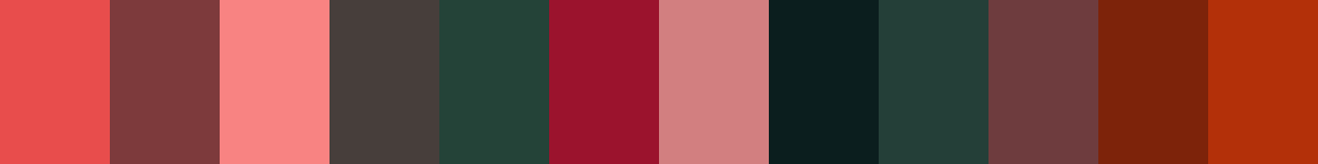
#f8485e Color Schemes
Download Color Schemes
#f8485e Color Shades
Download Color Shades
Pantone 1785 C Color | Hex color Code #f8485e Solid Color Background
Download Solid Color
#f8485e Pantone 1785 C Color | Hex color Code #f8485e Artwork Image (PNG)
Download Artwork (PNG)#f8485e Pantone 1785 C Color | Hex color Code #f8485e Artwork Vector (PDF)
Download Artwork (PDF)#f8485e Pantone 1785 C Color | Hex color Code #f8485e Artwork Vector (SVG)
Download Artwork (SVG)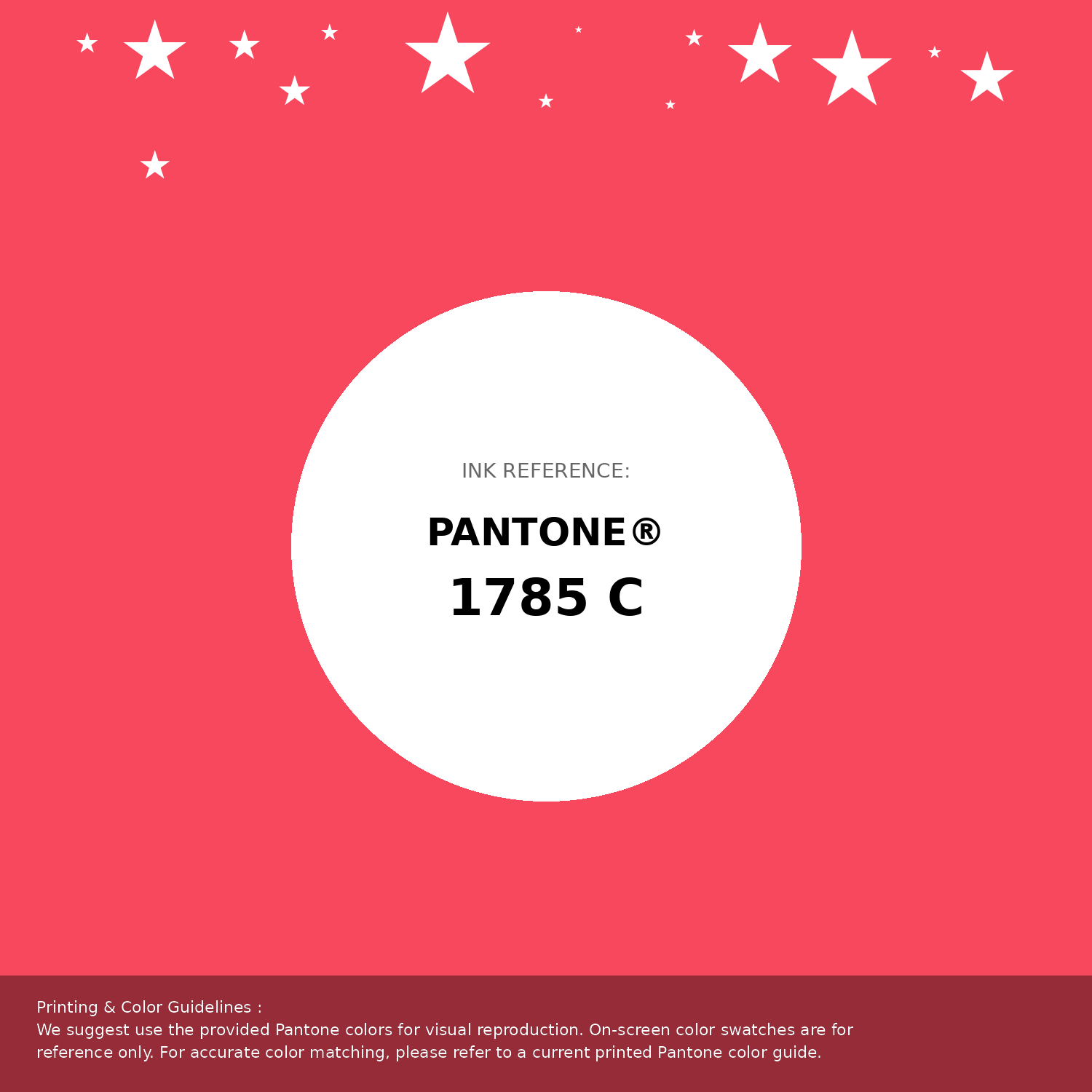
#f8485e Pantone 1785 C Color | Hex color Code #f8485e Pantone Swatch Artwork
Download Artwork Swatch
#f8485e Pantone 1785 C Color | Hex color Code #f8485e Gradient Artwork (PNG)
Download Gradient (PNG)#f8485e Pantone 1785 C Color | Hex color Code #f8485e Gradient Artwork (SVG)
Download Gradient (SVG)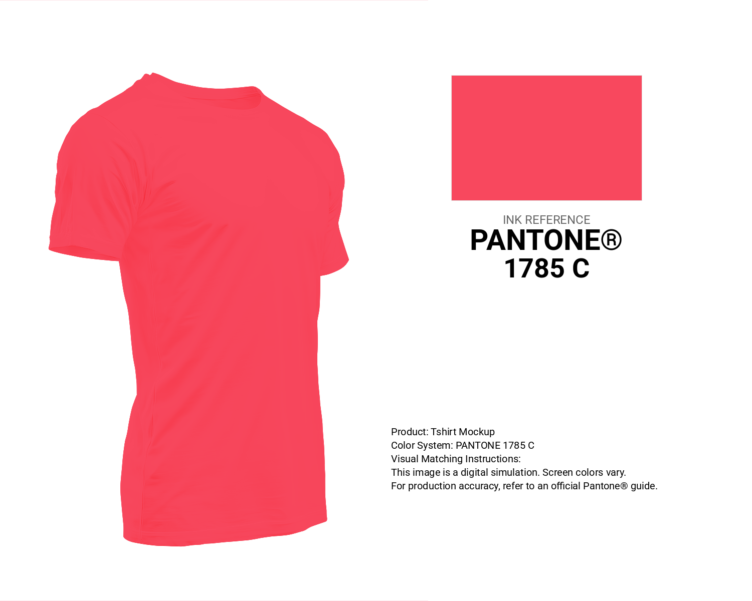
#f8485e Pantone 1785 C Color | Hex color Code #f8485e T-Shirt Mockup
Download T-Shirt Mockup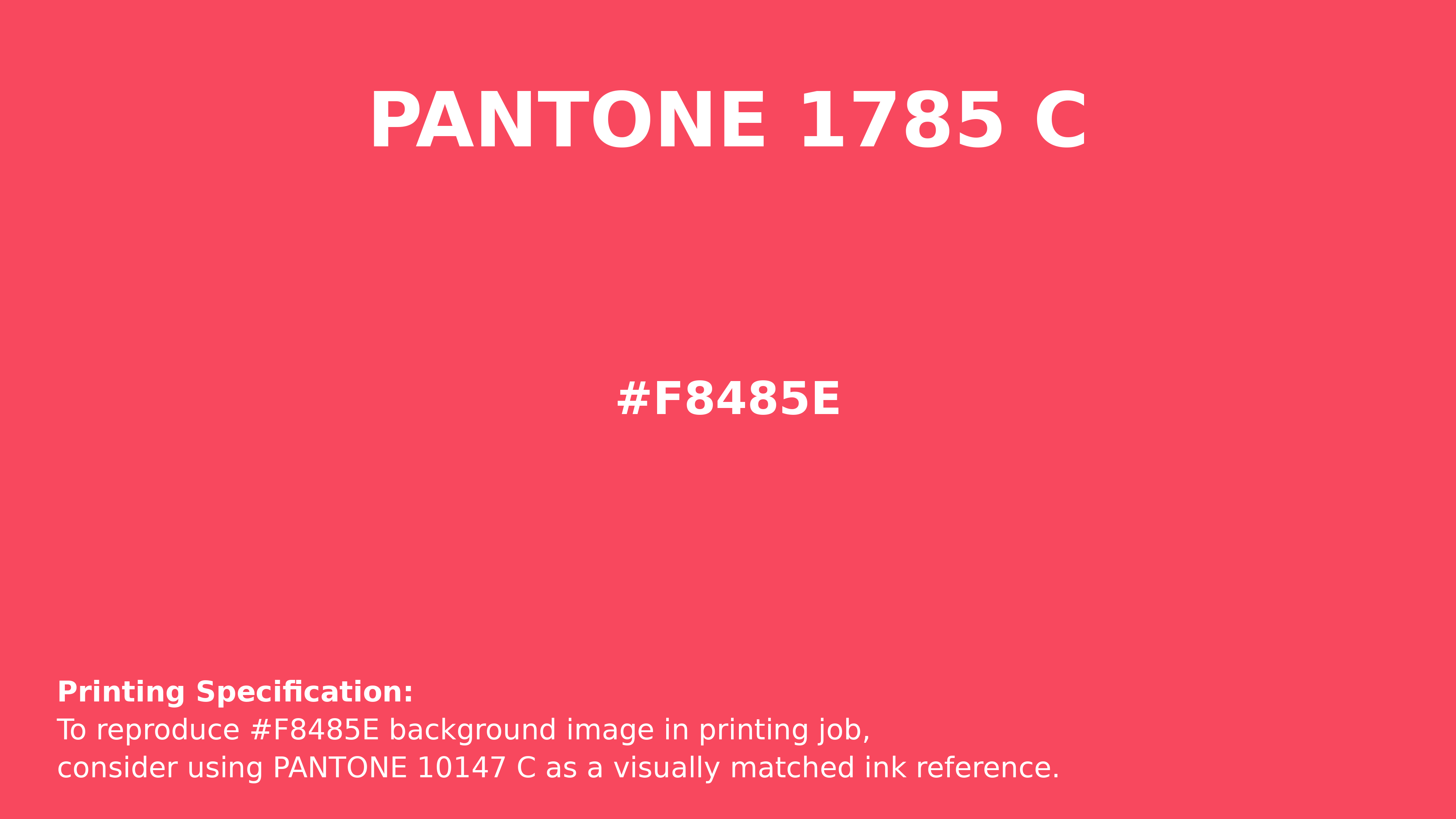
#f8485e Pantone 1785 C Color | Hex color Code #f8485e Printing Artwork Pantone Reference
Download Pantone Printing ReferenceRelated Color Palettes
- Red Color Palettes • Green Color Palettes • Purple Color Palettes • Pink Color Palettes • Orange Color Palettes • Blue Color Palettes • Yellow Color Palettes • Brown Color Palettes • Gray Color Palettes • Beige Color Palettes • Turquoise Color Palettes
Color Palette Collection
46 Flower Inspired Color Schemes
46 color palettes with 230 colors.

66 Brown Color Palettes
66 color palettes with 330 colors.
34 Yellow Color Schemes
34 color palettes with 170 colors.

50 Red color palettes
50 color palettes with 250 colors.